suiss/ui · Component
Toggle Group
A set of toggle buttons for choosing one or several related options, including segmented controls.
Toggle Group is an open-source component from suiss/ui for React, React Native, SwiftUI and Jetpack Compose. The @esuiss/ui CLI copies its source into your project, so you own the code.
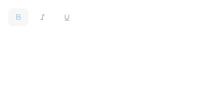
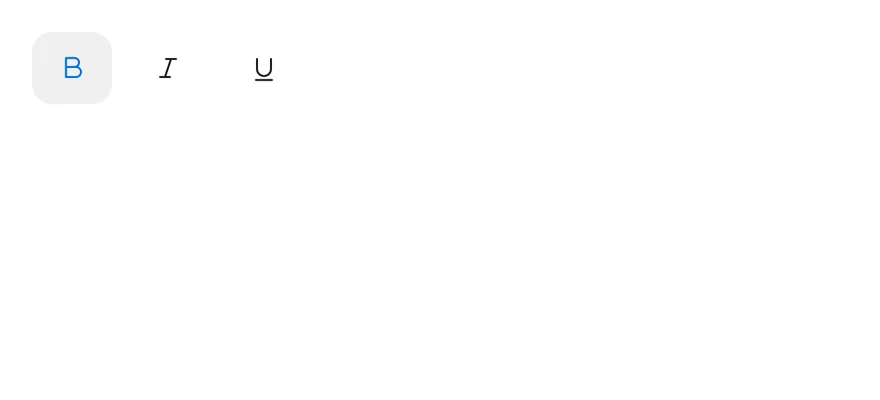
ToggleGroup wraps the toggle group primitive of the chosen base and holds ToggleGroupItem buttons that share the group's variant and size. Items can be spaced apart, attached into one bar, or combined into a segmented control.
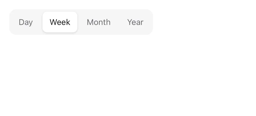
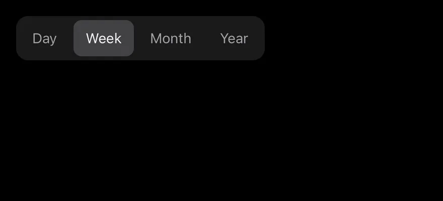
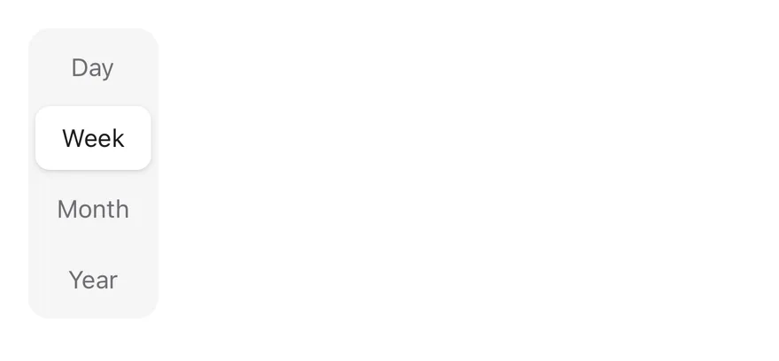
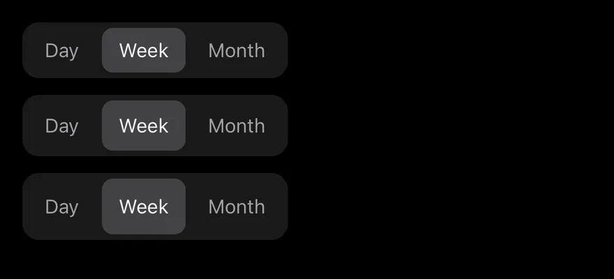
With spacing={0} and the default variant, the group becomes a segmented control: a filled track where a raised pill slides to the pressed item. Use a segmented group to switch between views, such as day, week and month. For a single on-off option, use Toggle; for switching panels of content, use Tabs.
Installation
CLI
Works in any project with a components.json. See Installation for the one-line registry setup. Or use the suiss/ui CLI:
Manual
- Install the dependencies and add the
cnhelper:
-
Add the pieces it builds on: Toggle.
-
Copy the source into
components/ui/toggle-group.tsx:
- Update the import paths to match your project.
Usage
The group's value is an array of item values. Use defaultValue for an uncontrolled group, or value with onValueChange to control it. Set multiple to let several items be pressed at once; without it, pressing an item releases the others.
Set variant and size on ToggleGroup; items take these from the group. Use spacing={0} with the outline variant to join items into one bordered bar.
Examples
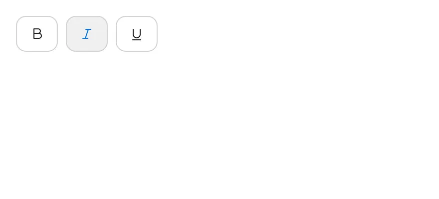
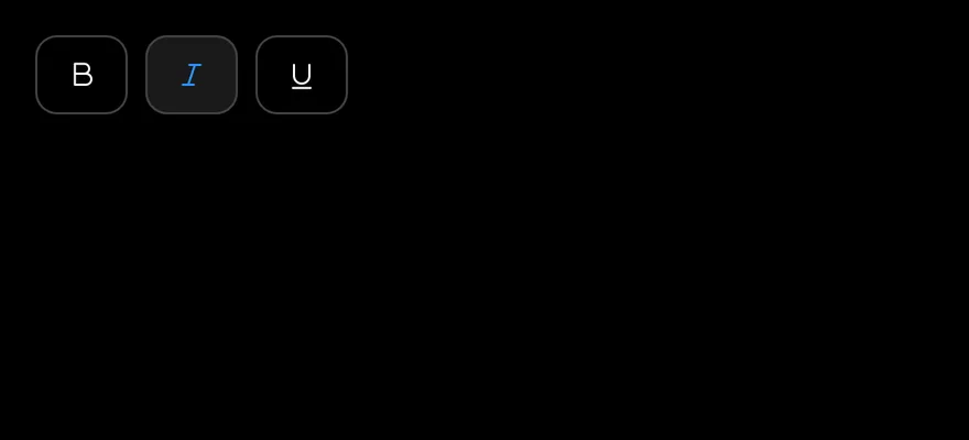
Outline
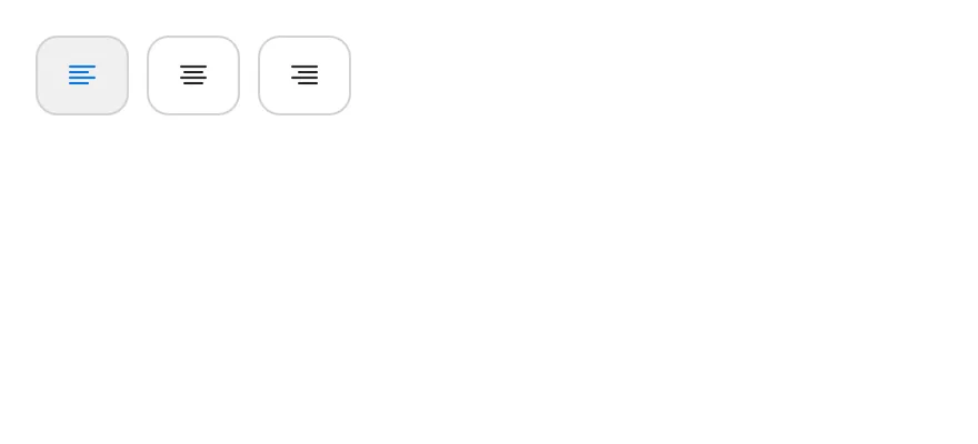
Uses the outline variant with spaced items.
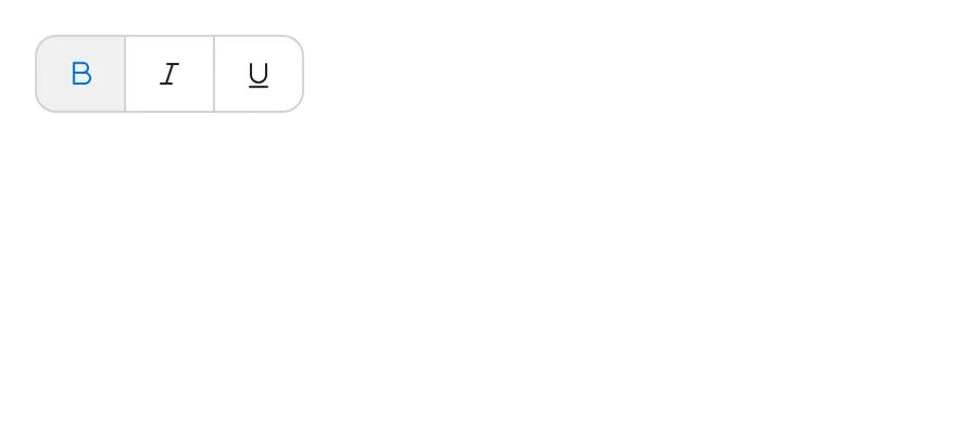
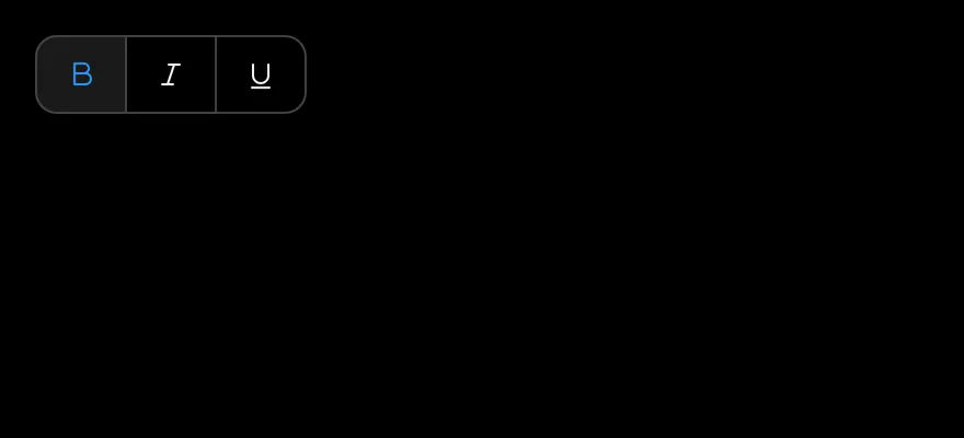
Attached
Joins outline items into one bar with spacing={0}.
Sizes
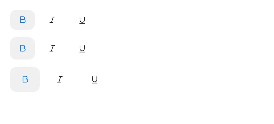
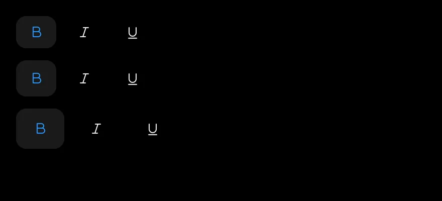
Compares the sm, default and lg sizes.
Segmented
Shows a single-choice segmented control with a sliding pill.
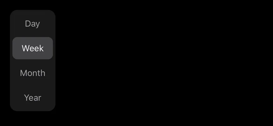
Segmented vertical
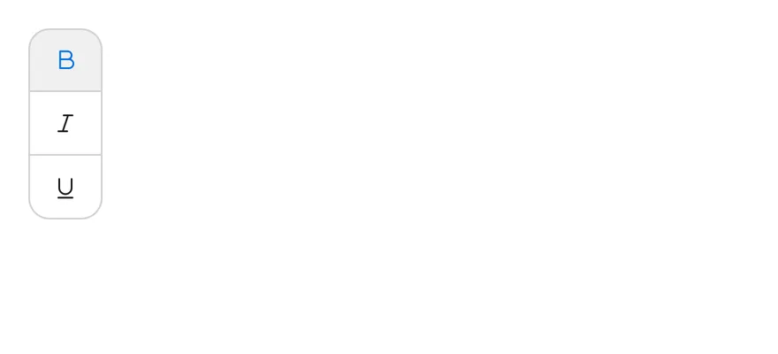
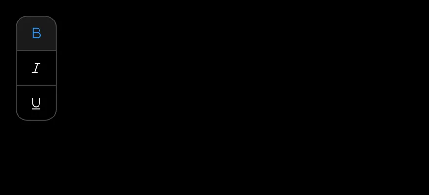
Stacks a segmented control vertically.
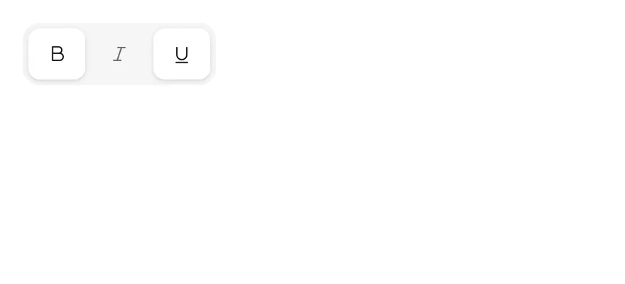
Segmented multiple
Uses a segmented control that allows several pressed items.
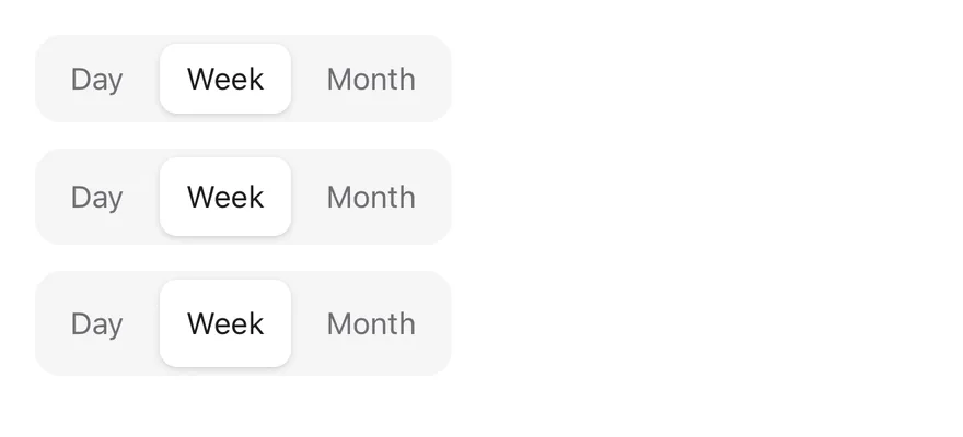
Segmented sizes
Compares segmented controls in each size.
Single selection
Allows only one pressed item in an outline group.
Vertical
Stacks attached outline items vertically.
Disabled
Disables every item in the group.
API Reference
ToggleGroup
The container that holds the pressed values and shared styles.
| Prop | Type | Default | Description |
|---|---|---|---|
spacing | number | 2 | Sets the gap between items on the spacing scale; 0 attaches them, or makes a segmented control with the default variant. |
orientation | "horizontal" | "vertical" | "horizontal" | Lays items out in a row or a column, and sets which arrow keys move focus. |
Also accepts the props of the primitive part it wraps.
ToggleGroupItem
A toggle button within the group, identified by its value.
Also accepts the props of the primitive part it wraps.
Accessibility
- The group has the
grouprole; name it witharia-label. - Each item is a
buttonwitharia-pressed. Icon-only items need anaria-label. - Arrow keys move focus between items: left and right in a horizontal group, up and down in a vertical one.
Spacetoggles the focused item. disabledon the group disables every item.
Notes
- The segmented indicator appears only when exactly one item is pressed. Its position is set through
--active-toggle-left,--active-toggle-top,--active-toggle-widthand--active-toggle-height. variantandsizeset on aToggleGroupItemare overridden by the group's values.- The group sets
data-variant,data-size,data-spacinganddata-orientation; parts use thetoggle-group,toggle-group-itemandtoggle-group-indicatorslots. - The segmented track uses
bg-secondaryand the pill usesbg-card. Its animation is removed when reduced motion is preferred.
ToggleGroup is built on the toggle group primitive and lays out ToggleGroupItem toggles in a row or a column. Items take the same variant and size styles as Toggle. The spacing prop sets the gap between items in steps of 4 points.
With spacing={0}, the group changes shape: the default variant becomes a segmented control on a bg-secondary track, and the outline variant joins items into one bordered strip. In a single-selection segmented control, the selected item is marked by a raised indicator that slides to the new item when the selection changes, like Tabs. In a multiple segmented control, each pressed item is raised on its own. Use the segmented style for switching views and the spaced style for toolbars.