suiss/ui · Component
Header
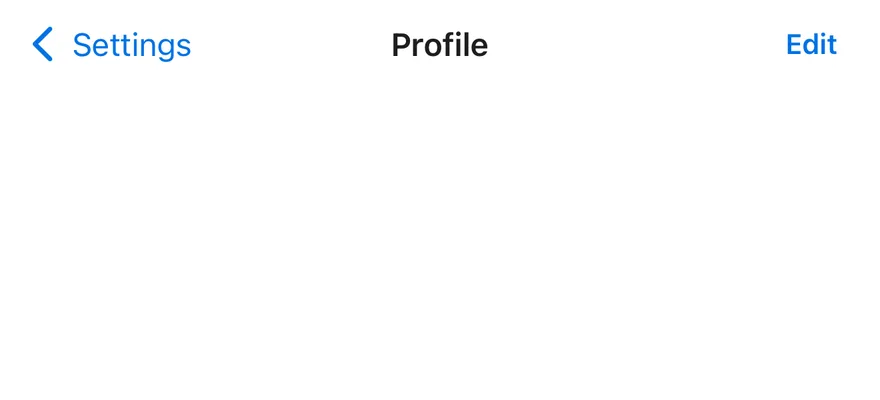
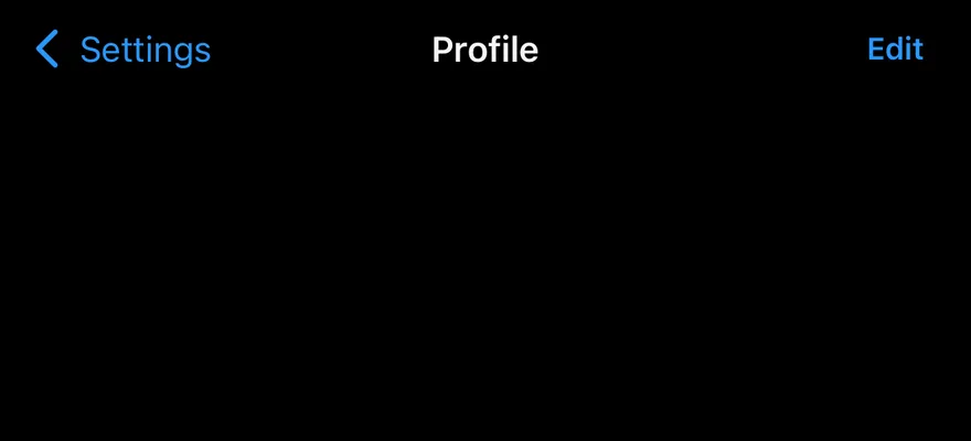
A navigation bar with a back button, a centered title, actions and an optional large title that collapses on scroll.
Header is an open-source component from suiss/ui for React Native, SwiftUI and Jetpack Compose. The @esuiss/ui CLI copies its source into your project, so you own the code.
import { View } from "react-native"
import { Button } from "@/components/ui/button"
import { Header, HeaderActions, HeaderBack, HeaderTitle } from "@/components/ui/header"
import { Text } from "@/components/ui/text"

export function HeaderExample() {
  return (
    <View className="-mx-4 -mt-4">
      <Header>
        <HeaderBack>Settings</HeaderBack>
        <HeaderTitle>Profile</HeaderTitle>
        <HeaderActions>
          <Button variant="plain" size="sm">
            <Text className="font-semibold">Edit</Text>
          </Button>
        </HeaderActions>
      </Header>
    </View>
  )
}import EsuissUI
import SwiftUI
struct HeaderExample: View {
var body: some View {
Header {
HeaderTitle("Profile")
} leading: {
HeaderBack("Settings")
} trailing: {
HeaderActions {
Button {} label: {
Text("Edit").fontWeight(.semibold)
}
.buttonStyle(.variant(.plain, size: .sm))
}
}
.headerStoryBleed()
}
}import androidx.compose.foundation.layout.Column
import androidx.compose.runtime.Composable
import androidx.compose.ui.Modifier
import androidx.compose.ui.layout.layout
import androidx.compose.ui.text.TextStyle
import androidx.compose.ui.text.font.FontWeight
import androidx.compose.ui.unit.dp
import com.esuiss.ui.components.Button
import com.esuiss.ui.components.ButtonSize
import com.esuiss.ui.components.ButtonVariant
import com.esuiss.ui.components.Header
import com.esuiss.ui.components.HeaderActions
import com.esuiss.ui.components.HeaderBack
import com.esuiss.ui.components.HeaderTitle
import com.esuiss.ui.components.Text
fun Modifier.headerBleed(): Modifier = layout { measurable, constraints ->
val inset = 16.dp.roundToPx()
val width = constraints.maxWidth + inset * 2
val placeable = measurable.measure(constraints.copy(minWidth = width, maxWidth = width))
layout(constraints.maxWidth, (placeable.height - inset).coerceAtLeast(0)) {
placeable.place(-inset, -inset)
}
}
@Composable
fun HeaderPlainAction(text: String) {
Button(onClick = {}, variant = ButtonVariant.Plain, size = ButtonSize.Sm) {
Text(text, style = TextStyle(fontWeight = FontWeight.SemiBold))
}
}
@Composable
fun HeaderDefault() {
Column(Modifier.headerBleed()) {
Header {
HeaderBack(onClick = {}, text = "Settings")
HeaderTitle("Profile")
HeaderActions { HeaderPlainAction("Edit") }
}
}
}Header is a 44-point bar that sorts its children into three slots: HeaderBack and leading HeaderActions on the start side, HeaderTitle in the center, and everything else on the end side. The side slots share the remaining width equally, so the title stays centered.
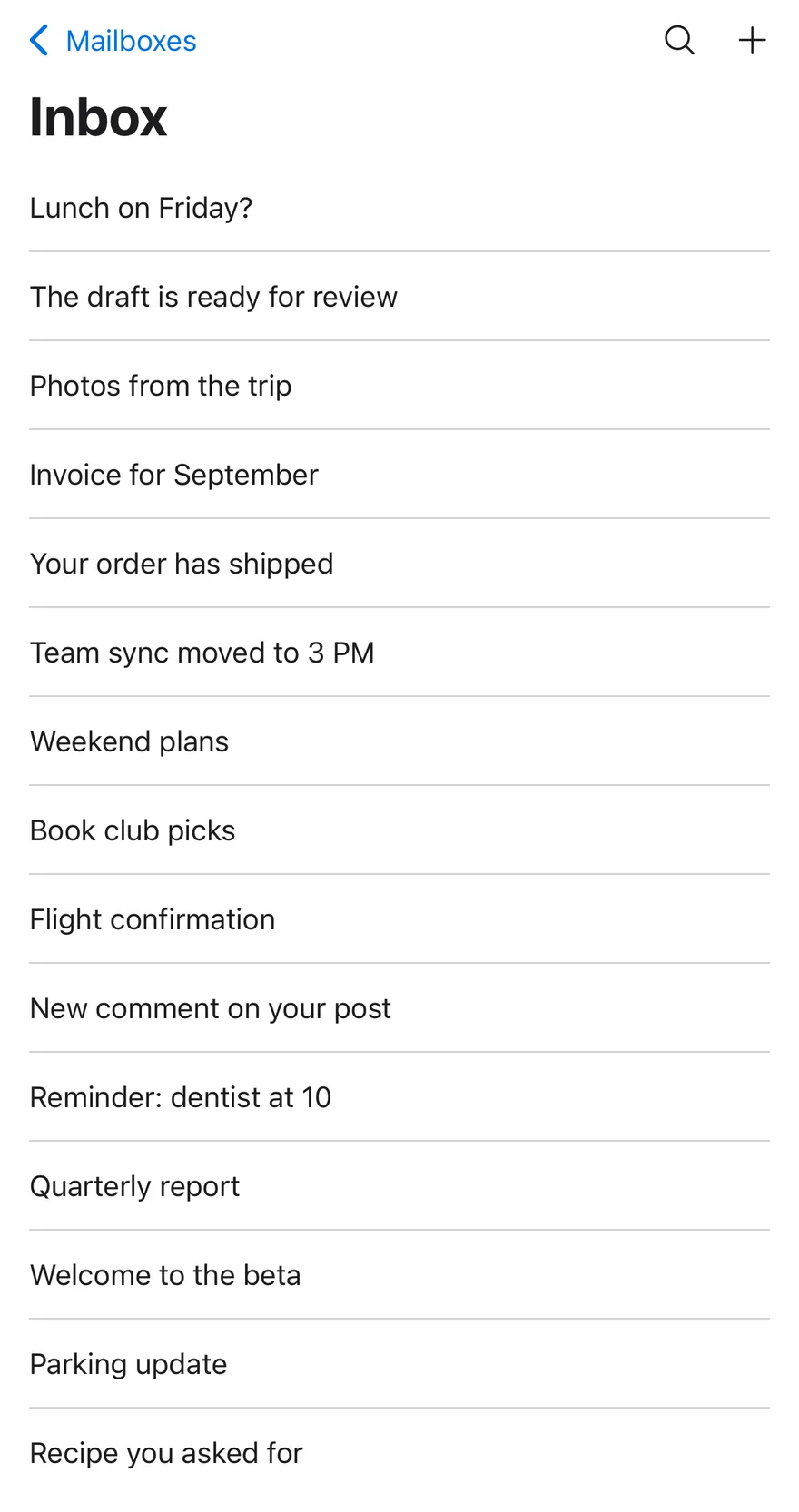
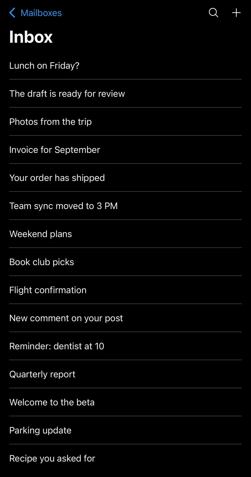
For a large title, create a scroll state with useHeaderScroll(), pass it to both Header and HeaderScrollView, and put a HeaderLargeTitle at the top of the scroll view. As the large title scrolls away, the small title fades in and a hairline appears under the bar. Pulling down stretches the large title slightly.
Installation
$ pnpm dlx shadcn@latest add @esuiss-rn/headerSee Installation for the components.json setup. Or use the suiss/ui CLI:
$ pnpm dlx @esuiss/ui@latest add header$ pnpm dlx @esuiss/ui@latest add header --platform swift$ pnpm dlx @esuiss/ui@latest add header --platform kotlinThe CLI also adds what it builds on: Icon, Text. On React Native it also adds the animated view components/ui/animated-view.tsx.
Manual
- Install the dependencies:
npx expo install cn phosphor-react-native react-native-reanimated react-native-svg react-native-worklets-
Add the pieces it builds on: Icon, Text, and the animated view
components/ui/animated-view.tsxfrom the next step. -
Copy the animated view into
components/ui/animated-view.tsx:
import { Pressable } from "react-native"
import Animated from "react-native-reanimated"

const AnimatedPressable = Animated.createAnimatedComponent(Pressable)

type AnimatedViewProps =
  | (React.ComponentProps<typeof Animated.View> &
      React.RefAttributes<React.ComponentRef<typeof Animated.View>> & {
        as?: "View"
      })
  | (React.ComponentProps<typeof AnimatedPressable> &
      React.RefAttributes<React.ComponentRef<typeof AnimatedPressable>> & {
        as: "Pressable"
      })

function AnimatedView(props: AnimatedViewProps) {- Copy the source into
components/ui/header.tsx:
import { cn } from "cn"
import { CaretLeftIcon } from "phosphor-react-native"
import * as React from "react"
import {
  I18nManager,
  Pressable,
  type ScrollViewProps,
  View,
  type ViewProps,
} from "react-native"
import Animated, {
  interpolate,
  type SharedValue,
  useAnimatedScrollHandler,
  useAnimatedStyle,
useSharedValue,- Update the import paths to match your project.
- Install the dependencies:
npx expo install cn phosphor-react-native react-native-reanimated react-native-svg react-native-worklets-
Add the pieces it builds on: Icon, Text, and the animated view
components/ui/animated-view.tsxfrom the next step. -
Copy the animated view into
components/ui/animated-view.tsx:
import { Pressable } from "react-native"
import Animated from "react-native-reanimated"

const AnimatedPressable = Animated.createAnimatedComponent(Pressable)

type AnimatedViewProps =
  | (React.ComponentProps<typeof Animated.View> &
      React.RefAttributes<React.ComponentRef<typeof Animated.View>> & {
        as?: "View"
      })
  | (React.ComponentProps<typeof AnimatedPressable> &
      React.RefAttributes<React.ComponentRef<typeof AnimatedPressable>> & {
        as: "Pressable"
      })

function AnimatedView(props: AnimatedViewProps) {- Copy the source into
components/ui/header.tsx:
import { cn } from "cn"
import { CaretLeftIcon } from "phosphor-react-native"
import * as React from "react"
import {
  I18nManager,
  Pressable,
  type ScrollViewProps,
  View,
  type ViewProps,
} from "react-native"
import Animated, {
  interpolate,
  type SharedValue,
  useAnimatedScrollHandler,
  useAnimatedStyle,
useSharedValue,- Update the import paths to match your project.
- Install the dependencies:
npx expo install phosphor-react-native react-native-reanimated react-native-svg react-native-worklets-
Add the pieces it builds on: Icon, Text, and the animated view
components/ui/animated-view.tsxfrom the next step. -
Copy the animated view into
components/ui/animated-view.tsx:
import { Pressable } from "react-native"
import Animated from "react-native-reanimated"

const AnimatedPressable = Animated.createAnimatedComponent(Pressable)

type AnimatedViewProps =
  | (React.ComponentProps<typeof Animated.View> &
      React.RefAttributes<React.ComponentRef<typeof Animated.View>> & {
        as?: "View"
      })
  | (React.ComponentProps<typeof AnimatedPressable> &
      React.RefAttributes<React.ComponentRef<typeof AnimatedPressable>> & {
        as: "Pressable"
      })

function AnimatedView(props: AnimatedViewProps) {- Copy the source into
components/ui/header.tsx:
import { CaretLeftIcon } from "phosphor-react-native"
import * as React from "react"
import {
  I18nManager,
  Pressable,
  type ScrollViewProps,
  type StyleProp,
  StyleSheet,
  type TextStyle,
  View,
  type ViewProps,
  type ViewStyle,
} from "react-native"
import Animated, {
  interpolate,
type SharedValue,- Update the import paths to match your project.
-
Target iOS 17 or later.
-
Add the Swift package to your app:
.package(url: "https://github.com/phosphor-icons/swift", from: "2.1.0")- Copy the theme files every view uses:
import SwiftUI
import UIKit

struct RGBA: Sendable {
  let red: CGFloat
  let green: CGFloat
  let blue: CGFloat
  let alpha: CGFloat

  init(_ hex: UInt32, _ alpha: CGFloat = 1) {
    red = CGFloat((hex >> 16) & 0xFF) / 255
    green = CGFloat((hex >> 8) & 0xFF) / 255
    blue = CGFloat(hex & 0xFF) / 255
    self.alpha = alpha
}import SwiftUI
public enum EsuissColor {
public static let background = Color.adaptive(light: .init(0xFFFFFF), dark: .init(0x000000))
public static let foreground = Color.adaptive(light: .init(0x1D1D1F), dark: .init(0xF5F5F7))
public static let card = Color.adaptive(light: .init(0xFFFFFF), dark: .init(0x1D1D1F))
public static let cardForeground = Color.adaptive(light: .init(0x1D1D1F), dark: .init(0xF5F5F7))
public static let popover = Color.adaptive(light: .init(0xFFFFFF), dark: .init(0x1D1D1F))
public static let popoverForeground = Color.adaptive(light: .init(0x1D1D1F), dark: .init(0xF5F5F7))
public static let primary = Color.adaptive(light: .init(0x0071E3), dark: .init(0x2997FF))
public static let primaryForeground = Color.adaptive(light: .init(0xFFFFFF), dark: .init(0xFFFFFF))
public static let secondary = Color.adaptive(light: .init(0x000000, 0.04), dark: .init(0xFFFFFF, 0.1))
public static let secondaryForeground = Color.adaptive(light: .init(0x1D1D1F), dark: .init(0xF5F5F7))
public static let muted = Color.adaptive(light: .init(0xF5F5F7), dark: .init(0x161617))
public static let mutedForeground = Color.adaptive(light: .init(0x6E6E73), dark: .init(0xA1A1A6))
public static let accent = Color.adaptive(light: .init(0x000000, 0.06), dark: .init(0xFFFFFF, 0.1))- Copy the source and every file it uses:
import PhosphorSwift
import SwiftUI

extension EnvironmentValues {
  @Entry var headerProgress: CGFloat?
  @Entry var headerReport: ((CGFloat) -> Void)?
}

enum HeaderMath {
  static func progress(minY: CGFloat, height: CGFloat) -> CGFloat {
    guard height > 0 else { return 0 }
    return min(max(-minY / height, 0), 1)
  }
}

public struct Header<Title: View, Leading: View, Trailing: View>: View {import SwiftUI
public struct VariantButtonStyle: ButtonStyle {
public enum Variant: CaseIterable, Sendable {
case `default`, outline, secondary, tinted, ghost, plain, destructive, link
}
public enum Size: CaseIterable, Sendable {
case `default`, xs, sm, lg, xl, icon, iconXs, iconSm, iconLg, iconXl
var height: CGFloat {
switch self {
case .xs, .iconXs: 24
case .sm, .iconSm: 32
case .default, .icon: 36
case .lg, .iconLg: 44import SwiftUI
extension EnvironmentValues {
@Entry var buttonGroup: Axis? = nil
@Entry var buttonGroupSize: CGSize = .zero
}
enum ButtonGroupSpace: Hashable {
case group
}
struct ButtonGroupFrame {
let bounds: Anchor<CGRect>
let outlined: Bool
}import PhosphorSwift
import SwiftUI
extension Shadow {
static let control = Shadow(color: .black.opacity(0.08), radius: 0.5, y: 0.5)
static let thumb = Shadow(color: .black.opacity(0.12), radius: 1.5, y: 1)
}
struct SelectionIndicator<Mark: View>: View {
let checked: Bool
let pressed: Bool
let cornerRadius: CGFloat
let mark: Mark
@Environment(\.isEnabled) private var isEnabled
@Environment(\.isInvalid) private var invalidimport SwiftUI
extension EnvironmentValues {
@Entry public var isInvalid = false
@Entry var fieldInset = false
@Entry var fieldGroupInset = false
@Entry var fieldSetInset = false
}
extension View {
public func invalid(_ isInvalid: Bool = true) -> some View {
environment(\.isInvalid, isInvalid)
}
}
public enum FieldOrientation: CaseIterable, Sendable {import SwiftUI
extension EnvironmentValues {
@Entry public var hapticsEnabled = true
}
extension View {
public func haptics(_ enabled: Bool) -> some View {
environment(\.hapticsEnabled, enabled)
}
func hapticFeedback<Trigger: Equatable>(_ feedback: SensoryFeedback, trigger: Trigger) -> some View {
modifier(HapticFeedbackModifier(feedback: feedback, trigger: trigger) { _, _ in true })
}
func hapticFeedback<Trigger: Equatable>(import SwiftUI
import UIKit
public struct KeyboardScrollView<Content: View>: View {
let showsIndicators: Bool
let content: Content
public init(showsIndicators: Bool = true, @ViewBuilder content: () -> Content) {
self.showsIndicators = showsIndicators
self.content = content()
}
public var body: some View {
ScrollView(.vertical, showsIndicators: showsIndicators) {
content
.frame(maxWidth: .infinity, alignment: .topLeading)import SwiftUI
extension EnvironmentValues {
@Entry var screenBackground: Color = EsuissColor.background
}
public struct Screen<Content: View>: View {
public enum Background: CaseIterable, Sendable {
case background, muted
var color: Color {
switch self {
case .background: EsuissColor.background
case .muted: EsuissColor.muted
}
}import SwiftUI
public struct Separator: View {
let orientation: Axis
public init(_ orientation: Axis = .horizontal) {
self.orientation = orientation
}
public var body: some View {
Rectangle()
.fill(EsuissColor.border)
.frame(width: orientation == .vertical ? 1 : nil, height: orientation == .horizontal ? 1 : nil)
.frame(maxWidth: orientation == .horizontal ? .infinity : nil, maxHeight: orientation == .vertical ? .infinity : nil)
.accessibilityHidden(true)
}import SwiftUI
public enum TextVariant: CaseIterable, Sendable {
case `default`, h1, h2, h3, h4, p, blockquote, code, lead, large, small, muted
var style: TextStyle {
switch self {
case .h1: .xl3
case .h2: .xl2
case .h3: .xl
case .h4, .lead, .large: .lg
case .code, .small, .muted: .sm
default: .base
}
}- Add the files to your app target.
- Set
minSdkto 24 or higher and add the dependencies:
implementation(platform("androidx.compose:compose-bom:2026.09.00"))
implementation("androidx.compose.foundation:foundation")
implementation("androidx.compose.ui:ui")
implementation("com.adamglin:phosphor-icon-android:1.0.0")- Copy the theme files every view uses:
package com.esuiss.ui.theme

import androidx.compose.foundation.isSystemInDarkTheme
import androidx.compose.runtime.Composable
import androidx.compose.runtime.CompositionLocalProvider
import androidx.compose.runtime.Immutable
import androidx.compose.runtime.staticCompositionLocalOf
import androidx.compose.ui.Modifier
import androidx.compose.ui.draw.dropShadow
import androidx.compose.ui.graphics.Color
import androidx.compose.ui.graphics.Shape
import androidx.compose.ui.graphics.shadow.Shadow as DropShadow
import androidx.compose.ui.text.TextStyle
import androidx.compose.ui.text.style.LineHeightStyle
import androidx.compose.ui.unit.Dp
import androidx.compose.ui.unit.DpOffsetpackage com.esuiss.ui.theme
import androidx.compose.runtime.Immutable
import androidx.compose.ui.graphics.Color
import androidx.compose.ui.unit.dp
@Immutable
data class Colors(
val background: Color,
val foreground: Color,
val card: Color,
val cardForeground: Color,
val popover: Color,
val popoverForeground: Color,
val primary: Color,
val primaryForeground: Color,- Copy the source and every file it uses:
package com.esuiss.ui.components

import androidx.compose.animation.core.animate
import androidx.compose.animation.core.animateFloatAsState
import androidx.compose.animation.core.tween
import androidx.compose.foundation.clickable
import androidx.compose.foundation.interaction.MutableInteractionSource
import androidx.compose.foundation.interaction.collectIsPressedAsState
import androidx.compose.foundation.layout.Arrangement
import androidx.compose.foundation.layout.Column
import androidx.compose.foundation.layout.Row
import androidx.compose.foundation.layout.RowScope
import androidx.compose.foundation.layout.height
import androidx.compose.foundation.layout.padding
import androidx.compose.foundation.text.BasicText
import androidx.compose.runtime.Composablepackage com.esuiss.ui.components
import androidx.compose.foundation.background
import androidx.compose.foundation.border
import androidx.compose.foundation.clickable
import androidx.compose.foundation.interaction.MutableInteractionSource
import androidx.compose.foundation.interaction.collectIsPressedAsState
import androidx.compose.foundation.layout.Arrangement
import androidx.compose.foundation.layout.Row
import androidx.compose.foundation.layout.RowScope
import androidx.compose.foundation.layout.fillMaxWidth
import androidx.compose.foundation.layout.height
import androidx.compose.foundation.layout.padding
import androidx.compose.foundation.layout.size
import androidx.compose.foundation.shape.CircleShape
import androidx.compose.foundation.shape.RoundedCornerShapepackage com.esuiss.ui.components
import androidx.compose.foundation.background
import androidx.compose.foundation.gestures.Orientation
import androidx.compose.foundation.layout.Arrangement
import androidx.compose.foundation.layout.Box
import androidx.compose.foundation.layout.Row
import androidx.compose.foundation.layout.RowScope
import androidx.compose.foundation.layout.padding
import androidx.compose.foundation.shape.CircleShape
import androidx.compose.foundation.shape.CornerSize
import androidx.compose.foundation.shape.RoundedCornerShape
import androidx.compose.runtime.Composable
import androidx.compose.runtime.CompositionLocalProvider
import androidx.compose.runtime.DisposableEffect
import androidx.compose.runtime.Immutablepackage com.esuiss.ui.components
import androidx.compose.runtime.compositionLocalOf
import androidx.compose.ui.graphics.Color
import androidx.compose.ui.text.TextStyle
import androidx.compose.ui.unit.Dp
import androidx.compose.ui.unit.dp
val LocalContentStyle = compositionLocalOf { TextStyle.Default }
val LocalContentColor = compositionLocalOf { Color.Unspecified }
val LocalIconSize = compositionLocalOf { 20.dp }package com.esuiss.ui.components
import androidx.compose.foundation.Image
import androidx.compose.foundation.layout.size
import androidx.compose.runtime.Composable
import androidx.compose.ui.Modifier
import androidx.compose.ui.graphics.Color
import androidx.compose.ui.graphics.ColorFilter
import androidx.compose.ui.graphics.takeOrElse
import androidx.compose.ui.graphics.vector.ImageVector
import androidx.compose.ui.unit.Dp
import com.esuiss.ui.theme.EsuissTheme
@Composable
fun Icon(
imageVector: ImageVector,- Update the
com.esuiss.uipackage names to match your project.
Usage
import { Header, HeaderTitle, HeaderLargeTitle, HeaderBack, HeaderActions, HeaderScrollView } from "@/components/ui/header"<View className="-mx-4 -mt-4">
<Header>
<HeaderBack>Settings</HeaderBack>
<HeaderTitle>Profile</HeaderTitle>
<HeaderActions>
<Button variant="plain" size="sm">
<Text className="font-semibold">Edit</Text>
</Button>
</HeaderActions>
</Header>
</View>HeaderBack shows a caret and an optional text label such as the previous screen's name; wire onPress to your navigation. Group icon buttons in HeaderActions, and set side="leading" to place a group on the start side.
Both HeaderTitle and HeaderLargeTitle accept a subtitle. Plain strings are wrapped in Text and truncated to one line in the bar.
Without a large title, you can still pass the same scroll to Header and HeaderScrollView to show the hairline once content scrolls under the bar.
Examples
Large title
A large title that collapses into the bar on scroll.
import { MagnifyingGlassIcon, PlusIcon } from "phosphor-react-native"
import { View } from "react-native"
import { Button } from "@/components/ui/button"
import { Header, HeaderActions, HeaderBack, HeaderLargeTitle, HeaderScrollView, HeaderTitle, useHeaderScroll } from "@/components/ui/header"
import { Icon } from "@/components/ui/icon"
import { Text } from "@/components/ui/text"

const messages = [
  "Lunch on Friday?",
  "The draft is ready for review",
  "Photos from the trip",
  "Invoice for September",
  "Your order has shipped",
  "Team sync moved to 3 PM",
  "Weekend plans",
  "Book club picks",
  "Flight confirmation",
  "New comment on your post",
  "Reminder: dentist at 10",
  "Quarterly report",
  "Welcome to the beta",
  "Parking update",
  "Recipe you asked for",
]

function MessageRows() {
  return (
    <View className="px-4">
      {messages.map((message, index) => (
        <View
          key={message}
          className={index > 0 ? "border-t border-border py-3" : "py-3"}
        >
          <Text numberOfLines={1}>{message}</Text>
        </View>
      ))}
    </View>
  )
}

function TrailingActions() {
  return (
    <HeaderActions>
      <Button variant="ghost" size="icon" accessibilityLabel="Search">
        <Icon as={MagnifyingGlassIcon} className="size-5" />
      </Button>
      <Button variant="ghost" size="icon" accessibilityLabel="New message">
        <Icon as={PlusIcon} className="size-5" />
      </Button>
    </HeaderActions>
  )
}

function LargeTitleDemo({ subtitle }: { subtitle?: string }) {
  const scroll = useHeaderScroll()
  return (
    <View className="-m-4 flex-1">
      <Header scroll={scroll}>
        <HeaderBack>Mailboxes</HeaderBack>
        <HeaderTitle>Inbox</HeaderTitle>
        <TrailingActions />
      </Header>
      <HeaderScrollView scroll={scroll}>
        <HeaderLargeTitle subtitle={subtitle}>Inbox</HeaderLargeTitle>
        <MessageRows />
      </HeaderScrollView>
    </View>
  )
}

export function HeaderLargeTitleExample() {
  return (
    <LargeTitleDemo />
  )
}import EsuissUI
import PhosphorSwift
import SwiftUI
let headerMessages = [
"Lunch on Friday?",
"The draft is ready for review",
"Photos from the trip",
"Invoice for September",
"Your order has shipped",
"Team sync moved to 3 PM",
"Weekend plans",
"Book club picks",
"Flight confirmation",
"New comment on your post",
"Reminder: dentist at 10",
"Quarterly report",
"Welcome to the beta",
"Parking update",
"Recipe you asked for",
]
extension View {
func headerStoryBleed() -> some View {
padding(.horizontal, -16).padding(.top, -16)
}
}
struct HeaderMessageRows: View {
var body: some View {
VStack(alignment: .leading, spacing: 0) {
ForEach(Array(headerMessages.enumerated()), id: \.offset) { index, message in
Text(LocalizedStringKey(message))
.textStyle(.base)
.foregroundStyle(EsuissColor.foreground)
.lineLimit(1)
.padding(.vertical, 12)
.frame(maxWidth: .infinity, alignment: .leading)
.overlay(alignment: .top) {
if index > 0 {
EsuissColor.border.frame(height: 1)
}
}
}
}
.padding(.horizontal, 16)
}
}
struct HeaderIconButton: View {
let icon: Image
let label: LocalizedStringKey
var body: some View {
Button {} label: {
icon.frame(width: 20, height: 20)
}
.accessibilityLabel(Text(label))
}
}
struct HeaderTrailingActions: View {
var body: some View {
HeaderActions {
HeaderIconButton(icon: Ph.magnifyingGlass.regular, label: "Search")
HeaderIconButton(icon: Ph.plus.regular, label: "New message")
}
}
}
struct HeaderLargeTitleDemo: View {
var subtitle: LocalizedStringKey?
var body: some View {
HeaderScrollView {
HeaderLargeTitle("Inbox", subtitle: subtitle)
HeaderMessageRows()
} header: {
Header {
HeaderTitle("Inbox")
} leading: {
HeaderBack("Mailboxes")
} trailing: {
HeaderTrailingActions()
}
}
}
}import androidx.compose.foundation.layout.Column
import androidx.compose.foundation.layout.fillMaxSize
import androidx.compose.foundation.layout.fillMaxWidth
import androidx.compose.foundation.layout.padding
import androidx.compose.foundation.rememberScrollState
import androidx.compose.foundation.verticalScroll
import androidx.compose.runtime.Composable
import androidx.compose.ui.Modifier
import androidx.compose.ui.input.nestedscroll.nestedScroll
import androidx.compose.ui.layout.layout
import androidx.compose.ui.text.style.TextOverflow
import androidx.compose.ui.unit.dp
import com.adamglin.PhosphorIcons
import com.adamglin.phosphoricons.Regular
import com.adamglin.phosphoricons.regular.MagnifyingGlass
import com.adamglin.phosphoricons.regular.Plus
import com.esuiss.ui.components.Button
import com.esuiss.ui.components.ButtonSize
import com.esuiss.ui.components.ButtonVariant
import com.esuiss.ui.components.Header
import com.esuiss.ui.components.HeaderActions
import com.esuiss.ui.components.HeaderBack
import com.esuiss.ui.components.HeaderLargeTitle
import com.esuiss.ui.components.HeaderTitle
import com.esuiss.ui.components.Icon
import com.esuiss.ui.components.Screen
import com.esuiss.ui.components.Separator
import com.esuiss.ui.components.Text
import com.esuiss.ui.components.rememberHeaderState
@Composable
fun HeaderLargeTitleExample() {
HeaderLargeTitleDemo(subtitle = null)
}
val HeaderMessages = listOf(
"Lunch on Friday?",
"The draft is ready for review",
"Photos from the trip",
"Invoice for September",
"Your order has shipped",
"Team sync moved to 3 PM",
"Weekend plans",
"Book club picks",
"Flight confirmation",
"New comment on your post",
"Reminder: dentist at 10",
"Quarterly report",
"Welcome to the beta",
"Parking update",
"Recipe you asked for",
)
fun Modifier.headerBleed(): Modifier = layout { measurable, constraints ->
val inset = 16.dp.roundToPx()
val width = constraints.maxWidth + inset * 2
val placeable = measurable.measure(constraints.copy(minWidth = width, maxWidth = width))
layout(constraints.maxWidth, (placeable.height - inset).coerceAtLeast(0)) {
placeable.place(-inset, -inset)
}
}
@Composable
fun HeaderMessageRows() {
Column(Modifier.fillMaxWidth().padding(horizontal = 16.dp)) {
HeaderMessages.forEachIndexed { index, message ->
if (index > 0) Separator()
Text(
message,
modifier = Modifier.fillMaxWidth().padding(vertical = 12.dp),
maxLines = 1,
overflow = TextOverflow.Ellipsis,
)
}
}
}
@Composable
fun HeaderTrailingActions() {
HeaderActions {
Button(onClick = {}, variant = ButtonVariant.Ghost, size = ButtonSize.Icon) {
Icon(PhosphorIcons.Regular.MagnifyingGlass, contentDescription = "Search")
}
Button(onClick = {}, variant = ButtonVariant.Ghost, size = ButtonSize.Icon) {
Icon(PhosphorIcons.Regular.Plus, contentDescription = "New message")
}
}
}
@Composable
fun HeaderLargeTitleDemo(subtitle: String?) {
val state = rememberHeaderState()
Screen {
Column(Modifier.fillMaxSize().nestedScroll(state.nestedScrollConnection)) {
Header(state = state) {
HeaderBack(onClick = {}, text = "Mailboxes")
HeaderTitle("Inbox")
HeaderLargeTitle("Inbox", subtitle = subtitle)
HeaderTrailingActions()
}
Column(Modifier.weight(1f).fillMaxWidth().verticalScroll(rememberScrollState())) {
HeaderMessageRows()
}
}
}
}Large title with subtitle
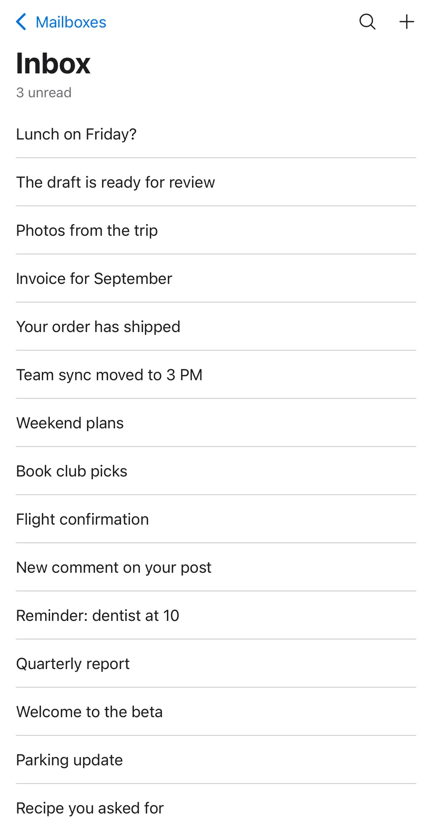
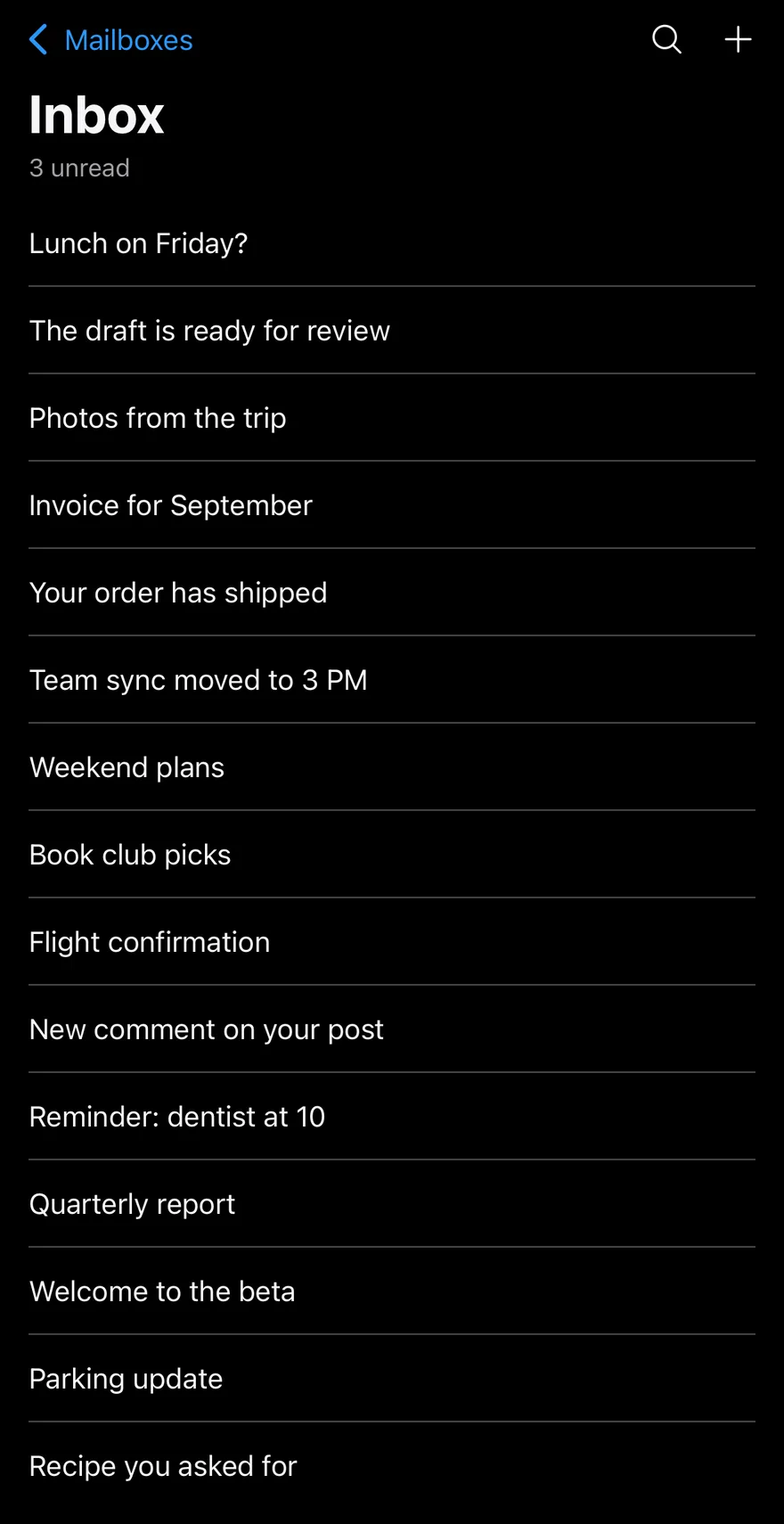
A large title with a subtitle.
import { MagnifyingGlassIcon, PlusIcon } from "phosphor-react-native"
import { View } from "react-native"
import { Button } from "@/components/ui/button"
import { Header, HeaderActions, HeaderBack, HeaderLargeTitle, HeaderScrollView, HeaderTitle, useHeaderScroll } from "@/components/ui/header"
import { Icon } from "@/components/ui/icon"
import { Text } from "@/components/ui/text"

const messages = [
  "Lunch on Friday?",
  "The draft is ready for review",
  "Photos from the trip",
  "Invoice for September",
  "Your order has shipped",
  "Team sync moved to 3 PM",
  "Weekend plans",
  "Book club picks",
  "Flight confirmation",
  "New comment on your post",
  "Reminder: dentist at 10",
  "Quarterly report",
  "Welcome to the beta",
  "Parking update",
  "Recipe you asked for",
]

function MessageRows() {
  return (
    <View className="px-4">
      {messages.map((message, index) => (
        <View
          key={message}
          className={index > 0 ? "border-t border-border py-3" : "py-3"}
        >
          <Text numberOfLines={1}>{message}</Text>
        </View>
      ))}
    </View>
  )
}

function TrailingActions() {
  return (
    <HeaderActions>
      <Button variant="ghost" size="icon" accessibilityLabel="Search">
        <Icon as={MagnifyingGlassIcon} className="size-5" />
      </Button>
      <Button variant="ghost" size="icon" accessibilityLabel="New message">
        <Icon as={PlusIcon} className="size-5" />
      </Button>
    </HeaderActions>
  )
}

function LargeTitleDemo({ subtitle }: { subtitle?: string }) {
  const scroll = useHeaderScroll()
  return (
    <View className="-m-4 flex-1">
      <Header scroll={scroll}>
        <HeaderBack>Mailboxes</HeaderBack>
        <HeaderTitle>Inbox</HeaderTitle>
        <TrailingActions />
      </Header>
      <HeaderScrollView scroll={scroll}>
        <HeaderLargeTitle subtitle={subtitle}>Inbox</HeaderLargeTitle>
        <MessageRows />
      </HeaderScrollView>
    </View>
  )
}

export function HeaderLargeTitleWithSubtitleExample() {
  return (
    <LargeTitleDemo subtitle="3 unread" />
  )
}import EsuissUI
import PhosphorSwift
import SwiftUI
struct HeaderLargeTitleWithSubtitleExample: View {
var body: some View {
HeaderLargeTitleDemo(subtitle: "3 unread")
}
}
let headerMessages = [
"Lunch on Friday?",
"The draft is ready for review",
"Photos from the trip",
"Invoice for September",
"Your order has shipped",
"Team sync moved to 3 PM",
"Weekend plans",
"Book club picks",
"Flight confirmation",
"New comment on your post",
"Reminder: dentist at 10",
"Quarterly report",
"Welcome to the beta",
"Parking update",
"Recipe you asked for",
]
extension View {
func headerStoryBleed() -> some View {
padding(.horizontal, -16).padding(.top, -16)
}
}
struct HeaderMessageRows: View {
var body: some View {
VStack(alignment: .leading, spacing: 0) {
ForEach(Array(headerMessages.enumerated()), id: \.offset) { index, message in
Text(LocalizedStringKey(message))
.textStyle(.base)
.foregroundStyle(EsuissColor.foreground)
.lineLimit(1)
.padding(.vertical, 12)
.frame(maxWidth: .infinity, alignment: .leading)
.overlay(alignment: .top) {
if index > 0 {
EsuissColor.border.frame(height: 1)
}
}
}
}
.padding(.horizontal, 16)
}
}
struct HeaderIconButton: View {
let icon: Image
let label: LocalizedStringKey
var body: some View {
Button {} label: {
icon.frame(width: 20, height: 20)
}
.accessibilityLabel(Text(label))
}
}
struct HeaderTrailingActions: View {
var body: some View {
HeaderActions {
HeaderIconButton(icon: Ph.magnifyingGlass.regular, label: "Search")
HeaderIconButton(icon: Ph.plus.regular, label: "New message")
}
}
}
struct HeaderLargeTitleDemo: View {
var subtitle: LocalizedStringKey?
var body: some View {
HeaderScrollView {
HeaderLargeTitle("Inbox", subtitle: subtitle)
HeaderMessageRows()
} header: {
Header {
HeaderTitle("Inbox")
} leading: {
HeaderBack("Mailboxes")
} trailing: {
HeaderTrailingActions()
}
}
}
}import androidx.compose.foundation.layout.Column
import androidx.compose.foundation.layout.fillMaxSize
import androidx.compose.foundation.layout.fillMaxWidth
import androidx.compose.foundation.layout.padding
import androidx.compose.foundation.rememberScrollState
import androidx.compose.foundation.verticalScroll
import androidx.compose.runtime.Composable
import androidx.compose.ui.Modifier
import androidx.compose.ui.input.nestedscroll.nestedScroll
import androidx.compose.ui.layout.layout
import androidx.compose.ui.text.style.TextOverflow
import androidx.compose.ui.unit.dp
import com.adamglin.PhosphorIcons
import com.adamglin.phosphoricons.Regular
import com.adamglin.phosphoricons.regular.MagnifyingGlass
import com.adamglin.phosphoricons.regular.Plus
import com.esuiss.ui.components.Button
import com.esuiss.ui.components.ButtonSize
import com.esuiss.ui.components.ButtonVariant
import com.esuiss.ui.components.Header
import com.esuiss.ui.components.HeaderActions
import com.esuiss.ui.components.HeaderBack
import com.esuiss.ui.components.HeaderLargeTitle
import com.esuiss.ui.components.HeaderTitle
import com.esuiss.ui.components.Icon
import com.esuiss.ui.components.Screen
import com.esuiss.ui.components.Separator
import com.esuiss.ui.components.Text
import com.esuiss.ui.components.rememberHeaderState
@Composable
fun HeaderLargeTitleWithSubtitleExample() {
HeaderLargeTitleDemo(subtitle = "3 unread")
}
val HeaderMessages = listOf(
"Lunch on Friday?",
"The draft is ready for review",
"Photos from the trip",
"Invoice for September",
"Your order has shipped",
"Team sync moved to 3 PM",
"Weekend plans",
"Book club picks",
"Flight confirmation",
"New comment on your post",
"Reminder: dentist at 10",
"Quarterly report",
"Welcome to the beta",
"Parking update",
"Recipe you asked for",
)
fun Modifier.headerBleed(): Modifier = layout { measurable, constraints ->
val inset = 16.dp.roundToPx()
val width = constraints.maxWidth + inset * 2
val placeable = measurable.measure(constraints.copy(minWidth = width, maxWidth = width))
layout(constraints.maxWidth, (placeable.height - inset).coerceAtLeast(0)) {
placeable.place(-inset, -inset)
}
}
@Composable
fun HeaderMessageRows() {
Column(Modifier.fillMaxWidth().padding(horizontal = 16.dp)) {
HeaderMessages.forEachIndexed { index, message ->
if (index > 0) Separator()
Text(
message,
modifier = Modifier.fillMaxWidth().padding(vertical = 12.dp),
maxLines = 1,
overflow = TextOverflow.Ellipsis,
)
}
}
}
@Composable
fun HeaderTrailingActions() {
HeaderActions {
Button(onClick = {}, variant = ButtonVariant.Ghost, size = ButtonSize.Icon) {
Icon(PhosphorIcons.Regular.MagnifyingGlass, contentDescription = "Search")
}
Button(onClick = {}, variant = ButtonVariant.Ghost, size = ButtonSize.Icon) {
Icon(PhosphorIcons.Regular.Plus, contentDescription = "New message")
}
}
}
@Composable
fun HeaderLargeTitleDemo(subtitle: String?) {
val state = rememberHeaderState()
Screen {
Column(Modifier.fillMaxSize().nestedScroll(state.nestedScrollConnection)) {
Header(state = state) {
HeaderBack(onClick = {}, text = "Mailboxes")
HeaderTitle("Inbox")
HeaderLargeTitle("Inbox", subtitle = subtitle)
HeaderTrailingActions()
}
Column(Modifier.weight(1f).fillMaxWidth().verticalScroll(rememberScrollState())) {
HeaderMessageRows()
}
}
}
}Compact with scroll
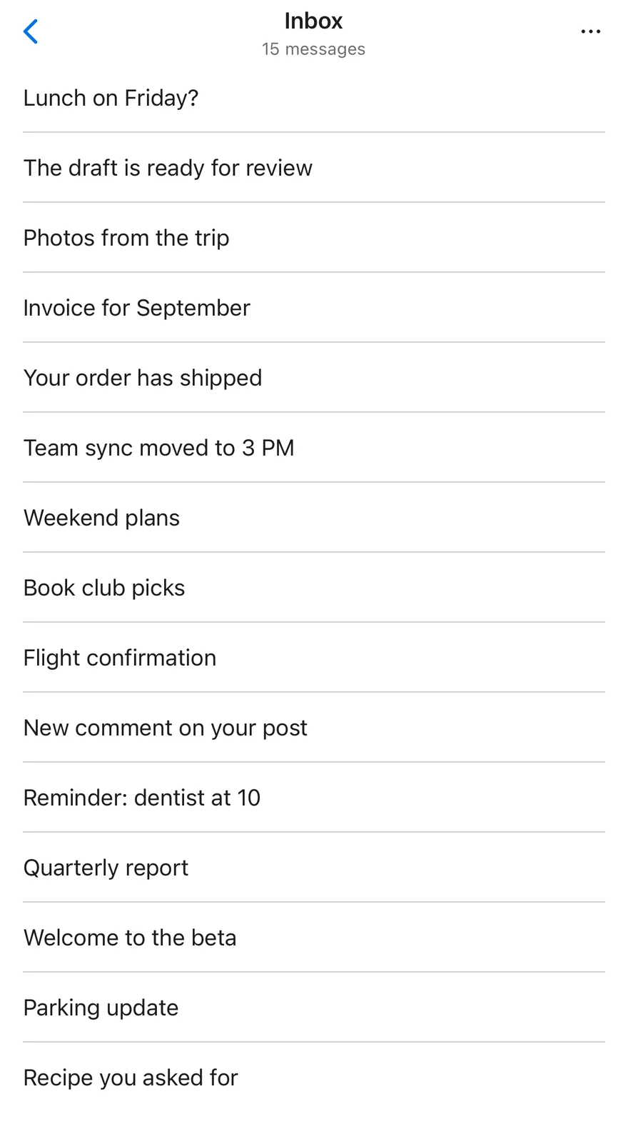
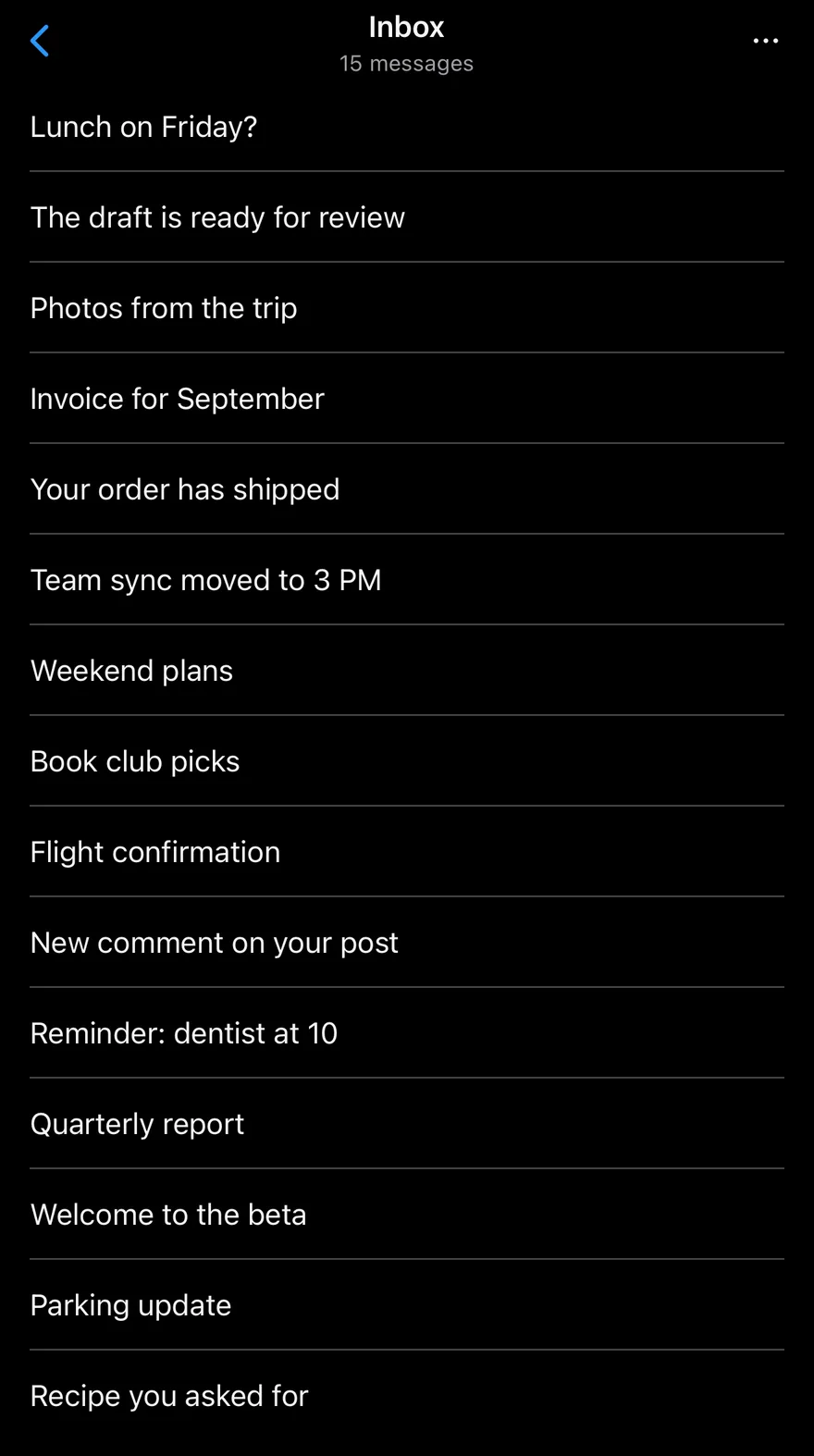
A compact title whose hairline appears on scroll.
import { DotsThreeIcon } from "phosphor-react-native"
import { View } from "react-native"
import { Button } from "@/components/ui/button"
import { Header, HeaderActions, HeaderBack, HeaderScrollView, HeaderTitle, useHeaderScroll } from "@/components/ui/header"
import { Icon } from "@/components/ui/icon"
import { Text } from "@/components/ui/text"

const messages = [
  "Lunch on Friday?",
  "The draft is ready for review",
  "Photos from the trip",
  "Invoice for September",
  "Your order has shipped",
  "Team sync moved to 3 PM",
  "Weekend plans",
  "Book club picks",
  "Flight confirmation",
  "New comment on your post",
  "Reminder: dentist at 10",
  "Quarterly report",
  "Welcome to the beta",
  "Parking update",
  "Recipe you asked for",
]

function MessageRows() {
  return (
    <View className="px-4">
      {messages.map((message, index) => (
        <View
          key={message}
          className={index > 0 ? "border-t border-border py-3" : "py-3"}
        >
          <Text numberOfLines={1}>{message}</Text>
        </View>
      ))}
    </View>
  )
}

function CompactScrollDemo() {
  const scroll = useHeaderScroll()
  return (
    <View className="-m-4 flex-1">
      <Header scroll={scroll}>
        <HeaderBack />
        <HeaderTitle subtitle="15 messages">Inbox</HeaderTitle>
        <HeaderActions>
          <Button variant="ghost" size="icon" accessibilityLabel="More">
            <Icon as={DotsThreeIcon} weight="bold" className="size-5" />
          </Button>
        </HeaderActions>
      </Header>
      <HeaderScrollView scroll={scroll}>
        <MessageRows />
      </HeaderScrollView>
    </View>
  )
}

export function HeaderCompactWithScrollExample() {
  return (
    <CompactScrollDemo />
  )
}import EsuissUI
import PhosphorSwift
import SwiftUI
struct HeaderCompactWithScrollExample: View {
var body: some View {
HeaderScrollView {
HeaderMessageRows()
} header: {
Header {
HeaderTitle("Inbox", subtitle: "15 messages")
} leading: {
HeaderBack()
} trailing: {
HeaderActions {
HeaderIconButton(icon: Ph.dotsThree.bold, label: "More")
}
}
}
}
}
let headerMessages = [
"Lunch on Friday?",
"The draft is ready for review",
"Photos from the trip",
"Invoice for September",
"Your order has shipped",
"Team sync moved to 3 PM",
"Weekend plans",
"Book club picks",
"Flight confirmation",
"New comment on your post",
"Reminder: dentist at 10",
"Quarterly report",
"Welcome to the beta",
"Parking update",
"Recipe you asked for",
]
extension View {
func headerStoryBleed() -> some View {
padding(.horizontal, -16).padding(.top, -16)
}
}
struct HeaderMessageRows: View {
var body: some View {
VStack(alignment: .leading, spacing: 0) {
ForEach(Array(headerMessages.enumerated()), id: \.offset) { index, message in
Text(LocalizedStringKey(message))
.textStyle(.base)
.foregroundStyle(EsuissColor.foreground)
.lineLimit(1)
.padding(.vertical, 12)
.frame(maxWidth: .infinity, alignment: .leading)
.overlay(alignment: .top) {
if index > 0 {
EsuissColor.border.frame(height: 1)
}
}
}
}
.padding(.horizontal, 16)
}
}
struct HeaderIconButton: View {
let icon: Image
let label: LocalizedStringKey
var body: some View {
Button {} label: {
icon.frame(width: 20, height: 20)
}
.accessibilityLabel(Text(label))
}
}import androidx.compose.foundation.layout.Column
import androidx.compose.foundation.layout.fillMaxSize
import androidx.compose.foundation.layout.fillMaxWidth
import androidx.compose.foundation.layout.padding
import androidx.compose.foundation.rememberScrollState
import androidx.compose.foundation.verticalScroll
import androidx.compose.runtime.Composable
import androidx.compose.ui.Modifier
import androidx.compose.ui.layout.layout
import androidx.compose.ui.text.style.TextOverflow
import androidx.compose.ui.unit.dp
import com.adamglin.PhosphorIcons
import com.adamglin.phosphoricons.Bold
import com.adamglin.phosphoricons.bold.DotsThree
import com.esuiss.ui.components.Button
import com.esuiss.ui.components.ButtonSize
import com.esuiss.ui.components.ButtonVariant
import com.esuiss.ui.components.Header
import com.esuiss.ui.components.HeaderActions
import com.esuiss.ui.components.HeaderBack
import com.esuiss.ui.components.HeaderTitle
import com.esuiss.ui.components.Icon
import com.esuiss.ui.components.Screen
import com.esuiss.ui.components.Separator
import com.esuiss.ui.components.Text
val HeaderMessages = listOf(
"Lunch on Friday?",
"The draft is ready for review",
"Photos from the trip",
"Invoice for September",
"Your order has shipped",
"Team sync moved to 3 PM",
"Weekend plans",
"Book club picks",
"Flight confirmation",
"New comment on your post",
"Reminder: dentist at 10",
"Quarterly report",
"Welcome to the beta",
"Parking update",
"Recipe you asked for",
)
fun Modifier.headerBleed(): Modifier = layout { measurable, constraints ->
val inset = 16.dp.roundToPx()
val width = constraints.maxWidth + inset * 2
val placeable = measurable.measure(constraints.copy(minWidth = width, maxWidth = width))
layout(constraints.maxWidth, (placeable.height - inset).coerceAtLeast(0)) {
placeable.place(-inset, -inset)
}
}
@Composable
fun HeaderMessageRows() {
Column(Modifier.fillMaxWidth().padding(horizontal = 16.dp)) {
HeaderMessages.forEachIndexed { index, message ->
if (index > 0) Separator()
Text(
message,
modifier = Modifier.fillMaxWidth().padding(vertical = 12.dp),
maxLines = 1,
overflow = TextOverflow.Ellipsis,
)
}
}
}
@Composable
fun HeaderCompactScroll() {
Screen {
Column(Modifier.fillMaxSize()) {
Header {
HeaderBack(onClick = {}, text = null)
HeaderTitle("Inbox", subtitle = "15 messages")
HeaderActions {
Button(onClick = {}, variant = ButtonVariant.Ghost, size = ButtonSize.Icon) {
Icon(PhosphorIcons.Bold.DotsThree, contentDescription = "More")
}
}
}
Column(Modifier.weight(1f).fillMaxWidth().verticalScroll(rememberScrollState())) {
HeaderMessageRows()
}
}
}
}Subtitle
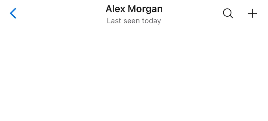
A two-line title with a subtitle.

import { MagnifyingGlassIcon, PlusIcon } from "phosphor-react-native"
import { View } from "react-native"
import { Button } from "@/components/ui/button"
import { Header, HeaderActions, HeaderBack, HeaderTitle } from "@/components/ui/header"
import { Icon } from "@/components/ui/icon"

function TrailingActions() {
  return (
    <HeaderActions>
      <Button variant="ghost" size="icon" accessibilityLabel="Search">
        <Icon as={MagnifyingGlassIcon} className="size-5" />
      </Button>
      <Button variant="ghost" size="icon" accessibilityLabel="New message">
        <Icon as={PlusIcon} className="size-5" />
      </Button>
    </HeaderActions>
  )
}

export function HeaderSubtitleExample() {
  return (
    <View className="-mx-4 -mt-4">
      <Header>
        <HeaderBack />
        <HeaderTitle subtitle="Last seen today">Alex Morgan</HeaderTitle>
        <TrailingActions />
      </Header>
    </View>
  )
}import EsuissUI
import PhosphorSwift
import SwiftUI
struct HeaderSubtitleExample: View {
var body: some View {
Header {
HeaderTitle("Alex Morgan", subtitle: "Last seen today")
} leading: {
HeaderBack()
} trailing: {
HeaderTrailingActions()
}
.headerStoryBleed()
}
}
extension View {
func headerStoryBleed() -> some View {
padding(.horizontal, -16).padding(.top, -16)
}
}
struct HeaderIconButton: View {
let icon: Image
let label: LocalizedStringKey
var body: some View {
Button {} label: {
icon.frame(width: 20, height: 20)
}
.accessibilityLabel(Text(label))
}
}
struct HeaderTrailingActions: View {
var body: some View {
HeaderActions {
HeaderIconButton(icon: Ph.magnifyingGlass.regular, label: "Search")
HeaderIconButton(icon: Ph.plus.regular, label: "New message")
}
}
}import androidx.compose.foundation.layout.Column
import androidx.compose.runtime.Composable
import androidx.compose.ui.Modifier
import androidx.compose.ui.layout.layout
import androidx.compose.ui.unit.dp
import com.adamglin.PhosphorIcons
import com.adamglin.phosphoricons.Regular
import com.adamglin.phosphoricons.regular.MagnifyingGlass
import com.adamglin.phosphoricons.regular.Plus
import com.esuiss.ui.components.Button
import com.esuiss.ui.components.ButtonSize
import com.esuiss.ui.components.ButtonVariant
import com.esuiss.ui.components.Header
import com.esuiss.ui.components.HeaderActions
import com.esuiss.ui.components.HeaderBack
import com.esuiss.ui.components.HeaderTitle
import com.esuiss.ui.components.Icon
fun Modifier.headerBleed(): Modifier = layout { measurable, constraints ->
val inset = 16.dp.roundToPx()
val width = constraints.maxWidth + inset * 2
val placeable = measurable.measure(constraints.copy(minWidth = width, maxWidth = width))
layout(constraints.maxWidth, (placeable.height - inset).coerceAtLeast(0)) {
placeable.place(-inset, -inset)
}
}
@Composable
fun HeaderTrailingActions() {
HeaderActions {
Button(onClick = {}, variant = ButtonVariant.Ghost, size = ButtonSize.Icon) {
Icon(PhosphorIcons.Regular.MagnifyingGlass, contentDescription = "Search")
}
Button(onClick = {}, variant = ButtonVariant.Ghost, size = ButtonSize.Icon) {
Icon(PhosphorIcons.Regular.Plus, contentDescription = "New message")
}
}
}
@Composable
fun HeaderSubtitle() {
Column(Modifier.headerBleed()) {
Header {
HeaderBack(onClick = {}, text = null)
HeaderTitle("Alex Morgan", subtitle = "Last seen today")
HeaderTrailingActions()
}
}
}Leading actions
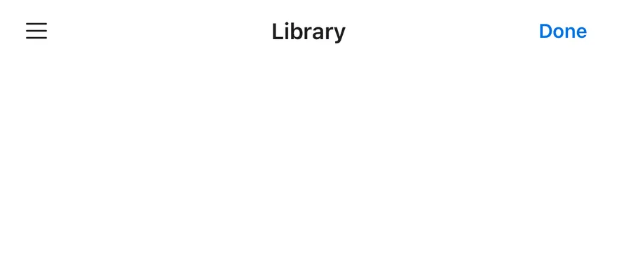
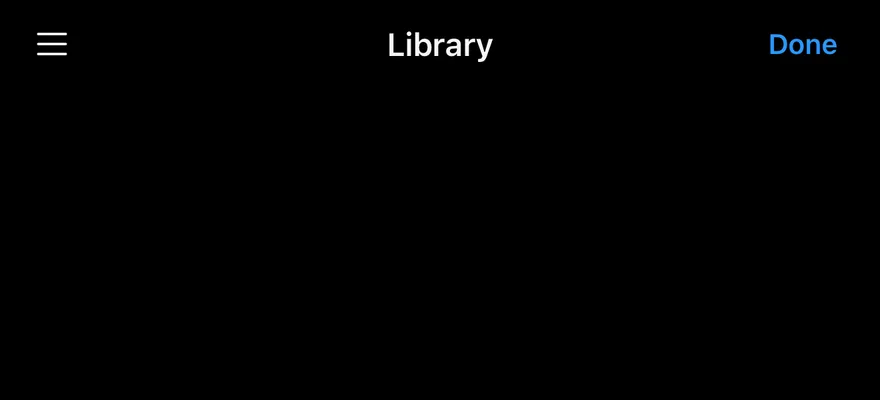
Actions on both sides of the title.
import { ListIcon } from "phosphor-react-native"
import { View } from "react-native"
import { Button } from "@/components/ui/button"
import { Header, HeaderActions, HeaderTitle } from "@/components/ui/header"
import { Icon } from "@/components/ui/icon"
import { Text } from "@/components/ui/text"

export function HeaderLeadingActionsExample() {
  return (
    <View className="-mx-4 -mt-4">
      <Header>
        <HeaderActions side="leading">
          <Button variant="ghost" size="icon" accessibilityLabel="Menu">
            <Icon as={ListIcon} className="size-5" />
          </Button>
        </HeaderActions>
        <HeaderTitle>Library</HeaderTitle>
        <HeaderActions>
          <Button variant="plain" size="sm">
            <Text className="font-semibold">Done</Text>
          </Button>
        </HeaderActions>
      </Header>
    </View>
  )
}import EsuissUI
import PhosphorSwift
import SwiftUI
struct HeaderLeadingActionsExample: View {
var body: some View {
Header {
HeaderTitle("Library")
} leading: {
HeaderActions {
HeaderIconButton(icon: Ph.list.regular, label: "Menu")
}
} trailing: {
HeaderActions {
Button {} label: {
Text("Done").fontWeight(.semibold)
}
.buttonStyle(.variant(.plain, size: .sm))
}
}
.headerStoryBleed()
}
}
extension View {
func headerStoryBleed() -> some View {
padding(.horizontal, -16).padding(.top, -16)
}
}
struct HeaderIconButton: View {
let icon: Image
let label: LocalizedStringKey
var body: some View {
Button {} label: {
icon.frame(width: 20, height: 20)
}
.accessibilityLabel(Text(label))
}
}import androidx.compose.foundation.layout.Column
import androidx.compose.runtime.Composable
import androidx.compose.ui.Modifier
import androidx.compose.ui.layout.layout
import androidx.compose.ui.text.TextStyle
import androidx.compose.ui.text.font.FontWeight
import androidx.compose.ui.unit.dp
import com.adamglin.PhosphorIcons
import com.adamglin.phosphoricons.Regular
import com.adamglin.phosphoricons.regular.List
import com.esuiss.ui.components.Button
import com.esuiss.ui.components.ButtonSize
import com.esuiss.ui.components.ButtonVariant
import com.esuiss.ui.components.Header
import com.esuiss.ui.components.HeaderActions
import com.esuiss.ui.components.HeaderActionsSide
import com.esuiss.ui.components.HeaderTitle
import com.esuiss.ui.components.Icon
import com.esuiss.ui.components.Text
fun Modifier.headerBleed(): Modifier = layout { measurable, constraints ->
val inset = 16.dp.roundToPx()
val width = constraints.maxWidth + inset * 2
val placeable = measurable.measure(constraints.copy(minWidth = width, maxWidth = width))
layout(constraints.maxWidth, (placeable.height - inset).coerceAtLeast(0)) {
placeable.place(-inset, -inset)
}
}
@Composable
fun HeaderPlainAction(text: String) {
Button(onClick = {}, variant = ButtonVariant.Plain, size = ButtonSize.Sm) {
Text(text, style = TextStyle(fontWeight = FontWeight.SemiBold))
}
}
@Composable
fun HeaderLeadingActions() {
Column(Modifier.headerBleed()) {
Header {
HeaderActions(side = HeaderActionsSide.Leading) {
Button(onClick = {}, variant = ButtonVariant.Ghost, size = ButtonSize.Icon) {
Icon(PhosphorIcons.Regular.List, contentDescription = "Menu")
}
}
HeaderTitle("Library")
HeaderActions { HeaderPlainAction("Done") }
}
}
}Back only
A long back label that truncates.


import { View } from "react-native"
import { Header, HeaderBack, HeaderTitle } from "@/components/ui/header"

export function HeaderBackOnlyExample() {
  return (
    <View className="-mx-4 -mt-4">
      <Header>
        <HeaderBack>A very long previous screen title</HeaderBack>
        <HeaderTitle>Details</HeaderTitle>
      </Header>
    </View>
  )
}import EsuissUI
import SwiftUI
struct HeaderBackOnlyExample: View {
var body: some View {
Header {
HeaderTitle("Details")
} leading: {
HeaderBack("A very long previous screen title")
}
.headerStoryBleed()
}
}import androidx.compose.foundation.layout.Column
import androidx.compose.runtime.Composable
import androidx.compose.ui.Modifier
import androidx.compose.ui.layout.layout
import androidx.compose.ui.unit.dp
import com.esuiss.ui.components.Header
import com.esuiss.ui.components.HeaderBack
import com.esuiss.ui.components.HeaderTitle
fun Modifier.headerBleed(): Modifier = layout { measurable, constraints ->
val inset = 16.dp.roundToPx()
val width = constraints.maxWidth + inset * 2
val placeable = measurable.measure(constraints.copy(minWidth = width, maxWidth = width))
layout(constraints.maxWidth, (placeable.height - inset).coerceAtLeast(0)) {
placeable.place(-inset, -inset)
}
}
@Composable
fun HeaderBackOnly() {
Column(Modifier.headerBleed()) {
Header {
HeaderBack(onClick = {}, text = "A very long previous screen title")
HeaderTitle("Details")
}
}
}API Reference
Header
Bar that lays out the back button, title and actions.
| Prop | Type | Default | Description |
|---|---|---|---|
scroll | HeaderScroll | - | Scroll state from useHeaderScroll(). |
Also accepts the props of ViewProps.
HeaderTitle
Centered title with optional subtitle.
| Prop | Type | Default | Description |
|---|---|---|---|
subtitle | React.ReactNode | - | Second line under the title. |
Also accepts the props of ViewProps.
HeaderLargeTitle
Large title at the top of the scroll content.
| Prop | Type | Default | Description |
|---|---|---|---|
subtitle | React.ReactNode | - | Line under the large title. |
Also accepts the props of ViewProps.
HeaderBack
Back button with a caret and optional label.
| Prop | Type | Default | Description |
|---|---|---|---|
children | React.ReactNode | - |
Also accepts the props of React.ComponentProps<typeof Pressable>.
HeaderActions
Row of actions for either side.
| Prop | Type | Default | Description |
|---|---|---|---|
side | "leading" | "trailing" | "trailing" | leading or trailing. Defaults to trailing. |
Also accepts the props of ViewProps.
HeaderScrollView
Scroll view that drives the header animations.
| Prop | Type | Default | Description |
|---|---|---|---|
scroll | HeaderScroll | Required | Scroll state from useHeaderScroll(). |
Also accepts the props of ScrollViewProps.
Accessibility
HeaderTitleand a stringHeaderLargeTitlehave theheadingrole.HeaderBackhas thebuttonrole and is labelled with its text, or "Back" when it has none.- Give icon-only actions an
accessibilityLabel.
Notes
- The back caret rotates and the large title scales from the correct edge in right-to-left layouts.
- Uses
text-primaryandbg-bordertokens, withopacity-80while pressed; light and dark follow the system appearance.