suiss/ui
  • Docs
  • Components
  • Patterns
  • Interactions
  • Charts
  • Blocks
GitHubGet started
DocsComponentsPatternsInteractionsChartsBlocks
Components82
  • Overview
  • Accordion
  • Alert
  • Alert Dialog
  • Alert Sheet
  • Amount Input
  • Aspect Ratio
  • Attachment
  • Avatar
  • Badge
  • Bottom Bar
  • Breadcrumb
  • Bubble
  • Button
  • Button Group
  • Calendar
  • Card
  • Carousel
  • Chart
  • Checkbox
  • Chip
  • Collapsible
  • Combobox
  • Command
  • Context Menu
  • Dialog
  • Direction
  • Drawer
  • Dropdown Menu
  • Empty
  • FAB
  • Field
  • Fullscreen Menu
  • Haptics
  • Header
  • Hover Card
  • Icon
  • Input
  • Input Accessory Bar
  • Input Group
  • Input OTP
  • Item
  • Kbd
  • Keyboard Scroll View
  • Keypad
  • Label
  • Marker
  • Menubar
  • Message
  • Message Scroller
  • Native Select
  • Navigation Menu
  • Page Indicator
  • Pagination
  • Pin Pad
  • Popover
  • Progress
  • QR Scanner
  • Questionnaire
  • Radio Group
  • Resizable
  • Screen
  • Scroll Area
  • Select
  • Separator
  • Sheet
  • Sidebar
  • Signature Pad
  • Skeleton
  • Slider
  • Spinner
  • Switch
  • Tab Bar
  • Table
  • Tabs
  • Text
  • Textarea
  • Toast
  • Toggle
  • Toggle Group
  • Tooltip
  • Wheel Picker
  • Widget

suiss/ui · Component

Alert

A static callout that draws attention to an important message without interrupting the user.

Alert is an open-source component from suiss/ui for React, React Native, SwiftUI and Jetpack Compose. The @esuiss/ui CLI copies its source into your project, so you own the code.

import { InfoIcon } from "@phosphor-icons/react"
import { Alert, AlertDescription, AlertTitle } from "@/components/ui/alert"

export default function AlertDemo() {
  return (
    <div className="w-96">
      <Alert>
        <InfoIcon />
        <AlertTitle>Update available</AlertTitle>
        <AlertDescription>
          A new version is ready to install. Restart the app to apply it.
        </AlertDescription>
      </Alert>
    </div>
  )
}

An Alert is a rounded container with an optional leading icon, an AlertTitle, an optional AlertDescription and an optional AlertAction. Place the icon as a direct child; the layout switches to a two-column grid so the title and description align beside it.

Use an alert for inline, persistent messages such as updates, warnings or errors. To interrupt the user and require a decision, use Alert Dialog instead; for short-lived notifications, use Toast.

Installation

CLI

$ pnpm dlx shadcn@latest add @esuiss/alert

Works in any project with a components.json. See Installation for the one-line registry setup. Or use the suiss/ui CLI:

$ pnpm dlx @esuiss/ui@latest add alert

Manual

  1. Install the dependencies and add the cn helper:
$ pnpm add class-variance-authority
  1. Copy the source into components/ui/alert.tsx:
components/ui/alert.tsx
import { cva, type VariantProps } from "class-variance-authority"
import type * as React from "react"
import { cn } from "@/lib/utils"

const alertVariants = cva(
  "group/alert relative grid w-full gap-0.5 rounded-2xl p-5 text-start text-base has-data-[slot=alert-action]:pe-24 has-[>svg]:grid-cols-[auto_1fr] has-[>svg]:gap-x-3 has-data-[slot=alert-description]:*:[svg]:row-span-2 *:[svg]:translate-y-px *:[svg:not([class*='size-'])]:size-5",
  {
    variants: {
      variant: {
        default: "bg-muted text-foreground *:[svg]:text-primary",
        destructive: "bg-muted text-foreground *:[svg]:text-destructive",
      },
    },
    defaultVariants: {
      variant: "default",
    },
  1. Update the import paths to match your project.

Usage

import { Alert, AlertTitle, AlertDescription, AlertAction } from "@/components/ui/alert"
<div className="w-96">
  <Alert>
    <InfoIcon weight="fill" />
    <AlertTitle>Update available</AlertTitle>
    <AlertDescription>
      A new version is ready to install. Restart the app to apply it.
    </AlertDescription>
  </Alert>
</div>

Put an icon from your icon library (or any svg) first inside Alert; it is sized to size-5 unless it already has a size class. When AlertDescription is present the icon spans both rows.

AlertAction is positioned in the top-end corner, and the alert reserves end padding for it automatically.

Examples

Destructive

Tints the icon with the destructive color for errors.

import { WarningCircleIcon } from "@phosphor-icons/react"
import { Alert, AlertDescription, AlertTitle } from "@/components/ui/alert"

export default function AlertDestructive() {
  return (
    <div className="w-96">
      <Alert variant="destructive">
        <WarningCircleIcon />
        <AlertTitle>Payment failed</AlertTitle>
        <AlertDescription>
          Your card was declined. Update your billing details to continue.
        </AlertDescription>
      </Alert>
    </div>
  )
}

Without icon

A title and description with no leading icon.

import { Alert, AlertDescription, AlertTitle } from "@/components/ui/alert"

export default function AlertWithoutIcon() {
  return (
    <div className="w-96">
      <Alert>
        <AlertTitle>Scheduled maintenance</AlertTitle>
        <AlertDescription>
          The service will be unavailable on Sunday from 2:00 to 4:00 AM.
        </AlertDescription>
      </Alert>
    </div>
  )
}

Title only

An icon with a single line of text and no description.

import { InfoIcon } from "@phosphor-icons/react"
import { Alert, AlertTitle } from "@/components/ui/alert"

export default function AlertTitleOnly() {
  return (
    <div className="w-96">
      <Alert>
        <InfoIcon />
        <AlertTitle>Your changes have been saved.</AlertTitle>
      </Alert>
    </div>
  )
}

With action

Places a small button in the top-end corner with AlertAction.

import { InfoIcon } from "@phosphor-icons/react"
import {
  Alert,
  AlertAction,
  AlertDescription,
  AlertTitle,
} from "@/components/ui/alert"
import { Button } from "@/components/ui/button"

export default function AlertWithAction() {
  return (
    <div className="w-96">
      <Alert>
        <InfoIcon />
        <AlertTitle>Storage almost full</AlertTitle>
        <AlertDescription>
          You have used 90% of your storage. Upgrade for more space.
        </AlertDescription>
        <AlertAction>
          <Button size="xs">Upgrade</Button>
        </AlertAction>
      </Alert>
    </div>
  )
}

API Reference

Anatomy4 parts
<Alert>
<AlertTitle />
<AlertDescription />
<AlertAction />
</Alert>
01

Alert

The container that lays out the icon, text and action.

PropTypeDefaultDescription
variant"default" | "destructive""default"Icon color. default uses text-primary; destructive uses text-destructive.

Also accepts the props of React.ComponentProps<"div">.

02

AlertTitle

The bold headline of the message.

Also accepts the props of React.ComponentProps<"div">.

03

AlertDescription

Secondary text that explains the message.

Also accepts the props of React.ComponentProps<"div">.

04

AlertAction

An absolutely positioned slot for a button or link in the top-end corner.

Also accepts the props of React.ComponentProps<"div">.

Accessibility

  • Alert renders with role="alert", so assistive technology announces its content when it appears.
  • Interactive content in AlertAction stays in the normal tab order.
  • Decorative icons should not need a label; put the meaning in the title text.

Notes

  • Styling hooks: data-slot="alert", "alert-title", "alert-description" and "alert-action".
  • Both variants use bg-muted; they differ only in icon color (text-primary or text-destructive).
  • Links inside the title or description are underlined automatically.

iOS
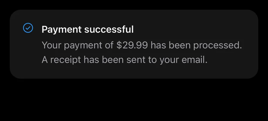
Alert on iOS in light modeAlert on iOS in dark mode
import { CheckCircleIcon } from "phosphor-react-native"
import { Alert, AlertDescription, AlertTitle } from "@/components/ui/alert"

export function AlertExample() {
  return (
    <Alert icon={CheckCircleIcon}>
      <AlertTitle>Payment successful</AlertTitle>
      <AlertDescription>
        Your payment of $29.99 has been processed. A receipt has been sent to
        your email.
      </AlertDescription>
    </Alert>
  )
}
import EsuissUI
import PhosphorSwift
import SwiftUI

struct AlertExample: View {
  var body: some View {
    InlineAlert(icon: Ph.checkCircle.regular) {
      AlertTitle("Payment successful")
      AlertDescription("Your payment of $29.99 has been processed. A receipt has been sent to your email.")
    }
  }
}
import androidx.compose.runtime.Composable
import com.adamglin.PhosphorIcons
import com.adamglin.phosphoricons.Regular
import com.adamglin.phosphoricons.regular.CheckCircle
import com.esuiss.ui.components.Alert
import com.esuiss.ui.components.AlertDescription
import com.esuiss.ui.components.AlertTitle

@Composable
fun AlertDefault() {
    Alert(icon = PhosphorIcons.Regular.CheckCircle) {
        AlertTitle("Payment successful")
        AlertDescription("Your payment of \$29.99 has been processed. A receipt has been sent to your email.")
    }
}

Alert is a View on a rounded bg-muted surface with an optional leading icon, a title and description column, and an optional action pinned to the top-end corner. It is static and stays in the layout; it is not a toast or a modal.

Use the default variant for neutral information, where the icon uses the primary color, and destructive for errors, where the icon uses the destructive color.

Installation

$ pnpm dlx shadcn@latest add @esuiss-rn/alert

See Installation for the components.json setup. Or use the suiss/ui CLI:

$ pnpm dlx @esuiss/ui@latest add alert
$ pnpm dlx @esuiss/ui@latest add alert --platform swift
$ pnpm dlx @esuiss/ui@latest add alert --platform kotlin

The CLI also adds what it builds on: Icon, Text.

Manual

  1. Install the dependencies:
npx expo install cn phosphor-react-native react-native-svg
  1. Add the pieces it builds on: Icon, Text.

  2. Copy the source into components/ui/alert.tsx:

uniwind/components/ui/alert.tsx
import { cn } from "cn"
import type { Icon as PhosphorIcon } from "phosphor-react-native"
import * as React from "react"
import { View } from "react-native"
import { Icon } from "@/components/ui/icon"
import { Text, TextClassContext } from "@/components/ui/text"

function Alert({
  className,
  variant = "default",
  children,
  icon,
  iconClassName,
  ...props
}: React.ComponentProps<typeof View> &
  React.RefAttributes<React.ComponentRef<typeof View>> & {
  1. Update the import paths to match your project.
  1. Install the dependencies:
npx expo install cn phosphor-react-native react-native-svg
  1. Add the pieces it builds on: Icon, Text.

  2. Copy the source into components/ui/alert.tsx:

nativewind/components/ui/alert.tsx
import { cn } from "cn"
import type { Icon as PhosphorIcon } from "phosphor-react-native"
import * as React from "react"
import { View } from "react-native"
import { Icon } from "@/components/ui/icon"
import { Text, TextClassContext } from "@/components/ui/text"

function Alert({
  className,
  variant = "default",
  children,
  icon,
  iconClassName,
  ...props
}: React.ComponentProps<typeof View> &
  React.RefAttributes<React.ComponentRef<typeof View>> & {
  1. Update the import paths to match your project.
  1. Install the dependencies:
npx expo install phosphor-react-native react-native-svg
  1. Add the pieces it builds on: Icon, Text.

  2. Copy the source into components/ui/alert.tsx:

stylesheet/components/ui/alert.tsx
import type {
  Icon as PhosphorIcon,
  IconProps as PhosphorIconProps,
} from "phosphor-react-native"
import * as React from "react"
import { StyleSheet, View } from "react-native"
import { Icon } from "@/components/ui/icon"
import { Text, TextStyleContext } from "@/components/ui/text"
import { fontSize, radius, useTheme } from "@/components/ui/theme"

const styles = StyleSheet.create({
  root: {
    position: "relative",
    width: "100%",
    flexDirection: "row",
    gap: 12,
  1. Update the import paths to match your project.
  1. Target iOS 17 or later.

  2. Copy the theme files every view uses:

swift/Theme/Theme.swift
import SwiftUI
import UIKit

struct RGBA: Sendable {
  let red: CGFloat
  let green: CGFloat
  let blue: CGFloat
  let alpha: CGFloat

  init(_ hex: UInt32, _ alpha: CGFloat = 1) {
    red = CGFloat((hex >> 16) & 0xFF) / 255
    green = CGFloat((hex >> 8) & 0xFF) / 255
    blue = CGFloat(hex & 0xFF) / 255
    self.alpha = alpha
  }
swift/Theme/Tokens.swift
import SwiftUI

public enum EsuissColor {
  public static let background = Color.adaptive(light: .init(0xFFFFFF), dark: .init(0x000000))
  public static let foreground = Color.adaptive(light: .init(0x1D1D1F), dark: .init(0xF5F5F7))
  public static let card = Color.adaptive(light: .init(0xFFFFFF), dark: .init(0x1D1D1F))
  public static let cardForeground = Color.adaptive(light: .init(0x1D1D1F), dark: .init(0xF5F5F7))
  public static let popover = Color.adaptive(light: .init(0xFFFFFF), dark: .init(0x1D1D1F))
  public static let popoverForeground = Color.adaptive(light: .init(0x1D1D1F), dark: .init(0xF5F5F7))
  public static let primary = Color.adaptive(light: .init(0x0071E3), dark: .init(0x2997FF))
  public static let primaryForeground = Color.adaptive(light: .init(0xFFFFFF), dark: .init(0xFFFFFF))
  public static let secondary = Color.adaptive(light: .init(0x000000, 0.04), dark: .init(0xFFFFFF, 0.1))
  public static let secondaryForeground = Color.adaptive(light: .init(0x1D1D1F), dark: .init(0xF5F5F7))
  public static let muted = Color.adaptive(light: .init(0xF5F5F7), dark: .init(0x161617))
  public static let mutedForeground = Color.adaptive(light: .init(0x6E6E73), dark: .init(0xA1A1A6))
  public static let accent = Color.adaptive(light: .init(0x000000, 0.06), dark: .init(0xFFFFFF, 0.1))
  1. Copy the source and every file it uses:
swift/Components/Alert.swift
import SwiftUI

public struct InlineAlert<Content: View, Action: View>: View {
  public enum Variant: CaseIterable, Sendable {
    case `default`, destructive
  }

  let variant: Variant
  let icon: Image?
  let content: Content
  let action: Action

  @ScaledMetric(relativeTo: .body) private var iconSize: CGFloat = 20

  public init(
    _ variant: Variant = .default,
swift/Components/TextVariant.swift
import SwiftUI

public enum TextVariant: CaseIterable, Sendable {
  case `default`, h1, h2, h3, h4, p, blockquote, code, lead, large, small, muted

  var style: TextStyle {
    switch self {
    case .h1: .xl3
    case .h2: .xl2
    case .h3: .xl
    case .h4, .lead, .large: .lg
    case .code, .small, .muted: .sm
    default: .base
    }
  }
  1. Add the files to your app target.
  1. Set minSdk to 24 or higher and add the dependencies:
build.gradle.kts
implementation(platform("androidx.compose:compose-bom:2026.09.00"))
implementation("androidx.compose.foundation:foundation")
implementation("androidx.compose.ui:ui")
  1. Copy the theme files every view uses:
kotlin/theme/Theme.kt
package com.esuiss.ui.theme

import androidx.compose.foundation.isSystemInDarkTheme
import androidx.compose.runtime.Composable
import androidx.compose.runtime.CompositionLocalProvider
import androidx.compose.runtime.Immutable
import androidx.compose.runtime.staticCompositionLocalOf
import androidx.compose.ui.Modifier
import androidx.compose.ui.draw.dropShadow
import androidx.compose.ui.graphics.Color
import androidx.compose.ui.graphics.Shape
import androidx.compose.ui.graphics.shadow.Shadow as DropShadow
import androidx.compose.ui.text.TextStyle
import androidx.compose.ui.text.style.LineHeightStyle
import androidx.compose.ui.unit.Dp
import androidx.compose.ui.unit.DpOffset
kotlin/theme/Tokens.kt
package com.esuiss.ui.theme

import androidx.compose.runtime.Immutable
import androidx.compose.ui.graphics.Color
import androidx.compose.ui.unit.dp

@Immutable
data class Colors(
    val background: Color,
    val foreground: Color,
    val card: Color,
    val cardForeground: Color,
    val popover: Color,
    val popoverForeground: Color,
    val primary: Color,
    val primaryForeground: Color,
  1. Copy the source and every file it uses:
kotlin/components/Alert.kt
package com.esuiss.ui.components

import androidx.compose.foundation.background
import androidx.compose.foundation.layout.Arrangement
import androidx.compose.foundation.layout.Box
import androidx.compose.foundation.layout.Column
import androidx.compose.foundation.layout.ColumnScope
import androidx.compose.foundation.layout.Row
import androidx.compose.foundation.layout.fillMaxWidth
import androidx.compose.foundation.layout.padding
import androidx.compose.foundation.shape.RoundedCornerShape
import androidx.compose.runtime.Composable
import androidx.compose.runtime.CompositionLocalProvider
import androidx.compose.ui.Alignment
import androidx.compose.ui.Modifier
import androidx.compose.ui.graphics.vector.ImageVector
kotlin/components/Content.kt
package com.esuiss.ui.components

import androidx.compose.runtime.compositionLocalOf
import androidx.compose.ui.graphics.Color
import androidx.compose.ui.text.TextStyle
import androidx.compose.ui.unit.Dp
import androidx.compose.ui.unit.dp

val LocalContentStyle = compositionLocalOf { TextStyle.Default }

val LocalContentColor = compositionLocalOf { Color.Unspecified }

val LocalIconSize = compositionLocalOf { 20.dp }
kotlin/components/Icon.kt
package com.esuiss.ui.components

import androidx.compose.foundation.Image
import androidx.compose.foundation.layout.size
import androidx.compose.runtime.Composable
import androidx.compose.ui.Modifier
import androidx.compose.ui.graphics.Color
import androidx.compose.ui.graphics.ColorFilter
import androidx.compose.ui.graphics.takeOrElse
import androidx.compose.ui.graphics.vector.ImageVector
import androidx.compose.ui.unit.Dp
import com.esuiss.ui.theme.EsuissTheme

@Composable
fun Icon(
    imageVector: ImageVector,
kotlin/components/Text.kt
package com.esuiss.ui.components

import androidx.compose.foundation.background
import androidx.compose.foundation.layout.padding
import androidx.compose.foundation.shape.RoundedCornerShape
import androidx.compose.foundation.text.BasicText
import androidx.compose.runtime.Composable
import androidx.compose.ui.Modifier
import androidx.compose.ui.draw.clip
import androidx.compose.ui.draw.drawBehind
import androidx.compose.ui.geometry.Offset
import androidx.compose.ui.geometry.Size
import androidx.compose.ui.graphics.Color
import androidx.compose.ui.semantics.heading
import androidx.compose.ui.semantics.semantics
import androidx.compose.ui.text.AnnotatedString
  1. Update the com.esuiss.ui package names to match your project.

Usage

import { Alert, AlertTitle, AlertDescription, AlertAction } from "@/components/ui/alert"
<Alert icon={CheckCircleIcon}>
  <AlertTitle>Payment successful</AlertTitle>
  <AlertDescription>
    Your payment of $29.99 has been processed. A receipt has been sent to
    your email.
  </AlertDescription>
</Alert>

Pass a Phosphor icon component to icon, and compose AlertTitle and AlertDescription as children. Any AlertAction child is detected and placed in the corner, and extra end padding is added so the text does not run under it.

Use iconClassName to adjust the icon's size or color.

Examples

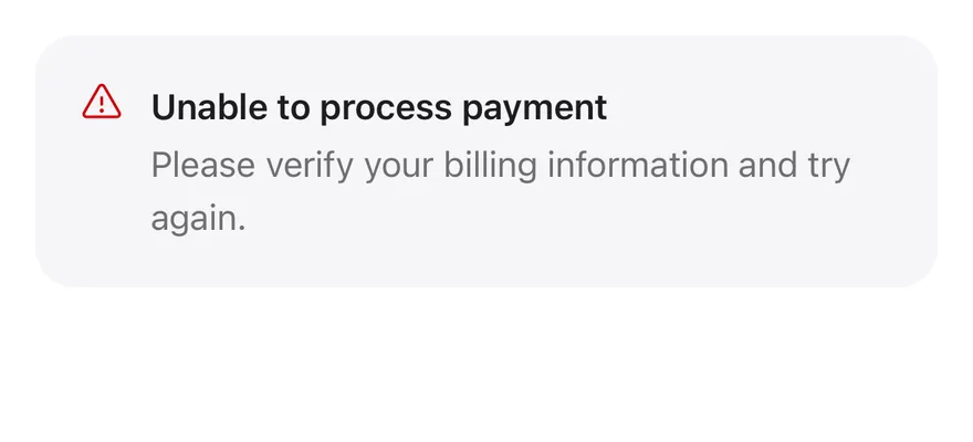
Destructive

The destructive variant with a destructive-colored icon.
iOS
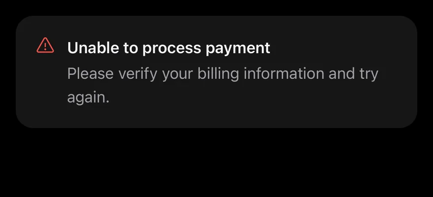
Alert (destructive) on iOS in light modeAlert (destructive) on iOS in dark mode
import { WarningIcon } from "phosphor-react-native"
import { Alert, AlertDescription, AlertTitle } from "@/components/ui/alert"

export function AlertDestructiveExample() {
  return (
    <Alert icon={WarningIcon} variant="destructive">
      <AlertTitle>Unable to process payment</AlertTitle>
      <AlertDescription>
        Please verify your billing information and try again.
      </AlertDescription>
    </Alert>
  )
}
import EsuissUI
import PhosphorSwift
import SwiftUI

struct AlertDestructiveExample: View {
  var body: some View {
    InlineAlert(.destructive, icon: Ph.warning.regular) {
      AlertTitle("Unable to process payment")
      AlertDescription("Please verify your billing information and try again.")
    }
  }
}
import androidx.compose.runtime.Composable
import com.adamglin.PhosphorIcons
import com.adamglin.phosphoricons.Regular
import com.adamglin.phosphoricons.regular.Warning
import com.esuiss.ui.components.Alert
import com.esuiss.ui.components.AlertDescription
import com.esuiss.ui.components.AlertTitle
import com.esuiss.ui.components.AlertVariant

@Composable
fun AlertDestructive() {
    Alert(icon = PhosphorIcons.Regular.Warning, variant = AlertVariant.Destructive) {
        AlertTitle("Unable to process payment")
        AlertDescription("Please verify your billing information and try again.")
    }
}

Title only

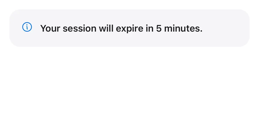
An alert with only a title.
iOS
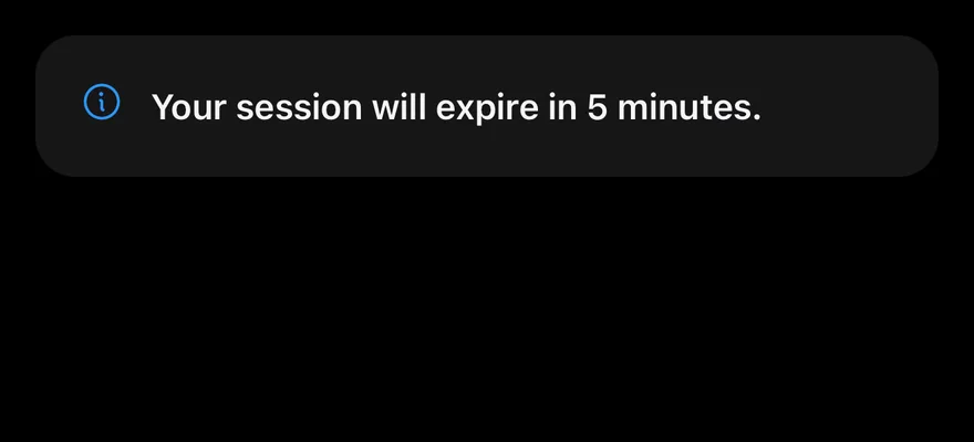
Alert (title only) on iOS in light modeAlert (title only) on iOS in dark mode
import { InfoIcon } from "phosphor-react-native"
import { Alert, AlertTitle } from "@/components/ui/alert"

export function AlertTitleOnlyExample() {
  return (
    <Alert icon={InfoIcon}>
      <AlertTitle>Your session will expire in 5 minutes.</AlertTitle>
    </Alert>
  )
}
import EsuissUI
import PhosphorSwift
import SwiftUI

struct AlertTitleOnlyExample: View {
  var body: some View {
    InlineAlert(icon: Ph.info.regular) {
      AlertTitle("Your session will expire in 5 minutes.")
    }
  }
}
import androidx.compose.runtime.Composable
import com.adamglin.PhosphorIcons
import com.adamglin.phosphoricons.Regular
import com.adamglin.phosphoricons.regular.Info
import com.esuiss.ui.components.Alert
import com.esuiss.ui.components.AlertTitle

@Composable
fun AlertTitleOnly() {
    Alert(icon = PhosphorIcons.Regular.Info) {
        AlertTitle("Your session will expire in 5 minutes.")
    }
}

With action

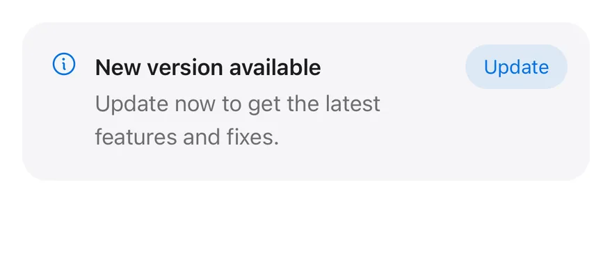
An AlertAction button in the top-end corner.
iOS
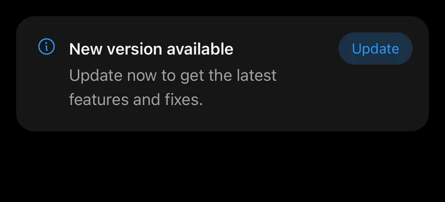
Alert (with action) on iOS in light modeAlert (with action) on iOS in dark mode
import { InfoIcon } from "phosphor-react-native"
import { Alert, AlertAction, AlertDescription, AlertTitle } from "@/components/ui/alert"
import { Button } from "@/components/ui/button"
import { Text } from "@/components/ui/text"

export function AlertWithActionExample() {
  return (
    <Alert icon={InfoIcon}>
      <AlertTitle>New version available</AlertTitle>
      <AlertDescription>
        Update now to get the latest features and fixes.
      </AlertDescription>
      <AlertAction>
        <Button size="sm" variant="tinted">
          <Text>Update</Text>
        </Button>
      </AlertAction>
    </Alert>
  )
}
import EsuissUI
import PhosphorSwift
import SwiftUI

struct AlertWithActionExample: View {
  var body: some View {
    InlineAlert(icon: Ph.info.regular) {
      AlertTitle("New version available")
      AlertDescription("Update now to get the latest features and fixes.")
    } action: {
      Button("Update") {}
        .buttonStyle(.variant(.tinted, size: .sm))
    }
  }
}
import androidx.compose.runtime.Composable
import com.adamglin.PhosphorIcons
import com.adamglin.phosphoricons.Regular
import com.adamglin.phosphoricons.regular.Info
import com.esuiss.ui.components.Alert
import com.esuiss.ui.components.AlertDescription
import com.esuiss.ui.components.AlertTitle
import com.esuiss.ui.components.Button
import com.esuiss.ui.components.ButtonSize
import com.esuiss.ui.components.ButtonVariant

@Composable
fun AlertWithAction() {
    Alert(
        icon = PhosphorIcons.Regular.Info,
        action = { Button("Update", onClick = {}, size = ButtonSize.Sm, variant = ButtonVariant.Tinted) },
    ) {
        AlertTitle("New version available")
        AlertDescription("Update now to get the latest features and fixes.")
    }
}

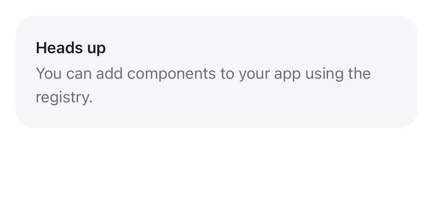
Without icon

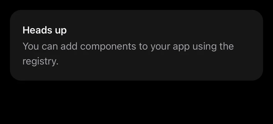
An alert with text only and no icon.
iOS
Alert (without icon) on iOS in light modeAlert (without icon) on iOS in dark mode
import { Alert, AlertDescription, AlertTitle } from "@/components/ui/alert"

export function AlertWithoutIconExample() {
  return (
    <Alert>
      <AlertTitle>Heads up</AlertTitle>
      <AlertDescription>
        You can add components to your app using the registry.
      </AlertDescription>
    </Alert>
  )
}
import EsuissUI
import SwiftUI

struct AlertWithoutIconExample: View {
  var body: some View {
    InlineAlert {
      AlertTitle("Heads up")
      AlertDescription("You can add components to your app using the registry.")
    }
  }
}
import androidx.compose.runtime.Composable
import com.esuiss.ui.components.Alert
import com.esuiss.ui.components.AlertDescription
import com.esuiss.ui.components.AlertTitle

@Composable
fun AlertWithoutIcon() {
    Alert {
        AlertTitle("Heads up")
        AlertDescription("You can add components to your app using the registry.")
    }
}

API Reference

01

Alert

Container with the icon, text column and action.

PropTypeDefaultDescription
iconPhosphorIcon-Phosphor icon component shown before the text.
variant"default" | "destructive""default"default or destructive; changes the icon color.
iconClassNamestring-Extra classes for the icon.

Also accepts the props of React.ComponentProps<typeof View>, React.RefAttributes<View>.

02

AlertTitle

Bold first line.

Also accepts the props of React.ComponentProps<typeof Text>.

03

AlertDescription

Secondary-colored supporting text.

Also accepts the props of React.ComponentProps<typeof Text>.

04

AlertAction

Slot positioned in the top-end corner.

Also accepts the props of React.ComponentProps<typeof View>, React.RefAttributes<View>.

Accessibility

  • The container has the alert role.
  • The icon is decorative; put the meaning in the title or description.

Notes

  • Uses bg-muted, text-foreground, text-primary and text-destructive tokens; light and dark follow the system appearance.
  • The action is positioned with end-4, so it flips in right-to-left layouts.
NextAlert DialogPreviousAccordion

On this page

  1. 01Installation
    • CLI
    • Manual
  2. 02Usage
  3. 03Examples
    • Destructive
    • Without icon
    • Title only
    • With action
  4. 04API Reference
    • Alert
    • AlertTitle
    • AlertDescription
    • AlertAction
  5. 05Accessibility
  6. 06Notes
  7. 07Installation
    • Manual
  8. 08Usage
  9. 09Examples
    • Destructive
    • Title only
    • With action
    • Without icon
  10. 10API Reference
    • Alert
    • AlertTitle
    • AlertDescription
    • AlertAction
  11. 11Accessibility
  12. 12Notes