suiss/ui
  • Docs
  • Components
  • Patterns
  • Interactions
  • Charts
  • Blocks
GitHubGet started
DocsComponentsPatternsInteractionsChartsBlocks
Components82
  • Overview
  • Accordion
  • Alert
  • Alert Dialog
  • Alert Sheet
  • Amount Input
  • Aspect Ratio
  • Attachment
  • Avatar
  • Badge
  • Bottom Bar
  • Breadcrumb
  • Bubble
  • Button
  • Button Group
  • Calendar
  • Card
  • Carousel
  • Chart
  • Checkbox
  • Chip
  • Collapsible
  • Combobox
  • Command
  • Context Menu
  • Dialog
  • Direction
  • Drawer
  • Dropdown Menu
  • Empty
  • FAB
  • Field
  • Fullscreen Menu
  • Haptics
  • Header
  • Hover Card
  • Icon
  • Input
  • Input Accessory Bar
  • Input Group
  • Input OTP
  • Item
  • Kbd
  • Keyboard Scroll View
  • Keypad
  • Label
  • Marker
  • Menubar
  • Message
  • Message Scroller
  • Native Select
  • Navigation Menu
  • Page Indicator
  • Pagination
  • Pin Pad
  • Popover
  • Progress
  • QR Scanner
  • Questionnaire
  • Radio Group
  • Resizable
  • Screen
  • Scroll Area
  • Select
  • Separator
  • Sheet
  • Sidebar
  • Signature Pad
  • Skeleton
  • Slider
  • Spinner
  • Switch
  • Tab Bar
  • Table
  • Tabs
  • Text
  • Textarea
  • Toast
  • Toggle
  • Toggle Group
  • Tooltip
  • Wheel Picker
  • Widget

suiss/ui · Component

Keyboard Scroll View

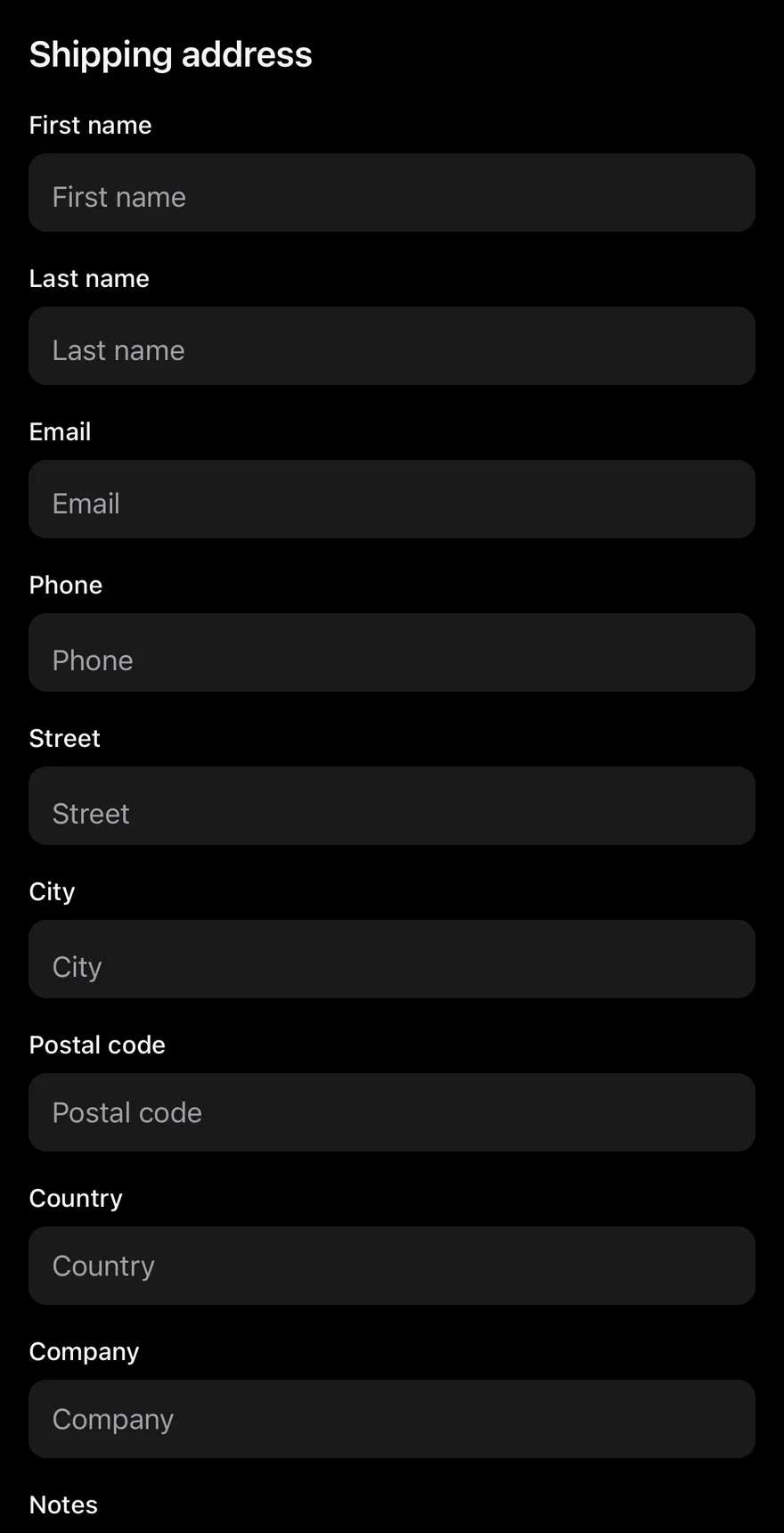
A scroll view that keeps the focused text field visible above the on-screen keyboard.

Keyboard Scroll View is an open-source component from suiss/ui for React Native, SwiftUI and Jetpack Compose. The @esuiss/ui CLI copies its source into your project, so you own the code.
iOS
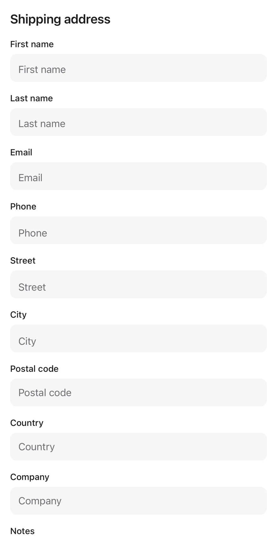
Keyboard Scroll View on iOS in light modeKeyboard Scroll View on iOS in dark mode
import { View } from "react-native"
import { Input } from "@/components/ui/input"
import { KeyboardScrollView } from "@/components/ui/keyboard-scroll-view"
import { Text } from "@/components/ui/text"

const fields = [
  "First name",
  "Last name",
  "Email",
  "Phone",
  "Street",
  "City",
  "Postal code",
  "Country",
  "Company",
  "Notes",
]

function Fields() {
  return fields.map((label) => (
    <View key={label} className="gap-1.5">
      <Text variant="small">{label}</Text>
      <Input placeholder={label} />
    </View>
  ))
}

export function KeyboardScrollViewExample() {
  return (
    <KeyboardScrollView className="-m-4" contentContainerClassName="gap-4 p-4">
      <Text variant="h3">Shipping address</Text>
      <Fields />
    </KeyboardScrollView>
  )
}
import EsuissUI
import SwiftUI

struct KeyboardScrollViewExample: View {
  var body: some View {
    KeyboardScrollView {
      VStack(alignment: .leading, spacing: 16) {
        Text("Shipping address").textVariant(.h3)
        KeyboardScrollViewFields(labels: KeyboardScrollViewFields.all)
      }
      .padding(16)
    }
  }
}

struct KeyboardScrollViewFields: View {
  static let all = [
    "First name",
    "Last name",
    "Email",
    "Phone",
    "Street",
    "City",
    "Postal code",
    "Country",
    "Company",
    "Notes",
  ]

  let labels: [String]

  var body: some View {
    ForEach(labels, id: \.self) { label in
      KeyboardScrollViewField(label: label)
    }
  }
}

struct KeyboardScrollViewField: View {
  let label: String

  @State private var text = ""

  var body: some View {
    VStack(alignment: .leading, spacing: 6) {
      Text(label).textVariant(.small)
      TextField(label, text: $text)
        .textFieldStyle(.input)
    }
    .frame(maxWidth: .infinity, alignment: .leading)
  }
}

let all = [
  "First name",
  "Last name",
  "Email",
  "Phone",
  "Street",
  "City",
  "Postal code",
  "Country",
  "Company",
  "Notes",
]
import androidx.compose.foundation.layout.Arrangement
import androidx.compose.foundation.layout.PaddingValues
import androidx.compose.foundation.layout.fillMaxSize
import androidx.compose.runtime.Composable
import androidx.compose.ui.Modifier
import androidx.compose.ui.unit.dp
import com.esuiss.ui.components.KeyboardScrollView
import com.esuiss.ui.components.Screen
import com.esuiss.ui.components.Text
import com.esuiss.ui.components.TextVariant

@Composable
fun KeyboardScrollViewDefault() {
    Screen {
        KeyboardScrollView(
            modifier = Modifier.fillMaxSize(),
            contentPadding = PaddingValues(16.dp),
            verticalArrangement = Arrangement.spacedBy(16.dp),
        ) {
            Text("Shipping address", variant = TextVariant.H3)
            KeyboardScrollViewFields()
        }
    }
}

KeyboardScrollView wraps the React Native ScrollView. When the keyboard opens, it measures how much of the view the keyboard covers, adds matching space at the end of the content and scroll indicator, and scrolls just enough to bring the focused input above the keyboard.

Use it for forms and other screens with text fields that would otherwise end up behind the keyboard.

Installation

$ pnpm dlx shadcn@latest add @esuiss-rn/keyboard-scroll-view

See Installation for the components.json setup. Or use the suiss/ui CLI:

$ pnpm dlx @esuiss/ui@latest add keyboard-scroll-view
$ pnpm dlx @esuiss/ui@latest add keyboard-scroll-view --platform swift
$ pnpm dlx @esuiss/ui@latest add keyboard-scroll-view --platform kotlin

Manual

  1. Install the dependencies:
npx expo install cn
  1. Add the pieces it builds on: the primitives components/primitives/hooks.tsx, components/primitives/keyboard.tsx.

  2. Copy the source into components/ui/keyboard-scroll-view.tsx:

uniwind/components/ui/keyboard-scroll-view.tsx
import { cn } from "cn"
import * as React from "react"
import {
  Platform,
  ScrollView,
  type ScrollViewProps,
  TextInput,
  useWindowDimensions,
  View,
} from "react-native"
import { useComposedRefs } from "@/components/primitives/hooks"
import { useKeyboard } from "@/components/primitives/keyboard"

type KeyboardScrollViewContextValue = {
  scrollToFocused: () => void
}
  1. Update the import paths to match your project.
  1. Install the dependencies:
npx expo install cn
  1. Add the pieces it builds on: the primitives components/primitives/hooks.tsx, components/primitives/keyboard.tsx.

  2. Copy the source into components/ui/keyboard-scroll-view.tsx:

nativewind/components/ui/keyboard-scroll-view.tsx
import { cn } from "cn"
import * as React from "react"
import {
  Platform,
  ScrollView,
  type ScrollViewProps,
  TextInput,
  useWindowDimensions,
  View,
} from "react-native"
import { useComposedRefs } from "@/components/primitives/hooks"
import { useKeyboard } from "@/components/primitives/keyboard"

type KeyboardScrollViewContextValue = {
  scrollToFocused: () => void
}
  1. Update the import paths to match your project.
  1. Add the pieces it builds on: the primitives components/primitives/hooks.tsx, components/primitives/keyboard.tsx.

  2. Copy the source into components/ui/keyboard-scroll-view.tsx:

stylesheet/components/ui/keyboard-scroll-view.tsx
import * as React from "react"
import {
  Platform,
  ScrollView,
  type ScrollViewProps,
  TextInput,
  useWindowDimensions,
  View,
} from "react-native"
import { useComposedRefs } from "@/components/primitives/hooks"
import { useKeyboard } from "@/components/primitives/keyboard"

type KeyboardScrollViewContextValue = {
  scrollToFocused: () => void
}
  1. Update the import paths to match your project.
  1. Target iOS 17 or later.

  2. Copy the theme files every view uses:

swift/Theme/Theme.swift
import SwiftUI
import UIKit

struct RGBA: Sendable {
  let red: CGFloat
  let green: CGFloat
  let blue: CGFloat
  let alpha: CGFloat

  init(_ hex: UInt32, _ alpha: CGFloat = 1) {
    red = CGFloat((hex >> 16) & 0xFF) / 255
    green = CGFloat((hex >> 8) & 0xFF) / 255
    blue = CGFloat(hex & 0xFF) / 255
    self.alpha = alpha
  }
swift/Theme/Tokens.swift
import SwiftUI

public enum EsuissColor {
  public static let background = Color.adaptive(light: .init(0xFFFFFF), dark: .init(0x000000))
  public static let foreground = Color.adaptive(light: .init(0x1D1D1F), dark: .init(0xF5F5F7))
  public static let card = Color.adaptive(light: .init(0xFFFFFF), dark: .init(0x1D1D1F))
  public static let cardForeground = Color.adaptive(light: .init(0x1D1D1F), dark: .init(0xF5F5F7))
  public static let popover = Color.adaptive(light: .init(0xFFFFFF), dark: .init(0x1D1D1F))
  public static let popoverForeground = Color.adaptive(light: .init(0x1D1D1F), dark: .init(0xF5F5F7))
  public static let primary = Color.adaptive(light: .init(0x0071E3), dark: .init(0x2997FF))
  public static let primaryForeground = Color.adaptive(light: .init(0xFFFFFF), dark: .init(0xFFFFFF))
  public static let secondary = Color.adaptive(light: .init(0x000000, 0.04), dark: .init(0xFFFFFF, 0.1))
  public static let secondaryForeground = Color.adaptive(light: .init(0x1D1D1F), dark: .init(0xF5F5F7))
  public static let muted = Color.adaptive(light: .init(0xF5F5F7), dark: .init(0x161617))
  public static let mutedForeground = Color.adaptive(light: .init(0x6E6E73), dark: .init(0xA1A1A6))
  public static let accent = Color.adaptive(light: .init(0x000000, 0.06), dark: .init(0xFFFFFF, 0.1))
  1. Copy the source:
swift/Components/KeyboardScrollView.swift
import SwiftUI
import UIKit

public struct KeyboardScrollView<Content: View>: View {
  let showsIndicators: Bool
  let content: Content

  public init(showsIndicators: Bool = true, @ViewBuilder content: () -> Content) {
    self.showsIndicators = showsIndicators
    self.content = content()
  }

  public var body: some View {
    ScrollView(.vertical, showsIndicators: showsIndicators) {
      content
        .frame(maxWidth: .infinity, alignment: .topLeading)
  1. Add the files to your app target.
  1. Set minSdk to 24 or higher and add the dependencies:
build.gradle.kts
implementation(platform("androidx.compose:compose-bom:2026.09.00"))
implementation("androidx.compose.foundation:foundation")
implementation("androidx.compose.ui:ui")
  1. Copy the theme files every view uses:
kotlin/theme/Theme.kt
package com.esuiss.ui.theme

import androidx.compose.foundation.isSystemInDarkTheme
import androidx.compose.runtime.Composable
import androidx.compose.runtime.CompositionLocalProvider
import androidx.compose.runtime.Immutable
import androidx.compose.runtime.staticCompositionLocalOf
import androidx.compose.ui.Modifier
import androidx.compose.ui.draw.dropShadow
import androidx.compose.ui.graphics.Color
import androidx.compose.ui.graphics.Shape
import androidx.compose.ui.graphics.shadow.Shadow as DropShadow
import androidx.compose.ui.text.TextStyle
import androidx.compose.ui.text.style.LineHeightStyle
import androidx.compose.ui.unit.Dp
import androidx.compose.ui.unit.DpOffset
kotlin/theme/Tokens.kt
package com.esuiss.ui.theme

import androidx.compose.runtime.Immutable
import androidx.compose.ui.graphics.Color
import androidx.compose.ui.unit.dp

@Immutable
data class Colors(
    val background: Color,
    val foreground: Color,
    val card: Color,
    val cardForeground: Color,
    val popover: Color,
    val popoverForeground: Color,
    val primary: Color,
    val primaryForeground: Color,
  1. Copy the source and every file it uses:
kotlin/components/KeyboardScrollView.kt
package com.esuiss.ui.components

import androidx.compose.foundation.ScrollState
import androidx.compose.foundation.gestures.detectTapGestures
import androidx.compose.foundation.layout.Arrangement
import androidx.compose.foundation.layout.Box
import androidx.compose.foundation.layout.Column
import androidx.compose.foundation.layout.ColumnScope
import androidx.compose.foundation.layout.PaddingValues
import androidx.compose.foundation.layout.WindowInsets
import androidx.compose.foundation.layout.fillMaxSize
import androidx.compose.foundation.layout.ime
import androidx.compose.foundation.layout.padding
import androidx.compose.foundation.rememberScrollState
import androidx.compose.foundation.verticalScroll
import androidx.compose.runtime.Composable
kotlin/components/Content.kt
package com.esuiss.ui.components

import androidx.compose.runtime.compositionLocalOf
import androidx.compose.ui.graphics.Color
import androidx.compose.ui.text.TextStyle
import androidx.compose.ui.unit.Dp
import androidx.compose.ui.unit.dp

val LocalContentStyle = compositionLocalOf { TextStyle.Default }

val LocalContentColor = compositionLocalOf { Color.Unspecified }

val LocalIconSize = compositionLocalOf { 20.dp }
kotlin/components/Screen.kt
package com.esuiss.ui.components

import android.app.Activity
import android.content.Context
import android.content.ContextWrapper
import android.os.Build
import android.view.View
import android.view.Window
import android.view.WindowInsetsController
import androidx.compose.foundation.background
import androidx.compose.foundation.layout.Arrangement
import androidx.compose.foundation.layout.Box
import androidx.compose.foundation.layout.BoxScope
import androidx.compose.foundation.layout.Column
import androidx.compose.foundation.layout.ExperimentalLayoutApi
import androidx.compose.foundation.layout.ColumnScope
  1. Update the com.esuiss.ui package names to match your project.

Usage

import { KeyboardScrollView } from "@/components/ui/keyboard-scroll-view"
<KeyboardScrollView className="-m-4" contentContainerClassName="gap-4 p-4">
  <Text variant="h3">Shipping address</Text>
  <Fields />
</KeyboardScrollView>

Place inputs anywhere inside the view; no extra setup is needed. Set bottomOffset to leave more space between the focused field and the keyboard.

All ScrollView props are passed through. By default taps on the content are handled while the keyboard is open (keyboardShouldPersistTaps="handled"), and dragging dismisses the keyboard.

KeyboardScrollViewContext exposes scrollToFocused, which children can call to bring the focused input into view again, for example after their layout changes.

Examples

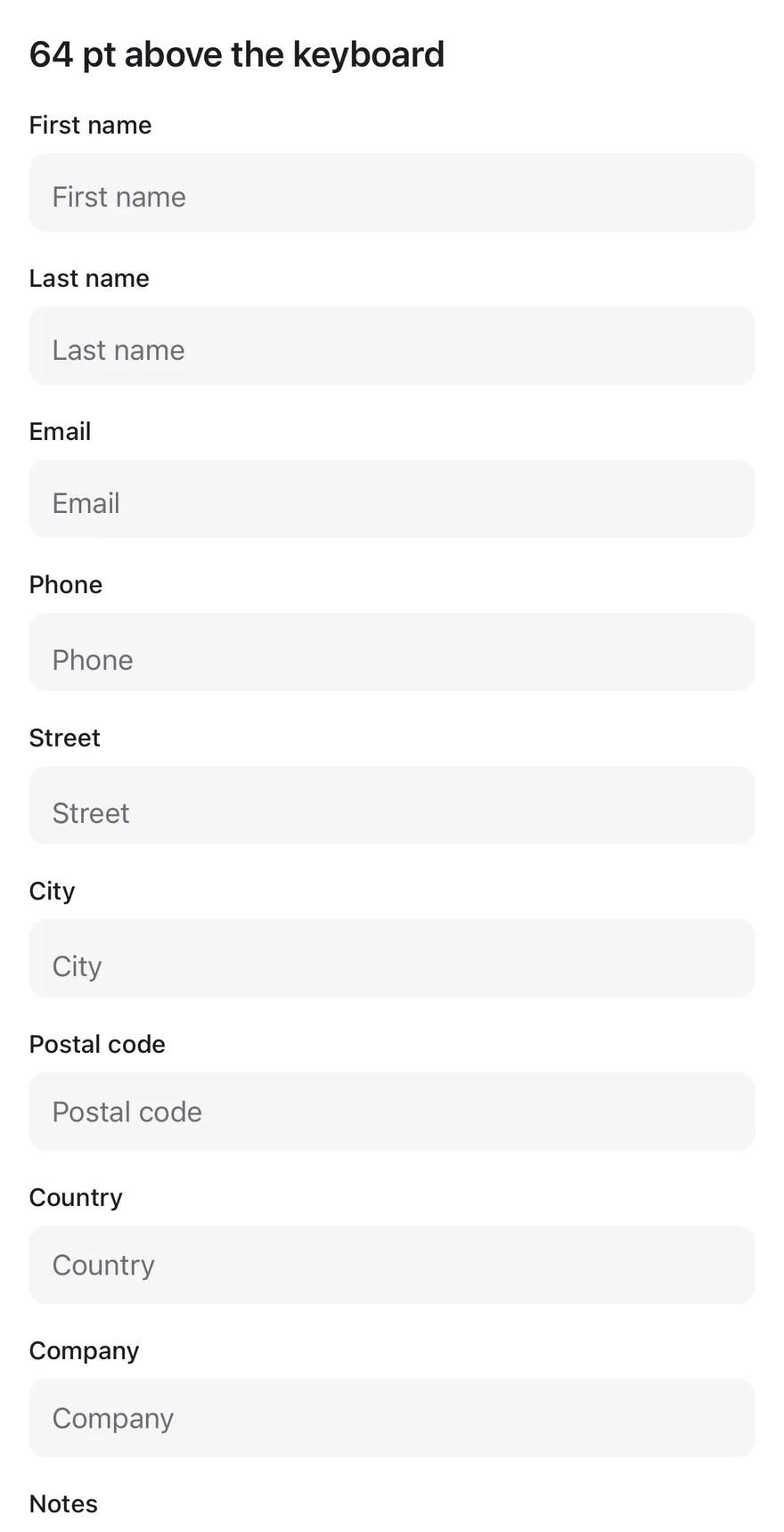
Larger bottom offset

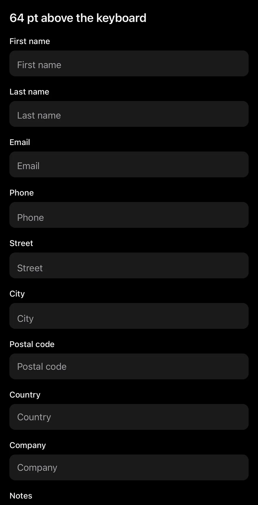
Keeps the focused field 64 points above the keyboard.
iOS
Keyboard Scroll View (larger bottom offset) on iOS in light modeKeyboard Scroll View (larger bottom offset) on iOS in dark mode
import { View } from "react-native"
import { Input } from "@/components/ui/input"
import { KeyboardScrollView } from "@/components/ui/keyboard-scroll-view"
import { Text } from "@/components/ui/text"

const fields = [
  "First name",
  "Last name",
  "Email",
  "Phone",
  "Street",
  "City",
  "Postal code",
  "Country",
  "Company",
  "Notes",
]

function Fields() {
  return fields.map((label) => (
    <View key={label} className="gap-1.5">
      <Text variant="small">{label}</Text>
      <Input placeholder={label} />
    </View>
  ))
}

export function KeyboardScrollViewLargerBottomOffsetExample() {
  return (
    <KeyboardScrollView
      bottomOffset={64}
      className="-m-4"
      contentContainerClassName="gap-4 p-4"
    >
      <Text variant="h3">64 pt above the keyboard</Text>
      <Fields />
    </KeyboardScrollView>
  )
}

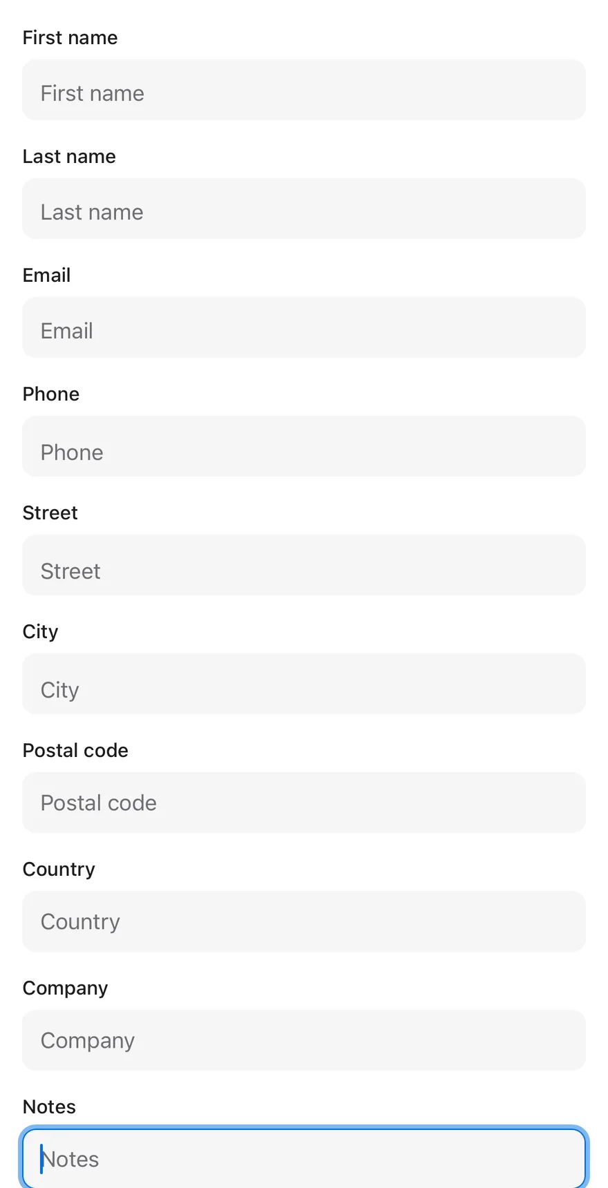
Focused

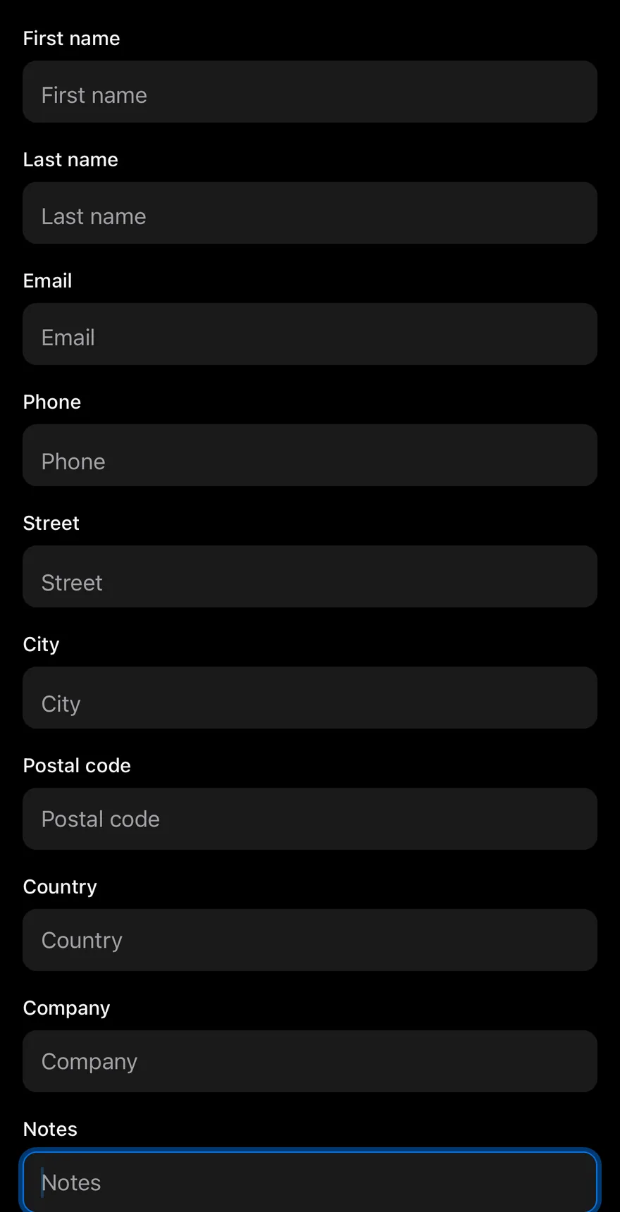
The last field is focused on mount and scrolled into view.
iOS
Keyboard Scroll View (focused) on iOS in light modeKeyboard Scroll View (focused) on iOS in dark mode
import { View } from "react-native"
import { Input } from "@/components/ui/input"
import { KeyboardScrollView } from "@/components/ui/keyboard-scroll-view"
import { Text } from "@/components/ui/text"

const fields = [
  "First name",
  "Last name",
  "Email",
  "Phone",
  "Street",
  "City",
  "Postal code",
  "Country",
  "Company",
  "Notes",
]

export function KeyboardScrollViewFocusedExample() {
  return (
    <KeyboardScrollView className="-m-4" contentContainerClassName="gap-4 p-4">
      <Text variant="h3">Last field focused</Text>
      {fields.slice(0, -1).map((label) => (
        <View key={label} className="gap-1.5">
          <Text variant="small">{label}</Text>
          <Input placeholder={label} />
        </View>
      ))}
      <View className="gap-1.5">
        <Text variant="small">Notes</Text>
        <Input placeholder="Notes" autoFocus />
      </View>
    </KeyboardScrollView>
  )
}
import EsuissUI
import SwiftUI

struct KeyboardScrollViewFields: View {
  static let all = [
    "First name",
    "Last name",
    "Email",
    "Phone",
    "Street",
    "City",
    "Postal code",
    "Country",
    "Company",
    "Notes",
  ]

  let labels: [String]

  var body: some View {
    ForEach(labels, id: \.self) { label in
      KeyboardScrollViewField(label: label)
    }
  }
}

struct KeyboardScrollViewField: View {
  let label: String

  @State private var text = ""

  var body: some View {
    VStack(alignment: .leading, spacing: 6) {
      Text(label).textVariant(.small)
      TextField(label, text: $text)
        .textFieldStyle(.input)
    }
    .frame(maxWidth: .infinity, alignment: .leading)
  }
}

struct KeyboardScrollViewFocused: View {
  @State private var notes = ""
  @FocusState private var focused: Bool

  var body: some View {
    KeyboardScrollView {
      VStack(alignment: .leading, spacing: 16) {
        Text("Last field focused").textVariant(.h3)
        KeyboardScrollViewFields(labels: Array(KeyboardScrollViewFields.all.dropLast()))
        VStack(alignment: .leading, spacing: 6) {
          Text("Notes").textVariant(.small)
          TextField("Notes", text: $notes)
            .textFieldStyle(.input)
            .focused($focused)
        }
        .frame(maxWidth: .infinity, alignment: .leading)
      }
      .padding(16)
    }
    .onAppear { focused = true }
  }
}

let all = [
  "First name",
  "Last name",
  "Email",
  "Phone",
  "Street",
  "City",
  "Postal code",
  "Country",
  "Company",
  "Notes",
]
import androidx.compose.foundation.layout.Arrangement
import androidx.compose.foundation.layout.Column
import androidx.compose.foundation.layout.PaddingValues
import androidx.compose.foundation.layout.fillMaxSize
import androidx.compose.runtime.Composable
import androidx.compose.runtime.LaunchedEffect
import androidx.compose.runtime.getValue
import androidx.compose.runtime.key
import androidx.compose.runtime.mutableStateOf
import androidx.compose.runtime.remember
import androidx.compose.runtime.saveable.rememberSaveable
import androidx.compose.runtime.setValue
import androidx.compose.ui.Modifier
import androidx.compose.ui.focus.FocusRequester
import androidx.compose.ui.focus.focusRequester
import androidx.compose.ui.unit.dp
import com.esuiss.ui.components.Input
import com.esuiss.ui.components.KeyboardScrollView
import com.esuiss.ui.components.Screen
import com.esuiss.ui.components.Text
import com.esuiss.ui.components.TextVariant

val keyboardScrollViewFields = listOf(
    "First name",
    "Last name",
    "Email",
    "Phone",
    "Street",
    "City",
    "Postal code",
    "Country",
    "Company",
    "Notes",
)

@Composable
fun KeyboardScrollViewField(label: String, modifier: Modifier = Modifier) {
    var value by rememberSaveable(label) { mutableStateOf("") }
    Column(verticalArrangement = Arrangement.spacedBy(6.dp)) {
        Text(label, variant = TextVariant.Small)
        Input(value, { value = it }, modifier, placeholder = label)
    }
}

@Composable
fun KeyboardScrollViewFocused() {
    val focus = remember { FocusRequester() }
    LaunchedEffect(Unit) { focus.requestFocus() }
    Screen {
        KeyboardScrollView(
            modifier = Modifier.fillMaxSize(),
            contentPadding = PaddingValues(16.dp),
            verticalArrangement = Arrangement.spacedBy(16.dp),
        ) {
            Text("Last field focused", variant = TextVariant.H3)
            keyboardScrollViewFields.dropLast(1).forEach { key(it) { KeyboardScrollViewField(it) } }
            KeyboardScrollViewField("Notes", Modifier.focusRequester(focus))
        }
    }
}

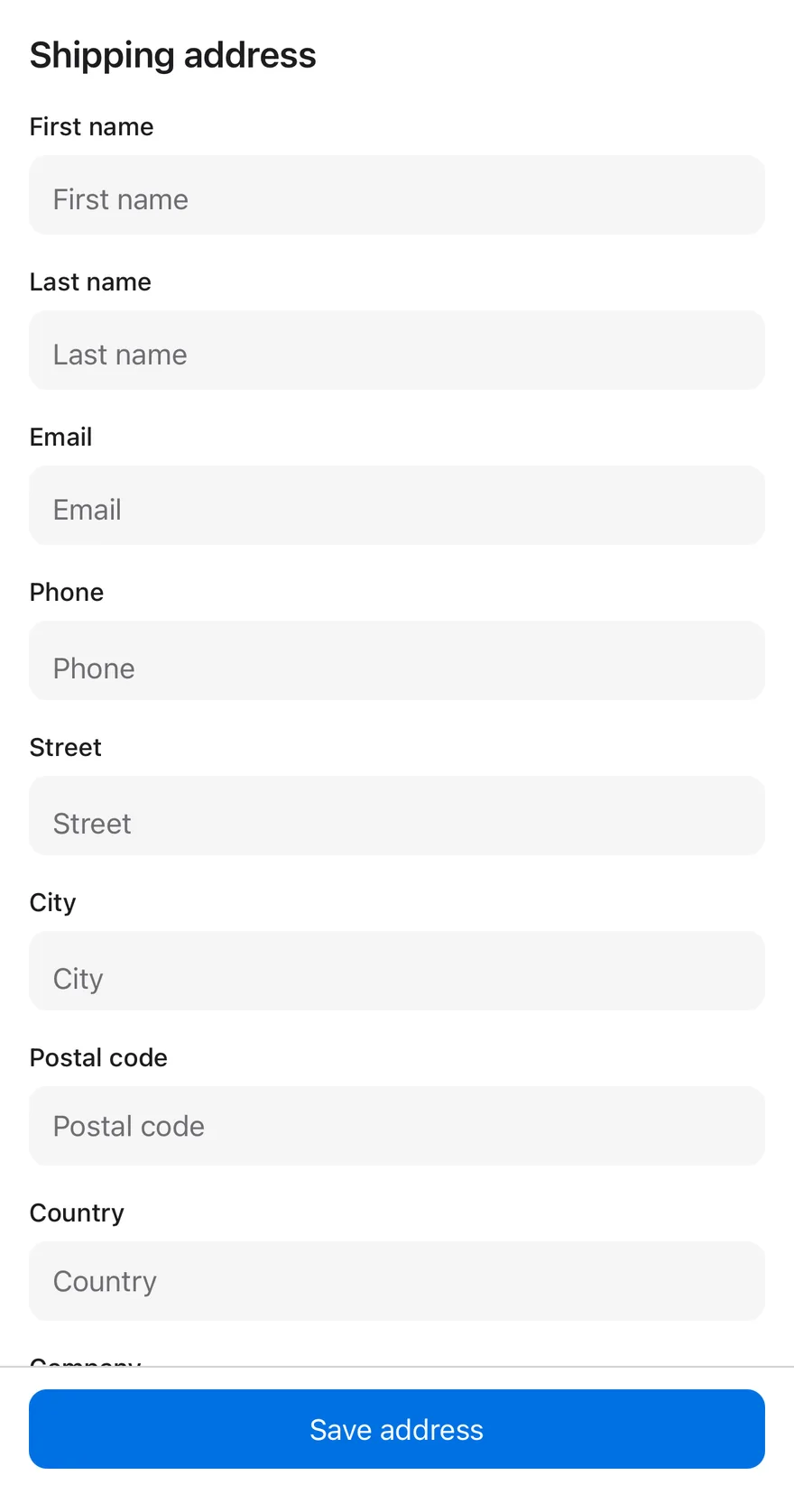
With bottom bar

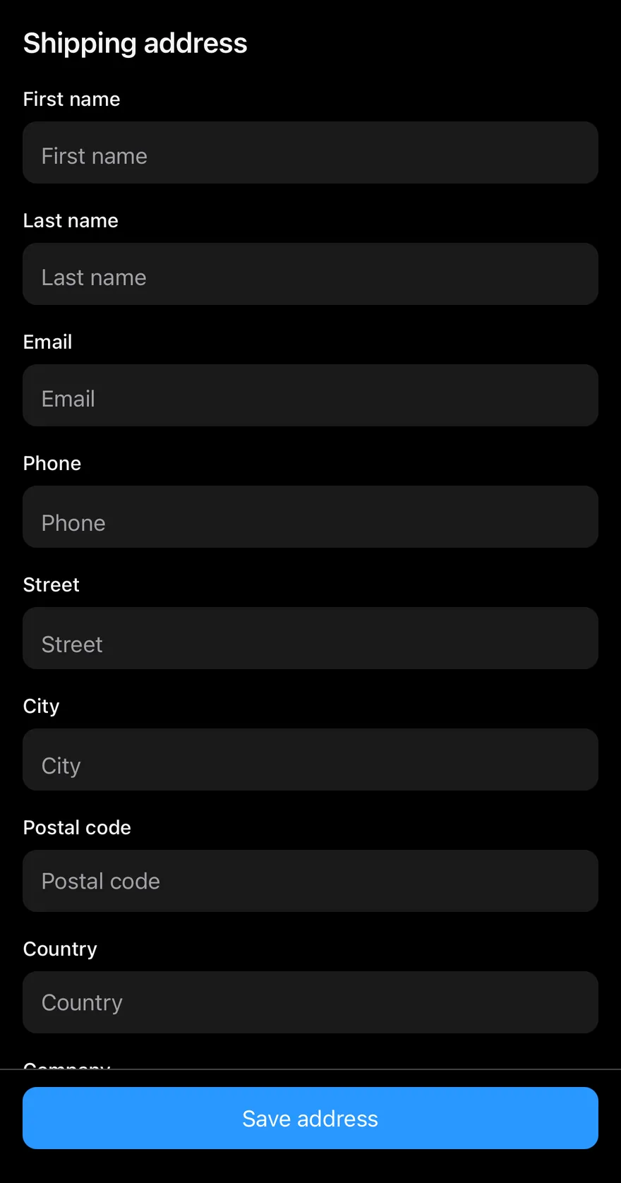
A form above a bottom bar with a full-width button.
iOS
Keyboard Scroll View (with bottom bar) on iOS in light modeKeyboard Scroll View (with bottom bar) on iOS in dark mode
import { View } from "react-native"
import { BottomBar, BottomBarContent } from "@/components/ui/bottom-bar"
import { Button } from "@/components/ui/button"
import { Input } from "@/components/ui/input"
import { KeyboardScrollView } from "@/components/ui/keyboard-scroll-view"
import { Text } from "@/components/ui/text"

const fields = [
  "First name",
  "Last name",
  "Email",
  "Phone",
  "Street",
  "City",
  "Postal code",
  "Country",
  "Company",
  "Notes",
]

function Fields() {
  return fields.map((label) => (
    <View key={label} className="gap-1.5">
      <Text variant="small">{label}</Text>
      <Input placeholder={label} />
    </View>
  ))
}

export function KeyboardScrollViewWithBottomBarExample() {
  return (
    <View className="-m-4 flex-1">
      <KeyboardScrollView contentContainerClassName="gap-4 p-4">
        <Text variant="h3">Shipping address</Text>
        <Fields />
      </KeyboardScrollView>
      <BottomBar separator>
        <BottomBarContent>
          <Button size="lg" block>
            <Text>Save address</Text>
          </Button>
        </BottomBarContent>
      </BottomBar>
    </View>
  )
}
import EsuissUI
import SwiftUI

struct KeyboardScrollViewWithBottomBarExample: View {
  var body: some View {
    VStack(spacing: 0) {
      KeyboardScrollView {
        VStack(alignment: .leading, spacing: 16) {
          Text("Shipping address").textVariant(.h3)
          KeyboardScrollViewFields(labels: KeyboardScrollViewFields.all)
        }
        .padding(16)
      }
      BottomBar(separator: true) {
        BottomBarContent {
          Button("Save address") {}
            .buttonStyle(.variant(size: .lg, block: true))
        }
      }
    }
  }
}

struct KeyboardScrollViewFields: View {
  static let all = [
    "First name",
    "Last name",
    "Email",
    "Phone",
    "Street",
    "City",
    "Postal code",
    "Country",
    "Company",
    "Notes",
  ]

  let labels: [String]

  var body: some View {
    ForEach(labels, id: \.self) { label in
      KeyboardScrollViewField(label: label)
    }
  }
}

struct KeyboardScrollViewField: View {
  let label: String

  @State private var text = ""

  var body: some View {
    VStack(alignment: .leading, spacing: 6) {
      Text(label).textVariant(.small)
      TextField(label, text: $text)
        .textFieldStyle(.input)
    }
    .frame(maxWidth: .infinity, alignment: .leading)
  }
}

let all = [
  "First name",
  "Last name",
  "Email",
  "Phone",
  "Street",
  "City",
  "Postal code",
  "Country",
  "Company",
  "Notes",
]
import androidx.compose.foundation.layout.Arrangement
import androidx.compose.foundation.layout.Column
import androidx.compose.foundation.layout.PaddingValues
import androidx.compose.foundation.layout.fillMaxSize
import androidx.compose.foundation.layout.fillMaxWidth
import androidx.compose.runtime.Composable
import androidx.compose.ui.Modifier
import androidx.compose.ui.unit.dp
import com.esuiss.ui.components.BottomBar
import com.esuiss.ui.components.BottomBarContent
import com.esuiss.ui.components.Button
import com.esuiss.ui.components.ButtonSize
import com.esuiss.ui.components.KeyboardScrollView
import com.esuiss.ui.components.Screen
import com.esuiss.ui.components.ScreenEdge
import com.esuiss.ui.components.Text
import com.esuiss.ui.components.TextVariant

@Composable
fun KeyboardScrollViewWithBottomBar() {
    Screen(edges = setOf(ScreenEdge.Top, ScreenEdge.Left, ScreenEdge.Right)) {
        Column(Modifier.fillMaxSize()) {
            KeyboardScrollView(
                modifier = Modifier.weight(1f).fillMaxWidth(),
                contentPadding = PaddingValues(16.dp),
                verticalArrangement = Arrangement.spacedBy(16.dp),
            ) {
                Text("Shipping address", variant = TextVariant.H3)
                KeyboardScrollViewFields()
            }
            BottomBar(separator = true) {
                BottomBarContent {
                    Button("Save address", onClick = {}, size = ButtonSize.Lg, block = true)
                }
            }
        }
    }
}

API Reference

01

KeyboardScrollView

PropTypeDefaultDescription
bottomOffsetnumber16Space kept between the focused input and the keyboard. Defaults to 16.

Also accepts the props of ScrollViewProps, React.RefAttributes<ScrollView>.

Accessibility

  • The view is a standard ScrollView, so screen reader scrolling works as usual.

Notes

  • keyboardDismissMode defaults to interactive on iOS and on-drag on Android.
  • After a touch while the keyboard is open, the view checks the focused input again after a short delay.
  • The view fills its parent with flex-1.
  • Only an input that is inside the visible frame of the scroll view is adjusted; inputs scrolled out of view are left alone.
NextKeypadPreviousKbd

On this page

  1. 01Installation
    • Manual
  2. 02Usage
  3. 03Examples
    • Larger bottom offset
    • Focused
    • With bottom bar
  4. 04API Reference
    • KeyboardScrollView
  5. 05Accessibility
  6. 06Notes