suiss/ui · Component
Sheet
A panel that slides in from an edge of the screen over the page.
Sheet is an open-source component from suiss/ui for React, React Native, SwiftUI and Jetpack Compose. The @esuiss/ui CLI copies its source into your project, so you own the code.
Sheet is built on the dialog primitive of the chosen base. SheetTrigger opens it, and SheetContent renders the panel in a portal over a dimming backdrop. Inside, SheetHeader holds a SheetTitle and SheetDescription, and SheetFooter holds actions. SheetClose closes the sheet from any element.
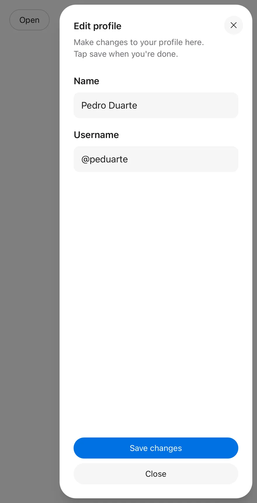
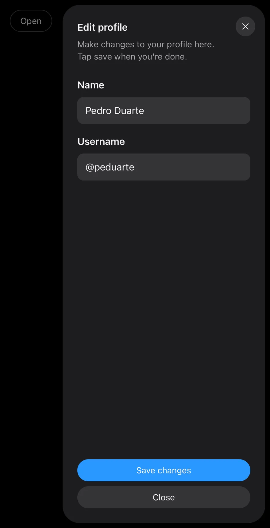
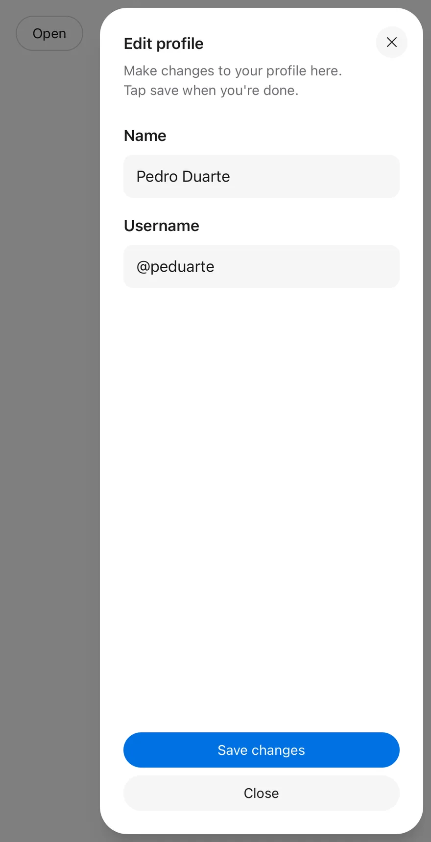
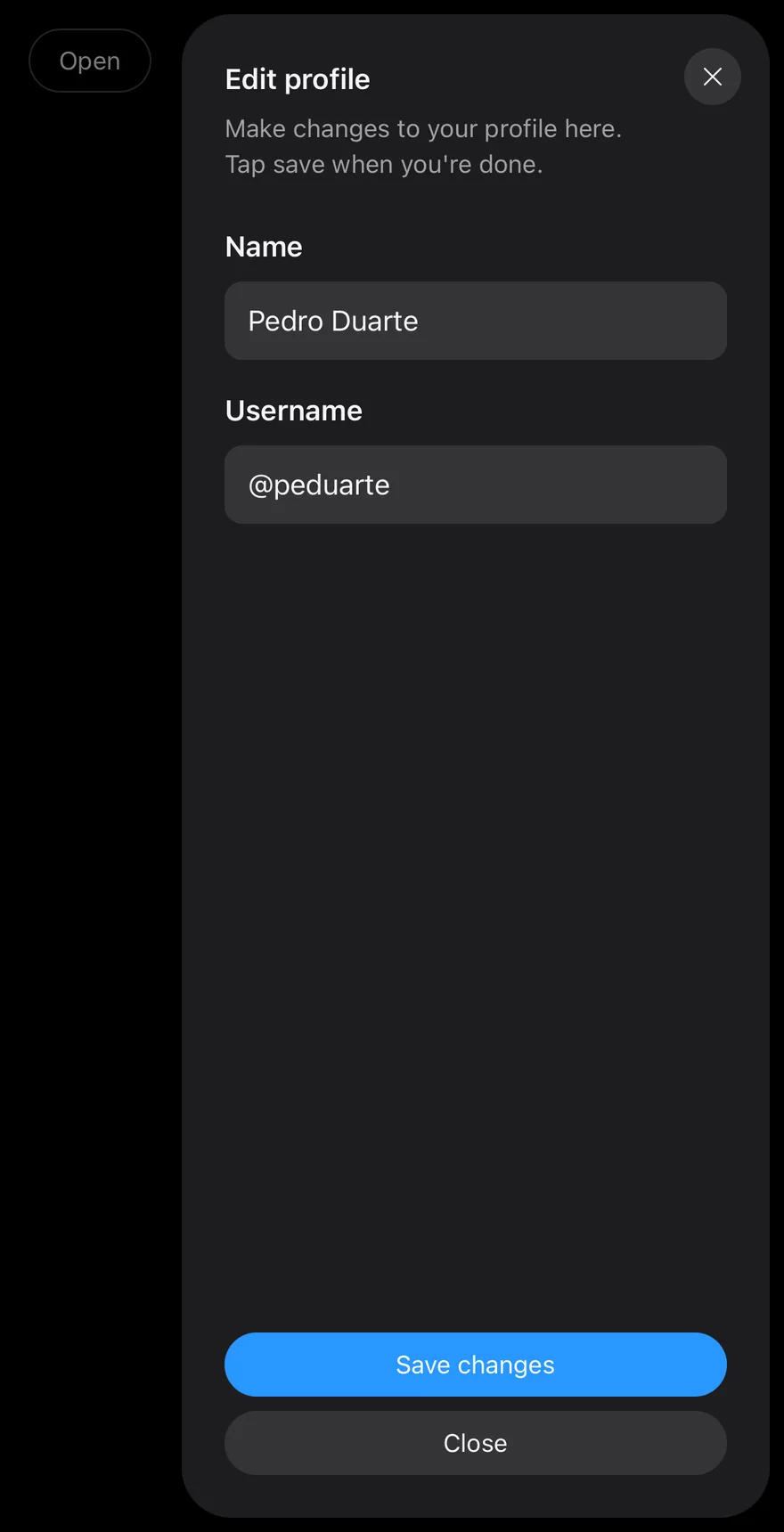
The panel floats inset from the screen edge with rounded corners and slides in from its side. Use a sheet for supporting tasks, such as editing details or showing navigation, that should keep the page in context. For short, centered confirmations, use Dialog or AlertDialog.
Installation
CLI
Works in any project with a components.json. See Installation for the one-line registry setup. Or use the suiss/ui CLI:
Manual
- Install the dependencies and add the
cnhelper:
-
Add the pieces it builds on: Button,
use-scrollbar-gap. -
Copy the source into
components/ui/sheet.tsx:
- Update the import paths to match your project.
Usage
Use defaultOpen for an uncontrolled sheet, or open with onOpenChange to control it. Use the render prop on SheetTrigger and SheetClose to render them as a Button.
Use defaultOpen for an uncontrolled sheet, or open with onOpenChange to control it. Set asChild on SheetTrigger and SheetClose to render a Button in their place.
Use defaultOpen for an uncontrolled sheet, or isOpen with onOpenChange to control it. The Button placed first inside Sheet opens it, and a Button with slot="close" closes it.
SheetFooter sits at the bottom of the panel with mt-auto. By default SheetContent adds an icon close button in the top corner; set closeLabel to show a text button instead, or showCloseButton={false} to remove it.
Examples
Sides
Opens a sheet from each of the four edges.
Left
Renders a sheet open on the left side.
Bottom
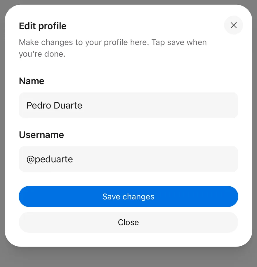
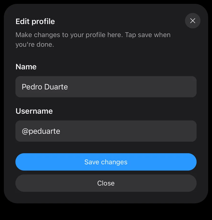
Renders a sheet open along the bottom edge.
Without close button
Removes the built-in close button.
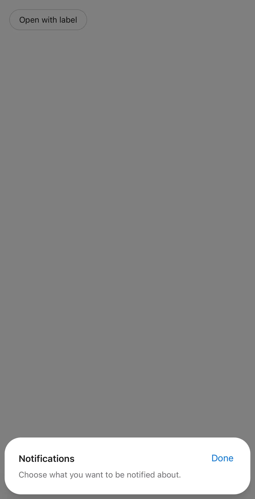
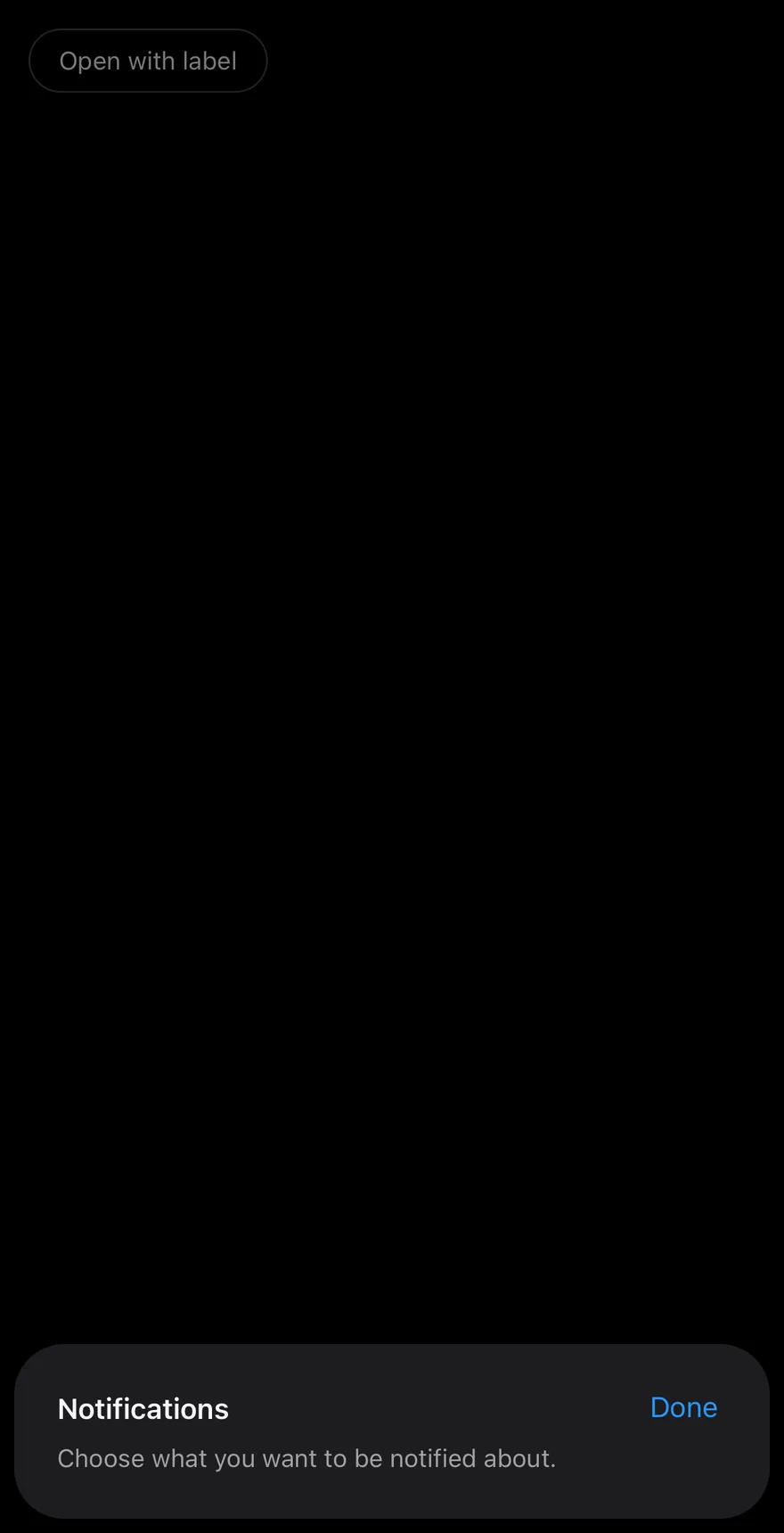
With close label
Replaces the icon close button with a text button labelled Done.
API Reference
Sheet
The root that holds the open state.
Also accepts the props of the primitive part it wraps.
SheetTrigger
The element that opens the sheet.
Also accepts the props of the primitive part it wraps.
SheetClose
An element that closes the sheet when pressed.
Also accepts the props of the primitive part it wraps.
SheetContent
The sliding panel, rendered in a portal with a backdrop.
| Prop | Type | Default | Description |
|---|---|---|---|
side | "top" | "right" | "bottom" | "left" | "right" | Chooses the edge the sheet slides in from. |
showCloseButton | boolean | true | Shows the built-in close button in the top corner. |
closeLabel | string | - | Shows this text in the close button instead of an icon. |
Also accepts the props of the primitive part it wraps.
SheetHeader
A padded stack for the title and description.
Also accepts the props of React.ComponentProps<"div">.
SheetFooter
A padded stack for actions, pushed to the bottom of the panel.
Also accepts the props of React.ComponentProps<"div">.
SheetTitle
The sheet's title, which names the dialog.
Also accepts the props of the primitive part it wraps.
SheetDescription
Supporting text, which describes the dialog.
Also accepts the props of the primitive part it wraps.
Accessibility
- The panel has the
dialogrole.SheetTitlegives it an accessible name andSheetDescriptionan accessible description. - Opening the sheet moves focus inside it.
Escapecloses the sheet, and focus returns to the trigger.- The icon close button has the hidden label
Close.
Notes
- Parts carry
data-slotattributes such assheet-content,sheet-overlayandsheet-close; the panel also setsdata-side. - Left and right sheets are 3/4 of the screen wide, up to
max-w-smfrom thesmbreakpoint. Slide directions flip in right-to-left layouts. - The panel uses
bg-popoverand the backdrop usesbg-black/50.
Sheet is built on the drawer primitive. SheetContent renders in a portal, above a dimmed overlay, as a rounded floating panel inset from the screen edges and the safe area. It enters and exits with a Reanimated fade-and-slide from its side and can be dismissed by swiping toward that edge.
Use right or left for navigation and detail panels that span the screen height, and top or bottom for short panels that span the width. For snap points and a drag handle, use Drawer instead.