suiss/ui
  • Docs
  • Components
  • Patterns
  • Interactions
  • Charts
  • Blocks
GitHubGet started
DocsComponentsPatternsInteractionsChartsBlocks
Components82
  • Overview
  • Accordion
  • Alert
  • Alert Dialog
  • Alert Sheet
  • Amount Input
  • Aspect Ratio
  • Attachment
  • Avatar
  • Badge
  • Bottom Bar
  • Breadcrumb
  • Bubble
  • Button
  • Button Group
  • Calendar
  • Card
  • Carousel
  • Chart
  • Checkbox
  • Chip
  • Collapsible
  • Combobox
  • Command
  • Context Menu
  • Dialog
  • Direction
  • Drawer
  • Dropdown Menu
  • Empty
  • FAB
  • Field
  • Fullscreen Menu
  • Haptics
  • Header
  • Hover Card
  • Icon
  • Input
  • Input Accessory Bar
  • Input Group
  • Input OTP
  • Item
  • Kbd
  • Keyboard Scroll View
  • Keypad
  • Label
  • Marker
  • Menubar
  • Message
  • Message Scroller
  • Native Select
  • Navigation Menu
  • Page Indicator
  • Pagination
  • Pin Pad
  • Popover
  • Progress
  • QR Scanner
  • Questionnaire
  • Radio Group
  • Resizable
  • Screen
  • Scroll Area
  • Select
  • Separator
  • Sheet
  • Sidebar
  • Signature Pad
  • Skeleton
  • Slider
  • Spinner
  • Switch
  • Tab Bar
  • Table
  • Tabs
  • Text
  • Textarea
  • Toast
  • Toggle
  • Toggle Group
  • Tooltip
  • Wheel Picker
  • Widget

suiss/ui · Component

Radio Group

A set of radio buttons where only one option can be selected at a time.

Radio Group is an open-source component from suiss/ui for React, React Native, SwiftUI and Jetpack Compose. The @esuiss/ui CLI copies its source into your project, so you own the code.

import { Label } from "@/components/ui/label"
import { RadioGroup, RadioGroupItem } from "@/components/ui/radio-group"

const options = [
  { value: "email", label: "Email" },
  { value: "sms", label: "Text message" },
  { value: "push", label: "Push notification" },
]

export default function RadioGroupDemo() {
  return (
    <div className="w-64">
      <RadioGroup aria-label="Notification method" defaultValue="email">
        {options.map((option) => (
          <Label key={option.value}>
            <RadioGroupItem value={option.value} />
            {option.label}
          </Label>
        ))}
      </RadioGroup>
    </div>
  )
}

Radio Group wraps the radio group primitive of the chosen base. RadioGroup holds the selected value and contains one RadioGroupItem per option. Each item renders a round control with an indicator dot when checked; pair it with a Label to give it visible text.

Use a radio group for a small set of mutually exclusive options that should all stay visible. Use Select or Native Select for longer lists, and Checkbox when several options can be selected.

Installation

CLI

$ pnpm dlx shadcn@latest add @esuiss/radio-group

Works in any project with a components.json. See Installation for the one-line registry setup. Or use the suiss/ui CLI:

$ pnpm dlx @esuiss/ui@latest add radio-group

Manual

  1. Install the dependencies and add the cn helper:
$ pnpm add @base-ui/react
  1. Copy the source into components/ui/radio-group.tsx:
  1. Update the import paths to match your project.

Usage

import { RadioGroup, RadioGroupItem } 
<div


Give each RadioGroupItem a unique value. The group is uncontrolled with defaultValue, or controlled with value and onValueChange. Set disabled on the group to disable every item, or on a single item.

Wrap each item and its text in a Label so clicking the text selects the option. The label switches to regular weight automatically next to a radio item.

Examples

With descriptions

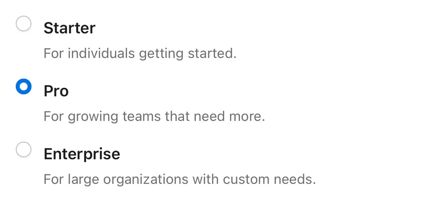
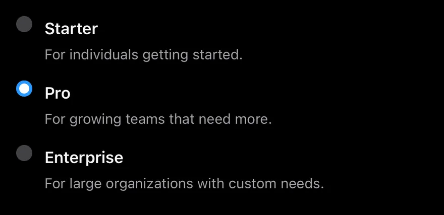
Options with a title and a secondary description, linked with aria-labelledby and aria-describedby.

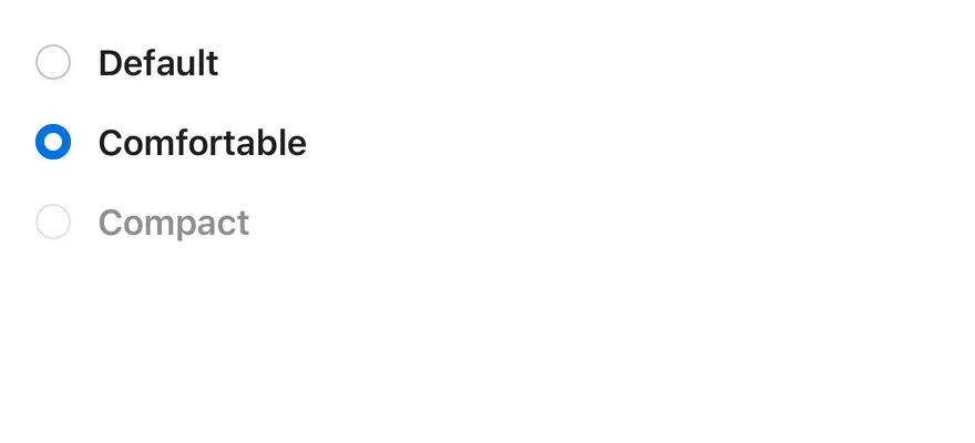
Disabled item

A group where one option is disabled and skipped by arrow-key navigation.

Disabled

A fully disabled group that ignores clicks.

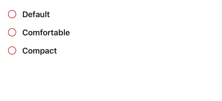
Invalid

Items marked with aria-invalid and shown with a destructive border.

API Reference

Anatomy2 parts
<RadioGroup>
<RadioGroupItem />
</RadioGroup>
01

RadioGroup

The container that manages the selected value and keyboard navigation.

Also accepts the props of the primitive part it wraps.

02

RadioGroupItem

A single radio button with a checked indicator.

Also accepts the props of the primitive part it wraps.

Accessibility

  • The group has the radiogroup role and each item the radio role with aria-checked.
  • Name the group with aria-label or aria-labelledby, and name each item with a wrapping Label or aria-labelledby.
  • Arrow keys move focus and selection between items, skipping disabled ones.
  • Set aria-invalid on items to communicate a validation error.
  • Each item has an enlarged invisible hit area for easier pointer targeting.

Notes

  • Styling hooks: data-slot values radio-group, radio-group-item and radio-group-indicator.
  • Items carry the peer class, so a following Label can react to their state.
  • Uses the primary, primary-foreground and destructive colors, and opacity-50 when disabled.

RadioGroup is a View with the radiogroup role that holds the selected value. Each RadioGroupItem is a small round Pressable with the radio role; when checked it fills with the primary color and shows a dot. Items have an enlarged hit area so they are easy to press.
Installation

$ pnpm dlx shadcn@latest add @esuiss-rn/radio-group

See Installation for the components.json setup. Or use the suiss/ui CLI:

$ pnpm dlx @esuiss/ui@latest add radio-group
$ pnpm dlx @esuiss/ui@latest add radio-group --platform swift
NextResizablePreviousQuestionnaire

On this page

  1. 01Installation
    • CLI
    • Manual
  2. 02Usage
  3. 03Examples
    • With descriptions
    • Disabled item
    • Disabled
    • Invalid
  4. 04API Reference
    • RadioGroup
    • RadioGroupItem
  5. 05Accessibility
  6. 06Notes
  7. 07Installation
    • Manual
  8. 08Usage
  9. 09Examples
    • With descriptions
    • Disabled item
    • Disabled
    • Invalid
  10. 10API Reference
    • RadioGroup
    • RadioGroupItem
  11. 11Accessibility
  12. 12Notes
from
"@/components/ui/radio-group"
className
=
"w-64"
>
<RadioGroup aria-label="Notification method" defaultValue="email">
{options.map((option) => (
<Label key={option.value}>
<RadioGroupItem value={option.value} />
{option.label}
</Label>
))}
</RadioGroup>
</div>
$ pnpm dlx @esuiss/ui@latest add radio-group --platform kotlin

Manual

  1. Install the dependencies:
npx expo install cn
  1. Add the pieces it builds on: the primitives components/primitives/radio.tsx, components/primitives/radio-group.tsx, components/primitives/use-render.tsx.

  2. Copy the source into components/ui/radio-group.tsx:

uniwind/components/ui/radio-group.tsx
import { cn } from "cn"
import { View } from "react-native"
import * as RadioPrimitive from "@/components/primitives/radio"
import {
  RadioGroup as RadioGroupPrimitive,
  type RadioGroupProps,
} from "@/components/primitives/radio-group"
import { resolveClassName } from "@/components/primitives/use-render"

const HIT_SLOP = { top: 8, bottom: 8, left: 12, right: 12 }

function RadioGroup<Value = string>({
  className,
  ...props
}: RadioGroupProps<Value>) {
  return (
  1. Update the import paths to match your project.
  1. Install the dependencies:
npx expo install cn
  1. Add the pieces it builds on: the primitives components/primitives/radio.tsx, components/primitives/radio-group.tsx, components/primitives/use-render.tsx.

  2. Copy the source into components/ui/radio-group.tsx:

nativewind/components/ui/radio-group.tsx
import { cn } from "cn"
import { View } from "react-native"
import * as RadioPrimitive from "@/components/primitives/radio"
import {
  RadioGroup as RadioGroupPrimitive,
  type RadioGroupProps,
} from "@/components/primitives/radio-group"
import { resolveClassName } from "@/components/primitives/use-render"

const HIT_SLOP = { top: 8, bottom: 8, left: 12, right: 12 }

function RadioGroup<Value = string>({
  className,
  ...props
}: RadioGroupProps<Value>) {
  return (
  1. Update the import paths to match your project.
  1. Add the pieces it builds on: the primitives components/primitives/radio.tsx, components/primitives/radio-group.tsx, components/primitives/use-render.tsx.

  2. Copy the source into components/ui/radio-group.tsx:

  1. Update the import paths to match your project.
  1. Target iOS 17 or later.

  2. Add the Swift package to your app:

Package.swift
.package(url: "https://github.com/phosphor-icons/swift", from: "2.1.0")
  1. Copy the theme files every view uses:
swift/Theme/Theme.swift
import SwiftUI
import UIKit

struct RGBA: Sendable {
  let red: CGFloat
  let green: CGFloat
  let blue: CGFloat
  let alpha: CGFloat

  init(_ hex: UInt32, _ alpha: CGFloat = 1) {
    red = CGFloat((hex >> 16) & 0xFF) / 255
    green = CGFloat((hex >> 8) & 0xFF) / 255
    blue = CGFloat(hex & 0xFF) / 255
    self.alpha = alpha
  }
swift/Theme/Tokens.swift
import SwiftUI

public enum EsuissColor {
  public static let background = Color.adaptive(light: .init(0xFFFFFF), dark: .init(0x000000))
  public static let foreground = Color.adaptive(light: .init(0x1D1D1F), dark: .init(0xF5F5F7))
  public static let card = Color.adaptive(light: .init(0xFFFFFF), dark: .init(0x1D1D1F))
  public static let cardForeground = Color.adaptive(light: .init(0x1D1D1F), dark: .init(0xF5F5F7))
  public static let popover = Color.adaptive(light: .init(0xFFFFFF), dark: .init(0x1D1D1F))
  public static let popoverForeground = Color.adaptive(light: .init(0x1D1D1F), dark: .init(0xF5F5F7))
  public static let primary = Color.adaptive(light: .init(0x0071E3), dark: .init(0x2997FF))
  public static let primaryForeground = Color.adaptive(light: .init(0xFFFFFF), dark: .init(0xFFFFFF))
  public static let secondary = Color.adaptive(light: .init(0x000000, 0.04), dark: .init(0xFFFFFF, 0.1))
  public static let secondaryForeground = Color.adaptive(light: .init(0x1D1D1F), dark: .init(0xF5F5F7))
  public static let muted = Color.adaptive(light: .init(0xF5F5F7), dark: .init(0x161617))
  public static let mutedForeground = Color.adaptive(light: .init(0x6E6E73), dark: .init(0xA1A1A6))
  public static let accent = Color.adaptive(light: .init(0x000000, 0.06), dark: .init(0xFFFFFF, 0.1))
  1. Copy the source and every file it uses:
swift/Components/RadioGroup.swift
import SwiftUI

struct RadioGroupContext {
  var selection: AnyHashable?
  var select: (AnyHashable) -> Void
}

extension EnvironmentValues {
  @Entry var radioGroup: RadioGroupContext?
}

public struct RadioGroup<Value: Hashable, Content: View>: View {
  @Binding var selection: Value?
  let content: Content

  public init(selection: Binding<Value?>, @ViewBuilder content: () -> Content) {
swift/Components/Button.swift
import SwiftUI

public struct VariantButtonStyle: ButtonStyle {
  public enum Variant: CaseIterable, Sendable {
    case `default`, outline, secondary, tinted, ghost, plain, destructive, link
  }

  public enum Size: CaseIterable, Sendable {
    case `default`, xs, sm, lg, xl, icon, iconXs, iconSm, iconLg, iconXl

    var height: CGFloat {
      switch self {
      case .xs, .iconXs: 24
      case .sm, .iconSm: 32
      case .default, .icon: 36
      case .lg, .iconLg: 44
swift/Components/ButtonGroup.swift
import SwiftUI

extension EnvironmentValues {
  @Entry var buttonGroup: Axis? = nil
  @Entry var buttonGroupSize: CGSize = .zero
}

enum ButtonGroupSpace: Hashable {
  case group
}

struct ButtonGroupFrame {
  let bounds: Anchor<CGRect>
  let outlined: Bool
}
swift/Components/Checkbox.swift
import PhosphorSwift
import SwiftUI

extension Shadow {
  static let control = Shadow(color: .black.opacity(0.08), radius: 0.5, y: 0.5)
  static let thumb = Shadow(color: .black.opacity(0.12), radius: 1.5, y: 1)
}

struct SelectionIndicator<Mark: View>: View {
  let checked: Bool
  let pressed: Bool
  let cornerRadius: CGFloat
  let mark: Mark

  @Environment(\.isEnabled) private var isEnabled
  @Environment(\.isInvalid) private var invalid
swift/Components/DropdownMenu.swift
import PhosphorSwift
import SwiftUI

enum MenuPresentation: Sendable {
  case system, popup
}

extension EnvironmentValues {
  @Entry var menuPresentation: MenuPresentation = .system
  @Entry var menuRadio = MenuRadioContext()
}

struct MenuRadioContext: @unchecked Sendable {
  var selected: AnyHashable?
  var select: @MainActor @Sendable (AnyHashable) -> Void = { _ in }
}
swift/Components/Field.swift
import SwiftUI

extension EnvironmentValues {
  @Entry public var isInvalid = false
  @Entry var fieldInset = false
  @Entry var fieldGroupInset = false
  @Entry var fieldSetInset = false
}

extension View {
  public func invalid(_ isInvalid: Bool = true) -> some View {
    environment(\.isInvalid, isInvalid)
  }
}

public enum FieldOrientation: CaseIterable, Sendable {
swift/Components/Haptics.swift
import SwiftUI

extension EnvironmentValues {
  @Entry public var hapticsEnabled = true
}

extension View {
  public func haptics(_ enabled: Bool) -> some View {
    environment(\.hapticsEnabled, enabled)
  }

  func hapticFeedback<Trigger: Equatable>(_ feedback: SensoryFeedback, trigger: Trigger) -> some View {
    modifier(HapticFeedbackModifier(feedback: feedback, trigger: trigger) { _, _ in true })
  }

  func hapticFeedback<Trigger: Equatable>(
swift/Components/Label.swift
import SwiftUI

public struct FieldLabel<Content: View>: View {
  let content: Content

  @Environment(\.fieldInset) private var inset
  @Environment(\.isEnabled) private var isEnabled

  public init(@ViewBuilder content: () -> Content) {
    self.content = content()
  }

  public var body: some View {
    content
      .scaledTextStyle(.base, weight: inset ? .regular : .semibold)
      .foregroundStyle(EsuissColor.foreground)
swift/Components/Overlay.swift
import PhosphorSwift
import Observation
import SwiftUI

public enum PopupAlignment: Sendable, CaseIterable {
  case start, center, end
}

struct OverlayDismiss: Sendable {
  let action: @MainActor @Sendable () -> Void

  @MainActor func callAsFunction() {
    action()
  }
}
swift/Components/Select.swift
import PhosphorSwift
import SwiftUI

struct SelectContext: @unchecked Sendable {
  var selected: AnyHashable?
  var registering = false
  var select: @MainActor @Sendable (AnyHashable) -> Void = { _ in }
}

extension EnvironmentValues {
  @Entry var select = SelectContext()
}

struct SelectLabelsKey: PreferenceKey {
  static var defaultValue: [AnyHashable: Text] { [:] }
swift/Components/Separator.swift
import SwiftUI

public struct Separator: View {
  let orientation: Axis

  public init(_ orientation: Axis = .horizontal) {
    self.orientation = orientation
  }

  public var body: some View {
    Rectangle()
      .fill(EsuissColor.border)
      .frame(width: orientation == .vertical ? 1 : nil, height: orientation == .horizontal ? 1 : nil)
      .frame(maxWidth: orientation == .horizontal ? .infinity : nil, maxHeight: orientation == .vertical ? .infinity : nil)
      .accessibilityHidden(true)
  }
swift/Components/TextVariant.swift
import SwiftUI

public enum TextVariant: CaseIterable, Sendable {
  case `default`, h1, h2, h3, h4, p, blockquote, code, lead, large, small, muted

  var style: TextStyle {
    switch self {
    case .h1: .xl3
    case .h2: .xl2
    case .h3: .xl
    case .h4, .lead, .large: .lg
    case .code, .small, .muted: .sm
    default: .base
    }
  }
  1. Add the files to your app target.
  1. Set minSdk to 24 or higher and add the dependencies:
build.gradle.kts
implementation(platform("androidx.compose:compose-bom:2026.09.00"))
implementation("androidx.compose.foundation:foundation")
implementation("androidx.compose.ui:ui")
implementation("com.adamglin:phosphor-icon-android:1.0.0")
  1. Copy the theme files every view uses:
kotlin/theme/Theme.kt
package com.esuiss.ui.theme

import androidx.compose.foundation.isSystemInDarkTheme
import androidx.compose.runtime.Composable
import androidx.compose.runtime.CompositionLocalProvider
import androidx.compose.runtime.Immutable
import androidx.compose.runtime.staticCompositionLocalOf
import androidx.compose.ui.Modifier
import androidx.compose.ui.draw.dropShadow
import androidx.compose.ui.graphics.Color
import androidx.compose.ui.graphics.Shape
import androidx.compose.ui.graphics.shadow.Shadow as DropShadow
import androidx.compose.ui.text.TextStyle
import androidx.compose.ui.text.style.LineHeightStyle
import androidx.compose.ui.unit.Dp
import androidx.compose.ui.unit.DpOffset
kotlin/theme/Tokens.kt
package com.esuiss.ui.theme

import androidx.compose.runtime.Immutable
import androidx.compose.ui.graphics.Color
import androidx.compose.ui.unit.dp

@Immutable
data class Colors(
    val background: Color,
    val foreground: Color,
    val card: Color,
    val cardForeground: Color,
    val popover: Color,
    val popoverForeground: Color,
    val primary: Color,
    val primaryForeground: Color,
  1. Copy the source and every file it uses:
kotlin/components/RadioGroup.kt
package com.esuiss.ui.components

import androidx.compose.foundation.background
import androidx.compose.foundation.border
import androidx.compose.foundation.interaction.MutableInteractionSource
import androidx.compose.foundation.interaction.collectIsPressedAsState
import androidx.compose.foundation.layout.Arrangement
import androidx.compose.foundation.layout.Box
import androidx.compose.foundation.layout.Column
import androidx.compose.foundation.layout.ColumnScope
import androidx.compose.foundation.layout.Row
import androidx.compose.foundation.layout.fillMaxWidth
import androidx.compose.foundation.layout.heightIn
import androidx.compose.foundation.layout.size
import androidx.compose.foundation.selection.selectable
import androidx.compose.foundation.selection.selectableGroup
kotlin/components/Checkbox.kt
package com.esuiss.ui.components

import androidx.compose.foundation.background
import androidx.compose.foundation.border
import androidx.compose.foundation.interaction.MutableInteractionSource
import androidx.compose.foundation.interaction.collectIsPressedAsState
import androidx.compose.foundation.layout.Box
import androidx.compose.foundation.layout.size
import androidx.compose.foundation.selection.triStateToggleable
import androidx.compose.foundation.shape.RoundedCornerShape
import androidx.compose.runtime.Composable
import androidx.compose.runtime.getValue
import androidx.compose.runtime.remember
import androidx.compose.ui.Alignment
import androidx.compose.ui.Modifier
import androidx.compose.ui.draw.alpha
kotlin/components/Content.kt
package com.esuiss.ui.components

import androidx.compose.runtime.compositionLocalOf
import androidx.compose.ui.graphics.Color
import androidx.compose.ui.text.TextStyle
import androidx.compose.ui.unit.Dp
import androidx.compose.ui.unit.dp

val LocalContentStyle = compositionLocalOf { TextStyle.Default }

val LocalContentColor = compositionLocalOf { Color.Unspecified }

val LocalIconSize = compositionLocalOf { 20.dp }
kotlin/components/Field.kt
package com.esuiss.ui.components

import androidx.compose.foundation.background
import androidx.compose.foundation.gestures.Orientation
import androidx.compose.foundation.layout.Arrangement
import androidx.compose.foundation.layout.Box
import androidx.compose.foundation.layout.Column
import androidx.compose.foundation.layout.ColumnScope
import androidx.compose.foundation.layout.LayoutScopeMarker
import androidx.compose.foundation.layout.Row
import androidx.compose.foundation.layout.RowScope
import androidx.compose.foundation.layout.fillMaxWidth
import androidx.compose.foundation.layout.heightIn
import androidx.compose.foundation.layout.padding
import androidx.compose.foundation.shape.RoundedCornerShape
import androidx.compose.foundation.text.BasicText
kotlin/components/FormSupport.kt
package com.esuiss.ui.components

import android.provider.Settings
import androidx.compose.animation.core.CubicBezierEasing
import androidx.compose.foundation.background
import androidx.compose.foundation.border
import androidx.compose.foundation.gestures.Orientation
import androidx.compose.foundation.text.selection.TextSelectionColors
import androidx.compose.runtime.Composable
import androidx.compose.runtime.mutableStateOf
import androidx.compose.runtime.remember
import androidx.compose.ui.Modifier
import androidx.compose.ui.draw.alpha
import androidx.compose.ui.draw.clip
import androidx.compose.ui.draw.drawWithContent
import androidx.compose.ui.geometry.Offset
kotlin/components/Haptics.kt
package com.esuiss.ui.components

import androidx.compose.runtime.Composable
import androidx.compose.runtime.CompositionLocalProvider
import androidx.compose.runtime.remember
import androidx.compose.runtime.staticCompositionLocalOf
import androidx.compose.ui.hapticfeedback.HapticFeedback
import androidx.compose.ui.hapticfeedback.HapticFeedbackType
import androidx.compose.ui.platform.LocalHapticFeedback

val LocalHapticsEnabled = staticCompositionLocalOf { true }

@Composable
fun ProvideHaptics(enabled: Boolean, content: @Composable () -> Unit) {
    CompositionLocalProvider(LocalHapticsEnabled provides enabled, content = content)
}
kotlin/components/Icon.kt
package com.esuiss.ui.components

import androidx.compose.foundation.Image
import androidx.compose.foundation.layout.size
import androidx.compose.runtime.Composable
import androidx.compose.ui.Modifier
import androidx.compose.ui.graphics.Color
import androidx.compose.ui.graphics.ColorFilter
import androidx.compose.ui.graphics.takeOrElse
import androidx.compose.ui.graphics.vector.ImageVector
import androidx.compose.ui.unit.Dp
import com.esuiss.ui.theme.EsuissTheme

@Composable
fun Icon(
    imageVector: ImageVector,
kotlin/components/Label.kt
package com.esuiss.ui.components

import androidx.compose.foundation.layout.Arrangement
import androidx.compose.foundation.layout.Row
import androidx.compose.foundation.layout.RowScope
import androidx.compose.foundation.text.BasicText
import androidx.compose.runtime.Composable
import androidx.compose.runtime.CompositionLocalProvider
import androidx.compose.ui.Alignment
import androidx.compose.ui.Modifier
import androidx.compose.ui.draw.alpha
import androidx.compose.ui.text.font.FontWeight
import androidx.compose.ui.unit.dp
import com.esuiss.ui.theme.EsuissTheme
import com.esuiss.ui.theme.Typography
kotlin/components/Separator.kt
package com.esuiss.ui.components

import androidx.compose.foundation.background
import androidx.compose.foundation.gestures.Orientation
import androidx.compose.foundation.layout.Box
import androidx.compose.foundation.layout.fillMaxHeight
import androidx.compose.foundation.layout.fillMaxWidth
import androidx.compose.foundation.layout.height
import androidx.compose.foundation.layout.width
import androidx.compose.runtime.Composable
import androidx.compose.ui.Modifier
import androidx.compose.ui.unit.dp
import com.esuiss.ui.theme.EsuissTheme

@Composable
fun Separator(
  1. Update the com.esuiss.ui package names to match your project.

Usage

import { RadioGroup, RadioGroupItem } from "@/components/ui/radio-group"
<RadioGroupDemo />

Give every RadioGroupItem a unique value. Control the group with value and onValueChange(value, details), or leave it uncontrolled with defaultValue. Values are generic, so they can be strings or other types.

Put a Label next to each item and link it through nativeID and accessibilityLabelledBy. Set disabled on the group to disable all items, or on a single item. Set invalid on items to show the destructive border.

Examples

With descriptions

Options with a label and a line of description each.

iOS
Radio Group (with descriptions) on iOS in light modeRadio Group (with descriptions) on iOS in dark mode
import * as React from "react"
import { View } from "react-native"
import { Label } from "@/components/ui/label"
import { RadioGroup, RadioGroupItem } from "@/components/ui/radio-group"
import { Text } from "@/components/ui/text"

const plans = [
  {
    value: "starter",
    label: "Starter",
    description: "For individuals getting started.",
  },
  {
    value: "pro",
    label: "Pro",
    description: "For growing teams that need more.",
  },
  {
    value: "enterprise",
    label: "Enterprise",
    description: "For large organizations with custom needs.",
  },
]

function WithDescriptionsDemo() {
  const [value, setValue] = React.useState("pro")
  return (
    <RadioGroup value={value} onValueChange={setValue} className="gap-4">
      {plans.map((plan) => (
        <View key={plan.value} className="flex-row items-start gap-3">
          <RadioGroupItem
            value={plan.value}
            accessibilityLabelledBy={`plan-${plan.value}`}
          />
          <View className="flex-1 gap-1">
            <Label
              nativeID={`plan-${plan.value}`}
              onPress={() => setValue(plan.value)}
            >
              {plan.label}
            </Label>
            <Text className="text-sm text-muted-foreground">
              {plan.description}
            </Text>
          </View>
        </View>
      ))}
    </RadioGroup>
  )
}

export function RadioGroupWithDescriptionsExample() {
  return (
    <WithDescriptionsDemo />
  )
}
import EsuissUI
import SwiftUI

struct RadioGroupPlan {
  let value: String
  let label: LocalizedStringKey
  let description: LocalizedStringKey
}

let radioGroupPlans = [
  RadioGroupPlan(value: "starter", label: "Starter", description: "For individuals getting started."),
  RadioGroupPlan(value: "pro", label: "Pro", description: "For growing teams that need more."),
  RadioGroupPlan(value: "enterprise", label: "Enterprise", description: "For large organizations with custom needs."),
]

struct RadioGroupDescriptionsDemo: View {
  @State private var value = "pro"

  var body: some View {
    RadioGroup(selection: $value) {
      ForEach(radioGroupPlans, id: \.value) { plan in
        RadioGroupItem(value: plan.value) {
          VStack(alignment: .leading, spacing: 4) {
            FieldLabel(plan.label)
            Text(plan.description)
              .textStyle(.sm)
              .foregroundStyle(EsuissColor.mutedForeground)
          }
          .frame(maxWidth: .infinity, alignment: .leading)
        }
      }
    }
  }
}
import androidx.compose.foundation.clickable
import androidx.compose.foundation.interaction.MutableInteractionSource
import androidx.compose.foundation.layout.Arrangement
import androidx.compose.foundation.layout.Column
import androidx.compose.foundation.layout.Row
import androidx.compose.runtime.Composable
import androidx.compose.runtime.getValue
import androidx.compose.runtime.mutableStateOf
import androidx.compose.runtime.remember
import androidx.compose.runtime.saveable.rememberSaveable
import androidx.compose.runtime.setValue
import androidx.compose.ui.Alignment
import androidx.compose.ui.Modifier
import androidx.compose.ui.semantics.contentDescription
import androidx.compose.ui.semantics.semantics
import androidx.compose.ui.unit.dp
import com.esuiss.ui.components.Label
import com.esuiss.ui.components.RadioGroup
import com.esuiss.ui.components.RadioGroupItem
import com.esuiss.ui.components.Text
import com.esuiss.ui.theme.EsuissTheme
import com.esuiss.ui.theme.Typography

class RadioGroupOption(val value: String, val label: String, val description: String = "")

val radioGroupPlans = listOf(
    RadioGroupOption("starter", "Starter", "For individuals getting started."),
    RadioGroupOption("pro", "Pro", "For growing teams that need more."),
    RadioGroupOption("enterprise", "Enterprise", "For large organizations with custom needs."),
)

@Composable
fun Modifier.radioGroupTap(enabled: Boolean, onTap: () -> Unit): Modifier = clickable(
    interactionSource = remember { MutableInteractionSource() },
    indication = null,
    enabled = enabled,
    onClick = onTap,
)

@Composable
fun RadioGroupWithDescriptions() {
    var value by rememberSaveable { mutableStateOf("pro") }
    val colors = EsuissTheme.colors
    RadioGroup(value = value, onValueChange = { value = it }) {
        Column(verticalArrangement = Arrangement.spacedBy(16.dp)) {
            radioGroupPlans.forEach { plan ->
                Row(horizontalArrangement = Arrangement.spacedBy(12.dp), verticalAlignment = Alignment.Top) {
                    RadioGroupItem(plan.value, Modifier.semantics { contentDescription = plan.label })
                    Column(Modifier.weight(1f), verticalArrangement = Arrangement.spacedBy(4.dp)) {
                        Label(plan.label, Modifier.radioGroupTap(true) { value = plan.value })
                        Text(plan.description, style = Typography.sm, color = colors.mutedForeground)
                    }
                }
            }
        }
    }
}

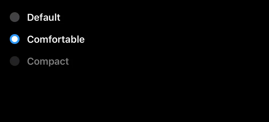
Disabled item

A group with one disabled option.

iOS
Radio Group (disabled item) on iOS in light modeRadio Group (disabled item) on iOS in dark mode
import * as React from "react"
import { View } from "react-native"
import { Label } from "@/components/ui/label"
import { RadioGroup, RadioGroupItem } from "@/components/ui/radio-group"

const options = [
  { value: "default", label: "Default" },
  { value: "comfortable", label: "Comfortable" },
  { value: "compact", label: "Compact" },
]

function RadioGroupDemo({
  disabled = false,
  disabledItem,
}: {
  disabled?: boolean
  disabledItem?: string
}) {
  const [value, setValue] = React.useState("comfortable")
  return (
    <RadioGroup value={value} onValueChange={setValue} disabled={disabled}>
      {options.map((option) => {
        const isDisabled = disabled || option.value === disabledItem
        return (
          <View key={option.value} className="flex-row items-center gap-3">
            <RadioGroupItem
              value={option.value}
              accessibilityLabelledBy={`radio-${option.value}`}
              disabled={isDisabled}
            />
            <Label
              nativeID={`radio-${option.value}`}
              disabled={isDisabled}
              onPress={() => setValue(option.value)}
            >
              {option.label}
            </Label>
          </View>
        )
      })}
    </RadioGroup>
  )
}

export function RadioGroupDisabledItemExample() {
  return (
    <RadioGroupDemo disabledItem="compact" />
  )
}
import EsuissUI
import SwiftUI

struct RadioGroupDisabledItemExample: View {
  var body: some View {
    RadioGroupDemo(disabledItem: "compact")
  }
}

struct RadioGroupOption {
  let value: String
  let label: LocalizedStringKey
}

let radioGroupOptions = [
  RadioGroupOption(value: "default", label: "Default"),
  RadioGroupOption(value: "comfortable", label: "Comfortable"),
  RadioGroupOption(value: "compact", label: "Compact"),
]

struct RadioGroupDemo: View {
  var disabled = false
  var disabledItem: String?

  @State private var value = "comfortable"

  var body: some View {
    RadioGroup(selection: $value) {
      ForEach(radioGroupOptions, id: \.value) { option in
        RadioGroupItem(option.label, value: option.value)
          .disabled(disabled || option.value == disabledItem)
      }
    }
  }
}
import androidx.compose.foundation.clickable
import androidx.compose.foundation.interaction.MutableInteractionSource
import androidx.compose.foundation.layout.Arrangement
import androidx.compose.foundation.layout.Row
import androidx.compose.runtime.Composable
import androidx.compose.runtime.getValue
import androidx.compose.runtime.mutableStateOf
import androidx.compose.runtime.remember
import androidx.compose.runtime.saveable.rememberSaveable
import androidx.compose.runtime.setValue
import androidx.compose.ui.Alignment
import androidx.compose.ui.Modifier
import androidx.compose.ui.semantics.contentDescription
import androidx.compose.ui.semantics.semantics
import androidx.compose.ui.unit.dp
import com.esuiss.ui.components.Label
import com.esuiss.ui.components.RadioGroup
import com.esuiss.ui.components.RadioGroupItem

@Composable
fun RadioGroupDisabledItemExample() {
    RadioGroupDemo(disabledItem = "compact")
}

class RadioGroupOption(val value: String, val label: String, val description: String = "")

val radioGroupOptions = listOf(
    RadioGroupOption("default", "Default"),
    RadioGroupOption("comfortable", "Comfortable"),
    RadioGroupOption("compact", "Compact"),
)

@Composable
fun Modifier.radioGroupTap(enabled: Boolean, onTap: () -> Unit): Modifier = clickable(
    interactionSource = remember { MutableInteractionSource() },
    indication = null,
    enabled = enabled,
    onClick = onTap,
)

@Composable
fun RadioGroupDemo(disabled: Boolean = false, disabledItem: String? = null) {
    var value by rememberSaveable { mutableStateOf("comfortable") }
    RadioGroup(value = value, onValueChange = { value = it }, enabled = !disabled) {
        radioGroupOptions.forEach { option ->
            val isDisabled = disabled || option.value == disabledItem
            Row(horizontalArrangement = Arrangement.spacedBy(12.dp), verticalAlignment = Alignment.CenterVertically) {
                RadioGroupItem(
                    option.value,
                    Modifier.semantics { contentDescription = option.label },
                    enabled = !isDisabled,
                )
                Label(option.label, Modifier.radioGroupTap(!isDisabled) { value = option.value }, enabled = !isDisabled)
            }
        }
    }
}

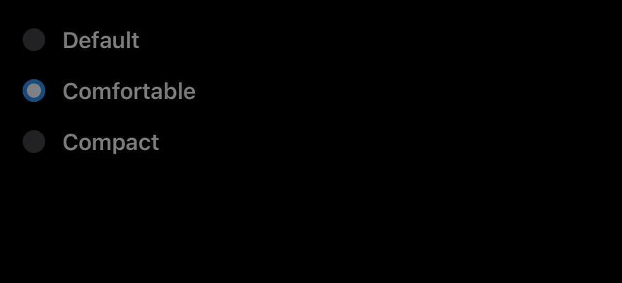
Disabled

A fully disabled group.

iOS
Radio Group (disabled) on iOS in light modeRadio Group (disabled) on iOS in dark mode
import * as React from "react"
import { View } from "react-native"
import { Label } from "@/components/ui/label"
import { RadioGroup, RadioGroupItem } from "@/components/ui/radio-group"

const options = [
  { value: "default", label: "Default" },
  { value: "comfortable", label: "Comfortable" },
  { value: "compact", label: "Compact" },
]

function RadioGroupDemo({
  disabled = false,
  disabledItem,
}: {
  disabled?: boolean
  disabledItem?: string
}) {
  const [value, setValue] = React.useState("comfortable")
  return (
    <RadioGroup value={value} onValueChange={setValue} disabled={disabled}>
      {options.map((option) => {
        const isDisabled = disabled || option.value === disabledItem
        return (
          <View key={option.value} className="flex-row items-center gap-3">
            <RadioGroupItem
              value={option.value}
              accessibilityLabelledBy={`radio-${option.value}`}
              disabled={isDisabled}
            />
            <Label
              nativeID={`radio-${option.value}`}
              disabled={isDisabled}
              onPress={() => setValue(option.value)}
            >
              {option.label}
            </Label>
          </View>
        )
      })}
    </RadioGroup>
  )
}

export function RadioGroupDisabledExample() {
  return (
    <RadioGroupDemo disabled />
  )
}
import EsuissUI
import SwiftUI

struct RadioGroupDisabledExample: View {
  var body: some View {
    RadioGroupDemo(disabled: true)
  }
}

struct RadioGroupOption {
  let value: String
  let label: LocalizedStringKey
}

let radioGroupOptions = [
  RadioGroupOption(value: "default", label: "Default"),
  RadioGroupOption(value: "comfortable", label: "Comfortable"),
  RadioGroupOption(value: "compact", label: "Compact"),
]

struct RadioGroupDemo: View {
  var disabled = false
  var disabledItem: String?

  @State private var value = "comfortable"

  var body: some View {
    RadioGroup(selection: $value) {
      ForEach(radioGroupOptions, id: \.value) { option in
        RadioGroupItem(option.label, value: option.value)
          .disabled(disabled || option.value == disabledItem)
      }
    }
  }
}
import androidx.compose.foundation.clickable
import androidx.compose.foundation.interaction.MutableInteractionSource
import androidx.compose.foundation.layout.Arrangement
import androidx.compose.foundation.layout.Row
import androidx.compose.runtime.Composable
import androidx.compose.runtime.getValue
import androidx.compose.runtime.mutableStateOf
import androidx.compose.runtime.remember
import androidx.compose.runtime.saveable.rememberSaveable
import androidx.compose.runtime.setValue
import androidx.compose.ui.Alignment
import androidx.compose.ui.Modifier
import androidx.compose.ui.semantics.contentDescription
import androidx.compose.ui.semantics.semantics
import androidx.compose.ui.unit.dp
import com.esuiss.ui.components.Label
import com.esuiss.ui.components.RadioGroup
import com.esuiss.ui.components.RadioGroupItem

@Composable
fun RadioGroupDisabledExample() {
    RadioGroupDemo(disabled = true)
}

class RadioGroupOption(val value: String, val label: String, val description: String = "")

val radioGroupOptions = listOf(
    RadioGroupOption("default", "Default"),
    RadioGroupOption("comfortable", "Comfortable"),
    RadioGroupOption("compact", "Compact"),
)

@Composable
fun Modifier.radioGroupTap(enabled: Boolean, onTap: () -> Unit): Modifier = clickable(
    interactionSource = remember { MutableInteractionSource() },
    indication = null,
    enabled = enabled,
    onClick = onTap,
)

@Composable
fun RadioGroupDemo(disabled: Boolean = false, disabledItem: String? = null) {
    var value by rememberSaveable { mutableStateOf("comfortable") }
    RadioGroup(value = value, onValueChange = { value = it }, enabled = !disabled) {
        radioGroupOptions.forEach { option ->
            val isDisabled = disabled || option.value == disabledItem
            Row(horizontalArrangement = Arrangement.spacedBy(12.dp), verticalAlignment = Alignment.CenterVertically) {
                RadioGroupItem(
                    option.value,
                    Modifier.semantics { contentDescription = option.label },
                    enabled = !isDisabled,
                )
                Label(option.label, Modifier.radioGroupTap(!isDisabled) { value = option.value }, enabled = !isDisabled)
            }
        }
    }
}

Invalid

Items with the invalid border.

iOS
Radio Group (invalid) on iOS in light modeRadio Group (invalid) on iOS in dark mode
import { View } from "react-native"
import { Label } from "@/components/ui/label"
import { RadioGroup, RadioGroupItem } from "@/components/ui/radio-group"

const options = [
  { value: "default", label: "Default" },
  { value: "comfortable", label: "Comfortable" },
  { value: "compact", label: "Compact" },
]

export function RadioGroupInvalidExample() {
  return (
    <RadioGroup className="gap-3">
      {options.map((option) => (
        <View key={option.value} className="flex-row items-center gap-3">
          <RadioGroupItem
            invalid
            value={option.value}
            accessibilityLabelledBy={`radio-invalid-${option.value}`}
          />
          <Label nativeID={`radio-invalid-${option.value}`}>
            {option.label}
          </Label>
        </View>
      ))}
    </RadioGroup>
  )
}
import EsuissUI
import SwiftUI

struct RadioGroupInvalidExample: View {
  var body: some View {
    RadioGroup(selection: .constant(String?.none)) {
      ForEach(radioGroupOptions, id: \.value) { option in
        RadioGroupItem(option.label, value: option.value)
      }
    }
    .invalid()
  }
}

struct RadioGroupOption {
  let value: String
  let label: LocalizedStringKey
}

let radioGroupOptions = [
  RadioGroupOption(value: "default", label: "Default"),
  RadioGroupOption(value: "comfortable", label: "Comfortable"),
  RadioGroupOption(value: "compact", label: "Compact"),
]
import androidx.compose.foundation.clickable
import androidx.compose.foundation.interaction.MutableInteractionSource
import androidx.compose.foundation.layout.Arrangement
import androidx.compose.foundation.layout.Row
import androidx.compose.runtime.Composable
import androidx.compose.runtime.getValue
import androidx.compose.runtime.mutableStateOf
import androidx.compose.runtime.remember
import androidx.compose.runtime.saveable.rememberSaveable
import androidx.compose.runtime.setValue
import androidx.compose.ui.Alignment
import androidx.compose.ui.Modifier
import androidx.compose.ui.semantics.contentDescription
import androidx.compose.ui.semantics.semantics
import androidx.compose.ui.unit.dp
import com.esuiss.ui.components.Label
import com.esuiss.ui.components.RadioGroup
import com.esuiss.ui.components.RadioGroupItem

class RadioGroupOption(val value: String, val label: String, val description: String = "")

val radioGroupOptions = listOf(
    RadioGroupOption("default", "Default"),
    RadioGroupOption("comfortable", "Comfortable"),
    RadioGroupOption("compact", "Compact"),
)

@Composable
fun Modifier.radioGroupTap(enabled: Boolean, onTap: () -> Unit): Modifier = clickable(
    interactionSource = remember { MutableInteractionSource() },
    indication = null,
    enabled = enabled,
    onClick = onTap,
)

@Composable
fun RadioGroupInvalid() {
    var value by rememberSaveable { mutableStateOf<String?>(null) }
    RadioGroup(value = value, onValueChange = { value = it }) {
        radioGroupOptions.forEach { option ->
            Row(horizontalArrangement = Arrangement.spacedBy(12.dp), verticalAlignment = Alignment.CenterVertically) {
                RadioGroupItem(option.value, Modifier.semantics { contentDescription = option.label }, invalid = true)
                Label(option.label)
            }
        }
    }
}

API Reference

01

RadioGroup

The container that holds the selected value.

Also accepts the props of RadioGroupProps<Value>.

02

RadioGroupItem

A single radio button with its checked indicator.

PropTypeDefaultDescription
invalidboolean-Shows a destructive border while unchecked.

Also accepts the props of RadioPrimitive.RootProps<Value>.

Accessibility

  • The group has the radiogroup role and reports disabled in accessibilityState.
  • Each item has the radio role and reports checked and disabled in accessibilityState.
  • The indicator is hidden from screen readers; label each item with a linked Label or an accessibilityLabel.

Notes

  • Selecting an item triggers a selection haptic when a haptics adapter is provided through HapticsContext.
  • Uses the bg-primary, bg-primary-foreground and border-destructive tokens, with opacity-50 when disabled.
  • Light and dark colors follow the system appearance; in dark mode unchecked items drop the border and shadow.
iOS
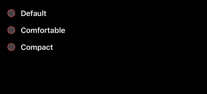
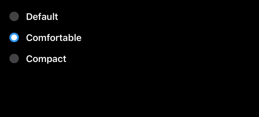
Radio Group on iOS in light modeRadio Group on iOS in dark mode
import * as React from "react"
import { View } from "react-native"
import { Label } from "@/components/ui/label"
import { RadioGroup, RadioGroupItem } from "@/components/ui/radio-group"

const options = [
  { value: "default", label: "Default" },
  { value: "comfortable", label: "Comfortable" },
  { value: "compact", label: "Compact" },
]

function RadioGroupDemo({
  disabled = false,
  disabledItem,
}: {
  disabled?: boolean
  disabledItem?: string
}) {
  const [value, setValue] = React.useState("comfortable")
  return (
    <RadioGroup value={value} onValueChange={setValue} disabled={disabled}>
      {options.map((option) => {
        const isDisabled = disabled || option.value === disabledItem
        return (
          <View key={option.value} className="flex-row items-center gap-3">
            <RadioGroupItem
              value={option.value}
              accessibilityLabelledBy={`radio-${option.value}`}
              disabled={isDisabled}
            />
            <Label
              nativeID={`radio-${option.value}`}
              disabled={isDisabled}
              onPress={() => setValue(option.value)}
            >
              {option.label}
            </Label>
          </View>
        )
      })}
    </RadioGroup>
  )
}

export function RadioGroupExample() {
  return (
    <RadioGroupDemo />
  )
}
import EsuissUI
import SwiftUI

struct RadioGroupOption {
  let value: String
  let label: LocalizedStringKey
}

let radioGroupOptions = [
  RadioGroupOption(value: "default", label: "Default"),
  RadioGroupOption(value: "comfortable", label: "Comfortable"),
  RadioGroupOption(value: "compact", label: "Compact"),
]

struct RadioGroupDemo: View {
  var disabled = false
  var disabledItem: String?

  @State private var value = "comfortable"

  var body: some View {
    RadioGroup(selection: $value) {
      ForEach(radioGroupOptions, id: \.value) { option in
        RadioGroupItem(option.label, value: option.value)
          .disabled(disabled || option.value == disabledItem)
      }
    }
  }
}
import androidx.compose.foundation.clickable
import androidx.compose.foundation.interaction.MutableInteractionSource
import androidx.compose.foundation.layout.Arrangement
import androidx.compose.foundation.layout.Row
import androidx.compose.runtime.Composable
import androidx.compose.runtime.getValue
import androidx.compose.runtime.mutableStateOf
import androidx.compose.runtime.remember
import androidx.compose.runtime.saveable.rememberSaveable
import androidx.compose.runtime.setValue
import androidx.compose.ui.Alignment
import androidx.compose.ui.Modifier
import androidx.compose.ui.semantics.contentDescription
import androidx.compose.ui.semantics.semantics
import androidx.compose.ui.unit.dp
import com.esuiss.ui.components.Label
import com.esuiss.ui.components.RadioGroup
import com.esuiss.ui.components.RadioGroupItem

class RadioGroupOption(val value: String, val label: String, val description: String = "")

val radioGroupOptions = listOf(
    RadioGroupOption("default", "Default"),
    RadioGroupOption("comfortable", "Comfortable"),
    RadioGroupOption("compact", "Compact"),
)

@Composable
fun Modifier.radioGroupTap(enabled: Boolean, onTap: () -> Unit): Modifier = clickable(
    interactionSource = remember { MutableInteractionSource() },
    indication = null,
    enabled = enabled,
    onClick = onTap,
)

@Composable
fun RadioGroupDemo(disabled: Boolean = false, disabledItem: String? = null) {
    var value by rememberSaveable { mutableStateOf("comfortable") }
    RadioGroup(value = value, onValueChange = { value = it }, enabled = !disabled) {
        radioGroupOptions.forEach { option ->
            val isDisabled = disabled || option.value == disabledItem
            Row(horizontalArrangement = Arrangement.spacedBy(12.dp), verticalAlignment = Alignment.CenterVertically) {
                RadioGroupItem(
                    option.value,
                    Modifier.semantics { contentDescription = option.label },
                    enabled = !isDisabled,
                )
                Label(option.label, Modifier.radioGroupTap(!isDisabled) { value = option.value }, enabled = !isDisabled)
            }
        }
    }
}
components/ui/radio-group.tsx
"use client"

import { Radio as RadioPrimitive } from "@base-ui/react/radio"
import { RadioGroup as RadioGroupPrimitive } from "@base-ui/react/radio-group"
import { cn } from "@/lib/utils"

function RadioGroup({ className, ...props }: RadioGroupPrimitive.Props) {
  return (
    <RadioGroupPrimitive
      data-slot="radio-group"
      className={cn("grid w-full gap-3", className)}
      {...props}
    />
  )
}
import { Label } from "@/components/ui/label"
import { RadioGroup, RadioGroupItem } from "@/components/ui/radio-group"

export default function RadioGroupWithDescriptions() {
  return (
    <div className="w-64">
      <RadioGroup aria-label="Shipping speed" defaultValue="standard">
        {[
          {
            value: "standard",
            label: "Standard",
            description: "Arrives in 4 to 6 business days.",
          },
          {
            value: "express",
            label: "Express",
            description: "Arrives in 1 to 2 business days.",
          },
        ].map((option) => (
          <Label key={option.value} className="items-start">
            <RadioGroupItem
              value={option.value}
              aria-labelledby={`${option.value}-label`}
              aria-describedby={`${option.value}-description`}
            />
            <span className="flex flex-col gap-1">
              <span id={`${option.value}-label`}>{option.label}</span>
              <span
                id={`${option.value}-description`}
                className="text-muted-foreground font-normal"
              >
                {option.description}
              </span>
            </span>
          </Label>
        ))}
      </RadioGroup>
    </div>
  )
}
import { Label } from "@/components/ui/label"
import { RadioGroup, RadioGroupItem } from "@/components/ui/radio-group"

const options = [
  { value: "email", label: "Email" },
  { value: "sms", label: "Text message" },
  { value: "push", label: "Push notification" },
]

export default function RadioGroupDisabledItem() {
  return (
    <div className="w-64">
      <RadioGroup aria-label="Notification method" defaultValue="email">
        {options.map((option) => (
          <Label key={option.value}>
            <RadioGroupItem
              value={option.value}
              disabled={option.value === "push"}
            />
            {option.label}
          </Label>
        ))}
      </RadioGroup>
    </div>
  )
}
import { Label } from "@/components/ui/label"
import { RadioGroup, RadioGroupItem } from "@/components/ui/radio-group"

const options = [
  { value: "email", label: "Email" },
  { value: "sms", label: "Text message" },
  { value: "push", label: "Push notification" },
]

export default function RadioGroupDisabled() {
  return (
    <div className="w-64">
      <RadioGroup
        aria-label="Notification method"
        defaultValue="email"
        disabled
      >
        {options.map((option) => (
          <Label key={option.value}>
            <RadioGroupItem value={option.value} />
            {option.label}
          </Label>
        ))}
      </RadioGroup>
    </div>
  )
}
import { Label } from "@/components/ui/label"
import { RadioGroup, RadioGroupItem } from "@/components/ui/radio-group"

const options = [
  { value: "email", label: "Email" },
  { value: "sms", label: "Text message" },
  { value: "push", label: "Push notification" },
]

export default function RadioGroupInvalid() {
  return (
    <div className="w-64">
      <RadioGroup aria-label="Notification method" defaultValue={undefined}>
        {options.map((option) => (
          <Label key={option.value}>
            <RadioGroupItem value={option.value} aria-invalid />
            {option.label}
          </Label>
        ))}
      </RadioGroup>
    </div>
  )
}
stylesheet/components/ui/radio-group.tsx
import {
  Pressable,
  type StyleProp,
  StyleSheet,
  View,
  type ViewStyle,
} from "react-native"
import * as RadioPrimitive from "@/components/primitives/radio"
import {
  RadioGroup as RadioGroupPrimitive,
  type RadioGroupProps,
} from "@/components/primitives/radio-group"
import { resolveStyle } from "@/components/primitives/use-render"
import { shadow, type ThemeColors, useTheme } from "@/components/ui/theme"

const HIT_SLOP = { top: 8, bottom: 8, left: 12, right: 12 }