suiss/ui
  • Docs
  • Components
  • Patterns
  • Interactions
  • Charts
  • Blocks
GitHubGet started
DocsComponentsPatternsInteractionsChartsBlocks
Components82
  • Overview
  • Accordion
  • Alert
  • Alert Dialog
  • Alert Sheet
  • Amount Input
  • Aspect Ratio
  • Attachment
  • Avatar
  • Badge
  • Bottom Bar
  • Breadcrumb
  • Bubble
  • Button
  • Button Group
  • Calendar
  • Card
  • Carousel
  • Chart
  • Checkbox
  • Chip
  • Collapsible
  • Combobox
  • Command
  • Context Menu
  • Dialog
  • Direction
  • Drawer
  • Dropdown Menu
  • Empty
  • FAB
  • Field
  • Fullscreen Menu
  • Haptics
  • Header
  • Hover Card
  • Icon
  • Input
  • Input Accessory Bar
  • Input Group
  • Input OTP
  • Item
  • Kbd
  • Keyboard Scroll View
  • Keypad
  • Label
  • Marker
  • Menubar
  • Message
  • Message Scroller
  • Native Select
  • Navigation Menu
  • Page Indicator
  • Pagination
  • Pin Pad
  • Popover
  • Progress
  • QR Scanner
  • Questionnaire
  • Radio Group
  • Resizable
  • Screen
  • Scroll Area
  • Select
  • Separator
  • Sheet
  • Sidebar
  • Signature Pad
  • Skeleton
  • Slider
  • Spinner
  • Switch
  • Tab Bar
  • Table
  • Tabs
  • Text
  • Textarea
  • Toast
  • Toggle
  • Toggle Group
  • Tooltip
  • Wheel Picker
  • Widget

suiss/ui · Component

Skeleton

A pulsing placeholder block that stands in for content while it loads.

Skeleton is an open-source component from suiss/ui for React, React Native, SwiftUI and Jetpack Compose. The @esuiss/ui CLI copies its source into your project, so you own the code.

import { Skeleton } from "@/components/ui/skeleton"

export default function SkeletonDemo() {
  return <Skeleton className="h-4 w-48" />
}

Skeleton is a plain div with a pulsing animation, rounded corners and a muted fill. It has no size of its own; set width, height and shape with utility classes so each placeholder matches the content it replaces.

Combine several skeletons to sketch a layout, such as an avatar with two lines of text. For an indeterminate activity indicator, use Spinner instead.

Installation

CLI

$ pnpm dlx shadcn@latest add @esuiss/skeleton

Works in any project with a components.json. See Installation for the one-line registry setup. Or use the suiss/ui CLI:

$ pnpm dlx @esuiss/ui@latest add skeleton

Manual

  1. Add the cn helper.

  2. Copy the source into components/ui/skeleton.tsx:

components/ui/skeleton.tsx
import { cn } from "@/lib/utils"

function Skeleton({ className, ...props }: React.ComponentProps<"div">) {
  return (
    <div
      data-slot="skeleton"
      className={cn("animate-pulse rounded-md bg-muted", className)}
      {...props}
    />
  )
}

export { Skeleton }
  1. Update the import paths to match your project.

Usage

import { Skeleton } from "@/components/ui/skeleton"
<Skeleton className="h-4 w-48" />

Size every skeleton with classes such as h-4 w-48. Use rounded-full for avatars and other rounded shapes to override the default rounded-md.

Examples

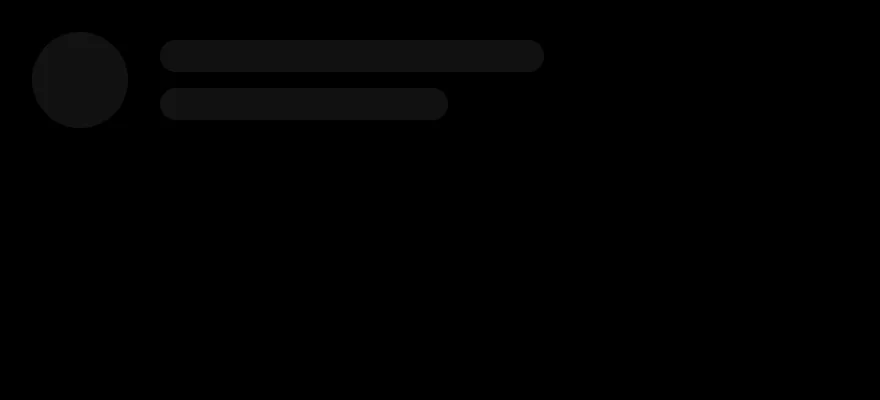
Profile

Sketches an avatar beside two lines of text.

import { Skeleton } from "@/components/ui/skeleton"

export default function SkeletonProfile() {
  return (
    <div className="flex items-center gap-4">
      <Skeleton className="size-12 rounded-full" />
      <div className="flex flex-col gap-2">
        <Skeleton className="h-4 w-48" />
        <Skeleton className="h-4 w-32" />
      </div>
    </div>
  )
}

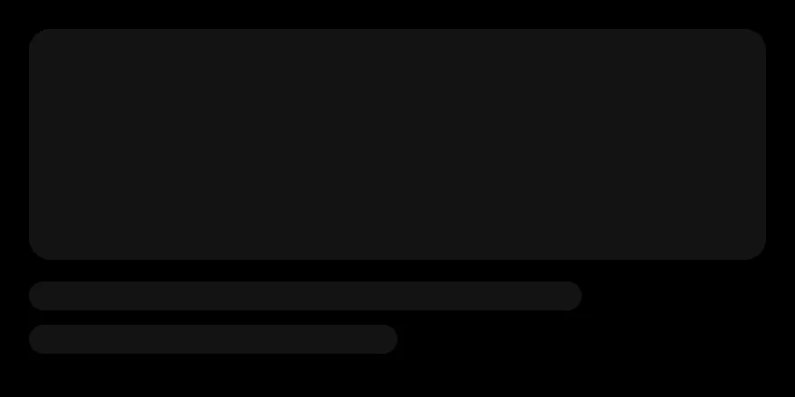
Card

Sketches a media card with an image and two lines of text.

import { Skeleton } from "@/components/ui/skeleton"

export default function SkeletonCard() {
  return (
    <div className="flex w-72 flex-col gap-3">
      <Skeleton className="aspect-video w-full" />
      <Skeleton className="h-4 w-3/4" />
      <Skeleton className="h-4 w-1/2" />
    </div>
  )
}

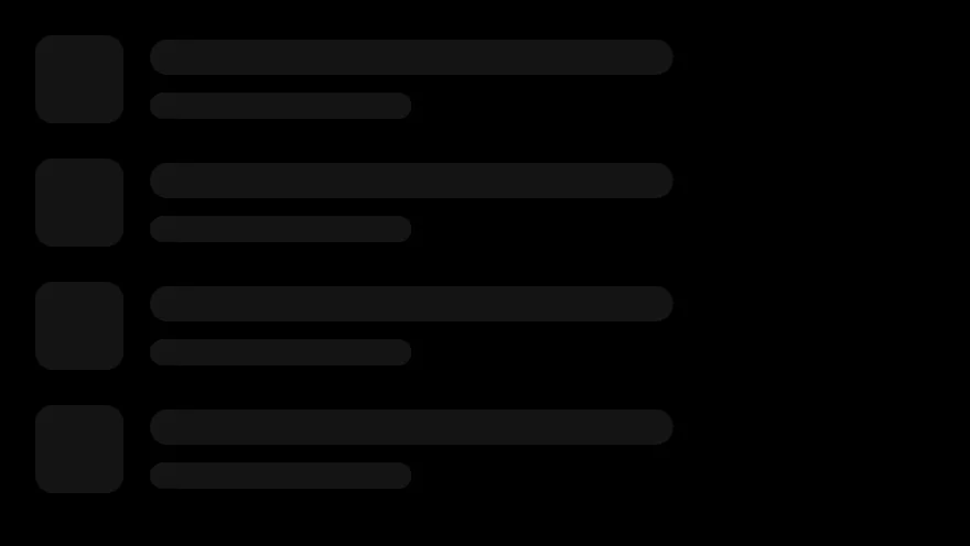
List

Sketches a list of rows, each with an icon and two lines of text.

import { Skeleton } from "@/components/ui/skeleton"

export default function SkeletonList() {
  return (
    <div className="flex w-80 flex-col gap-4">
      {Array.from({ length: 4 }, (_, index) => (
        <div key={index} className="flex items-center gap-3">
          <Skeleton className="size-9 rounded-xl" />
          <div className="flex flex-1 flex-col gap-2">
            <Skeleton className="h-3.5 w-2/3" />
            <Skeleton className="h-3 w-1/3" />
          </div>
        </div>
      ))}
    </div>
  )
}

API Reference

01

Skeleton

A pulsing placeholder block.

Also accepts the props of React.ComponentProps<"div">.

Accessibility

  • Skeleton renders an empty div with no role or text, so it isn't announced. Let assistive technologies know content is loading another way, for example with aria-busy on the region that's loading.

Notes

  • Uses data-slot="skeleton", the animate-pulse animation and the bg-muted token.
iOS
Skeleton on iOS in light modeSkeleton on iOS in dark mode
import { Skeleton } from "@/components/ui/skeleton"

export function SkeletonExample() {
  return (
    <Skeleton className="h-4 w-48" />
  )
}
import EsuissUI
import SwiftUI

struct SkeletonExample: View {
  var body: some View {
    Skeleton()
      .frame(width: 192, height: 16)
  }
}
import androidx.compose.foundation.layout.height
import androidx.compose.foundation.layout.width
import androidx.compose.runtime.Composable
import androidx.compose.ui.Modifier
import androidx.compose.ui.unit.dp
import com.esuiss.ui.components.Skeleton

@Composable
fun SkeletonExample() {
    Skeleton(Modifier.width(192.dp).height(16.dp))
}

Skeleton is a Reanimated View with a rounded background whose opacity pulses between 1 and 0.5 on a loop. It has no fixed size; you shape it with classes to match the content it stands in for.

Installation

$ pnpm dlx shadcn@latest add @esuiss-rn/skeleton

See Installation for the components.json setup. Or use the suiss/ui CLI:

$ pnpm dlx @esuiss/ui@latest add skeleton
$ pnpm dlx @esuiss/ui@latest add skeleton --platform swift
$ pnpm dlx @esuiss/ui@latest add skeleton --platform kotlin

Manual

  1. Install the dependencies:
npx expo install cn react-native-reanimated react-native-worklets
  1. Copy the source into components/ui/skeleton.tsx:
uniwind/components/ui/skeleton.tsx
import { cn } from "cn"
import * as React from "react"
import type { View } from "react-native"
import Animated, {
  useAnimatedStyle,
  useSharedValue,
  withRepeat,
  withTiming,
} from "react-native-reanimated"

const duration = 1000

function Skeleton({
  className,
  style,
  ...props
  1. Update the import paths to match your project.
  1. Install the dependencies:
npx expo install cn react-native-reanimated react-native-worklets
  1. Copy the source into components/ui/skeleton.tsx:
nativewind/components/ui/skeleton.tsx
import { cn } from "cn"
import * as React from "react"
import type { View } from "react-native"
import Animated, {
  useAnimatedStyle,
  useSharedValue,
  withRepeat,
  withTiming,
} from "react-native-reanimated"

const duration = 1000

function Skeleton({
  className,
  style,
  ...props
  1. Update the import paths to match your project.
  1. Install the dependencies:
npx expo install react-native-reanimated react-native-worklets
  1. Copy the source into components/ui/skeleton.tsx:
stylesheet/components/ui/skeleton.tsx
import * as React from "react"
import { StyleSheet, type View } from "react-native"
import Animated, {
  useAnimatedStyle,
  useSharedValue,
  withRepeat,
  withTiming,
} from "react-native-reanimated"
import { radius, useTheme } from "@/components/ui/theme"

const duration = 1000

const styles = StyleSheet.create({
  root: { borderRadius: radius.md },
})
  1. Update the import paths to match your project.
  1. Target iOS 17 or later.

  2. Copy the theme files every view uses:

swift/Theme/Theme.swift
import SwiftUI
import UIKit

struct RGBA: Sendable {
  let red: CGFloat
  let green: CGFloat
  let blue: CGFloat
  let alpha: CGFloat

  init(_ hex: UInt32, _ alpha: CGFloat = 1) {
    red = CGFloat((hex >> 16) & 0xFF) / 255
    green = CGFloat((hex >> 8) & 0xFF) / 255
    blue = CGFloat(hex & 0xFF) / 255
    self.alpha = alpha
  }
swift/Theme/Tokens.swift
import SwiftUI

public enum EsuissColor {
  public static let background = Color.adaptive(light: .init(0xFFFFFF), dark: .init(0x000000))
  public static let foreground = Color.adaptive(light: .init(0x1D1D1F), dark: .init(0xF5F5F7))
  public static let card = Color.adaptive(light: .init(0xFFFFFF), dark: .init(0x1D1D1F))
  public static let cardForeground = Color.adaptive(light: .init(0x1D1D1F), dark: .init(0xF5F5F7))
  public static let popover = Color.adaptive(light: .init(0xFFFFFF), dark: .init(0x1D1D1F))
  public static let popoverForeground = Color.adaptive(light: .init(0x1D1D1F), dark: .init(0xF5F5F7))
  public static let primary = Color.adaptive(light: .init(0x0071E3), dark: .init(0x2997FF))
  public static let primaryForeground = Color.adaptive(light: .init(0xFFFFFF), dark: .init(0xFFFFFF))
  public static let secondary = Color.adaptive(light: .init(0x000000, 0.04), dark: .init(0xFFFFFF, 0.1))
  public static let secondaryForeground = Color.adaptive(light: .init(0x1D1D1F), dark: .init(0xF5F5F7))
  public static let muted = Color.adaptive(light: .init(0xF5F5F7), dark: .init(0x161617))
  public static let mutedForeground = Color.adaptive(light: .init(0x6E6E73), dark: .init(0xA1A1A6))
  public static let accent = Color.adaptive(light: .init(0x000000, 0.06), dark: .init(0xFFFFFF, 0.1))
  1. Copy the source:
swift/Components/Skeleton.swift
import SwiftUI

public struct Skeleton: View {
  let cornerRadius: CGFloat

  @Environment(\.accessibilityReduceMotion) private var reduceMotion
  @State private var dimmed = false

  public init(cornerRadius: CGFloat = Radius.md) {
    self.cornerRadius = cornerRadius
  }

  public var body: some View {
    RoundedRectangle(cornerRadius: cornerRadius, style: .continuous)
      .fill(EsuissColor.muted)
      .opacity(dimmed ? 0.5 : 1)
  1. Add the files to your app target.
  1. Set minSdk to 24 or higher and add the dependencies:
build.gradle.kts
implementation(platform("androidx.compose:compose-bom:2026.09.00"))
implementation("androidx.compose.foundation:foundation")
implementation("androidx.compose.ui:ui")
  1. Copy the theme files every view uses:
kotlin/theme/Theme.kt
package com.esuiss.ui.theme

import androidx.compose.foundation.isSystemInDarkTheme
import androidx.compose.runtime.Composable
import androidx.compose.runtime.CompositionLocalProvider
import androidx.compose.runtime.Immutable
import androidx.compose.runtime.staticCompositionLocalOf
import androidx.compose.ui.Modifier
import androidx.compose.ui.draw.dropShadow
import androidx.compose.ui.graphics.Color
import androidx.compose.ui.graphics.Shape
import androidx.compose.ui.graphics.shadow.Shadow as DropShadow
import androidx.compose.ui.text.TextStyle
import androidx.compose.ui.text.style.LineHeightStyle
import androidx.compose.ui.unit.Dp
import androidx.compose.ui.unit.DpOffset
kotlin/theme/Tokens.kt
package com.esuiss.ui.theme

import androidx.compose.runtime.Immutable
import androidx.compose.ui.graphics.Color
import androidx.compose.ui.unit.dp

@Immutable
data class Colors(
    val background: Color,
    val foreground: Color,
    val card: Color,
    val cardForeground: Color,
    val popover: Color,
    val popoverForeground: Color,
    val primary: Color,
    val primaryForeground: Color,
  1. Copy the source and every file it uses:
kotlin/components/Skeleton.kt
package com.esuiss.ui.components

import androidx.compose.animation.core.LinearEasing
import androidx.compose.animation.core.RepeatMode
import androidx.compose.animation.core.animateFloat
import androidx.compose.animation.core.infiniteRepeatable
import androidx.compose.animation.core.rememberInfiniteTransition
import androidx.compose.animation.core.tween
import androidx.compose.foundation.background
import androidx.compose.foundation.layout.Box
import androidx.compose.foundation.shape.RoundedCornerShape
import androidx.compose.runtime.Composable
import androidx.compose.runtime.getValue
import androidx.compose.ui.Modifier
import androidx.compose.ui.graphics.Shape
import androidx.compose.ui.graphics.graphicsLayer
kotlin/components/FormSupport.kt
package com.esuiss.ui.components

import android.provider.Settings
import androidx.compose.animation.core.CubicBezierEasing
import androidx.compose.foundation.background
import androidx.compose.foundation.border
import androidx.compose.foundation.gestures.Orientation
import androidx.compose.foundation.text.selection.TextSelectionColors
import androidx.compose.runtime.Composable
import androidx.compose.runtime.mutableStateOf
import androidx.compose.runtime.remember
import androidx.compose.ui.Modifier
import androidx.compose.ui.draw.alpha
import androidx.compose.ui.draw.clip
import androidx.compose.ui.draw.drawWithContent
import androidx.compose.ui.geometry.Offset
  1. Update the com.esuiss.ui package names to match your project.

Usage

import { Skeleton } from "@/components/ui/skeleton"
<Skeleton className="h-4 w-48" />

Set width, height and radius through className, for example h-4 w-48 for a line of text or size-12 rounded-full for an avatar. Compose several skeletons to mirror the layout of the loaded content, then swap them for the real content once it arrives.

Examples

Profile

An avatar circle with two lines of text.

iOS
Skeleton (profile) on iOS in light modeSkeleton (profile) on iOS in dark mode
import { View } from "react-native"
import { Skeleton } from "@/components/ui/skeleton"

export function SkeletonProfileExample() {
  return (
    <View className="flex-row items-center gap-4">
      <Skeleton className="size-12 rounded-full" />
      <View className="gap-2">
        <Skeleton className="h-4 w-48" />
        <Skeleton className="h-4 w-36" />
      </View>
    </View>
  )
}
import EsuissUI
import SwiftUI

struct SkeletonProfileExample: View {
  var body: some View {
    HStack(spacing: 16) {
      Skeleton(cornerRadius: Radius.full)
        .frame(width: 48, height: 48)
      VStack(alignment: .leading, spacing: 8) {
        Skeleton().frame(width: 192, height: 16)
        Skeleton().frame(width: 144, height: 16)
      }
    }
  }
}
import androidx.compose.foundation.layout.Arrangement
import androidx.compose.foundation.layout.Column
import androidx.compose.foundation.layout.Row
import androidx.compose.foundation.layout.height
import androidx.compose.foundation.layout.size
import androidx.compose.foundation.layout.width
import androidx.compose.foundation.shape.CircleShape
import androidx.compose.runtime.Composable
import androidx.compose.ui.Alignment
import androidx.compose.ui.Modifier
import androidx.compose.ui.unit.dp
import com.esuiss.ui.components.Skeleton

@Composable
fun SkeletonProfile() {
    Row(horizontalArrangement = Arrangement.spacedBy(16.dp), verticalAlignment = Alignment.CenterVertically) {
        Skeleton(Modifier.size(48.dp), shape = CircleShape)
        Column(verticalArrangement = Arrangement.spacedBy(8.dp)) {
            Skeleton(Modifier.width(192.dp).height(16.dp))
            Skeleton(Modifier.width(144.dp).height(16.dp))
        }
    }
}

Card

A media block with two lines of text below it.

iOS
Skeleton (card) on iOS in light modeSkeleton (card) on iOS in dark mode
import { View } from "react-native"
import { Skeleton } from "@/components/ui/skeleton"

export function SkeletonCardExample() {
  return (
    <View className="gap-3">
      <Skeleton className="h-32 w-full rounded-xl" />
      <View className="gap-2">
        <Skeleton className="h-4 w-3/4" />
        <Skeleton className="h-4 w-1/2" />
      </View>
    </View>
  )
}
import EsuissUI
import SwiftUI

struct SkeletonCardExample: View {
  var body: some View {
    VStack(alignment: .leading, spacing: 12) {
      Skeleton(cornerRadius: Radius.xl)
        .frame(height: 128)
        .frame(maxWidth: .infinity)
      GeometryReader { proxy in
        VStack(alignment: .leading, spacing: 8) {
          Skeleton().frame(width: proxy.size.width * 0.75, height: 16)
          Skeleton().frame(width: proxy.size.width * 0.5, height: 16)
        }
      }
      .frame(height: 40)
    }
  }
}
import androidx.compose.foundation.layout.Arrangement
import androidx.compose.foundation.layout.Column
import androidx.compose.foundation.layout.fillMaxWidth
import androidx.compose.foundation.layout.height
import androidx.compose.foundation.shape.RoundedCornerShape
import androidx.compose.runtime.Composable
import androidx.compose.ui.Modifier
import androidx.compose.ui.unit.dp
import com.esuiss.ui.components.Skeleton
import com.esuiss.ui.theme.Radius

@Composable
fun SkeletonCard() {
    Column(Modifier.fillMaxWidth(), verticalArrangement = Arrangement.spacedBy(12.dp)) {
        Skeleton(Modifier.fillMaxWidth().height(128.dp), shape = RoundedCornerShape(Radius.xl))
        Column(Modifier.fillMaxWidth(), verticalArrangement = Arrangement.spacedBy(8.dp)) {
            Skeleton(Modifier.fillMaxWidth(0.75f).height(16.dp))
            Skeleton(Modifier.fillMaxWidth(0.5f).height(16.dp))
        }
    }
}

List

Rows with a thumbnail and two lines of text.

iOS
Skeleton (list) on iOS in light modeSkeleton (list) on iOS in dark mode
import { View } from "react-native"
import { Skeleton } from "@/components/ui/skeleton"

export function SkeletonListExample() {
  return (
    <View className="gap-4">
      {["one", "two", "three", "four"].map((key) => (
        <View key={key} className="flex-row items-center gap-3">
          <Skeleton className="size-10 rounded-md" />
          <View className="flex-1 gap-2">
            <Skeleton className="h-4 w-2/3" />
            <Skeleton className="h-3 w-1/3" />
          </View>
        </View>
      ))}
    </View>
  )
}
import EsuissUI
import SwiftUI

struct SkeletonListExample: View {
  var body: some View {
    VStack(alignment: .leading, spacing: 16) {
      ForEach(["one", "two", "three", "four"], id: \.self) { _ in
        HStack(spacing: 12) {
          Skeleton(cornerRadius: Radius.md)
            .frame(width: 40, height: 40)
          GeometryReader { proxy in
            VStack(alignment: .leading, spacing: 8) {
              Skeleton().frame(width: proxy.size.width * 2 / 3, height: 16)
              Skeleton().frame(width: proxy.size.width / 3, height: 12)
            }
            .frame(maxHeight: .infinity)
          }
          .frame(height: 40)
        }
      }
    }
  }
}
import androidx.compose.foundation.layout.Arrangement
import androidx.compose.foundation.layout.Column
import androidx.compose.foundation.layout.Row
import androidx.compose.foundation.layout.fillMaxWidth
import androidx.compose.foundation.layout.height
import androidx.compose.foundation.layout.size
import androidx.compose.foundation.shape.RoundedCornerShape
import androidx.compose.runtime.Composable
import androidx.compose.ui.Alignment
import androidx.compose.ui.Modifier
import androidx.compose.ui.unit.dp
import com.esuiss.ui.components.Skeleton
import com.esuiss.ui.theme.Radius

@Composable
fun SkeletonList() {
    Column(Modifier.fillMaxWidth(), verticalArrangement = Arrangement.spacedBy(16.dp)) {
        repeat(4) {
            Row(horizontalArrangement = Arrangement.spacedBy(12.dp), verticalAlignment = Alignment.CenterVertically) {
                Skeleton(Modifier.size(40.dp), shape = RoundedCornerShape(Radius.md))
                Column(Modifier.weight(1f), verticalArrangement = Arrangement.spacedBy(8.dp)) {
                    Skeleton(Modifier.fillMaxWidth(2f / 3f).height(16.dp))
                    Skeleton(Modifier.fillMaxWidth(1f / 3f).height(12.dp))
                }
            }
        }
    }
}

API Reference

01

Skeleton

Also accepts the props of React.ComponentProps<typeof View>, React.RefAttributes<View>.

Accessibility

  • The skeleton is a plain view with no role or label. If loading state matters to the user, announce it elsewhere, for example with a Spinner that has an accessibilityLabel.

Notes

  • Uses the bg-muted token.
  • The pulse runs on the UI thread through Reanimated, with a 1000 ms cycle.
  • Light and dark colors follow the system appearance.
NextSliderPreviousSignature Pad

On this page

  1. 01Installation
    • CLI
    • Manual
  2. 02Usage
  3. 03Examples
    • Profile
    • Card
    • List
  4. 04API Reference
    • Skeleton
  5. 05Accessibility
  6. 06Notes
  7. 07Installation
    • Manual
  8. 08Usage
  9. 09Examples
    • Profile
    • Card
    • List
  10. 10API Reference
    • Skeleton
  11. 11Accessibility
  12. 12Notes