suiss/ui
  • Docs
  • Components
  • Patterns
  • Interactions
  • Charts
  • Blocks
GitHubGet started
DocsComponentsPatternsInteractionsChartsBlocks
Components82
  • Overview
  • Accordion
  • Alert
  • Alert Dialog
  • Alert Sheet
  • Amount Input
  • Aspect Ratio
  • Attachment
  • Avatar
  • Badge
  • Bottom Bar
  • Breadcrumb
  • Bubble
  • Button
  • Button Group
  • Calendar
  • Card
  • Carousel
  • Chart
  • Checkbox
  • Chip
  • Collapsible
  • Combobox
  • Command
  • Context Menu
  • Dialog
  • Direction
  • Drawer
  • Dropdown Menu
  • Empty
  • FAB
  • Field
  • Fullscreen Menu
  • Haptics
  • Header
  • Hover Card
  • Icon
  • Input
  • Input Accessory Bar
  • Input Group
  • Input OTP
  • Item
  • Kbd
  • Keyboard Scroll View
  • Keypad
  • Label
  • Marker
  • Menubar
  • Message
  • Message Scroller
  • Native Select
  • Navigation Menu
  • Page Indicator
  • Pagination
  • Pin Pad
  • Popover
  • Progress
  • QR Scanner
  • Questionnaire
  • Radio Group
  • Resizable
  • Screen
  • Scroll Area
  • Select
  • Separator
  • Sheet
  • Sidebar
  • Signature Pad
  • Skeleton
  • Slider
  • Spinner
  • Switch
  • Tab Bar
  • Table
  • Tabs
  • Text
  • Textarea
  • Toast
  • Toggle
  • Toggle Group
  • Tooltip
  • Wheel Picker
  • Widget

suiss/ui · Component

Accordion

A vertically stacked set of headings that each reveal a section of content.

Accordion is an open-source component from suiss/ui for React, React Native, SwiftUI and Jetpack Compose. The @esuiss/ui CLI copies its source into your project, so you own the code.

import {
  Accordion,
  AccordionContent,
  AccordionItem,
  AccordionTrigger,
} from "@/components/ui/accordion"

const items = [
  {
    value: "shipping",
    title: "How long does shipping take?",
    content:
      "Orders ship within two business days and arrive in three to five days.",
  },
  {
    value: "returns",
    title: "Can I return an item?",
    content:
      "Items can be returned within 14 days of delivery for a full refund.",
  },
  {
    value: "support",
    title: "How do I contact support?",
    content:
      "Reach the support team from the help center, available around the clock.",
  },
]

export default function AccordionDemo() {
  return (
    <div className="w-96">
      <Accordion>
        {items.map((item) => (
          <AccordionItem key={item.value} value={item.value}>
            <AccordionTrigger>{item.title}</AccordionTrigger>
            <AccordionContent>{item.content}</AccordionContent>
          </AccordionItem>
        ))}
      </Accordion>
    </div>
  )
}

Accordion wraps the accordion primitive of the chosen base. An Accordion holds one or more AccordionItem parts; each item pairs an AccordionTrigger with an AccordionContent panel. The trigger renders inside a heading element and shows a caret that flips between down and up as the panel opens and closes.

Use an accordion to shorten long pages of related content, such as FAQs or settings groups, where people only need one or a few sections at a time. For a single show-and-hide region, a collapsible is a lighter fit.

Installation

CLI

$ pnpm dlx shadcn@latest add @esuiss/accordion

Works in any project with a components.json. See Installation for the one-line registry setup. Or use the suiss/ui CLI:

$ pnpm dlx @esuiss/ui@latest add accordion

Manual

  1. Install the dependencies and add the cn helper:
$ pnpm add @base-ui/react @phosphor-icons/react class-variance-authority
  1. Copy the source into components/ui/accordion.tsx:
  1. Update the import paths to match your project.

Usage

import { Accordion, AccordionItem, AccordionTrigger, AccordionContent } 
<div


Give each AccordionItem a unique value. By default only one panel is open at a time; opening another closes the previous one. Set multiple on Accordion to let several panels stay open.

The open state is an array of item values. Use defaultValue (for example ["shipping"]) for uncontrolled use, or value with onValueChange to control it.

Examples

Filled

The filled variant places the items on a rounded bg-muted surface.

By default

Opens an item on first render with defaultValue.

Multiple

Keeps several panels open at once with multiple.

API Reference

Anatomy4 parts
<Accordion>
<AccordionItem>
<AccordionTrigger />
<AccordionContent />
</AccordionItem>
</Accordion>
01

Accordion

The root that groups items and manages which panels are open.

PropTypeDefaultDescription
variant"default" | "filled""default"Visual style. default is plain with dividers; filled adds a rounded bg-muted container.

Also accepts the props of the primitive part it wraps.

02

AccordionItem

A single section that pairs a trigger with its panel, identified by value.

Also accepts the props of the primitive part it wraps.

03

AccordionTrigger

The button, inside a heading, that toggles its item's panel and shows the caret indicator.

Also accepts the props of the primitive part it wraps.

04

AccordionContent

The collapsible panel holding the item's content.

Also accepts the props of the primitive part it wraps.

Accessibility

  • Each trigger is a button with aria-expanded reflecting its panel's state.
  • Triggers are wrapped in a heading element.
  • Triggers are reachable with Tab; Enter and Space toggle the focused panel.
  • Disabled triggers receive aria-disabled and are dimmed with opacity-50.

Notes

  • Styling hooks: data-slot="accordion", "accordion-item", "accordion-trigger", "accordion-trigger-icon" and "accordion-content".
  • The panel animates with animate-accordion-down and animate-accordion-up on data-open and data-closed.
  • className on AccordionContent applies to the inner padded wrapper, not the animated panel.

Accordion groups AccordionItems, each with an AccordionTrigger and an AccordionContent panel. The root and items are Reanimated views with a layout transition, so items below move smoothly as a panel opens or closes, and the trigger's caret rotates as it opens.

The default variant draws items on the page background separated by hairlines. The filled variant puts the whole list on a rounded bg-muted surface, which suits grouped settings or FAQ cards.
Installation

$ pnpm dlx shadcn@latest add @esuiss-rn/accordion

See Installation for the components.json setup. Or use the suiss/ui CLI:

$ pnpm dlx @esuiss/ui@latest add accordion
$ pnpm dlx @esuiss/ui@latest add accordion --platform swift
NextAlertPreviousComponents

On this page

  1. 01Installation
    • CLI
    • Manual
  2. 02Usage
  3. 03Examples
    • Filled
    • By default
    • Multiple
  4. 04API Reference
    • Accordion
    • AccordionItem
    • AccordionTrigger
    • AccordionContent
  5. 05Accessibility
  6. 06Notes
  7. 07Installation
    • Manual
  8. 08Usage
  9. 09Examples
    • Default
    • Filled
    • Multiple
  10. 10API Reference
    • Accordion
    • AccordionItem
    • AccordionTrigger
    • AccordionContent
  11. 11Accessibility
  12. 12Notes
from
"@/components/ui/accordion"
className
=
"w-96"
>
<Accordion>
{items.map((item) => (
<AccordionItem key={item.value} value={item.value}>
<AccordionTrigger>{item.title}</AccordionTrigger>
<AccordionContent>{item.content}</AccordionContent>
</AccordionItem>
))}
</Accordion>
</div>
$ pnpm dlx @esuiss/ui@latest add accordion --platform kotlin

The CLI also adds what it builds on: Icon, Text.

Manual

  1. Install the dependencies:
npx expo install class-variance-authority cn phosphor-react-native react-native-reanimated react-native-svg react-native-worklets
  1. Add the pieces it builds on: Icon, Text, and the primitives components/primitives/accordion.tsx, components/primitives/use-render.tsx.

  2. Copy the source into components/ui/accordion.tsx:

uniwind/components/ui/accordion.tsx
import { cva, type VariantProps } from "class-variance-authority"
import { cn } from "cn"
import { CaretDownIcon } from "phosphor-react-native"
import * as React from "react"
import type { GestureResponderEvent } from "react-native"
import Animated, {
  FadeOutUp,
  LayoutAnimationConfig,
  LinearTransition,
  ReduceMotion,
  useAnimatedStyle,
  useDerivedValue,
  withTiming,
} from "react-native-reanimated"
import * as AccordionPrimitive from "@/components/primitives/accordion"
import { resolveClassName } from "@/components/primitives/use-render"
  1. Update the import paths to match your project.
  1. Install the dependencies:
npx expo install class-variance-authority cn phosphor-react-native react-native-reanimated react-native-svg react-native-worklets
  1. Add the pieces it builds on: Icon, Text, and the primitives components/primitives/accordion.tsx, components/primitives/use-render.tsx.

  2. Copy the source into components/ui/accordion.tsx:

  1. Update the import paths to match your project.
  1. Install the dependencies:
npx expo install phosphor-react-native react-native-reanimated react-native-svg react-native-worklets
  1. Add the pieces it builds on: Icon, Text, and the primitives components/primitives/accordion.tsx, components/primitives/use-render.tsx.

  2. Copy the source into components/ui/accordion.tsx:

  1. Update the import paths to match your project.
  1. Target iOS 17 or later.

  2. Add the Swift package to your app:

Package.swift
.package(url: "https://github.com/phosphor-icons/swift", from: "2.1.0")
  1. Copy the theme files every view uses:
swift/Theme/Theme.swift
import SwiftUI
import UIKit

struct RGBA: Sendable {
  let red: CGFloat
  let green: CGFloat
  let blue: CGFloat
  let alpha: CGFloat

  init(_ hex: UInt32, _ alpha: CGFloat = 1) {
    red = CGFloat((hex >> 16) & 0xFF) / 255
    green = CGFloat((hex >> 8) & 0xFF) / 255
    blue = CGFloat(hex & 0xFF) / 255
    self.alpha = alpha
  }
swift/Theme/Tokens.swift
import SwiftUI

public enum EsuissColor {
  public static let background = Color.adaptive(light: .init(0xFFFFFF), dark: .init(0x000000))
  public static let foreground = Color.adaptive(light: .init(0x1D1D1F), dark: .init(0xF5F5F7))
  public static let card = Color.adaptive(light: .init(0xFFFFFF), dark: .init(0x1D1D1F))
  public static let cardForeground = Color.adaptive(light: .init(0x1D1D1F), dark: .init(0xF5F5F7))
  public static let popover = Color.adaptive(light: .init(0xFFFFFF), dark: .init(0x1D1D1F))
  public static let popoverForeground = Color.adaptive(light: .init(0x1D1D1F), dark: .init(0xF5F5F7))
  public static let primary = Color.adaptive(light: .init(0x0071E3), dark: .init(0x2997FF))
  public static let primaryForeground = Color.adaptive(light: .init(0xFFFFFF), dark: .init(0xFFFFFF))
  public static let secondary = Color.adaptive(light: .init(0x000000, 0.04), dark: .init(0xFFFFFF, 0.1))
  public static let secondaryForeground = Color.adaptive(light: .init(0x1D1D1F), dark: .init(0xF5F5F7))
  public static let muted = Color.adaptive(light: .init(0xF5F5F7), dark: .init(0x161617))
  public static let mutedForeground = Color.adaptive(light: .init(0x6E6E73), dark: .init(0xA1A1A6))
  public static let accent = Color.adaptive(light: .init(0x000000, 0.06), dark: .init(0xFFFFFF, 0.1))
  1. Copy the source:
swift/Components/Accordion.swift
import PhosphorSwift
import SwiftUI

public struct Accordion<Content: View>: View {
  public enum Variant: CaseIterable, Sendable {
    case `default`, filled
  }

  let variant: Variant
  let multiple: Bool
  let external: Binding<Set<AnyHashable>>?
  let content: Content

  @State private var local: Set<AnyHashable> = []
  @Environment(\.accessibilityReduceMotion) private var reduceMotion
  1. Add the files to your app target.
  1. Set minSdk to 24 or higher and add the dependencies:
build.gradle.kts
implementation(platform("androidx.compose:compose-bom:2026.09.00"))
implementation("androidx.compose.foundation:foundation")
implementation("androidx.compose.ui:ui")
implementation("com.adamglin:phosphor-icon-android:1.0.0")
  1. Copy the theme files every view uses:
kotlin/theme/Theme.kt
package com.esuiss.ui.theme

import androidx.compose.foundation.isSystemInDarkTheme
import androidx.compose.runtime.Composable
import androidx.compose.runtime.CompositionLocalProvider
import androidx.compose.runtime.Immutable
import androidx.compose.runtime.staticCompositionLocalOf
import androidx.compose.ui.Modifier
import androidx.compose.ui.draw.dropShadow
import androidx.compose.ui.graphics.Color
import androidx.compose.ui.graphics.Shape
import androidx.compose.ui.graphics.shadow.Shadow as DropShadow
import androidx.compose.ui.text.TextStyle
import androidx.compose.ui.text.style.LineHeightStyle
import androidx.compose.ui.unit.Dp
import androidx.compose.ui.unit.DpOffset
kotlin/theme/Tokens.kt
package com.esuiss.ui.theme

import androidx.compose.runtime.Immutable
import androidx.compose.ui.graphics.Color
import androidx.compose.ui.unit.dp

@Immutable
data class Colors(
    val background: Color,
    val foreground: Color,
    val card: Color,
    val cardForeground: Color,
    val popover: Color,
    val popoverForeground: Color,
    val primary: Color,
    val primaryForeground: Color,
  1. Copy the source and every file it uses:
kotlin/components/Accordion.kt
package com.esuiss.ui.components

import androidx.compose.animation.AnimatedVisibility
import androidx.compose.animation.core.animateFloatAsState
import androidx.compose.animation.core.tween
import androidx.compose.animation.expandVertically
import androidx.compose.animation.fadeIn
import androidx.compose.animation.fadeOut
import androidx.compose.animation.shrinkVertically
import androidx.compose.foundation.background
import androidx.compose.foundation.clickable
import androidx.compose.foundation.interaction.MutableInteractionSource
import androidx.compose.foundation.interaction.collectIsPressedAsState
import androidx.compose.foundation.layout.Arrangement
import androidx.compose.foundation.layout.Column
import androidx.compose.foundation.layout.ColumnScope
kotlin/components/Button.kt
package com.esuiss.ui.components

import androidx.compose.foundation.background
import androidx.compose.foundation.border
import androidx.compose.foundation.clickable
import androidx.compose.foundation.interaction.MutableInteractionSource
import androidx.compose.foundation.interaction.collectIsPressedAsState
import androidx.compose.foundation.layout.Arrangement
import androidx.compose.foundation.layout.Row
import androidx.compose.foundation.layout.RowScope
import androidx.compose.foundation.layout.fillMaxWidth
import androidx.compose.foundation.layout.height
import androidx.compose.foundation.layout.padding
import androidx.compose.foundation.layout.size
import androidx.compose.foundation.shape.CircleShape
import androidx.compose.foundation.shape.RoundedCornerShape
kotlin/components/ButtonGroup.kt
package com.esuiss.ui.components

import androidx.compose.foundation.background
import androidx.compose.foundation.gestures.Orientation
import androidx.compose.foundation.layout.Arrangement
import androidx.compose.foundation.layout.Box
import androidx.compose.foundation.layout.Row
import androidx.compose.foundation.layout.RowScope
import androidx.compose.foundation.layout.padding
import androidx.compose.foundation.shape.CircleShape
import androidx.compose.foundation.shape.CornerSize
import androidx.compose.foundation.shape.RoundedCornerShape
import androidx.compose.runtime.Composable
import androidx.compose.runtime.CompositionLocalProvider
import androidx.compose.runtime.DisposableEffect
import androidx.compose.runtime.Immutable
kotlin/components/Content.kt
package com.esuiss.ui.components

import androidx.compose.runtime.compositionLocalOf
import androidx.compose.ui.graphics.Color
import androidx.compose.ui.text.TextStyle
import androidx.compose.ui.unit.Dp
import androidx.compose.ui.unit.dp

val LocalContentStyle = compositionLocalOf { TextStyle.Default }

val LocalContentColor = compositionLocalOf { Color.Unspecified }

val LocalIconSize = compositionLocalOf { 20.dp }
kotlin/components/Icon.kt
package com.esuiss.ui.components

import androidx.compose.foundation.Image
import androidx.compose.foundation.layout.size
import androidx.compose.runtime.Composable
import androidx.compose.ui.Modifier
import androidx.compose.ui.graphics.Color
import androidx.compose.ui.graphics.ColorFilter
import androidx.compose.ui.graphics.takeOrElse
import androidx.compose.ui.graphics.vector.ImageVector
import androidx.compose.ui.unit.Dp
import com.esuiss.ui.theme.EsuissTheme

@Composable
fun Icon(
    imageVector: ImageVector,
  1. Update the com.esuiss.ui package names to match your project.

Usage

import { Accordion, AccordionItem, AccordionTrigger, AccordionContent } from "@/components/ui/accordion"
<Accordion defaultValue={["item-2"]}>
  <AccordionItems />
</Accordion>

Give each AccordionItem a value. By default only one item is open at a time; set multiple to let several stay open.

Use defaultValue (an array of item values) for uncontrolled state, or value with onValueChange to control it. Set disabled on the root or on a single item to block toggling, and keepMounted to keep closed panels mounted.

accordionVariants is also exported if you need the classes elsewhere.

Examples

Default

iOS
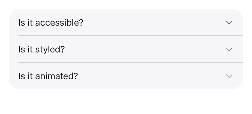
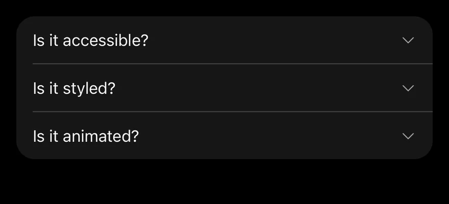
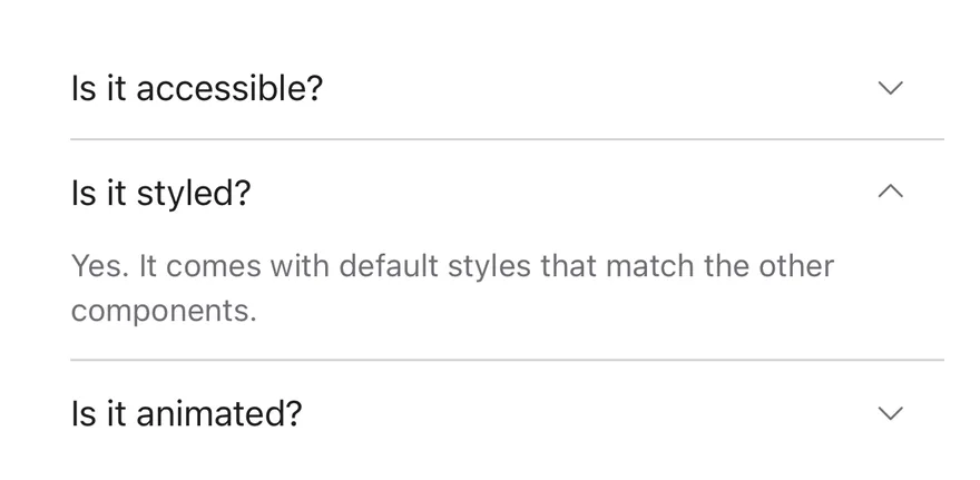
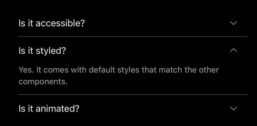
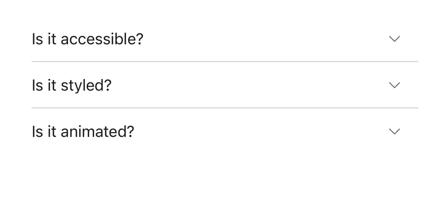
Accordion on iOS in light modeAccordion on iOS in dark mode
import { Accordion, AccordionContent, AccordionItem, AccordionTrigger } from "@/components/ui/accordion"
import { Text } from "@/components/ui/text"

const items = [
  {
    value: "item-1",
    title: "Is it accessible?",
    content: "Yes. It works with VoiceOver and TalkBack.",
  },
  {
    value: "item-2",
    title: "Is it styled?",
    content:
      "Yes. It comes with default styles that match the other components.",
  },
  {
    value: "item-3",
    title: "Is it animated?",
    content: "Yes. It animates open and closed by default.",
  },
]

function AccordionItems() {
  return items.map((item) => (
    <AccordionItem key={item.value} value={item.value}>
      <AccordionTrigger>
        <Text>{item.title}</Text>
      </AccordionTrigger>
      <AccordionContent>
        <Text>{item.content}</Text>
      </AccordionContent>
    </AccordionItem>
  ))
}

export function AccordionExample() {
  return (
    <Accordion>
      <AccordionItems />
    </Accordion>
  )
}
import EsuissUI
import SwiftUI

struct AccordionExample: View {
  var body: some View {
    Accordion {
      AccordionItems()
    }
  }
}

struct AccordionEntry: Identifiable {
  let value: String
  let title: LocalizedStringKey
  let content: LocalizedStringKey

  var id: String { value }
}

let accordionEntries = [
  AccordionEntry(value: "item-1", title: "Is it accessible?", content: "Yes. It works with VoiceOver and TalkBack."),
  AccordionEntry(
    value: "item-2",
    title: "Is it styled?",
    content: "Yes. It comes with default styles that match the other components."
  ),
  AccordionEntry(value: "item-3", title: "Is it animated?", content: "Yes. It animates open and closed by default."),
]

struct AccordionItems: View {
  var body: some View {
    ForEach(accordionEntries) { entry in
      AccordionItem(entry.title, value: entry.value) {
        Text(entry.content)
      }
    }
  }
}
import androidx.compose.runtime.Composable
import androidx.compose.runtime.getValue
import androidx.compose.runtime.mutableStateOf
import androidx.compose.runtime.saveable.rememberSaveable
import androidx.compose.runtime.setValue
import com.esuiss.ui.components.Accordion
import com.esuiss.ui.components.AccordionItem
import com.esuiss.ui.components.AccordionVariant
import com.esuiss.ui.components.Text

@Composable
fun AccordionExample() {
    AccordionSingle(AccordionVariant.Default, "")
}

class AccordionEntry(val value: String, val title: String, val content: String)

val accordionEntries = listOf(
    AccordionEntry("item-1", "Is it accessible?", "Yes. It works with VoiceOver and TalkBack."),
    AccordionEntry("item-2", "Is it styled?", "Yes. It comes with default styles that match the other components."),
    AccordionEntry("item-3", "Is it animated?", "Yes. It animates open and closed by default."),
)

@Composable
fun AccordionItems(open: List<String>, onToggle: (String, Boolean) -> Unit) {
    accordionEntries.forEach { entry ->
        AccordionItem(
            expanded = entry.value in open,
            onExpandedChange = { onToggle(entry.value, it) },
            title = entry.title,
        ) {
            Text(entry.content)
        }
    }
}

@Composable
fun AccordionSingle(variant: AccordionVariant, defaultValue: String) {
    var open by rememberSaveable { mutableStateOf(defaultValue) }
    Accordion(variant = variant) {
        AccordionItems(listOf(open)) { value, expanded -> open = if (expanded) value else "" }
    }
}

Filled

The filled variant on a rounded bg-muted surface.

iOS
Accordion (filled) on iOS in light modeAccordion (filled) on iOS in dark mode
import { Accordion, AccordionContent, AccordionItem, AccordionTrigger } from "@/components/ui/accordion"
import { Text } from "@/components/ui/text"

const items = [
  {
    value: "item-1",
    title: "Is it accessible?",
    content: "Yes. It works with VoiceOver and TalkBack.",
  },
  {
    value: "item-2",
    title: "Is it styled?",
    content:
      "Yes. It comes with default styles that match the other components.",
  },
  {
    value: "item-3",
    title: "Is it animated?",
    content: "Yes. It animates open and closed by default.",
  },
]

function AccordionItems() {
  return items.map((item) => (
    <AccordionItem key={item.value} value={item.value}>
      <AccordionTrigger>
        <Text>{item.title}</Text>
      </AccordionTrigger>
      <AccordionContent>
        <Text>{item.content}</Text>
      </AccordionContent>
    </AccordionItem>
  ))
}

export function AccordionFilledExample() {
  return (
    <Accordion variant="filled">
      <AccordionItems />
    </Accordion>
  )
}
import EsuissUI
import SwiftUI

struct AccordionFilledExample: View {
  var body: some View {
    Accordion(.filled) {
      AccordionItems()
    }
  }
}

struct AccordionEntry: Identifiable {
  let value: String
  let title: LocalizedStringKey
  let content: LocalizedStringKey

  var id: String { value }
}

let accordionEntries = [
  AccordionEntry(value: "item-1", title: "Is it accessible?", content: "Yes. It works with VoiceOver and TalkBack."),
  AccordionEntry(
    value: "item-2",
    title: "Is it styled?",
    content: "Yes. It comes with default styles that match the other components."
  ),
  AccordionEntry(value: "item-3", title: "Is it animated?", content: "Yes. It animates open and closed by default."),
]

struct AccordionItems: View {
  var body: some View {
    ForEach(accordionEntries) { entry in
      AccordionItem(entry.title, value: entry.value) {
        Text(entry.content)
      }
    }
  }
}
import androidx.compose.runtime.Composable
import androidx.compose.runtime.getValue
import androidx.compose.runtime.mutableStateOf
import androidx.compose.runtime.saveable.rememberSaveable
import androidx.compose.runtime.setValue
import com.esuiss.ui.components.Accordion
import com.esuiss.ui.components.AccordionItem
import com.esuiss.ui.components.AccordionVariant
import com.esuiss.ui.components.Text

@Composable
fun AccordionFilledExample() {
    AccordionSingle(AccordionVariant.Filled, "")
}

class AccordionEntry(val value: String, val title: String, val content: String)

val accordionEntries = listOf(
    AccordionEntry("item-1", "Is it accessible?", "Yes. It works with VoiceOver and TalkBack."),
    AccordionEntry("item-2", "Is it styled?", "Yes. It comes with default styles that match the other components."),
    AccordionEntry("item-3", "Is it animated?", "Yes. It animates open and closed by default."),
)

@Composable
fun AccordionItems(open: List<String>, onToggle: (String, Boolean) -> Unit) {
    accordionEntries.forEach { entry ->
        AccordionItem(
            expanded = entry.value in open,
            onExpandedChange = { onToggle(entry.value, it) },
            title = entry.title,
        ) {
            Text(entry.content)
        }
    }
}

@Composable
fun AccordionSingle(variant: AccordionVariant, defaultValue: String) {
    var open by rememberSaveable { mutableStateOf(defaultValue) }
    Accordion(variant = variant) {
        AccordionItems(listOf(open)) { value, expanded -> open = if (expanded) value else "" }
    }
}

Multiple

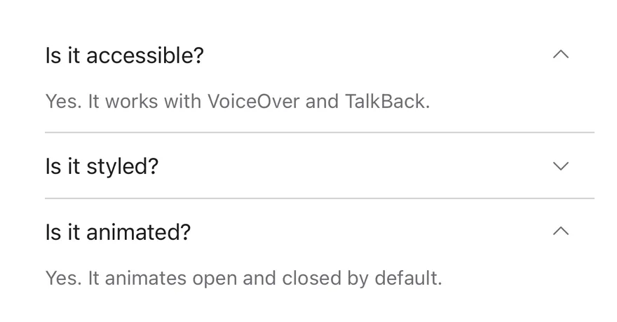
A controlled accordion with multiple, so several items stay open.

iOS
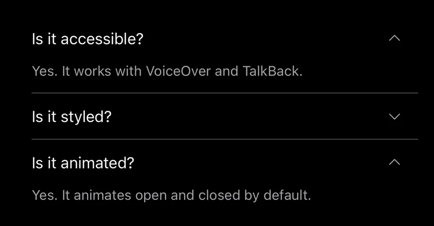
Accordion (multiple) on iOS in light modeAccordion (multiple) on iOS in dark mode
import * as React from "react"
import { Accordion, AccordionContent, AccordionItem, AccordionTrigger } from "@/components/ui/accordion"
import { Text } from "@/components/ui/text"

const items = [
  {
    value: "item-1",
    title: "Is it accessible?",
    content: "Yes. It works with VoiceOver and TalkBack.",
  },
  {
    value: "item-2",
    title: "Is it styled?",
    content:
      "Yes. It comes with default styles that match the other components.",
  },
  {
    value: "item-3",
    title: "Is it animated?",
    content: "Yes. It animates open and closed by default.",
  },
]

function AccordionItems() {
  return items.map((item) => (
    <AccordionItem key={item.value} value={item.value}>
      <AccordionTrigger>
        <Text>{item.title}</Text>
      </AccordionTrigger>
      <AccordionContent>
        <Text>{item.content}</Text>
      </AccordionContent>
    </AccordionItem>
  ))
}

function MultipleDemo() {
  const [value, setValue] = React.useState<string[]>(["item-1", "item-3"])
  return (
    <Accordion multiple value={value} onValueChange={setValue}>
      <AccordionItems />
    </Accordion>
  )
}

export function AccordionMultipleExample() {
  return (
    <MultipleDemo />
  )
}
import EsuissUI
import SwiftUI

struct AccordionMultipleExample: View {
  var body: some View {
    AccordionDemo(initial: ["item-1", "item-3"], multiple: true)
  }
}

struct AccordionEntry: Identifiable {
  let value: String
  let title: LocalizedStringKey
  let content: LocalizedStringKey

  var id: String { value }
}

let accordionEntries = [
  AccordionEntry(value: "item-1", title: "Is it accessible?", content: "Yes. It works with VoiceOver and TalkBack."),
  AccordionEntry(
    value: "item-2",
    title: "Is it styled?",
    content: "Yes. It comes with default styles that match the other components."
  ),
  AccordionEntry(value: "item-3", title: "Is it animated?", content: "Yes. It animates open and closed by default."),
]

struct AccordionItems: View {
  var body: some View {
    ForEach(accordionEntries) { entry in
      AccordionItem(entry.title, value: entry.value) {
        Text(entry.content)
      }
    }
  }
}

struct AccordionDemo: View {
  let multiple: Bool

  @State private var expanded: Set<String>

  init(initial: Set<String>, multiple: Bool) {
    self.multiple = multiple
    _expanded = State(initialValue: initial)
  }

  var body: some View {
    Accordion(expanded: $expanded, multiple: multiple) {
      AccordionItems()
    }
  }
}
import androidx.compose.runtime.Composable
import androidx.compose.runtime.getValue
import androidx.compose.runtime.mutableStateOf
import androidx.compose.runtime.saveable.rememberSaveable
import androidx.compose.runtime.setValue
import com.esuiss.ui.components.Accordion
import com.esuiss.ui.components.AccordionItem
import com.esuiss.ui.components.Text

class AccordionEntry(val value: String, val title: String, val content: String)

val accordionEntries = listOf(
    AccordionEntry("item-1", "Is it accessible?", "Yes. It works with VoiceOver and TalkBack."),
    AccordionEntry("item-2", "Is it styled?", "Yes. It comes with default styles that match the other components."),
    AccordionEntry("item-3", "Is it animated?", "Yes. It animates open and closed by default."),
)

@Composable
fun AccordionItems(open: List<String>, onToggle: (String, Boolean) -> Unit) {
    accordionEntries.forEach { entry ->
        AccordionItem(
            expanded = entry.value in open,
            onExpandedChange = { onToggle(entry.value, it) },
            title = entry.title,
        ) {
            Text(entry.content)
        }
    }
}

@Composable
fun AccordionMultiple() {
    var open by rememberSaveable { mutableStateOf("item-1,item-3") }
    Accordion {
        AccordionItems(open.split(",")) { value, expanded ->
            val current = open.split(",").filter { it.isNotEmpty() }
            open = (if (expanded) current + value else current - value).joinToString(",")
        }
    }
}

API Reference

01

Accordion

Root that holds the open state and lays out the items.

PropTypeDefaultDescription
variant"default" | "filled""default"default or filled.

Also accepts the props of React.ComponentProps<typeof AccordionPrimitive.Root>.

02

AccordionItem

One section, separated from the previous one by a hairline.

Also accepts the props of React.ComponentProps<typeof AccordionPrimitive.Item>.

03

AccordionTrigger

Pressable heading row with a rotating caret.

Also accepts the props of React.ComponentProps<typeof AccordionPrimitive.Trigger>.

04

AccordionContent

Panel shown while the item is open; fades out upward on close.

PropTypeDefaultDescription
classNamestring-

Also accepts the props of React.ComponentProps<typeof AccordionPrimitive.Panel>.

Accessibility

  • The header row has the header role, and the trigger has the button role with expanded and disabled accessibility state.
  • Closed panels are hidden from VoiceOver and TalkBack.
  • A disabled trigger is shown at 50% opacity.

Notes

  • The trigger label underlines while pressed.
  • Animations respect the system Reduce Motion setting.
  • Uses bg-muted, border-border and text-foreground tokens; light and dark follow the system appearance.
iOS
Accordion (open by default) on iOS in light modeAccordion (open by default) on iOS in dark mode
import { Accordion, AccordionContent, AccordionItem, AccordionTrigger } from "@/components/ui/accordion"
import { Text } from "@/components/ui/text"

const items = [
  {
    value: "item-1",
    title: "Is it accessible?",
    content: "Yes. It works with VoiceOver and TalkBack.",
  },
  {
    value: "item-2",
    title: "Is it styled?",
    content:
      "Yes. It comes with default styles that match the other components.",
  },
  {
    value: "item-3",
    title: "Is it animated?",
    content: "Yes. It animates open and closed by default.",
  },
]

function AccordionItems() {
  return items.map((item) => (
    <AccordionItem key={item.value} value={item.value}>
      <AccordionTrigger>
        <Text>{item.title}</Text>
      </AccordionTrigger>
      <AccordionContent>
        <Text>{item.content}</Text>
      </AccordionContent>
    </AccordionItem>
  ))
}

export function AccordionOpenByDefaultExample() {
  return (
    <Accordion defaultValue={["item-2"]}>
      <AccordionItems />
    </Accordion>
  )
}
import EsuissUI
import SwiftUI

struct AccordionOpenByDefaultExample: View {
  var body: some View {
    AccordionDemo(initial: ["item-2"], multiple: false)
  }
}

struct AccordionEntry: Identifiable {
  let value: String
  let title: LocalizedStringKey
  let content: LocalizedStringKey

  var id: String { value }
}

let accordionEntries = [
  AccordionEntry(value: "item-1", title: "Is it accessible?", content: "Yes. It works with VoiceOver and TalkBack."),
  AccordionEntry(
    value: "item-2",
    title: "Is it styled?",
    content: "Yes. It comes with default styles that match the other components."
  ),
  AccordionEntry(value: "item-3", title: "Is it animated?", content: "Yes. It animates open and closed by default."),
]

struct AccordionItems: View {
  var body: some View {
    ForEach(accordionEntries) { entry in
      AccordionItem(entry.title, value: entry.value) {
        Text(entry.content)
      }
    }
  }
}

struct AccordionDemo: View {
  let multiple: Bool

  @State private var expanded: Set<String>

  init(initial: Set<String>, multiple: Bool) {
    self.multiple = multiple
    _expanded = State(initialValue: initial)
  }

  var body: some View {
    Accordion(expanded: $expanded, multiple: multiple) {
      AccordionItems()
    }
  }
}
import androidx.compose.runtime.Composable
import androidx.compose.runtime.getValue
import androidx.compose.runtime.mutableStateOf
import androidx.compose.runtime.saveable.rememberSaveable
import androidx.compose.runtime.setValue
import com.esuiss.ui.components.Accordion
import com.esuiss.ui.components.AccordionItem
import com.esuiss.ui.components.AccordionVariant
import com.esuiss.ui.components.Text

@Composable
fun AccordionOpenByDefaultExample() {
    AccordionSingle(AccordionVariant.Default, "item-2")
}

class AccordionEntry(val value: String, val title: String, val content: String)

val accordionEntries = listOf(
    AccordionEntry("item-1", "Is it accessible?", "Yes. It works with VoiceOver and TalkBack."),
    AccordionEntry("item-2", "Is it styled?", "Yes. It comes with default styles that match the other components."),
    AccordionEntry("item-3", "Is it animated?", "Yes. It animates open and closed by default."),
)

@Composable
fun AccordionItems(open: List<String>, onToggle: (String, Boolean) -> Unit) {
    accordionEntries.forEach { entry ->
        AccordionItem(
            expanded = entry.value in open,
            onExpandedChange = { onToggle(entry.value, it) },
            title = entry.title,
        ) {
            Text(entry.content)
        }
    }
}

@Composable
fun AccordionSingle(variant: AccordionVariant, defaultValue: String) {
    var open by rememberSaveable { mutableStateOf(defaultValue) }
    Accordion(variant = variant) {
        AccordionItems(listOf(open)) { value, expanded -> open = if (expanded) value else "" }
    }
}
components/ui/accordion.tsx
"use client"

import { Accordion as AccordionPrimitive } from "@base-ui/react/accordion"
import { CaretDownIcon, CaretUpIcon } from "@phosphor-icons/react"
import { cva, type VariantProps } from "class-variance-authority"
import { cn } from "@/lib/utils"

const accordionVariants = cva("flex w-full flex-col", {
  variants: {
    variant: {
      default: "",
      filled: "overflow-hidden rounded-2xl bg-muted",
    },
  },
  defaultVariants: {
    variant: "default",
import {
  Accordion,
  AccordionContent,
  AccordionItem,
  AccordionTrigger,
} from "@/components/ui/accordion"

const items = [
  {
    value: "shipping",
    title: "How long does shipping take?",
    content:
      "Orders ship within two business days and arrive in three to five days.",
  },
  {
    value: "returns",
    title: "Can I return an item?",
    content:
      "Items can be returned within 14 days of delivery for a full refund.",
  },
  {
    value: "support",
    title: "How do I contact support?",
    content:
      "Reach the support team from the help center, available around the clock.",
  },
]

export default function AccordionFilled() {
  return (
    <div className="w-96">
      <Accordion variant="filled">
        {items.map((item) => (
          <AccordionItem key={item.value} value={item.value}>
            <AccordionTrigger>{item.title}</AccordionTrigger>
            <AccordionContent>{item.content}</AccordionContent>
          </AccordionItem>
        ))}
      </Accordion>
    </div>
  )
}
import {
  Accordion,
  AccordionContent,
  AccordionItem,
  AccordionTrigger,
} from "@/components/ui/accordion"

const items = [
  {
    value: "shipping",
    title: "How long does shipping take?",
    content:
      "Orders ship within two business days and arrive in three to five days.",
  },
  {
    value: "returns",
    title: "Can I return an item?",
    content:
      "Items can be returned within 14 days of delivery for a full refund.",
  },
  {
    value: "support",
    title: "How do I contact support?",
    content:
      "Reach the support team from the help center, available around the clock.",
  },
]

export default function AccordionOpenByDefault() {
  return (
    <div className="w-96">
      <Accordion defaultValue={["shipping"]}>
        {items.map((item) => (
          <AccordionItem key={item.value} value={item.value}>
            <AccordionTrigger>{item.title}</AccordionTrigger>
            <AccordionContent>{item.content}</AccordionContent>
          </AccordionItem>
        ))}
      </Accordion>
    </div>
  )
}
import {
  Accordion,
  AccordionContent,
  AccordionItem,
  AccordionTrigger,
} from "@/components/ui/accordion"

const items = [
  {
    value: "shipping",
    title: "How long does shipping take?",
    content:
      "Orders ship within two business days and arrive in three to five days.",
  },
  {
    value: "returns",
    title: "Can I return an item?",
    content:
      "Items can be returned within 14 days of delivery for a full refund.",
  },
  {
    value: "support",
    title: "How do I contact support?",
    content:
      "Reach the support team from the help center, available around the clock.",
  },
]

export default function AccordionMultiple() {
  return (
    <div className="w-96">
      <Accordion multiple defaultValue={["shipping", "returns"]}>
        {items.map((item) => (
          <AccordionItem key={item.value} value={item.value}>
            <AccordionTrigger>{item.title}</AccordionTrigger>
            <AccordionContent>{item.content}</AccordionContent>
          </AccordionItem>
        ))}
      </Accordion>
    </div>
  )
}
nativewind/components/ui/accordion.tsx
import { cva, type VariantProps } from "class-variance-authority"
import { cn } from "cn"
import { CaretDownIcon } from "phosphor-react-native"
import * as React from "react"
import type { GestureResponderEvent } from "react-native"
import Animated, {
  FadeOutUp,
  LayoutAnimationConfig,
  LinearTransition,
  ReduceMotion,
  useAnimatedStyle,
  useDerivedValue,
  withTiming,
} from "react-native-reanimated"
import * as AccordionPrimitive from "@/components/primitives/accordion"
import { resolveClassName } from "@/components/primitives/use-render"
stylesheet/components/ui/accordion.tsx
import { CaretDownIcon } from "phosphor-react-native"
import * as React from "react"
import {
  type GestureResponderEvent,
  type StyleProp,
  StyleSheet,
  type ViewStyle,
} from "react-native"
import Animated, {
  FadeOutUp,
  LayoutAnimationConfig,
  LinearTransition,
  ReduceMotion,
  useAnimatedStyle,
  useDerivedValue,
  withTiming,