suiss/ui · Component
Chip
A compact, selectable pill for filters and tags, with an optional icon and remove button.
Chip is an open-source component from suiss/ui for React Native, SwiftUI and Jetpack Compose. The @esuiss/ui CLI copies its source into your project, so you own the code.


import { Chip } from "@/components/ui/chip"

export function ChipExample() {
  return (
    <Chip>Open now</Chip>
  )
}import EsuissUI
import SwiftUI
struct ChipExample: View {
var body: some View {
ChipToggleDemo(title: "Open now", initial: false)
}
}
struct ChipToggleDemo: View {
let title: LocalizedStringKey
var size: ChipSize?
var icon: Image?
var onRemove: (() -> Void)?
@State private var selected: Bool
init(
title: LocalizedStringKey,
initial: Bool,
size: ChipSize? = nil,
icon: Image? = nil,
onRemove: (() -> Void)? = nil
) {
self.title = title
self.size = size
self.icon = icon
self.onRemove = onRemove
_selected = State(initialValue: initial)
}
var body: some View {
Chip(title, isSelected: $selected, size: size, icon: icon, onRemove: onRemove)
}
}import androidx.compose.foundation.layout.Column
import androidx.compose.runtime.Composable
import androidx.compose.runtime.getValue
import androidx.compose.runtime.mutableStateOf
import androidx.compose.runtime.saveable.rememberSaveable
import androidx.compose.runtime.setValue
import androidx.compose.ui.graphics.vector.ImageVector
import com.esuiss.ui.components.Chip
import com.esuiss.ui.components.ChipSize
@Composable
fun ChipItem(
text: String,
defaultSelected: Boolean = false,
size: ChipSize = ChipSize.Default,
enabled: Boolean = true,
icon: ImageVector? = null,
onRemove: (() -> Unit)? = null,
) {
var selected by rememberSaveable { mutableStateOf(defaultSelected) }
Chip(
text,
selected = selected,
onSelectedChange = { selected = it },
size = size,
enabled = enabled,
icon = icon,
onRemove = onRemove,
)
}
@Composable
fun ChipDefault() {
Column {
ChipItem("Open now")
}
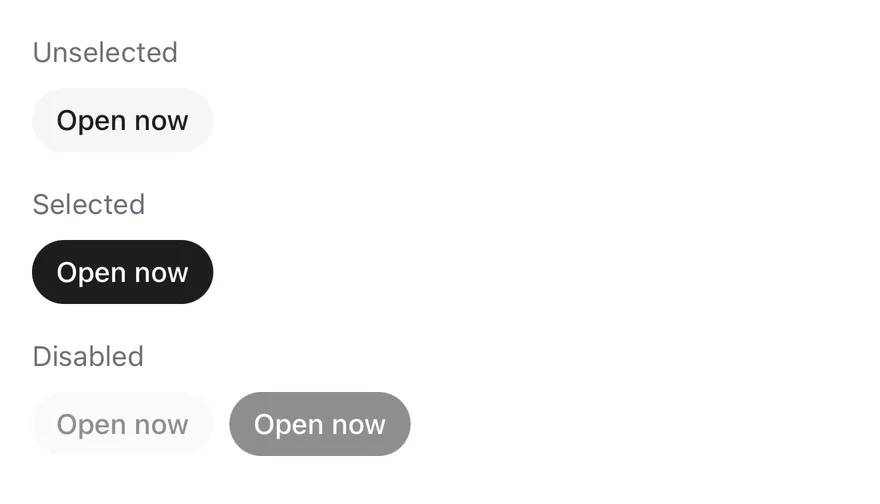
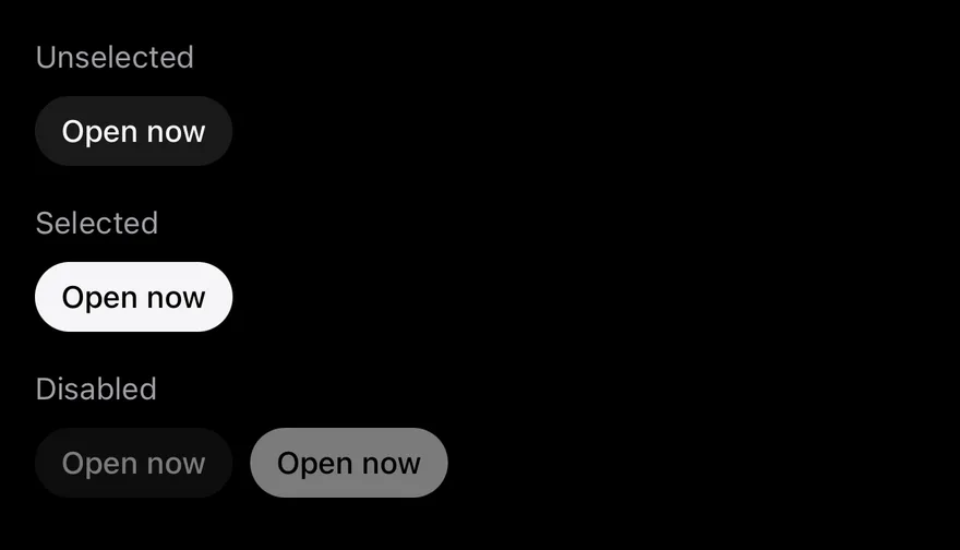
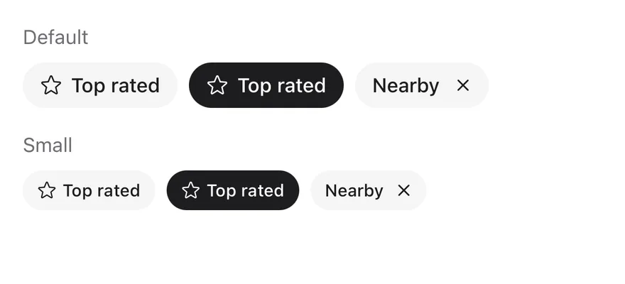
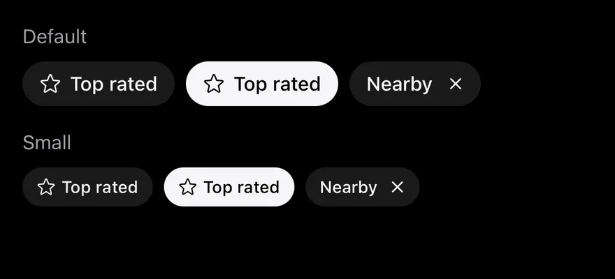
}Chip is a toggle rendered as a rounded Pressable. It switches between an unselected bg-secondary background and a selected bg-foreground fill, and shrinks slightly while pressed. It has default and sm sizes, an optional leading icon, and an optional trailing remove button when onRemove is set.
ChipGroup manages selection for a set of chips: single selection by default, or several with multiple. It wraps chips onto new lines, or lays them out in a horizontal scroll view with scrollable.
Installation
$ pnpm dlx shadcn@latest add @esuiss-rn/chipSee Installation for the components.json setup. Or use the suiss/ui CLI:
$ pnpm dlx @esuiss/ui@latest add chip$ pnpm dlx @esuiss/ui@latest add chip --platform swift$ pnpm dlx @esuiss/ui@latest add chip --platform kotlinThe CLI also adds what it builds on: Icon, Text.
Manual
- Install the dependencies:
npx expo install class-variance-authority cn phosphor-react-native react-native-svg-
Add the pieces it builds on: Icon, Text, and the primitives
components/primitives/toggle.tsx,components/primitives/toggle-group.tsx,components/primitives/use-render.tsx. -
Copy the source into
components/ui/chip.tsx:
import { cva } from "class-variance-authority"
import { cn } from "cn"
import { type Icon as PhosphorIcon, XIcon } from "phosphor-react-native"
import * as React from "react"
import { Pressable, ScrollView } from "react-native"
import {
  type ToggleChangeEventDetails,
  Toggle as TogglePrimitive,
  type ToggleState,
} from "@/components/primitives/toggle"
import { ToggleGroup as ToggleGroupPrimitive } from "@/components/primitives/toggle-group"
import { resolveClassName } from "@/components/primitives/use-render"
import { Icon, IconClassContext } from "@/components/ui/icon"
import { Text, TextClassContext } from "@/components/ui/text"

type ChipSize = "default" | "sm"- Update the import paths to match your project.
- Install the dependencies:
npx expo install class-variance-authority cn phosphor-react-native react-native-svg-
Add the pieces it builds on: Icon, Text, and the primitives
components/primitives/toggle.tsx,components/primitives/toggle-group.tsx,components/primitives/use-render.tsx. -
Copy the source into
components/ui/chip.tsx:
import { cva } from "class-variance-authority"
import { cn } from "cn"
import { type Icon as PhosphorIcon, XIcon } from "phosphor-react-native"
import * as React from "react"
import { Pressable, ScrollView } from "react-native"
import {
  type ToggleChangeEventDetails,
  Toggle as TogglePrimitive,
  type ToggleState,
} from "@/components/primitives/toggle"
import { ToggleGroup as ToggleGroupPrimitive } from "@/components/primitives/toggle-group"
import { resolveClassName } from "@/components/primitives/use-render"
import { Icon, IconClassContext } from "@/components/ui/icon"
import { Text, TextClassContext } from "@/components/ui/text"

type ChipSize = "default" | "sm"- Update the import paths to match your project.
- Install the dependencies:
npx expo install phosphor-react-native react-native-svg-
Add the pieces it builds on: Icon, Text, and the primitives
components/primitives/toggle.tsx,components/primitives/toggle-group.tsx,components/primitives/use-render.tsx. -
Copy the source into
components/ui/chip.tsx:
import { type Icon as PhosphorIcon, XIcon } from "phosphor-react-native"
import * as React from "react"
import {
  Pressable,
  ScrollView,
  type StyleProp,
  StyleSheet,
  type TextStyle,
  type ViewStyle,
} from "react-native"
import {
  type ToggleChangeEventDetails,
  Toggle as TogglePrimitive,
  type ToggleState,
} from "@/components/primitives/toggle"
import { ToggleGroup as ToggleGroupPrimitive } from "@/components/primitives/toggle-group"- Update the import paths to match your project.
-
Target iOS 17 or later.
-
Add the Swift package to your app:
.package(url: "https://github.com/phosphor-icons/swift", from: "2.1.0")- Copy the theme files every view uses:
import SwiftUI
import UIKit

struct RGBA: Sendable {
  let red: CGFloat
  let green: CGFloat
  let blue: CGFloat
  let alpha: CGFloat

  init(_ hex: UInt32, _ alpha: CGFloat = 1) {
    red = CGFloat((hex >> 16) & 0xFF) / 255
    green = CGFloat((hex >> 8) & 0xFF) / 255
    blue = CGFloat(hex & 0xFF) / 255
    self.alpha = alpha
}import SwiftUI
public enum EsuissColor {
public static let background = Color.adaptive(light: .init(0xFFFFFF), dark: .init(0x000000))
public static let foreground = Color.adaptive(light: .init(0x1D1D1F), dark: .init(0xF5F5F7))
public static let card = Color.adaptive(light: .init(0xFFFFFF), dark: .init(0x1D1D1F))
public static let cardForeground = Color.adaptive(light: .init(0x1D1D1F), dark: .init(0xF5F5F7))
public static let popover = Color.adaptive(light: .init(0xFFFFFF), dark: .init(0x1D1D1F))
public static let popoverForeground = Color.adaptive(light: .init(0x1D1D1F), dark: .init(0xF5F5F7))
public static let primary = Color.adaptive(light: .init(0x0071E3), dark: .init(0x2997FF))
public static let primaryForeground = Color.adaptive(light: .init(0xFFFFFF), dark: .init(0xFFFFFF))
public static let secondary = Color.adaptive(light: .init(0x000000, 0.04), dark: .init(0xFFFFFF, 0.1))
public static let secondaryForeground = Color.adaptive(light: .init(0x1D1D1F), dark: .init(0xF5F5F7))
public static let muted = Color.adaptive(light: .init(0xF5F5F7), dark: .init(0x161617))
public static let mutedForeground = Color.adaptive(light: .init(0x6E6E73), dark: .init(0xA1A1A6))
public static let accent = Color.adaptive(light: .init(0x000000, 0.06), dark: .init(0xFFFFFF, 0.1))- Copy the source and every file it uses:
import PhosphorSwift
import SwiftUI

public enum ChipSize: CaseIterable, Sendable {
  case sm, `default`

  var height: CGFloat {
    switch self {
    case .sm: 28
    case .default: 32
    }
  }

  var padding: CGFloat {
    switch self {
case .sm: 10import SwiftUI
public struct VariantButtonStyle: ButtonStyle {
public enum Variant: CaseIterable, Sendable {
case `default`, outline, secondary, tinted, ghost, plain, destructive, link
}
public enum Size: CaseIterable, Sendable {
case `default`, xs, sm, lg, xl, icon, iconXs, iconSm, iconLg, iconXl
var height: CGFloat {
switch self {
case .xs, .iconXs: 24
case .sm, .iconSm: 32
case .default, .icon: 36
case .lg, .iconLg: 44import SwiftUI
extension EnvironmentValues {
@Entry var buttonGroup: Axis? = nil
@Entry var buttonGroupSize: CGSize = .zero
}
enum ButtonGroupSpace: Hashable {
case group
}
struct ButtonGroupFrame {
let bounds: Anchor<CGRect>
let outlined: Bool
}import PhosphorSwift
import SwiftUI
extension Shadow {
static let control = Shadow(color: .black.opacity(0.08), radius: 0.5, y: 0.5)
static let thumb = Shadow(color: .black.opacity(0.12), radius: 1.5, y: 1)
}
struct SelectionIndicator<Mark: View>: View {
let checked: Bool
let pressed: Bool
let cornerRadius: CGFloat
let mark: Mark
@Environment(\.isEnabled) private var isEnabled
@Environment(\.isInvalid) private var invalidimport PhosphorSwift
import SwiftUI
public struct Combobox<Item: Hashable & Sendable>: View {
let items: [Item]
let single: Binding<Item?>?
let multiple: Binding<[Item]>?
let placeholder: LocalizedStringKey
let searchPlaceholder: LocalizedStringKey
let emptyText: LocalizedStringKey
let title: (Item) -> String
@State private var open = false
@Environment(\.isEnabled) private var isEnabled
@Environment(\.isInvalid) private var invalid
@Environment(\.colorScheme) private var colorSchemeimport PhosphorSwift
import SwiftUI
enum MenuPresentation: Sendable {
case system, popup
}
extension EnvironmentValues {
@Entry var menuPresentation: MenuPresentation = .system
@Entry var menuRadio = MenuRadioContext()
}
struct MenuRadioContext: @unchecked Sendable {
var selected: AnyHashable?
var select: @MainActor @Sendable (AnyHashable) -> Void = { _ in }
}import SwiftUI
extension EnvironmentValues {
@Entry public var isInvalid = false
@Entry var fieldInset = false
@Entry var fieldGroupInset = false
@Entry var fieldSetInset = false
}
extension View {
public func invalid(_ isInvalid: Bool = true) -> some View {
environment(\.isInvalid, isInvalid)
}
}
public enum FieldOrientation: CaseIterable, Sendable {import SwiftUI
extension EnvironmentValues {
@Entry public var hapticsEnabled = true
}
extension View {
public func haptics(_ enabled: Bool) -> some View {
environment(\.hapticsEnabled, enabled)
}
func hapticFeedback<Trigger: Equatable>(_ feedback: SensoryFeedback, trigger: Trigger) -> some View {
modifier(HapticFeedbackModifier(feedback: feedback, trigger: trigger) { _, _ in true })
}
func hapticFeedback<Trigger: Equatable>(import SwiftUI
public enum ItemVariant: CaseIterable, Sendable {
case `default`, outline, muted
}
public enum ItemSize: CaseIterable, Sendable {
case `default`, sm, xs
var horizontalPadding: CGFloat {
switch self {
case .default: 16
case .sm: 14
case .xs: 12
}
}import PhosphorSwift
import Observation
import SwiftUI
public enum PopupAlignment: Sendable, CaseIterable {
case start, center, end
}
struct OverlayDismiss: Sendable {
let action: @MainActor @Sendable () -> Void
@MainActor func callAsFunction() {
action()
}
}import PhosphorSwift
import SwiftUI
struct SelectContext: @unchecked Sendable {
var selected: AnyHashable?
var registering = false
var select: @MainActor @Sendable (AnyHashable) -> Void = { _ in }
}
extension EnvironmentValues {
@Entry var select = SelectContext()
}
struct SelectLabelsKey: PreferenceKey {
static var defaultValue: [AnyHashable: Text] { [:] }import SwiftUI
public struct Separator: View {
let orientation: Axis
public init(_ orientation: Axis = .horizontal) {
self.orientation = orientation
}
public var body: some View {
Rectangle()
.fill(EsuissColor.border)
.frame(width: orientation == .vertical ? 1 : nil, height: orientation == .horizontal ? 1 : nil)
.frame(maxWidth: orientation == .horizontal ? .infinity : nil, maxHeight: orientation == .vertical ? .infinity : nil)
.accessibilityHidden(true)
}import SwiftUI
public enum TextVariant: CaseIterable, Sendable {
case `default`, h1, h2, h3, h4, p, blockquote, code, lead, large, small, muted
var style: TextStyle {
switch self {
case .h1: .xl3
case .h2: .xl2
case .h3: .xl
case .h4, .lead, .large: .lg
case .code, .small, .muted: .sm
default: .base
}
}- Add the files to your app target.
- Set
minSdkto 24 or higher and add the dependencies:
implementation(platform("androidx.compose:compose-bom:2026.09.00"))
implementation("androidx.compose.foundation:foundation")
implementation("androidx.compose.ui:ui")
implementation("com.adamglin:phosphor-icon-android:1.0.0")- Copy the theme files every view uses:
package com.esuiss.ui.theme

import androidx.compose.foundation.isSystemInDarkTheme
import androidx.compose.runtime.Composable
import androidx.compose.runtime.CompositionLocalProvider
import androidx.compose.runtime.Immutable
import androidx.compose.runtime.staticCompositionLocalOf
import androidx.compose.ui.Modifier
import androidx.compose.ui.draw.dropShadow
import androidx.compose.ui.graphics.Color
import androidx.compose.ui.graphics.Shape
import androidx.compose.ui.graphics.shadow.Shadow as DropShadow
import androidx.compose.ui.text.TextStyle
import androidx.compose.ui.text.style.LineHeightStyle
import androidx.compose.ui.unit.Dp
import androidx.compose.ui.unit.DpOffsetpackage com.esuiss.ui.theme
import androidx.compose.runtime.Immutable
import androidx.compose.ui.graphics.Color
import androidx.compose.ui.unit.dp
@Immutable
data class Colors(
val background: Color,
val foreground: Color,
val card: Color,
val cardForeground: Color,
val popover: Color,
val popoverForeground: Color,
val primary: Color,
val primaryForeground: Color,- Copy the source and every file it uses:
package com.esuiss.ui.components

import androidx.compose.animation.core.animateFloatAsState
import androidx.compose.animation.core.tween
import androidx.compose.foundation.background
import androidx.compose.foundation.clickable
import androidx.compose.foundation.horizontalScroll
import androidx.compose.foundation.interaction.MutableInteractionSource
import androidx.compose.foundation.interaction.collectIsPressedAsState
import androidx.compose.foundation.layout.Arrangement
import androidx.compose.foundation.layout.Box
import androidx.compose.foundation.layout.FlowRow
import androidx.compose.foundation.layout.PaddingValues
import androidx.compose.foundation.layout.Row
import androidx.compose.foundation.layout.height
import androidx.compose.foundation.layout.paddingpackage com.esuiss.ui.components
import androidx.compose.foundation.background
import androidx.compose.foundation.border
import androidx.compose.foundation.clickable
import androidx.compose.foundation.interaction.MutableInteractionSource
import androidx.compose.foundation.interaction.collectIsPressedAsState
import androidx.compose.foundation.layout.Arrangement
import androidx.compose.foundation.layout.Row
import androidx.compose.foundation.layout.RowScope
import androidx.compose.foundation.layout.fillMaxWidth
import androidx.compose.foundation.layout.height
import androidx.compose.foundation.layout.padding
import androidx.compose.foundation.layout.size
import androidx.compose.foundation.shape.CircleShape
import androidx.compose.foundation.shape.RoundedCornerShapepackage com.esuiss.ui.components
import androidx.compose.foundation.background
import androidx.compose.foundation.gestures.Orientation
import androidx.compose.foundation.layout.Arrangement
import androidx.compose.foundation.layout.Box
import androidx.compose.foundation.layout.Row
import androidx.compose.foundation.layout.RowScope
import androidx.compose.foundation.layout.padding
import androidx.compose.foundation.shape.CircleShape
import androidx.compose.foundation.shape.CornerSize
import androidx.compose.foundation.shape.RoundedCornerShape
import androidx.compose.runtime.Composable
import androidx.compose.runtime.CompositionLocalProvider
import androidx.compose.runtime.DisposableEffect
import androidx.compose.runtime.Immutablepackage com.esuiss.ui.components
import androidx.compose.foundation.background
import androidx.compose.foundation.border
import androidx.compose.foundation.interaction.MutableInteractionSource
import androidx.compose.foundation.interaction.collectIsPressedAsState
import androidx.compose.foundation.layout.Box
import androidx.compose.foundation.layout.size
import androidx.compose.foundation.selection.triStateToggleable
import androidx.compose.foundation.shape.RoundedCornerShape
import androidx.compose.runtime.Composable
import androidx.compose.runtime.getValue
import androidx.compose.runtime.remember
import androidx.compose.ui.Alignment
import androidx.compose.ui.Modifier
import androidx.compose.ui.draw.alphapackage com.esuiss.ui.components
import androidx.compose.runtime.compositionLocalOf
import androidx.compose.ui.graphics.Color
import androidx.compose.ui.text.TextStyle
import androidx.compose.ui.unit.Dp
import androidx.compose.ui.unit.dp
val LocalContentStyle = compositionLocalOf { TextStyle.Default }
val LocalContentColor = compositionLocalOf { Color.Unspecified }
val LocalIconSize = compositionLocalOf { 20.dp }package com.esuiss.ui.components
import androidx.compose.foundation.background
import androidx.compose.foundation.gestures.Orientation
import androidx.compose.foundation.layout.Arrangement
import androidx.compose.foundation.layout.Box
import androidx.compose.foundation.layout.Column
import androidx.compose.foundation.layout.ColumnScope
import androidx.compose.foundation.layout.LayoutScopeMarker
import androidx.compose.foundation.layout.Row
import androidx.compose.foundation.layout.RowScope
import androidx.compose.foundation.layout.fillMaxWidth
import androidx.compose.foundation.layout.heightIn
import androidx.compose.foundation.layout.padding
import androidx.compose.foundation.shape.RoundedCornerShape
import androidx.compose.foundation.text.BasicTextpackage com.esuiss.ui.components
import android.provider.Settings
import androidx.compose.animation.core.CubicBezierEasing
import androidx.compose.foundation.background
import androidx.compose.foundation.border
import androidx.compose.foundation.gestures.Orientation
import androidx.compose.foundation.text.selection.TextSelectionColors
import androidx.compose.runtime.Composable
import androidx.compose.runtime.mutableStateOf
import androidx.compose.runtime.remember
import androidx.compose.ui.Modifier
import androidx.compose.ui.draw.alpha
import androidx.compose.ui.draw.clip
import androidx.compose.ui.draw.drawWithContent
import androidx.compose.ui.geometry.Offsetpackage com.esuiss.ui.components
import androidx.compose.runtime.Composable
import androidx.compose.runtime.CompositionLocalProvider
import androidx.compose.runtime.remember
import androidx.compose.runtime.staticCompositionLocalOf
import androidx.compose.ui.hapticfeedback.HapticFeedback
import androidx.compose.ui.hapticfeedback.HapticFeedbackType
import androidx.compose.ui.platform.LocalHapticFeedback
val LocalHapticsEnabled = staticCompositionLocalOf { true }
@Composable
fun ProvideHaptics(enabled: Boolean, content: @Composable () -> Unit) {
CompositionLocalProvider(LocalHapticsEnabled provides enabled, content = content)
}package com.esuiss.ui.components
import androidx.compose.foundation.Image
import androidx.compose.foundation.layout.size
import androidx.compose.runtime.Composable
import androidx.compose.ui.Modifier
import androidx.compose.ui.graphics.Color
import androidx.compose.ui.graphics.ColorFilter
import androidx.compose.ui.graphics.takeOrElse
import androidx.compose.ui.graphics.vector.ImageVector
import androidx.compose.ui.unit.Dp
import com.esuiss.ui.theme.EsuissTheme
@Composable
fun Icon(
imageVector: ImageVector,package com.esuiss.ui.components
import androidx.compose.foundation.layout.Arrangement
import androidx.compose.foundation.layout.Row
import androidx.compose.foundation.layout.RowScope
import androidx.compose.foundation.text.BasicText
import androidx.compose.runtime.Composable
import androidx.compose.runtime.CompositionLocalProvider
import androidx.compose.ui.Alignment
import androidx.compose.ui.Modifier
import androidx.compose.ui.draw.alpha
import androidx.compose.ui.text.font.FontWeight
import androidx.compose.ui.unit.dp
import com.esuiss.ui.theme.EsuissTheme
import com.esuiss.ui.theme.Typographypackage com.esuiss.ui.components
import androidx.compose.foundation.background
import androidx.compose.foundation.gestures.Orientation
import androidx.compose.foundation.layout.Box
import androidx.compose.foundation.layout.fillMaxHeight
import androidx.compose.foundation.layout.fillMaxWidth
import androidx.compose.foundation.layout.height
import androidx.compose.foundation.layout.width
import androidx.compose.runtime.Composable
import androidx.compose.ui.Modifier
import androidx.compose.ui.unit.dp
import com.esuiss.ui.theme.EsuissTheme
@Composable
fun Separator(- Update the
com.esuiss.uipackage names to match your project.
Usage
import { Chip, ChipGroup } from "@/components/ui/chip"<Chip>Open now</Chip>Use selected with onSelectedChange, or defaultSelected, on a standalone chip. Inside a ChipGroup, give each chip a value and control the group with value, defaultValue and onValueChange (arrays of values).
The group's size is passed to every chip unless a chip sets its own. Use removeLabel to localize the remove button's label.
chipVariants is also exported if you need the classes elsewhere.
Examples
States
Unselected, selected and disabled chips.
import * as React from "react"
import { View } from "react-native"
import { Chip } from "@/components/ui/chip"
import { Text } from "@/components/ui/text"

function Section({
  label,
  children,
}: {
  label: string
  children: React.ReactNode
}) {
  return (
    <View className="gap-2">
      <Text variant="muted">{label}</Text>
      {children}
    </View>
  )
}

export function ChipStatesExample() {
  return (
    <View className="gap-4">
      <Section label="Unselected">
        <Chip>Open now</Chip>
      </Section>
      <Section label="Selected">
        <Chip defaultSelected>Open now</Chip>
      </Section>
      <Section label="Disabled">
        <View className="flex-row gap-2">
          <Chip disabled>Open now</Chip>
          <Chip disabled defaultSelected>
            Open now
          </Chip>
        </View>
      </Section>
    </View>
  )
}import EsuissUI
import SwiftUI
struct ChipStatesExample: View {
var body: some View {
VStack(alignment: .leading, spacing: 16) {
ChipSection(label: "Unselected") {
ChipToggleDemo(title: "Open now", initial: false)
}
ChipSection(label: "Selected") {
ChipToggleDemo(title: "Open now", initial: true)
}
ChipSection(label: "Disabled") {
HStack(spacing: 8) {
Chip("Open now", isSelected: .constant(false))
Chip("Open now", isSelected: .constant(true))
}
.disabled(true)
}
}
}
}
struct ChipSection<Content: View>: View {
let label: LocalizedStringKey
@ViewBuilder let content: () -> Content
var body: some View {
VStack(alignment: .leading, spacing: 8) {
Text(label).textVariant(.muted)
content()
}
}
}
struct ChipToggleDemo: View {
let title: LocalizedStringKey
var size: ChipSize?
var icon: Image?
var onRemove: (() -> Void)?
@State private var selected: Bool
init(
title: LocalizedStringKey,
initial: Bool,
size: ChipSize? = nil,
icon: Image? = nil,
onRemove: (() -> Void)? = nil
) {
self.title = title
self.size = size
self.icon = icon
self.onRemove = onRemove
_selected = State(initialValue: initial)
}
var body: some View {
Chip(title, isSelected: $selected, size: size, icon: icon, onRemove: onRemove)
}
}import androidx.compose.foundation.layout.Arrangement
import androidx.compose.foundation.layout.Column
import androidx.compose.foundation.layout.Row
import androidx.compose.foundation.layout.fillMaxWidth
import androidx.compose.runtime.Composable
import androidx.compose.runtime.getValue
import androidx.compose.runtime.mutableStateOf
import androidx.compose.runtime.saveable.rememberSaveable
import androidx.compose.runtime.setValue
import androidx.compose.ui.Modifier
import androidx.compose.ui.graphics.vector.ImageVector
import androidx.compose.ui.unit.dp
import com.esuiss.ui.components.Chip
import com.esuiss.ui.components.ChipSize
import com.esuiss.ui.components.Text
import com.esuiss.ui.components.TextVariant
@Composable
fun ChipItem(
text: String,
defaultSelected: Boolean = false,
size: ChipSize = ChipSize.Default,
enabled: Boolean = true,
icon: ImageVector? = null,
onRemove: (() -> Unit)? = null,
) {
var selected by rememberSaveable { mutableStateOf(defaultSelected) }
Chip(
text,
selected = selected,
onSelectedChange = { selected = it },
size = size,
enabled = enabled,
icon = icon,
onRemove = onRemove,
)
}
@Composable
fun ChipSection(label: String, content: @Composable () -> Unit) {
Column(Modifier.fillMaxWidth(), verticalArrangement = Arrangement.spacedBy(8.dp)) {
Text(label, variant = TextVariant.Muted)
content()
}
}
@Composable
fun ChipStates() {
Column(Modifier.fillMaxWidth(), verticalArrangement = Arrangement.spacedBy(16.dp)) {
ChipSection("Unselected") { ChipItem("Open now") }
ChipSection("Selected") { ChipItem("Open now", defaultSelected = true) }
ChipSection("Disabled") {
Row(horizontalArrangement = Arrangement.spacedBy(8.dp)) {
ChipItem("Open now", enabled = false)
ChipItem("Open now", defaultSelected = true, enabled = false)
}
}
}
}Sizes
The default and sm sizes.
import { StarIcon } from "phosphor-react-native"
import * as React from "react"
import { View } from "react-native"
import { Chip } from "@/components/ui/chip"
import { Text } from "@/components/ui/text"

function Section({
  label,
  children,
}: {
  label: string
  children: React.ReactNode
}) {
  return (
    <View className="gap-2">
      <Text variant="muted">{label}</Text>
      {children}
    </View>
  )
}

export function ChipSizesExample() {
  return (
    <View className="gap-4">
      <Section label="Default">
        <View className="flex-row gap-2">
          <Chip icon={StarIcon}>Top rated</Chip>
          <Chip icon={StarIcon} defaultSelected>
            Top rated
          </Chip>
          <Chip onRemove={() => undefined}>Nearby</Chip>
        </View>
      </Section>
      <Section label="Small">
        <View className="flex-row gap-2">
          <Chip size="sm" icon={StarIcon}>
            Top rated
          </Chip>
          <Chip size="sm" icon={StarIcon} defaultSelected>
            Top rated
          </Chip>
          <Chip size="sm" onRemove={() => undefined}>
            Nearby
          </Chip>
        </View>
      </Section>
    </View>
  )
}import EsuissUI
import PhosphorSwift
import SwiftUI
struct ChipSizesExample: View {
var body: some View {
VStack(alignment: .leading, spacing: 16) {
ChipSection(label: "Default") {
HStack(spacing: 8) {
ChipToggleDemo(title: "Top rated", initial: false, icon: Ph.star.regular)
ChipToggleDemo(title: "Top rated", initial: true, icon: Ph.star.regular)
ChipToggleDemo(title: "Nearby", initial: false, onRemove: {})
}
}
ChipSection(label: "Small") {
HStack(spacing: 8) {
ChipToggleDemo(title: "Top rated", initial: false, size: .sm, icon: Ph.star.regular)
ChipToggleDemo(title: "Top rated", initial: true, size: .sm, icon: Ph.star.regular)
ChipToggleDemo(title: "Nearby", initial: false, size: .sm, onRemove: {})
}
}
}
}
}
struct ChipSection<Content: View>: View {
let label: LocalizedStringKey
@ViewBuilder let content: () -> Content
var body: some View {
VStack(alignment: .leading, spacing: 8) {
Text(label).textVariant(.muted)
content()
}
}
}
struct ChipToggleDemo: View {
let title: LocalizedStringKey
var size: ChipSize?
var icon: Image?
var onRemove: (() -> Void)?
@State private var selected: Bool
init(
title: LocalizedStringKey,
initial: Bool,
size: ChipSize? = nil,
icon: Image? = nil,
onRemove: (() -> Void)? = nil
) {
self.title = title
self.size = size
self.icon = icon
self.onRemove = onRemove
_selected = State(initialValue: initial)
}
var body: some View {
Chip(title, isSelected: $selected, size: size, icon: icon, onRemove: onRemove)
}
}import androidx.compose.foundation.layout.Arrangement
import androidx.compose.foundation.layout.Column
import androidx.compose.foundation.layout.Row
import androidx.compose.foundation.layout.fillMaxWidth
import androidx.compose.runtime.Composable
import androidx.compose.runtime.getValue
import androidx.compose.runtime.mutableStateOf
import androidx.compose.runtime.saveable.rememberSaveable
import androidx.compose.runtime.setValue
import androidx.compose.ui.Modifier
import androidx.compose.ui.graphics.vector.ImageVector
import androidx.compose.ui.unit.dp
import com.adamglin.PhosphorIcons
import com.adamglin.phosphoricons.Regular
import com.adamglin.phosphoricons.regular.Star
import com.esuiss.ui.components.Chip
import com.esuiss.ui.components.ChipSize
import com.esuiss.ui.components.Text
import com.esuiss.ui.components.TextVariant
@Composable
fun ChipItem(
text: String,
defaultSelected: Boolean = false,
size: ChipSize = ChipSize.Default,
enabled: Boolean = true,
icon: ImageVector? = null,
onRemove: (() -> Unit)? = null,
) {
var selected by rememberSaveable { mutableStateOf(defaultSelected) }
Chip(
text,
selected = selected,
onSelectedChange = { selected = it },
size = size,
enabled = enabled,
icon = icon,
onRemove = onRemove,
)
}
@Composable
fun ChipSection(label: String, content: @Composable () -> Unit) {
Column(Modifier.fillMaxWidth(), verticalArrangement = Arrangement.spacedBy(8.dp)) {
Text(label, variant = TextVariant.Muted)
content()
}
}
@Composable
fun ChipSizes() {
Column(Modifier.fillMaxWidth(), verticalArrangement = Arrangement.spacedBy(16.dp)) {
ChipSection("Default") {
Row(horizontalArrangement = Arrangement.spacedBy(8.dp)) {
ChipItem("Top rated", icon = PhosphorIcons.Regular.Star)
ChipItem("Top rated", defaultSelected = true, icon = PhosphorIcons.Regular.Star)
ChipItem("Nearby", onRemove = {})
}
}
ChipSection("Small") {
Row(horizontalArrangement = Arrangement.spacedBy(8.dp)) {
ChipItem("Top rated", size = ChipSize.Sm, icon = PhosphorIcons.Regular.Star)
ChipItem("Top rated", defaultSelected = true, size = ChipSize.Sm, icon = PhosphorIcons.Regular.Star)
ChipItem("Nearby", size = ChipSize.Sm, onRemove = {})
}
}
}
}With icon
Chips with a leading icon.
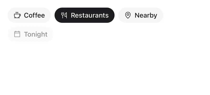
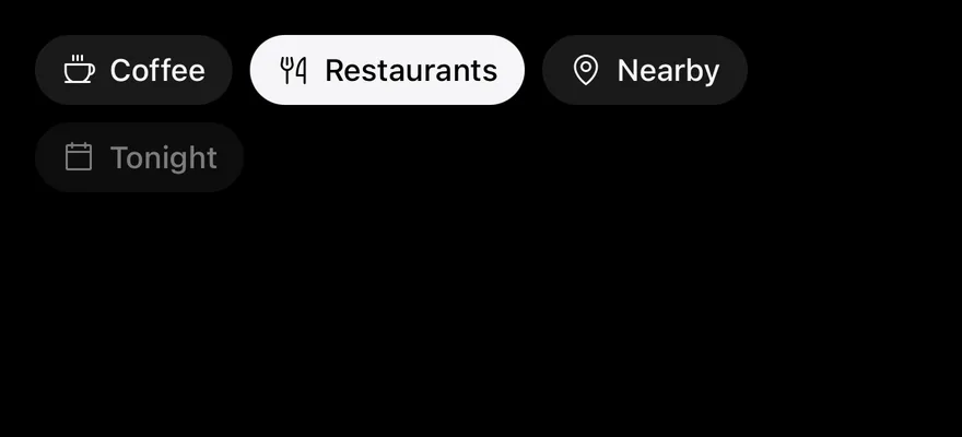
import { CalendarBlankIcon, CoffeeIcon, ForkKnifeIcon, MapPinIcon } from "phosphor-react-native"
import { View } from "react-native"
import { Chip } from "@/components/ui/chip"

export function ChipWithIconExample() {
  return (
    <View className="flex-row flex-wrap gap-2">
      <Chip icon={CoffeeIcon}>Coffee</Chip>
      <Chip icon={ForkKnifeIcon} defaultSelected>
        Restaurants
      </Chip>
      <Chip icon={MapPinIcon}>Nearby</Chip>
      <Chip icon={CalendarBlankIcon} disabled>
        Tonight
      </Chip>
    </View>
  )
}import EsuissUI
import PhosphorSwift
import SwiftUI
struct ChipWithIconExample: View {
var body: some View {
FlowRow(spacing: 8) {
ChipToggleDemo(title: "Coffee", initial: false, icon: Ph.coffee.regular)
ChipToggleDemo(title: "Restaurants", initial: true, icon: Ph.forkKnife.regular)
ChipToggleDemo(title: "Nearby", initial: false, icon: Ph.mapPin.regular)
ChipToggleDemo(title: "Tonight", initial: false, icon: Ph.calendarBlank.regular)
.disabled(true)
}
}
}
struct ChipToggleDemo: View {
let title: LocalizedStringKey
var size: ChipSize?
var icon: Image?
var onRemove: (() -> Void)?
@State private var selected: Bool
init(
title: LocalizedStringKey,
initial: Bool,
size: ChipSize? = nil,
icon: Image? = nil,
onRemove: (() -> Void)? = nil
) {
self.title = title
self.size = size
self.icon = icon
self.onRemove = onRemove
_selected = State(initialValue: initial)
}
var body: some View {
Chip(title, isSelected: $selected, size: size, icon: icon, onRemove: onRemove)
}
}import androidx.compose.foundation.layout.Arrangement
import androidx.compose.foundation.layout.FlowRow
import androidx.compose.foundation.layout.fillMaxWidth
import androidx.compose.runtime.Composable
import androidx.compose.runtime.getValue
import androidx.compose.runtime.mutableStateOf
import androidx.compose.runtime.saveable.rememberSaveable
import androidx.compose.runtime.setValue
import androidx.compose.ui.Modifier
import androidx.compose.ui.graphics.vector.ImageVector
import androidx.compose.ui.unit.dp
import com.adamglin.PhosphorIcons
import com.adamglin.phosphoricons.Regular
import com.adamglin.phosphoricons.regular.CalendarBlank
import com.adamglin.phosphoricons.regular.Coffee
import com.adamglin.phosphoricons.regular.ForkKnife
import com.adamglin.phosphoricons.regular.MapPin
import com.esuiss.ui.components.Chip
import com.esuiss.ui.components.ChipSize
@Composable
fun ChipItem(
text: String,
defaultSelected: Boolean = false,
size: ChipSize = ChipSize.Default,
enabled: Boolean = true,
icon: ImageVector? = null,
onRemove: (() -> Unit)? = null,
) {
var selected by rememberSaveable { mutableStateOf(defaultSelected) }
Chip(
text,
selected = selected,
onSelectedChange = { selected = it },
size = size,
enabled = enabled,
icon = icon,
onRemove = onRemove,
)
}
@Composable
fun ChipWithIcon() {
FlowRow(
Modifier.fillMaxWidth(),
horizontalArrangement = Arrangement.spacedBy(8.dp),
verticalArrangement = Arrangement.spacedBy(8.dp),
) {
ChipItem("Coffee", icon = PhosphorIcons.Regular.Coffee)
ChipItem("Restaurants", defaultSelected = true, icon = PhosphorIcons.Regular.ForkKnife)
ChipItem("Nearby", icon = PhosphorIcons.Regular.MapPin)
ChipItem("Tonight", enabled = false, icon = PhosphorIcons.Regular.CalendarBlank)
}
}Removable
Chips with a remove button through onRemove.
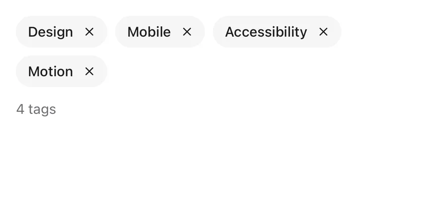
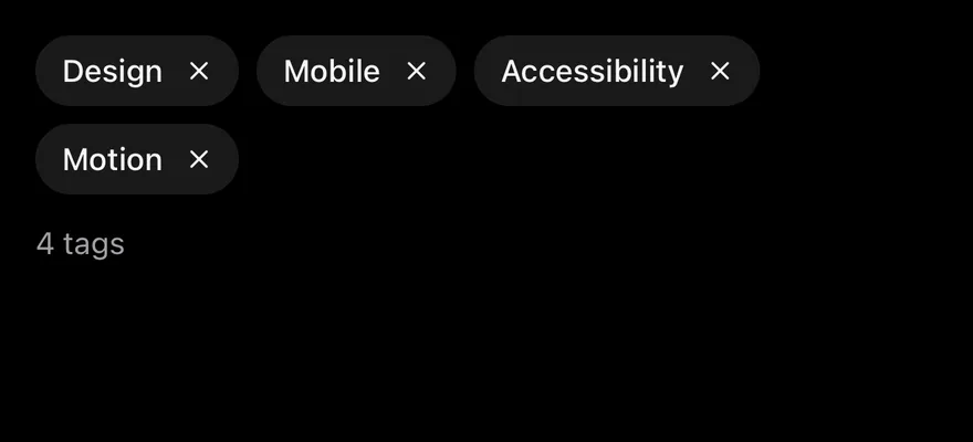
import * as React from "react"
import { View } from "react-native"
import { Chip } from "@/components/ui/chip"
import { Text } from "@/components/ui/text"

function RemovableDemo() {
  const [tags, setTags] = React.useState([
    "Design",
    "Mobile",
    "Accessibility",
    "Motion",
  ])
  return (
    <View className="gap-3">
      <View className="flex-row flex-wrap gap-2">
        {tags.map((tag) => (
          <Chip
            key={tag}
            onRemove={() =>
              setTags((current) => current.filter((item) => item !== tag))
            }
            removeLabel={`Remove ${tag}`}
          >
            {tag}
          </Chip>
        ))}
      </View>
      <Text variant="muted">{tags.length} tags</Text>
    </View>
  )
}

export function ChipRemovableExample() {
  return (
    <RemovableDemo />
  )
}import EsuissUI
import SwiftUI
struct ChipRemovableDemo: View {
@State private var tags = ["Design", "Mobile", "Accessibility", "Motion"]
@State private var selected: Set<String> = []
var body: some View {
VStack(alignment: .leading, spacing: 12) {
FlowRow(spacing: 8) {
ForEach(tags, id: \.self) { tag in
Chip(isSelected: binding(tag), onRemove: {
withAnimation { tags.removeAll { $0 == tag } }
}) {
Text(verbatim: tag)
}
}
}
Text("\(tags.count) tags").textVariant(.muted)
}
}
func binding(_ tag: String) -> Binding<Bool> {
Binding(
get: { selected.contains(tag) },
set: { isOn in
if isOn { selected.insert(tag) } else { selected.remove(tag) }
}
)
}
}import androidx.compose.foundation.layout.Arrangement
import androidx.compose.foundation.layout.Column
import androidx.compose.foundation.layout.FlowRow
import androidx.compose.foundation.layout.fillMaxWidth
import androidx.compose.runtime.Composable
import androidx.compose.runtime.getValue
import androidx.compose.runtime.mutableStateOf
import androidx.compose.runtime.saveable.rememberSaveable
import androidx.compose.runtime.setValue
import androidx.compose.ui.Modifier
import androidx.compose.ui.unit.dp
import com.esuiss.ui.components.Chip
import com.esuiss.ui.components.Text
import com.esuiss.ui.components.TextVariant
@Composable
fun ChipRemovable() {
var tags by rememberSaveable { mutableStateOf(listOf("Design", "Mobile", "Accessibility", "Motion")) }
Column(Modifier.fillMaxWidth(), verticalArrangement = Arrangement.spacedBy(12.dp)) {
FlowRow(
Modifier.fillMaxWidth(),
horizontalArrangement = Arrangement.spacedBy(8.dp),
verticalArrangement = Arrangement.spacedBy(8.dp),
) {
tags.forEach { tag ->
var selected by rememberSaveable(tag) { mutableStateOf(false) }
Chip(
tag,
selected = selected,
onSelectedChange = { selected = it },
onRemove = { tags = tags.filter { it != tag } },
removeLabel = "Remove $tag",
)
}
}
Text("${tags.size} tags", variant = TextVariant.Muted)
}
}Controlled
A chip controlled with selected and onSelectedChange.


import * as React from "react"
import { View } from "react-native"
import { Chip } from "@/components/ui/chip"
import { Text } from "@/components/ui/text"

function ControlledDemo() {
  const [selected, setSelected] = React.useState(true)
  return (
    <View className="gap-3">
      <Chip selected={selected} onSelectedChange={setSelected}>
        Free delivery
      </Chip>
      <Text variant="muted">{selected ? "Selected" : "Not selected"}</Text>
    </View>
  )
}

export function ChipControlledExample() {
  return (
    <ControlledDemo />
  )
}import EsuissUI
import SwiftUI
struct ChipControlledDemo: View {
@State private var selected = true
var body: some View {
VStack(alignment: .leading, spacing: 12) {
Chip("Free delivery", isSelected: $selected)
Text(selected ? "Selected" : "Not selected").textVariant(.muted)
}
}
}import androidx.compose.foundation.layout.Arrangement
import androidx.compose.foundation.layout.Column
import androidx.compose.foundation.layout.fillMaxWidth
import androidx.compose.runtime.Composable
import androidx.compose.runtime.getValue
import androidx.compose.runtime.mutableStateOf
import androidx.compose.runtime.saveable.rememberSaveable
import androidx.compose.runtime.setValue
import androidx.compose.ui.Modifier
import androidx.compose.ui.unit.dp
import com.esuiss.ui.components.Chip
import com.esuiss.ui.components.Text
import com.esuiss.ui.components.TextVariant
@Composable
fun ChipControlled() {
var selected by rememberSaveable { mutableStateOf(true) }
Column(Modifier.fillMaxWidth(), verticalArrangement = Arrangement.spacedBy(12.dp)) {
Chip("Free delivery", selected = selected, onSelectedChange = { selected = it })
Text(if (selected) "Selected" else "Not selected", variant = TextVariant.Muted)
}
}Group single
A group that allows one selected chip.
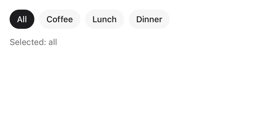
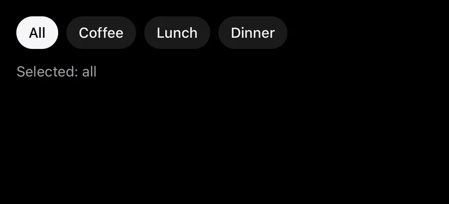
import * as React from "react"
import { View } from "react-native"
import { Chip, ChipGroup } from "@/components/ui/chip"
import { Text } from "@/components/ui/text"

const categories = [
  { value: "all", label: "All" },
  { value: "coffee", label: "Coffee" },
  { value: "lunch", label: "Lunch" },
  { value: "dinner", label: "Dinner" },
  { value: "bakery", label: "Bakery" },
  { value: "bars", label: "Bars" },
  { value: "desserts", label: "Desserts" },
]

function SingleGroupDemo() {
  const [value, setValue] = React.useState(["all"])
  return (
    <View className="gap-3">
      <ChipGroup value={value} onValueChange={setValue}>
        {categories.slice(0, 4).map((category) => (
          <Chip key={category.value} value={category.value}>
            {category.label}
          </Chip>
        ))}
      </ChipGroup>
      <Text variant="muted">Selected: {value.join(", ") || "none"}</Text>
    </View>
  )
}

export function ChipGroupSingleExample() {
  return (
    <SingleGroupDemo />
  )
}import EsuissUI
import SwiftUI
struct ChipCategory: Hashable {
let value: String
let label: String
}
let chipCategories = [
ChipCategory(value: "all", label: "All"),
ChipCategory(value: "coffee", label: "Coffee"),
ChipCategory(value: "lunch", label: "Lunch"),
ChipCategory(value: "dinner", label: "Dinner"),
ChipCategory(value: "bakery", label: "Bakery"),
ChipCategory(value: "bars", label: "Bars"),
ChipCategory(value: "desserts", label: "Desserts"),
]
struct ChipGroupSingleDemo: View {
@State private var value: String? = "all"
var body: some View {
VStack(alignment: .leading, spacing: 12) {
ChipGroup(selection: $value) {
ForEach(chipCategories.prefix(4), id: \.value) { category in
Chip(value: category.value) { Text(verbatim: category.label) }
}
}
Text("Selected: \(value ?? "none")").textVariant(.muted)
}
}
}import androidx.compose.foundation.layout.Arrangement
import androidx.compose.foundation.layout.Column
import androidx.compose.foundation.layout.fillMaxWidth
import androidx.compose.runtime.Composable
import androidx.compose.runtime.getValue
import androidx.compose.runtime.mutableStateOf
import androidx.compose.runtime.saveable.rememberSaveable
import androidx.compose.runtime.setValue
import androidx.compose.ui.Modifier
import androidx.compose.ui.unit.dp
import com.adamglin.phosphoricons.regular.Coffee
import com.esuiss.ui.components.Chip
import com.esuiss.ui.components.ChipGroup
import com.esuiss.ui.components.Text
import com.esuiss.ui.components.TextVariant
val ChipCategories = listOf(
"all" to "All",
"coffee" to "Coffee",
"lunch" to "Lunch",
"dinner" to "Dinner",
"bakery" to "Bakery",
"bars" to "Bars",
"desserts" to "Desserts",
)
@Composable
fun ChipGroupSingle() {
var value by rememberSaveable { mutableStateOf<String?>("all") }
Column(Modifier.fillMaxWidth(), verticalArrangement = Arrangement.spacedBy(12.dp)) {
ChipGroup(value = value, onValueChange = { value = it }) {
ChipCategories.take(4).forEach { (key, label) -> Chip(label, value = key) }
}
Text("Selected: ${value ?: "none"}", variant = TextVariant.Muted)
}
}Group multiple
A group with multiple selection.
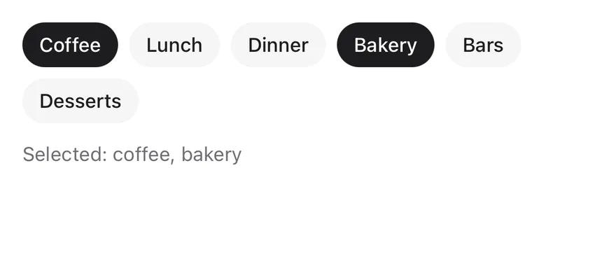
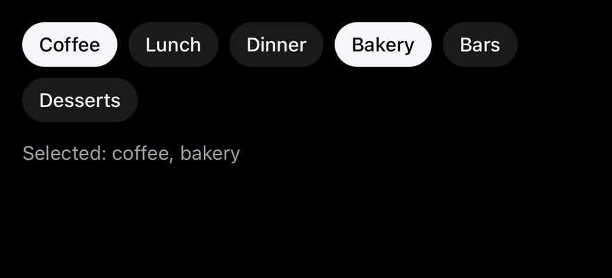
import * as React from "react"
import { View } from "react-native"
import { Chip, ChipGroup } from "@/components/ui/chip"
import { Text } from "@/components/ui/text"

const categories = [
  { value: "all", label: "All" },
  { value: "coffee", label: "Coffee" },
  { value: "lunch", label: "Lunch" },
  { value: "dinner", label: "Dinner" },
  { value: "bakery", label: "Bakery" },
  { value: "bars", label: "Bars" },
  { value: "desserts", label: "Desserts" },
]

function MultipleGroupDemo() {
  const [value, setValue] = React.useState(["coffee", "bakery"])
  return (
    <View className="gap-3">
      <ChipGroup multiple value={value} onValueChange={setValue}>
        {categories.slice(1).map((category) => (
          <Chip key={category.value} value={category.value}>
            {category.label}
          </Chip>
        ))}
      </ChipGroup>
      <Text variant="muted">Selected: {value.join(", ") || "none"}</Text>
    </View>
  )
}

export function ChipGroupMultipleExample() {
  return (
    <MultipleGroupDemo />
  )
}import EsuissUI
import SwiftUI
struct ChipCategory: Hashable {
let value: String
let label: String
}
let chipCategories = [
ChipCategory(value: "all", label: "All"),
ChipCategory(value: "coffee", label: "Coffee"),
ChipCategory(value: "lunch", label: "Lunch"),
ChipCategory(value: "dinner", label: "Dinner"),
ChipCategory(value: "bakery", label: "Bakery"),
ChipCategory(value: "bars", label: "Bars"),
ChipCategory(value: "desserts", label: "Desserts"),
]
struct ChipGroupMultipleDemo: View {
@State private var value: Set<String> = ["coffee", "bakery"]
var body: some View {
let selected = chipCategories.map(\.value).filter { value.contains($0) }
VStack(alignment: .leading, spacing: 12) {
ChipGroup(selection: $value) {
ForEach(chipCategories.dropFirst(), id: \.value) { category in
Chip(value: category.value) { Text(verbatim: category.label) }
}
}
Text("Selected: \(selected.isEmpty ? "none" : selected.joined(separator: ", "))").textVariant(.muted)
}
}
}import androidx.compose.foundation.layout.Arrangement
import androidx.compose.foundation.layout.Column
import androidx.compose.foundation.layout.fillMaxWidth
import androidx.compose.runtime.Composable
import androidx.compose.runtime.getValue
import androidx.compose.runtime.mutableStateOf
import androidx.compose.runtime.saveable.rememberSaveable
import androidx.compose.runtime.setValue
import androidx.compose.ui.Modifier
import androidx.compose.ui.unit.dp
import com.adamglin.phosphoricons.regular.Coffee
import com.esuiss.ui.components.Chip
import com.esuiss.ui.components.ChipGroup
import com.esuiss.ui.components.Text
import com.esuiss.ui.components.TextVariant
val ChipCategories = listOf(
"all" to "All",
"coffee" to "Coffee",
"lunch" to "Lunch",
"dinner" to "Dinner",
"bakery" to "Bakery",
"bars" to "Bars",
"desserts" to "Desserts",
)
@Composable
fun ChipGroupMultiple() {
var values by rememberSaveable { mutableStateOf(listOf("coffee", "bakery")) }
Column(Modifier.fillMaxWidth(), verticalArrangement = Arrangement.spacedBy(12.dp)) {
ChipGroup(values = values.toSet(), onValuesChange = { next -> values = values.filter { it in next } + next.filter { it !in values } }) {
ChipCategories.drop(1).forEach { (key, label) -> Chip(label, value = key) }
}
Text("Selected: ${values.joinToString(", ").ifEmpty { "none" }}", variant = TextVariant.Muted)
}
}Group uncontrolled
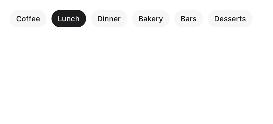
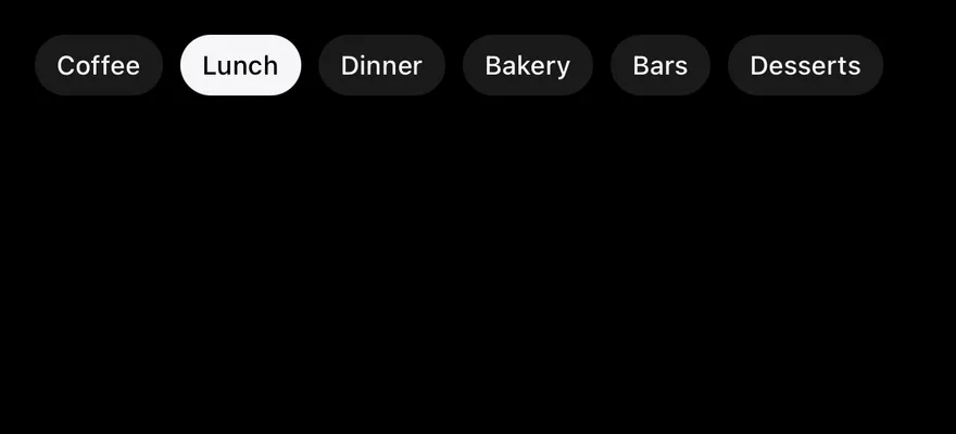
A group using defaultValue.
import { Chip, ChipGroup } from "@/components/ui/chip"

const categories = [
  { value: "all", label: "All" },
  { value: "coffee", label: "Coffee" },
  { value: "lunch", label: "Lunch" },
  { value: "dinner", label: "Dinner" },
  { value: "bakery", label: "Bakery" },
  { value: "bars", label: "Bars" },
  { value: "desserts", label: "Desserts" },
]

export function ChipGroupUncontrolledExample() {
  return (
    <ChipGroup multiple defaultValue={["lunch"]} size="sm">
      {categories.slice(1).map((category) => (
        <Chip key={category.value} value={category.value}>
          {category.label}
        </Chip>
      ))}
    </ChipGroup>
  )
}import EsuissUI
import SwiftUI
struct ChipCategory: Hashable {
let value: String
let label: String
}
let chipCategories = [
ChipCategory(value: "all", label: "All"),
ChipCategory(value: "coffee", label: "Coffee"),
ChipCategory(value: "lunch", label: "Lunch"),
ChipCategory(value: "dinner", label: "Dinner"),
ChipCategory(value: "bakery", label: "Bakery"),
ChipCategory(value: "bars", label: "Bars"),
ChipCategory(value: "desserts", label: "Desserts"),
]
struct ChipGroupUncontrolledDemo: View {
@State private var value: Set<String> = ["lunch"]
var body: some View {
ChipGroup(selection: $value, size: .sm) {
ForEach(chipCategories.dropFirst(), id: \.value) { category in
Chip(value: category.value) { Text(verbatim: category.label) }
}
}
}
}import androidx.compose.runtime.Composable
import androidx.compose.runtime.getValue
import androidx.compose.runtime.mutableStateOf
import androidx.compose.runtime.saveable.rememberSaveable
import androidx.compose.runtime.setValue
import com.adamglin.phosphoricons.regular.Coffee
import com.esuiss.ui.components.Chip
import com.esuiss.ui.components.ChipGroup
import com.esuiss.ui.components.ChipSize
val ChipCategories = listOf(
"all" to "All",
"coffee" to "Coffee",
"lunch" to "Lunch",
"dinner" to "Dinner",
"bakery" to "Bakery",
"bars" to "Bars",
"desserts" to "Desserts",
)
@Composable
fun ChipGroupUncontrolled() {
var values by rememberSaveable { mutableStateOf(listOf("lunch")) }
ChipGroup(values = values.toSet(), onValuesChange = { values = it.toList() }, size = ChipSize.Sm) {
ChipCategories.drop(1).forEach { (key, label) -> Chip(label, value = key) }
}
}Group scrollable
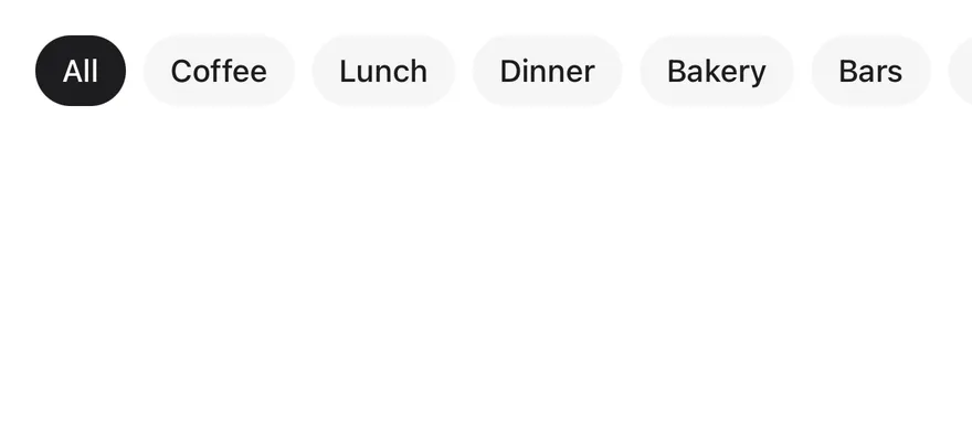
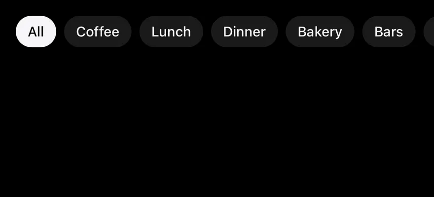
A single scrolling row with scrollable.
import { View } from "react-native"
import { Chip, ChipGroup } from "@/components/ui/chip"

const categories = [
  { value: "all", label: "All" },
  { value: "coffee", label: "Coffee" },
  { value: "lunch", label: "Lunch" },
  { value: "dinner", label: "Dinner" },
  { value: "bakery", label: "Bakery" },
  { value: "bars", label: "Bars" },
  { value: "desserts", label: "Desserts" },
]

export function ChipGroupScrollableExample() {
  return (
    <View className="-mx-4">
      <ChipGroup scrollable defaultValue={["all"]} className="px-4">
        {categories.map((category) => (
          <Chip key={category.value} value={category.value}>
            {category.label}
          </Chip>
        ))}
      </ChipGroup>
    </View>
  )
}import EsuissUI
import SwiftUI
struct ChipCategory: Hashable {
let value: String
let label: String
}
let chipCategories = [
ChipCategory(value: "all", label: "All"),
ChipCategory(value: "coffee", label: "Coffee"),
ChipCategory(value: "lunch", label: "Lunch"),
ChipCategory(value: "dinner", label: "Dinner"),
ChipCategory(value: "bakery", label: "Bakery"),
ChipCategory(value: "bars", label: "Bars"),
ChipCategory(value: "desserts", label: "Desserts"),
]
struct ChipGroupScrollableDemo: View {
@State private var value: String? = "all"
var body: some View {
ChipGroup(selection: $value, scrollable: true) {
ForEach(chipCategories, id: \.value) { category in
Chip(value: category.value) { Text(verbatim: category.label) }
}
}
.contentMargins(.horizontal, 16, for: .scrollContent)
.padding(.horizontal, -16)
}
}import androidx.compose.foundation.layout.PaddingValues
import androidx.compose.runtime.Composable
import androidx.compose.runtime.getValue
import androidx.compose.runtime.mutableStateOf
import androidx.compose.runtime.saveable.rememberSaveable
import androidx.compose.runtime.setValue
import androidx.compose.ui.Modifier
import androidx.compose.ui.layout.layout
import androidx.compose.ui.unit.dp
import com.adamglin.phosphoricons.regular.Coffee
import com.esuiss.ui.components.Chip
import com.esuiss.ui.components.ChipGroup
val ChipCategories = listOf(
"all" to "All",
"coffee" to "Coffee",
"lunch" to "Lunch",
"dinner" to "Dinner",
"bakery" to "Bakery",
"bars" to "Bars",
"desserts" to "Desserts",
)
@Composable
fun ChipGroupScrollable() {
var value by rememberSaveable { mutableStateOf<String?>("all") }
ChipGroup(
value = value,
onValueChange = { value = it },
modifier = Modifier.layout { measurable, constraints ->
val bleed = 16.dp.roundToPx()
val width = constraints.maxWidth + bleed * 2
val placeable = measurable.measure(constraints.copy(minWidth = width, maxWidth = width))
layout(constraints.maxWidth, placeable.height) { placeable.place(-bleed, 0) }
},
scrollable = true,
contentPadding = PaddingValues(horizontal = 16.dp),
) {
ChipCategories.forEach { (key, label) -> Chip(label, value = key) }
}
}Group disabled
A disabled group.

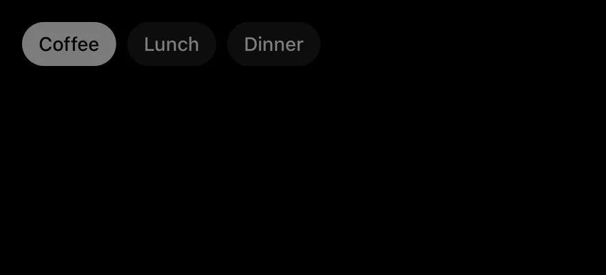
import { Chip, ChipGroup } from "@/components/ui/chip"

const categories = [
  { value: "all", label: "All" },
  { value: "coffee", label: "Coffee" },
  { value: "lunch", label: "Lunch" },
  { value: "dinner", label: "Dinner" },
  { value: "bakery", label: "Bakery" },
  { value: "bars", label: "Bars" },
  { value: "desserts", label: "Desserts" },
]

export function ChipGroupDisabledExample() {
  return (
    <ChipGroup disabled defaultValue={["coffee"]}>
      {categories.slice(1, 4).map((category) => (
        <Chip key={category.value} value={category.value}>
          {category.label}
        </Chip>
      ))}
    </ChipGroup>
  )
}import EsuissUI
import SwiftUI
struct ChipCategory: Hashable {
let value: String
let label: String
}
let chipCategories = [
ChipCategory(value: "all", label: "All"),
ChipCategory(value: "coffee", label: "Coffee"),
ChipCategory(value: "lunch", label: "Lunch"),
ChipCategory(value: "dinner", label: "Dinner"),
ChipCategory(value: "bakery", label: "Bakery"),
ChipCategory(value: "bars", label: "Bars"),
ChipCategory(value: "desserts", label: "Desserts"),
]
struct ChipGroupDisabledDemo: View {
@State private var value: String? = "coffee"
var body: some View {
ChipGroup(selection: $value) {
ForEach(chipCategories[1..<4], id: \.value) { category in
Chip(value: category.value) { Text(verbatim: category.label) }
}
}
.disabled(true)
}
}import androidx.compose.runtime.Composable
import androidx.compose.runtime.getValue
import androidx.compose.runtime.mutableStateOf
import androidx.compose.runtime.saveable.rememberSaveable
import androidx.compose.runtime.setValue
import com.adamglin.phosphoricons.regular.Coffee
import com.esuiss.ui.components.Chip
import com.esuiss.ui.components.ChipGroup
val ChipCategories = listOf(
"all" to "All",
"coffee" to "Coffee",
"lunch" to "Lunch",
"dinner" to "Dinner",
"bakery" to "Bakery",
"bars" to "Bars",
"desserts" to "Desserts",
)
@Composable
fun ChipGroupDisabled() {
var value by rememberSaveable { mutableStateOf<String?>("coffee") }
ChipGroup(value = value, onValueChange = { value = it }, enabled = false) {
ChipCategories.subList(1, 4).forEach { (key, label) -> Chip(label, value = key) }
}
}API Reference
Chip
Selectable pill.
| Prop | Type | Default | Description |
|---|---|---|---|
selected | boolean | - | Whether the chip is selected, for controlled use. |
defaultSelected | boolean | - | Whether the chip starts selected when uncontrolled. |
onSelectedChange | (selected: boolean, details) => void | - | Called when the chip is toggled. |
size | "default" | "sm" | "default" | The chip height; inherited from a surrounding group. |
icon | PhosphorIcon | - | An icon shown before the label. |
onRemove | () => void | - | Shows a remove button and is called when it is pressed. |
removeLabel | string | "Remove" | Accessibility label of the remove button. |
Also accepts the props of ChipProps.
ChipGroup
Manages selection and layout for several chips.
| Prop | Type | Default | Description |
|---|---|---|---|
size | ChipSize | "default" | Size passed to every chip. |
scrollable | boolean | false | Shows chips in a horizontal scroll view instead of wrapping. |
Also accepts the props of React.ComponentProps<typeof ToggleGroupPrimitive>.
Accessibility
- A chip has the
togglebuttonrole withcheckedstate, or theradiorole in a single-selection group. - A group has the
radiogrouprole for single selection andgroupfor multiple. - With
onRemove, the chip exposes aremoveaccessibility action, and the remove button has its ownbuttonrole and label.
Notes
- Uses
bg-secondary,bg-foregroundandtext-backgroundtokens, withopacity-80while pressed andopacity-50when disabled; light and dark follow the system appearance.