suiss/ui · Component
Context Menu
A menu of actions that opens at the pointer when people right-click an area.
Context Menu is an open-source component from suiss/ui for React, React Native, SwiftUI and Jetpack Compose. The @esuiss/ui CLI copies its source into your project, so you own the code.
Context menu wraps the context menu primitive of the chosen base. The ContextMenu root manages the open state and ContextMenuTrigger defines the area that opens the menu. ContextMenuContent renders the menu in a portal at the pointer position. Inside it, use ContextMenuItem for actions, ContextMenuCheckboxItem for toggles, and ContextMenuRadioGroup with ContextMenuRadioItem for a single choice. Organize items with ContextMenuGroup, ContextMenuLabel and ContextMenuSeparator, and nest a submenu with ContextMenuSub, ContextMenuSubTrigger and ContextMenuSubContent. ContextMenuShortcut displays a keyboard shortcut at the end of an item.
Use a context menu for secondary actions on an object. Because it is hidden until a right-click or long press, make the same actions available elsewhere. For a menu opened from a visible button, use a dropdown menu.
Installation
CLI
Works in any project with a components.json. See Installation for the one-line registry setup. Or use the suiss/ui CLI:
Manual
- Install the dependencies and add the
cnhelper:
-
Add the pieces it builds on:
use-platform. -
Copy the source into
components/ui/context-menu.tsx:
- Update the import paths to match your project.
Usage
Checkbox items are uncontrolled with defaultChecked, or controlled with checked and onCheckedChange. Radio groups take defaultValue, or value and onValueChange, and each radio item needs a value. Respond to an action with the item's onClick. Selecting a regular item closes the menu; checkbox and radio items keep it open.
Checkbox items are uncontrolled with defaultSelected, or controlled with isSelected and onChange. Radio groups take defaultValue, or value and onChange, and each radio item needs a value. Respond to an action with the item's onAction. Selecting a regular item closes the menu; checkbox and radio items keep it open.
Set inset on items and labels that have no icon so their text aligns with items that do, or with the indicators of checkbox and radio items. Set variant="destructive" on items that delete or remove something.
Examples
Inset
A file menu where inset aligns a label and items without icons, ending with a destructive item.
API Reference
ContextMenu
The root that manages the menu's open state.
Also accepts the props of the primitive part it wraps.
ContextMenuPortal
Renders its children into a portal outside the current DOM hierarchy.
Also accepts the props of the primitive part it wraps.
ContextMenuTrigger
The area that opens the menu on right-click.
Also accepts the props of the primitive part it wraps.
ContextMenuContent
The menu panel, rendered in a portal at the pointer position.
Also accepts the props of the primitive parts it wraps.
ContextMenuGroup
Groups related items.
Also accepts the props of the primitive part it wraps.
ContextMenuLabel
A heading for a group of items.
| Prop | Type | Default | Description |
|---|---|---|---|
inset | boolean | - | Adds leading padding so the label aligns with items that have an icon or indicator. |
Also accepts the props of the primitive part it wraps.
ContextMenuItem
An action in the menu.
| Prop | Type | Default | Description |
|---|---|---|---|
inset | boolean | - | Adds leading padding so the item aligns with items that have an icon or indicator. |
variant | "default" | "destructive" | "default" | destructive colors the item and its icon with the destructive color. |
Also accepts the props of the primitive part it wraps.
ContextMenuSub
The root of a nested submenu.
Also accepts the props of the primitive part it wraps.
ContextMenuSubTrigger
The item that opens a submenu, shown with a trailing caret.
| Prop | Type | Default | Description |
|---|---|---|---|
inset | boolean | - | Adds leading padding so the trigger aligns with items that have an icon or indicator. |
Also accepts the props of the primitive part it wraps.
ContextMenuSubContent
The panel of a submenu, opened beside its trigger.
Also accepts the props of React.ComponentProps<typeof ContextMenuContent>.
ContextMenuCheckboxItem
An item that toggles a setting on or off and shows a check mark when on.
| Prop | Type | Default | Description |
|---|---|---|---|
inset | boolean | - | Adds leading padding so the item aligns with other inset items. |
Also accepts the props of the primitive part it wraps.
ContextMenuRadioGroup
Groups radio items so that only one can be selected.
Also accepts the props of the primitive part it wraps.
ContextMenuRadioItem
An item in a radio group that shows a check mark when selected.
| Prop | Type | Default | Description |
|---|---|---|---|
inset | boolean | - | Adds leading padding so the item aligns with other inset items. |
Also accepts the props of the primitive part it wraps.
ContextMenuSeparator
A divider between groups of items.
Also accepts the props of the primitive part it wraps.
ContextMenuShortcut
Displays a keyboard shortcut at the end of an item.
| Prop | Type | Default | Description |
|---|---|---|---|
mod | boolean | - | Prefixes the shortcut with the platform modifier key, ⌘ on Apple platforms and Ctrl+ elsewhere. |
Also accepts the props of React.ComponentProps<"span">.
Accessibility
- The menu has the
menurole. Items have themenuitem,menuitemcheckboxormenuitemradiorole, and checkbox and radio items setaria-checked. - Disabled items set
aria-disabledand cannot be chosen. - Arrow keys move between items. On a submenu trigger, the Right Arrow opens the submenu and moves focus into it, and the Left Arrow returns to the trigger. The arrow directions follow the reading direction.
- Escape closes the menu, and choosing a regular item closes it.
ContextMenuShortcutonly displays a shortcut; it does not register one. It is hidden on small screens.
Notes
- Styling hooks:
data-slotvalues such ascontext-menu-content,context-menu-item,context-menu-checkbox-item,context-menu-radio-item,context-menu-sub-trigger,context-menu-label,context-menu-separatorandcontext-menu-shortcut. - Items set
data-insetanddata-variant; disabled items getdata-disabled, and an open submenu trigger getsdata-popup-open. - By default the menu opens on the
inline-endside of the pointer, aligned tostart. - The trigger sets
select-noneso long-pressing does not select its text. - Uses the
popover,accent,destructiveandbordercolors.
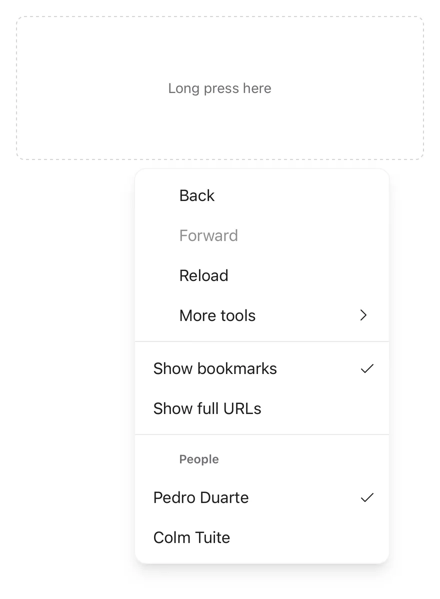
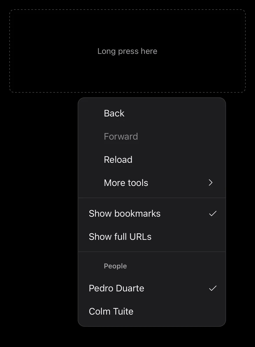
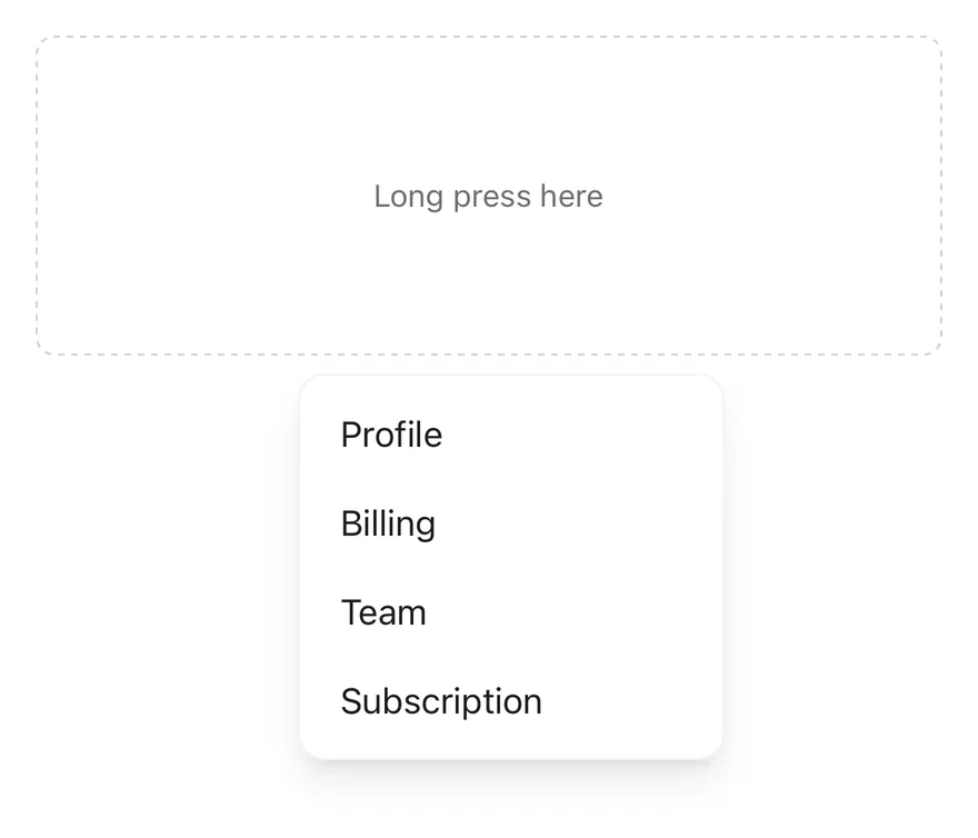
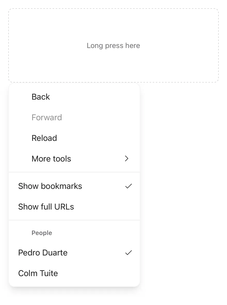
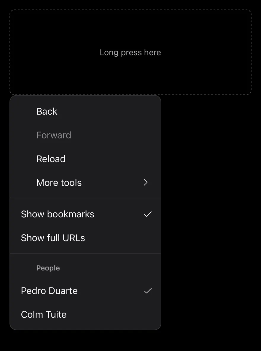
ContextMenu attaches a menu to a ContextMenuTrigger area. A long press opens ContextMenuContent at the position of the finger with a medium impact haptic. The content renders through a portal (inside a full-window overlay on iOS) as a raised, rounded card.
Items can be plain actions, checkbox items, radio items in a group, or a submenu. ContextMenuSubContent expands in place under its trigger, and the caret turns to point down while it is open.