suiss/ui · Component
Textarea
A multi-line text field that grows with its content, with an optional resize handle.
Textarea is an open-source component from suiss/ui for React, React Native, SwiftUI and Jetpack Compose. The @esuiss/ui CLI copies its source into your project, so you own the code.
Textarea renders a native textarea styled to match the other form controls. By default it uses field-sizing: content, so it grows as people type, starting at a minimum height of 4rem.
Set resizable to give it a fixed height and a custom handle that people drag to resize it vertically. Use Textarea for free-form text such as messages or notes; for a single line, use Input.
Installation
CLI
Works in any project with a components.json. See Installation for the one-line registry setup. Or use the suiss/ui CLI:
Manual
-
Add the
cnhelper. -
Copy the source into
components/ui/textarea.tsx:
- Update the import paths to match your project.
Usage
Textarea passes its props to the native element, so use value with onChange to control it, or defaultValue for an uncontrolled field. Pair it with a Label through htmlFor and id, and link hint text with aria-describedby.
With resizable, the textarea and its handle are wrapped in a relative container. Double-click the handle to reset the height.
Examples
With value
Starts with a default value.
With label
Names the textarea with a Label.
Resizable
Adds a resize handle inside the bottom corner of the field.
Resizable outside
Places the resize handle just outside the bottom corner of the field.
Disabled
Disables the textarea so it can't be edited.
Invalid
Marks the textarea with aria-invalid to show an error state.
API Reference
Textarea
The multi-line text field, with an optional resize handle.
| Prop | Type | Default | Description |
|---|---|---|---|
resizable | "inside" | "outside" | - | Adds a vertical resize handle, placed inside or outside the field's bottom corner, and turns off automatic growth. |
Also accepts the props of React.ComponentProps<"textarea">.
Accessibility
- Renders a native
textareawith thetextboxrole. Name it with aLabeloraria-label. - The resize handle is hidden from assistive technologies and works with a pointer only.
- An invalid field is exposed through
aria-invalid.
Notes
- Uses
data-slot="textarea"and setsdata-resizablewhen resizable; the wrapper and handle usetextarea-containerandtextarea-handle. - A resizable textarea starts at a minimum height of
6rem, and dragging never shrinks it below its minimum height. - The handle is hidden while the textarea is disabled, and mirrors in right-to-left layouts.
- The caret uses the
primarycolor; invalid fields use thedestructivecolor.
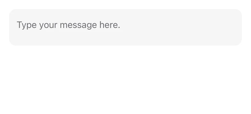
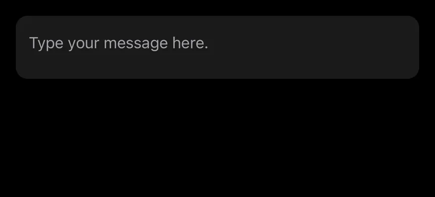
Textarea is the multi-line version of Input. It wraps a TextInput through the same field control primitive, defaults to multiline with numberOfLines={8}, aligns text to the top and has a minimum height. It shows a focus border while editing, a destructive border and tint when invalid, and 50% opacity when disabled.
Installation
Manual
- Install the dependencies:
-
Add the pieces it builds on: the primitives
components/primitives/input.tsx,components/primitives/use-render.tsx. -
Copy the source into
components/ui/textarea.tsx:
- Update the import paths to match your project.
- Install the dependencies:
-
Add the pieces it builds on: the primitives
components/primitives/input.tsx,components/primitives/use-render.tsx. -
Copy the source into
components/ui/textarea.tsx:
- Update the import paths to match your project.
-
Add the pieces it builds on: the primitives
components/primitives/input.tsx,components/primitives/use-render.tsx. -
Copy the source into
components/ui/textarea.tsx:
- Update the import paths to match your project.
-
Target iOS 17 or later.
-
Copy the theme files every view uses:
- Copy the source and every file it uses:
- Add the files to your app target.
- Set
minSdkto 24 or higher and add the dependencies:
- Copy the theme files every view uses:
- Copy the source and every file it uses:
- Update the
com.esuiss.uipackage names to match your project.
Usage
Use it for comments, messages and other free-form text. Use Input for single-line values.
The value works controlled with value and onValueChange(value, details), or uncontrolled with defaultValue. Inside a Field, the textarea picks up the field's label, description, invalid and disabled state.
Override numberOfLines or set a height through className to change the visible size.
Examples
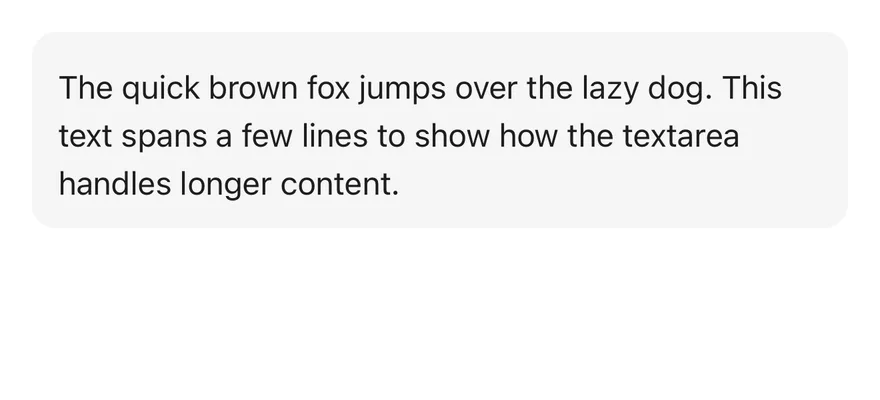
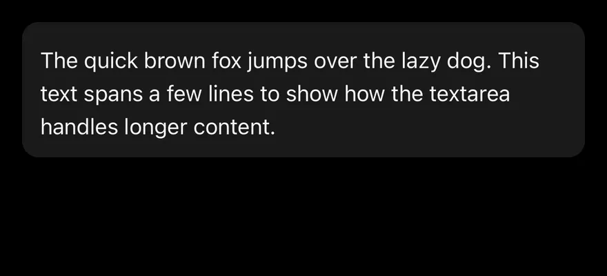
With value
A textarea that starts with a defaultValue.
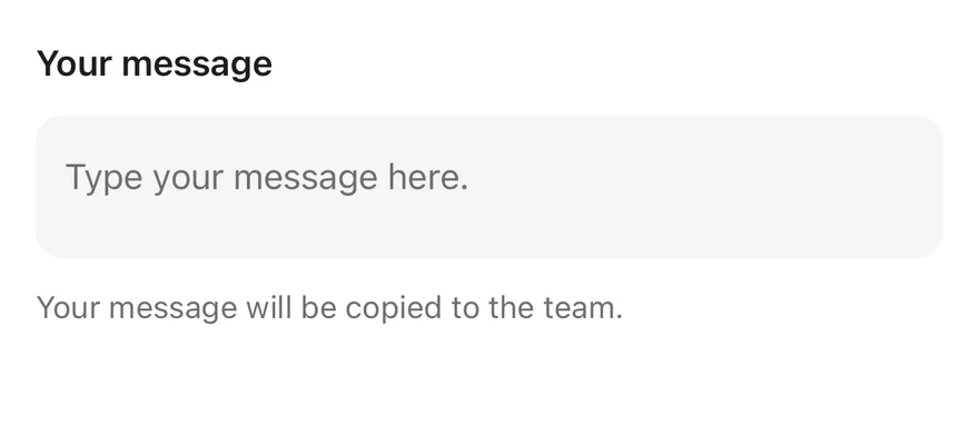
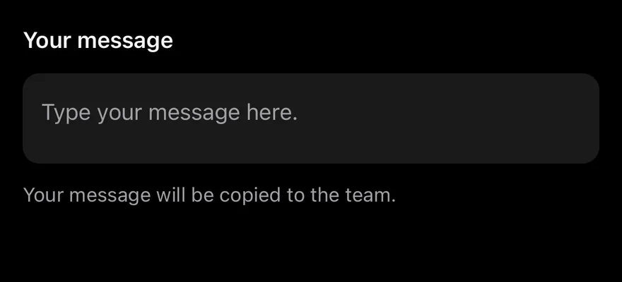
With label
A textarea inside a Field with a label and description.
Disabled
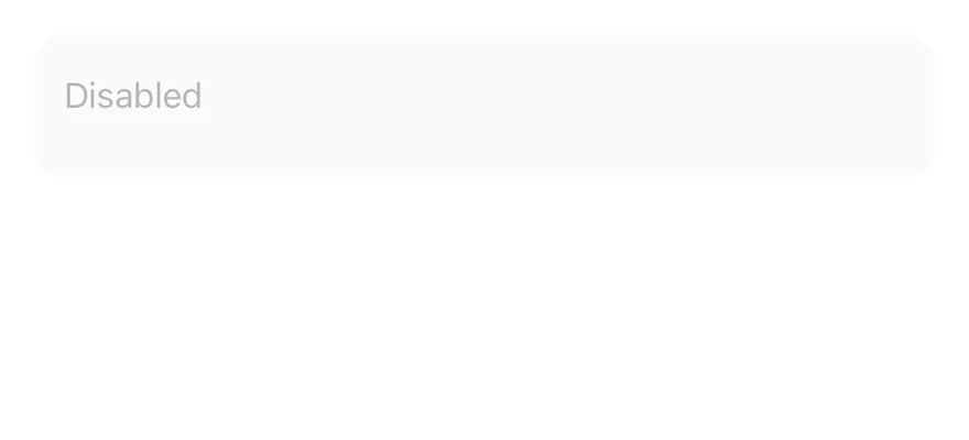
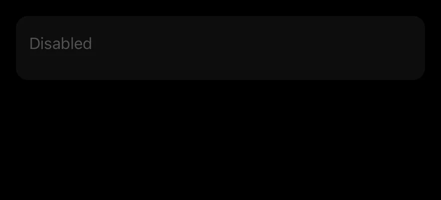
A disabled textarea.
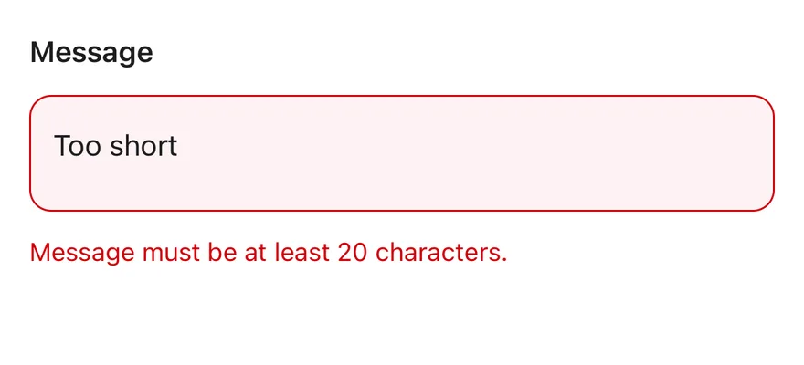
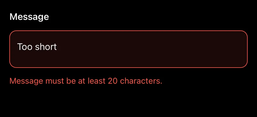
Invalid
A textarea inside an invalid Field with an error message.
API Reference
Textarea
Also accepts the props of React.ComponentProps<typeof InputPrimitive.Root>.
Accessibility
- Inside a
Field, the textarea gets the field label asaccessibilityLabeland the description asaccessibilityHint. disabledis set inaccessibilityStateand makes the textarea non-editable.- Outside a
Field, give it anaccessibilityLabel.
Notes
- Uses the
bg-secondary,border-ringandborder-destructivetokens, withopacity-50when disabled. - In Uniwind and NativeWind, a focused field also draws the
ring-3 ring-ring/50focus ring. - Placeholder, cursor and selection colors come from the
muted-foregroundandprimarytokens. - Light and dark colors follow the system appearance.