suiss/ui
  • Docs
  • Components
  • Patterns
  • Interactions
  • Charts
  • Blocks
GitHubGet started
DocsComponentsPatternsInteractionsChartsBlocks
Components82
  • Overview
  • Accordion
  • Alert
  • Alert Dialog
  • Alert Sheet
  • Amount Input
  • Aspect Ratio
  • Attachment
  • Avatar
  • Badge
  • Bottom Bar
  • Breadcrumb
  • Bubble
  • Button
  • Button Group
  • Calendar
  • Card
  • Carousel
  • Chart
  • Checkbox
  • Chip
  • Collapsible
  • Combobox
  • Command
  • Context Menu
  • Dialog
  • Direction
  • Drawer
  • Dropdown Menu
  • Empty
  • FAB
  • Field
  • Fullscreen Menu
  • Haptics
  • Header
  • Hover Card
  • Icon
  • Input
  • Input Accessory Bar
  • Input Group
  • Input OTP
  • Item
  • Kbd
  • Keyboard Scroll View
  • Keypad
  • Label
  • Marker
  • Menubar
  • Message
  • Message Scroller
  • Native Select
  • Navigation Menu
  • Page Indicator
  • Pagination
  • Pin Pad
  • Popover
  • Progress
  • QR Scanner
  • Questionnaire
  • Radio Group
  • Resizable
  • Screen
  • Scroll Area
  • Select
  • Separator
  • Sheet
  • Sidebar
  • Signature Pad
  • Skeleton
  • Slider
  • Spinner
  • Switch
  • Tab Bar
  • Table
  • Tabs
  • Text
  • Textarea
  • Toast
  • Toggle
  • Toggle Group
  • Tooltip
  • Wheel Picker
  • Widget

suiss/ui · Component

Amount Input

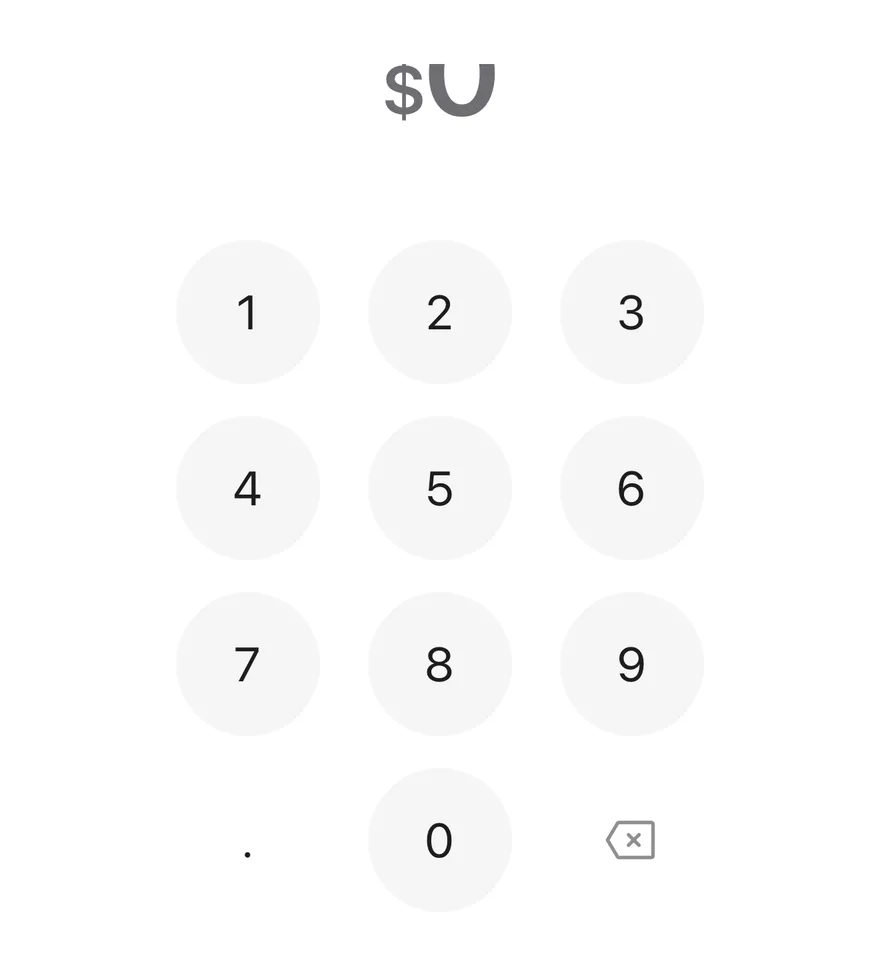
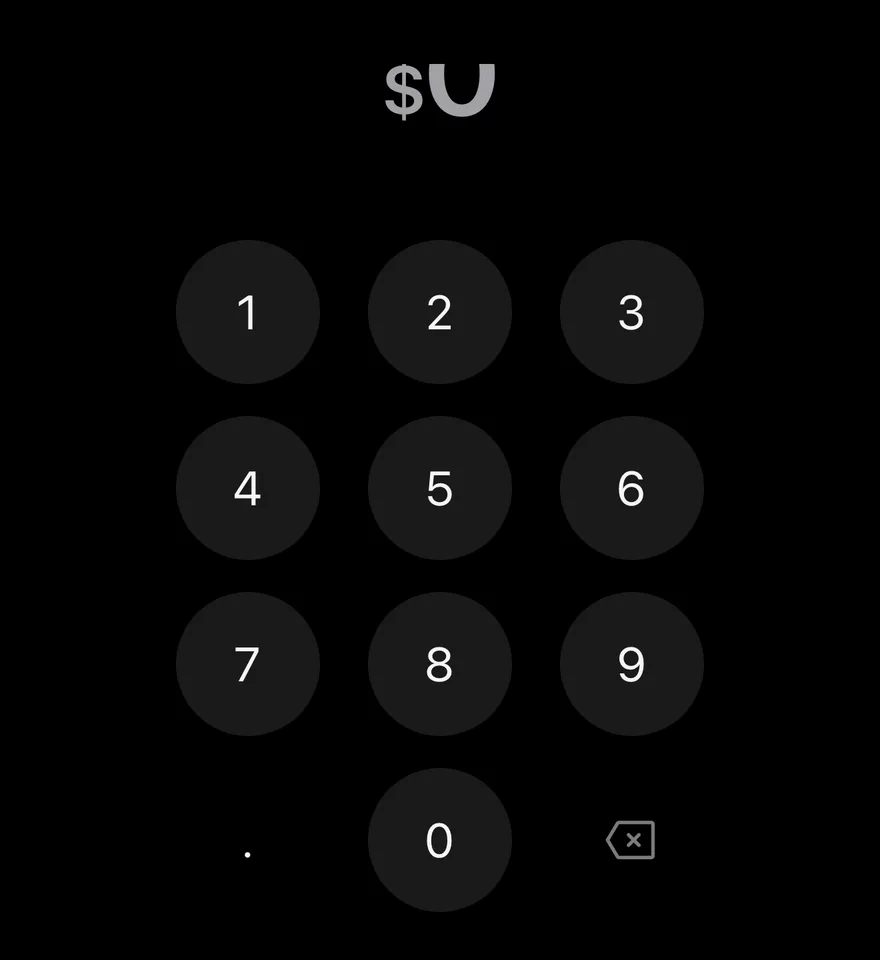
A large, locale-formatted money display with an on-screen keypad for entering an amount.

Amount Input is an open-source component from suiss/ui for React Native, SwiftUI and Jetpack Compose. The @esuiss/ui CLI copies its source into your project, so you own the code.
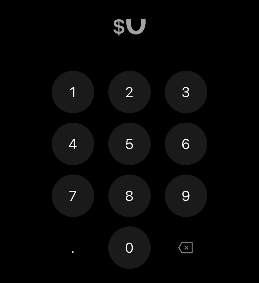
iOS
Amount Input on iOS in light modeAmount Input on iOS in dark mode
import { AmountInput } from "@/components/ui/amount-input"

export function AmountInputExample() {
  return (
    <AmountInput currency="USD" locale="en-US" />
  )
}
import EsuissUI
import SwiftUI

struct AmountInputExample: View {
  var body: some View {
    AmountInputDemo(currency: "USD", locale: "en-US")
  }
}

struct AmountInputDemo: View {
  let currency: String
  let locale: String
  var max: Double?

  @State private var value: String

  init(currency: String, locale: String, initial: String = "", max: Double? = nil) {
    self.currency = currency
    self.locale = locale
    self.max = max
    _value = State(initialValue: initial)
  }

  var body: some View {
    AmountInput(value: $value, currency: currency, max: max)
      .environment(\.locale, Locale(identifier: locale))
  }
}
import androidx.compose.foundation.layout.fillMaxWidth
import androidx.compose.runtime.Composable
import androidx.compose.runtime.getValue
import androidx.compose.runtime.mutableStateOf
import androidx.compose.runtime.saveable.rememberSaveable
import androidx.compose.runtime.setValue
import androidx.compose.ui.Modifier
import com.esuiss.ui.components.AmountInput
import java.util.Locale

@Composable
fun AmountInputExample() {
    AmountInputStory("USD", "en-US")
}

@Composable
fun AmountInputStory(
    currency: String,
    locale: String,
    defaultValue: String = "",
    max: Double? = null,
    enabled: Boolean = true,
) {
    var value by rememberSaveable { mutableStateOf(defaultValue) }
    AmountInput(
        modifier = Modifier.fillMaxWidth(),
        value = value,
        onValueChange = { next, _ -> value = next },
        currency = currency,
        locale = Locale.forLanguageTag(locale),
        max = max,
        enabled = enabled,
    )
}

AmountInput combines a big formatted amount with a Keypad. The amount is formatted with Intl.NumberFormat for the given locale and currency, the currency symbol is drawn smaller, and the font size steps down as the number gets longer.

The decimal key appears only when the currency allows fractions, using the locale's decimal separator. A key that would exceed the limits is rejected with a shake and an error haptic; accepted keys play a selection haptic.

Installation

$ pnpm dlx shadcn@latest add @esuiss-rn/amount-input

See Installation for the components.json setup. Or use the suiss/ui CLI:

$ pnpm dlx @esuiss/ui@latest add amount-input
$ pnpm dlx @esuiss/ui@latest add amount-input --platform swift
$ pnpm dlx @esuiss/ui@latest add amount-input --platform kotlin

The CLI also adds what it builds on: Keypad, Text. On React Native it also adds the animated view components/ui/animated-view.tsx.

Manual

  1. Install the dependencies:
npx expo install cn react-native-reanimated react-native-worklets
  1. Add the pieces it builds on: Keypad, Text, and the primitives components/primitives/haptics.tsx, and the animated view components/ui/animated-view.tsx from the next step.

  2. Copy the animated view into components/ui/animated-view.tsx:

uniwind/components/ui/animated-view.tsx
import { Pressable } from "react-native"
import Animated from "react-native-reanimated"

const AnimatedPressable = Animated.createAnimatedComponent(Pressable)

type AnimatedViewProps =
  | (React.ComponentProps<typeof Animated.View> &
      React.RefAttributes<React.ComponentRef<typeof Animated.View>> & {
        as?: "View"
      })
  | (React.ComponentProps<typeof AnimatedPressable> &
      React.RefAttributes<React.ComponentRef<typeof AnimatedPressable>> & {
        as: "Pressable"
      })

function AnimatedView(props: AnimatedViewProps) {
  1. Copy the source into components/ui/amount-input.tsx:
uniwind/components/ui/amount-input.tsx
import { cn } from "cn"
import * as React from "react"
import { View } from "react-native"
import {
  ReduceMotion,
  useAnimatedStyle,
  useSharedValue,
  withSequence,
  withTiming,
} from "react-native-reanimated"
import { useHaptics } from "@/components/primitives/haptics"
import { AnimatedView } from "@/components/ui/animated-view"
import { Keypad, type KeypadKeyValue } from "@/components/ui/keypad"
import { Text } from "@/components/ui/text"

type AmountPart = { type: string; value: string }
  1. Update the import paths to match your project.
  1. Install the dependencies:
npx expo install cn react-native-reanimated react-native-worklets
  1. Add the pieces it builds on: Keypad, Text, and the primitives components/primitives/haptics.tsx, and the animated view components/ui/animated-view.tsx from the next step.

  2. Copy the animated view into components/ui/animated-view.tsx:

nativewind/components/ui/animated-view.tsx
import { Pressable } from "react-native"
import Animated from "react-native-reanimated"

const AnimatedPressable = Animated.createAnimatedComponent(Pressable)

type AnimatedViewProps =
  | (React.ComponentProps<typeof Animated.View> &
      React.RefAttributes<React.ComponentRef<typeof Animated.View>> & {
        as?: "View"
      })
  | (React.ComponentProps<typeof AnimatedPressable> &
      React.RefAttributes<React.ComponentRef<typeof AnimatedPressable>> & {
        as: "Pressable"
      })

function AnimatedView(props: AnimatedViewProps) {
  1. Copy the source into components/ui/amount-input.tsx:
nativewind/components/ui/amount-input.tsx
import { cn } from "cn"
import * as React from "react"
import { View } from "react-native"
import {
  ReduceMotion,
  useAnimatedStyle,
  useSharedValue,
  withSequence,
  withTiming,
} from "react-native-reanimated"
import { useHaptics } from "@/components/primitives/haptics"
import { AnimatedView } from "@/components/ui/animated-view"
import { Keypad, type KeypadKeyValue } from "@/components/ui/keypad"
import { Text } from "@/components/ui/text"

type AmountPart = { type: string; value: string }
  1. Update the import paths to match your project.
  1. Install the dependencies:
npx expo install react-native-reanimated react-native-worklets
  1. Add the pieces it builds on: Keypad, Text, and the primitives components/primitives/haptics.tsx, and the animated view components/ui/animated-view.tsx from the next step.

  2. Copy the animated view into components/ui/animated-view.tsx:

stylesheet/components/ui/animated-view.tsx
import { Pressable } from "react-native"
import Animated from "react-native-reanimated"

const AnimatedPressable = Animated.createAnimatedComponent(Pressable)

type AnimatedViewProps =
  | (React.ComponentProps<typeof Animated.View> &
      React.RefAttributes<React.ComponentRef<typeof Animated.View>> & {
        as?: "View"
      })
  | (React.ComponentProps<typeof AnimatedPressable> &
      React.RefAttributes<React.ComponentRef<typeof AnimatedPressable>> & {
        as: "Pressable"
      })

function AnimatedView(props: AnimatedViewProps) {
  1. Copy the source into components/ui/amount-input.tsx:
stylesheet/components/ui/amount-input.tsx
import * as React from "react"
import {
  type StyleProp,
  StyleSheet,
  type TextStyle,
  View,
  type ViewStyle,
} from "react-native"
import {
  ReduceMotion,
  useAnimatedStyle,
  useSharedValue,
  withSequence,
  withTiming,
} from "react-native-reanimated"
import { useHaptics } from "@/components/primitives/haptics"
  1. Update the import paths to match your project.
  1. Target iOS 17 or later.

  2. Add the Swift package to your app:

Package.swift
.package(url: "https://github.com/phosphor-icons/swift", from: "2.1.0")
  1. Copy the theme files every view uses:
swift/Theme/Theme.swift
import SwiftUI
import UIKit

struct RGBA: Sendable {
  let red: CGFloat
  let green: CGFloat
  let blue: CGFloat
  let alpha: CGFloat

  init(_ hex: UInt32, _ alpha: CGFloat = 1) {
    red = CGFloat((hex >> 16) & 0xFF) / 255
    green = CGFloat((hex >> 8) & 0xFF) / 255
    blue = CGFloat(hex & 0xFF) / 255
    self.alpha = alpha
  }
swift/Theme/Tokens.swift
import SwiftUI

public enum EsuissColor {
  public static let background = Color.adaptive(light: .init(0xFFFFFF), dark: .init(0x000000))
  public static let foreground = Color.adaptive(light: .init(0x1D1D1F), dark: .init(0xF5F5F7))
  public static let card = Color.adaptive(light: .init(0xFFFFFF), dark: .init(0x1D1D1F))
  public static let cardForeground = Color.adaptive(light: .init(0x1D1D1F), dark: .init(0xF5F5F7))
  public static let popover = Color.adaptive(light: .init(0xFFFFFF), dark: .init(0x1D1D1F))
  public static let popoverForeground = Color.adaptive(light: .init(0x1D1D1F), dark: .init(0xF5F5F7))
  public static let primary = Color.adaptive(light: .init(0x0071E3), dark: .init(0x2997FF))
  public static let primaryForeground = Color.adaptive(light: .init(0xFFFFFF), dark: .init(0xFFFFFF))
  public static let secondary = Color.adaptive(light: .init(0x000000, 0.04), dark: .init(0xFFFFFF, 0.1))
  public static let secondaryForeground = Color.adaptive(light: .init(0x1D1D1F), dark: .init(0xF5F5F7))
  public static let muted = Color.adaptive(light: .init(0xF5F5F7), dark: .init(0x161617))
  public static let mutedForeground = Color.adaptive(light: .init(0x6E6E73), dark: .init(0xA1A1A6))
  public static let accent = Color.adaptive(light: .init(0x000000, 0.06), dark: .init(0xFFFFFF, 0.1))
  1. Copy the source and every file it uses:
swift/Components/AmountInput.swift
import SwiftUI

struct AmountFormat {
  let locale: Locale
  let currency: String?
  let fractionDigits: Int
  let decimalSeparator: String
  let prefix: String
  let suffix: String

  init(locale: Locale, currency: String?, maxFractionDigits: Int? = nil) {
    let formatter = NumberFormatter()
    formatter.locale = locale
    formatter.numberStyle = currency == nil ? .decimal : .currency
    if let currency { formatter.currencyCode = currency }
    self.locale = locale
swift/Components/Checkbox.swift
import PhosphorSwift
import SwiftUI

extension Shadow {
  static let control = Shadow(color: .black.opacity(0.08), radius: 0.5, y: 0.5)
  static let thumb = Shadow(color: .black.opacity(0.12), radius: 1.5, y: 1)
}

struct SelectionIndicator<Mark: View>: View {
  let checked: Bool
  let pressed: Bool
  let cornerRadius: CGFloat
  let mark: Mark

  @Environment(\.isEnabled) private var isEnabled
  @Environment(\.isInvalid) private var invalid
swift/Components/Field.swift
import SwiftUI

extension EnvironmentValues {
  @Entry public var isInvalid = false
  @Entry var fieldInset = false
  @Entry var fieldGroupInset = false
  @Entry var fieldSetInset = false
}

extension View {
  public func invalid(_ isInvalid: Bool = true) -> some View {
    environment(\.isInvalid, isInvalid)
  }
}

public enum FieldOrientation: CaseIterable, Sendable {
swift/Components/Haptics.swift
import SwiftUI

extension EnvironmentValues {
  @Entry public var hapticsEnabled = true
}

extension View {
  public func haptics(_ enabled: Bool) -> some View {
    environment(\.hapticsEnabled, enabled)
  }

  func hapticFeedback<Trigger: Equatable>(_ feedback: SensoryFeedback, trigger: Trigger) -> some View {
    modifier(HapticFeedbackModifier(feedback: feedback, trigger: trigger) { _, _ in true })
  }

  func hapticFeedback<Trigger: Equatable>(
swift/Components/Keypad.swift
import PhosphorSwift
import SwiftUI

public enum KeypadKey: Hashable, Sendable {
  case digit(Int)
  case decimal
  case delete
  case biometric
}

public enum KeypadAccessory {
  case none
  case decimal(String, label: LocalizedStringKey = "Decimal separator")
  case biometric(Image, label: LocalizedStringKey = "Use biometrics")
}
swift/Components/Separator.swift
import SwiftUI

public struct Separator: View {
  let orientation: Axis

  public init(_ orientation: Axis = .horizontal) {
    self.orientation = orientation
  }

  public var body: some View {
    Rectangle()
      .fill(EsuissColor.border)
      .frame(width: orientation == .vertical ? 1 : nil, height: orientation == .horizontal ? 1 : nil)
      .frame(maxWidth: orientation == .horizontal ? .infinity : nil, maxHeight: orientation == .vertical ? .infinity : nil)
      .accessibilityHidden(true)
  }
swift/Components/TextVariant.swift
import SwiftUI

public enum TextVariant: CaseIterable, Sendable {
  case `default`, h1, h2, h3, h4, p, blockquote, code, lead, large, small, muted

  var style: TextStyle {
    switch self {
    case .h1: .xl3
    case .h2: .xl2
    case .h3: .xl
    case .h4, .lead, .large: .lg
    case .code, .small, .muted: .sm
    default: .base
    }
  }
  1. Add the files to your app target.
  1. Set minSdk to 24 or higher and add the dependencies:
build.gradle.kts
implementation(platform("androidx.compose:compose-bom:2026.09.00"))
implementation("androidx.compose.foundation:foundation")
implementation("androidx.compose.ui:ui")
implementation("com.adamglin:phosphor-icon-android:1.0.0")
  1. Copy the theme files every view uses:
kotlin/theme/Theme.kt
package com.esuiss.ui.theme

import androidx.compose.foundation.isSystemInDarkTheme
import androidx.compose.runtime.Composable
import androidx.compose.runtime.CompositionLocalProvider
import androidx.compose.runtime.Immutable
import androidx.compose.runtime.staticCompositionLocalOf
import androidx.compose.ui.Modifier
import androidx.compose.ui.draw.dropShadow
import androidx.compose.ui.graphics.Color
import androidx.compose.ui.graphics.Shape
import androidx.compose.ui.graphics.shadow.Shadow as DropShadow
import androidx.compose.ui.text.TextStyle
import androidx.compose.ui.text.style.LineHeightStyle
import androidx.compose.ui.unit.Dp
import androidx.compose.ui.unit.DpOffset
kotlin/theme/Tokens.kt
package com.esuiss.ui.theme

import androidx.compose.runtime.Immutable
import androidx.compose.ui.graphics.Color
import androidx.compose.ui.unit.dp

@Immutable
data class Colors(
    val background: Color,
    val foreground: Color,
    val card: Color,
    val cardForeground: Color,
    val popover: Color,
    val popoverForeground: Color,
    val primary: Color,
    val primaryForeground: Color,
  1. Copy the source and every file it uses:
kotlin/components/AmountInput.kt
package com.esuiss.ui.components

import androidx.compose.animation.core.Animatable
import androidx.compose.foundation.layout.Arrangement
import androidx.compose.foundation.layout.BoxWithConstraints
import androidx.compose.foundation.layout.Column
import androidx.compose.foundation.layout.fillMaxWidth
import androidx.compose.foundation.layout.height
import androidx.compose.foundation.text.BasicText
import androidx.compose.runtime.Composable
import androidx.compose.runtime.getValue
import androidx.compose.runtime.mutableStateOf
import androidx.compose.runtime.remember
import androidx.compose.runtime.rememberCoroutineScope
import androidx.compose.runtime.setValue
import androidx.compose.ui.Alignment
kotlin/components/Button.kt
package com.esuiss.ui.components

import androidx.compose.foundation.background
import androidx.compose.foundation.border
import androidx.compose.foundation.clickable
import androidx.compose.foundation.interaction.MutableInteractionSource
import androidx.compose.foundation.interaction.collectIsPressedAsState
import androidx.compose.foundation.layout.Arrangement
import androidx.compose.foundation.layout.Row
import androidx.compose.foundation.layout.RowScope
import androidx.compose.foundation.layout.fillMaxWidth
import androidx.compose.foundation.layout.height
import androidx.compose.foundation.layout.padding
import androidx.compose.foundation.layout.size
import androidx.compose.foundation.shape.CircleShape
import androidx.compose.foundation.shape.RoundedCornerShape
kotlin/components/ButtonGroup.kt
package com.esuiss.ui.components

import androidx.compose.foundation.background
import androidx.compose.foundation.gestures.Orientation
import androidx.compose.foundation.layout.Arrangement
import androidx.compose.foundation.layout.Box
import androidx.compose.foundation.layout.Row
import androidx.compose.foundation.layout.RowScope
import androidx.compose.foundation.layout.padding
import androidx.compose.foundation.shape.CircleShape
import androidx.compose.foundation.shape.CornerSize
import androidx.compose.foundation.shape.RoundedCornerShape
import androidx.compose.runtime.Composable
import androidx.compose.runtime.CompositionLocalProvider
import androidx.compose.runtime.DisposableEffect
import androidx.compose.runtime.Immutable
kotlin/components/Content.kt
package com.esuiss.ui.components

import androidx.compose.runtime.compositionLocalOf
import androidx.compose.ui.graphics.Color
import androidx.compose.ui.text.TextStyle
import androidx.compose.ui.unit.Dp
import androidx.compose.ui.unit.dp

val LocalContentStyle = compositionLocalOf { TextStyle.Default }

val LocalContentColor = compositionLocalOf { Color.Unspecified }

val LocalIconSize = compositionLocalOf { 20.dp }
kotlin/components/FormSupport.kt
package com.esuiss.ui.components

import android.provider.Settings
import androidx.compose.animation.core.CubicBezierEasing
import androidx.compose.foundation.background
import androidx.compose.foundation.border
import androidx.compose.foundation.gestures.Orientation
import androidx.compose.foundation.text.selection.TextSelectionColors
import androidx.compose.runtime.Composable
import androidx.compose.runtime.mutableStateOf
import androidx.compose.runtime.remember
import androidx.compose.ui.Modifier
import androidx.compose.ui.draw.alpha
import androidx.compose.ui.draw.clip
import androidx.compose.ui.draw.drawWithContent
import androidx.compose.ui.geometry.Offset
kotlin/components/Haptics.kt
package com.esuiss.ui.components

import androidx.compose.runtime.Composable
import androidx.compose.runtime.CompositionLocalProvider
import androidx.compose.runtime.remember
import androidx.compose.runtime.staticCompositionLocalOf
import androidx.compose.ui.hapticfeedback.HapticFeedback
import androidx.compose.ui.hapticfeedback.HapticFeedbackType
import androidx.compose.ui.platform.LocalHapticFeedback

val LocalHapticsEnabled = staticCompositionLocalOf { true }

@Composable
fun ProvideHaptics(enabled: Boolean, content: @Composable () -> Unit) {
    CompositionLocalProvider(LocalHapticsEnabled provides enabled, content = content)
}
kotlin/components/Icon.kt
package com.esuiss.ui.components

import androidx.compose.foundation.Image
import androidx.compose.foundation.layout.size
import androidx.compose.runtime.Composable
import androidx.compose.ui.Modifier
import androidx.compose.ui.graphics.Color
import androidx.compose.ui.graphics.ColorFilter
import androidx.compose.ui.graphics.takeOrElse
import androidx.compose.ui.graphics.vector.ImageVector
import androidx.compose.ui.unit.Dp
import com.esuiss.ui.theme.EsuissTheme

@Composable
fun Icon(
    imageVector: ImageVector,
kotlin/components/Keypad.kt
package com.esuiss.ui.components

import androidx.compose.animation.core.Animatable
import androidx.compose.animation.core.AnimationVector1D
import androidx.compose.animation.core.keyframes
import androidx.compose.foundation.background
import androidx.compose.foundation.clickable
import androidx.compose.foundation.interaction.MutableInteractionSource
import androidx.compose.foundation.interaction.collectIsPressedAsState
import androidx.compose.foundation.layout.Arrangement
import androidx.compose.foundation.layout.Box
import androidx.compose.foundation.layout.Column
import androidx.compose.foundation.layout.Row
import androidx.compose.foundation.layout.size
import androidx.compose.foundation.shape.CircleShape
import androidx.compose.foundation.text.BasicText
  1. Update the com.esuiss.ui package names to match your project.

Usage

import { AmountInput } from "@/components/ui/amount-input"
<AmountInput currency="USD" locale="en-US" />

The value is a plain numeric string such as "1250.5". Use defaultValue for uncontrolled state, or value with onValueChange, which receives the string and the parsed number.

Fraction digits default to the currency's own precision (for example 0 for JPY); override with maxFractionDigits. Use max to cap the amount. Input is limited to 15 digits.

Pass deleteLabel and decimalLabel to localize the keypad's spoken labels.

Examples

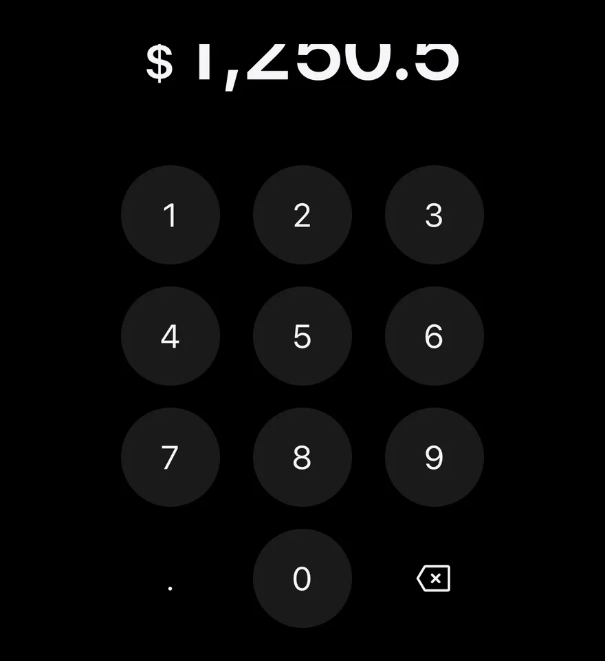
Filled

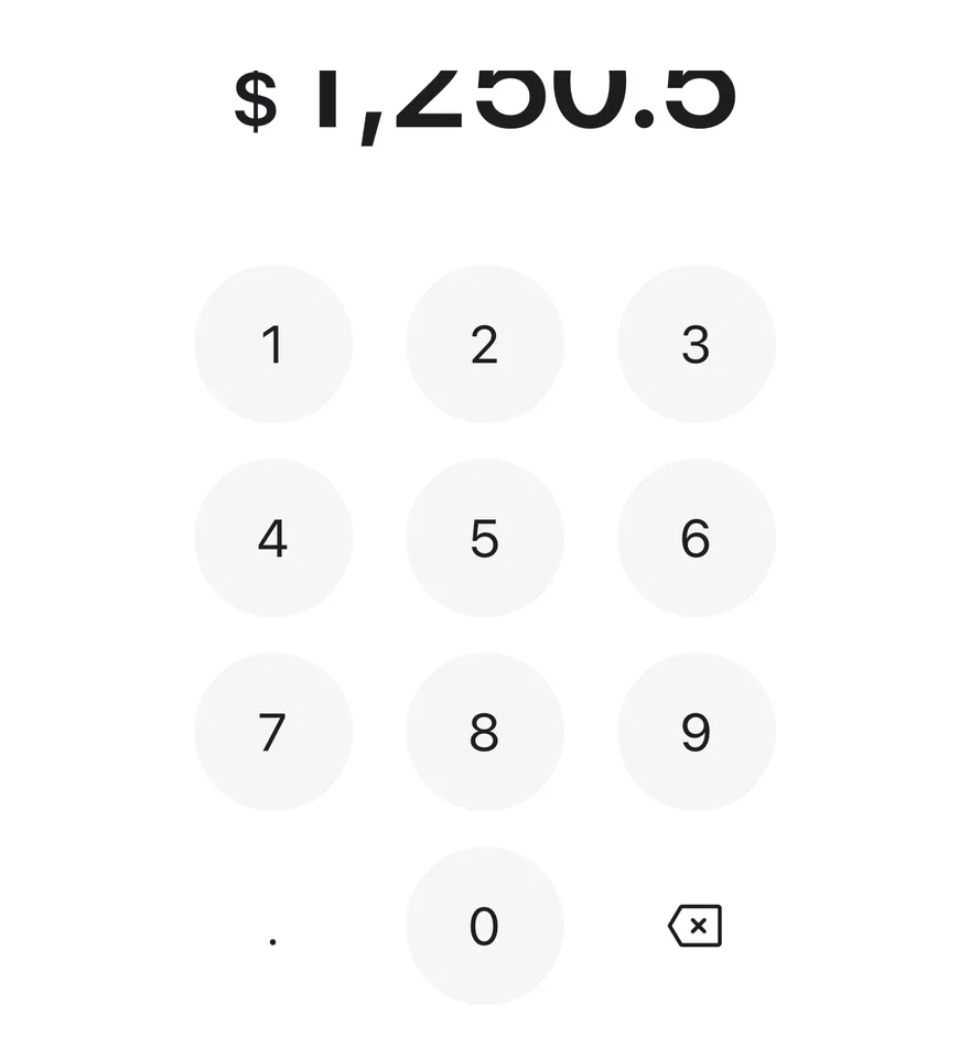
Starts with a value through defaultValue.
iOS
Amount Input (filled) on iOS in light modeAmount Input (filled) on iOS in dark mode
import { AmountInput } from "@/components/ui/amount-input"

export function AmountInputFilledExample() {
  return (
    <AmountInput currency="USD" locale="en-US" defaultValue="1250.5" />
  )
}
import EsuissUI
import SwiftUI

struct AmountInputFilledExample: View {
  var body: some View {
    AmountInputDemo(currency: "USD", locale: "en-US", initial: "1250.5")
  }
}

struct AmountInputDemo: View {
  let currency: String
  let locale: String
  var max: Double?

  @State private var value: String

  init(currency: String, locale: String, initial: String = "", max: Double? = nil) {
    self.currency = currency
    self.locale = locale
    self.max = max
    _value = State(initialValue: initial)
  }

  var body: some View {
    AmountInput(value: $value, currency: currency, max: max)
      .environment(\.locale, Locale(identifier: locale))
  }
}
import androidx.compose.foundation.layout.fillMaxWidth
import androidx.compose.runtime.Composable
import androidx.compose.runtime.getValue
import androidx.compose.runtime.mutableStateOf
import androidx.compose.runtime.saveable.rememberSaveable
import androidx.compose.runtime.setValue
import androidx.compose.ui.Modifier
import com.esuiss.ui.components.AmountInput
import java.util.Locale

@Composable
fun AmountInputFilledExample() {
    AmountInputStory("USD", "en-US", "1250.5")
}

@Composable
fun AmountInputStory(
    currency: String,
    locale: String,
    defaultValue: String = "",
    max: Double? = null,
    enabled: Boolean = true,
) {
    var value by rememberSaveable { mutableStateOf(defaultValue) }
    AmountInput(
        modifier = Modifier.fillMaxWidth(),
        value = value,
        onValueChange = { next, _ -> value = next },
        currency = currency,
        locale = Locale.forLanguageTag(locale),
        max = max,
        enabled = enabled,
    )
}

Controlled

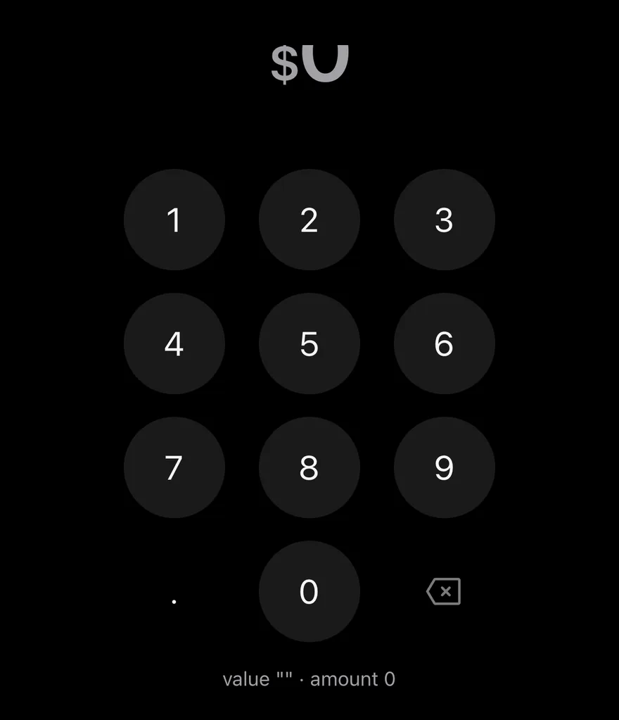
Controlled with value and onValueChange.
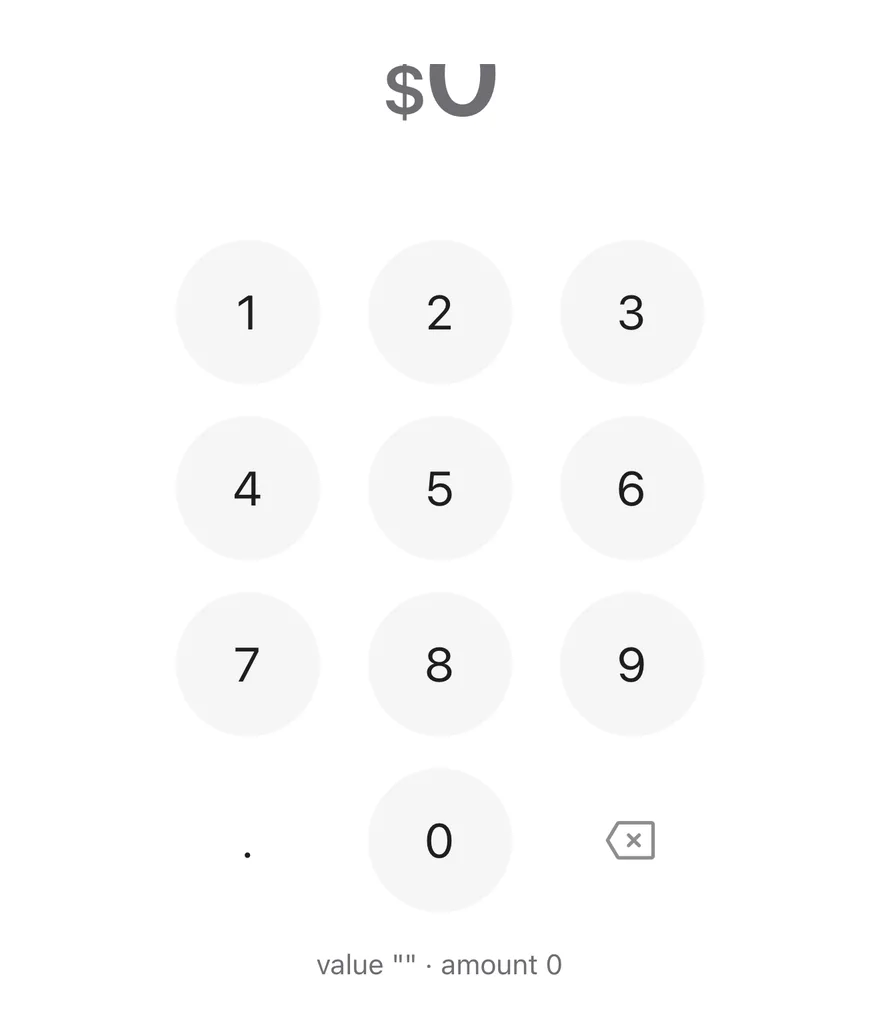
iOS
Amount Input (controlled) on iOS in light modeAmount Input (controlled) on iOS in dark mode
import * as React from "react"
import { View } from "react-native"
import { AmountInput } from "@/components/ui/amount-input"
import { Text } from "@/components/ui/text"

function ControlledDemo() {
  const [value, setValue] = React.useState("")
  const [amount, setAmount] = React.useState(0)
  return (
    <View className="items-center gap-4">
      <AmountInput
        currency="USD"
        locale="en-US"
        value={value}
        onValueChange={(next, nextAmount) => {
          setValue(next)
          setAmount(nextAmount)
        }}
      />
      <Text className="text-sm text-muted-foreground">
        {`value "${value}" · amount ${amount}`}
      </Text>
    </View>
  )
}

export function AmountInputControlledExample() {
  return (
    <ControlledDemo />
  )
}
import EsuissUI
import SwiftUI

struct AmountInputControlledDemo: View {
  @State private var value = ""
  @State private var amount: Double = 0

  var body: some View {
    VStack(spacing: 16) {
      AmountInput(value: $value, currency: "USD") { _, next in
        amount = next
      }
      .environment(\.locale, Locale(identifier: "en-US"))
      Text(verbatim: "value \"\(value)\" · amount \(amountText)")
        .textStyle(.sm)
        .foregroundStyle(EsuissColor.mutedForeground)
    }
    .frame(maxWidth: .infinity)
  }

  var amountText: String {
    amount.rounded() == amount && abs(amount) < 1e15 ? String(Int64(amount)) : String(amount)
  }
}
import androidx.compose.foundation.layout.Arrangement
import androidx.compose.foundation.layout.Column
import androidx.compose.foundation.layout.fillMaxWidth
import androidx.compose.runtime.Composable
import androidx.compose.runtime.getValue
import androidx.compose.runtime.mutableDoubleStateOf
import androidx.compose.runtime.mutableStateOf
import androidx.compose.runtime.saveable.rememberSaveable
import androidx.compose.runtime.setValue
import androidx.compose.ui.Alignment
import androidx.compose.ui.Modifier
import androidx.compose.ui.unit.dp
import com.esuiss.ui.components.AmountInput
import com.esuiss.ui.components.Text
import com.esuiss.ui.theme.EsuissTheme
import com.esuiss.ui.theme.Typography
import java.util.Locale

@Composable
fun AmountInputControlled() {
    var value by rememberSaveable { mutableStateOf("") }
    var amount by rememberSaveable { mutableDoubleStateOf(0.0) }
    Column(
        Modifier.fillMaxWidth(),
        verticalArrangement = Arrangement.spacedBy(16.dp),
        horizontalAlignment = Alignment.CenterHorizontally,
    ) {
        AmountInput(
            modifier = Modifier.fillMaxWidth(),
            value = value,
            onValueChange = { next, nextAmount ->
                value = next
                amount = nextAmount
            },
            currency = "USD",
            locale = Locale.forLanguageTag("en-US"),
        )
        val shown = if (amount % 1.0 == 0.0) amount.toLong().toString() else amount.toString()
        Text(
            "value \"$value\" · amount $shown",
            style = Typography.sm.copy(color = EsuissTheme.colors.mutedForeground),
        )
    }
}

Long amount

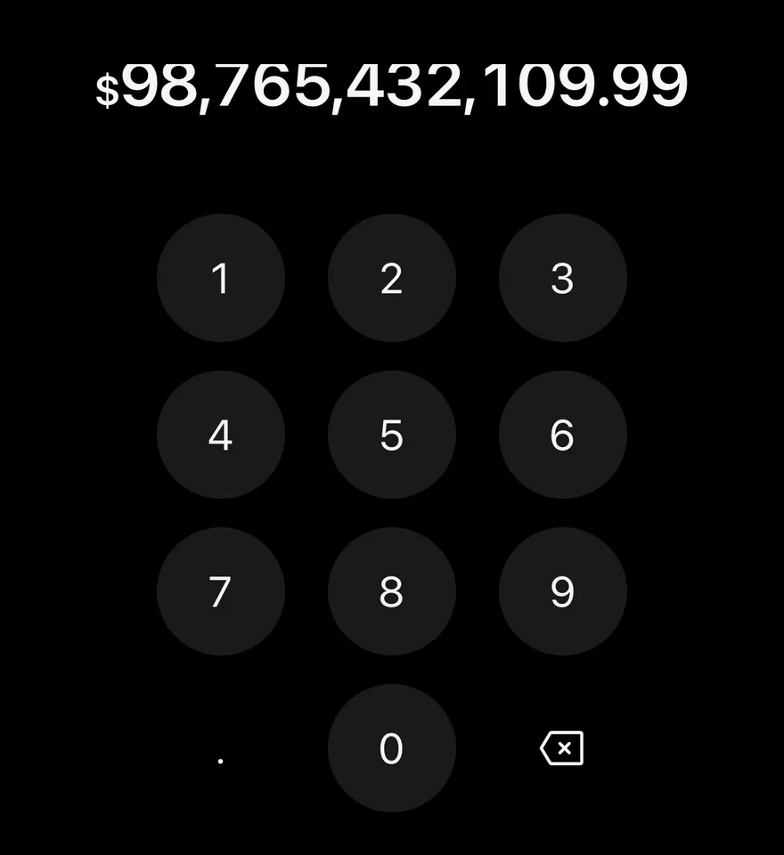
A long amount that shrinks to fit.
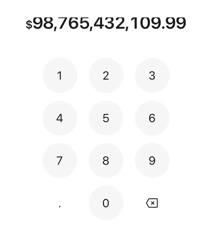
iOS
Amount Input (long amount) on iOS in light modeAmount Input (long amount) on iOS in dark mode
import { AmountInput } from "@/components/ui/amount-input"

export function AmountInputLongAmountExample() {
  return (
    <AmountInput currency="USD" locale="en-US" defaultValue="98765432109.99" />
  )
}
import EsuissUI
import SwiftUI

struct AmountInputLongAmountExample: View {
  var body: some View {
    AmountInputDemo(currency: "USD", locale: "en-US", initial: "98765432109.99")
  }
}

struct AmountInputDemo: View {
  let currency: String
  let locale: String
  var max: Double?

  @State private var value: String

  init(currency: String, locale: String, initial: String = "", max: Double? = nil) {
    self.currency = currency
    self.locale = locale
    self.max = max
    _value = State(initialValue: initial)
  }

  var body: some View {
    AmountInput(value: $value, currency: currency, max: max)
      .environment(\.locale, Locale(identifier: locale))
  }
}
import androidx.compose.foundation.layout.fillMaxWidth
import androidx.compose.runtime.Composable
import androidx.compose.runtime.getValue
import androidx.compose.runtime.mutableStateOf
import androidx.compose.runtime.saveable.rememberSaveable
import androidx.compose.runtime.setValue
import androidx.compose.ui.Modifier
import com.esuiss.ui.components.AmountInput
import java.util.Locale

@Composable
fun AmountInputLongAmountExample() {
    AmountInputStory("USD", "en-US", "98765432109.99")
}

@Composable
fun AmountInputStory(
    currency: String,
    locale: String,
    defaultValue: String = "",
    max: Double? = null,
    enabled: Boolean = true,
) {
    var value by rememberSaveable { mutableStateOf(defaultValue) }
    AmountInput(
        modifier = Modifier.fillMaxWidth(),
        value = value,
        onValueChange = { next, _ -> value = next },
        currency = currency,
        locale = Locale.forLanguageTag(locale),
        max = max,
        enabled = enabled,
    )
}

Euro

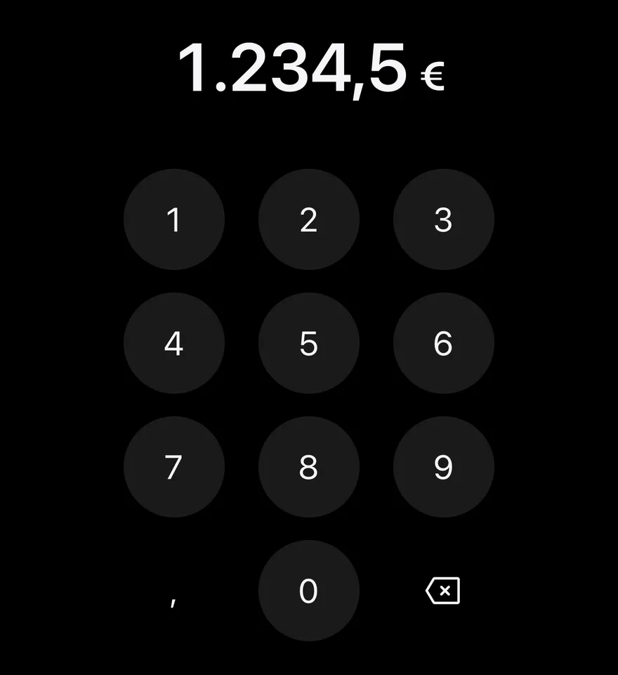
EUR in the de-DE locale with a comma decimal separator.
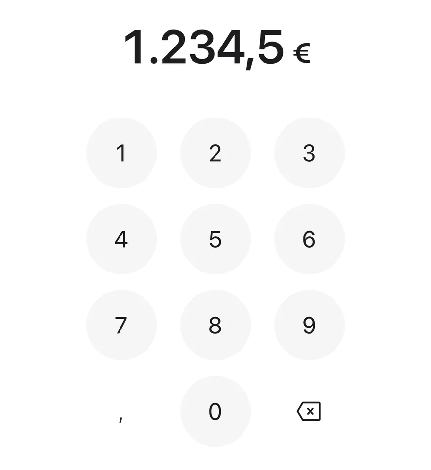
iOS
Amount Input (euro) on iOS in light modeAmount Input (euro) on iOS in dark mode
import { AmountInput } from "@/components/ui/amount-input"

export function AmountInputEuroExample() {
  return (
    <AmountInput currency="EUR" locale="de-DE" defaultValue="1234.5" />
  )
}
import EsuissUI
import SwiftUI

struct AmountInputEuroExample: View {
  var body: some View {
    AmountInputDemo(currency: "EUR", locale: "de-DE", initial: "1234.5")
  }
}

struct AmountInputDemo: View {
  let currency: String
  let locale: String
  var max: Double?

  @State private var value: String

  init(currency: String, locale: String, initial: String = "", max: Double? = nil) {
    self.currency = currency
    self.locale = locale
    self.max = max
    _value = State(initialValue: initial)
  }

  var body: some View {
    AmountInput(value: $value, currency: currency, max: max)
      .environment(\.locale, Locale(identifier: locale))
  }
}
import androidx.compose.foundation.layout.fillMaxWidth
import androidx.compose.runtime.Composable
import androidx.compose.runtime.getValue
import androidx.compose.runtime.mutableStateOf
import androidx.compose.runtime.saveable.rememberSaveable
import androidx.compose.runtime.setValue
import androidx.compose.ui.Modifier
import com.esuiss.ui.components.AmountInput
import java.util.Locale

@Composable
fun AmountInputEuroExample() {
    AmountInputStory("EUR", "de-DE", "1234.5")
}

@Composable
fun AmountInputStory(
    currency: String,
    locale: String,
    defaultValue: String = "",
    max: Double? = null,
    enabled: Boolean = true,
) {
    var value by rememberSaveable { mutableStateOf(defaultValue) }
    AmountInput(
        modifier = Modifier.fillMaxWidth(),
        value = value,
        onValueChange = { next, _ -> value = next },
        currency = currency,
        locale = Locale.forLanguageTag(locale),
        max = max,
        enabled = enabled,
    )
}

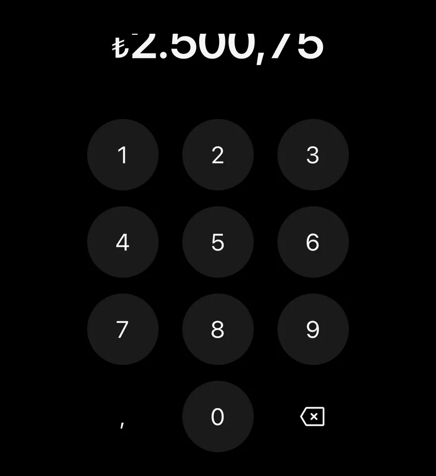
Turkish lira

TRY in the tr-TR locale.
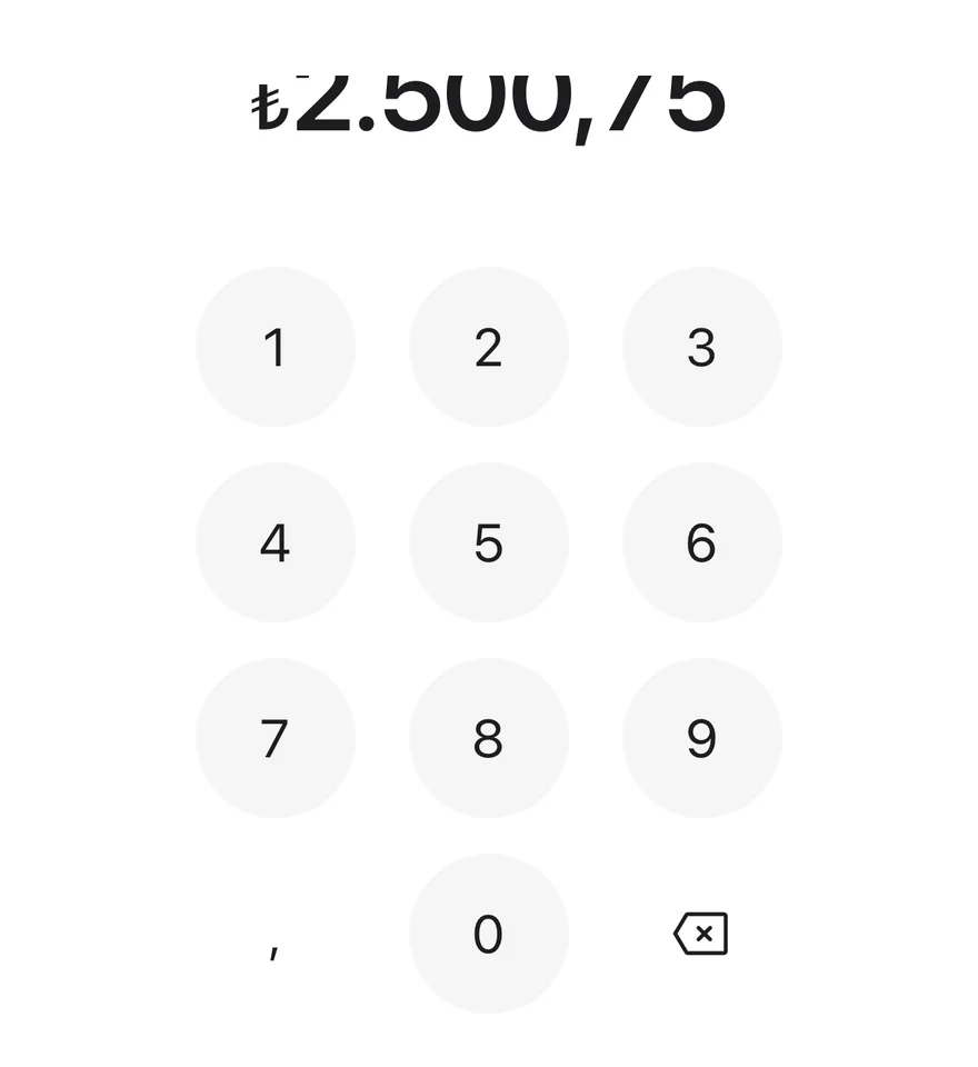
iOS
Amount Input (turkish lira) on iOS in light modeAmount Input (turkish lira) on iOS in dark mode
import { AmountInput } from "@/components/ui/amount-input"

export function AmountInputTurkishLiraExample() {
  return (
    <AmountInput currency="TRY" locale="tr-TR" defaultValue="2500.75" />
  )
}
import EsuissUI
import SwiftUI

struct AmountInputTurkishLiraExample: View {
  var body: some View {
    AmountInputDemo(currency: "TRY", locale: "tr-TR", initial: "2500.75")
  }
}

struct AmountInputDemo: View {
  let currency: String
  let locale: String
  var max: Double?

  @State private var value: String

  init(currency: String, locale: String, initial: String = "", max: Double? = nil) {
    self.currency = currency
    self.locale = locale
    self.max = max
    _value = State(initialValue: initial)
  }

  var body: some View {
    AmountInput(value: $value, currency: currency, max: max)
      .environment(\.locale, Locale(identifier: locale))
  }
}
import androidx.compose.foundation.layout.fillMaxWidth
import androidx.compose.runtime.Composable
import androidx.compose.runtime.getValue
import androidx.compose.runtime.mutableStateOf
import androidx.compose.runtime.saveable.rememberSaveable
import androidx.compose.runtime.setValue
import androidx.compose.ui.Modifier
import com.esuiss.ui.components.AmountInput
import java.util.Locale

@Composable
fun AmountInputTurkishLiraExample() {
    AmountInputStory("TRY", "tr-TR", "2500.75")
}

@Composable
fun AmountInputStory(
    currency: String,
    locale: String,
    defaultValue: String = "",
    max: Double? = null,
    enabled: Boolean = true,
) {
    var value by rememberSaveable { mutableStateOf(defaultValue) }
    AmountInput(
        modifier = Modifier.fillMaxWidth(),
        value = value,
        onValueChange = { next, _ -> value = next },
        currency = currency,
        locale = Locale.forLanguageTag(locale),
        max = max,
        enabled = enabled,
    )
}

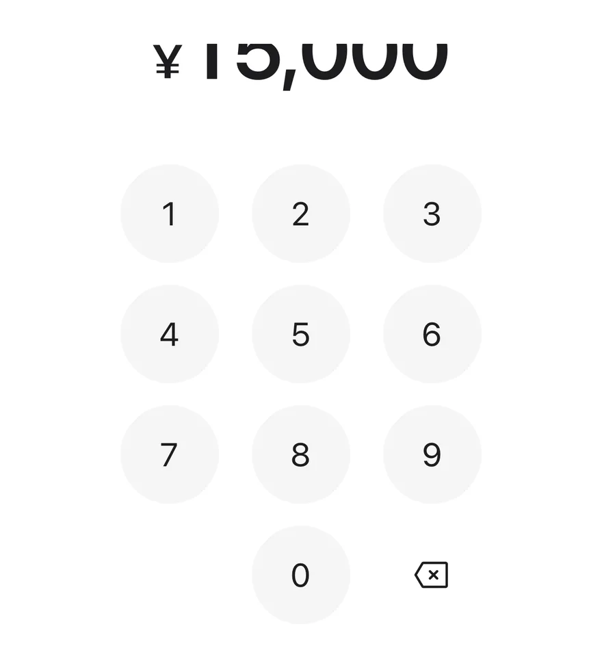
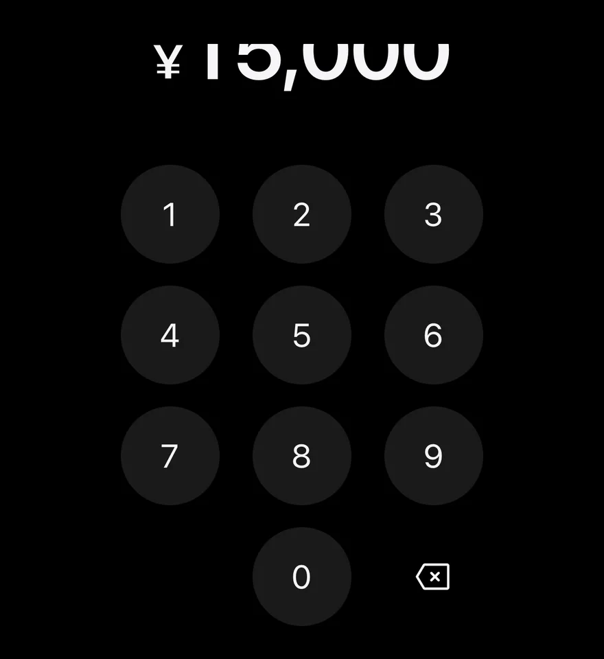
Yen

JPY, which has no decimal key.

iOS
Amount Input (yen) on iOS in light modeAmount Input (yen) on iOS in dark mode
import { AmountInput } from "@/components/ui/amount-input"

export function AmountInputYenExample() {
  return (
    <AmountInput currency="JPY" locale="ja-JP" defaultValue="15000" />
  )
}
import EsuissUI
import SwiftUI

struct AmountInputYenExample: View {
  var body: some View {
    AmountInputDemo(currency: "JPY", locale: "ja-JP", initial: "15000")
  }
}

struct AmountInputDemo: View {
  let currency: String
  let locale: String
  var max: Double?

  @State private var value: String

  init(currency: String, locale: String, initial: String = "", max: Double? = nil) {
    self.currency = currency
    self.locale = locale
    self.max = max
    _value = State(initialValue: initial)
  }

  var body: some View {
    AmountInput(value: $value, currency: currency, max: max)
      .environment(\.locale, Locale(identifier: locale))
  }
}
import androidx.compose.foundation.layout.fillMaxWidth
import androidx.compose.runtime.Composable
import androidx.compose.runtime.getValue
import androidx.compose.runtime.mutableStateOf
import androidx.compose.runtime.saveable.rememberSaveable
import androidx.compose.runtime.setValue
import androidx.compose.ui.Modifier
import com.esuiss.ui.components.AmountInput
import java.util.Locale

@Composable
fun AmountInputYenExample() {
    AmountInputStory("JPY", "ja-JP", "15000")
}

@Composable
fun AmountInputStory(
    currency: String,
    locale: String,
    defaultValue: String = "",
    max: Double? = null,
    enabled: Boolean = true,
) {
    var value by rememberSaveable { mutableStateOf(defaultValue) }
    AmountInput(
        modifier = Modifier.fillMaxWidth(),
        value = value,
        onValueChange = { next, _ -> value = next },
        currency = currency,
        locale = Locale.forLanguageTag(locale),
        max = max,
        enabled = enabled,
    )
}

With max

Capped at 500 with max; larger entries are rejected.
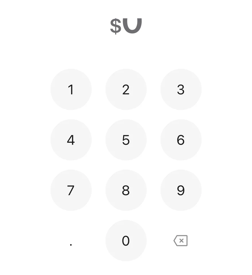
iOS
Amount Input (with max) on iOS in light modeAmount Input (with max) on iOS in dark mode
import { AmountInput } from "@/components/ui/amount-input"

export function AmountInputWithMaxExample() {
  return (
    <AmountInput currency="USD" locale="en-US" max={500} />
  )
}
import EsuissUI
import SwiftUI

struct AmountInputWithMaxExample: View {
  var body: some View {
    AmountInputDemo(currency: "USD", locale: "en-US", max: 500)
  }
}

struct AmountInputDemo: View {
  let currency: String
  let locale: String
  var max: Double?

  @State private var value: String

  init(currency: String, locale: String, initial: String = "", max: Double? = nil) {
    self.currency = currency
    self.locale = locale
    self.max = max
    _value = State(initialValue: initial)
  }

  var body: some View {
    AmountInput(value: $value, currency: currency, max: max)
      .environment(\.locale, Locale(identifier: locale))
  }
}
import androidx.compose.foundation.layout.fillMaxWidth
import androidx.compose.runtime.Composable
import androidx.compose.runtime.getValue
import androidx.compose.runtime.mutableStateOf
import androidx.compose.runtime.saveable.rememberSaveable
import androidx.compose.runtime.setValue
import androidx.compose.ui.Modifier
import com.esuiss.ui.components.AmountInput
import java.util.Locale

@Composable
fun AmountInputWithMaxExample() {
    AmountInputStory("USD", "en-US", max = 500.0)
}

@Composable
fun AmountInputStory(
    currency: String,
    locale: String,
    defaultValue: String = "",
    max: Double? = null,
    enabled: Boolean = true,
) {
    var value by rememberSaveable { mutableStateOf(defaultValue) }
    AmountInput(
        modifier = Modifier.fillMaxWidth(),
        value = value,
        onValueChange = { next, _ -> value = next },
        currency = currency,
        locale = Locale.forLanguageTag(locale),
        max = max,
        enabled = enabled,
    )
}

Disabled

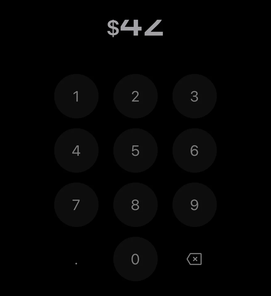
A disabled input with a dimmed amount and keypad.
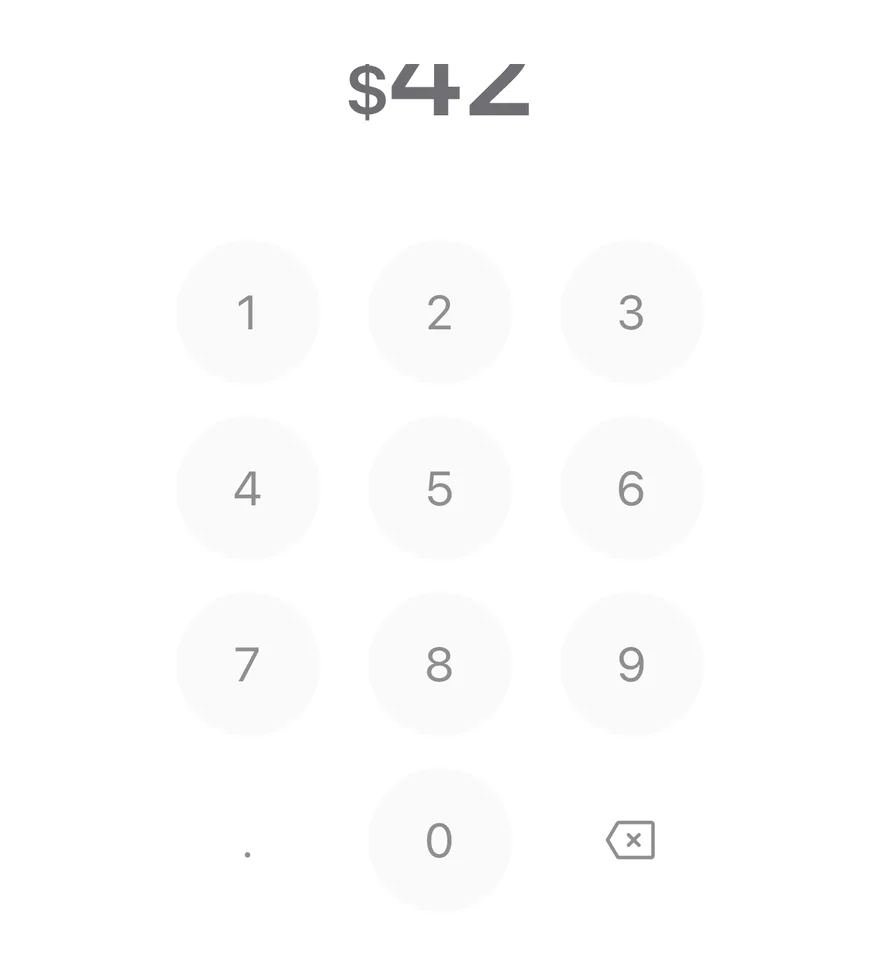
iOS
Amount Input (disabled) on iOS in light modeAmount Input (disabled) on iOS in dark mode
import { AmountInput } from "@/components/ui/amount-input"

export function AmountInputDisabledExample() {
  return (
    <AmountInput currency="USD" locale="en-US" defaultValue="42" disabled />
  )
}
import EsuissUI
import SwiftUI

struct AmountInputDisabledExample: View {
  var body: some View {
    AmountInputDemo(currency: "USD", locale: "en-US", initial: "42")
      .disabled(true)
  }
}

struct AmountInputDemo: View {
  let currency: String
  let locale: String
  var max: Double?

  @State private var value: String

  init(currency: String, locale: String, initial: String = "", max: Double? = nil) {
    self.currency = currency
    self.locale = locale
    self.max = max
    _value = State(initialValue: initial)
  }

  var body: some View {
    AmountInput(value: $value, currency: currency, max: max)
      .environment(\.locale, Locale(identifier: locale))
  }
}
import androidx.compose.foundation.layout.fillMaxWidth
import androidx.compose.runtime.Composable
import androidx.compose.runtime.getValue
import androidx.compose.runtime.mutableStateOf
import androidx.compose.runtime.saveable.rememberSaveable
import androidx.compose.runtime.setValue
import androidx.compose.ui.Modifier
import com.esuiss.ui.components.AmountInput
import java.util.Locale

@Composable
fun AmountInputDisabledExample() {
    AmountInputStory("USD", "en-US", "42", enabled = false)
}

@Composable
fun AmountInputStory(
    currency: String,
    locale: String,
    defaultValue: String = "",
    max: Double? = null,
    enabled: Boolean = true,
) {
    var value by rememberSaveable { mutableStateOf(defaultValue) }
    AmountInput(
        modifier = Modifier.fillMaxWidth(),
        value = value,
        onValueChange = { next, _ -> value = next },
        currency = currency,
        locale = Locale.forLanguageTag(locale),
        max = max,
        enabled = enabled,
    )
}

API Reference

01

AmountInput

PropTypeDefaultDescription
valuestring-Controlled numeric string.
defaultValuestring""Initial numeric string when uncontrolled.
onValueChange(value: string, amount: number) => void-Called with the new string and its numeric amount.
currencystring-ISO currency code used for formatting.
localestring-Locale used for formatting and the decimal separator.
maxFractionDigitsnumber-Maximum digits after the decimal separator.
maxnumber-Largest allowed amount.
placeholderstring"0"Shown in place of the integer when empty. Defaults to "0".
disabledbooleanfalseDims the amount and disables the keypad.
deleteLabelstring-Accessibility label for the delete key.
decimalLabelstring-Accessibility label for the decimal key.
amountClassNamestring-Extra classes for the amount text.
keypadClassNamestring-Extra classes for the keypad.

Also accepts the props of React.ComponentProps<typeof View>.

Accessibility

  • The amount text is a polite live region, so changes are announced.
  • Its label is the formatted amount, prefixed with accessibilityLabel when given.
  • Keypad keys announce their digit; the delete key is disabled while the value is empty.

Notes

  • The shake animation respects the system Reduce Motion setting.
  • Uses tabular numerals so digits do not shift as they change.
  • Uses text-foreground and text-muted-foreground tokens; light and dark follow the system appearance.
NextAspect RatioPreviousAlert Sheet

On this page

  1. 01Installation
    • Manual
  2. 02Usage
  3. 03Examples
    • Filled
    • Controlled
    • Long amount
    • Euro
    • Turkish lira
    • Yen
    • With max
    • Disabled
  4. 04API Reference
    • AmountInput
  5. 05Accessibility
  6. 06Notes