suiss/ui · Component
Input Group
A text field with icons, text, buttons or keyboard hints attached inside its border.
Input Group is an open-source component from suiss/ui for React, React Native, SwiftUI and Jetpack Compose. The @esuiss/ui CLI copies its source into your project, so you own the code.
InputGroup is the container that draws the field's background, border and focus ring. Inside it, place one control, either InputGroupInput or InputGroupTextarea, and one or more InputGroupAddon elements. An addon can hold icons, InputGroupText, InputGroupButton or a Kbd, and is placed before, after, above or below the control with its align prop.
Use an input group when supporting content belongs inside the field, such as a search icon, a currency symbol, a clear button or a send button. For a plain field, use Input; for a field with a filterable list of options, use Combobox, which is built on this component.
Installation
CLI
Works in any project with a components.json. See Installation for the one-line registry setup. Or use the suiss/ui CLI:
Manual
- Install the dependencies and add the
cnhelper:
-
Copy the source into
components/ui/input-group.tsx:
- Update the import paths to match your project.
Usage
Addons are positioned with CSS order, so you can place them before or after the control in your markup. inline-start and inline-end sit beside the control; block-start and block-end sit above or below it and make the group grow to fit. Clicking an addon outside its buttons focuses the group's input.
InputGroupButton defaults to type="button", so it does not submit a surrounding form unless you set type="submit". Set aria-invalid on the control to show the error style on the whole group. To dim a disabled group's addons, disable the control and set data-disabled="true" on InputGroup.
Examples
Search
A search field with a clear button that appears only when there is text.
With text
Text addons for a currency symbol and code, and for a URL prefix and suffix.
With buttons
Buttons inside the field for copying a link, subscribing, and showing information.
Button sizes
The xs, icon-xs and icon-sm button sizes in one addon.
With kbd
A search field with a keyboard shortcut hint at the end.
Block addons
Addons placed above and below the input with block-start and block-end.
With textarea
A chat-style textarea with attach and send buttons and usage text in a bottom addon.
Invalid
An invalid input that shows the error style on the whole group.
Disabled
A disabled group with a dimmed background and addon.
API Reference
InputGroup
The container that draws the field and holds the control and addons.
Also accepts the props of React.ComponentProps<"div">.
InputGroupAddon
Holds icons, text or buttons beside, above or below the control.
| Prop | Type | Default | Description |
|---|---|---|---|
align | "inline-start" | "inline-end" | "block-start" | "block-end" | "inline-start" | Places the addon before (inline-start) or after (inline-end) the control, or above (block-start) or below (block-end) it. |
Also accepts the props of React.ComponentProps<"div">.
InputGroupButton
A compact button sized to fit inside the field.
| Prop | Type | Default | Description |
|---|---|---|---|
size | "xs" | "sm" | "icon-xs" | "icon-sm" | "xs" | xs for a small text button, or icon-xs and icon-sm for square icon buttons. sm keeps the base button size. |
type | "button" | "submit" | "reset" | "button" | The native button type. Defaults to button so the button does not submit forms. |
Also accepts the props of React.ComponentProps<typeof Button>.
InputGroupText
Static text or an icon with text, such as a unit or prefix.
Also accepts the props of React.ComponentProps<"span">.
InputGroupInput
The single-line text control of the group.
Also accepts the props of React.ComponentProps<"input">.
InputGroupTextarea
The multi-line text control of the group.
Also accepts the props of React.ComponentProps<"textarea">.
Accessibility
InputGroupandInputGroupAddonhave thegrouprole.- Give the control an accessible name with a label or
aria-label; placeholder text and addon text do not name it. - Give icon-only buttons an accessible name with
aria-label. - Buttons in addons are reachable with Tab after the control.
- Set
aria-invalidon the control to communicate a validation error.
Notes
- Styling hooks:
data-slotvaluesinput-group,input-group-addonandinput-group-control(on the input or textarea). Addons setdata-align, and buttons setdata-size. - The group's rounded corners grow when it contains a textarea or a block addon.
- Uses the
secondary,muted-foregroundanddestructivecolors, andopacity-50when disabled.
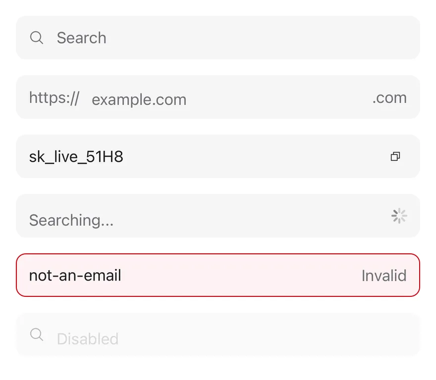
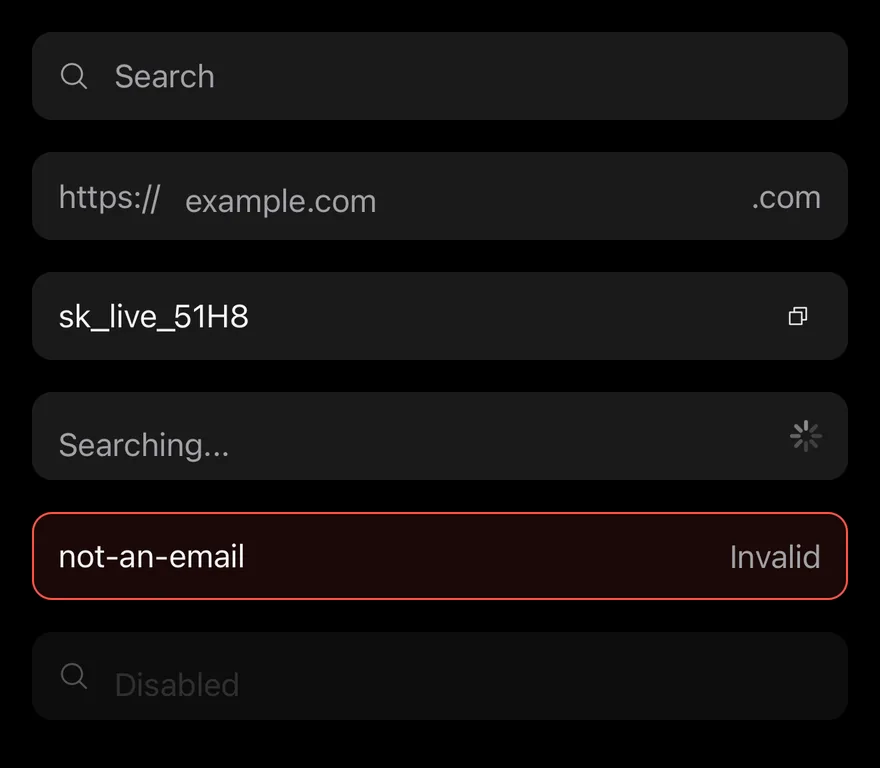
InputGroup draws one bg-secondary field and places an InputGroupInput or InputGroupTextarea inside it with addons around. Addons can sit on the start or end of the same line (inline-start, inline-end), or above or below the input (block-start, block-end), which turns the group into a column.
The group shows the focus border while its input is focused, and reads the disabled and invalid state from a surrounding Field. Pressing an addon focuses the input.
Installation
The CLI also adds what it builds on: Button, Icon, Input, Text, Textarea.
Manual
- Install the dependencies:
-
Add the pieces it builds on: Button, Icon, Input, Text, Textarea, and the primitives
components/primitives/field.tsx,components/primitives/use-render.tsx. -
Copy the source into
components/ui/input-group.tsx:
- Update the import paths to match your project.
- Install the dependencies:
-
Add the pieces it builds on: Button, Icon, Input, Text, Textarea, and the primitives
components/primitives/field.tsx,components/primitives/use-render.tsx. -
Copy the source into
components/ui/input-group.tsx:
- Update the import paths to match your project.
-
Target iOS 17 or later.
-
Add the Swift package to your app:
- Copy the theme files every view uses:
- Copy the source and every file it uses:
- Add the files to your app target.
- Set
minSdkto 24 or higher and add the dependencies:
- Copy the theme files every view uses:
- Copy the source and every file it uses:
- Update the
com.esuiss.uipackage names to match your project.
Usage
Add children in any order; the group sorts start addons before the input and end addons after it. Put short labels such as a URL prefix or a unit in InputGroupText, and actions in InputGroupButton, a small rounded Button that defaults to the ghost variant and xs size.
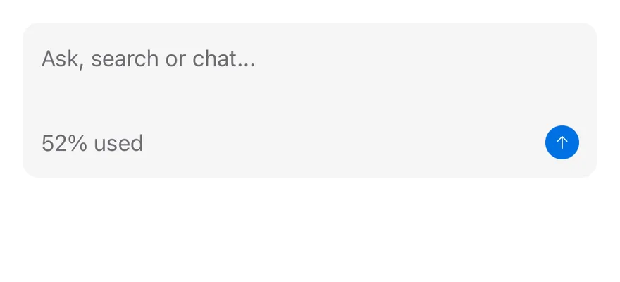
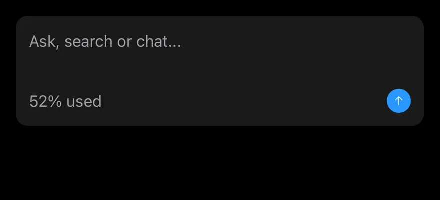
Use a block-end addon with InputGroupTextarea for a footer row, for example a character count and a send button. Set invalid or disabled on the group, or let a Field provide them.
Examples
With textarea
A textarea with a footer row holding a usage label and a button.
Block start
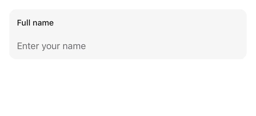
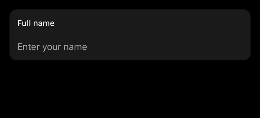
A label addon above the input with block-start.
API Reference
InputGroup
Field container that lays out the input and addons.
| Prop | Type | Default | Description |
|---|---|---|---|
disabled | boolean | false | Disables the group and its input. |
invalid | boolean | - | Shows the destructive border and tint. |
Also accepts the props of ViewProps.
InputGroupAddon
Slot for text, icons or buttons beside or around the input.
| Prop | Type | Default | Description |
|---|---|---|---|
align | "inline-start" | "inline-end" | "block-start" | "block-end" | "inline-start" | inline-start, inline-end, block-start or block-end. Defaults to inline-start. |
Also accepts the props of React.ComponentProps<typeof Pressable>.
InputGroupButton
Compact button inside an addon.
| Prop | Type | Default | Description |
|---|---|---|---|
size | keyof typeof BUTTON_SIZE | "xs" | xs, sm, icon-xs or icon-sm. Defaults to xs. |
Also accepts the props of React.ComponentProps<typeof Button>.
InputGroupText
Text inside an addon.
Also accepts the props of React.ComponentProps<typeof Text>.
InputGroupInput
Single-line input without its own border.
Also accepts the props of React.ComponentProps<typeof Input>.
InputGroupTextarea
Multi-line input without its own border.
Also accepts the props of React.ComponentProps<typeof Textarea>.
Accessibility
- The container has the
grouprole. - Addons are not separate accessibility elements; their text is not announced with the input, so give the input an
accessibilityLabelthat includes needed context. - Icon-only buttons need an
accessibilityLabel.
Notes
- Uses
bg-secondary,border-ring,border-destructivetokens, withopacity-50when disabled; the invalid tint is stronger in dark mode. - In Uniwind and NativeWind, a focused field also draws the
ring-3 ring-ring/50focus ring. - Light and dark follow the system appearance.