suiss/ui · Component
Signature Pad
A drawing area that captures a handwritten signature as strokes and can export it as an SVG string.
Signature Pad is an open-source component from suiss/ui for React Native, SwiftUI and Jetpack Compose. The @esuiss/ui CLI copies its source into your project, so you own the code.
import { SignaturePad } from "@/components/ui/signature-pad"

export function SignaturePadExample() {
  return (
    <SignaturePad />
  )
}import EsuissUI
import SwiftUI
struct SignaturePadExample: View {
var body: some View {
SignaturePadDemo(initial: [])
}
}
struct SignaturePadDemo: View {
var strokeWidth: CGFloat = 2.5
@State private var strokes: [SignatureStroke]
init(initial: [SignatureStroke], strokeWidth: CGFloat = 2.5) {
self.strokeWidth = strokeWidth
_strokes = State(initialValue: initial)
}
var body: some View {
SignaturePad(value: $strokes, strokeWidth: strokeWidth)
.frame(height: 192)
.frame(maxWidth: .infinity)
}
}import androidx.compose.foundation.layout.fillMaxWidth
import androidx.compose.runtime.Composable
import androidx.compose.ui.Modifier
import com.esuiss.ui.components.SignaturePad
@Composable
fun SignaturePadExample() {
SignaturePad(Modifier.fillMaxWidth())
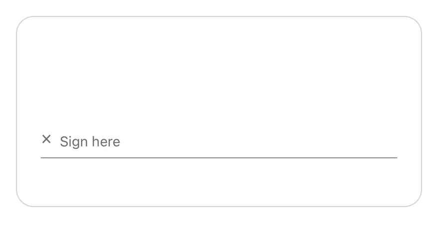
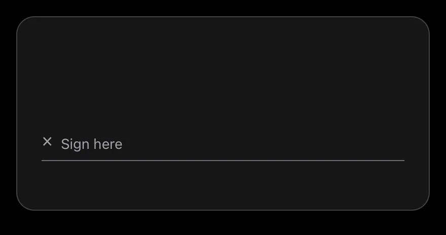
}SignaturePad is a View with a single-finger pan gesture from react-native-gesture-handler. Each touch records a stroke of points, and the strokes are drawn as smoothed paths with react-native-svg. A signature line with an × mark and a placeholder sits near the bottom, and a ghost Clear button appears in the top corner once something is drawn.
Installation
$ pnpm dlx shadcn@latest add @esuiss-rn/signature-padSee Installation for the components.json setup. Or use the suiss/ui CLI:
$ pnpm dlx @esuiss/ui@latest add signature-pad$ pnpm dlx @esuiss/ui@latest add signature-pad --platform swift$ pnpm dlx @esuiss/ui@latest add signature-pad --platform kotlinThe CLI also adds what it builds on: Button, Icon, Text.
Manual
- Install the dependencies:
npx expo install cn phosphor-react-native react-native-gesture-handler react-native-svg-
Copy the source into
components/ui/signature-pad.tsx:
import { cn } from "cn"
import type { IconProps as PhosphorIconProps } from "phosphor-react-native"
import * as React from "react"
import { View } from "react-native"
import { Gesture, GestureDetector } from "react-native-gesture-handler"
import Svg, { Path } from "react-native-svg"
import { Button } from "@/components/ui/button"
import { Icon } from "@/components/ui/icon"
import { Text, TextClassContext } from "@/components/ui/text"

type SignaturePadPoint = { x: number; y: number }

type SignaturePadStroke = SignaturePadPoint[]

type SignaturePadHandle = {
toSVG: (options?: { color?: string }) => string- Update the import paths to match your project.
- Install the dependencies:
npx expo install cn phosphor-react-native react-native-gesture-handler react-native-svg-
Copy the source into
components/ui/signature-pad.tsx:
import { cn } from "cn"
import type { IconProps as PhosphorIconProps } from "phosphor-react-native"
import * as React from "react"
import { View } from "react-native"
import { Gesture, GestureDetector } from "react-native-gesture-handler"
import Svg, { Path } from "react-native-svg"
import { Button } from "@/components/ui/button"
import { Icon } from "@/components/ui/icon"
import { Text, TextClassContext } from "@/components/ui/text"

type SignaturePadPoint = { x: number; y: number }

type SignaturePadStroke = SignaturePadPoint[]

type SignaturePadHandle = {
toSVG: (options?: { color?: string }) => string- Update the import paths to match your project.
- Install the dependencies:
npx expo install react-native-gesture-handler react-native-svg-
Copy the source into
components/ui/signature-pad.tsx:
import * as React from "react"
import { type StyleProp, StyleSheet, View, type ViewStyle } from "react-native"
import { Gesture, GestureDetector } from "react-native-gesture-handler"
import Svg, { Path } from "react-native-svg"
import { Button } from "@/components/ui/button"
import { Text } from "@/components/ui/text"
import { fontSize, radius, useTheme } from "@/components/ui/theme"

type SignaturePadPoint = { x: number; y: number }

type SignaturePadStroke = SignaturePadPoint[]

type SignaturePadHandle = {
  toSVG: (options?: { color?: string }) => string
  clear: () => void
isEmpty: () => boolean- Update the import paths to match your project.
-
Target iOS 17 or later.
-
Add the Swift package to your app:
.package(url: "https://github.com/phosphor-icons/swift", from: "2.1.0")- Copy the theme files every view uses:
import SwiftUI
import UIKit

struct RGBA: Sendable {
  let red: CGFloat
  let green: CGFloat
  let blue: CGFloat
  let alpha: CGFloat

  init(_ hex: UInt32, _ alpha: CGFloat = 1) {
    red = CGFloat((hex >> 16) & 0xFF) / 255
    green = CGFloat((hex >> 8) & 0xFF) / 255
    blue = CGFloat(hex & 0xFF) / 255
    self.alpha = alpha
}import SwiftUI
public enum EsuissColor {
public static let background = Color.adaptive(light: .init(0xFFFFFF), dark: .init(0x000000))
public static let foreground = Color.adaptive(light: .init(0x1D1D1F), dark: .init(0xF5F5F7))
public static let card = Color.adaptive(light: .init(0xFFFFFF), dark: .init(0x1D1D1F))
public static let cardForeground = Color.adaptive(light: .init(0x1D1D1F), dark: .init(0xF5F5F7))
public static let popover = Color.adaptive(light: .init(0xFFFFFF), dark: .init(0x1D1D1F))
public static let popoverForeground = Color.adaptive(light: .init(0x1D1D1F), dark: .init(0xF5F5F7))
public static let primary = Color.adaptive(light: .init(0x0071E3), dark: .init(0x2997FF))
public static let primaryForeground = Color.adaptive(light: .init(0xFFFFFF), dark: .init(0xFFFFFF))
public static let secondary = Color.adaptive(light: .init(0x000000, 0.04), dark: .init(0xFFFFFF, 0.1))
public static let secondaryForeground = Color.adaptive(light: .init(0x1D1D1F), dark: .init(0xF5F5F7))
public static let muted = Color.adaptive(light: .init(0xF5F5F7), dark: .init(0x161617))
public static let mutedForeground = Color.adaptive(light: .init(0x6E6E73), dark: .init(0xA1A1A6))
public static let accent = Color.adaptive(light: .init(0x000000, 0.06), dark: .init(0xFFFFFF, 0.1))- Copy the source and every file it uses:
import PhosphorSwift
import SwiftUI
import UIKit

public struct SignatureStroke: Hashable, Sendable {
  public var points: [CGPoint]

  public init(_ points: [CGPoint]) {
    self.points = points
  }
}

enum SignatureMath {
  static func path(for stroke: [CGPoint], strokeWidth: CGFloat) -> Path {
    var path = Path()
guard let first = stroke.first else { return path }import SwiftUI
public struct VariantButtonStyle: ButtonStyle {
public enum Variant: CaseIterable, Sendable {
case `default`, outline, secondary, tinted, ghost, plain, destructive, link
}
public enum Size: CaseIterable, Sendable {
case `default`, xs, sm, lg, xl, icon, iconXs, iconSm, iconLg, iconXl
var height: CGFloat {
switch self {
case .xs, .iconXs: 24
case .sm, .iconSm: 32
case .default, .icon: 36
case .lg, .iconLg: 44import SwiftUI
extension EnvironmentValues {
@Entry var buttonGroup: Axis? = nil
@Entry var buttonGroupSize: CGSize = .zero
}
enum ButtonGroupSpace: Hashable {
case group
}
struct ButtonGroupFrame {
let bounds: Anchor<CGRect>
let outlined: Bool
}import SwiftUI
extension EnvironmentValues {
@Entry public var isInvalid = false
@Entry var fieldInset = false
@Entry var fieldGroupInset = false
@Entry var fieldSetInset = false
}
extension View {
public func invalid(_ isInvalid: Bool = true) -> some View {
environment(\.isInvalid, isInvalid)
}
}
public enum FieldOrientation: CaseIterable, Sendable {import SwiftUI
public struct Separator: View {
let orientation: Axis
public init(_ orientation: Axis = .horizontal) {
self.orientation = orientation
}
public var body: some View {
Rectangle()
.fill(EsuissColor.border)
.frame(width: orientation == .vertical ? 1 : nil, height: orientation == .horizontal ? 1 : nil)
.frame(maxWidth: orientation == .horizontal ? .infinity : nil, maxHeight: orientation == .vertical ? .infinity : nil)
.accessibilityHidden(true)
}import SwiftUI
public enum TextVariant: CaseIterable, Sendable {
case `default`, h1, h2, h3, h4, p, blockquote, code, lead, large, small, muted
var style: TextStyle {
switch self {
case .h1: .xl3
case .h2: .xl2
case .h3: .xl
case .h4, .lead, .large: .lg
case .code, .small, .muted: .sm
default: .base
}
}- Add the files to your app target.
- Set
minSdkto 24 or higher and add the dependencies:
implementation(platform("androidx.compose:compose-bom:2026.09.00"))
implementation("androidx.compose.foundation:foundation")
implementation("androidx.compose.ui:ui")- Copy the theme files every view uses:
package com.esuiss.ui.theme

import androidx.compose.foundation.isSystemInDarkTheme
import androidx.compose.runtime.Composable
import androidx.compose.runtime.CompositionLocalProvider
import androidx.compose.runtime.Immutable
import androidx.compose.runtime.staticCompositionLocalOf
import androidx.compose.ui.Modifier
import androidx.compose.ui.draw.dropShadow
import androidx.compose.ui.graphics.Color
import androidx.compose.ui.graphics.Shape
import androidx.compose.ui.graphics.shadow.Shadow as DropShadow
import androidx.compose.ui.text.TextStyle
import androidx.compose.ui.text.style.LineHeightStyle
import androidx.compose.ui.unit.Dp
import androidx.compose.ui.unit.DpOffsetpackage com.esuiss.ui.theme
import androidx.compose.runtime.Immutable
import androidx.compose.ui.graphics.Color
import androidx.compose.ui.unit.dp
@Immutable
data class Colors(
val background: Color,
val foreground: Color,
val card: Color,
val cardForeground: Color,
val popover: Color,
val popoverForeground: Color,
val primary: Color,
val primaryForeground: Color,- Copy the source and every file it uses:
package com.esuiss.ui.components

import androidx.compose.foundation.Canvas
import androidx.compose.foundation.background
import androidx.compose.foundation.border
import androidx.compose.foundation.gestures.awaitEachGesture
import androidx.compose.foundation.gestures.awaitFirstDown
import androidx.compose.foundation.layout.Box
import androidx.compose.foundation.layout.fillMaxWidth
import androidx.compose.foundation.layout.height
import androidx.compose.foundation.layout.padding
import androidx.compose.foundation.shape.RoundedCornerShape
import androidx.compose.foundation.text.BasicText
import androidx.compose.runtime.Composable
import androidx.compose.runtime.Immutable
import androidx.compose.runtime.getValuepackage com.esuiss.ui.components
import androidx.compose.foundation.background
import androidx.compose.foundation.border
import androidx.compose.foundation.clickable
import androidx.compose.foundation.interaction.MutableInteractionSource
import androidx.compose.foundation.interaction.collectIsPressedAsState
import androidx.compose.foundation.layout.Arrangement
import androidx.compose.foundation.layout.Row
import androidx.compose.foundation.layout.RowScope
import androidx.compose.foundation.layout.fillMaxWidth
import androidx.compose.foundation.layout.height
import androidx.compose.foundation.layout.padding
import androidx.compose.foundation.layout.size
import androidx.compose.foundation.shape.CircleShape
import androidx.compose.foundation.shape.RoundedCornerShapepackage com.esuiss.ui.components
import androidx.compose.foundation.background
import androidx.compose.foundation.gestures.Orientation
import androidx.compose.foundation.layout.Arrangement
import androidx.compose.foundation.layout.Box
import androidx.compose.foundation.layout.Row
import androidx.compose.foundation.layout.RowScope
import androidx.compose.foundation.layout.padding
import androidx.compose.foundation.shape.CircleShape
import androidx.compose.foundation.shape.CornerSize
import androidx.compose.foundation.shape.RoundedCornerShape
import androidx.compose.runtime.Composable
import androidx.compose.runtime.CompositionLocalProvider
import androidx.compose.runtime.DisposableEffect
import androidx.compose.runtime.Immutablepackage com.esuiss.ui.components
import androidx.compose.runtime.compositionLocalOf
import androidx.compose.ui.graphics.Color
import androidx.compose.ui.text.TextStyle
import androidx.compose.ui.unit.Dp
import androidx.compose.ui.unit.dp
val LocalContentStyle = compositionLocalOf { TextStyle.Default }
val LocalContentColor = compositionLocalOf { Color.Unspecified }
val LocalIconSize = compositionLocalOf { 20.dp }package com.esuiss.ui.components
import androidx.compose.foundation.Image
import androidx.compose.foundation.layout.size
import androidx.compose.runtime.Composable
import androidx.compose.ui.Modifier
import androidx.compose.ui.graphics.Color
import androidx.compose.ui.graphics.ColorFilter
import androidx.compose.ui.graphics.takeOrElse
import androidx.compose.ui.graphics.vector.ImageVector
import androidx.compose.ui.unit.Dp
import com.esuiss.ui.theme.EsuissTheme
@Composable
fun Icon(
imageVector: ImageVector,- Update the
com.esuiss.uipackage names to match your project.
Usage
import { SignaturePad } from "@/components/ui/signature-pad"<SignaturePad />Use it uncontrolled with defaultValue, or controlled with value and onChange. The value is an array of strokes, where each stroke is an array of { x, y } points.
Pass a ref to get a SignaturePadHandle with toSVG(), clear() and isEmpty(). toSVG returns an SVG string sized to the pad and accepts an optional color (defaults to currentColor).
The SignaturePadHandle, SignaturePadPoint and SignaturePadStroke types are also exported.
Examples
Signed
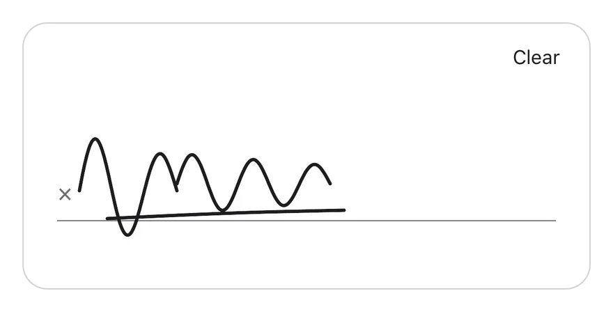
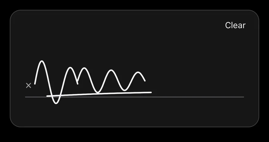
A pad that starts with a saved signature.
import { SignaturePad, type SignaturePadStroke } from "@/components/ui/signature-pad"

function wave(
  startX: number,
  baseY: number,
  length: number,
  amplitude: number,
  turns: number
): SignaturePadStroke {
  return Array.from({ length: 48 }, (_, index) => {
    const progress = index / 47
    return {
      x: startX + progress * length,
      y:
        baseY -
        Math.sin(progress * Math.PI * turns) * amplitude * (1 - progress * 0.4),
    }
  })
}

const SIGNATURE: SignaturePadStroke[] = [
  wave(40, 120, 70, 40, 3),
  wave(110, 115, 110, 22, 5),
  [
    { x: 60, y: 140 },
    { x: 140, y: 136 },
    { x: 230, y: 134 },
  ],
]

export function SignaturePadSignedExample() {
  return (
    <SignaturePad defaultValue={SIGNATURE} />
  )
}import EsuissUI
import SwiftUI
struct SignaturePadSignedExample: View {
var body: some View {
SignaturePadDemo(initial: signaturePadSample)
}
}
func signaturePadWave(startX: CGFloat, baseY: CGFloat, length: CGFloat, amplitude: CGFloat, turns: CGFloat) -> SignatureStroke {
SignatureStroke((0..<48).map { index in
let progress = CGFloat(index) / 47
return CGPoint(
x: startX + progress * length,
y: baseY - sin(progress * .pi * turns) * amplitude * (1 - progress * 0.4)
)
})
}
let signaturePadSample: [SignatureStroke] = [
signaturePadWave(startX: 40, baseY: 120, length: 70, amplitude: 40, turns: 3),
signaturePadWave(startX: 110, baseY: 115, length: 110, amplitude: 22, turns: 5),
SignatureStroke([CGPoint(x: 60, y: 140), CGPoint(x: 140, y: 136), CGPoint(x: 230, y: 134)]),
]
struct SignaturePadDemo: View {
var strokeWidth: CGFloat = 2.5
@State private var strokes: [SignatureStroke]
init(initial: [SignatureStroke], strokeWidth: CGFloat = 2.5) {
self.strokeWidth = strokeWidth
_strokes = State(initialValue: initial)
}
var body: some View {
SignaturePad(value: $strokes, strokeWidth: strokeWidth)
.frame(height: 192)
.frame(maxWidth: .infinity)
}
}import androidx.compose.foundation.layout.fillMaxWidth
import androidx.compose.runtime.Composable
import androidx.compose.ui.Modifier
import androidx.compose.ui.geometry.Offset
import com.esuiss.ui.components.SignaturePad
import com.esuiss.ui.components.SignatureStroke
import kotlin.math.PI
import kotlin.math.sin
@Composable
fun SignaturePadSignedExample() {
SignaturePad(Modifier.fillMaxWidth(), defaultValue = signaturePadSample)
}
fun signaturePadWave(startX: Float, baseY: Float, length: Float, amplitude: Float, turns: Float): SignatureStroke =
SignatureStroke(
List(48) { index ->
val progress = index / 47f
Offset(
startX + progress * length,
baseY - sin(progress * PI.toFloat() * turns) * amplitude * (1 - progress * 0.4f),
)
},
)
val signaturePadSample = listOf(
signaturePadWave(40f, 120f, 70f, 40f, 3f),
signaturePadWave(110f, 115f, 110f, 22f, 5f),
SignatureStroke(listOf(Offset(60f, 140f), Offset(140f, 136f), Offset(230f, 134f))),
)Thick stroke
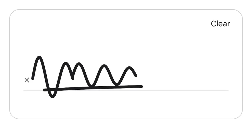
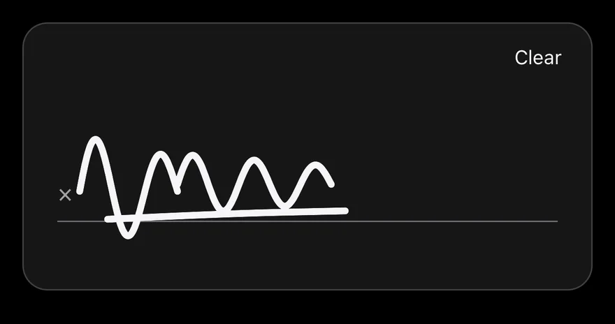
A signature drawn with strokeWidth={5}.
import { SignaturePad, type SignaturePadStroke } from "@/components/ui/signature-pad"

function wave(
  startX: number,
  baseY: number,
  length: number,
  amplitude: number,
  turns: number
): SignaturePadStroke {
  return Array.from({ length: 48 }, (_, index) => {
    const progress = index / 47
    return {
      x: startX + progress * length,
      y:
        baseY -
        Math.sin(progress * Math.PI * turns) * amplitude * (1 - progress * 0.4),
    }
  })
}

const SIGNATURE: SignaturePadStroke[] = [
  wave(40, 120, 70, 40, 3),
  wave(110, 115, 110, 22, 5),
  [
    { x: 60, y: 140 },
    { x: 140, y: 136 },
    { x: 230, y: 134 },
  ],
]

export function SignaturePadThickStrokeExample() {
  return (
    <SignaturePad defaultValue={SIGNATURE} strokeWidth={5} />
  )
}import EsuissUI
import SwiftUI
struct SignaturePadThickStrokeExample: View {
var body: some View {
SignaturePadDemo(initial: signaturePadSample, strokeWidth: 5)
}
}
func signaturePadWave(startX: CGFloat, baseY: CGFloat, length: CGFloat, amplitude: CGFloat, turns: CGFloat) -> SignatureStroke {
SignatureStroke((0..<48).map { index in
let progress = CGFloat(index) / 47
return CGPoint(
x: startX + progress * length,
y: baseY - sin(progress * .pi * turns) * amplitude * (1 - progress * 0.4)
)
})
}
let signaturePadSample: [SignatureStroke] = [
signaturePadWave(startX: 40, baseY: 120, length: 70, amplitude: 40, turns: 3),
signaturePadWave(startX: 110, baseY: 115, length: 110, amplitude: 22, turns: 5),
SignatureStroke([CGPoint(x: 60, y: 140), CGPoint(x: 140, y: 136), CGPoint(x: 230, y: 134)]),
]
struct SignaturePadDemo: View {
var strokeWidth: CGFloat = 2.5
@State private var strokes: [SignatureStroke]
init(initial: [SignatureStroke], strokeWidth: CGFloat = 2.5) {
self.strokeWidth = strokeWidth
_strokes = State(initialValue: initial)
}
var body: some View {
SignaturePad(value: $strokes, strokeWidth: strokeWidth)
.frame(height: 192)
.frame(maxWidth: .infinity)
}
}import androidx.compose.foundation.layout.fillMaxWidth
import androidx.compose.runtime.Composable
import androidx.compose.ui.Modifier
import androidx.compose.ui.geometry.Offset
import androidx.compose.ui.unit.dp
import com.esuiss.ui.components.SignaturePad
import com.esuiss.ui.components.SignatureStroke
import kotlin.math.PI
import kotlin.math.sin
@Composable
fun SignaturePadThickStrokeExample() {
SignaturePad(Modifier.fillMaxWidth(), defaultValue = signaturePadSample, strokeWidth = 5.dp)
}
fun signaturePadWave(startX: Float, baseY: Float, length: Float, amplitude: Float, turns: Float): SignatureStroke =
SignatureStroke(
List(48) { index ->
val progress = index / 47f
Offset(
startX + progress * length,
baseY - sin(progress * PI.toFloat() * turns) * amplitude * (1 - progress * 0.4f),
)
},
)
val signaturePadSample = listOf(
signaturePadWave(40f, 120f, 70f, 40f, 3f),
signaturePadWave(110f, 115f, 110f, 22f, 5f),
SignatureStroke(listOf(Offset(60f, 140f), Offset(140f, 136f), Offset(230f, 134f))),
)Disabled
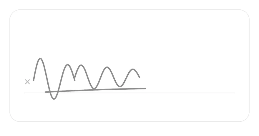
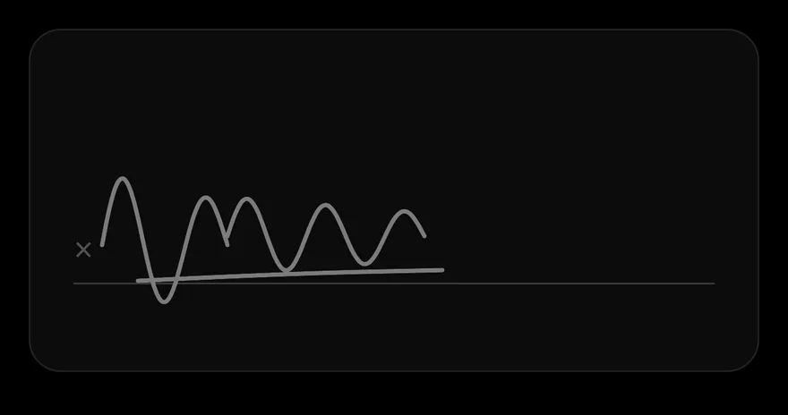
A disabled pad that ignores touches and hides the Clear button.
import { SignaturePad, type SignaturePadStroke } from "@/components/ui/signature-pad"

function wave(
  startX: number,
  baseY: number,
  length: number,
  amplitude: number,
  turns: number
): SignaturePadStroke {
  return Array.from({ length: 48 }, (_, index) => {
    const progress = index / 47
    return {
      x: startX + progress * length,
      y:
        baseY -
        Math.sin(progress * Math.PI * turns) * amplitude * (1 - progress * 0.4),
    }
  })
}

const SIGNATURE: SignaturePadStroke[] = [
  wave(40, 120, 70, 40, 3),
  wave(110, 115, 110, 22, 5),
  [
    { x: 60, y: 140 },
    { x: 140, y: 136 },
    { x: 230, y: 134 },
  ],
]

export function SignaturePadDisabledExample() {
  return (
    <SignaturePad defaultValue={SIGNATURE} disabled />
  )
}import EsuissUI
import SwiftUI
struct SignaturePadDisabledExample: View {
var body: some View {
SignaturePadDemo(initial: signaturePadSample)
.disabled(true)
}
}
func signaturePadWave(startX: CGFloat, baseY: CGFloat, length: CGFloat, amplitude: CGFloat, turns: CGFloat) -> SignatureStroke {
SignatureStroke((0..<48).map { index in
let progress = CGFloat(index) / 47
return CGPoint(
x: startX + progress * length,
y: baseY - sin(progress * .pi * turns) * amplitude * (1 - progress * 0.4)
)
})
}
let signaturePadSample: [SignatureStroke] = [
signaturePadWave(startX: 40, baseY: 120, length: 70, amplitude: 40, turns: 3),
signaturePadWave(startX: 110, baseY: 115, length: 110, amplitude: 22, turns: 5),
SignatureStroke([CGPoint(x: 60, y: 140), CGPoint(x: 140, y: 136), CGPoint(x: 230, y: 134)]),
]
struct SignaturePadDemo: View {
var strokeWidth: CGFloat = 2.5
@State private var strokes: [SignatureStroke]
init(initial: [SignatureStroke], strokeWidth: CGFloat = 2.5) {
self.strokeWidth = strokeWidth
_strokes = State(initialValue: initial)
}
var body: some View {
SignaturePad(value: $strokes, strokeWidth: strokeWidth)
.frame(height: 192)
.frame(maxWidth: .infinity)
}
}import androidx.compose.foundation.layout.fillMaxWidth
import androidx.compose.runtime.Composable
import androidx.compose.ui.Modifier
import androidx.compose.ui.geometry.Offset
import com.esuiss.ui.components.SignaturePad
import com.esuiss.ui.components.SignatureStroke
import kotlin.math.PI
import kotlin.math.sin
@Composable
fun SignaturePadDisabledExample() {
SignaturePad(Modifier.fillMaxWidth(), defaultValue = signaturePadSample, enabled = false)
}
fun signaturePadWave(startX: Float, baseY: Float, length: Float, amplitude: Float, turns: Float): SignatureStroke =
SignatureStroke(
List(48) { index ->
val progress = index / 47f
Offset(
startX + progress * length,
baseY - sin(progress * PI.toFloat() * turns) * amplitude * (1 - progress * 0.4f),
)
},
)
val signaturePadSample = listOf(
signaturePadWave(40f, 120f, 70f, 40f, 3f),
signaturePadWave(110f, 115f, 110f, 22f, 5f),
SignatureStroke(listOf(Offset(60f, 140f), Offset(140f, 136f), Offset(230f, 134f))),
)Controlled
A controlled pad that reads the signature through the ref and exports it with toSVG.
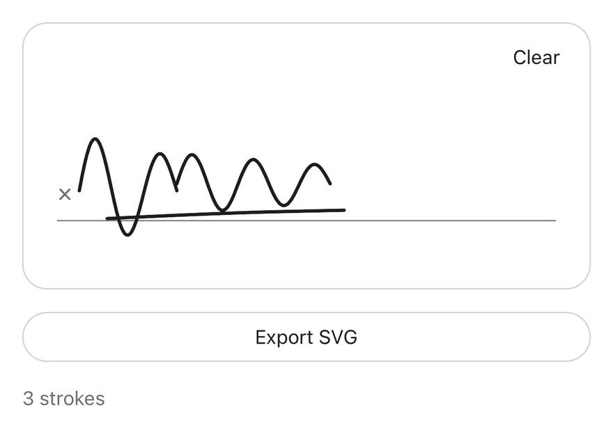
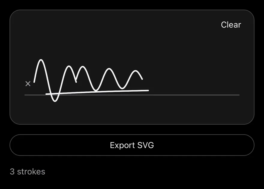
import * as React from "react"
import { View } from "react-native"
import { Button } from "@/components/ui/button"
import { SignaturePad, type SignaturePadHandle, type SignaturePadStroke } from "@/components/ui/signature-pad"
import { Text } from "@/components/ui/text"

function wave(
  startX: number,
  baseY: number,
  length: number,
  amplitude: number,
  turns: number
): SignaturePadStroke {
  return Array.from({ length: 48 }, (_, index) => {
    const progress = index / 47
    return {
      x: startX + progress * length,
      y:
        baseY -
        Math.sin(progress * Math.PI * turns) * amplitude * (1 - progress * 0.4),
    }
  })
}

const SIGNATURE: SignaturePadStroke[] = [
  wave(40, 120, 70, 40, 3),
  wave(110, 115, 110, 22, 5),
  [
    { x: 60, y: 140 },
    { x: 140, y: 136 },
    { x: 230, y: 134 },
  ],
]

function ExportDemo() {
  const ref = React.useRef<SignaturePadHandle>(null)
  const [strokes, setStrokes] = React.useState<SignaturePadStroke[]>(SIGNATURE)
  const [size, setSize] = React.useState("")
  return (
    <View className="w-full gap-4">
      <SignaturePad ref={ref} value={strokes} onChange={setStrokes} />
      <Button
        variant="outline"
        onPress={() =>
          setSize(`SVG: ${ref.current?.toSVG().length ?? 0} characters`)
        }
      >
        <Text>Export SVG</Text>
      </Button>
      <Text role="status" className="text-sm text-muted-foreground">
        {`${strokes.length} strokes${size ? ` · ${size}` : ""}`}
      </Text>
    </View>
  )
}

export function SignaturePadControlledExample() {
  return (
    <ExportDemo />
  )
}import EsuissUI
import SwiftUI
func signaturePadWave(startX: CGFloat, baseY: CGFloat, length: CGFloat, amplitude: CGFloat, turns: CGFloat) -> SignatureStroke {
SignatureStroke((0..<48).map { index in
let progress = CGFloat(index) / 47
return CGPoint(
x: startX + progress * length,
y: baseY - sin(progress * .pi * turns) * amplitude * (1 - progress * 0.4)
)
})
}
let signaturePadSample: [SignatureStroke] = [
signaturePadWave(startX: 40, baseY: 120, length: 70, amplitude: 40, turns: 3),
signaturePadWave(startX: 110, baseY: 115, length: 110, amplitude: 22, turns: 5),
SignatureStroke([CGPoint(x: 60, y: 140), CGPoint(x: 140, y: 136), CGPoint(x: 230, y: 134)]),
]
struct SignaturePadExportDemo: View {
@State private var strokes = signaturePadSample
@State private var exported = ""
@State private var width: CGFloat = 0
@Environment(\.colorScheme) private var colorScheme
var body: some View {
VStack(alignment: .leading, spacing: 16) {
SignaturePad(value: $strokes)
.frame(height: 192)
.frame(maxWidth: .infinity)
.onGeometryChange(for: CGFloat.self) { $0.size.width } action: { width = $0 }
.onChange(of: strokes) { _, _ in exported = "" }
Button {
let image = SignaturePad.image(strokes, size: CGSize(width: width, height: 192), colorScheme: colorScheme)
if let image {
exported = "Image: \(Int(image.size.width * image.scale))×\(Int(image.size.height * image.scale)) px"
}
} label: {
Text("Export image").frame(maxWidth: .infinity)
}
.buttonStyle(.variant(.outline))
Text(verbatim: exported.isEmpty ? "\(strokes.count) strokes" : "\(strokes.count) strokes · \(exported)")
.textStyle(.sm)
.foregroundStyle(EsuissColor.mutedForeground)
}
.frame(maxWidth: .infinity, alignment: .leading)
}
}import androidx.compose.foundation.layout.Arrangement
import androidx.compose.foundation.layout.Column
import androidx.compose.foundation.layout.fillMaxWidth
import androidx.compose.runtime.Composable
import androidx.compose.runtime.getValue
import androidx.compose.runtime.mutableStateOf
import androidx.compose.runtime.remember
import androidx.compose.runtime.saveable.rememberSaveable
import androidx.compose.runtime.setValue
import androidx.compose.ui.Modifier
import androidx.compose.ui.geometry.Offset
import androidx.compose.ui.layout.onSizeChanged
import androidx.compose.ui.platform.LocalDensity
import androidx.compose.ui.semantics.LiveRegionMode
import androidx.compose.ui.semantics.liveRegion
import androidx.compose.ui.semantics.semantics
import androidx.compose.ui.unit.IntSize
import androidx.compose.ui.unit.dp
import com.esuiss.ui.components.Button
import com.esuiss.ui.components.ButtonVariant
import com.esuiss.ui.components.SignaturePad
import com.esuiss.ui.components.SignatureStroke
import com.esuiss.ui.components.Text
import com.esuiss.ui.components.toSvg
import com.esuiss.ui.theme.EsuissTheme
import com.esuiss.ui.theme.Typography
import kotlin.math.PI
import kotlin.math.sin
fun signaturePadWave(startX: Float, baseY: Float, length: Float, amplitude: Float, turns: Float): SignatureStroke =
SignatureStroke(
List(48) { index ->
val progress = index / 47f
Offset(
startX + progress * length,
baseY - sin(progress * PI.toFloat() * turns) * amplitude * (1 - progress * 0.4f),
)
},
)
val signaturePadSample = listOf(
signaturePadWave(40f, 120f, 70f, 40f, 3f),
signaturePadWave(110f, 115f, 110f, 22f, 5f),
SignatureStroke(listOf(Offset(60f, 140f), Offset(140f, 136f), Offset(230f, 134f))),
)
@Composable
fun SignaturePadControlled() {
var strokes by remember { mutableStateOf(signaturePadSample) }
var exported by rememberSaveable { mutableStateOf("") }
var size by remember { mutableStateOf(IntSize.Zero) }
val density = LocalDensity.current
Column(Modifier.fillMaxWidth(), verticalArrangement = Arrangement.spacedBy(16.dp)) {
SignaturePad(
Modifier.fillMaxWidth().onSizeChanged { size = it },
value = strokes,
onValueChange = { strokes = it },
)
Button(
"Export SVG",
onClick = {
val svg = with(density) { strokes.toSvg(size.width.toDp().value, size.height.toDp().value) }
exported = "SVG: ${svg.length} characters"
},
modifier = Modifier.fillMaxWidth(),
variant = ButtonVariant.Outline,
)
Text(
"${strokes.size} strokes" + if (exported.isNotEmpty()) " · $exported" else "",
modifier = Modifier.semantics { liveRegion = LiveRegionMode.Polite },
style = Typography.sm,
color = EsuissTheme.colors.mutedForeground,
)
}
}API Reference
SignaturePad
| Prop | Type | Default | Description |
|---|---|---|---|
value | SignaturePadStroke[] | - | Strokes for controlled use. |
defaultValue | SignaturePadStroke[] | - | Initial strokes for uncontrolled use. |
onChange | (value: SignaturePadStroke[]) => void | - | Called with the full list of strokes after each stroke ends or the pad is cleared. |
strokeWidth | number | 2.5 | Line width of the strokes. Defaults to 2.5. |
disabled | boolean | false | Turns off drawing, hides the Clear button and dims the pad. |
placeholder | React.ReactNode | "Sign here" | Content shown on the signature line while the pad is empty. Defaults to "Sign here". |
clearLabel | React.ReactNode | "Clear" | Label of the Clear button. Defaults to "Clear". |
ref | React.Ref<SignaturePadHandle> | - | Receives a SignaturePadHandle with toSVG, clear and isEmpty. |
Also accepts the props of React.ComponentProps<typeof View>.
Accessibility
- The pad is a single accessible element labeled by
accessibilityLabel. - Its value is announced as "Empty" or "Signed", and
disabledis reported in its state. - When it has a signature and is not disabled, it offers a
clearaccessibility action, so VoiceOver and TalkBack users can clear it without finding the button.
Notes
- Uses
bg-cardin light mode andbg-mutedin dark mode, withborder-borderandtext-foregroundfor the strokes. - Points closer than one point to the previous point are skipped while drawing.