suiss/ui
  • Docs
  • Components
  • Patterns
  • Interactions
  • Charts
  • Blocks
GitHubGet started
DocsComponentsPatternsInteractionsChartsBlocks
Components82
  • Overview
  • Accordion
  • Alert
  • Alert Dialog
  • Alert Sheet
  • Amount Input
  • Aspect Ratio
  • Attachment
  • Avatar
  • Badge
  • Bottom Bar
  • Breadcrumb
  • Bubble
  • Button
  • Button Group
  • Calendar
  • Card
  • Carousel
  • Chart
  • Checkbox
  • Chip
  • Collapsible
  • Combobox
  • Command
  • Context Menu
  • Dialog
  • Direction
  • Drawer
  • Dropdown Menu
  • Empty
  • FAB
  • Field
  • Fullscreen Menu
  • Haptics
  • Header
  • Hover Card
  • Icon
  • Input
  • Input Accessory Bar
  • Input Group
  • Input OTP
  • Item
  • Kbd
  • Keyboard Scroll View
  • Keypad
  • Label
  • Marker
  • Menubar
  • Message
  • Message Scroller
  • Native Select
  • Navigation Menu
  • Page Indicator
  • Pagination
  • Pin Pad
  • Popover
  • Progress
  • QR Scanner
  • Questionnaire
  • Radio Group
  • Resizable
  • Screen
  • Scroll Area
  • Select
  • Separator
  • Sheet
  • Sidebar
  • Signature Pad
  • Skeleton
  • Slider
  • Spinner
  • Switch
  • Tab Bar
  • Table
  • Tabs
  • Text
  • Textarea
  • Toast
  • Toggle
  • Toggle Group
  • Tooltip
  • Wheel Picker
  • Widget

suiss/ui · Component

Slider

A track with one or more draggable thumbs for choosing a value or range.

Slider is an open-source component from suiss/ui for React, React Native, SwiftUI and Jetpack Compose. The @esuiss/ui CLI copies its source into your project, so you own the code.

Slider wraps the slider primitive of the chosen base in a single component. It renders the track, the filled range and one thumb per value. The thumb is a wide capsule that stretches while it's dragged or pressed.

Use a slider when an approximate value within a range matters more than a precise number, such as volume or brightness. For exact numbers, use a number field or Input.

Installation

CLI

$ pnpm dlx shadcn@latest add @esuiss/slider

Works in any project with a components.json. See Installation for the one-line registry setup. Or use the suiss/ui CLI:

$ pnpm dlx @esuiss/ui@latest add slider

Manual

  1. Install the dependencies and add the cn helper:
$ pnpm add @base-ui/react
  1. Copy the source into components/ui/slider.tsx:
  1. Update the import paths to match your project.

Usage

import { Slider } 
<div

Pass defaultValue or value as an array: one number for a single thumb, two for a range. min defaults to 0 and max to 100; use step to snap to increments. Use onValueChange with value to control it, and set orientation="vertical" for a vertical slider.

Examples

Range

Uses two values to select a range with two thumbs.

Steps

Moves in increments of 10.

Vertical

Runs vertically.

Disabled

Disables interaction and removes the thumb from the tab order.

API Reference

01

Slider

The complete slider: track, filled range and thumbs.

Also accepts the props of the primitive part it wraps.

Accessibility

  • Each thumb has the slider role with aria-valuenow and aria-orientation.
  • aria-label and aria-labelledby on Slider are passed to every thumb, so each thumb is named.
  • Arrow keys move the focused thumb by one step; Home and End jump to the minimum and maximum. Vertical sliders use the up and down arrow keys.
  • In a range, Tab moves between thumbs, and each thumb moves independently.
  • A disabled slider can't be focused.

Notes

  • If neither value nor defaultValue is an array, the slider renders two thumbs. Always pass an array.
  • Parts carry data-slot attributes: slider, slider-track, slider-range and slider-thumb.
  • The range uses bg-primary, the track uses bg-border, and disabled sliders are dimmed with opacity-50.
  • Thumbs use thumbAlignment="edge", so they stay inside the track at both ends.

Slider renders a thin track, a filled indicator and one thumb per value. Pass a number for a single value, or an array for a range or several thumbs. The active thumb widens while it is dragged. It works horizontally or vertically.

Thumbs are aligned to the edges of the track, so they stay within it at min and max.
Installation

$ pnpm dlx shadcn@latest add @esuiss-rn/slider

See Installation for the components.json setup. Or use the suiss/ui CLI:

$ pnpm dlx @esuiss/ui@latest add slider
$ pnpm dlx @esuiss/ui@latest add slider --platform swift
NextSpinnerPreviousSkeleton

On this page

  1. 01Installation
    • CLI
    • Manual
  2. 02Usage
  3. 03Examples
    • Range
    • Steps
    • Vertical
    • Disabled
  4. 04API Reference
    • Slider
  5. 05Accessibility
  6. 06Notes
  7. 07Installation
    • Manual
  8. 08Usage
  9. 09Examples
    • Controlled
    • Range
    • Multiple thumbs
    • Step
    • Vertical
    • Disabled
  10. 10API Reference
    • Slider
  11. 11Accessibility
  12. 12Notes
from
"@/components/ui/slider"
className
=
"w-72"
>
<Slider defaultValue={[50]} min={0} max={100} step={1} aria-label="Volume" />
</div>
$ pnpm dlx @esuiss/ui@latest add slider --platform kotlin

Manual

  1. Install the dependencies:
npx expo install cn
  1. Add the pieces it builds on: the primitives components/primitives/slider.tsx, components/primitives/use-render.tsx.

  2. Copy the source into components/ui/slider.tsx:

  1. Update the import paths to match your project.
  1. Install the dependencies:
npx expo install cn
  1. Add the pieces it builds on: the primitives components/primitives/slider.tsx, components/primitives/use-render.tsx.

  2. Copy the source into components/ui/slider.tsx:

  1. Update the import paths to match your project.
  1. Add the pieces it builds on: the primitives components/primitives/slider.tsx, components/primitives/use-render.tsx.

  2. Copy the source into components/ui/slider.tsx:

  1. Update the import paths to match your project.
  1. Target iOS 17 or later.

  2. Copy the theme files every view uses:

swift/Theme/Theme.swift
import SwiftUI
import UIKit

struct RGBA: Sendable {
  let red: CGFloat
  let green: CGFloat
  let blue: CGFloat
  let alpha: CGFloat

  init(_ hex: UInt32, _ alpha: CGFloat = 1) {
    red = CGFloat((hex >> 16) & 0xFF) / 255
    green = CGFloat((hex >> 8) & 0xFF) / 255
    blue = CGFloat(hex & 0xFF) / 255
    self.alpha = alpha
  }
swift/Theme/Tokens.swift
import SwiftUI

public enum EsuissColor {
  public static let background = Color.adaptive(light: .init(0xFFFFFF), dark: .init(0x000000))
  public static let foreground = Color.adaptive(light: .init(0x1D1D1F), dark: .init(0xF5F5F7))
  public static let card = Color.adaptive(light: .init(0xFFFFFF), dark: .init(0x1D1D1F))
  public static let cardForeground = Color.adaptive(light: .init(0x1D1D1F), dark: .init(0xF5F5F7))
  public static let popover = Color.adaptive(light: .init(0xFFFFFF), dark: .init(0x1D1D1F))
  public static let popoverForeground = Color.adaptive(light: .init(0x1D1D1F), dark: .init(0xF5F5F7))
  public static let primary = Color.adaptive(light: .init(0x0071E3), dark: .init(0x2997FF))
  public static let primaryForeground = Color.adaptive(light: .init(0xFFFFFF), dark: .init(0xFFFFFF))
  public static let secondary = Color.adaptive(light: .init(0x000000, 0.04), dark: .init(0xFFFFFF, 0.1))
  public static let secondaryForeground = Color.adaptive(light: .init(0x1D1D1F), dark: .init(0xF5F5F7))
  public static let muted = Color.adaptive(light: .init(0xF5F5F7), dark: .init(0x161617))
  public static let mutedForeground = Color.adaptive(light: .init(0x6E6E73), dark: .init(0xA1A1A6))
  public static let accent = Color.adaptive(light: .init(0x000000, 0.06), dark: .init(0xFFFFFF, 0.1))
  1. Copy the source and every file it uses:
  1. Add the files to your app target.
  1. Set minSdk to 24 or higher and add the dependencies:
build.gradle.kts
implementation(platform("androidx.compose:compose-bom:2026.09.00"))
implementation("androidx.compose.foundation:foundation")
implementation("androidx.compose.ui:ui")
  1. Copy the theme files every view uses:
kotlin/theme/Theme.kt
package com.esuiss.ui.theme

import androidx.compose.foundation.isSystemInDarkTheme
import androidx.compose.runtime.Composable
import androidx.compose.runtime.CompositionLocalProvider
import androidx.compose.runtime.Immutable
import androidx.compose.runtime.staticCompositionLocalOf
import androidx.compose.ui.Modifier
import androidx.compose.ui.draw.dropShadow
import androidx.compose.ui.graphics.Color
import androidx.compose.ui.graphics.Shape
import androidx.compose.ui.graphics.shadow.Shadow as DropShadow
import androidx.compose.ui.text.TextStyle
import androidx.compose.ui.text.style.LineHeightStyle
import androidx.compose.ui.unit.Dp
import androidx.compose.ui.unit.DpOffset
kotlin/theme/Tokens.kt
package com.esuiss.ui.theme

import androidx.compose.runtime.Immutable
import androidx.compose.ui.graphics.Color
import androidx.compose.ui.unit.dp

@Immutable
data class Colors(
    val background: Color,
    val foreground: Color,
    val card: Color,
    val cardForeground: Color,
    val popover: Color,
    val popoverForeground: Color,
    val primary: Color,
    val primaryForeground: Color,
  1. Copy the source and every file it uses:
kotlin/components/Content.kt
package com.esuiss.ui.components

import androidx.compose.runtime.compositionLocalOf
import androidx.compose.ui.graphics.Color
import androidx.compose.ui.text.TextStyle
import androidx.compose.ui.unit.Dp
import androidx.compose.ui.unit.dp

val LocalContentStyle = compositionLocalOf { TextStyle.Default }

val LocalContentColor = compositionLocalOf { Color.Unspecified }

val LocalIconSize = compositionLocalOf { 20.dp }
kotlin/components/Haptics.kt
package com.esuiss.ui.components

import androidx.compose.runtime.Composable
import androidx.compose.runtime.CompositionLocalProvider
import androidx.compose.runtime.remember
import androidx.compose.runtime.staticCompositionLocalOf
import androidx.compose.ui.hapticfeedback.HapticFeedback
import androidx.compose.ui.hapticfeedback.HapticFeedbackType
import androidx.compose.ui.platform.LocalHapticFeedback

val LocalHapticsEnabled = staticCompositionLocalOf { true }

@Composable
fun ProvideHaptics(enabled: Boolean, content: @Composable () -> Unit) {
    CompositionLocalProvider(LocalHapticsEnabled provides enabled, content = content)
}
kotlin/components/Separator.kt
package com.esuiss.ui.components

import androidx.compose.foundation.background
import androidx.compose.foundation.gestures.Orientation
import androidx.compose.foundation.layout.Box
import androidx.compose.foundation.layout.fillMaxHeight
import androidx.compose.foundation.layout.fillMaxWidth
import androidx.compose.foundation.layout.height
import androidx.compose.foundation.layout.width
import androidx.compose.runtime.Composable
import androidx.compose.ui.Modifier
import androidx.compose.ui.unit.dp
import com.esuiss.ui.theme.EsuissTheme

@Composable
fun Separator(
  1. Update the com.esuiss.ui package names to match your project.

Usage

import { Slider } from "@/components/ui/slider"
<Slider defaultValue={50} max={100} step={1} accessibilityLabel="Volume" />

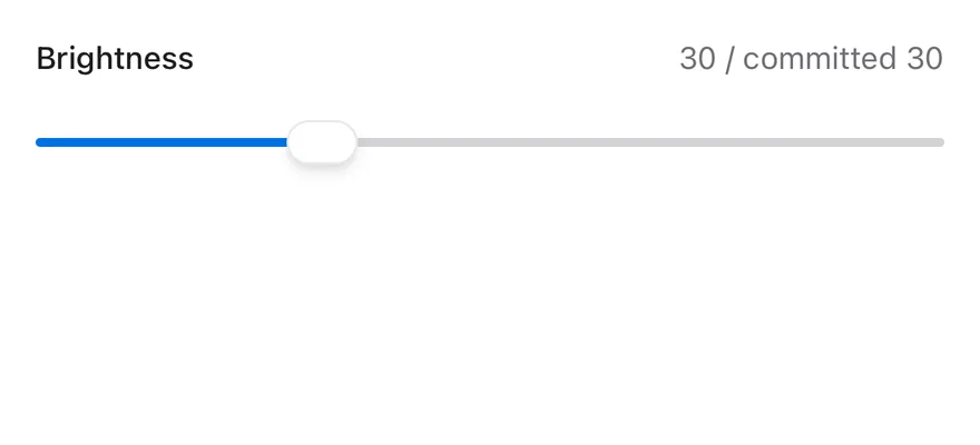
Use defaultValue for an uncontrolled slider, or value with onValueChange to control it. onValueCommitted runs when a drag or track press ends, which suits saving or fetching.

Set min, max and step to define the range; min defaults to 0 and max to 100. For ranges, minStepsBetweenValues keeps thumbs apart and thumbCollisionBehavior decides whether thumbs push each other, swap, or stop (none).

The number of thumbs comes from the array length of value or defaultValue.

Examples

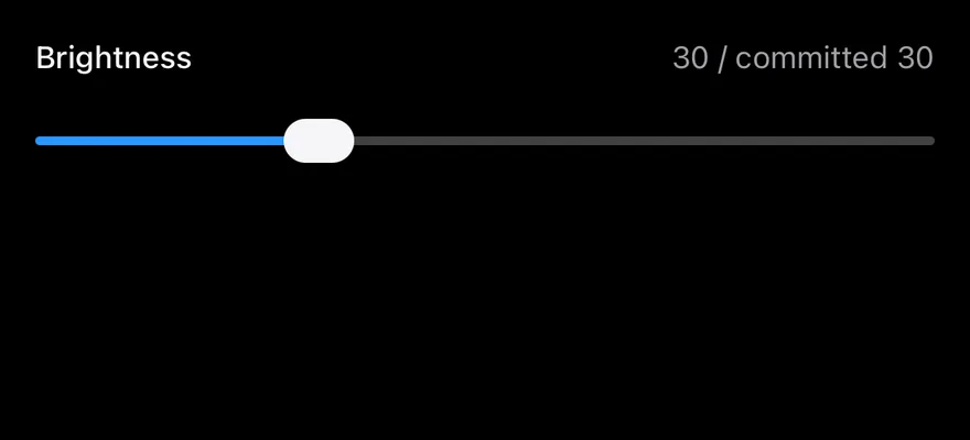
Controlled

A controlled slider that shows the live and committed values.

iOS
Slider (controlled) on iOS in light modeSlider (controlled) on iOS in dark mode
import * as React from "react"
import { View } from "react-native"
import { Slider } from "@/components/ui/slider"
import { Text } from "@/components/ui/text"

function ControlledDemo() {
  const [value, setValue] = React.useState(30)
  const [committed, setCommitted] = React.useState(30)
  return (
    <View className="w-full gap-3">
      <View className="flex-row items-center justify-between">
        <Text className="text-sm font-medium">Brightness</Text>
        <Text className="text-sm text-muted-foreground">
          {value} / committed {committed}
        </Text>
      </View>
      <Slider
        value={value}
        onValueChange={(next) => setValue(next)}
        onValueCommitted={(next) => setCommitted(next)}
        accessibilityLabel="Brightness"
      />
    </View>
  )
}

export function SliderControlledExample() {
  return (
    <ControlledDemo />
  )
}
import EsuissUI
import SwiftUI

struct SliderControlledDemo: View {
  @State private var value: Double = 30
  @State private var committed: Double = 30

  var body: some View {
    VStack(alignment: .leading, spacing: 12) {
      HStack {
        Text("Brightness")
          .textStyle(.sm, weight: .medium)
          .foregroundStyle(EsuissColor.foreground)
        Spacer()
        Text(verbatim: "\(Int(value)) / committed \(Int(committed))")
          .textStyle(.sm)
          .foregroundStyle(EsuissColor.mutedForeground)
      }
      ValueSlider(value: $value, in: 0...100, step: 1) { editing in
        if !editing { committed = value }
      }
      .accessibilityLabel(Text("Brightness"))
    }
    .frame(maxWidth: .infinity, alignment: .leading)
  }
}
import androidx.compose.foundation.layout.Arrangement
import androidx.compose.foundation.layout.Column
import androidx.compose.foundation.layout.Row
import androidx.compose.foundation.layout.fillMaxWidth
import androidx.compose.runtime.Composable
import androidx.compose.runtime.getValue
import androidx.compose.runtime.mutableFloatStateOf
import androidx.compose.runtime.saveable.rememberSaveable
import androidx.compose.runtime.setValue
import androidx.compose.ui.Alignment
import androidx.compose.ui.Modifier
import androidx.compose.ui.text.font.FontWeight
import androidx.compose.ui.unit.dp
import com.esuiss.ui.components.Slider
import com.esuiss.ui.components.Text
import com.esuiss.ui.theme.EsuissTheme
import com.esuiss.ui.theme.Typography
import kotlin.math.roundToInt

@Composable
fun SliderHeader(title: String, detail: String) {
    Row(Modifier.fillMaxWidth(), horizontalArrangement = Arrangement.SpaceBetween, verticalAlignment = Alignment.CenterVertically) {
        Text(title, style = Typography.sm.copy(fontWeight = FontWeight.Medium))
        Text(detail, style = Typography.sm, color = EsuissTheme.colors.mutedForeground)
    }
}

@Composable
fun SliderControlled() {
    var value by rememberSaveable { mutableFloatStateOf(30f) }
    var committed by rememberSaveable { mutableFloatStateOf(30f) }
    Column(Modifier.fillMaxWidth(), verticalArrangement = Arrangement.spacedBy(12.dp)) {
        SliderHeader("Brightness", "${value.roundToInt()} / committed ${committed.roundToInt()}")
        Slider(
            value,
            { value = it },
            Modifier.fillMaxWidth(),
            onValueChangeFinished = { committed = value },
            contentDescription = "Brightness",
        )
    }
}

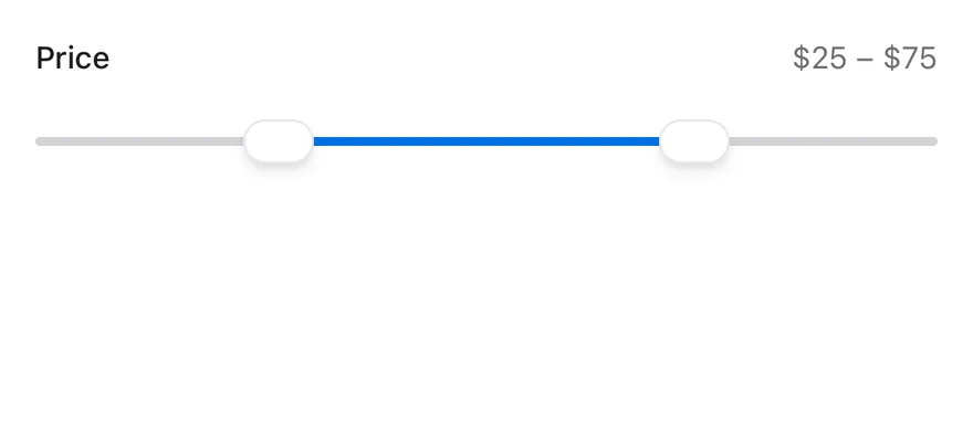
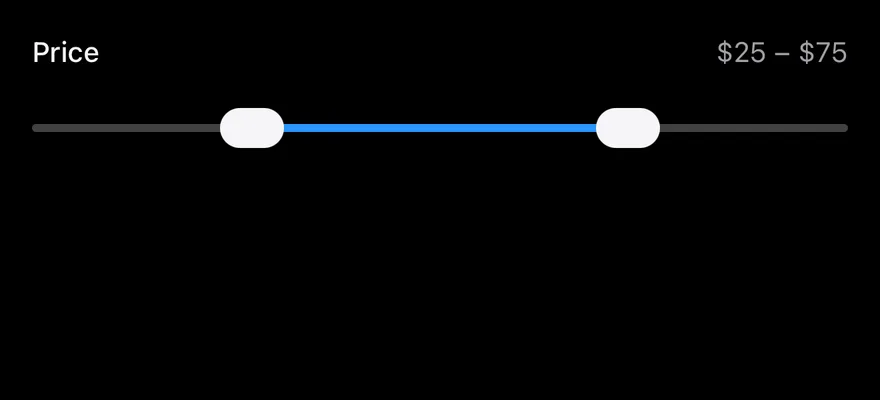
Range

A two-thumb price range with a step and a minimum gap.

iOS
Slider (range) on iOS in light modeSlider (range) on iOS in dark mode
import * as React from "react"
import { View } from "react-native"
import { Slider } from "@/components/ui/slider"
import { Text } from "@/components/ui/text"

function RangeDemo() {
  const [value, setValue] = React.useState<readonly number[]>([25, 75])
  return (
    <View className="w-full gap-3">
      <View className="flex-row items-center justify-between">
        <Text className="text-sm font-medium">Price</Text>
        <Text className="text-sm text-muted-foreground">
          ${value[0]} – ${value[1]}
        </Text>
      </View>
      <Slider
        value={value}
        onValueChange={setValue}
        step={5}
        minStepsBetweenValues={2}
        accessibilityLabel="Price"
      />
    </View>
  )
}

export function SliderRangeExample() {
  return (
    <RangeDemo />
  )
}
import EsuissUI
import SwiftUI

struct SliderRangeDemo: View {
  @State private var value: ClosedRange<Double> = 25...75

  var body: some View {
    VStack(alignment: .leading, spacing: 12) {
      HStack {
        Text("Price")
          .textStyle(.sm, weight: .medium)
          .foregroundStyle(EsuissColor.foreground)
        Spacer()
        Text(verbatim: "$\(Int(value.lowerBound)) – $\(Int(value.upperBound))")
          .textStyle(.sm)
          .foregroundStyle(EsuissColor.mutedForeground)
      }
      RangeSlider(value: $value, in: 0...100, step: 5)
        .accessibilityLabel(Text("Price"))
    }
    .frame(maxWidth: .infinity, alignment: .leading)
  }
}
import androidx.compose.foundation.layout.Arrangement
import androidx.compose.foundation.layout.Column
import androidx.compose.foundation.layout.Row
import androidx.compose.foundation.layout.fillMaxWidth
import androidx.compose.runtime.Composable
import androidx.compose.runtime.getValue
import androidx.compose.runtime.mutableFloatStateOf
import androidx.compose.runtime.saveable.rememberSaveable
import androidx.compose.runtime.setValue
import androidx.compose.ui.Alignment
import androidx.compose.ui.Modifier
import androidx.compose.ui.text.font.FontWeight
import androidx.compose.ui.unit.dp
import com.esuiss.ui.components.RangeSlider
import com.esuiss.ui.components.Text
import com.esuiss.ui.theme.EsuissTheme
import com.esuiss.ui.theme.Typography
import kotlin.math.roundToInt

@Composable
fun SliderHeader(title: String, detail: String) {
    Row(Modifier.fillMaxWidth(), horizontalArrangement = Arrangement.SpaceBetween, verticalAlignment = Alignment.CenterVertically) {
        Text(title, style = Typography.sm.copy(fontWeight = FontWeight.Medium))
        Text(detail, style = Typography.sm, color = EsuissTheme.colors.mutedForeground)
    }
}

@Composable
fun SliderRange() {
    var start by rememberSaveable { mutableFloatStateOf(25f) }
    var end by rememberSaveable { mutableFloatStateOf(75f) }
    Column(Modifier.fillMaxWidth(), verticalArrangement = Arrangement.spacedBy(12.dp)) {
        SliderHeader("Price", "$${start.roundToInt()} – $${end.roundToInt()}")
        RangeSlider(
            start..end,
            {
                start = it.start
                end = it.endInclusive
            },
            Modifier.fillMaxWidth(),
            step = 5f,
            contentDescription = "Price",
        )
    }
}

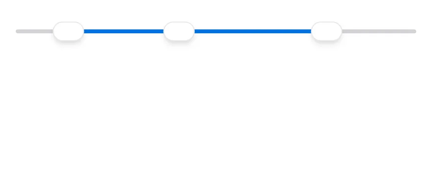
Multiple thumbs

Three thumbs that swap when they cross.

iOS
Slider (multiple thumbs) on iOS in light modeSlider (multiple thumbs) on iOS in dark mode
import { Slider } from "@/components/ui/slider"

export function SliderMultipleThumbsExample() {
  return (
    <Slider defaultValue={[10, 40, 80]} max={100} step={1} accessibilityLabel="Volume" thumbCollisionBehavior="swap" />
  )
}

Step

A slider that moves in decimal steps.

iOS
Slider (step) on iOS in light modeSlider (step) on iOS in dark mode
import { Slider } from "@/components/ui/slider"

export function SliderStepExample() {
  return (
    <Slider defaultValue={0.5} max={1} step={0.1} accessibilityLabel="Volume" min={0} />
  )
}
import EsuissUI
import SwiftUI

struct SliderStepExample: View {
  var body: some View {
    SliderDemo(initial: 0.5, bounds: 0...1, step: 0.1)
  }
}

struct SliderDemo: View {
  var bounds: ClosedRange<Double> = 0...100
  var step: Double = 1

  @State private var value: Double

  init(initial: Double, bounds: ClosedRange<Double> = 0...100, step: Double = 1) {
    self.bounds = bounds
    self.step = step
    _value = State(initialValue: initial)
  }

  var body: some View {
    ValueSlider(value: $value, in: bounds, step: step)
      .accessibilityLabel(Text("Volume"))
      .frame(maxWidth: .infinity)
  }
}
import androidx.compose.foundation.layout.fillMaxWidth
import androidx.compose.runtime.Composable
import androidx.compose.runtime.getValue
import androidx.compose.runtime.mutableFloatStateOf
import androidx.compose.runtime.saveable.rememberSaveable
import androidx.compose.runtime.setValue
import androidx.compose.ui.Modifier
import com.esuiss.ui.components.Slider

@Composable
fun SliderStepExample() {
    SliderUncontrolled(0.5f, valueRange = 0f..1f, step = 0.1f)
}

@Composable
fun SliderUncontrolled(
    initial: Float,
    valueRange: ClosedFloatingPointRange<Float> = 0f..100f,
    step: Float = 1f,
    enabled: Boolean = true,
) {
    var value by rememberSaveable { mutableFloatStateOf(initial) }
    Slider(
        value,
        { value = it },
        Modifier.fillMaxWidth(),
        enabled = enabled,
        valueRange = valueRange,
        step = step,
        contentDescription = "Volume",
    )
}

Vertical

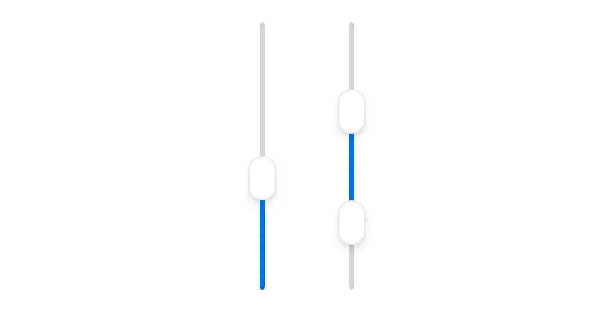
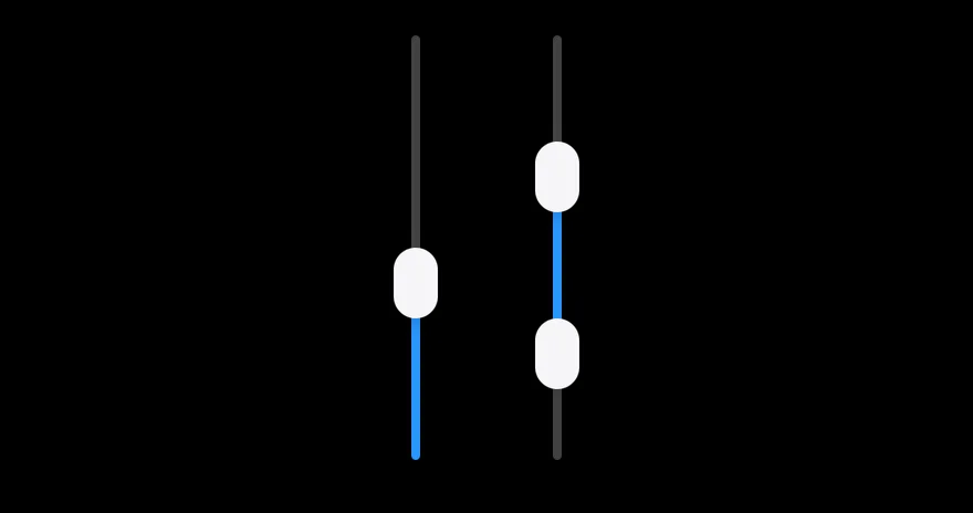
Single and range sliders in vertical orientation.

iOS
Slider (vertical) on iOS in light modeSlider (vertical) on iOS in dark mode
import { View } from "react-native"
import { Slider } from "@/components/ui/slider"

export function SliderVerticalExample() {
  return (
    <View className="h-48 flex-row justify-center gap-8">
      <Slider defaultValue={40} orientation="vertical" />
      <Slider defaultValue={[20, 70]} orientation="vertical" />
    </View>
  )
}

Disabled

A disabled slider with muted colors.

iOS
Slider (disabled) on iOS in light modeSlider (disabled) on iOS in dark mode
import { Slider } from "@/components/ui/slider"

export function SliderDisabledExample() {
  return (
    <Slider defaultValue={40} max={100} step={1} accessibilityLabel="Volume" disabled />
  )
}
import EsuissUI
import SwiftUI

struct SliderDisabledExample: View {
  var body: some View {
    SliderDemo(initial: 40)
      .disabled(true)
  }
}

struct SliderDemo: View {
  var bounds: ClosedRange<Double> = 0...100
  var step: Double = 1

  @State private var value: Double

  init(initial: Double, bounds: ClosedRange<Double> = 0...100, step: Double = 1) {
    self.bounds = bounds
    self.step = step
    _value = State(initialValue: initial)
  }

  var body: some View {
    ValueSlider(value: $value, in: bounds, step: step)
      .accessibilityLabel(Text("Volume"))
      .frame(maxWidth: .infinity)
  }
}
import androidx.compose.foundation.layout.fillMaxWidth
import androidx.compose.runtime.Composable
import androidx.compose.runtime.getValue
import androidx.compose.runtime.mutableFloatStateOf
import androidx.compose.runtime.saveable.rememberSaveable
import androidx.compose.runtime.setValue
import androidx.compose.ui.Modifier
import com.esuiss.ui.components.Slider

@Composable
fun SliderDisabledExample() {
    SliderUncontrolled(40f, enabled = false)
}

@Composable
fun SliderUncontrolled(
    initial: Float,
    valueRange: ClosedFloatingPointRange<Float> = 0f..100f,
    step: Float = 1f,
    enabled: Boolean = true,
) {
    var value by rememberSaveable { mutableFloatStateOf(initial) }
    Slider(
        value,
        { value = it },
        Modifier.fillMaxWidth(),
        enabled = enabled,
        valueRange = valueRange,
        step = step,
        contentDescription = "Volume",
    )
}

API Reference

01

Slider

Also accepts the props of SliderPrimitive.RootProps<Value>.

Accessibility

  • Each thumb has the adjustable role with its min, max and current value, so VoiceOver and TalkBack users can swipe up or down to change it.
  • accessibilityLabel on Slider is passed to every thumb; set it, since the slider has no visible label.
  • Disabled thumbs report disabled in their accessibility state.

Notes

  • The track uses bg-border and the indicator bg-primary, and the slider is shown at opacity-50 when disabled.
  • Thumbs use bg-background with a shadow, or bg-foreground in dark mode.
  • Light and dark colors follow the system appearance.
iOS
Slider on iOS in light modeSlider on iOS in dark mode
import { Slider } from "@/components/ui/slider"

export function SliderExample() {
  return (
    <Slider defaultValue={50} max={100} step={1} accessibilityLabel="Volume" />
  )
}
import EsuissUI
import SwiftUI

struct SliderExample: View {
  var body: some View {
    SliderDemo(initial: 50)
  }
}

struct SliderDemo: View {
  var bounds: ClosedRange<Double> = 0...100
  var step: Double = 1

  @State private var value: Double

  init(initial: Double, bounds: ClosedRange<Double> = 0...100, step: Double = 1) {
    self.bounds = bounds
    self.step = step
    _value = State(initialValue: initial)
  }

  var body: some View {
    ValueSlider(value: $value, in: bounds, step: step)
      .accessibilityLabel(Text("Volume"))
      .frame(maxWidth: .infinity)
  }
}
import androidx.compose.foundation.layout.fillMaxWidth
import androidx.compose.runtime.Composable
import androidx.compose.runtime.getValue
import androidx.compose.runtime.mutableFloatStateOf
import androidx.compose.runtime.saveable.rememberSaveable
import androidx.compose.runtime.setValue
import androidx.compose.ui.Modifier
import com.esuiss.ui.components.Slider

@Composable
fun SliderExample() {
    SliderUncontrolled(50f)
}

@Composable
fun SliderUncontrolled(
    initial: Float,
    valueRange: ClosedFloatingPointRange<Float> = 0f..100f,
    step: Float = 1f,
    enabled: Boolean = true,
) {
    var value by rememberSaveable { mutableFloatStateOf(initial) }
    Slider(
        value,
        { value = it },
        Modifier.fillMaxWidth(),
        enabled = enabled,
        valueRange = valueRange,
        step = step,
        contentDescription = "Volume",
    )
}
import { Slider } from "@/components/ui/slider"

export default function SliderDemo() {
  return (
    <div className="w-72">
      <Slider
        defaultValue={[50]}
        min={0}
        max={100}
        step={1}
        aria-label="Volume"
      />
    </div>
  )
}
components/ui/slider.tsx
import { Slider as SliderPrimitive } from "@base-ui/react/slider"
import { cn } from "@/lib/utils"

function thumbCount(
  value: SliderPrimitive.Root.Props["value"],
  defaultValue: SliderPrimitive.Root.Props["defaultValue"]
) {
  if (Array.isArray(value)) return value.length
  if (Array.isArray(defaultValue)) return defaultValue.length
  return 1
}

function Slider({
  className,
  defaultValue,
  value,
import { Slider } from "@/components/ui/slider"

export default function SliderRange() {
  return (
    <div className="w-72">
      <Slider
        defaultValue={[25, 75]}
        min={0}
        max={100}
        step={1}
        aria-label="Price range"
      />
    </div>
  )
}
import { Slider } from "@/components/ui/slider"

export default function SliderSteps() {
  return (
    <div className="w-72">
      <Slider
        defaultValue={[40]}
        min={0}
        max={100}
        step={10}
        aria-label="Brightness"
      />
    </div>
  )
}
import { Slider } from "@/components/ui/slider"

export default function SliderVertical() {
  return (
    <div className="w-72">
      <div className="flex h-48 justify-center">
        <Slider
          defaultValue={[50]}
          min={0}
          max={100}
          step={1}
          orientation="vertical"
          aria-label="Volume"
        />
      </div>
    </div>
  )
}
import { Slider } from "@/components/ui/slider"

export default function SliderDisabled() {
  return (
    <div className="w-72">
      <Slider
        defaultValue={[50]}
        min={0}
        max={100}
        step={1}
        disabled
        aria-label="Volume"
      />
    </div>
  )
}
uniwind/components/ui/slider.tsx
import { cn } from "cn"
import * as SliderPrimitive from "@/components/primitives/slider"
import { resolveClassName } from "@/components/primitives/use-render"

const THUMB_SIZE = {
  vertical: { active: "h-9 w-5", idle: "h-8 w-5" },
  horizontal: { active: "h-5 w-9", idle: "h-5 w-8" },
}

function thumbIndexes(
  value: SliderPrimitive.SliderValue | undefined,
  defaultValue: SliderPrimitive.SliderValue | undefined
) {
  const source = Array.isArray(value) ? value : defaultValue
  const count = Array.isArray(source) ? source.length : 1
  return Array.from({ length: count }, (_, index) => index)
nativewind/components/ui/slider.tsx
import { cn } from "cn"
import * as SliderPrimitive from "@/components/primitives/slider"
import { resolveClassName } from "@/components/primitives/use-render"

const THUMB_SIZE = {
  vertical: { active: "h-9 w-5", idle: "h-8 w-5" },
  horizontal: { active: "h-5 w-9", idle: "h-5 w-8" },
}

function thumbIndexes(
  value: SliderPrimitive.SliderValue | undefined,
  defaultValue: SliderPrimitive.SliderValue | undefined
) {
  const source = Array.isArray(value) ? value : defaultValue
  const count = Array.isArray(source) ? source.length : 1
  return Array.from({ length: count }, (_, index) => index)
swift/Components/Slider.swift
import SwiftUI

public struct ValueSlider<Value: BinaryFloatingPoint>: View where Value.Stride: BinaryFloatingPoint {
  @Binding var value: Value
  let bounds: ClosedRange<Value>
  let step: Value.Stride?
  let onEditingChanged: (Bool) -> Void

  public init(
    value: Binding<Value>,
    in bounds: ClosedRange<Value> = 0...1,
    step: Value.Stride? = nil,
    onEditingChanged: @escaping (Bool) -> Void = { _ in }
  ) {
    _value = value
    self.bounds = bounds
swift/Components/Haptics.swift
import SwiftUI

extension EnvironmentValues {
  @Entry public var hapticsEnabled = true
}

extension View {
  public func haptics(_ enabled: Bool) -> some View {
    environment(\.hapticsEnabled, enabled)
  }

  func hapticFeedback<Trigger: Equatable>(_ feedback: SensoryFeedback, trigger: Trigger) -> some View {
    modifier(HapticFeedbackModifier(feedback: feedback, trigger: trigger) { _, _ in true })
  }

  func hapticFeedback<Trigger: Equatable>(
kotlin/components/Slider.kt
package com.esuiss.ui.components

import androidx.compose.animation.core.animateDpAsState
import androidx.compose.animation.core.tween
import androidx.compose.foundation.background
import androidx.compose.foundation.border
import androidx.compose.foundation.gestures.awaitEachGesture
import androidx.compose.foundation.gestures.awaitFirstDown
import androidx.compose.foundation.gestures.awaitHorizontalTouchSlopOrCancellation
import androidx.compose.foundation.gestures.horizontalDrag
import androidx.compose.foundation.layout.Box
import androidx.compose.foundation.layout.fillMaxWidth
import androidx.compose.foundation.layout.height
import androidx.compose.foundation.layout.size
import androidx.compose.foundation.shape.CircleShape
import androidx.compose.runtime.Composable
kotlin/components/Field.kt
package com.esuiss.ui.components

import androidx.compose.foundation.background
import androidx.compose.foundation.gestures.Orientation
import androidx.compose.foundation.layout.Arrangement
import androidx.compose.foundation.layout.Box
import androidx.compose.foundation.layout.Column
import androidx.compose.foundation.layout.ColumnScope
import androidx.compose.foundation.layout.LayoutScopeMarker
import androidx.compose.foundation.layout.Row
import androidx.compose.foundation.layout.RowScope
import androidx.compose.foundation.layout.fillMaxWidth
import androidx.compose.foundation.layout.heightIn
import androidx.compose.foundation.layout.padding
import androidx.compose.foundation.shape.RoundedCornerShape
import androidx.compose.foundation.text.BasicText
kotlin/components/FormSupport.kt
package com.esuiss.ui.components

import android.provider.Settings
import androidx.compose.animation.core.CubicBezierEasing
import androidx.compose.foundation.background
import androidx.compose.foundation.border
import androidx.compose.foundation.gestures.Orientation
import androidx.compose.foundation.text.selection.TextSelectionColors
import androidx.compose.runtime.Composable
import androidx.compose.runtime.mutableStateOf
import androidx.compose.runtime.remember
import androidx.compose.ui.Modifier
import androidx.compose.ui.draw.alpha
import androidx.compose.ui.draw.clip
import androidx.compose.ui.draw.drawWithContent
import androidx.compose.ui.geometry.Offset
kotlin/components/Label.kt
package com.esuiss.ui.components

import androidx.compose.foundation.layout.Arrangement
import androidx.compose.foundation.layout.Row
import androidx.compose.foundation.layout.RowScope
import androidx.compose.foundation.text.BasicText
import androidx.compose.runtime.Composable
import androidx.compose.runtime.CompositionLocalProvider
import androidx.compose.ui.Alignment
import androidx.compose.ui.Modifier
import androidx.compose.ui.draw.alpha
import androidx.compose.ui.text.font.FontWeight
import androidx.compose.ui.unit.dp
import com.esuiss.ui.theme.EsuissTheme
import com.esuiss.ui.theme.Typography
stylesheet/components/ui/slider.tsx
import { StyleSheet, type ViewStyle } from "react-native"
import * as SliderPrimitive from "@/components/primitives/slider"
import { shadow, useTheme } from "@/components/ui/theme"

const styles = StyleSheet.create({
  rootHorizontal: { width: "100%" },
  rootVertical: { height: "100%" },
  controlHorizontal: {
    position: "relative",
    height: 32,
    width: "100%",
    flexDirection: "row",
    alignItems: "center",
    justifyContent: "center",
  },
  controlVertical: {