suiss/ui
  • Docs
  • Components
  • Patterns
  • Interactions
  • Charts
  • Blocks
GitHubGet started
DocsComponentsPatternsInteractionsChartsBlocks
Components82
  • Overview
  • Accordion
  • Alert
  • Alert Dialog
  • Alert Sheet
  • Amount Input
  • Aspect Ratio
  • Attachment
  • Avatar
  • Badge
  • Bottom Bar
  • Breadcrumb
  • Bubble
  • Button
  • Button Group
  • Calendar
  • Card
  • Carousel
  • Chart
  • Checkbox
  • Chip
  • Collapsible
  • Combobox
  • Command
  • Context Menu
  • Dialog
  • Direction
  • Drawer
  • Dropdown Menu
  • Empty
  • FAB
  • Field
  • Fullscreen Menu
  • Haptics
  • Header
  • Hover Card
  • Icon
  • Input
  • Input Accessory Bar
  • Input Group
  • Input OTP
  • Item
  • Kbd
  • Keyboard Scroll View
  • Keypad
  • Label
  • Marker
  • Menubar
  • Message
  • Message Scroller
  • Native Select
  • Navigation Menu
  • Page Indicator
  • Pagination
  • Pin Pad
  • Popover
  • Progress
  • QR Scanner
  • Questionnaire
  • Radio Group
  • Resizable
  • Screen
  • Scroll Area
  • Select
  • Separator
  • Sheet
  • Sidebar
  • Signature Pad
  • Skeleton
  • Slider
  • Spinner
  • Switch
  • Tab Bar
  • Table
  • Tabs
  • Text
  • Textarea
  • Toast
  • Toggle
  • Toggle Group
  • Tooltip
  • Wheel Picker
  • Widget

suiss/ui · Component

Text

Styled text with typography variants for headings, body copy, quotes, code and captions.

Text is an open-source component from suiss/ui for React Native, SwiftUI and Jetpack Compose. The @esuiss/ui CLI copies its source into your project, so you own the code.
iOS
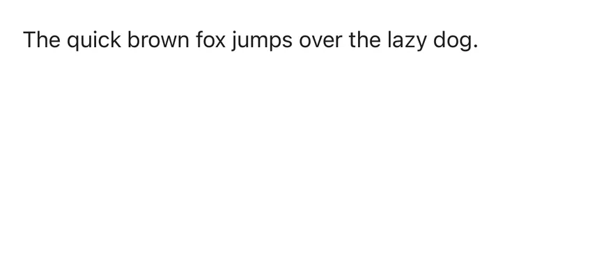
Text on iOS in light modeText on iOS in dark mode
import { Text } from "@/components/ui/text"

export function TextExample() {
  return (
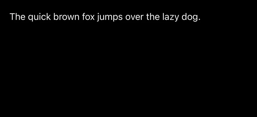
    <Text>The quick brown fox jumps over the lazy dog.</Text>
  )
}
import EsuissUI
import SwiftUI

struct TextExample: View {
  var body: some View {
    Text("The quick brown fox jumps over the lazy dog.")
      .textVariant(.default)
  }
}
import androidx.compose.runtime.Composable
import com.esuiss.ui.components.Text

@Composable
fun TextExample() {
    Text("The quick brown fox jumps over the lazy dog.")
}

Text renders a React Native Text with one of twelve typography variants: default, h1–h4, p, blockquote, code, lead, large, small and muted. Heading variants also set the heading role.

It reads TextClassContext, so components such as Button can pass a text color and size down to any Text inside them.

Installation

$ pnpm dlx shadcn@latest add @esuiss-rn/text

See Installation for the components.json setup. Or use the suiss/ui CLI:

$ pnpm dlx @esuiss/ui@latest add text
$ pnpm dlx @esuiss/ui@latest add text --platform swift
$ pnpm dlx @esuiss/ui@latest add text --platform kotlin

Manual

  1. Install the dependencies:
npx expo install class-variance-authority cn
  1. Add the pieces it builds on: the primitives components/primitives/types.tsx, components/primitives/use-render.tsx.

  2. Copy the source into components/ui/text.tsx:

uniwind/components/ui/text.tsx
import { cva, type VariantProps } from "class-variance-authority"
import { cn } from "cn"
import * as React from "react"
import { Text as RNText, type Role } from "react-native"
import type { RenderProp } from "@/components/primitives/types"
import { useRender } from "@/components/primitives/use-render"

const textVariants = cva("text-base text-foreground", {
  variants: {
    variant: {
      default: "",
      h1: "text-3xl font-bold",
      h2: "text-2xl font-bold",
      h3: "text-xl font-semibold",
      h4: "text-lg font-semibold",
      p: "mt-3",
  1. Update the import paths to match your project.
  1. Install the dependencies:
npx expo install class-variance-authority cn
  1. Add the pieces it builds on: the primitives components/primitives/types.tsx, components/primitives/use-render.tsx.

  2. Copy the source into components/ui/text.tsx:

nativewind/components/ui/text.tsx
import { cva, type VariantProps } from "class-variance-authority"
import { cn } from "cn"
import * as React from "react"
import { Text as RNText, type Role } from "react-native"
import type { RenderProp } from "@/components/primitives/types"
import { useRender } from "@/components/primitives/use-render"

const textVariants = cva("text-base text-foreground", {
  variants: {
    variant: {
      default: "",
      h1: "text-3xl font-bold",
      h2: "text-2xl font-bold",
      h3: "text-xl font-semibold",
      h4: "text-lg font-semibold",
      p: "mt-3",
  1. Update the import paths to match your project.
  1. Add the pieces it builds on: the primitives components/primitives/types.tsx, components/primitives/use-render.tsx.

  2. Copy the source into components/ui/text.tsx:

stylesheet/components/ui/text.tsx
import * as React from "react"
import {
  Text as RNText,
  type Role,
  StyleSheet,
  type TextStyle,
} from "react-native"
import type { RenderProp } from "@/components/primitives/types"
import { useRender } from "@/components/primitives/use-render"
import {
  fontSize,
  radius,
  type ThemeColors,
  useTheme,
} from "@/components/ui/theme"
  1. Update the import paths to match your project.
  1. Target iOS 17 or later.

  2. Copy the theme files every view uses:

swift/Theme/Theme.swift
import SwiftUI
import UIKit

struct RGBA: Sendable {
  let red: CGFloat
  let green: CGFloat
  let blue: CGFloat
  let alpha: CGFloat

  init(_ hex: UInt32, _ alpha: CGFloat = 1) {
    red = CGFloat((hex >> 16) & 0xFF) / 255
    green = CGFloat((hex >> 8) & 0xFF) / 255
    blue = CGFloat(hex & 0xFF) / 255
    self.alpha = alpha
  }
swift/Theme/Tokens.swift
import SwiftUI

public enum EsuissColor {
  public static let background = Color.adaptive(light: .init(0xFFFFFF), dark: .init(0x000000))
  public static let foreground = Color.adaptive(light: .init(0x1D1D1F), dark: .init(0xF5F5F7))
  public static let card = Color.adaptive(light: .init(0xFFFFFF), dark: .init(0x1D1D1F))
  public static let cardForeground = Color.adaptive(light: .init(0x1D1D1F), dark: .init(0xF5F5F7))
  public static let popover = Color.adaptive(light: .init(0xFFFFFF), dark: .init(0x1D1D1F))
  public static let popoverForeground = Color.adaptive(light: .init(0x1D1D1F), dark: .init(0xF5F5F7))
  public static let primary = Color.adaptive(light: .init(0x0071E3), dark: .init(0x2997FF))
  public static let primaryForeground = Color.adaptive(light: .init(0xFFFFFF), dark: .init(0xFFFFFF))
  public static let secondary = Color.adaptive(light: .init(0x000000, 0.04), dark: .init(0xFFFFFF, 0.1))
  public static let secondaryForeground = Color.adaptive(light: .init(0x1D1D1F), dark: .init(0xF5F5F7))
  public static let muted = Color.adaptive(light: .init(0xF5F5F7), dark: .init(0x161617))
  public static let mutedForeground = Color.adaptive(light: .init(0x6E6E73), dark: .init(0xA1A1A6))
  public static let accent = Color.adaptive(light: .init(0x000000, 0.06), dark: .init(0xFFFFFF, 0.1))
  1. Copy the source:
swift/Components/TextVariant.swift
import SwiftUI

public enum TextVariant: CaseIterable, Sendable {
  case `default`, h1, h2, h3, h4, p, blockquote, code, lead, large, small, muted

  var style: TextStyle {
    switch self {
    case .h1: .xl3
    case .h2: .xl2
    case .h3: .xl
    case .h4, .lead, .large: .lg
    case .code, .small, .muted: .sm
    default: .base
    }
  }
  1. Add the files to your app target.
  1. Set minSdk to 24 or higher and add the dependencies:
build.gradle.kts
implementation(platform("androidx.compose:compose-bom:2026.09.00"))
implementation("androidx.compose.foundation:foundation")
implementation("androidx.compose.ui:ui")
  1. Copy the theme files every view uses:
kotlin/theme/Theme.kt
package com.esuiss.ui.theme

import androidx.compose.foundation.isSystemInDarkTheme
import androidx.compose.runtime.Composable
import androidx.compose.runtime.CompositionLocalProvider
import androidx.compose.runtime.Immutable
import androidx.compose.runtime.staticCompositionLocalOf
import androidx.compose.ui.Modifier
import androidx.compose.ui.draw.dropShadow
import androidx.compose.ui.graphics.Color
import androidx.compose.ui.graphics.Shape
import androidx.compose.ui.graphics.shadow.Shadow as DropShadow
import androidx.compose.ui.text.TextStyle
import androidx.compose.ui.text.style.LineHeightStyle
import androidx.compose.ui.unit.Dp
import androidx.compose.ui.unit.DpOffset
kotlin/theme/Tokens.kt
package com.esuiss.ui.theme

import androidx.compose.runtime.Immutable
import androidx.compose.ui.graphics.Color
import androidx.compose.ui.unit.dp

@Immutable
data class Colors(
    val background: Color,
    val foreground: Color,
    val card: Color,
    val cardForeground: Color,
    val popover: Color,
    val popoverForeground: Color,
    val primary: Color,
    val primaryForeground: Color,
  1. Copy the source and every file it uses:
kotlin/components/Text.kt
package com.esuiss.ui.components

import androidx.compose.foundation.background
import androidx.compose.foundation.layout.padding
import androidx.compose.foundation.shape.RoundedCornerShape
import androidx.compose.foundation.text.BasicText
import androidx.compose.runtime.Composable
import androidx.compose.ui.Modifier
import androidx.compose.ui.draw.clip
import androidx.compose.ui.draw.drawBehind
import androidx.compose.ui.geometry.Offset
import androidx.compose.ui.geometry.Size
import androidx.compose.ui.graphics.Color
import androidx.compose.ui.semantics.heading
import androidx.compose.ui.semantics.semantics
import androidx.compose.ui.text.AnnotatedString
kotlin/components/Content.kt
package com.esuiss.ui.components

import androidx.compose.runtime.compositionLocalOf
import androidx.compose.ui.graphics.Color
import androidx.compose.ui.text.TextStyle
import androidx.compose.ui.unit.Dp
import androidx.compose.ui.unit.dp

val LocalContentStyle = compositionLocalOf { TextStyle.Default }

val LocalContentColor = compositionLocalOf { Color.Unspecified }

val LocalIconSize = compositionLocalOf { 20.dp }
  1. Update the com.esuiss.ui package names to match your project.

Usage

import { Text } from "@/components/ui/text"
<Text>The quick brown fox jumps over the lazy dog.</Text>

Pick a variant for the role of the text, and add classes through className for one-off changes.

Use the render prop to render a different component with the same classes. TextClassContext is exported so your own components can style nested Text the same way.

Examples

Typography

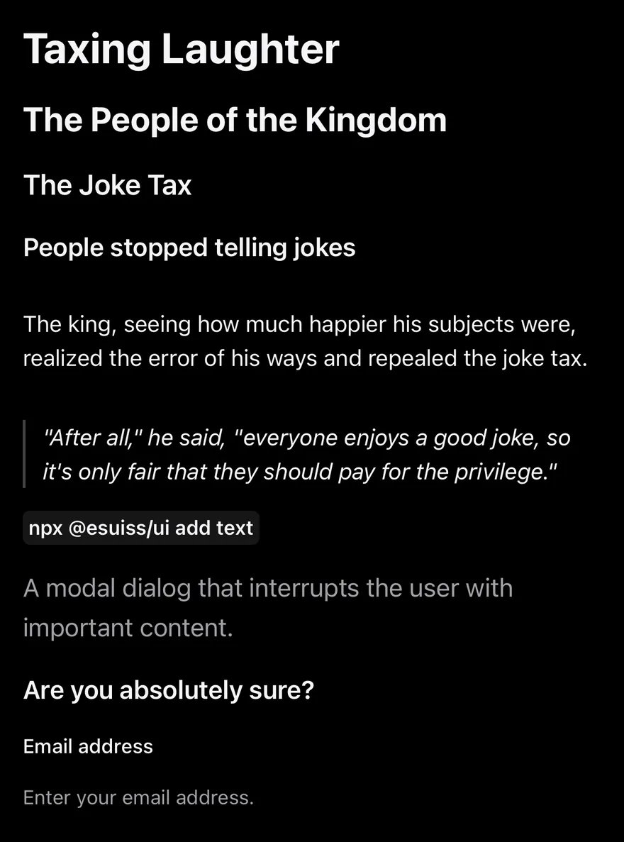
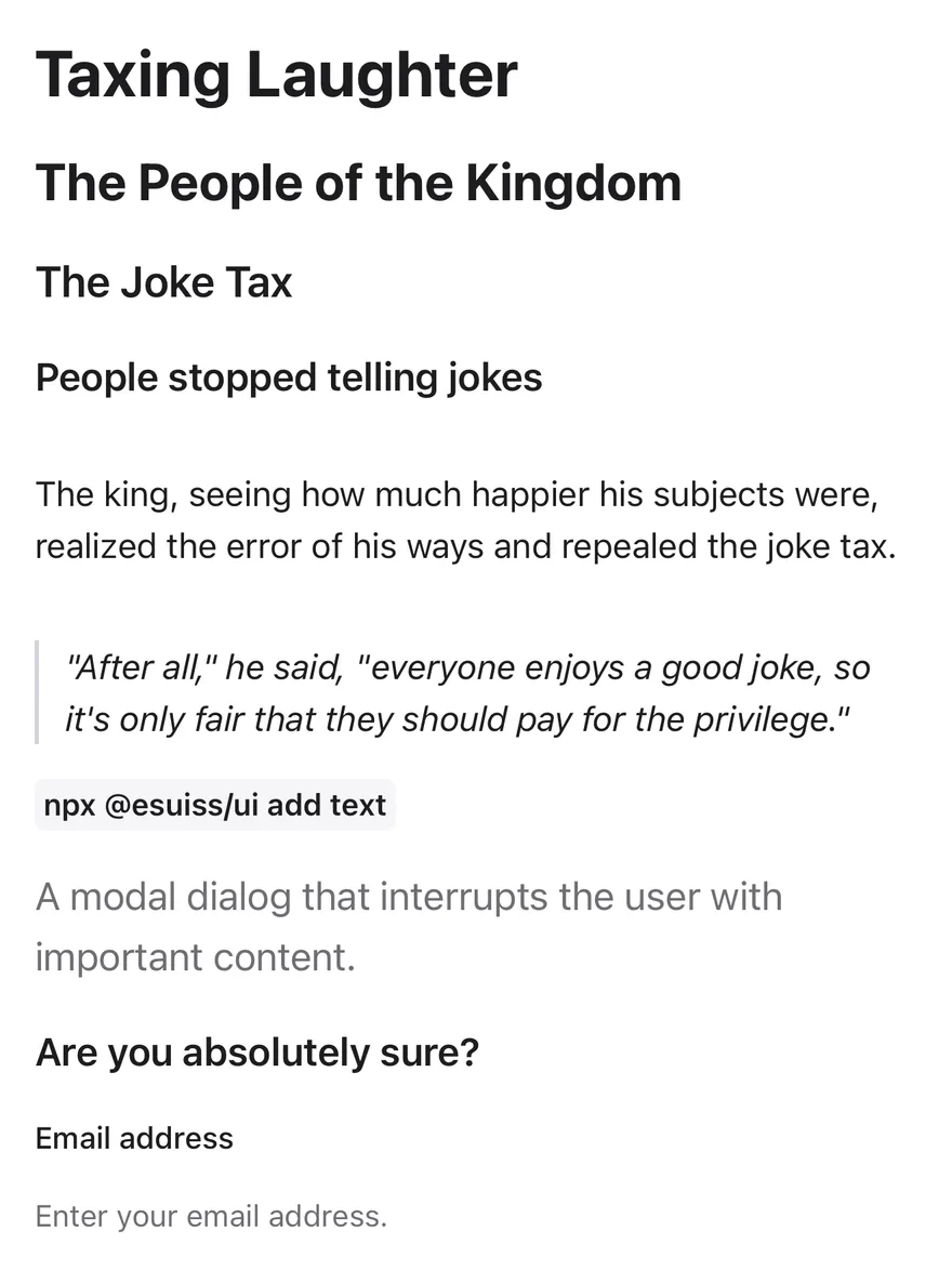
Every variant in a sample article.
iOS
Text (typography) on iOS in light modeText (typography) on iOS in dark mode
import { View } from "react-native"
import { Text } from "@/components/ui/text"

export function TextTypographyExample() {
  return (
    <View className="gap-4">
      <Text variant="h1">Taxing Laughter</Text>
      <Text variant="h2">The People of the Kingdom</Text>
      <Text variant="h3">The Joke Tax</Text>
      <Text variant="h4">People stopped telling jokes</Text>
      <Text variant="p">
        The king, seeing how much happier his subjects were, realized the error
        of his ways and repealed the joke tax.
      </Text>
      <Text variant="blockquote">
        &quot;After all,&quot; he said, &quot;everyone enjoys a good joke, so
        it&apos;s only fair that they should pay for the privilege.&quot;
      </Text>
      <View className="flex-row">
        <Text variant="code">npx @esuiss/ui add text</Text>
      </View>
      <Text variant="lead">
        A modal dialog that interrupts the user with important content.
      </Text>
      <Text variant="large">Are you absolutely sure?</Text>
      <Text variant="small">Email address</Text>
      <Text variant="muted">Enter your email address.</Text>
    </View>
  )
}
import EsuissUI
import SwiftUI

struct TextTypographyExample: View {
  var body: some View {
    VStack(alignment: .leading, spacing: 16) {
      Text("Taxing Laughter").textVariant(.h1)
      Text("The People of the Kingdom").textVariant(.h2)
      Text("The Joke Tax").textVariant(.h3)
      Text("People stopped telling jokes").textVariant(.h4)
      Text("The king, seeing how much happier his subjects were, realized the error of his ways and repealed the joke tax.")
        .textVariant(.p)
      Text("\"After all,\" he said, \"everyone enjoys a good joke, so it's only fair that they should pay for the privilege.\"")
        .textVariant(.blockquote)
      Text(verbatim: "npx @esuiss/ui add text").textVariant(.code)
      Text("A modal dialog that interrupts the user with important content.").textVariant(.lead)
      Text("Are you absolutely sure?").textVariant(.large)
      Text("Email address").textVariant(.small)
      Text("Enter your email address.").textVariant(.muted)
    }
    .frame(maxWidth: .infinity, alignment: .leading)
  }
}
import androidx.compose.foundation.layout.Arrangement
import androidx.compose.foundation.layout.Column
import androidx.compose.foundation.layout.Row
import androidx.compose.runtime.Composable
import androidx.compose.ui.unit.dp
import com.esuiss.ui.components.Text
import com.esuiss.ui.components.TextVariant

@Composable
fun TextTypography() {
    Column(verticalArrangement = Arrangement.spacedBy(16.dp)) {
        Text("Taxing Laughter", variant = TextVariant.H1)
        Text("The People of the Kingdom", variant = TextVariant.H2)
        Text("The Joke Tax", variant = TextVariant.H3)
        Text("People stopped telling jokes", variant = TextVariant.H4)
        Text(
            "The king, seeing how much happier his subjects were, realized the error of his ways and repealed the joke tax.",
            variant = TextVariant.P,
        )
        Text(
            "\"After all,\" he said, \"everyone enjoys a good joke, so it's only fair that they should pay for the privilege.\"",
            variant = TextVariant.Blockquote,
        )
        Row {
            Text("npx @esuiss/ui add text", variant = TextVariant.Code)
        }
        Text("A modal dialog that interrupts the user with important content.", variant = TextVariant.Lead)
        Text("Are you absolutely sure?", variant = TextVariant.Large)
        Text("Email address", variant = TextVariant.Small)
        Text("Enter your email address.", variant = TextVariant.Muted)
    }
}

Headings

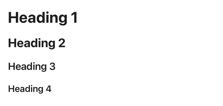
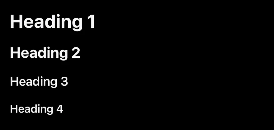
The four heading levels.

iOS
Text (headings) on iOS in light modeText (headings) on iOS in dark mode
import { View } from "react-native"
import { Text } from "@/components/ui/text"

export function TextHeadingsExample() {
  return (
    <View className="gap-4">
      <Text variant="h1">Heading 1</Text>
      <Text variant="h2">Heading 2</Text>
      <Text variant="h3">Heading 3</Text>
      <Text variant="h4">Heading 4</Text>
    </View>
  )
}
import EsuissUI
import SwiftUI

struct TextHeadingsExample: View {
  var body: some View {
    VStack(alignment: .leading, spacing: 16) {
      Text("Heading 1").textVariant(.h1)
      Text("Heading 2").textVariant(.h2)
      Text("Heading 3").textVariant(.h3)
      Text("Heading 4").textVariant(.h4)
    }
    .frame(maxWidth: .infinity, alignment: .leading)
  }
}
import androidx.compose.foundation.layout.Arrangement
import androidx.compose.foundation.layout.Column
import androidx.compose.runtime.Composable
import androidx.compose.ui.unit.dp
import com.esuiss.ui.components.Text
import com.esuiss.ui.components.TextVariant

@Composable
fun TextHeadings() {
    Column(verticalArrangement = Arrangement.spacedBy(16.dp)) {
        Text("Heading 1", variant = TextVariant.H1)
        Text("Heading 2", variant = TextVariant.H2)
        Text("Heading 3", variant = TextVariant.H3)
        Text("Heading 4", variant = TextVariant.H4)
    }
}

API Reference

01

Text

The text element with typography variants.

PropTypeDefaultDescription
renderRenderProp<Record<string, unknown>, Record<string, never>>-Renders another component in place of the default Text, with the same props.
variant"default" | "h1" | "h2" | "h3" | "h4" | "p" | "blockquote" | "code" | "lead" | "large" | "small" | "muted""default"Typography style.

Also accepts the props of React.ComponentProps<typeof RNText>, React.RefAttributes<typeof RNText>, TextVariantProps.

Accessibility

  • h1 to h4 set role="heading", so VoiceOver and TalkBack can navigate by heading.
  • Text scales with the system font size.

Notes

  • Colors use the text-foreground and text-muted-foreground tokens; code uses bg-muted and blockquote a border-border start border.
  • Light and dark colors follow the system appearance.
NextTextareaPreviousTabs

On this page

  1. 01Installation
    • Manual
  2. 02Usage
  3. 03Examples
    • Typography
    • Headings
  4. 04API Reference
    • Text
  5. 05Accessibility
  6. 06Notes