suiss/ui · Component
Pin Pad
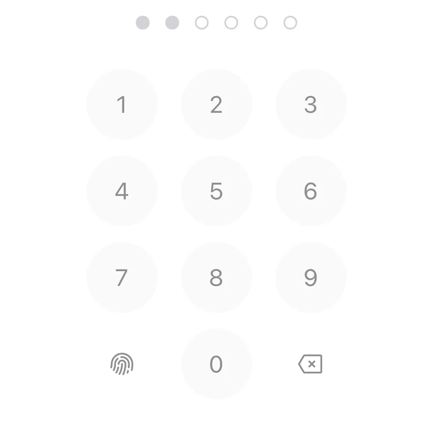
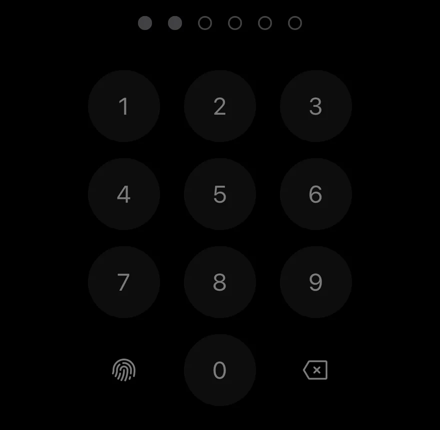
A passcode entry screen element with a row of dots and a numeric keypad.
Pin Pad is an open-source component from suiss/ui for React Native, SwiftUI and Jetpack Compose. The @esuiss/ui CLI copies its source into your project, so you own the code.
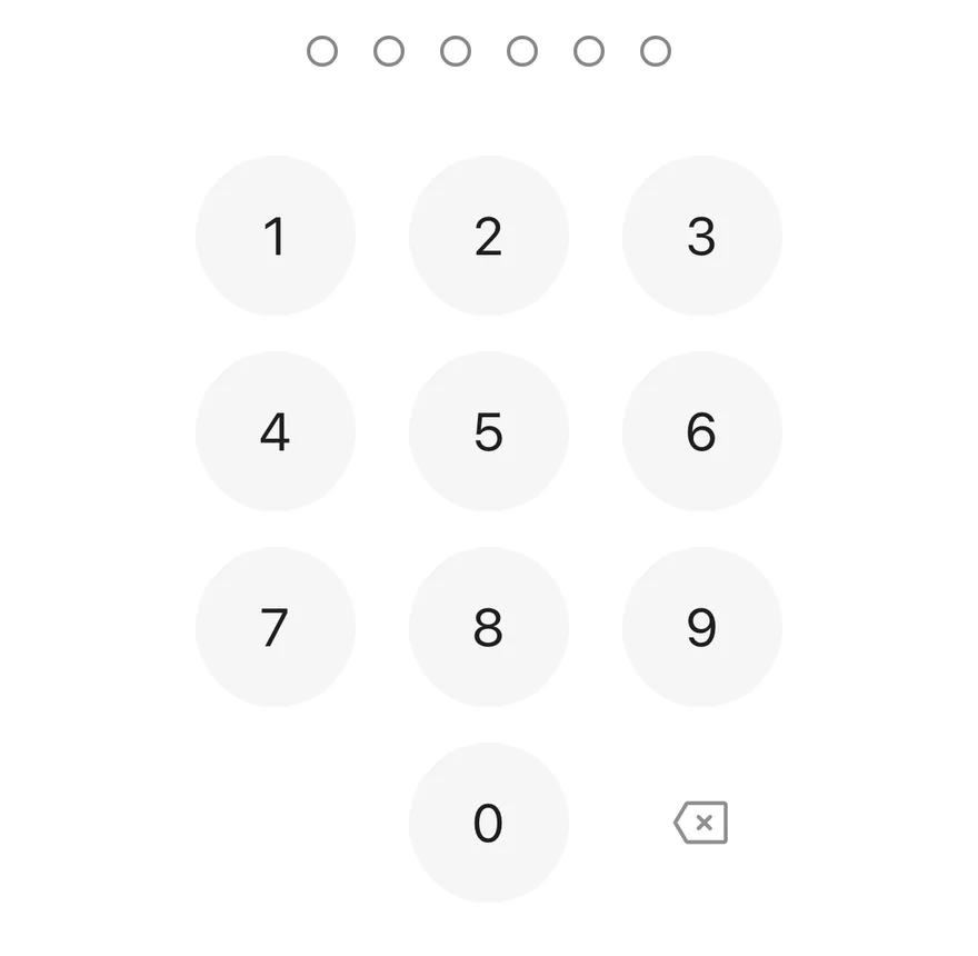
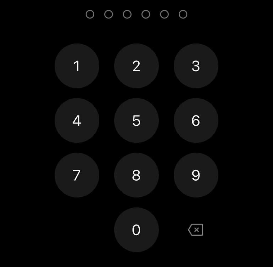
PinPad combines a row of dots that fill as digits are entered with a Keypad for input. The length is between 4 and 8 digits. Each key press plays a selection haptic, and switching to the error state turns the dots red, plays an error haptic and shakes the row with Reanimated. Haptics play when a haptics adapter is provided through HapticsContext.
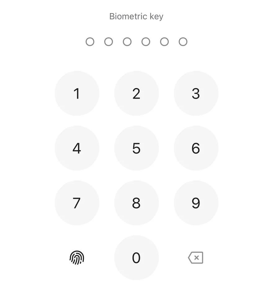
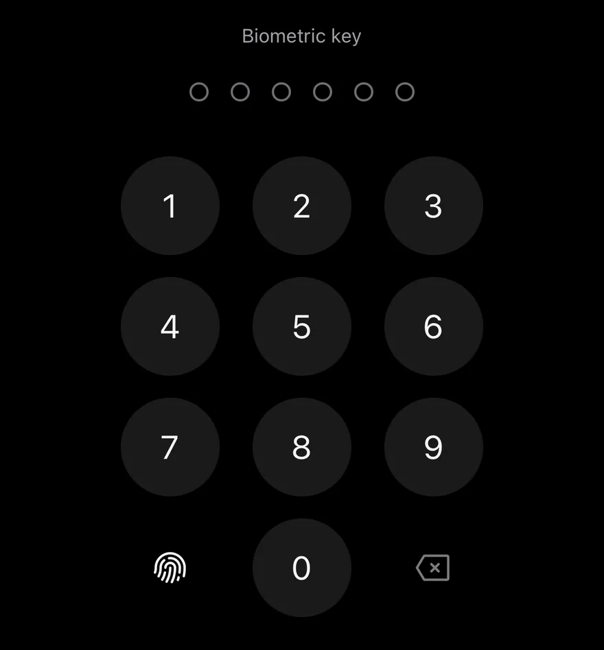
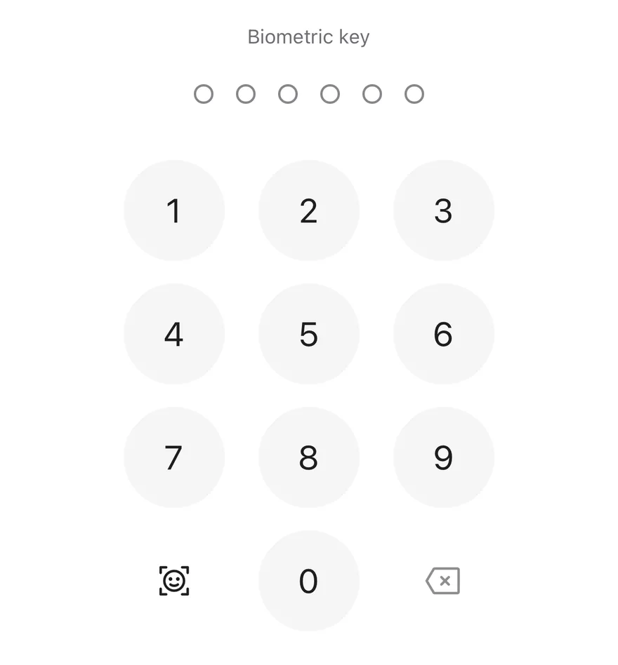
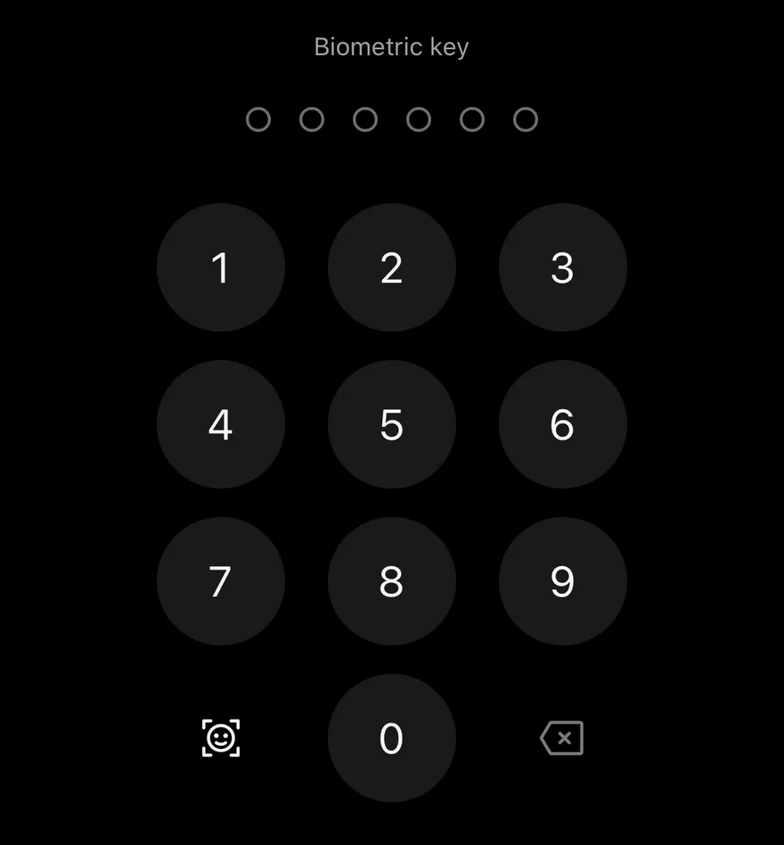
An optional biometric key appears in the bottom-left corner of the keypad when onBiometric is set, and the delete key is disabled while nothing is entered.
Installation
The CLI also adds what it builds on: Keypad. On React Native it also adds the animated view components/ui/animated-view.tsx.
Manual
- Install the dependencies:
-
Add the pieces it builds on: Keypad, and the primitives
components/primitives/haptics.tsx,components/primitives/hooks.tsx, and the animated viewcomponents/ui/animated-view.tsxfrom the next step. -
Copy the animated view into
components/ui/animated-view.tsx:
- Copy the source into
components/ui/pin-pad.tsx:
- Update the import paths to match your project.
- Install the dependencies:
-
Add the pieces it builds on: Keypad, and the primitives
components/primitives/haptics.tsx,components/primitives/hooks.tsx, and the animated viewcomponents/ui/animated-view.tsxfrom the next step. -
Copy the animated view into
components/ui/animated-view.tsx:
- Copy the source into
components/ui/pin-pad.tsx:
- Update the import paths to match your project.
- Install the dependencies:
-
Add the pieces it builds on: Keypad, and the primitives
components/primitives/haptics.tsx,components/primitives/hooks.tsx, and the animated viewcomponents/ui/animated-view.tsxfrom the next step. -
Copy the animated view into
components/ui/animated-view.tsx:
- Copy the source into
components/ui/pin-pad.tsx:
- Update the import paths to match your project.
-
Target iOS 17 or later.
-
Add the Swift package to your app:
- Copy the theme files every view uses:
- Copy the source and every file it uses:
- Add the files to your app target.
- Set
minSdkto 24 or higher and add the dependencies:
- Copy the theme files every view uses:
- Copy the source and every file it uses:
- Update the
com.esuiss.uipackage names to match your project.
Usage
Use it uncontrolled with defaultValue, or controlled with value and onValueChange. onComplete fires with the full code once the last digit is entered; check the code there, set error when it is wrong and clear the value to let the user try again.
Pass onBiometric to show the biometric key, with biometricIcon and biometricLabel to match the method in use. Style the dots and keypad separately with dotsClassName and keypadClassName.
Examples
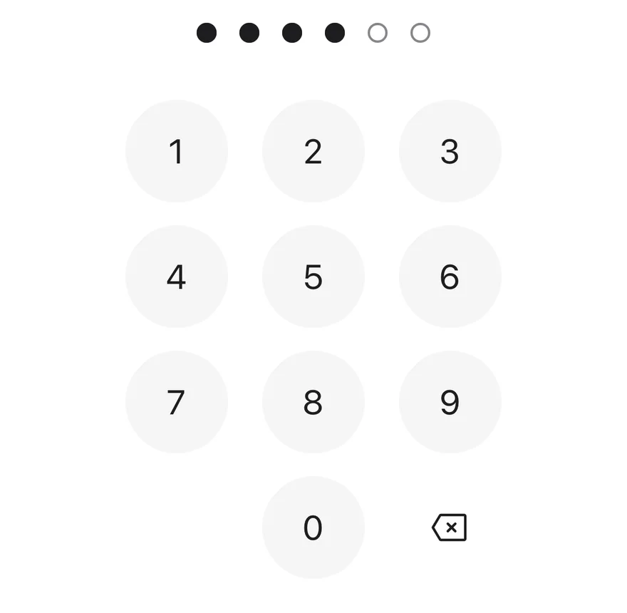
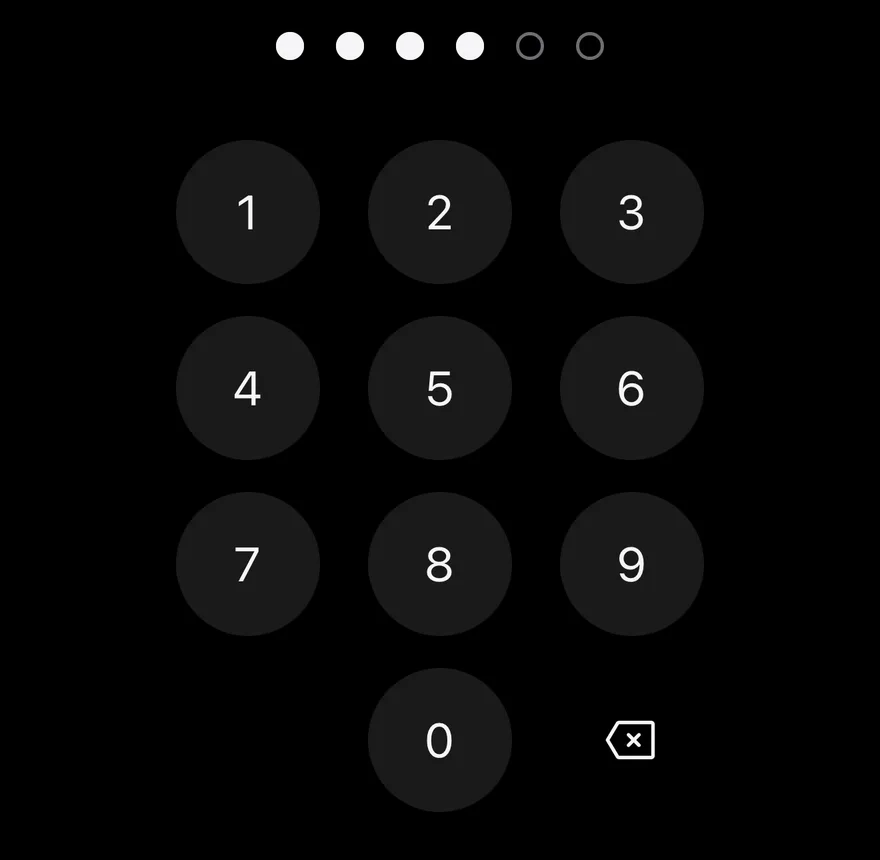
Filled
A pin pad with four of six digits entered.
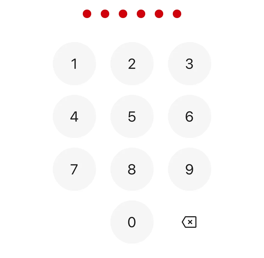
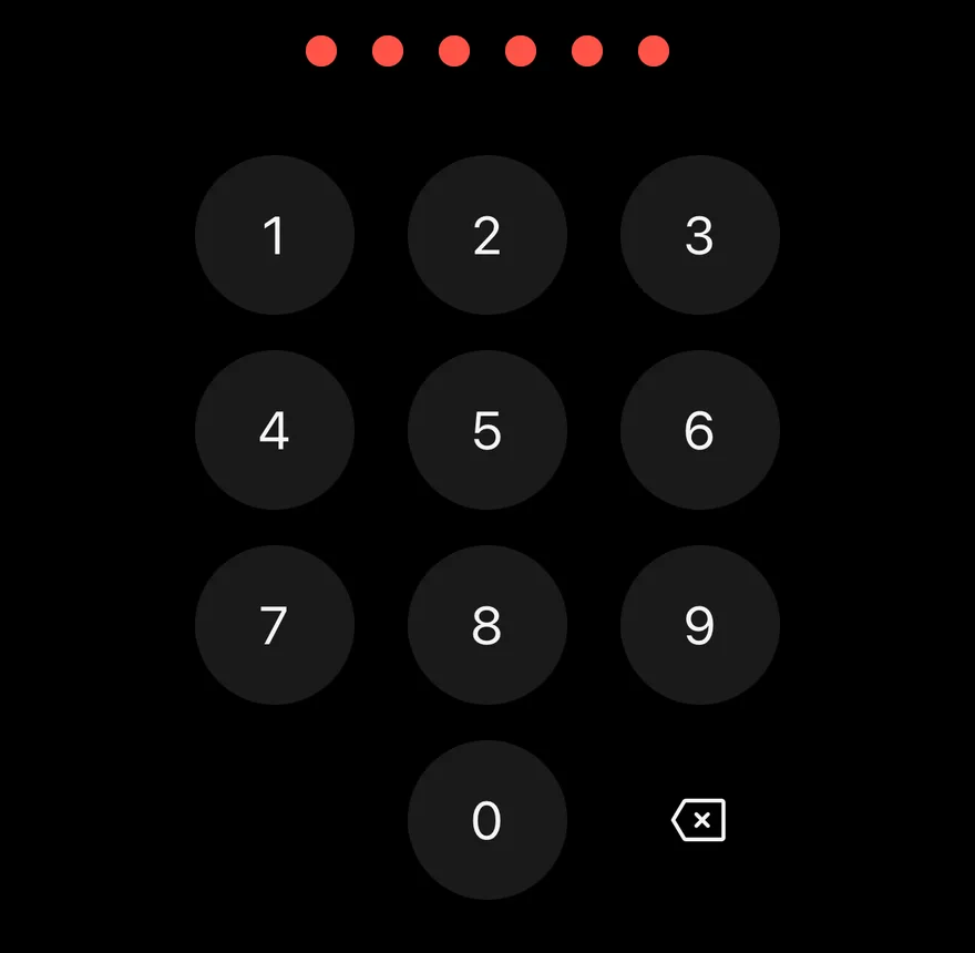
Error
The error state with red dots.
Verify
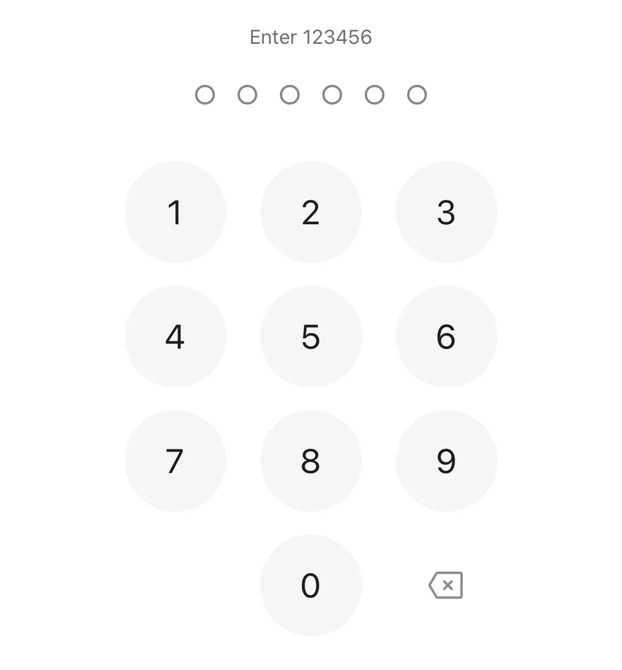
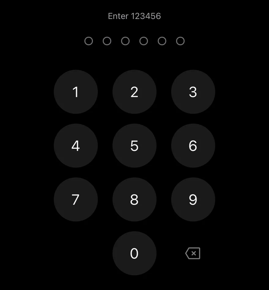
Checks the code on completion, shows an error for a wrong code and clears it.
Disabled
A disabled pin pad with a biometric key.
Biometric
A biometric key with the default fingerprint icon.
Face biometric
A biometric key with a face icon and a matching label.
Four digits
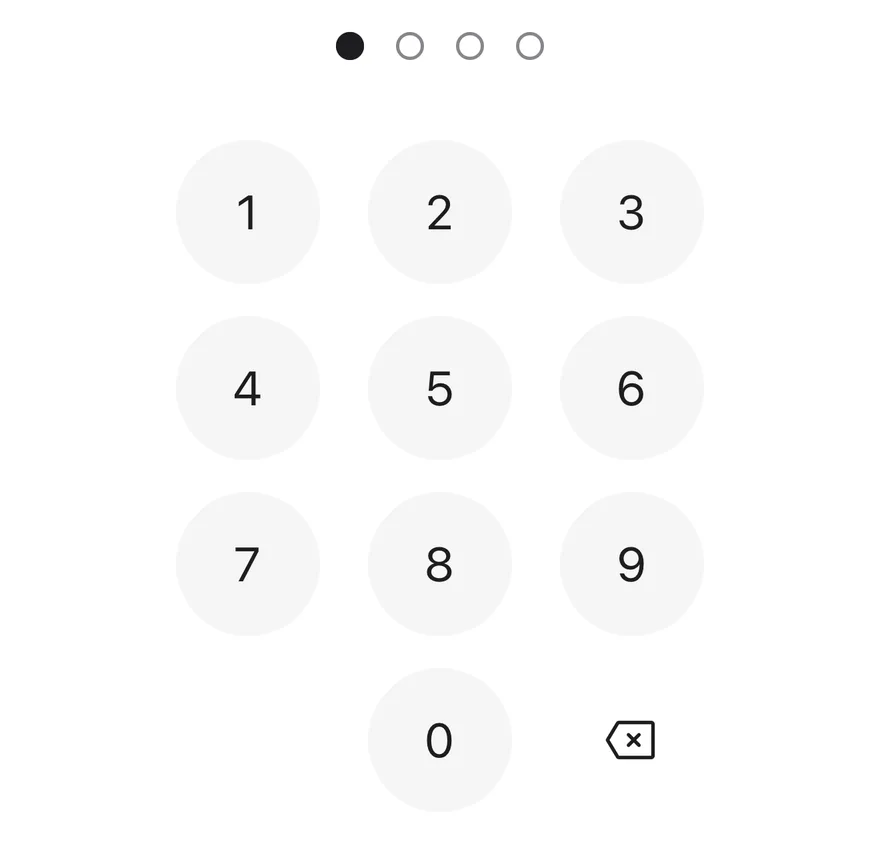
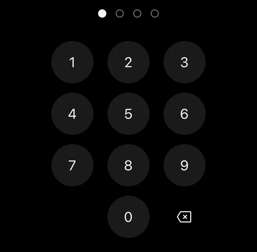
A four-digit code with length={4}.
API Reference
PinPad
| Prop | Type | Default | Description |
|---|---|---|---|
length | number | 6 | Number of digits, clamped between 4 and 8. Defaults to 6. |
value | string | - | Entered digits for controlled use. |
defaultValue | string | "" | Initial digits for uncontrolled use. Non-digits are removed. |
onValueChange | (value: string) => void | - | Called with the new value after each digit or deletion. |
onComplete | (value: string) => void | - | Called with the full code when the last digit is entered. |
error | boolean | false | Shows the error state. Turning it on shakes the dots and plays an error haptic. |
disabled | boolean | false | Turns off the keypad and dims the dots. |
onBiometric | () => void | - | Called when the biometric key is pressed. The key is shown only when this is set. |
biometricIcon | PhosphorIcon | - | Icon for the biometric key. |
biometricLabel | string | - | Accessibility label for the biometric key. |
deleteLabel | string | - | Accessibility label for the delete key. |
dotsLabel | (entered: number, length: number) => string | defaultDotsLabel | Builds the dots label from the entered count and the length. Defaults to "3 of 6 entered". |
dotsClassName | string | - | Classes for the dots row. |
keypadClassName | string | - | Classes for the keypad. |
Also accepts the props of React.ComponentProps<typeof View>.
Accessibility
- The dots row is a single element labeled by
dotsLabel, so screen readers hear progress without the digits. - The row is a polite live region, so TalkBack announces progress as it changes.
- Keypad keys are buttons labeled with their digit; the delete and biometric keys use
deleteLabelandbiometricLabel. - The shake animation respects the system reduce motion setting.
Notes
- Uses
bg-foregroundfor filled dots,border-inputfor empty ones andbg-destructivein the error state; colors follow the system appearance.