suiss/ui
  • Docs
  • Components
  • Patterns
  • Interactions
  • Charts
  • Blocks
GitHubGet started
DocsComponentsPatternsInteractionsChartsBlocks
Components82
  • Overview
  • Accordion
  • Alert
  • Alert Dialog
  • Alert Sheet
  • Amount Input
  • Aspect Ratio
  • Attachment
  • Avatar
  • Badge
  • Bottom Bar
  • Breadcrumb
  • Bubble
  • Button
  • Button Group
  • Calendar
  • Card
  • Carousel
  • Chart
  • Checkbox
  • Chip
  • Collapsible
  • Combobox
  • Command
  • Context Menu
  • Dialog
  • Direction
  • Drawer
  • Dropdown Menu
  • Empty
  • FAB
  • Field
  • Fullscreen Menu
  • Haptics
  • Header
  • Hover Card
  • Icon
  • Input
  • Input Accessory Bar
  • Input Group
  • Input OTP
  • Item
  • Kbd
  • Keyboard Scroll View
  • Keypad
  • Label
  • Marker
  • Menubar
  • Message
  • Message Scroller
  • Native Select
  • Navigation Menu
  • Page Indicator
  • Pagination
  • Pin Pad
  • Popover
  • Progress
  • QR Scanner
  • Questionnaire
  • Radio Group
  • Resizable
  • Screen
  • Scroll Area
  • Select
  • Separator
  • Sheet
  • Sidebar
  • Signature Pad
  • Skeleton
  • Slider
  • Spinner
  • Switch
  • Tab Bar
  • Table
  • Tabs
  • Text
  • Textarea
  • Toast
  • Toggle
  • Toggle Group
  • Tooltip
  • Wheel Picker
  • Widget

suiss/ui · Component

Badge

A small inline label for status, counts or metadata.

Badge is an open-source component from suiss/ui for React, React Native, SwiftUI and Jetpack Compose. The @esuiss/ui CLI copies its source into your project, so you own the code.

Badge is a single element that renders a span by default and can render as another element, such as a link. Badges can hold text and an icon on either side.

Use the render prop to render the badge as another element: render={<a href="/" />}.

Set asChild and pass the element as the only child to render the badge as it.

Pass a render function that returns the element; spread the props it receives onto it.

Use a badge to tag content with a short status or category. For actions, use Button instead.

Installation

CLI

$ pnpm dlx shadcn@latest add @esuiss/badge

Works in any project with a components.json. See Installation for the one-line registry setup. Or use the suiss/ui CLI:

$ pnpm dlx @esuiss/ui@latest add badge

Manual

  1. Install the dependencies and add the cn helper:
$ pnpm add @base-ui/react class-variance-authority
  1. Copy the source into components/ui/badge.tsx:
  1. Update the import paths to match your project.

Usage

import { Badge } 
<Badge

Mark icons with data-icon="inline-start" or data-icon="inline-end" so the outline and ghost variants tighten their padding on that side. Icons are sized to size-3.

Pass render with an anchor element, for example an a with an href, to make the badge a link. Linked badges get hover styles that depend on the variant.

To use a custom color, override the text color with a className such as text-green-600 dark:text-green-400.

Examples

Variants

Shows the default, secondary, destructive, outline, ghost and link variants.

With icon

Places icons before and after the label with data-icon.

As link

Renders the badge as a link.

Custom color

Overrides the text color with utility classes.

API Reference

01

Badge

The inline label element.

PropTypeDefaultDescription
variant"default" | "secondary" | "destructive" | "outline" | "ghost" | "link""default"Visual style. default, secondary, destructive and link are text-only; outline adds a border and ghost adds horizontal padding.

Also accepts the props of useRender.ComponentProps<"span">.

Accessibility

  • A badge is static text by default and is not focusable.
  • When rendered as a link, it shows a focus ring on keyboard focus.
  • aria-invalid adds a border-destructive border.

Notes

  • Styling hook: data-slot="badge", plus data-variant from the render state.
  • The destructive variant also tints the focus ring with ring-destructive/20 (ring-destructive/40 in dark mode).
  • Badges are a fixed h-5 with fully rounded corners and do not wrap text.

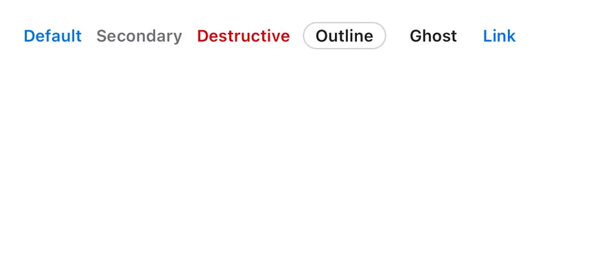
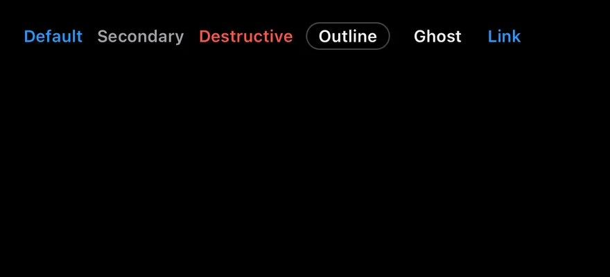
Badge is a compact pill View that passes a small, bold text style and a 12-point icon size to its children. Six variants are available. default, secondary, destructive and link show colored text with no background, while outline adds a hairline border and ghost adds horizontal padding.

Use default for highlighted labels, secondary for neutral metadata, destructive for errors and outline when the badge needs a visible edge.
Installation

$ pnpm dlx shadcn@latest add @esuiss-rn/badge

See Installation for the components.json setup. Or use the suiss/ui CLI:

$ pnpm dlx @esuiss/ui@latest add badge
$ pnpm dlx @esuiss/ui@latest add badge --platform swift
NextBottom BarPreviousAvatar

On this page

  1. 01Installation
    • CLI
    • Manual
  2. 02Usage
  3. 03Examples
    • Variants
    • With icon
    • As link
    • Custom color
  4. 04API Reference
    • Badge
  5. 05Accessibility
  6. 06Notes
  7. 07Installation
    • Manual
  8. 08Usage
  9. 09Examples
    • Variants
    • With icon
  10. 10API Reference
    • Badge
  11. 11Accessibility
  12. 12Notes
from
"@/components/ui/badge"
>Badge</
Badge
>
$ pnpm dlx @esuiss/ui@latest add badge --platform kotlin

The CLI also adds what it builds on: Icon, Text.

Manual

  1. Install the dependencies:
npx expo install class-variance-authority cn
  1. Add the pieces it builds on: Icon, Text, and the primitives components/primitives/types.tsx, components/primitives/use-render.tsx.

  2. Copy the source into components/ui/badge.tsx:

  1. Update the import paths to match your project.
  1. Install the dependencies:
npx expo install class-variance-authority cn
  1. Add the pieces it builds on: Icon, Text, and the primitives components/primitives/types.tsx, components/primitives/use-render.tsx.

  2. Copy the source into components/ui/badge.tsx:

  1. Update the import paths to match your project.
  1. Add the pieces it builds on: Icon, Text, and the primitives components/primitives/types.tsx, components/primitives/use-render.tsx.

  2. Copy the source into components/ui/badge.tsx:

  1. Update the import paths to match your project.
  1. Target iOS 17 or later.

  2. Copy the theme files every view uses:

swift/Theme/Theme.swift
import SwiftUI
import UIKit

struct RGBA: Sendable {
  let red: CGFloat
  let green: CGFloat
  let blue: CGFloat
  let alpha: CGFloat

  init(_ hex: UInt32, _ alpha: CGFloat = 1) {
    red = CGFloat((hex >> 16) & 0xFF) / 255
    green = CGFloat((hex >> 8) & 0xFF) / 255
    blue = CGFloat(hex & 0xFF) / 255
    self.alpha = alpha
  }
swift/Theme/Tokens.swift
import SwiftUI

public enum EsuissColor {
  public static let background = Color.adaptive(light: .init(0xFFFFFF), dark: .init(0x000000))
  public static let foreground = Color.adaptive(light: .init(0x1D1D1F), dark: .init(0xF5F5F7))
  public static let card = Color.adaptive(light: .init(0xFFFFFF), dark: .init(0x1D1D1F))
  public static let cardForeground = Color.adaptive(light: .init(0x1D1D1F), dark: .init(0xF5F5F7))
  public static let popover = Color.adaptive(light: .init(0xFFFFFF), dark: .init(0x1D1D1F))
  public static let popoverForeground = Color.adaptive(light: .init(0x1D1D1F), dark: .init(0xF5F5F7))
  public static let primary = Color.adaptive(light: .init(0x0071E3), dark: .init(0x2997FF))
  public static let primaryForeground = Color.adaptive(light: .init(0xFFFFFF), dark: .init(0xFFFFFF))
  public static let secondary = Color.adaptive(light: .init(0x000000, 0.04), dark: .init(0xFFFFFF, 0.1))
  public static let secondaryForeground = Color.adaptive(light: .init(0x1D1D1F), dark: .init(0xF5F5F7))
  public static let muted = Color.adaptive(light: .init(0xF5F5F7), dark: .init(0x161617))
  public static let mutedForeground = Color.adaptive(light: .init(0x6E6E73), dark: .init(0xA1A1A6))
  public static let accent = Color.adaptive(light: .init(0x000000, 0.06), dark: .init(0xFFFFFF, 0.1))
  1. Copy the source and every file it uses:
swift/Components/Button.swift
import SwiftUI

public struct VariantButtonStyle: ButtonStyle {
  public enum Variant: CaseIterable, Sendable {
    case `default`, outline, secondary, tinted, ghost, plain, destructive, link
  }

  public enum Size: CaseIterable, Sendable {
    case `default`, xs, sm, lg, xl, icon, iconXs, iconSm, iconLg, iconXl

    var height: CGFloat {
      switch self {
      case .xs, .iconXs: 24
      case .sm, .iconSm: 32
      case .default, .icon: 36
      case .lg, .iconLg: 44
swift/Components/ButtonGroup.swift
import SwiftUI

extension EnvironmentValues {
  @Entry var buttonGroup: Axis? = nil
  @Entry var buttonGroupSize: CGSize = .zero
}

enum ButtonGroupSpace: Hashable {
  case group
}

struct ButtonGroupFrame {
  let bounds: Anchor<CGRect>
  let outlined: Bool
}
swift/Components/TextVariant.swift
import SwiftUI

public enum TextVariant: CaseIterable, Sendable {
  case `default`, h1, h2, h3, h4, p, blockquote, code, lead, large, small, muted

  var style: TextStyle {
    switch self {
    case .h1: .xl3
    case .h2: .xl2
    case .h3: .xl
    case .h4, .lead, .large: .lg
    case .code, .small, .muted: .sm
    default: .base
    }
  }
  1. Add the files to your app target.
  1. Set minSdk to 24 or higher and add the dependencies:
build.gradle.kts
implementation(platform("androidx.compose:compose-bom:2026.09.00"))
implementation("androidx.compose.foundation:foundation")
implementation("androidx.compose.ui:ui")
  1. Copy the theme files every view uses:
kotlin/theme/Theme.kt
package com.esuiss.ui.theme

import androidx.compose.foundation.isSystemInDarkTheme
import androidx.compose.runtime.Composable
import androidx.compose.runtime.CompositionLocalProvider
import androidx.compose.runtime.Immutable
import androidx.compose.runtime.staticCompositionLocalOf
import androidx.compose.ui.Modifier
import androidx.compose.ui.draw.dropShadow
import androidx.compose.ui.graphics.Color
import androidx.compose.ui.graphics.Shape
import androidx.compose.ui.graphics.shadow.Shadow as DropShadow
import androidx.compose.ui.text.TextStyle
import androidx.compose.ui.text.style.LineHeightStyle
import androidx.compose.ui.unit.Dp
import androidx.compose.ui.unit.DpOffset
kotlin/theme/Tokens.kt
package com.esuiss.ui.theme

import androidx.compose.runtime.Immutable
import androidx.compose.ui.graphics.Color
import androidx.compose.ui.unit.dp

@Immutable
data class Colors(
    val background: Color,
    val foreground: Color,
    val card: Color,
    val cardForeground: Color,
    val popover: Color,
    val popoverForeground: Color,
    val primary: Color,
    val primaryForeground: Color,
  1. Copy the source and every file it uses:
kotlin/components/Content.kt
package com.esuiss.ui.components

import androidx.compose.runtime.compositionLocalOf
import androidx.compose.ui.graphics.Color
import androidx.compose.ui.text.TextStyle
import androidx.compose.ui.unit.Dp
import androidx.compose.ui.unit.dp

val LocalContentStyle = compositionLocalOf { TextStyle.Default }

val LocalContentColor = compositionLocalOf { Color.Unspecified }

val LocalIconSize = compositionLocalOf { 20.dp }
  1. Update the com.esuiss.ui package names to match your project.

Usage

import { Badge } from "@/components/ui/badge"
<View className="flex-row">
  <Badge>
    <Text>Badge</Text>
  </Badge>
</View>

Put the label in a Text and icons in an Icon. Use render to render the badge as a different component, such as a Pressable, while keeping its styles.

badgeVariants and badgeTextVariants are also exported if you need the classes on another element.

Examples

Variants

All six variants side by side.

iOS
Badge (variants) on iOS in light modeBadge (variants) on iOS in dark mode
import { View } from "react-native"
import { Badge } from "@/components/ui/badge"
import { Text } from "@/components/ui/text"

export function BadgeVariantsExample() {
  return (
    <View className="flex-row flex-wrap gap-2">
      <Badge>
        <Text>Default</Text>
      </Badge>
      <Badge variant="secondary">
        <Text>Secondary</Text>
      </Badge>
      <Badge variant="destructive">
        <Text>Destructive</Text>
      </Badge>
      <Badge variant="outline">
        <Text>Outline</Text>
      </Badge>
      <Badge variant="ghost">
        <Text>Ghost</Text>
      </Badge>
      <Badge variant="link">
        <Text>Link</Text>
      </Badge>
    </View>
  )
}
import EsuissUI
import SwiftUI

struct BadgeVariantsExample: View {
  var body: some View {
    FlowRow(spacing: 8) {
      Badge("Default")
      Badge("Secondary", variant: .secondary)
      Badge("Destructive", variant: .destructive)
      Badge("Outline", variant: .outline)
      Badge("Ghost", variant: .ghost)
      Badge("Link", variant: .link)
    }
  }
}
import androidx.compose.foundation.layout.Arrangement
import androidx.compose.foundation.layout.FlowRow
import androidx.compose.runtime.Composable
import androidx.compose.ui.unit.dp
import com.esuiss.ui.components.Badge
import com.esuiss.ui.components.BadgeVariant

@Composable
fun BadgeVariants() {
    FlowRow(horizontalArrangement = Arrangement.spacedBy(8.dp), verticalArrangement = Arrangement.spacedBy(8.dp)) {
        Badge("Default")
        Badge("Secondary", variant = BadgeVariant.Secondary)
        Badge("Destructive", variant = BadgeVariant.Destructive)
        Badge("Outline", variant = BadgeVariant.Outline)
        Badge("Ghost", variant = BadgeVariant.Ghost)
        Badge("Link", variant = BadgeVariant.Link)
    }
}

With icon

Badges with a leading icon.

iOS
Badge (with icon) on iOS in light modeBadge (with icon) on iOS in dark mode
import { SealCheckIcon, StarIcon } from "phosphor-react-native"
import { View } from "react-native"
import { Badge } from "@/components/ui/badge"
import { Icon } from "@/components/ui/icon"
import { Text } from "@/components/ui/text"

export function BadgeWithIconExample() {
  return (
    <View className="flex-row flex-wrap gap-2">
      <Badge variant="secondary">
        <Icon as={SealCheckIcon} />
        <Text>Verified</Text>
      </Badge>
      <Badge variant="outline">
        <Icon as={StarIcon} />
        <Text>Featured</Text>
      </Badge>
      <Badge variant="outline" className="min-w-5 px-1">
        <Text>8</Text>
      </Badge>
    </View>
  )
}
import EsuissUI
import PhosphorSwift
import SwiftUI

struct BadgeWithIconExample: View {
  var body: some View {
    FlowRow(spacing: 8) {
      Badge(.secondary) {
        Label {
          Text("Verified")
        } icon: {
          Ph.sealCheck.regular
        }
      }
      Badge(.outline) {
        Label {
          Text("Featured")
        } icon: {
          Ph.star.regular
        }
      }
      Badge("8", variant: .outline)
    }
  }
}
import androidx.compose.foundation.layout.Arrangement
import androidx.compose.foundation.layout.FlowRow
import androidx.compose.foundation.layout.widthIn
import androidx.compose.runtime.Composable
import androidx.compose.ui.Modifier
import androidx.compose.ui.unit.dp
import com.adamglin.PhosphorIcons
import com.adamglin.phosphoricons.Regular
import com.adamglin.phosphoricons.regular.SealCheck
import com.adamglin.phosphoricons.regular.Star
import com.esuiss.ui.components.Badge
import com.esuiss.ui.components.BadgeVariant
import com.esuiss.ui.components.Icon
import com.esuiss.ui.components.Text

@Composable
fun BadgeWithIcon() {
    FlowRow(horizontalArrangement = Arrangement.spacedBy(8.dp), verticalArrangement = Arrangement.spacedBy(8.dp)) {
        Badge(variant = BadgeVariant.Secondary) {
            Icon(PhosphorIcons.Regular.SealCheck, contentDescription = null)
            Text("Verified")
        }
        Badge(variant = BadgeVariant.Outline) {
            Icon(PhosphorIcons.Regular.Star, contentDescription = null)
            Text("Featured")
        }
        Badge(Modifier.widthIn(min = 20.dp), variant = BadgeVariant.Outline) {
            Text("8")
        }
    }
}

API Reference

01

Badge

PropTypeDefaultDescription
variant"default" | "secondary" | "destructive" | "outline" | "ghost" | "link""default"Visual style.
renderRenderProp-Renders the badge as another element.

Also accepts the props of BadgeProps.

Accessibility

  • The badge adds no role; it is read as plain text.
  • If you render it as a pressable element, give that element a role and label.

Notes

  • Text colors come from text-primary, text-muted-foreground, text-destructive and text-foreground; light and dark follow the system appearance.
iOS
Badge on iOS in light modeBadge on iOS in dark mode
import { View } from "react-native"
import { Badge } from "@/components/ui/badge"
import { Text } from "@/components/ui/text"

export function BadgeExample() {
  return (
    <View className="flex-row">
      <Badge>
        <Text>Badge</Text>
      </Badge>
    </View>
  )
}
import EsuissUI
import SwiftUI

struct BadgeExample: View {
  var body: some View {
    Badge("Badge")
  }
}
import androidx.compose.foundation.layout.Row
import androidx.compose.runtime.Composable
import com.esuiss.ui.components.Badge

@Composable
fun BadgeDefault() {
    Row {
        Badge("Badge")
    }
}
import { Badge } from "@/components/ui/badge"

export default function BadgeDemo() {
  return <Badge>Badge</Badge>
}
import { Badge } from "@/components/ui/badge"

export default function BadgeVariants() {
  return (
    <div className="flex flex-wrap items-center gap-3">
      <Badge variant="default">Default</Badge>
      <Badge variant="secondary">Secondary</Badge>
      <Badge variant="destructive">Destructive</Badge>
      <Badge variant="outline">Outline</Badge>
      <Badge variant="ghost">Ghost</Badge>
      <Badge variant="link">Link</Badge>
    </div>
  )
}
components/ui/badge.tsx
import { mergeProps } from "@base-ui/react/merge-props"
import { useRender } from "@base-ui/react/use-render"
import { cva, type VariantProps } from "class-variance-authority"
import { cn } from "@/lib/utils"

const badgeVariants = cva(
  "inline-flex h-5 w-fit shrink-0 items-center justify-center gap-1 overflow-hidden rounded-full border border-transparent text-xs font-semibold whitespace-nowrap transition-colors focus-visible:border-ring focus-visible:ring-3 focus-visible:ring-ring/50 aria-invalid:border-destructive [&>svg]:pointer-events-none [&>svg]:size-3!",
  {
    variants: {
      variant: {
        default: "text-primary [a]:hover:underline",
        secondary: "text-muted-foreground [a]:hover:underline",
        destructive:
          "text-destructive focus-visible:ring-destructive/20 dark:focus-visible:ring-destructive/40 [a]:hover:underline",
        outline:
          "border-border px-2 text-foreground has-data-[icon=inline-end]:pe-1.5 has-data-[icon=inline-start]:ps-1.5 [a]:hover:bg-accent [a]:hover:text-accent-foreground",
import { Badge } from "@/components/ui/badge"

export default function BadgeAsLink() {
  return <Badge render={<a href="#documentation" />}>Documentation</Badge>
}
import { Badge } from "@/components/ui/badge"

export default function BadgeCustomColor() {
  return (
    <div className="flex flex-wrap items-center gap-3">
      <Badge className="text-orange-700 dark:text-orange-400">New</Badge>
      <Badge className="text-green-600 dark:text-green-400">Available</Badge>
    </div>
  )
}
import { ArrowUpRightIcon, CheckCircleIcon } from "@phosphor-icons/react"
import { Badge } from "@/components/ui/badge"

export default function BadgeWithIcon() {
  return (
    <div className="flex flex-wrap items-center gap-3">
      <Badge variant="secondary">
        <CheckCircleIcon data-icon="inline-start" />
        Verified
      </Badge>
      <Badge variant="outline">
        Changelog
        <ArrowUpRightIcon data-icon="inline-end" />
      </Badge>
    </div>
  )
}
swift/Components/Badge.swift
import SwiftUI

public struct Badge<Label: View>: View {
  public enum Variant: CaseIterable, Sendable {
    case `default`, secondary, destructive, outline, ghost, link
  }

  let variant: Variant
  let label: Label

  public init(_ variant: Variant = .default, @ViewBuilder label: () -> Label) {
    self.variant = variant
    self.label = label()
  }

  public var body: some View {
uniwind/components/ui/badge.tsx
import { cva, type VariantProps } from "class-variance-authority"
import { cn } from "cn"
import { View } from "react-native"
import type { RenderProp } from "@/components/primitives/types"
import { useRender } from "@/components/primitives/use-render"
import { IconClassContext } from "@/components/ui/icon"
import { TextClassContext } from "@/components/ui/text"

const badgeVariants = cva(
  "h-5 shrink-0 flex-row items-center justify-center gap-1 self-start overflow-hidden rounded-full border border-transparent",
  {
    variants: {
      variant: {
        default: "",
        secondary: "",
        destructive: "",
kotlin/components/Badge.kt
package com.esuiss.ui.components

import androidx.compose.foundation.border
import androidx.compose.foundation.layout.Arrangement
import androidx.compose.foundation.layout.Row
import androidx.compose.foundation.layout.RowScope
import androidx.compose.foundation.layout.height
import androidx.compose.foundation.layout.padding
import androidx.compose.foundation.shape.CircleShape
import androidx.compose.foundation.text.BasicText
import androidx.compose.runtime.Composable
import androidx.compose.runtime.CompositionLocalProvider
import androidx.compose.ui.Alignment
import androidx.compose.ui.Modifier
import androidx.compose.ui.draw.clip
import androidx.compose.ui.text.font.FontWeight
nativewind/components/ui/badge.tsx
import { cva, type VariantProps } from "class-variance-authority"
import { cn } from "cn"
import { View } from "react-native"
import type { RenderProp } from "@/components/primitives/types"
import { useRender } from "@/components/primitives/use-render"
import { IconClassContext } from "@/components/ui/icon"
import { TextClassContext } from "@/components/ui/text"

const badgeVariants = cva(
  "h-5 shrink-0 flex-row items-center justify-center gap-1 self-start overflow-hidden rounded-full border border-transparent",
  {
    variants: {
      variant: {
        default: "",
        secondary: "",
        destructive: "",
stylesheet/components/ui/badge.tsx
import { StyleSheet, type TextStyle, View, type ViewStyle } from "react-native"
import type { RenderProp } from "@/components/primitives/types"
import { useRender } from "@/components/primitives/use-render"
import { IconSizeContext } from "@/components/ui/icon"
import { TextStyleContext } from "@/components/ui/text"
import {
  fontSize,
  radius,
  type ThemeColors,
  useTheme,
} from "@/components/ui/theme"

type BadgeVariant =
  | "default"
  | "secondary"
  | "destructive"