suiss/ui · Component
Marker
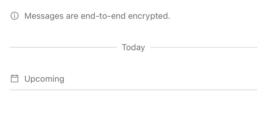
An inline annotation for timelines and conversations, such as a date divider or system event.
Marker is an open-source component from suiss/ui for React, React Native, SwiftUI and Jetpack Compose. The @esuiss/ui CLI copies its source into your project, so you own the code.
Marker displays a short line of secondary text, typically between messages or list entries. Put the text in MarkerContent and, optionally, a leading MarkerIcon.
The variant prop changes the treatment: plain text, text centered between two separator rules, or text above a bottom border. Use Marker for annotations within content; use Separator for a purely visual rule with no text.
Installation
CLI
Works in any project with a components.json. See Installation for the one-line registry setup. Or use the suiss/ui CLI:
Manual
- Install the dependencies and add the
cnhelper:
- Copy the source into
components/ui/marker.tsx:
- Update the import paths to match your project.
Usage
Links inside the marker or its content are underlined automatically. The underlying element can be changed:
Marker is built on Base UI's useRender, so it accepts a render prop to change the underlying element.
Set asChild on Marker and pass the element as the child.
Pass a render function to Marker that returns the element with the props it receives.
Examples
Variants
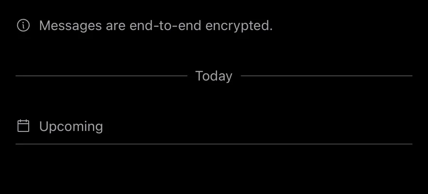
The default, separator and border variants stacked for comparison.
Separator
Text centered between two horizontal rules, as used for a date divider.
With icon
Markers with a leading decorative icon in the default and separator variants.
With link
A marker whose content includes an inline link.
API Reference
Marker
The container row that applies the variant styling.
| Prop | Type | Default | Description |
|---|---|---|---|
variant | "default" | "separator" | "border" | "default" | Sets the visual treatment: default for plain text, separator for text between two rules, or border for text above a bottom border. |
Also accepts the props of useRender.ComponentProps<"div">.
MarkerIcon
A decorative icon slot shown before the content and hidden from assistive technology.
Also accepts the props of React.ComponentProps<"span">.
MarkerContent
Holds the marker text and any inline links.
Also accepts the props of React.ComponentProps<"span">.
Accessibility
MarkerIconsetsaria-hidden="true", so icons must be decorative; put meaningful text inMarkerContent.- Links inside the content remain in the normal tab order.
Notes
- Styling hooks:
data-slot="marker",data-slot="marker-icon"anddata-slot="marker-content". The root also exposesdata-variant. - Rules and borders use the
bordercolor; text usesmuted-foregroundand links hover toforeground.
Marker is a row of secondary text with an optional icon. It has three variants: default for a plain row, separator for centered text with a line on each side, and border for a row with a bottom border.
Use separator for date dividers in a chat or feed, border for section headings, and default for short notices.