suiss/ui · Component
Message Scroller
A scroll container for chat transcripts that opens at the latest message and keeps scroll position stable.
Message Scroller is an open-source component from suiss/ui for React, React Native, SwiftUI and Jetpack Compose. The @esuiss/ui CLI copies its source into your project, so you own the code.
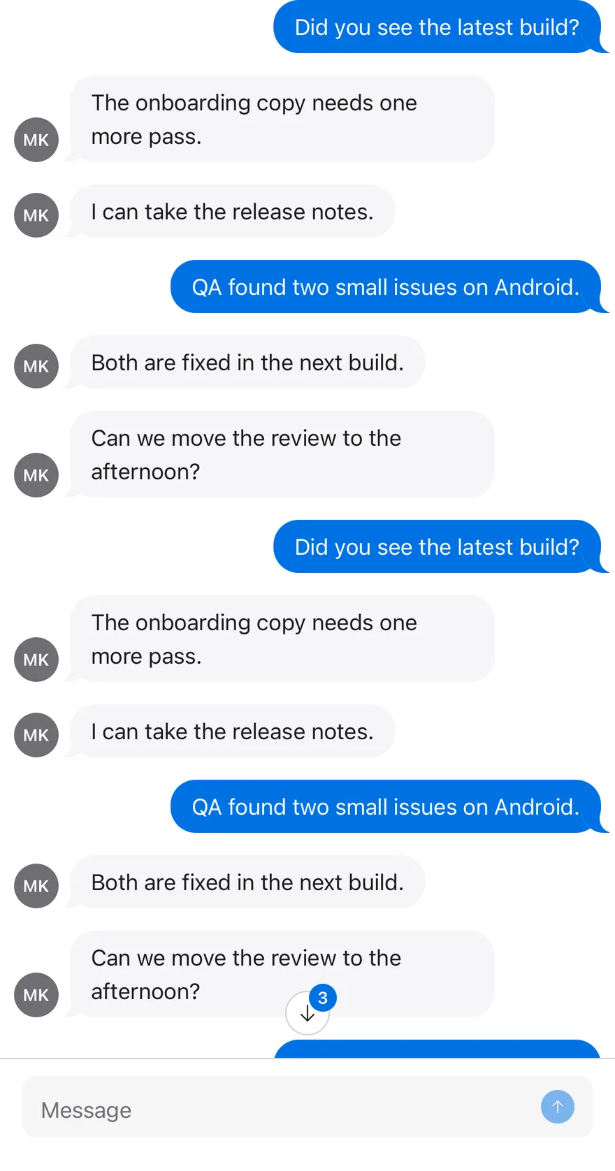
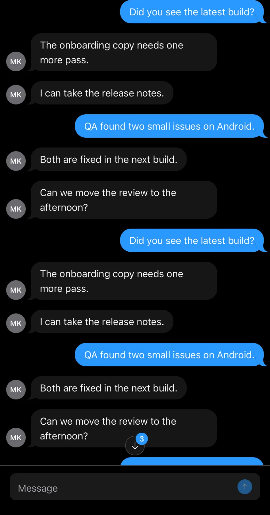
Message Scroller manages scrolling for conversation views. MessageScrollerProvider creates the scroll controller and holds options such as the initial position and auto-scroll. Inside it, MessageScroller is the root, MessageScrollerViewport is the scrollable region, and MessageScrollerContent lists one MessageScrollerItem per message. MessageScrollerButton sits inside the root and jumps to the start or end.
The scroller opens at the end by default, preserves the reading position when older messages are prepended, and can anchor a newly added message to the top of the viewport. Use it for chat and activity feeds; use Scroll Area for general scrollable content.
Installation
CLI
Works in any project with a components.json. See Installation for the one-line registry setup. Or use the suiss/ui CLI:
Manual
- Install the dependencies and add the
cnhelper:
-
Add the pieces it builds on: Button, Scroll Area,
use-message-scroller. -
Copy the source into
components/ui/message-scroller.tsx:
- Update the import paths to match your project.
Usage
Place every part inside MessageScrollerProvider; the components and hooks throw outside of it. Provider options:
defaultScrollPosition:"end"(default),"start", or"last-anchor"to open at the last item marked withscrollAnchor.autoScroll: whentrue, follows new content at the bottom until the user scrolls away. Defaults tofalse.scrollEdgeThreshold,scrollPreviousItemPeekandscrollMargin: pixel values that tune edge detection and anchoring (defaults8,64and0).
Give each item a stable messageId so it can be targeted programmatically. The exported useMessageScroller hook returns scrollToEnd, scrollToStart and scrollToMessage; useMessageScrollerScrollable reports whether each edge can scroll, and useMessageScrollerVisibility reports the visible message IDs.
Examples
Start at top
A scroller that opens at the first message with defaultScrollPosition="start", with buttons for both directions.
API Reference
MessageScrollerProvider
Creates the scroll controller and provides it to the parts and hooks inside.
| Prop | Type | Default | Description |
|---|---|---|---|
children | React.ReactNode | - | The scroller parts and any components that use the message scroller hooks. |
Also accepts the props of MessageScrollerOptions.
MessageScroller
The root container, built on a scroll area.
Also accepts the props of React.ComponentProps<"div">.
MessageScrollerViewport
The focusable scrollable region, rendered with a vertical scrollbar.
| Prop | Type | Default | Description |
|---|---|---|---|
preserveScrollOnPrepend | boolean | true | Keeps the visible messages in place when items are inserted before the first one, such as when loading history. |
Also accepts the props of React.ComponentProps<"div">.
MessageScrollerContent
The live log that holds the message items.
| Prop | Type | Default | Description |
|---|---|---|---|
spacerClassName | string | - | Class name for the hidden spacer element the scroller appends after the items. |
Also accepts the props of React.ComponentProps<"div">.
MessageScrollerItem
Wraps one message and registers it with the controller.
| Prop | Type | Default | Description |
|---|---|---|---|
messageId | string | - | A stable ID used for scrollToMessage, visibility tracking and the data-message-id attribute. |
scrollAnchor | boolean | false | Marks the item as an anchor; when it is added, the scroller aligns it to the top of the viewport instead of the bottom. |
Also accepts the props of React.ComponentProps<"div">.
MessageScrollerButton
A floating button that appears when the scroller can move toward its direction and jumps there on click.
| Prop | Type | Default | Description |
|---|---|---|---|
behavior | ScrollBehavior | "smooth" | The scroll behavior used when jumping, such as smooth or auto. |
direction | MessageScrollerScrollDirection | "end" | Which edge the button scrolls to: end or start. It also sets the button's position and icon rotation. |
Also accepts the props of useRender.ComponentProps<"button", MessageScrollerButtonState>, React.ComponentProps<typeof Button>.
Accessibility
- The viewport has
role="region", anaria-labelofMessagesby default, andtabIndex={0}so it can be scrolled with the keyboard. - The content has
role="log"witharia-relevant="additions", so assistive technology can announce new messages. MessageScrollerButtonincludes a visually hidden label,Scroll to endorScroll to start. While it cannot scroll, the button isinertand removed from the tab order.- Wheel, touch and scrolling keys stop auto-follow so the user's reading position is respected.
Notes
- Styling hooks:
data-slotvaluesmessage-scroller,message-scroller-viewport,message-scroller-content,message-scroller-itemandmessage-scroller-button. - The root and viewport receive
data-pending-scrolluntil the initial position is applied; the viewport is invisible during that time. They also getdata-scrollablewith the scrollable edges anddata-autoscrollingwhile a programmatic scroll is running. - The button exposes
data-active,data-direction,data-variantanddata-size. It defaults to thesecondaryvariant andicon-smsize ofButton. - Items set
data-scroll-anchorand usecontent-visibility: autoto keep long transcripts fast.
MessageScroller is a View that hosts a scroll controller. MessageScrollerViewport renders your messages in an inverted FlatList, so the newest message sits at the bottom and new messages keep the list anchored there through maintainVisibleContentPosition. You pass data in chronological order; the viewport reverses it internally and maps indexes back for renderItem and keyExtractor.
MessageScrollerButton is a floating icon button that animates in with Reanimated when there is more content in its direction. When the user has scrolled up and new messages arrive, it shows an unread count badge.