suiss/ui · Component
Drawer
A panel that slides in from an edge of the screen and can be dismissed with a swipe.
Drawer is an open-source component from suiss/ui for React, React Native, SwiftUI and Jetpack Compose. The @esuiss/ui CLI copies its source into your project, so you own the code.
Drawer wraps the Base UI Drawer. The Drawer root manages the open state and the swipe direction, and DrawerTrigger opens it. DrawerContent renders the panel in a portal, over a dimmed DrawerOverlay when modal, with an optional swipe handle and close button. Inside it, DrawerHeader holds the DrawerTitle and DrawerDescription, and DrawerFooter holds the actions. DrawerClose closes the drawer from any element.
The drawer opens from the bottom by default and can also open from the top, left or right. It supports snap points, a floating style inset from the screen edges, and a non-modal mode. To get the iOS sheet effect, where the page behind scales down as a bottom drawer opens, wrap the page in DrawerProvider with DrawerIndentBackground and DrawerIndent. Use a drawer for touch-friendly, swipeable panels; for a centered window, use a dialog.
Installation
CLI
Works in any project with a components.json. See Installation for the one-line registry setup. Or use the suiss/ui CLI:
Manual
- Install the dependencies and add the
cnhelper:
-
Add the pieces it builds on: Button,
use-scrollbar-gap. -
Copy the source into
components/ui/drawer.tsx:
- Update the import paths to match your project.
Usage
The drawer is uncontrolled by default; set defaultOpen to start open, or control it with open and onOpenChange. Set swipeDirection to down, up, left or right to choose the edge it opens from and the direction it is swiped to close.
Pass snapPoints, such as [0.5, 1], to let people drag the drawer between heights; it opens at the first snap point unless you set defaultSnapPoint, or control it with snapPoint and onSnapPointChange. Set modal={false} to keep the rest of the page interactive; no overlay is rendered in that case.
For the indented page effect, place DrawerIndentBackground and DrawerIndent inside DrawerProvider and put the page content in DrawerIndent. The page is scaled while a non-floating drawer that opens from the bottom is open, and, with snap points, only at the last snap point.
Examples
Directions
Four drawers that open from the bottom, top, left and right edges.
With close button
A drawer with an icon close button in the top corner.
With close label
A drawer whose close button shows a text label instead of an icon.
Floating
A floating drawer, inset from the screen edges with rounded corners on all sides.
With snap points
A drawer that opens at half height and expands when dragged up.
Non modal
A non-modal drawer that leaves the rest of the page interactive.
Sheet with detents
An iOS-style event sheet with snap points that scales the page behind it using DrawerIndent.
API Reference
DrawerProvider
Coordinates drawers with DrawerIndent so the page can react when a drawer opens.
Also accepts the props of DrawerPrimitive.Provider.Props.
DrawerIndentBackground
The dark layer shown behind the page when it scales down.
Also accepts the props of DrawerPrimitive.IndentBackground.Props.
DrawerIndent
Wraps the page content and scales it down while a bottom drawer is open.
Also accepts the props of DrawerPrimitive.Indent.Props.
Drawer
The root that manages the open state, swipe direction and snap points.
| Prop | Type | Default | Description |
|---|---|---|---|
floating | boolean | false | Insets the drawer from the screen edges and rounds all of its corners. |
showSwipeHandle | boolean | false | Shows a grab bar on the edge of the panel that faces the screen center. |
Also accepts the props of DrawerPrimitive.Root.Props.
DrawerTrigger
The button that opens the drawer.
Also accepts the props of DrawerPrimitive.Trigger.Props.
DrawerPortal
Renders its children into a portal outside the current DOM hierarchy.
Also accepts the props of DrawerPrimitive.Portal.Props.
DrawerClose
A button that closes the drawer.
Also accepts the props of DrawerPrimitive.Close.Props.
DrawerOverlay
The dimmed layer behind a modal drawer, which fades as the drawer is swiped away.
Also accepts the props of DrawerPrimitive.Backdrop.Props.
DrawerSwipeHandle
The grab bar people drag to move or dismiss the drawer.
Also accepts the props of React.ComponentProps<"div">.
DrawerContent
The drawer panel, rendered in a portal with an optional overlay, swipe handle and close button.
| Prop | Type | Default | Description |
|---|---|---|---|
showCloseButton | boolean | false | Shows a close button in the top corner. |
closeLabel | string | - | Replaces the close button's icon with this text. |
Also accepts the props of DrawerPrimitive.Popup.Props.
DrawerHeader
Groups the title and description.
Also accepts the props of React.ComponentProps<"div">.
DrawerFooter
Holds the drawer's actions at the bottom of the panel.
Also accepts the props of React.ComponentProps<"div">.
DrawerTitle
The drawer's title, which also names it for assistive technology.
Also accepts the props of DrawerPrimitive.Title.Props.
DrawerDescription
Supporting text that describes the drawer for assistive technology.
Also accepts the props of DrawerPrimitive.Description.Props.
Accessibility
- The panel has the
dialogrole.DrawerTitleprovides its accessible name andDrawerDescriptionits accessible description. - Opening the drawer moves focus inside it. Escape closes it and returns focus to the trigger.
- A non-modal drawer does not set
aria-modal. - The swipe handle is hidden from assistive technology, so always provide another way to close the drawer, such as a
DrawerClosebutton. - The icon-only close button has a visually hidden
Closelabel.
Notes
- Styling hooks:
data-slotvalues such asdrawer-popup,drawer-content,drawer-overlay,drawer-swipe-handle,drawer-close-button,drawer-header,drawer-footeranddrawer-indent. - The panel sets
data-swipe-direction,data-swipe-axis, and, when applicable,data-floatinganddata-snap-points. A drawer at its last snap point getsdata-expanded.DrawerIndentgetsdata-raisedwhile the page is scaled. - Side drawers are
75%wide, and24remwide from thesmbreakpoint. Top and bottom drawers are limited to the viewport height minus6rem. - Nested drawers stack, with the drawer behind scaled down slightly.
- Uses the
popover,backgroundandbordercolors, with abg-black/50backdrop. Animations are disabled onDrawerIndentwhen reduced motion is preferred.
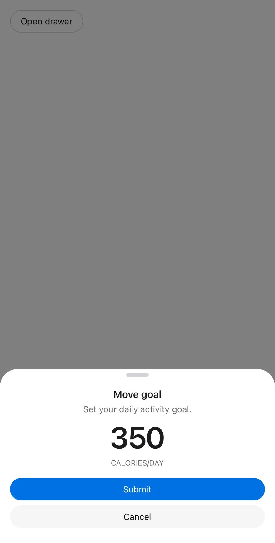
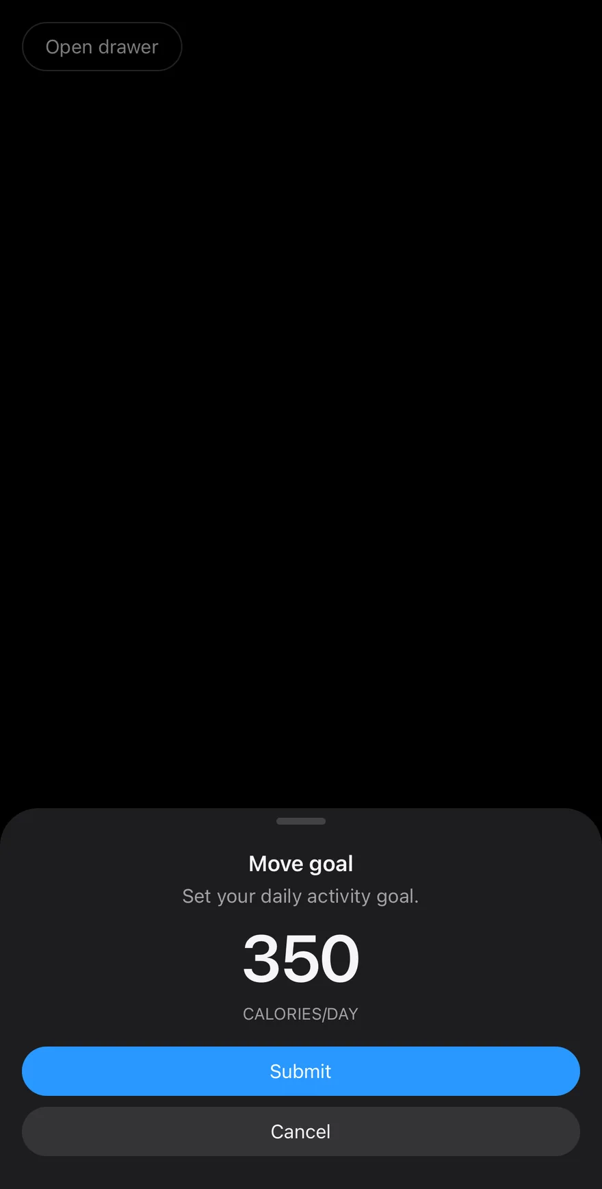
Drawer presents content in a panel attached to an edge of the screen. It slides in from the bottom by default, or from the top, left or right with swipeDirection, and the user can drag it closed in that direction. The content renders through a portal (inside a full-window overlay on iOS) and respects the safe-area insets.
Set floating to inset the panel from the screen edges with all corners rounded. Use snapPoints to let a bottom drawer rest at several heights. Wrap your app in DrawerProvider and its screen in DrawerIndent to scale the page back behind an open bottom drawer.
Installation
The CLI also adds what it builds on: Button, Icon, Text. On React Native it also adds the animated view components/ui/animated-view.tsx.
Manual
- Install the dependencies:
-
Add the pieces it builds on: Button, Icon, Text, and the primitives
components/primitives/drawer.tsx,components/primitives/use-render.tsx, and the animated viewcomponents/ui/animated-view.tsxfrom the next step. -
Copy the animated view into
components/ui/animated-view.tsx:
- Copy the source into
components/ui/drawer.tsx:
- Update the import paths to match your project.
- Install the dependencies:
-
Add the pieces it builds on: Button, Icon, Text, and the primitives
components/primitives/drawer.tsx,components/primitives/use-render.tsx, and the animated viewcomponents/ui/animated-view.tsxfrom the next step. -
Copy the animated view into
components/ui/animated-view.tsx:
- Copy the source into
components/ui/drawer.tsx:
- Update the import paths to match your project.
- Install the dependencies:
-
Add the pieces it builds on: Button, Icon, Text, and the primitives
components/primitives/drawer.tsx,components/primitives/use-render.tsx, and the animated viewcomponents/ui/animated-view.tsxfrom the next step. -
Copy the animated view into
components/ui/animated-view.tsx:
- Copy the source into
components/ui/drawer.tsx:
- Update the import paths to match your project.
-
Target iOS 17 or later.
-
Add the Swift package to your app:
- Copy the theme files every view uses:
- Copy the source and every file it uses:
- Add the files to your app target.
- Set
minSdkto 24 or higher and add the dependencies:
- Copy the theme files every view uses:
- Copy the source and every file it uses:
- Update the
com.esuiss.uipackage names to match your project.
Usage
Compose DrawerTrigger and DrawerContent with a DrawerHeader (DrawerTitle, DrawerDescription), your content and a DrawerFooter. Use DrawerClose to close it from a button.
Set showSwipeHandle to show a grab handle, and showCloseButton on the content for a corner close button, with closeLabel for a text button. snapPoints accepts fractions of the screen such as [0.4, 1]; control the current one with snapPoint and onSnapPointChange.
With modal={false} there is no scrim. For the scaled background, render DrawerIndentBackground behind a DrawerIndent inside DrawerProvider.
Examples
Default
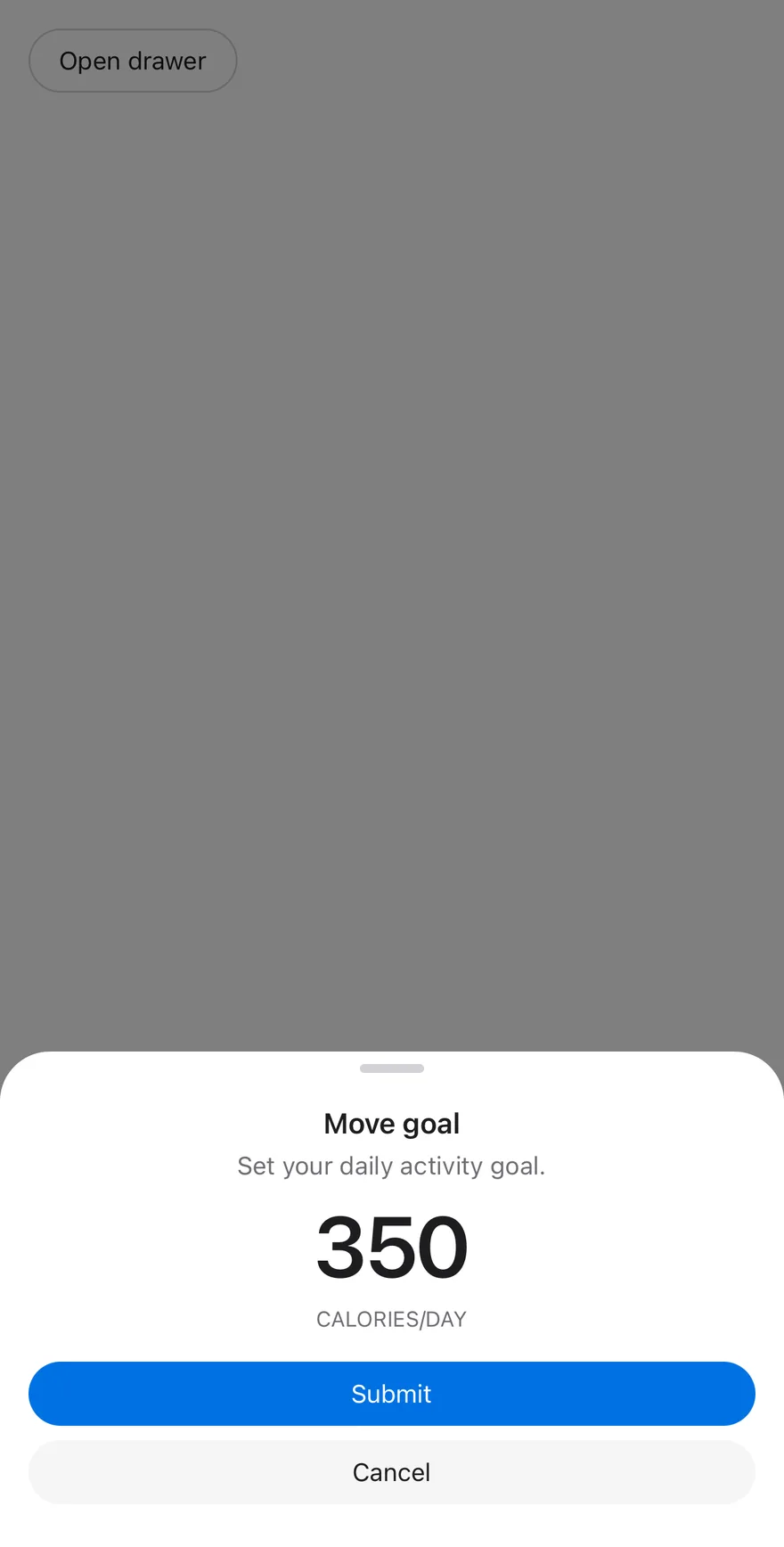
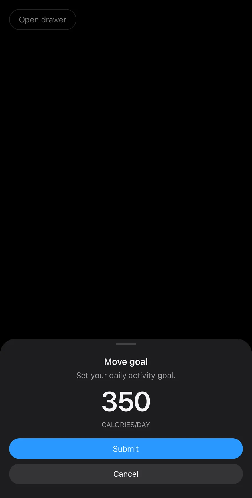
Snap points
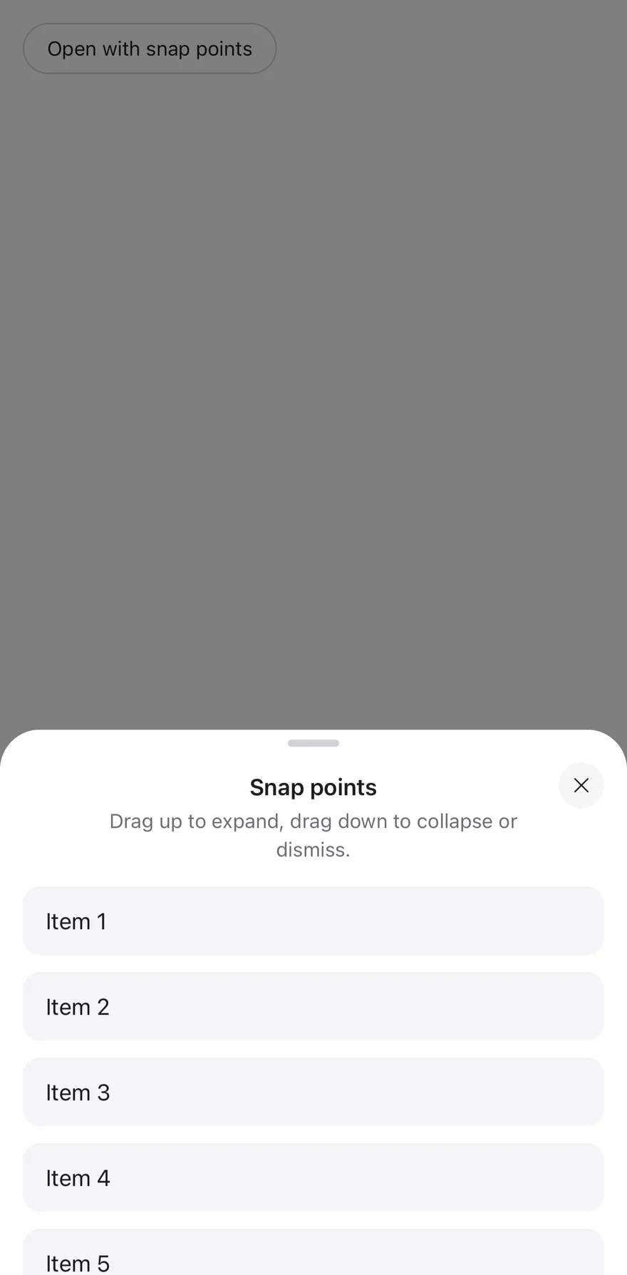
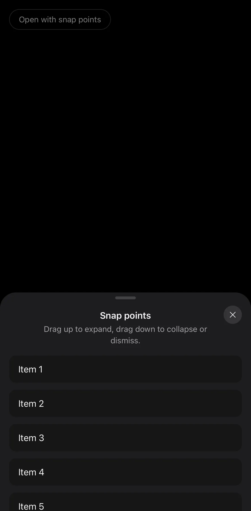
A drawer that rests at 40% and full height.
Floating
A floating drawer inset from the edges.
Sides
Drawers from the top, bottom, left and right.
API Reference
DrawerProvider
Tracks open drawers for the indent effect.
Also accepts the props of DrawerPrimitive.ProviderProps.
DrawerIndentBackground
Background shown behind the scaled screen.
Also accepts the props of React.ComponentProps<typeof DrawerPrimitive.IndentBackground>.
DrawerIndent
Screen wrapper that scales back while a bottom drawer is open.
Also accepts the props of React.ComponentProps<typeof DrawerPrimitive.Indent>.
Drawer
Root that holds the open state, direction and snap points.
| Prop | Type | Default | Description |
|---|---|---|---|
floating | boolean | false | Insets the panel from the edges. |
showSwipeHandle | boolean | false | Shows a grab handle. |
Also accepts the props of DrawerPrimitive.RootProps.
DrawerOverlay
Dimmed scrim behind a modal drawer.
Also accepts the props of React.ComponentProps<typeof DrawerPrimitive.Backdrop>.
DrawerSwipeHandle
Grab handle on the dragging edge.
Also accepts the props of ViewProps.
DrawerContent
Sliding panel with optional handle and close button.
| Prop | Type | Default | Description |
|---|---|---|---|
portalHost | string | - | Name of the portal host to render into. |
showCloseButton | boolean | false | Shows a corner close button. |
closeLabel | string | - | Text for the close button instead of the icon. |
Also accepts the props of React.ComponentProps<typeof DrawerPrimitive.Popup>.
DrawerHeader
Area for the title and description.
Also accepts the props of ViewProps.
DrawerFooter
Area for actions at the end of the panel.
Also accepts the props of ViewProps.
DrawerTitle
Drawer heading, centered for top and bottom drawers.
Also accepts the props of React.ComponentProps<typeof DrawerPrimitive.Title>.
DrawerDescription
Supporting text.
Also accepts the props of React.ComponentProps<typeof DrawerPrimitive.Description>.
Accessibility
- The popup has the
dialogrole and is labelled by the title. - The swipe handle and decorative edge fill are hidden from screen readers.
- The icon close button is labelled "Close".
Notes
- Padding follows the safe-area insets, and a docked drawer extends its background past the screen edge so drag overshoot shows no gap.
- Animations respect the system Reduce Motion setting.
- Uses
bg-popover,bg-black/50andbg-bordertokens; light and dark follow the system appearance.