suiss/ui
  • Docs
  • Components
  • Patterns
  • Interactions
  • Charts
  • Blocks
GitHubGet started
DocsComponentsPatternsInteractionsChartsBlocks
Components82
  • Overview
  • Accordion
  • Alert
  • Alert Dialog
  • Alert Sheet
  • Amount Input
  • Aspect Ratio
  • Attachment
  • Avatar
  • Badge
  • Bottom Bar
  • Breadcrumb
  • Bubble
  • Button
  • Button Group
  • Calendar
  • Card
  • Carousel
  • Chart
  • Checkbox
  • Chip
  • Collapsible
  • Combobox
  • Command
  • Context Menu
  • Dialog
  • Direction
  • Drawer
  • Dropdown Menu
  • Empty
  • FAB
  • Field
  • Fullscreen Menu
  • Haptics
  • Header
  • Hover Card
  • Icon
  • Input
  • Input Accessory Bar
  • Input Group
  • Input OTP
  • Item
  • Kbd
  • Keyboard Scroll View
  • Keypad
  • Label
  • Marker
  • Menubar
  • Message
  • Message Scroller
  • Native Select
  • Navigation Menu
  • Page Indicator
  • Pagination
  • Pin Pad
  • Popover
  • Progress
  • QR Scanner
  • Questionnaire
  • Radio Group
  • Resizable
  • Screen
  • Scroll Area
  • Select
  • Separator
  • Sheet
  • Sidebar
  • Signature Pad
  • Skeleton
  • Slider
  • Spinner
  • Switch
  • Tab Bar
  • Table
  • Tabs
  • Text
  • Textarea
  • Toast
  • Toggle
  • Toggle Group
  • Tooltip
  • Wheel Picker
  • Widget

suiss/ui · Component

Keypad

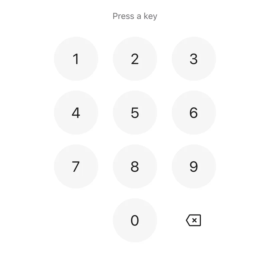
A numeric keypad with round digit keys, a delete key and an optional decimal or biometric key.

Keypad is an open-source component from suiss/ui for React Native, SwiftUI and Jetpack Compose. The @esuiss/ui CLI copies its source into your project, so you own the code.
iOS
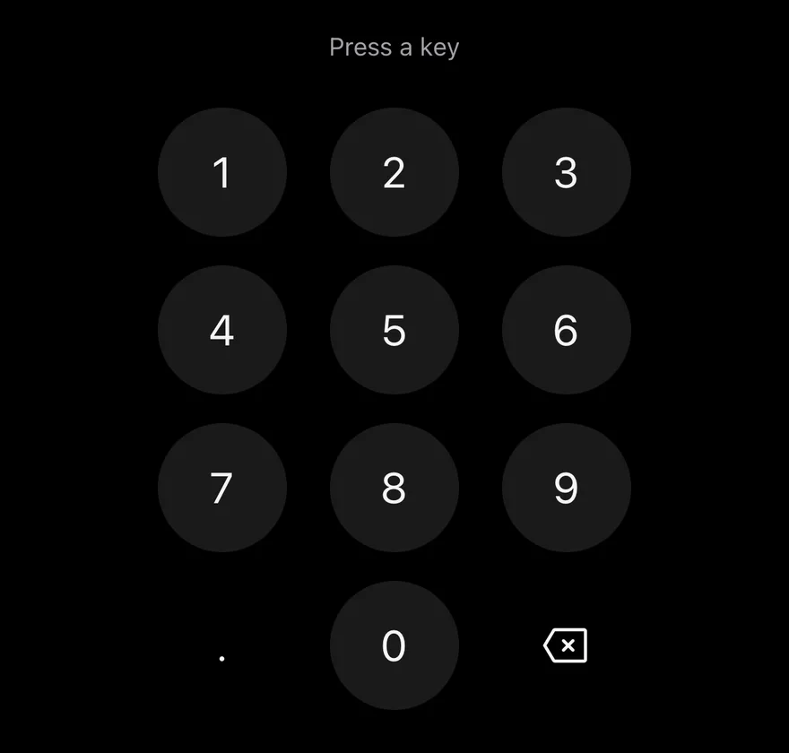
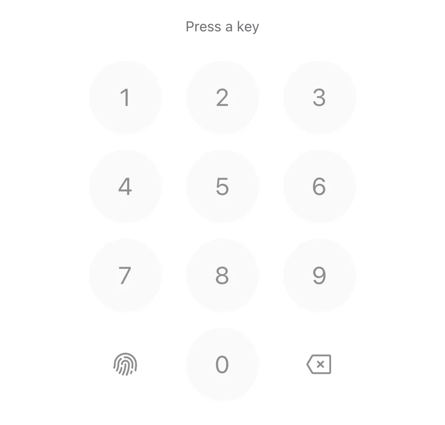
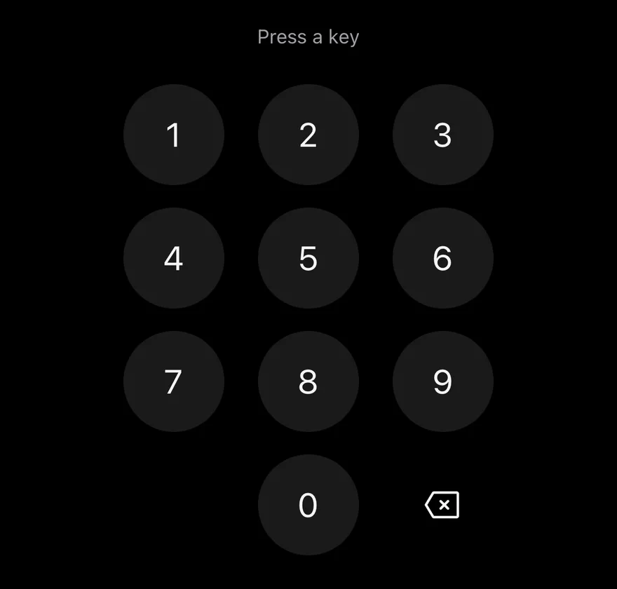
Keypad on iOS in light modeKeypad on iOS in dark mode
import * as React from "react"
import { View } from "react-native"
import { Keypad, type KeypadAccessoryKey, type KeypadKeyValue } from "@/components/ui/keypad"
import { Text } from "@/components/ui/text"

function KeyLog({
  accessoryKey,
  disabled,
}: {
  accessoryKey?: KeypadAccessoryKey
  disabled?: boolean
}) {
  const [last, setLast] = React.useState<KeypadKeyValue | null>(null)
  return (
    <View className="items-center gap-6">
      <Text
        role="status"
        accessibilityLiveRegion="polite"
        className="text-sm text-muted-foreground"
      >
        {last ? `Last key: ${last}` : "Press a key"}
      </Text>
      <Keypad
        accessoryKey={accessoryKey}
        disabled={disabled}
        onKeyPress={setLast}
      />
    </View>
  )
}

export function KeypadExample() {
  return (
    <KeyLog />
  )
}
import EsuissUI
import SwiftUI

struct KeypadExample: View {
  var body: some View {
    KeypadLog(accessory: .none)
  }
}

struct KeypadLog: View {
  let accessory: KeypadAccessory

  @State private var last: KeypadKey?

  var body: some View {
    VStack(spacing: 24) {
      Group {
        if let last {
          Text(verbatim: "Last key: \(name(last))")
        } else {
          Text("Press a key")
        }
      }
      .textStyle(.sm)
      .foregroundStyle(EsuissColor.mutedForeground)
      .accessibilityAddTraits(.updatesFrequently)
      Keypad(accessory: accessory) { key in
        last = key
      }
    }
    .frame(maxWidth: .infinity)
  }

  func name(_ key: KeypadKey) -> String {
    switch key {
    case .digit(let value): "\(value)"
    case .decimal: "decimal"
    case .delete: "delete"
    case .biometric: "biometric"
    }
  }
}
import androidx.compose.foundation.layout.Arrangement
import androidx.compose.foundation.layout.Column
import androidx.compose.foundation.layout.fillMaxWidth
import androidx.compose.runtime.Composable
import androidx.compose.runtime.getValue
import androidx.compose.runtime.mutableStateOf
import androidx.compose.runtime.saveable.rememberSaveable
import androidx.compose.runtime.setValue
import androidx.compose.ui.Alignment
import androidx.compose.ui.Modifier
import androidx.compose.ui.semantics.LiveRegionMode
import androidx.compose.ui.semantics.liveRegion
import androidx.compose.ui.semantics.semantics
import androidx.compose.ui.unit.dp
import com.esuiss.ui.components.Keypad
import com.esuiss.ui.components.KeypadAccessory
import com.esuiss.ui.components.KeypadKey
import com.esuiss.ui.components.Text
import com.esuiss.ui.theme.EsuissTheme
import com.esuiss.ui.theme.Typography

@Composable
fun KeypadExample() {
    KeypadKeyLog(KeypadAccessory.None)
}

fun keypadKeyName(key: KeypadKey): String = when (key) {
    is KeypadKey.Digit -> key.value.toString()
    KeypadKey.Decimal -> "decimal"
    KeypadKey.Biometric -> "biometric"
    KeypadKey.Delete -> "delete"
}

@Composable
fun KeypadKeyLog(accessory: KeypadAccessory, enabled: Boolean = true) {
    var last by rememberSaveable { mutableStateOf<String?>(null) }
    Column(
        modifier = Modifier.fillMaxWidth(),
        horizontalAlignment = Alignment.CenterHorizontally,
        verticalArrangement = Arrangement.spacedBy(24.dp),
    ) {
        Text(
            last?.let { "Last key: $it" } ?: "Press a key",
            modifier = Modifier.semantics { liveRegion = LiveRegionMode.Polite },
            style = Typography.sm,
            color = EsuissTheme.colors.mutedForeground,
        )
        Keypad(onKeyPress = { last = keypadKeyName(it) }, accessory = accessory, enabled = enabled)
    }
}

Keypad lays out digits 1 to 9 in three rows and a bottom row with an accessory key, 0 and a delete key. Each key is a KeypadKey, a round Pressable with the button role. Digit keys have a filled background; the accessory and delete keys use the plain variant with no fill.

Use it for PIN entry, amounts and other numeric input where the system keyboard is not wanted.

Installation

$ pnpm dlx shadcn@latest add @esuiss-rn/keypad

See Installation for the components.json setup. Or use the suiss/ui CLI:

$ pnpm dlx @esuiss/ui@latest add keypad
$ pnpm dlx @esuiss/ui@latest add keypad --platform swift
$ pnpm dlx @esuiss/ui@latest add keypad --platform kotlin

The CLI also adds what it builds on: Icon, Text.

Manual

  1. Install the dependencies:
npx expo install cn phosphor-react-native react-native-svg
  1. Add the pieces it builds on: Icon, Text.

  2. Copy the source into components/ui/keypad.tsx:

uniwind/components/ui/keypad.tsx
import { cn } from "cn"
import {
  BackspaceIcon,
  FingerprintIcon,
  type Icon as PhosphorIcon,
} from "phosphor-react-native"
import type * as React from "react"
import { Pressable, View } from "react-native"
import { Icon, IconClassContext } from "@/components/ui/icon"
import { Text, TextClassContext } from "@/components/ui/text"

type KeypadDigit = "0" | "1" | "2" | "3" | "4" | "5" | "6" | "7" | "8" | "9"

type KeypadKeyValue = KeypadDigit | "decimal" | "delete" | "biometric"

type KeypadAccessoryKey = "decimal" | "biometric"
  1. Update the import paths to match your project.
  1. Install the dependencies:
npx expo install cn phosphor-react-native react-native-svg
  1. Add the pieces it builds on: Icon, Text.

  2. Copy the source into components/ui/keypad.tsx:

nativewind/components/ui/keypad.tsx
import { cn } from "cn"
import {
  BackspaceIcon,
  FingerprintIcon,
  type Icon as PhosphorIcon,
} from "phosphor-react-native"
import type * as React from "react"
import { Pressable, View } from "react-native"
import { Icon, IconClassContext } from "@/components/ui/icon"
import { Text, TextClassContext } from "@/components/ui/text"

type KeypadDigit = "0" | "1" | "2" | "3" | "4" | "5" | "6" | "7" | "8" | "9"

type KeypadKeyValue = KeypadDigit | "decimal" | "delete" | "biometric"

type KeypadAccessoryKey = "decimal" | "biometric"
  1. Update the import paths to match your project.
  1. Install the dependencies:
npx expo install phosphor-react-native react-native-svg
  1. Add the pieces it builds on: Icon, Text.

  2. Copy the source into components/ui/keypad.tsx:

stylesheet/components/ui/keypad.tsx
import {
  BackspaceIcon,
  FingerprintIcon,
  type Icon as PhosphorIcon,
} from "phosphor-react-native"
import type * as React from "react"
import {
  Pressable,
  type StyleProp,
  StyleSheet,
  View,
  type ViewStyle,
} from "react-native"
import { Icon, IconSizeContext } from "@/components/ui/icon"
import { Text, TextStyleContext } from "@/components/ui/text"
import { fontSize, radius, useTheme } from "@/components/ui/theme"
  1. Update the import paths to match your project.
  1. Target iOS 17 or later.

  2. Add the Swift package to your app:

Package.swift
.package(url: "https://github.com/phosphor-icons/swift", from: "2.1.0")
  1. Copy the theme files every view uses:
swift/Theme/Theme.swift
import SwiftUI
import UIKit

struct RGBA: Sendable {
  let red: CGFloat
  let green: CGFloat
  let blue: CGFloat
  let alpha: CGFloat

  init(_ hex: UInt32, _ alpha: CGFloat = 1) {
    red = CGFloat((hex >> 16) & 0xFF) / 255
    green = CGFloat((hex >> 8) & 0xFF) / 255
    blue = CGFloat(hex & 0xFF) / 255
    self.alpha = alpha
  }
swift/Theme/Tokens.swift
import SwiftUI

public enum EsuissColor {
  public static let background = Color.adaptive(light: .init(0xFFFFFF), dark: .init(0x000000))
  public static let foreground = Color.adaptive(light: .init(0x1D1D1F), dark: .init(0xF5F5F7))
  public static let card = Color.adaptive(light: .init(0xFFFFFF), dark: .init(0x1D1D1F))
  public static let cardForeground = Color.adaptive(light: .init(0x1D1D1F), dark: .init(0xF5F5F7))
  public static let popover = Color.adaptive(light: .init(0xFFFFFF), dark: .init(0x1D1D1F))
  public static let popoverForeground = Color.adaptive(light: .init(0x1D1D1F), dark: .init(0xF5F5F7))
  public static let primary = Color.adaptive(light: .init(0x0071E3), dark: .init(0x2997FF))
  public static let primaryForeground = Color.adaptive(light: .init(0xFFFFFF), dark: .init(0xFFFFFF))
  public static let secondary = Color.adaptive(light: .init(0x000000, 0.04), dark: .init(0xFFFFFF, 0.1))
  public static let secondaryForeground = Color.adaptive(light: .init(0x1D1D1F), dark: .init(0xF5F5F7))
  public static let muted = Color.adaptive(light: .init(0xF5F5F7), dark: .init(0x161617))
  public static let mutedForeground = Color.adaptive(light: .init(0x6E6E73), dark: .init(0xA1A1A6))
  public static let accent = Color.adaptive(light: .init(0x000000, 0.06), dark: .init(0xFFFFFF, 0.1))
  1. Copy the source and every file it uses:
swift/Components/Keypad.swift
import PhosphorSwift
import SwiftUI

public enum KeypadKey: Hashable, Sendable {
  case digit(Int)
  case decimal
  case delete
  case biometric
}

public enum KeypadAccessory {
  case none
  case decimal(String, label: LocalizedStringKey = "Decimal separator")
  case biometric(Image, label: LocalizedStringKey = "Use biometrics")
}
swift/Components/Checkbox.swift
import PhosphorSwift
import SwiftUI

extension Shadow {
  static let control = Shadow(color: .black.opacity(0.08), radius: 0.5, y: 0.5)
  static let thumb = Shadow(color: .black.opacity(0.12), radius: 1.5, y: 1)
}

struct SelectionIndicator<Mark: View>: View {
  let checked: Bool
  let pressed: Bool
  let cornerRadius: CGFloat
  let mark: Mark

  @Environment(\.isEnabled) private var isEnabled
  @Environment(\.isInvalid) private var invalid
swift/Components/Field.swift
import SwiftUI

extension EnvironmentValues {
  @Entry public var isInvalid = false
  @Entry var fieldInset = false
  @Entry var fieldGroupInset = false
  @Entry var fieldSetInset = false
}

extension View {
  public func invalid(_ isInvalid: Bool = true) -> some View {
    environment(\.isInvalid, isInvalid)
  }
}

public enum FieldOrientation: CaseIterable, Sendable {
swift/Components/Haptics.swift
import SwiftUI

extension EnvironmentValues {
  @Entry public var hapticsEnabled = true
}

extension View {
  public func haptics(_ enabled: Bool) -> some View {
    environment(\.hapticsEnabled, enabled)
  }

  func hapticFeedback<Trigger: Equatable>(_ feedback: SensoryFeedback, trigger: Trigger) -> some View {
    modifier(HapticFeedbackModifier(feedback: feedback, trigger: trigger) { _, _ in true })
  }

  func hapticFeedback<Trigger: Equatable>(
swift/Components/Separator.swift
import SwiftUI

public struct Separator: View {
  let orientation: Axis

  public init(_ orientation: Axis = .horizontal) {
    self.orientation = orientation
  }

  public var body: some View {
    Rectangle()
      .fill(EsuissColor.border)
      .frame(width: orientation == .vertical ? 1 : nil, height: orientation == .horizontal ? 1 : nil)
      .frame(maxWidth: orientation == .horizontal ? .infinity : nil, maxHeight: orientation == .vertical ? .infinity : nil)
      .accessibilityHidden(true)
  }
swift/Components/TextVariant.swift
import SwiftUI

public enum TextVariant: CaseIterable, Sendable {
  case `default`, h1, h2, h3, h4, p, blockquote, code, lead, large, small, muted

  var style: TextStyle {
    switch self {
    case .h1: .xl3
    case .h2: .xl2
    case .h3: .xl
    case .h4, .lead, .large: .lg
    case .code, .small, .muted: .sm
    default: .base
    }
  }
  1. Add the files to your app target.
  1. Set minSdk to 24 or higher and add the dependencies:
build.gradle.kts
implementation(platform("androidx.compose:compose-bom:2026.09.00"))
implementation("androidx.compose.foundation:foundation")
implementation("androidx.compose.ui:ui")
implementation("com.adamglin:phosphor-icon-android:1.0.0")
  1. Copy the theme files every view uses:
kotlin/theme/Theme.kt
package com.esuiss.ui.theme

import androidx.compose.foundation.isSystemInDarkTheme
import androidx.compose.runtime.Composable
import androidx.compose.runtime.CompositionLocalProvider
import androidx.compose.runtime.Immutable
import androidx.compose.runtime.staticCompositionLocalOf
import androidx.compose.ui.Modifier
import androidx.compose.ui.draw.dropShadow
import androidx.compose.ui.graphics.Color
import androidx.compose.ui.graphics.Shape
import androidx.compose.ui.graphics.shadow.Shadow as DropShadow
import androidx.compose.ui.text.TextStyle
import androidx.compose.ui.text.style.LineHeightStyle
import androidx.compose.ui.unit.Dp
import androidx.compose.ui.unit.DpOffset
kotlin/theme/Tokens.kt
package com.esuiss.ui.theme

import androidx.compose.runtime.Immutable
import androidx.compose.ui.graphics.Color
import androidx.compose.ui.unit.dp

@Immutable
data class Colors(
    val background: Color,
    val foreground: Color,
    val card: Color,
    val cardForeground: Color,
    val popover: Color,
    val popoverForeground: Color,
    val primary: Color,
    val primaryForeground: Color,
  1. Copy the source and every file it uses:
kotlin/components/Keypad.kt
package com.esuiss.ui.components

import androidx.compose.animation.core.Animatable
import androidx.compose.animation.core.AnimationVector1D
import androidx.compose.animation.core.keyframes
import androidx.compose.foundation.background
import androidx.compose.foundation.clickable
import androidx.compose.foundation.interaction.MutableInteractionSource
import androidx.compose.foundation.interaction.collectIsPressedAsState
import androidx.compose.foundation.layout.Arrangement
import androidx.compose.foundation.layout.Box
import androidx.compose.foundation.layout.Column
import androidx.compose.foundation.layout.Row
import androidx.compose.foundation.layout.size
import androidx.compose.foundation.shape.CircleShape
import androidx.compose.foundation.text.BasicText
kotlin/components/Button.kt
package com.esuiss.ui.components

import androidx.compose.foundation.background
import androidx.compose.foundation.border
import androidx.compose.foundation.clickable
import androidx.compose.foundation.interaction.MutableInteractionSource
import androidx.compose.foundation.interaction.collectIsPressedAsState
import androidx.compose.foundation.layout.Arrangement
import androidx.compose.foundation.layout.Row
import androidx.compose.foundation.layout.RowScope
import androidx.compose.foundation.layout.fillMaxWidth
import androidx.compose.foundation.layout.height
import androidx.compose.foundation.layout.padding
import androidx.compose.foundation.layout.size
import androidx.compose.foundation.shape.CircleShape
import androidx.compose.foundation.shape.RoundedCornerShape
kotlin/components/ButtonGroup.kt
package com.esuiss.ui.components

import androidx.compose.foundation.background
import androidx.compose.foundation.gestures.Orientation
import androidx.compose.foundation.layout.Arrangement
import androidx.compose.foundation.layout.Box
import androidx.compose.foundation.layout.Row
import androidx.compose.foundation.layout.RowScope
import androidx.compose.foundation.layout.padding
import androidx.compose.foundation.shape.CircleShape
import androidx.compose.foundation.shape.CornerSize
import androidx.compose.foundation.shape.RoundedCornerShape
import androidx.compose.runtime.Composable
import androidx.compose.runtime.CompositionLocalProvider
import androidx.compose.runtime.DisposableEffect
import androidx.compose.runtime.Immutable
kotlin/components/Content.kt
package com.esuiss.ui.components

import androidx.compose.runtime.compositionLocalOf
import androidx.compose.ui.graphics.Color
import androidx.compose.ui.text.TextStyle
import androidx.compose.ui.unit.Dp
import androidx.compose.ui.unit.dp

val LocalContentStyle = compositionLocalOf { TextStyle.Default }

val LocalContentColor = compositionLocalOf { Color.Unspecified }

val LocalIconSize = compositionLocalOf { 20.dp }
kotlin/components/Haptics.kt
package com.esuiss.ui.components

import androidx.compose.runtime.Composable
import androidx.compose.runtime.CompositionLocalProvider
import androidx.compose.runtime.remember
import androidx.compose.runtime.staticCompositionLocalOf
import androidx.compose.ui.hapticfeedback.HapticFeedback
import androidx.compose.ui.hapticfeedback.HapticFeedbackType
import androidx.compose.ui.platform.LocalHapticFeedback

val LocalHapticsEnabled = staticCompositionLocalOf { true }

@Composable
fun ProvideHaptics(enabled: Boolean, content: @Composable () -> Unit) {
    CompositionLocalProvider(LocalHapticsEnabled provides enabled, content = content)
}
kotlin/components/Icon.kt
package com.esuiss.ui.components

import androidx.compose.foundation.Image
import androidx.compose.foundation.layout.size
import androidx.compose.runtime.Composable
import androidx.compose.ui.Modifier
import androidx.compose.ui.graphics.Color
import androidx.compose.ui.graphics.ColorFilter
import androidx.compose.ui.graphics.takeOrElse
import androidx.compose.ui.graphics.vector.ImageVector
import androidx.compose.ui.unit.Dp
import com.esuiss.ui.theme.EsuissTheme

@Composable
fun Icon(
    imageVector: ImageVector,
  1. Update the com.esuiss.ui package names to match your project.

Usage

import { KeypadKey, Keypad } from "@/components/ui/keypad"
<KeyLog />

Handle input in onKeyPress, which receives a digit string ("0" to "9"), "decimal", "delete" or "biometric". The keypad holds no value of its own.

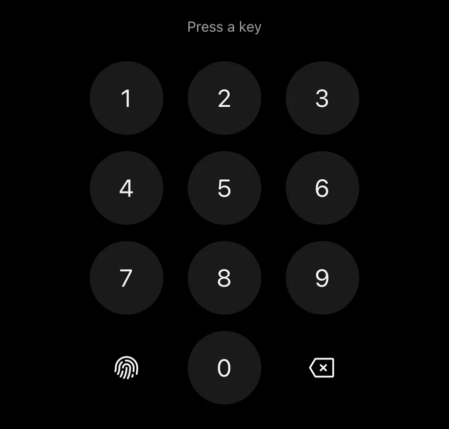
Set accessoryKey to decimal or biometric to fill the bottom-left slot; otherwise it stays empty. Change the decimal character with decimalSeparator and the biometric icon with biometricIcon.

Use deleteDisabled to turn off only the delete key, for example when the value is empty. KeypadKey is exported for custom layouts, along with the KeypadDigit, KeypadKeyValue and KeypadAccessoryKey types.

Examples

Decimal

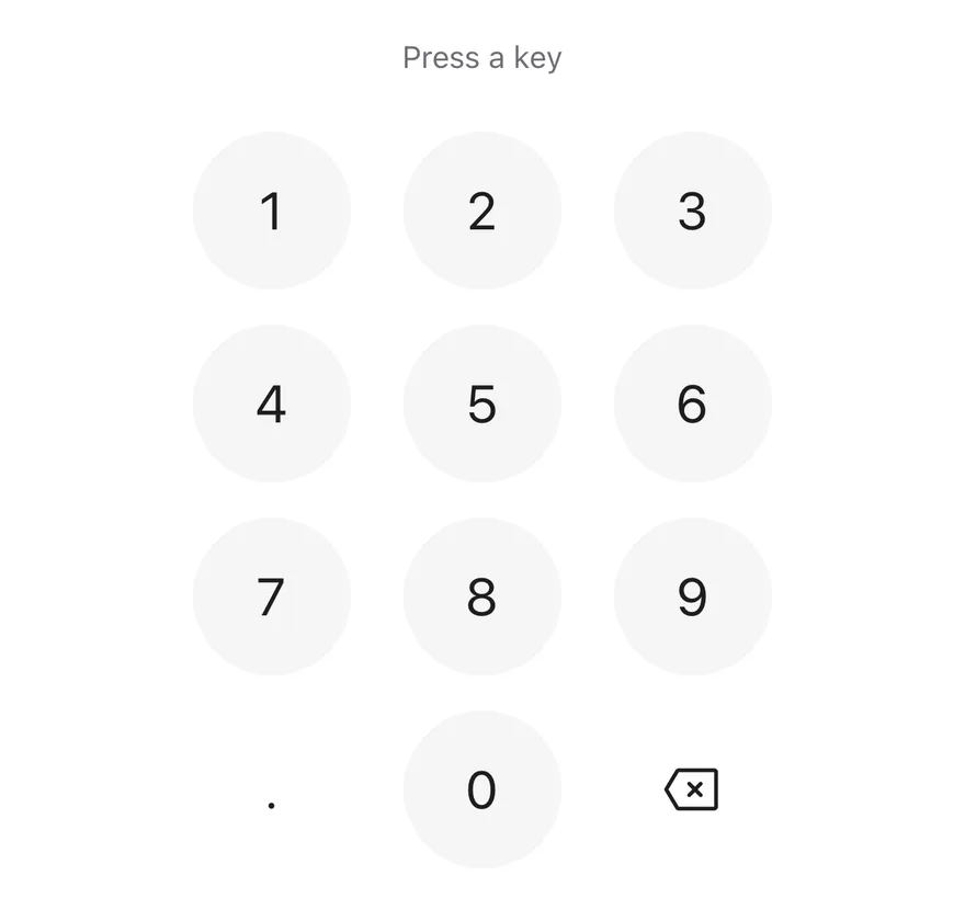
A keypad with a decimal separator key.
iOS
Keypad (decimal) on iOS in light modeKeypad (decimal) on iOS in dark mode
import * as React from "react"
import { View } from "react-native"
import { Keypad, type KeypadAccessoryKey, type KeypadKeyValue } from "@/components/ui/keypad"
import { Text } from "@/components/ui/text"

function KeyLog({
  accessoryKey,
  disabled,
}: {
  accessoryKey?: KeypadAccessoryKey
  disabled?: boolean
}) {
  const [last, setLast] = React.useState<KeypadKeyValue | null>(null)
  return (
    <View className="items-center gap-6">
      <Text
        role="status"
        accessibilityLiveRegion="polite"
        className="text-sm text-muted-foreground"
      >
        {last ? `Last key: ${last}` : "Press a key"}
      </Text>
      <Keypad
        accessoryKey={accessoryKey}
        disabled={disabled}
        onKeyPress={setLast}
      />
    </View>
  )
}

export function KeypadDecimalExample() {
  return (
    <KeyLog accessoryKey="decimal" />
  )
}
import EsuissUI
import SwiftUI

struct KeypadDecimalExample: View {
  var body: some View {
    KeypadLog(accessory: .decimal("."))
  }
}

struct KeypadLog: View {
  let accessory: KeypadAccessory

  @State private var last: KeypadKey?

  var body: some View {
    VStack(spacing: 24) {
      Group {
        if let last {
          Text(verbatim: "Last key: \(name(last))")
        } else {
          Text("Press a key")
        }
      }
      .textStyle(.sm)
      .foregroundStyle(EsuissColor.mutedForeground)
      .accessibilityAddTraits(.updatesFrequently)
      Keypad(accessory: accessory) { key in
        last = key
      }
    }
    .frame(maxWidth: .infinity)
  }

  func name(_ key: KeypadKey) -> String {
    switch key {
    case .digit(let value): "\(value)"
    case .decimal: "decimal"
    case .delete: "delete"
    case .biometric: "biometric"
    }
  }
}
import androidx.compose.foundation.layout.Arrangement
import androidx.compose.foundation.layout.Column
import androidx.compose.foundation.layout.fillMaxWidth
import androidx.compose.runtime.Composable
import androidx.compose.runtime.getValue
import androidx.compose.runtime.mutableStateOf
import androidx.compose.runtime.saveable.rememberSaveable
import androidx.compose.runtime.setValue
import androidx.compose.ui.Alignment
import androidx.compose.ui.Modifier
import androidx.compose.ui.semantics.LiveRegionMode
import androidx.compose.ui.semantics.liveRegion
import androidx.compose.ui.semantics.semantics
import androidx.compose.ui.unit.dp
import com.esuiss.ui.components.Keypad
import com.esuiss.ui.components.KeypadAccessory
import com.esuiss.ui.components.KeypadKey
import com.esuiss.ui.components.Text
import com.esuiss.ui.theme.EsuissTheme
import com.esuiss.ui.theme.Typography

@Composable
fun KeypadDecimalExample() {
    KeypadKeyLog(KeypadAccessory.Decimal())
}

fun keypadKeyName(key: KeypadKey): String = when (key) {
    is KeypadKey.Digit -> key.value.toString()
    KeypadKey.Decimal -> "decimal"
    KeypadKey.Biometric -> "biometric"
    KeypadKey.Delete -> "delete"
}

@Composable
fun KeypadKeyLog(accessory: KeypadAccessory, enabled: Boolean = true) {
    var last by rememberSaveable { mutableStateOf<String?>(null) }
    Column(
        modifier = Modifier.fillMaxWidth(),
        horizontalAlignment = Alignment.CenterHorizontally,
        verticalArrangement = Arrangement.spacedBy(24.dp),
    ) {
        Text(
            last?.let { "Last key: $it" } ?: "Press a key",
            modifier = Modifier.semantics { liveRegion = LiveRegionMode.Polite },
            style = Typography.sm,
            color = EsuissTheme.colors.mutedForeground,
        )
        Keypad(onKeyPress = { last = keypadKeyName(it) }, accessory = accessory, enabled = enabled)
    }
}

Biometric

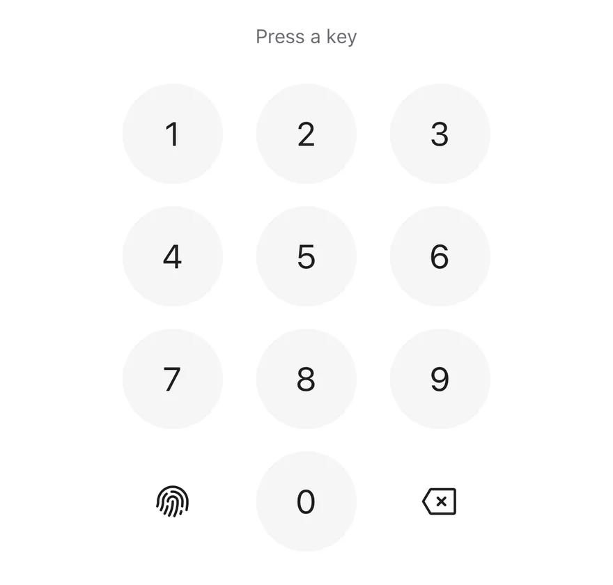
A keypad with a biometric key.
iOS
Keypad (biometric) on iOS in light modeKeypad (biometric) on iOS in dark mode
import * as React from "react"
import { View } from "react-native"
import { Keypad, type KeypadAccessoryKey, type KeypadKeyValue } from "@/components/ui/keypad"
import { Text } from "@/components/ui/text"

function KeyLog({
  accessoryKey,
  disabled,
}: {
  accessoryKey?: KeypadAccessoryKey
  disabled?: boolean
}) {
  const [last, setLast] = React.useState<KeypadKeyValue | null>(null)
  return (
    <View className="items-center gap-6">
      <Text
        role="status"
        accessibilityLiveRegion="polite"
        className="text-sm text-muted-foreground"
      >
        {last ? `Last key: ${last}` : "Press a key"}
      </Text>
      <Keypad
        accessoryKey={accessoryKey}
        disabled={disabled}
        onKeyPress={setLast}
      />
    </View>
  )
}

export function KeypadBiometricExample() {
  return (
    <KeyLog accessoryKey="biometric" />
  )
}
import EsuissUI
import PhosphorSwift
import SwiftUI

struct KeypadBiometricExample: View {
  var body: some View {
    KeypadLog(accessory: .biometric(Ph.fingerprint.regular))
  }
}

struct KeypadLog: View {
  let accessory: KeypadAccessory

  @State private var last: KeypadKey?

  var body: some View {
    VStack(spacing: 24) {
      Group {
        if let last {
          Text(verbatim: "Last key: \(name(last))")
        } else {
          Text("Press a key")
        }
      }
      .textStyle(.sm)
      .foregroundStyle(EsuissColor.mutedForeground)
      .accessibilityAddTraits(.updatesFrequently)
      Keypad(accessory: accessory) { key in
        last = key
      }
    }
    .frame(maxWidth: .infinity)
  }

  func name(_ key: KeypadKey) -> String {
    switch key {
    case .digit(let value): "\(value)"
    case .decimal: "decimal"
    case .delete: "delete"
    case .biometric: "biometric"
    }
  }
}
import androidx.compose.foundation.layout.Arrangement
import androidx.compose.foundation.layout.Column
import androidx.compose.foundation.layout.fillMaxWidth
import androidx.compose.runtime.Composable
import androidx.compose.runtime.getValue
import androidx.compose.runtime.mutableStateOf
import androidx.compose.runtime.saveable.rememberSaveable
import androidx.compose.runtime.setValue
import androidx.compose.ui.Alignment
import androidx.compose.ui.Modifier
import androidx.compose.ui.semantics.LiveRegionMode
import androidx.compose.ui.semantics.liveRegion
import androidx.compose.ui.semantics.semantics
import androidx.compose.ui.unit.dp
import com.esuiss.ui.components.Keypad
import com.esuiss.ui.components.KeypadAccessory
import com.esuiss.ui.components.KeypadKey
import com.esuiss.ui.components.Text
import com.esuiss.ui.theme.EsuissTheme
import com.esuiss.ui.theme.Typography

@Composable
fun KeypadBiometricExample() {
    KeypadKeyLog(KeypadAccessory.Biometric())
}

fun keypadKeyName(key: KeypadKey): String = when (key) {
    is KeypadKey.Digit -> key.value.toString()
    KeypadKey.Decimal -> "decimal"
    KeypadKey.Biometric -> "biometric"
    KeypadKey.Delete -> "delete"
}

@Composable
fun KeypadKeyLog(accessory: KeypadAccessory, enabled: Boolean = true) {
    var last by rememberSaveable { mutableStateOf<String?>(null) }
    Column(
        modifier = Modifier.fillMaxWidth(),
        horizontalAlignment = Alignment.CenterHorizontally,
        verticalArrangement = Arrangement.spacedBy(24.dp),
    ) {
        Text(
            last?.let { "Last key: $it" } ?: "Press a key",
            modifier = Modifier.semantics { liveRegion = LiveRegionMode.Polite },
            style = Typography.sm,
            color = EsuissTheme.colors.mutedForeground,
        )
        Keypad(onKeyPress = { last = keypadKeyName(it) }, accessory = accessory, enabled = enabled)
    }
}

Disabled

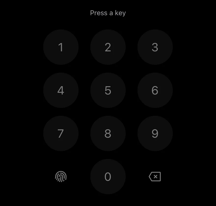
A fully disabled keypad.

iOS
Keypad (disabled) on iOS in light modeKeypad (disabled) on iOS in dark mode
import * as React from "react"
import { View } from "react-native"
import { Keypad, type KeypadAccessoryKey, type KeypadKeyValue } from "@/components/ui/keypad"
import { Text } from "@/components/ui/text"

function KeyLog({
  accessoryKey,
  disabled,
}: {
  accessoryKey?: KeypadAccessoryKey
  disabled?: boolean
}) {
  const [last, setLast] = React.useState<KeypadKeyValue | null>(null)
  return (
    <View className="items-center gap-6">
      <Text
        role="status"
        accessibilityLiveRegion="polite"
        className="text-sm text-muted-foreground"
      >
        {last ? `Last key: ${last}` : "Press a key"}
      </Text>
      <Keypad
        accessoryKey={accessoryKey}
        disabled={disabled}
        onKeyPress={setLast}
      />
    </View>
  )
}

export function KeypadDisabledExample() {
  return (
    <KeyLog accessoryKey="biometric" disabled />
  )
}
import EsuissUI
import PhosphorSwift
import SwiftUI

struct KeypadDisabledExample: View {
  var body: some View {
    KeypadLog(accessory: .biometric(Ph.fingerprint.regular))
      .disabled(true)
  }
}

struct KeypadLog: View {
  let accessory: KeypadAccessory

  @State private var last: KeypadKey?

  var body: some View {
    VStack(spacing: 24) {
      Group {
        if let last {
          Text(verbatim: "Last key: \(name(last))")
        } else {
          Text("Press a key")
        }
      }
      .textStyle(.sm)
      .foregroundStyle(EsuissColor.mutedForeground)
      .accessibilityAddTraits(.updatesFrequently)
      Keypad(accessory: accessory) { key in
        last = key
      }
    }
    .frame(maxWidth: .infinity)
  }

  func name(_ key: KeypadKey) -> String {
    switch key {
    case .digit(let value): "\(value)"
    case .decimal: "decimal"
    case .delete: "delete"
    case .biometric: "biometric"
    }
  }
}
import androidx.compose.foundation.layout.Arrangement
import androidx.compose.foundation.layout.Column
import androidx.compose.foundation.layout.fillMaxWidth
import androidx.compose.runtime.Composable
import androidx.compose.runtime.getValue
import androidx.compose.runtime.mutableStateOf
import androidx.compose.runtime.saveable.rememberSaveable
import androidx.compose.runtime.setValue
import androidx.compose.ui.Alignment
import androidx.compose.ui.Modifier
import androidx.compose.ui.semantics.LiveRegionMode
import androidx.compose.ui.semantics.liveRegion
import androidx.compose.ui.semantics.semantics
import androidx.compose.ui.unit.dp
import com.esuiss.ui.components.Keypad
import com.esuiss.ui.components.KeypadAccessory
import com.esuiss.ui.components.KeypadKey
import com.esuiss.ui.components.Text
import com.esuiss.ui.theme.EsuissTheme
import com.esuiss.ui.theme.Typography

@Composable
fun KeypadDisabledExample() {
    KeypadKeyLog(KeypadAccessory.Biometric(), enabled = false)
}

fun keypadKeyName(key: KeypadKey): String = when (key) {
    is KeypadKey.Digit -> key.value.toString()
    KeypadKey.Decimal -> "decimal"
    KeypadKey.Biometric -> "biometric"
    KeypadKey.Delete -> "delete"
}

@Composable
fun KeypadKeyLog(accessory: KeypadAccessory, enabled: Boolean = true) {
    var last by rememberSaveable { mutableStateOf<String?>(null) }
    Column(
        modifier = Modifier.fillMaxWidth(),
        horizontalAlignment = Alignment.CenterHorizontally,
        verticalArrangement = Arrangement.spacedBy(24.dp),
    ) {
        Text(
            last?.let { "Last key: $it" } ?: "Press a key",
            modifier = Modifier.semantics { liveRegion = LiveRegionMode.Polite },
            style = Typography.sm,
            color = EsuissTheme.colors.mutedForeground,
        )
        Keypad(onKeyPress = { last = keypadKeyName(it) }, accessory = accessory, enabled = enabled)
    }
}

API Reference

01

KeypadKey

A single round key that passes text and icon styles to its children.

PropTypeDefaultDescription
variant"default" | "plain""default"default with a filled background, or plain without one.
classNamestring-
childrenReact.ReactNode-

Also accepts the props of React.ComponentProps<typeof Pressable>.

02

Keypad

The full grid of keys.

PropTypeDefaultDescription
onKeyPress(key: KeypadKeyValue) => void-Called with the pressed key value.
accessoryKeyKeypadAccessoryKey-Bottom-left key: decimal or biometric.
decimalSeparatorstring"."Character shown on the decimal key. Defaults to ..
biometricIconPhosphorIconFingerprintIconPhosphor icon for the biometric key. Defaults to FingerprintIcon.
biometricLabelstring"Use biometrics"Accessibility label for the biometric key.
decimalLabelstring"Decimal separator"Accessibility label for the decimal key.
deleteLabelstring"Delete"Accessibility label for the delete key.
disabledbooleanfalseDisables every key.
deleteDisabledbooleanfalseDisables only the delete key.
keyClassNamestring-Extra classes applied to each key.

Also accepts the props of React.ComponentProps<typeof View>.

Accessibility

  • Every key has the button role and an accessibilityLabel: the digit itself, or decimalLabel, biometricLabel and deleteLabel for the other keys.
  • Disabled keys set disabled in their accessibility state and block presses.
  • Translate the default labels (Decimal separator, Use biometrics, Delete) for localized apps.

Notes

  • Filled keys use bg-secondary, opacity-80 when pressed and opacity-50 when disabled.
  • Digits use text-2xl with tabular numbers.
  • Light and dark colors follow the system appearance.
NextLabelPreviousKeyboard Scroll View

On this page

  1. 01Installation
    • Manual
  2. 02Usage
  3. 03Examples
    • Decimal
    • Biometric
    • Disabled
  4. 04API Reference
    • KeypadKey
    • Keypad
  5. 05Accessibility
  6. 06Notes