suiss/ui · Component
Select
A button that opens a list of options so people can pick one value.
Select is an open-source component from suiss/ui for React, React Native, SwiftUI and Jetpack Compose. The @esuiss/ui CLI copies its source into your project, so you own the code.
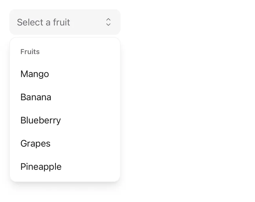
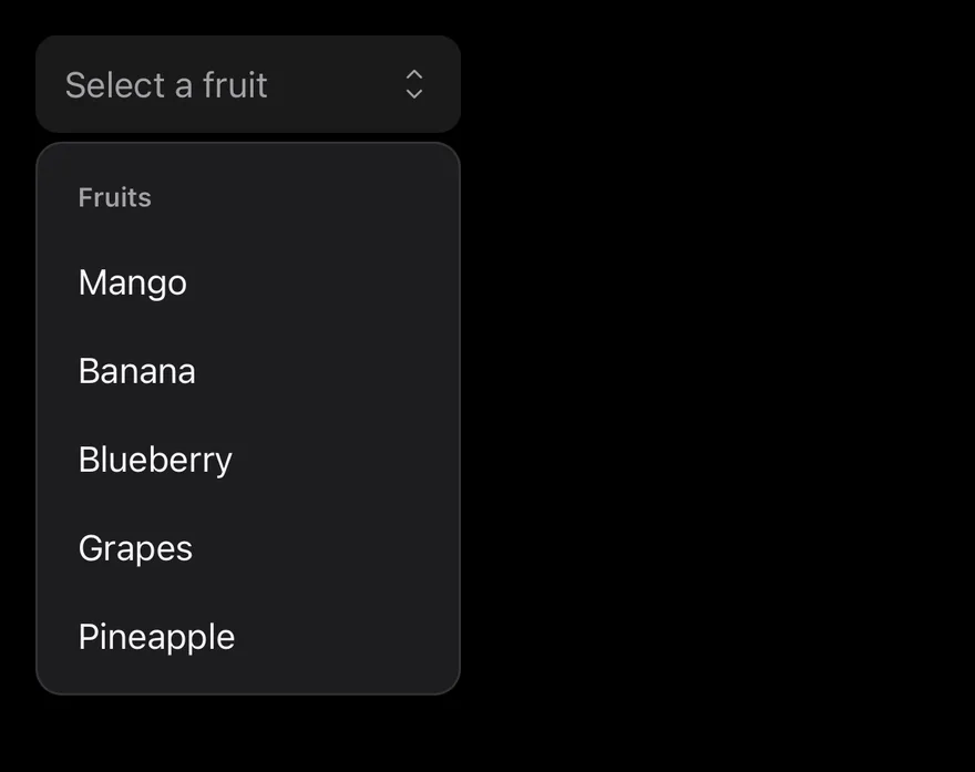
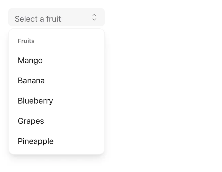
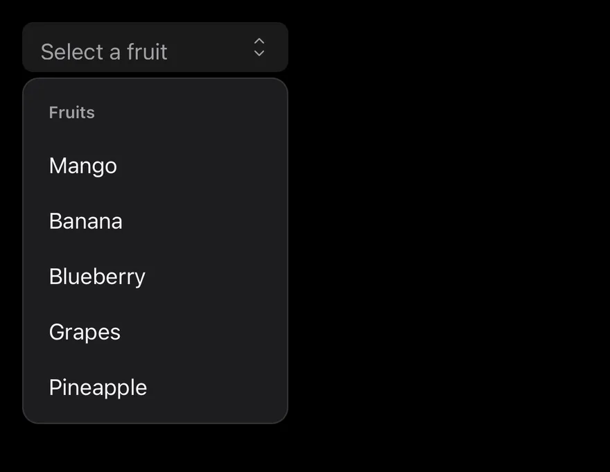
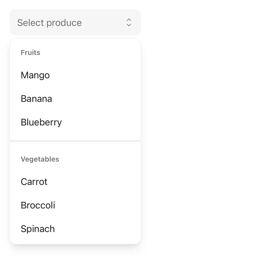
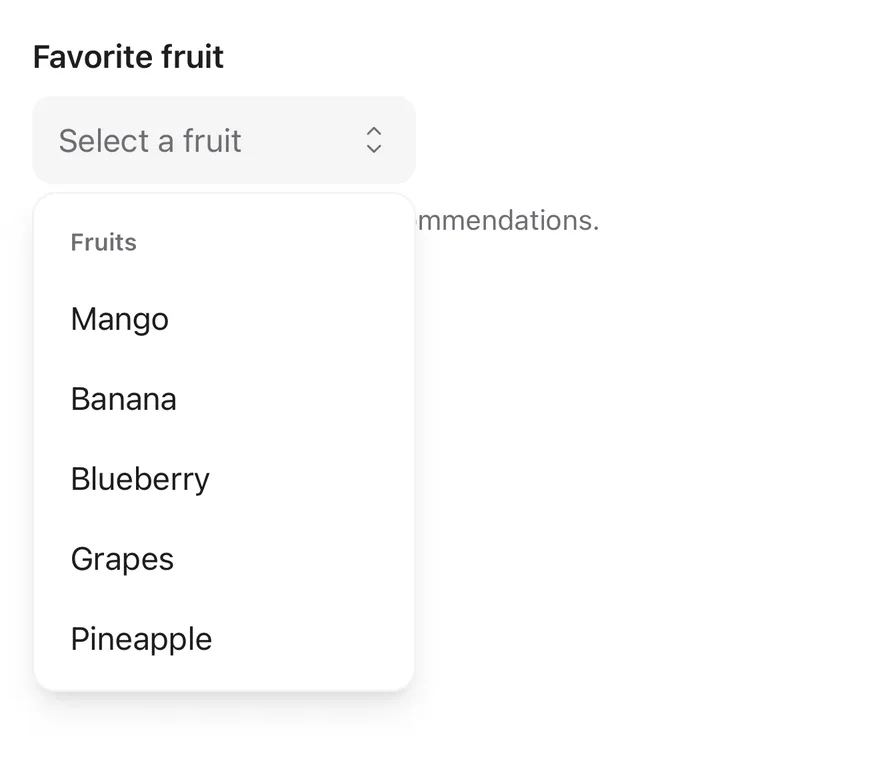
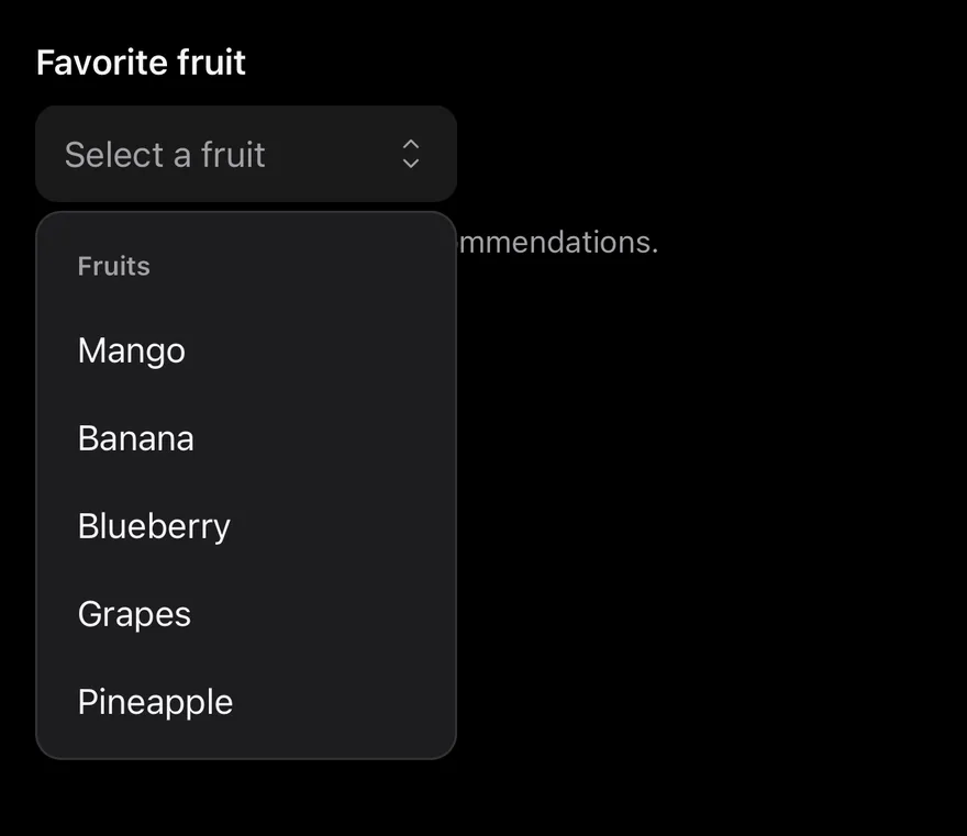
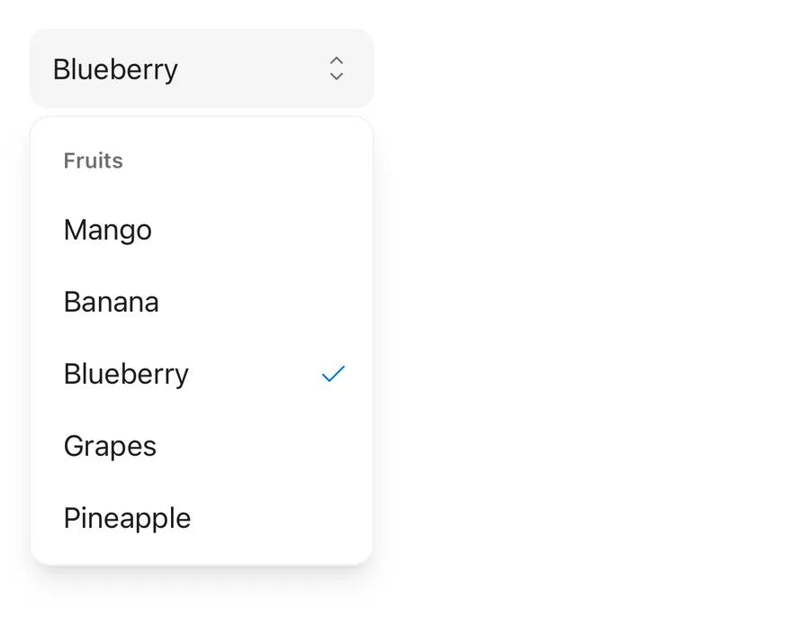
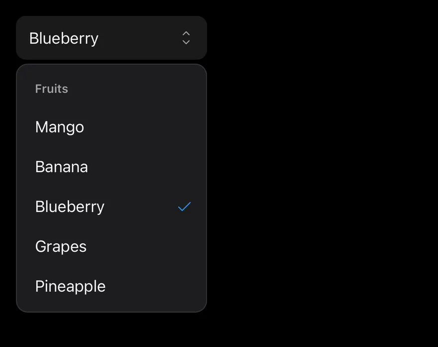
Select wraps the select primitive of the chosen base. SelectTrigger shows the current choice through SelectValue and a chevron icon; SelectContent renders the popup in a portal, positioned against the trigger, and holds SelectItem options. Use SelectGroup with a SelectLabel to title a set of options, and SelectSeparator to divide groups.
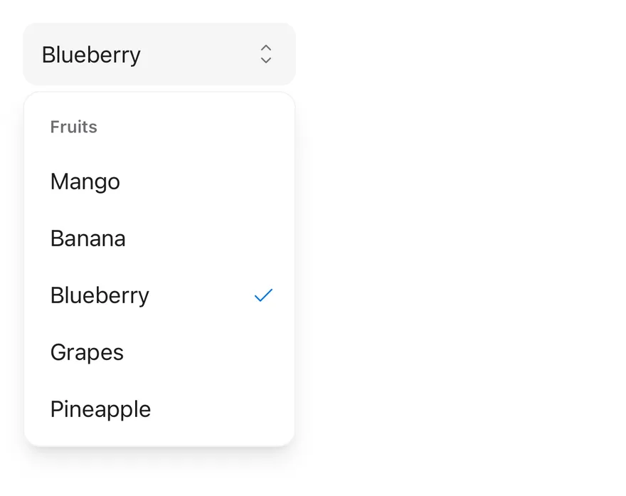
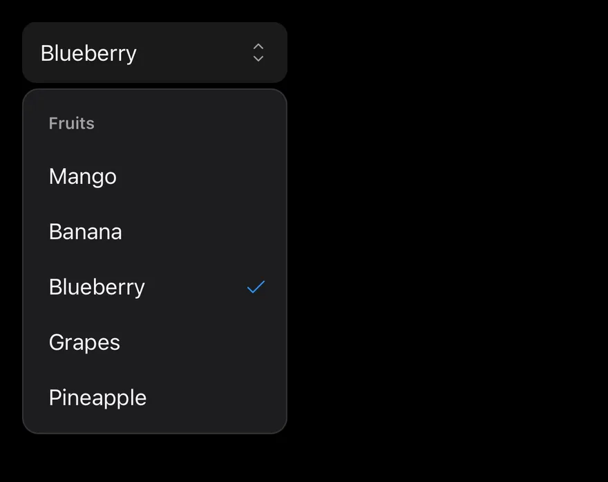
A highlight pill slides between options as the highlighted item changes, and the selected item shows a check mark. Use Select when people choose one value from a fixed list. For a few always-visible options, consider ToggleGroup or RadioGroup.
Installation
CLI
Works in any project with a components.json. See Installation for the one-line registry setup. Or use the suiss/ui CLI:
Manual
- Install the dependencies and add the
cnhelper:
- Copy the source into
components/ui/select.tsx:
- Update the import paths to match your project.
Usage
Pass items to Select as { value, label } pairs so SelectValue can show the label for the chosen value, even before the popup opens. Use defaultValue for an uncontrolled select, or value with onValueChange to control it. SelectValue shows its placeholder until a value is chosen.
SelectContent opens below the trigger by default. It accepts the positioner props side, sideOffset, align, alignOffset and alignItemWithTrigger.
Examples
Open
Renders the popup open on mount with a value already selected.
With value
Starts with a default value, so the trigger shows its label.
Small
Uses the compact sm trigger size.
Grouped
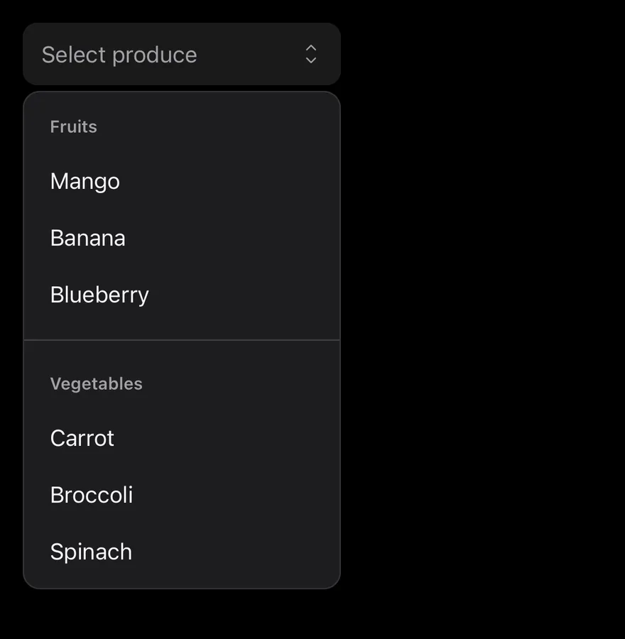
Splits options into labelled groups with a separator between them.
With icons
Places an icon before each option's label.
Disabled
Disables the select so it can't be opened.
Invalid
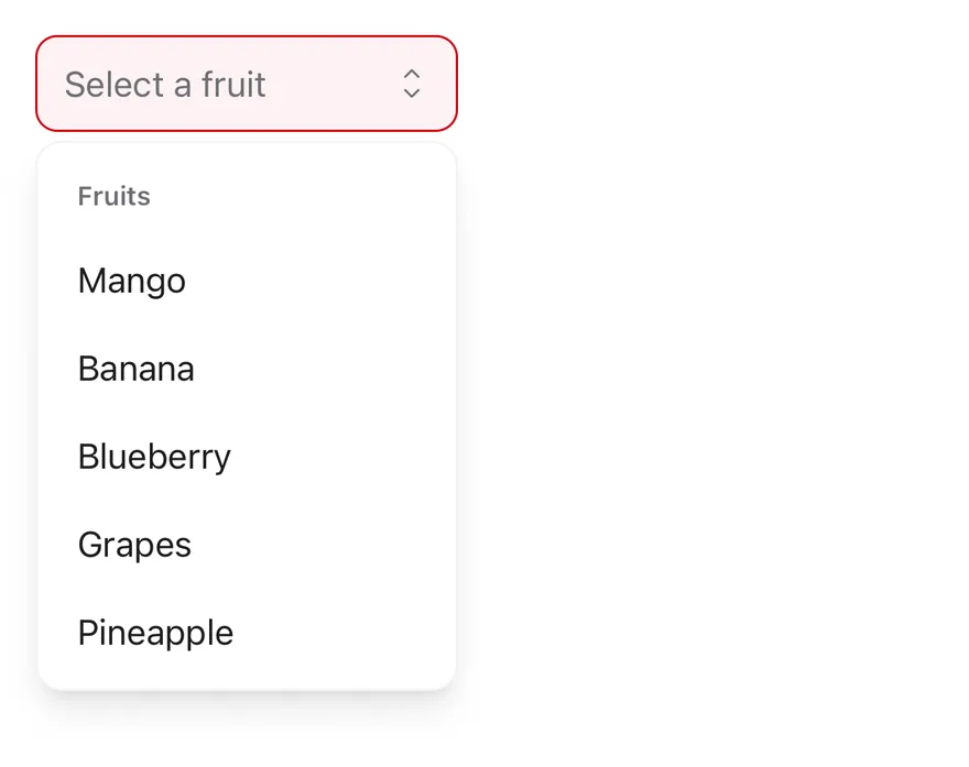
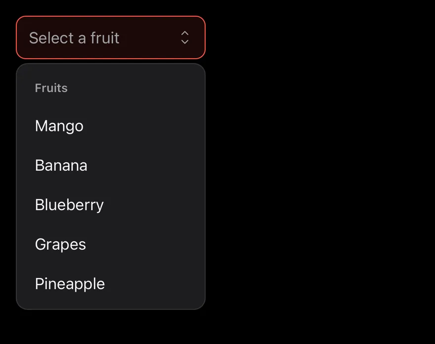
Marks the trigger with aria-invalid to show an error state.
API Reference
Select
The root that holds the selected value and the open state.
Also accepts the props of the primitive part it wraps.
SelectGroup
Groups related options; label it with a SelectLabel.
Also accepts the props of the primitive part it wraps.
SelectValue
Shows the selected option's label, or the placeholder, inside the trigger.
Also accepts the props of the primitive part it wraps.
SelectTrigger
The button that opens the popup and displays the current value.
| Prop | Type | Default | Description |
|---|---|---|---|
size | "sm" | "default" | "default" | Sets the trigger height: default is 44px tall, sm is 36px with smaller corners. |
Also accepts the props of the primitive part it wraps.
SelectContent
The positioned popup that holds the option list and scroll arrows.
Also accepts the props of the primitive parts it wraps.
SelectLabel
A heading that names a SelectGroup.
Also accepts the props of the primitive part it wraps.
SelectItem
A selectable option, with a check mark when selected.
Also accepts the props of the primitive part it wraps.
SelectSeparator
A thin line that divides groups of options.
Also accepts the props of the primitive part it wraps.
SelectScrollUpButton
An arrow that scrolls the list up when it overflows; rendered by SelectContent.
Also accepts the props of React.ComponentProps<typeof SelectPrimitive.ScrollUpArrow>.
SelectScrollDownButton
An arrow that scrolls the list down when it overflows; rendered by SelectContent.
Also accepts the props of React.ComponentProps<typeof SelectPrimitive.ScrollDownArrow>.
Accessibility
- The trigger has the
comboboxrole and the popup list has thelistboxrole; each item is anoptionwitharia-selectedon the chosen one. - Give the trigger an accessible name, such as
aria-labelor an associated label. - When the popup opens, focus moves to the selected option. Arrow keys move between options and
Enterselects. Escapecloses the popup without changing the value, and focus returns to the trigger.- A
SelectGroupwith aSelectLabelis exposed as a namedgroup.
Notes
- Parts carry
data-slotattributes such asselect-trigger,select-content,select-itemandselect-highlight. - The trigger sets
data-size, and stylesdata-placeholder,aria-invalidanddisabledstates. Invalid triggers use thedestructivecolor. - The popup uses
bg-popover, the highlight usesbg-accent text-accent-foreground, and the check mark usestext-primary. - The highlight animation is turned off when reduced motion is preferred.
Select is built on the select primitive. SelectTrigger is a pressable field with the combobox role and an up-down caret. SelectContent renders in a portal, positioned next to the trigger, and fades in and out with Reanimated. The list matches the trigger width.
The trigger comes in two sizes, default and sm. Use Select for picking one value from a short list; for a list that needs searching, use Combobox.