suiss/ui
  • Docs
  • Components
  • Patterns
  • Interactions
  • Charts
  • Blocks
GitHubGet started
DocsComponentsPatternsInteractionsChartsBlocks
Components82
  • Overview
  • Accordion
  • Alert
  • Alert Dialog
  • Alert Sheet
  • Amount Input
  • Aspect Ratio
  • Attachment
  • Avatar
  • Badge
  • Bottom Bar
  • Breadcrumb
  • Bubble
  • Button
  • Button Group
  • Calendar
  • Card
  • Carousel
  • Chart
  • Checkbox
  • Chip
  • Collapsible
  • Combobox
  • Command
  • Context Menu
  • Dialog
  • Direction
  • Drawer
  • Dropdown Menu
  • Empty
  • FAB
  • Field
  • Fullscreen Menu
  • Haptics
  • Header
  • Hover Card
  • Icon
  • Input
  • Input Accessory Bar
  • Input Group
  • Input OTP
  • Item
  • Kbd
  • Keyboard Scroll View
  • Keypad
  • Label
  • Marker
  • Menubar
  • Message
  • Message Scroller
  • Native Select
  • Navigation Menu
  • Page Indicator
  • Pagination
  • Pin Pad
  • Popover
  • Progress
  • QR Scanner
  • Questionnaire
  • Radio Group
  • Resizable
  • Screen
  • Scroll Area
  • Select
  • Separator
  • Sheet
  • Sidebar
  • Signature Pad
  • Skeleton
  • Slider
  • Spinner
  • Switch
  • Tab Bar
  • Table
  • Tabs
  • Text
  • Textarea
  • Toast
  • Toggle
  • Toggle Group
  • Tooltip
  • Wheel Picker
  • Widget

suiss/ui · Component

Popover

A floating panel anchored to a trigger, for supplementary content and lightweight controls.

Popover is an open-source component from suiss/ui for React, React Native, SwiftUI and Jetpack Compose. The @esuiss/ui CLI copies its source into your project, so you own the code.

import { Button } from "@/components/ui/button"
import { Input } from "@/components/ui/input"
import { Label } from "@/components/ui/label"
import {
  Popover,
  PopoverContent,
  PopoverDescription,
  PopoverHeader,
  PopoverTitle,
  PopoverTrigger,
} from "@/components/ui/popover"

export default function PopoverDemo() {
  return (
    <Popover>
      <PopoverTrigger render={<Button variant="outline" />}>
        Open popover
      </PopoverTrigger>
      <PopoverContent>
        <PopoverHeader>
          <PopoverTitle>Dimensions</PopoverTitle>
          <PopoverDescription>
            Set the dimensions for the layer.
          </PopoverDescription>
        </PopoverHeader>
        <div className="grid gap-3">
          <div className="grid grid-cols-3 items-center gap-3">
            <Label htmlFor="popover-width">Width</Label>
            <Input
              id="popover-width"
              defaultValue="100%"
              className="col-span-2"
            />
          </div>
          <div className="grid grid-cols-3 items-center gap-3">
            <Label htmlFor="popover-height">Height</Label>
            <Input
              id="popover-height"
              defaultValue="25px"
              className="col-span-2"
            />
          </div>
        </div>
      </PopoverContent>
    </Popover>
  )
}

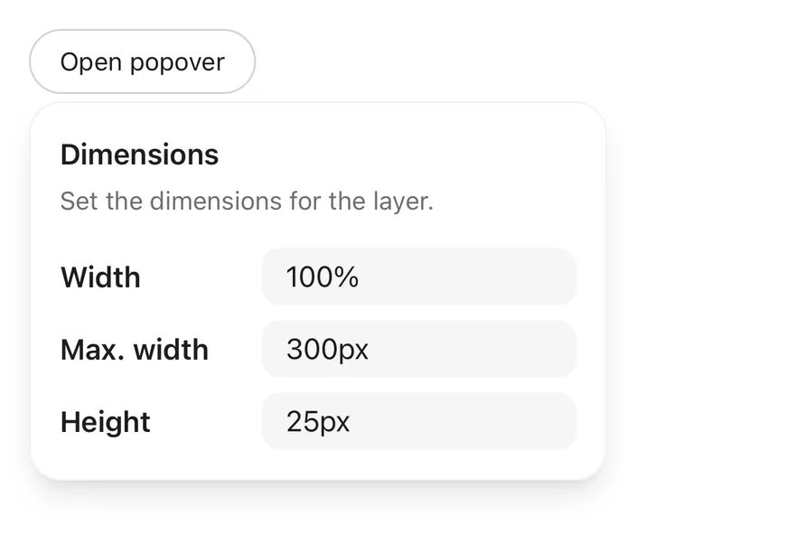
Popover wraps the popover primitive of the chosen base. Popover is the root that holds the open state, PopoverTrigger toggles it, and PopoverContent renders the positioned panel in a portal. Inside the content, PopoverHeader groups a PopoverTitle and PopoverDescription above any other content, such as form fields.

Use a popover for interactive content that relates to its trigger. Use Tooltip for short, non-interactive hints, and Dialog when the task needs the user's full attention.

Installation

CLI

$ pnpm dlx shadcn@latest add @esuiss/popover

Works in any project with a components.json. See Installation for the one-line registry setup. Or use the suiss/ui CLI:

$ pnpm dlx @esuiss/ui@latest add popover

Manual

  1. Install the dependencies and add the cn helper:
$ pnpm add @base-ui/react
  1. Copy the source into components/ui/popover.tsx:
  1. Update the import paths to match your project.

Usage

import { Popover, PopoverTrigger, PopoverContent, PopoverHeader, PopoverTitle, PopoverDescription } 
<


<


<


The popover is uncontrolled by default; use defaultOpen, or the open state with onOpenChange to control it. PopoverContent accepts the positioning props side, sideOffset, align and alignOffset, defaulting to bottom, 4, center and 0.

Use the trigger's render prop to render it as another component, such as a Button.

Set asChild on PopoverTrigger to render another component, such as a Button, as the trigger.

The Button placed first inside Popover opens it, and isOpen controls the open state.

Examples

Sides

Four popovers that open on the top, right, bottom and left of their triggers.

Simple

A plain text popover opened from a ghost button, without a header.

API Reference

Anatomy6 parts
<Popover>
<PopoverTrigger />
<PopoverContent>
<PopoverHeader>
<PopoverTitle />
<PopoverDescription />
</PopoverHeader>
</PopoverContent
01

Popover

The root that manages the popover's open state.

Also accepts the props of the primitive part it wraps.

02

PopoverTrigger

The button that opens and closes the popover.

Also accepts the props of the primitive part it wraps.

03

PopoverContent

The positioned panel that renders in a portal.

Also accepts the props of the primitive parts it wraps.

04

PopoverHeader

Groups the title and description at the top of the panel.

Also accepts the props of React.ComponentProps<"div">.

05

PopoverTitle

The heading that names the popover.

Also accepts the props of the primitive part it wraps.

06

PopoverDescription

Secondary text that describes the popover.

Also accepts the props of the primitive part it wraps.

Accessibility

  • The panel has the dialog role. PopoverTitle provides its accessible name and PopoverDescription its accessible description.
  • The trigger exposes aria-expanded.
  • Escape closes the popover and returns focus to the trigger.
  • Clicking outside the panel, or clicking the trigger again, closes it.

Notes

  • Styling hooks: data-slot values popover, popover-trigger, popover-content, popover-header, popover-title and popover-description.
  • The panel is w-72 by default; override it with className.
  • The panel animates in from the side it opens on.
  • Uses the popover, popover-foreground and muted-foreground tokens.

Popover positions a panel next to its PopoverTrigger. PopoverContent renders in a portal, is placed on any side with an align and offsets, and animates in with a short fade, scale and slide using Reanimated. On iOS the content is wrapped in a FullWindowOverlay from react-native-screens, so it draws above native modals.

Use PopoverHeader, PopoverTitle and PopoverDescription to label the panel. For short hints, use Tooltip instead.

Installation

$ pnpm dlx shadcn@latest add @esuiss-rn/popover

See Installation for the components.json setup. Or use the suiss/ui CLI:

$ pnpm dlx @esuiss/ui@latest add popover
$ pnpm dlx @esuiss/ui@latest add popover --platform swift
NextProgressPreviousPin Pad

On this page

  1. 01Installation
    • CLI
    • Manual
  2. 02Usage
  3. 03Examples
    • Sides
    • Simple
  4. 04API Reference
    • Popover
    • PopoverTrigger
    • PopoverContent
    • PopoverHeader
    • PopoverTitle
    • PopoverDescription
  5. 05Accessibility
  6. 06Notes
  7. 07Installation
    • Manual
  8. 08Usage
  9. 09Examples
    • Default
    • Sides
    • Simple
    • Detached triggers
  10. 10API Reference
    • Popover
    • PopoverContent
    • PopoverHeader
    • PopoverTitle
    • PopoverDescription
  11. 11Accessibility
  12. 12Notes
from
"@/components/ui/popover"
Popover
>
<PopoverTrigger render={<Button variant="outline" />}>
Open popover
</PopoverTrigger>
<PopoverContent>
<PopoverHeader>
<PopoverTitle>Dimensions</PopoverTitle>
<PopoverDescription>
Set the dimensions for the layer.
</PopoverDescription>
</PopoverHeader>
<div className="grid gap-3">
<div className="grid grid-cols-3 items-center gap-3">
<Label htmlFor="popover-width">Width</Label>
<Input
id="popover-width"
defaultValue="100%"
className="col-span-2"
/>
</div>
<div className="grid grid-cols-3 items-center gap-3">
<Label htmlFor="popover-height">Height</Label>
<Input
id="popover-height"
defaultValue="25px"
className="col-span-2"
/>
</div>
</div>
</PopoverContent>
</Popover>
Popover
>
<PopoverTrigger asChild>
<Button variant="outline">Open popover</Button>
</PopoverTrigger>
<PopoverContent>
<PopoverHeader>
<PopoverTitle>Dimensions</PopoverTitle>
<PopoverDescription>
Set the dimensions for the layer.
</PopoverDescription>
</PopoverHeader>
<div className="grid gap-3">
<div className="grid grid-cols-3 items-center gap-3">
<Label htmlFor="popover-width">Width</Label>
<Input
id="popover-width"
defaultValue="100%"
className="col-span-2"
/>
</div>
<div className="grid grid-cols-3 items-center gap-3">
<Label htmlFor="popover-height">Height</Label>
<Input
id="popover-height"
defaultValue="25px"
className="col-span-2"
/>
</div>
</div>
</PopoverContent>
</Popover>
Popover
>
<Button variant="outline">Open popover</Button>
<PopoverContent>
<PopoverHeader>
<PopoverTitle>Dimensions</PopoverTitle>
<PopoverDescription>
Set the dimensions for the layer.
</PopoverDescription>
</PopoverHeader>
<div className="grid gap-3">
<div className="grid grid-cols-3 items-center gap-3">
<Label htmlFor="popover-width">Width</Label>
<Input
id="popover-width"
defaultValue="100%"
className="col-span-2"
/>
</div>
<div className="grid grid-cols-3 items-center gap-3">
<Label htmlFor="popover-height">Height</Label>
<Input
id="popover-height"
defaultValue="25px"
className="col-span-2"
/>
</div>
</div>
</PopoverContent>
</Popover>
>
</Popover>
$ pnpm dlx @esuiss/ui@latest add popover --platform kotlin

The CLI also adds what it builds on: Text. On React Native it also adds the animated view components/ui/animated-view.tsx.

Manual

  1. Install the dependencies:
npx expo install cn react-native-reanimated react-native-screens react-native-worklets
  1. Add the pieces it builds on: Text, and the primitives components/primitives/popover.tsx, components/primitives/types.tsx, components/primitives/use-render.tsx, and the animated view components/ui/animated-view.tsx from the next step.

  2. Copy the animated view into components/ui/animated-view.tsx:

uniwind/components/ui/animated-view.tsx
import { Pressable } from "react-native"
import Animated from "react-native-reanimated"

const AnimatedPressable = Animated.createAnimatedComponent(Pressable)

type AnimatedViewProps =
  | (React.ComponentProps<typeof Animated.View> &
      React.RefAttributes<React.ComponentRef<typeof Animated.View>> & {
        as?: "View"
      })
  | (React.ComponentProps<typeof AnimatedPressable> &
      React.RefAttributes<React.ComponentRef<typeof AnimatedPressable>> & {
        as: "Pressable"
      })

function AnimatedView(props: AnimatedViewProps) {
  1. Copy the source into components/ui/popover.tsx:
uniwind/components/ui/popover.tsx
import { cn } from "cn"
import * as React from "react"
import { Platform, View, type ViewProps } from "react-native"
import { Keyframe, ReduceMotion } from "react-native-reanimated"
import { FullWindowOverlay as RNFullWindowOverlay } from "react-native-screens"
import * as PopoverPrimitive from "@/components/primitives/popover"
import type { Side } from "@/components/primitives/types"
import { resolveClassName } from "@/components/primitives/use-render"
import { AnimatedView } from "@/components/ui/animated-view"
import { TextClassContext } from "@/components/ui/text"

const Popover = PopoverPrimitive.Root

const PopoverTrigger = PopoverPrimitive.Trigger

const FullWindowOverlay =
  1. Update the import paths to match your project.
  1. Install the dependencies:
npx expo install cn react-native-reanimated react-native-screens react-native-worklets
  1. Add the pieces it builds on: Text, and the primitives components/primitives/popover.tsx, components/primitives/types.tsx, components/primitives/use-render.tsx, and the animated view components/ui/animated-view.tsx from the next step.

  2. Copy the animated view into components/ui/animated-view.tsx:

  1. Copy the source into components/ui/popover.tsx:
  1. Update the import paths to match your project.
  1. Install the dependencies:
npx expo install react-native-reanimated react-native-screens react-native-worklets
  1. Add the pieces it builds on: Text, and the primitives components/primitives/popover.tsx, components/primitives/types.tsx, components/primitives/use-render.tsx, and the animated view components/ui/animated-view.tsx from the next step.

  2. Copy the animated view into components/ui/animated-view.tsx:

  1. Copy the source into components/ui/popover.tsx:
  1. Update the import paths to match your project.
  1. Target iOS 17 or later.

  2. Add the Swift package to your app:

Package.swift
.package(url: "https://github.com/phosphor-icons/swift", from: "2.1.0")
  1. Copy the theme files every view uses:
swift/Theme/Theme.swift
import SwiftUI
import UIKit

struct RGBA: Sendable {
  let red: CGFloat
  let green: CGFloat
  let blue: CGFloat
  let alpha: CGFloat

  init(_ hex: UInt32, _ alpha: CGFloat = 1) {
    red = CGFloat((hex >> 16) & 0xFF) / 255
    green = CGFloat((hex >> 8) & 0xFF) / 255
    blue = CGFloat(hex & 0xFF) / 255
    self.alpha = alpha
  }
swift/Theme/Tokens.swift
import SwiftUI

public enum EsuissColor {
  public static let background = Color.adaptive(light: .init(0xFFFFFF), dark: .init(0x000000))
  public static let foreground = Color.adaptive(light: .init(0x1D1D1F), dark: .init(0xF5F5F7))
  public static let card = Color.adaptive(light: .init(0xFFFFFF), dark: .init(0x1D1D1F))
  public static let cardForeground = Color.adaptive(light: .init(0x1D1D1F), dark: .init(0xF5F5F7))
  public static let popover = Color.adaptive(light: .init(0xFFFFFF), dark: .init(0x1D1D1F))
  public static let popoverForeground = Color.adaptive(light: .init(0x1D1D1F), dark: .init(0xF5F5F7))
  public static let primary = Color.adaptive(light: .init(0x0071E3), dark: .init(0x2997FF))
  public static let primaryForeground = Color.adaptive(light: .init(0xFFFFFF), dark: .init(0xFFFFFF))
  public static let secondary = Color.adaptive(light: .init(0x000000, 0.04), dark: .init(0xFFFFFF, 0.1))
  public static let secondaryForeground = Color.adaptive(light: .init(0x1D1D1F), dark: .init(0xF5F5F7))
  public static let muted = Color.adaptive(light: .init(0xF5F5F7), dark: .init(0x161617))
  public static let mutedForeground = Color.adaptive(light: .init(0x6E6E73), dark: .init(0xA1A1A6))
  public static let accent = Color.adaptive(light: .init(0x000000, 0.06), dark: .init(0xFFFFFF, 0.1))
  1. Copy the source and every file it uses:
swift/Components/Popover.swift
import SwiftUI
import UIKit

public struct PopoverContent<Content: View>: View {
  let width: CGFloat?
  let content: Content

  public init(width: CGFloat? = 288, @ViewBuilder content: () -> Content) {
    self.width = width
    self.content = content()
  }

  public var body: some View {
    VStack(alignment: .leading, spacing: 16) {
      content
    }
swift/Components/Button.swift
import SwiftUI

public struct VariantButtonStyle: ButtonStyle {
  public enum Variant: CaseIterable, Sendable {
    case `default`, outline, secondary, tinted, ghost, plain, destructive, link
  }

  public enum Size: CaseIterable, Sendable {
    case `default`, xs, sm, lg, xl, icon, iconXs, iconSm, iconLg, iconXl

    var height: CGFloat {
      switch self {
      case .xs, .iconXs: 24
      case .sm, .iconSm: 32
      case .default, .icon: 36
      case .lg, .iconLg: 44
swift/Components/ButtonGroup.swift
import SwiftUI

extension EnvironmentValues {
  @Entry var buttonGroup: Axis? = nil
  @Entry var buttonGroupSize: CGSize = .zero
}

enum ButtonGroupSpace: Hashable {
  case group
}

struct ButtonGroupFrame {
  let bounds: Anchor<CGRect>
  let outlined: Bool
}
swift/Components/Dialog.swift
import SwiftUI

extension View {
  public func dialog<Content: View>(
    isPresented: Binding<Bool>,
    @ViewBuilder content: @escaping () -> Content
  ) -> some View {
    modifier(
      CoverPresenter(isPresented: isPresented) { visible in
        CenteredStage(visible: visible, dismissible: true, content: content)
      }
    )
  }
}

struct CenteredStage<Content: View>: View {
swift/Components/Overlay.swift
import PhosphorSwift
import Observation
import SwiftUI

public enum PopupAlignment: Sendable, CaseIterable {
  case start, center, end
}

struct OverlayDismiss: Sendable {
  let action: @MainActor @Sendable () -> Void

  @MainActor func callAsFunction() {
    action()
  }
}
swift/Components/TextVariant.swift
import SwiftUI

public enum TextVariant: CaseIterable, Sendable {
  case `default`, h1, h2, h3, h4, p, blockquote, code, lead, large, small, muted

  var style: TextStyle {
    switch self {
    case .h1: .xl3
    case .h2: .xl2
    case .h3: .xl
    case .h4, .lead, .large: .lg
    case .code, .small, .muted: .sm
    default: .base
    }
  }
  1. Add the files to your app target.
  1. Set minSdk to 24 or higher and add the dependencies:
build.gradle.kts
implementation(platform("androidx.compose:compose-bom:2026.09.00"))
implementation("androidx.compose.foundation:foundation")
implementation("androidx.compose.ui:ui")
implementation("com.adamglin:phosphor-icon-android:1.0.0")
  1. Copy the theme files every view uses:
kotlin/theme/Theme.kt
package com.esuiss.ui.theme

import androidx.compose.foundation.isSystemInDarkTheme
import androidx.compose.runtime.Composable
import androidx.compose.runtime.CompositionLocalProvider
import androidx.compose.runtime.Immutable
import androidx.compose.runtime.staticCompositionLocalOf
import androidx.compose.ui.Modifier
import androidx.compose.ui.draw.dropShadow
import androidx.compose.ui.graphics.Color
import androidx.compose.ui.graphics.Shape
import androidx.compose.ui.graphics.shadow.Shadow as DropShadow
import androidx.compose.ui.text.TextStyle
import androidx.compose.ui.text.style.LineHeightStyle
import androidx.compose.ui.unit.Dp
import androidx.compose.ui.unit.DpOffset
kotlin/theme/Tokens.kt
package com.esuiss.ui.theme

import androidx.compose.runtime.Immutable
import androidx.compose.ui.graphics.Color
import androidx.compose.ui.unit.dp

@Immutable
data class Colors(
    val background: Color,
    val foreground: Color,
    val card: Color,
    val cardForeground: Color,
    val popover: Color,
    val popoverForeground: Color,
    val primary: Color,
    val primaryForeground: Color,
  1. Copy the source and every file it uses:
kotlin/components/Popover.kt
package com.esuiss.ui.components

import androidx.compose.foundation.layout.Arrangement
import androidx.compose.foundation.layout.Box
import androidx.compose.foundation.layout.Column
import androidx.compose.foundation.layout.ColumnScope
import androidx.compose.foundation.layout.fillMaxWidth
import androidx.compose.foundation.layout.padding
import androidx.compose.foundation.layout.width
import androidx.compose.foundation.shape.RoundedCornerShape
import androidx.compose.foundation.text.BasicText
import androidx.compose.runtime.Composable
import androidx.compose.runtime.CompositionLocalProvider
import androidx.compose.runtime.remember
import androidx.compose.ui.Modifier
import androidx.compose.ui.semantics.paneTitle
kotlin/components/Button.kt
package com.esuiss.ui.components

import androidx.compose.foundation.background
import androidx.compose.foundation.border
import androidx.compose.foundation.clickable
import androidx.compose.foundation.interaction.MutableInteractionSource
import androidx.compose.foundation.interaction.collectIsPressedAsState
import androidx.compose.foundation.layout.Arrangement
import androidx.compose.foundation.layout.Row
import androidx.compose.foundation.layout.RowScope
import androidx.compose.foundation.layout.fillMaxWidth
import androidx.compose.foundation.layout.height
import androidx.compose.foundation.layout.padding
import androidx.compose.foundation.layout.size
import androidx.compose.foundation.shape.CircleShape
import androidx.compose.foundation.shape.RoundedCornerShape
kotlin/components/ButtonGroup.kt
package com.esuiss.ui.components

import androidx.compose.foundation.background
import androidx.compose.foundation.gestures.Orientation
import androidx.compose.foundation.layout.Arrangement
import androidx.compose.foundation.layout.Box
import androidx.compose.foundation.layout.Row
import androidx.compose.foundation.layout.RowScope
import androidx.compose.foundation.layout.padding
import androidx.compose.foundation.shape.CircleShape
import androidx.compose.foundation.shape.CornerSize
import androidx.compose.foundation.shape.RoundedCornerShape
import androidx.compose.runtime.Composable
import androidx.compose.runtime.CompositionLocalProvider
import androidx.compose.runtime.DisposableEffect
import androidx.compose.runtime.Immutable
kotlin/components/Content.kt
package com.esuiss.ui.components

import androidx.compose.runtime.compositionLocalOf
import androidx.compose.ui.graphics.Color
import androidx.compose.ui.text.TextStyle
import androidx.compose.ui.unit.Dp
import androidx.compose.ui.unit.dp

val LocalContentStyle = compositionLocalOf { TextStyle.Default }

val LocalContentColor = compositionLocalOf { Color.Unspecified }

val LocalIconSize = compositionLocalOf { 20.dp }
kotlin/components/Icon.kt
package com.esuiss.ui.components

import androidx.compose.foundation.Image
import androidx.compose.foundation.layout.size
import androidx.compose.runtime.Composable
import androidx.compose.ui.Modifier
import androidx.compose.ui.graphics.Color
import androidx.compose.ui.graphics.ColorFilter
import androidx.compose.ui.graphics.takeOrElse
import androidx.compose.ui.graphics.vector.ImageVector
import androidx.compose.ui.unit.Dp
import com.esuiss.ui.theme.EsuissTheme

@Composable
fun Icon(
    imageVector: ImageVector,
kotlin/components/Overlay.kt
package com.esuiss.ui.components

import android.os.Build
import android.view.Window
import android.view.WindowManager
import androidx.compose.animation.AnimatedVisibility
import androidx.compose.animation.AnimatedVisibilityScope
import androidx.compose.animation.EnterExitState
import androidx.compose.animation.core.MutableTransitionState
import androidx.compose.animation.core.animateFloat
import androidx.compose.animation.core.tween
import androidx.compose.animation.fadeIn
import androidx.compose.animation.fadeOut
import androidx.compose.animation.scaleIn
import androidx.compose.animation.scaleOut
import androidx.compose.animation.slideIn
  1. Update the com.esuiss.ui package names to match your project.

Usage

import { PopoverContent, PopoverHeader, PopoverTitle, PopoverDescription } from "@/components/ui/popover"
<View className="items-start">
  <Popover defaultOpen>
    <PopoverTrigger render={<Button variant="outline" />}>
      <Text>Open popover</Text>
    </PopoverTrigger>
    <PopoverContent align="start" className="w-80">
      <View className="gap-4">
        <PopoverHeader>
          <PopoverTitle>Dimensions</PopoverTitle>
          <PopoverDescription>
            Set the dimensions for the layer.
          </PopoverDescription>
        </PopoverHeader>
        <View className="gap-2">
          {dimensions.map((dimension) => (
            <View
              key={dimension.id}
              className="flex-row items-center gap-4"
            >
              <Label nativeID={`popover-${dimension.id}`} className="w-24">
                {dimension.label}
              </Label>
              <Input
                accessibilityLabelledBy={`popover-${dimension.id}`}
                defaultValue={dimension.value}
                className="h-8 flex-1"
              />
            </View>
          ))}
        </View>
      </View>
    </PopoverContent>
  </Popover>
</View>

The popover is uncontrolled by default. Use defaultOpen to start open, or open with onOpenChange to control it. onOpenChangeComplete runs after the open or close animation.

Pass a render element to PopoverTrigger, such as a Button, to use your own pressable.

To share one popover between several triggers, create a handle with createHandle from the popover primitive, pass it as handle to the Popover and each PopoverTrigger, and give each trigger a payload. The Popover children can be a function that receives the active payload.

Use portalHost on PopoverContent to render into a named portal host.

Examples

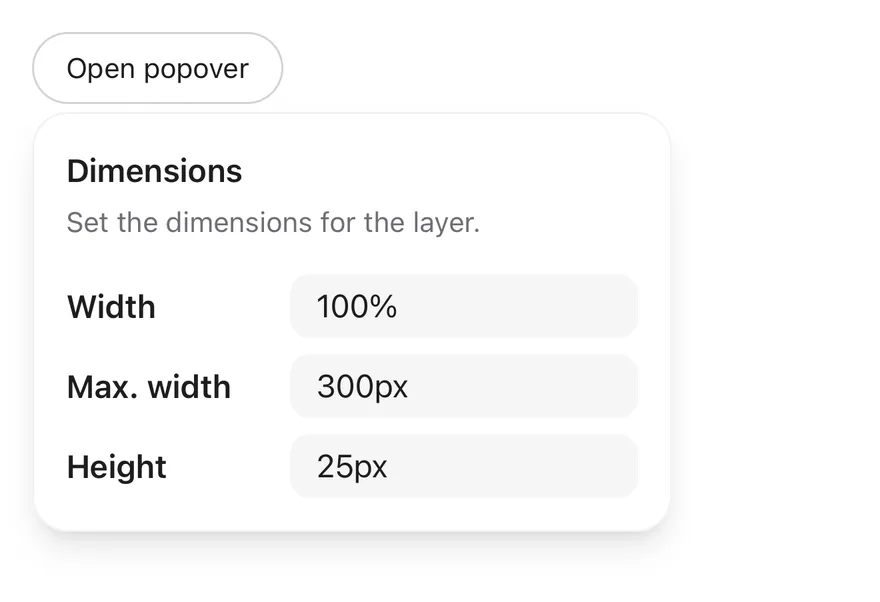
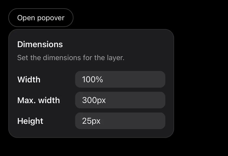
Default

iOS
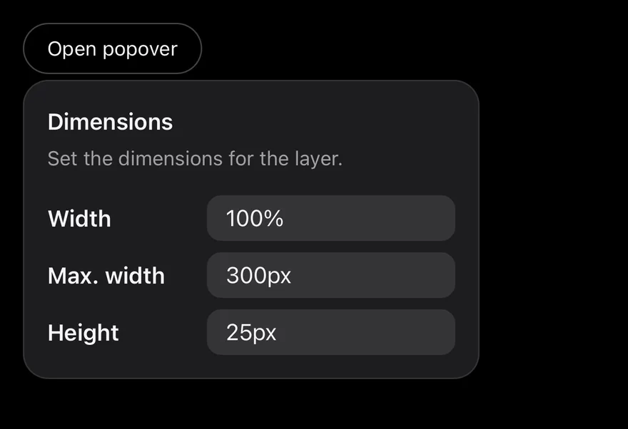
Popover on iOS in light modePopover on iOS in dark mode
import { View } from "react-native"
import { Button } from "@/components/ui/button"
import { Input } from "@/components/ui/input"
import { Label } from "@/components/ui/label"
import { Popover, PopoverContent, PopoverDescription, PopoverHeader, PopoverTitle, PopoverTrigger } from "@/components/ui/popover"
import { Text } from "@/components/ui/text"

const dimensions = [
  { id: "width", label: "Width", value: "100%" },
  { id: "max-width", label: "Max. width", value: "300px" },
  { id: "height", label: "Height", value: "25px" },
]

export function PopoverExample() {
  return (
    <View className="items-start">
      <Popover>
        <PopoverTrigger render={<Button variant="outline" />}>
          <Text>Open popover</Text>
        </PopoverTrigger>
        <PopoverContent align="start" className="w-80">
          <View className="gap-4">
            <PopoverHeader>
              <PopoverTitle>Dimensions</PopoverTitle>
              <PopoverDescription>
                Set the dimensions for the layer.
              </PopoverDescription>
            </PopoverHeader>
            <View className="gap-2">
              {dimensions.map((dimension) => (
                <View
                  key={dimension.id}
                  className="flex-row items-center gap-4"
                >
                  <Label nativeID={`popover-${dimension.id}`} className="w-24">
                    {dimension.label}
                  </Label>
                  <Input
                    accessibilityLabelledBy={`popover-${dimension.id}`}
                    defaultValue={dimension.value}
                    className="h-8 flex-1"
                  />
                </View>
              ))}
            </View>
          </View>
        </PopoverContent>
      </Popover>
    </View>
  )
}
import EsuissUI
import SwiftUI

struct PopoverExample: View {
  var body: some View {
    PopoverDimensions(open: false)
  }
}

struct PopoverDimensions: View {
  @State private var open: Bool

  init(open: Bool) {
    _open = State(initialValue: open)
  }

  var body: some View {
    Button("Open popover") { open = true }
      .buttonStyle(.variant(.outline))
      .popover(isPresented: $open) {
        PopoverContent(width: 320) {
          PopoverHeader {
            PopoverTitle("Dimensions")
            PopoverDescription("Set the dimensions for the layer.")
          }
          VStack(spacing: 8) {
            PopoverDimensionRow(label: "Width", value: "100%")
            PopoverDimensionRow(label: "Max. width", value: "300px")
            PopoverDimensionRow(label: "Height", value: "25px")
          }
        }
      }
  }
}

struct PopoverDimensionRow: View {
  let label: String

  @State private var value: String

  init(label: String, value: String) {
    self.label = label
    _value = State(initialValue: value)
  }

  var body: some View {
    HStack(spacing: 16) {
      FieldLabel(label)
        .frame(width: 96, alignment: .leading)
        .accessibilityHidden(true)
      TextField(label, text: $value)
        .textFieldStyle(.input(size: .sm))
        .accessibilityLabel(Text(label))
    }
  }
}
import androidx.compose.foundation.layout.Column
import androidx.compose.foundation.layout.width
import androidx.compose.runtime.Composable
import androidx.compose.runtime.getValue
import androidx.compose.runtime.mutableStateOf
import androidx.compose.runtime.saveable.rememberSaveable
import androidx.compose.runtime.setValue
import androidx.compose.ui.Modifier
import androidx.compose.ui.unit.dp
import com.esuiss.ui.components.Button
import com.esuiss.ui.components.ButtonVariant
import com.esuiss.ui.components.Popover
import com.esuiss.ui.components.PopupAlign

@Composable
fun PopoverExample() {
    PopoverDimensions(defaultOpen = false)
}

@Composable
fun PopoverDimensions(defaultOpen: Boolean) {
    var open by rememberSaveable { mutableStateOf(defaultOpen) }
    Column {
        Popover(
            open = open,
            onOpenChange = { open = it },
            trigger = { Button("Open popover", onClick = { open = true }, variant = ButtonVariant.Outline) },
            modifier = Modifier.width(320.dp),
            align = PopupAlign.Start,
        ) {
            PopoverDimensionsContent()
        }
    }
}

Sides

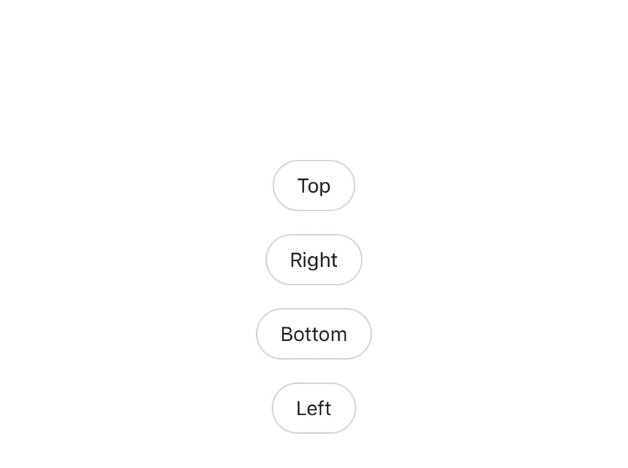
Popovers opened on each of the four sides.

iOS
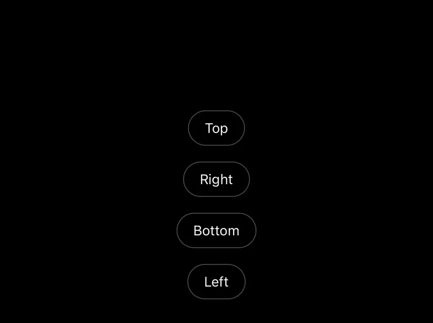
Popover (sides) on iOS in light modePopover (sides) on iOS in dark mode
import { View } from "react-native"
import { Button } from "@/components/ui/button"
import { Popover, PopoverContent, PopoverTrigger } from "@/components/ui/popover"
import { Text } from "@/components/ui/text"

export function PopoverSidesExample() {
  return (
    <View className="items-center gap-4 py-24">
      {(["top", "right", "bottom", "left"] as const).map((side) => (
        <Popover key={side}>
          <PopoverTrigger render={<Button variant="outline" />}>
            <Text className="capitalize">{side}</Text>
          </PopoverTrigger>
          <PopoverContent side={side} className="w-56">
            <Text className="text-sm">Popover on the {side}.</Text>
          </PopoverContent>
        </Popover>
      ))}
    </View>
  )
}
import EsuissUI
import SwiftUI

struct PopoverSidesExample: View {
  var body: some View {
    VStack(spacing: 16) {
      PopoverSide(title: "Top", edge: .top)
      PopoverSide(title: "Right", edge: .trailing)
      PopoverSide(title: "Bottom", edge: .bottom)
      PopoverSide(title: "Left", edge: .leading)
    }
    .padding(.vertical, 96)
    .frame(maxWidth: .infinity)
  }
}

struct PopoverSide: View {
  let title: String
  let edge: Edge

  @State private var open = false

  var body: some View {
    Button(title) { open = true }
      .buttonStyle(.variant(.outline))
      .popover(isPresented: $open, arrowEdge: edge) {
        PopoverContent(width: 224) {
          Text(verbatim: "Popover on the \(title.lowercased()).")
            .textStyle(.sm)
        }
      }
  }
}
import androidx.compose.foundation.layout.Arrangement
import androidx.compose.foundation.layout.Column
import androidx.compose.foundation.layout.fillMaxWidth
import androidx.compose.foundation.layout.padding
import androidx.compose.foundation.layout.width
import androidx.compose.runtime.Composable
import androidx.compose.runtime.getValue
import androidx.compose.runtime.key
import androidx.compose.runtime.mutableStateOf
import androidx.compose.runtime.saveable.rememberSaveable
import androidx.compose.runtime.setValue
import androidx.compose.ui.Alignment
import androidx.compose.ui.Modifier
import androidx.compose.ui.unit.dp
import com.esuiss.ui.components.Button
import com.esuiss.ui.components.ButtonVariant
import com.esuiss.ui.components.Popover
import com.esuiss.ui.components.PopupSide
import com.esuiss.ui.components.Text
import com.esuiss.ui.theme.Typography

@Composable
fun PopoverSides() {
    Column(
        modifier = Modifier.fillMaxWidth().padding(vertical = 96.dp),
        horizontalAlignment = Alignment.CenterHorizontally,
        verticalArrangement = Arrangement.spacedBy(16.dp),
    ) {
        listOf(
            PopupSide.Top to "top",
            PopupSide.Right to "right",
            PopupSide.Bottom to "bottom",
            PopupSide.Left to "left",
        ).forEach { (side, name) ->
            key(name) {
                var open by rememberSaveable { mutableStateOf(false) }
                Popover(
                    open = open,
                    onOpenChange = { open = it },
                    trigger = {
                        Button(name.replaceFirstChar { it.uppercaseChar() }, onClick = { open = true }, variant = ButtonVariant.Outline)
                    },
                    modifier = Modifier.width(224.dp),
                    side = side,
                ) {
                    Text("Popover on the $name.", style = Typography.sm)
                }
            }
        }
    }
}

Simple

A short text popover aligned to the start of its trigger.

iOS
Popover (simple) on iOS in light modePopover (simple) on iOS in dark mode
import { View } from "react-native"
import { Button } from "@/components/ui/button"
import { Popover, PopoverContent, PopoverTrigger } from "@/components/ui/popover"
import { Text } from "@/components/ui/text"

export function PopoverSimpleExample() {
  return (
    <View className="items-start">
      <Popover>
        <PopoverTrigger render={<Button />}>
          <Text>Info</Text>
        </PopoverTrigger>
        <PopoverContent align="start" className="w-64">
          <Text className="text-sm">
            Popovers display rich content next to a trigger.
          </Text>
        </PopoverContent>
      </Popover>
    </View>
  )
}
import EsuissUI
import SwiftUI

struct PopoverSimple: View {
  @State private var open = false

  var body: some View {
    Button("Info") { open = true }
      .buttonStyle(.variant())
      .popover(isPresented: $open) {
        PopoverContent(width: 256) {
          Text("Popovers display rich content next to a trigger.")
            .textStyle(.sm)
        }
      }
  }
}
import androidx.compose.foundation.layout.Column
import androidx.compose.foundation.layout.width
import androidx.compose.runtime.Composable
import androidx.compose.runtime.getValue
import androidx.compose.runtime.mutableStateOf
import androidx.compose.runtime.saveable.rememberSaveable
import androidx.compose.runtime.setValue
import androidx.compose.ui.Modifier
import androidx.compose.ui.unit.dp
import com.esuiss.ui.components.Button
import com.esuiss.ui.components.Popover
import com.esuiss.ui.components.PopupAlign
import com.esuiss.ui.components.Text
import com.esuiss.ui.theme.Typography

@Composable
fun PopoverSimple() {
    var open by rememberSaveable { mutableStateOf(false) }
    Column {
        Popover(
            open = open,
            onOpenChange = { open = it },
            trigger = { Button("Info", onClick = { open = true }) },
            modifier = Modifier.width(256.dp),
            align = PopupAlign.Start,
        ) {
            Text("Popovers display rich content next to a trigger.", style = Typography.sm)
        }
    }
}

Detached triggers

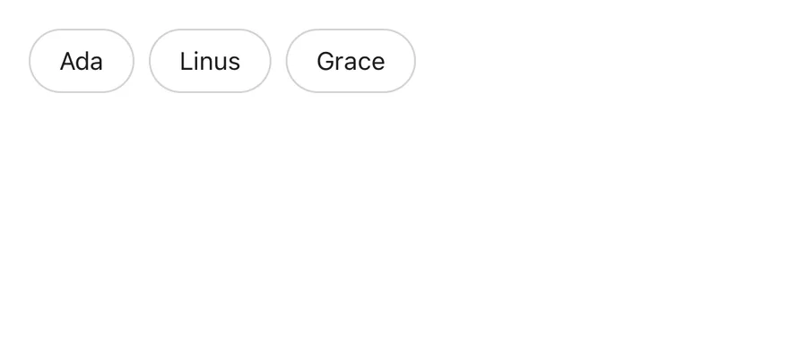
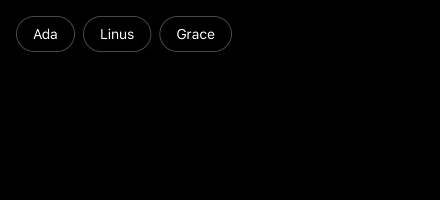
Several triggers sharing one popover through a handle, each passing its own payload.

iOS
Popover (detached triggers) on iOS in light modePopover (detached triggers) on iOS in dark mode
import { View } from "react-native"
import { createHandle } from "@/components/primitives/popover"
import { Button } from "@/components/ui/button"
import { Popover, PopoverContent, PopoverDescription, PopoverHeader, PopoverTitle, PopoverTrigger } from "@/components/ui/popover"
import { Text } from "@/components/ui/text"

const members = [
  { id: "ada", name: "Ada", role: "Design lead" },
  { id: "linus", name: "Linus", role: "Platform engineer" },
  { id: "grace", name: "Grace", role: "Product manager" },
]

const memberPopover = createHandle<(typeof members)[number]>()

export function PopoverDetachedTriggersExample() {
  return (
    <View className="flex-row items-start gap-2">
      {members.map((member) => (
        <PopoverTrigger
          key={member.id}
          id={member.id}
          handle={memberPopover}
          payload={member}
          render={<Button variant="outline" />}
        >
          <Text>{member.name}</Text>
        </PopoverTrigger>
      ))}
      <Popover handle={memberPopover}>
        {({ payload }) => (
          <PopoverContent align="start">
            <PopoverHeader>
              <PopoverTitle>{payload?.name}</PopoverTitle>
              <PopoverDescription>{payload?.role}</PopoverDescription>
            </PopoverHeader>
          </PopoverContent>
        )}
      </Popover>
    </View>
  )
}
import EsuissUI
import SwiftUI

struct PopoverMember: Identifiable {
  let id: String
  let name: String
  let role: String
}

struct PopoverDetached: View {
  private static let members = [
    PopoverMember(id: "ada", name: "Ada", role: "Design lead"),
    PopoverMember(id: "linus", name: "Linus", role: "Platform engineer"),
    PopoverMember(id: "grace", name: "Grace", role: "Product manager"),
  ]

  @State private var openID: String?

  var body: some View {
    HStack(alignment: .top, spacing: 8) {
      ForEach(Self.members) { member in
        Button(member.name) { openID = member.id }
          .buttonStyle(.variant(.outline))
          .popover(isPresented: binding(member.id)) {
            PopoverContent(width: nil) {
              PopoverHeader {
                PopoverTitle(LocalizedStringKey(member.name))
                PopoverDescription(LocalizedStringKey(member.role))
              }
            }
          }
      }
    }
  }

  func binding(_ id: String) -> Binding<Bool> {
    Binding {
      openID == id
    } set: { open in
      if !open, openID == id { openID = nil }
    }
  }
}

let members = [
  PopoverMember(id: "ada", name: "Ada", role: "Design lead"),
  PopoverMember(id: "linus", name: "Linus", role: "Platform engineer"),
  PopoverMember(id: "grace", name: "Grace", role: "Product manager"),
]

API Reference

01

Popover

The root that manages the open state.

PropTypeDefaultDescription
openboolean-Whether the popover is open, for controlled use.
defaultOpenbooleanfalseWhether the popover starts open when uncontrolled.
onOpenChange(open: boolean, details) => void-Called when the popover opens or closes.
modalbooleanfalseBlocks interaction with the rest of the screen while open.
02

PopoverContent

Animated panel rendered in a portal and positioned next to the trigger.

PropTypeDefaultDescription
portalHoststring-Name of the portal host to render into.

Also accepts the props of React.ComponentProps<typeof PopoverPrimitive.Popup>, React.ComponentProps<typeof PopoverPrimitive.Positioner>.

03

PopoverHeader

Column for the title and description.

Also accepts the props of ViewProps.

04

PopoverTitle

Heading that labels the panel.

Also accepts the props of React.ComponentProps<typeof PopoverPrimitive.Title>.

05

PopoverDescription

Secondary text under the title.

Also accepts the props of React.ComponentProps<typeof PopoverPrimitive.Description>.

Accessibility

  • The panel has the dialog role and is labeled by PopoverTitle when one is present.
  • PopoverTitle has the heading role.
  • When the popover opens, focus moves to the title by default.
  • The popover can close from an outside press, the Android back button, or the screen reader escape gesture.
  • Animations follow the system reduce motion setting.

Notes

  • The panel uses bg-popover, a subtle border-foreground/5 border (border-foreground/10 in dark mode) and shadow-lg.
  • FullWindowOverlay is used only on iOS; on Android the content renders in the portal directly.
  • Light and dark colors follow the system appearance.
iOS
Popover (open by default) on iOS in light modePopover (open by default) on iOS in dark mode
import { View } from "react-native"
import { Button } from "@/components/ui/button"
import { Input } from "@/components/ui/input"
import { Label } from "@/components/ui/label"
import { Popover, PopoverContent, PopoverDescription, PopoverHeader, PopoverTitle, PopoverTrigger } from "@/components/ui/popover"
import { Text } from "@/components/ui/text"

const dimensions = [
  { id: "width", label: "Width", value: "100%" },
  { id: "max-width", label: "Max. width", value: "300px" },
  { id: "height", label: "Height", value: "25px" },
]

export function PopoverOpenByDefaultExample() {
  return (
    <View className="items-start">
      <Popover defaultOpen>
        <PopoverTrigger render={<Button variant="outline" />}>
          <Text>Open popover</Text>
        </PopoverTrigger>
        <PopoverContent align="start" className="w-80">
          <View className="gap-4">
            <PopoverHeader>
              <PopoverTitle>Dimensions</PopoverTitle>
              <PopoverDescription>
                Set the dimensions for the layer.
              </PopoverDescription>
            </PopoverHeader>
            <View className="gap-2">
              {dimensions.map((dimension) => (
                <View
                  key={dimension.id}
                  className="flex-row items-center gap-4"
                >
                  <Label nativeID={`popover-${dimension.id}`} className="w-24">
                    {dimension.label}
                  </Label>
                  <Input
                    accessibilityLabelledBy={`popover-${dimension.id}`}
                    defaultValue={dimension.value}
                    className="h-8 flex-1"
                  />
                </View>
              ))}
            </View>
          </View>
        </PopoverContent>
      </Popover>
    </View>
  )
}
import EsuissUI
import SwiftUI

struct PopoverOpenByDefaultExample: View {
  var body: some View {
    PopoverDimensions(open: true)
  }
}

struct PopoverDimensions: View {
  @State private var open: Bool

  init(open: Bool) {
    _open = State(initialValue: open)
  }

  var body: some View {
    Button("Open popover") { open = true }
      .buttonStyle(.variant(.outline))
      .popover(isPresented: $open) {
        PopoverContent(width: 320) {
          PopoverHeader {
            PopoverTitle("Dimensions")
            PopoverDescription("Set the dimensions for the layer.")
          }
          VStack(spacing: 8) {
            PopoverDimensionRow(label: "Width", value: "100%")
            PopoverDimensionRow(label: "Max. width", value: "300px")
            PopoverDimensionRow(label: "Height", value: "25px")
          }
        }
      }
  }
}

struct PopoverDimensionRow: View {
  let label: String

  @State private var value: String

  init(label: String, value: String) {
    self.label = label
    _value = State(initialValue: value)
  }

  var body: some View {
    HStack(spacing: 16) {
      FieldLabel(label)
        .frame(width: 96, alignment: .leading)
        .accessibilityHidden(true)
      TextField(label, text: $value)
        .textFieldStyle(.input(size: .sm))
        .accessibilityLabel(Text(label))
    }
  }
}
import androidx.compose.foundation.layout.Column
import androidx.compose.foundation.layout.width
import androidx.compose.runtime.Composable
import androidx.compose.runtime.getValue
import androidx.compose.runtime.mutableStateOf
import androidx.compose.runtime.saveable.rememberSaveable
import androidx.compose.runtime.setValue
import androidx.compose.ui.Modifier
import androidx.compose.ui.unit.dp
import com.esuiss.ui.components.Button
import com.esuiss.ui.components.ButtonVariant
import com.esuiss.ui.components.Popover
import com.esuiss.ui.components.PopupAlign

@Composable
fun PopoverOpenByDefaultExample() {
    PopoverDimensions(defaultOpen = true)
}

@Composable
fun PopoverDimensions(defaultOpen: Boolean) {
    var open by rememberSaveable { mutableStateOf(defaultOpen) }
    Column {
        Popover(
            open = open,
            onOpenChange = { open = it },
            trigger = { Button("Open popover", onClick = { open = true }, variant = ButtonVariant.Outline) },
            modifier = Modifier.width(320.dp),
            align = PopupAlign.Start,
        ) {
            PopoverDimensionsContent()
        }
    }
}
components/ui/popover.tsx
"use client"

import { Popover as PopoverPrimitive } from "@base-ui/react/popover"
import type * as React from "react"
import { cn } from "@/lib/utils"

function Popover({ ...props }: PopoverPrimitive.Root.Props) {
  return <PopoverPrimitive.Root data-slot="popover" {...props} />
}

function PopoverTrigger({ ...props }: PopoverPrimitive.Trigger.Props) {
  return <PopoverPrimitive.Trigger data-slot="popover-trigger" {...props} />
}

function PopoverContent({
  className,
import { Button } from "@/components/ui/button"
import {
  Popover,
  PopoverContent,
  PopoverDescription,
  PopoverHeader,
  PopoverTitle,
  PopoverTrigger,
} from "@/components/ui/popover"

export default function PopoverSides() {
  return (
    <div className="grid grid-cols-2 gap-3">
      {(["top", "right", "bottom", "left"] as const).map((side) => (
        <Popover key={side}>
          <PopoverTrigger render={<Button variant="outline" />}>
            {side.charAt(0).toUpperCase() + side.slice(1)}
          </PopoverTrigger>
          <PopoverContent side={side} className="w-56">
            <PopoverHeader>
              <PopoverTitle>Heads up</PopoverTitle>
              <PopoverDescription>
                This popover opens on the {side} side.
              </PopoverDescription>
            </PopoverHeader>
          </PopoverContent>
        </Popover>
      ))}
    </div>
  )
}
import { Button } from "@/components/ui/button"
import {
  Popover,
  PopoverContent,
  PopoverTrigger,
} from "@/components/ui/popover"

export default function PopoverSimple() {
  return (
    <Popover>
      <PopoverTrigger render={<Button variant="ghost" />}>
        What is this?
      </PopoverTrigger>
      <PopoverContent className="w-64">
        <p>
          Shared links stay active for 30 days and can be revoked at any time
          from settings.
        </p>
      </PopoverContent>
    </Popover>
  )
}
nativewind/components/ui/animated-view.tsx
import { Pressable } from "react-native"
import Animated from "react-native-reanimated"

const AnimatedPressable = Animated.createAnimatedComponent(Pressable)

type AnimatedViewProps =
  | (React.ComponentProps<typeof Animated.View> &
      React.RefAttributes<React.ComponentRef<typeof Animated.View>> & {
        as?: "View"
      })
  | (React.ComponentProps<typeof AnimatedPressable> &
      React.RefAttributes<React.ComponentRef<typeof AnimatedPressable>> & {
        as: "Pressable"
      })

function AnimatedView(props: AnimatedViewProps) {
nativewind/components/ui/popover.tsx
import { cn } from "cn"
import * as React from "react"
import { Platform, View, type ViewProps } from "react-native"
import { Keyframe, ReduceMotion } from "react-native-reanimated"
import { FullWindowOverlay as RNFullWindowOverlay } from "react-native-screens"
import * as PopoverPrimitive from "@/components/primitives/popover"
import type { Side } from "@/components/primitives/types"
import { resolveClassName } from "@/components/primitives/use-render"
import { AnimatedView } from "@/components/ui/animated-view"
import { TextClassContext } from "@/components/ui/text"

const Popover = PopoverPrimitive.Root

const PopoverTrigger = PopoverPrimitive.Trigger

const FullWindowOverlay =
stylesheet/components/ui/animated-view.tsx
import { Pressable } from "react-native"
import Animated from "react-native-reanimated"

const AnimatedPressable = Animated.createAnimatedComponent(Pressable)

type AnimatedViewProps =
  | (React.ComponentProps<typeof Animated.View> &
      React.RefAttributes<React.ComponentRef<typeof Animated.View>> & {
        as?: "View"
      })
  | (React.ComponentProps<typeof AnimatedPressable> &
      React.RefAttributes<React.ComponentRef<typeof AnimatedPressable>> & {
        as: "Pressable"
      })

function AnimatedView(props: AnimatedViewProps) {
stylesheet/components/ui/popover.tsx
import * as React from "react"
import { Platform, StyleSheet, View, type ViewProps } from "react-native"
import { Keyframe, ReduceMotion } from "react-native-reanimated"
import { FullWindowOverlay as RNFullWindowOverlay } from "react-native-screens"
import * as PopoverPrimitive from "@/components/primitives/popover"
import type { Side } from "@/components/primitives/types"
import { AnimatedView } from "@/components/ui/animated-view"
import { TextStyleContext } from "@/components/ui/text"
import { fontSize, radius, shadow, useTheme } from "@/components/ui/theme"

const Popover = PopoverPrimitive.Root

const PopoverTrigger = PopoverPrimitive.Trigger

const FullWindowOverlay =
  Platform.OS === "ios" ? RNFullWindowOverlay : React.Fragment