suiss/ui · Component
Card
A raised container that groups related content and actions about a single subject.
Card is an open-source component from suiss/ui for React, React Native, SwiftUI and Jetpack Compose. The @esuiss/ui CLI copies its source into your project, so you own the code.
A Card stacks a CardHeader, CardContent and CardFooter with consistent spacing. The header holds a CardTitle, an optional CardDescription, and an optional CardAction that sits in the top-end corner. An img placed as the first child runs edge to edge, with rounded top corners and no top padding.
Use a card to present a self-contained summary, such as a plan, a metric or a place. For dense lists of rows, use Item or a table instead.
Installation
CLI
Works in any project with a components.json. See Installation for the one-line registry setup. Or use the suiss/ui CLI:
Manual
-
Add the
cnhelper. -
Copy the source into
components/ui/card.tsx:
- Update the import paths to match your project.
Usage
All parts are plain div elements, so you can omit any of them. Add border-b to CardHeader or border-t to CardFooter to draw a divider; the card adds matching padding on that side.
Spacing is controlled by the --card-spacing custom property, which the sm size reduces.
Examples
Small
The sm size with tighter spacing.
Filled
The filled variant on a flat bg-muted surface with no shadow.
With action
Places an icon button in the header with CardAction.
With borders
Separates the header and footer with borders.
With image
Leads with a full-bleed image above the header.
API Reference
Card
The rounded container that sets size and surface.
| Prop | Type | Default | Description |
|---|---|---|---|
size | "default" | "sm" | "default" | Inner spacing: default or the more compact sm. |
variant | "default" | "filled" | "default" | Surface style. default is raised with a shadow and ring; filled uses bg-muted with no shadow. |
Also accepts the props of React.ComponentProps<"div">.
CardHeader
Lays out the title, description and action.
Also accepts the props of React.ComponentProps<"div">.
CardTitle
The card's heading text.
Also accepts the props of React.ComponentProps<"div">.
CardDescription
Secondary text below the title.
Also accepts the props of React.ComponentProps<"div">.
CardAction
A slot in the header's top-end corner for a button or menu.
Also accepts the props of React.ComponentProps<"div">.
CardContent
The main body, padded to the card's spacing.
Also accepts the props of React.ComponentProps<"div">.
CardFooter
A row for actions or summary at the bottom.
Also accepts the props of React.ComponentProps<"div">.
Accessibility
- Card parts are non-semantic
divelements, andCardTitleis not a heading. If the title belongs in the document outline, place a heading element such ash2inside it. - Icon-only buttons in
CardActionneed anaria-label.
Notes
- Styling hooks:
data-slotvaluescard,card-header,card-title,card-description,card-action,card-contentandcard-footer, plusdata-sizeanddata-varianton the root. - The header switches to a two-column grid when it contains a
CardAction. - Calendar detects
data-slot="card-content"and drops its own background inside a card.
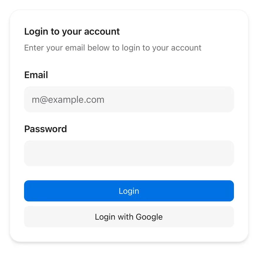
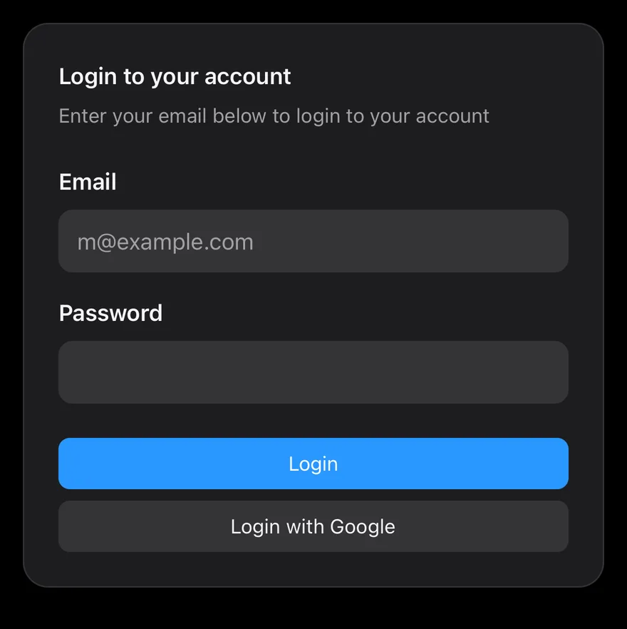
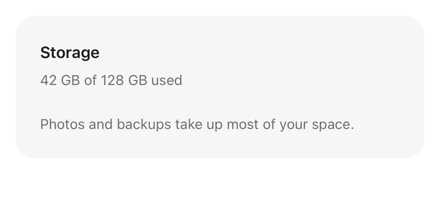
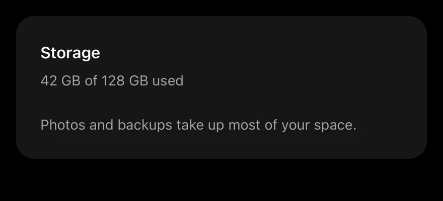
Card is a rounded View that stacks a CardHeader, CardContent and CardFooter with consistent spacing. The default variant is a raised surface with a hairline border and a shadow; the filled variant is a flat bg-muted surface.
The sm size reduces the padding and gaps for dense layouts. All parts read the size from context, so their horizontal padding stays aligned.
Installation
The CLI also adds what it builds on: Text.
Manual
- Install the dependencies:
-
Add the pieces it builds on: Text.
-
Copy the source into
components/ui/card.tsx:
- Update the import paths to match your project.
- Install the dependencies:
-
Add the pieces it builds on: Text.
-
Copy the source into
components/ui/card.tsx:
- Update the import paths to match your project.
-
Add the pieces it builds on: Text.
-
Copy the source into
components/ui/card.tsx:
- Update the import paths to match your project.
-
Target iOS 17 or later.
-
Copy the theme files every view uses:
- Copy the source:
- Add the files to your app target.
- Set
minSdkto 24 or higher and add the dependencies:
- Copy the theme files every view uses:
- Copy the source and every file it uses:
- Update the
com.esuiss.uipackage names to match your project.
Usage
Put a CardTitle and CardDescription in CardHeader. Add a CardAction anywhere in the header and it is placed in the top-end corner beside the title.
To show an image edge to edge, place it directly in the card before the header and add pt-0 to the card; only the header, content and footer are padded horizontally.
Examples
Small
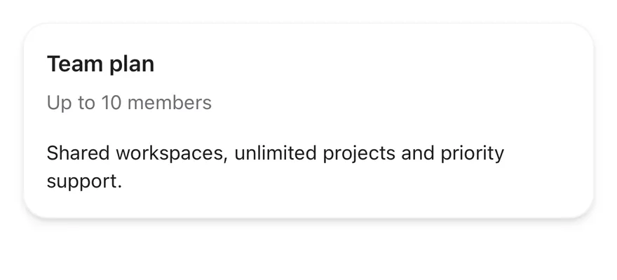
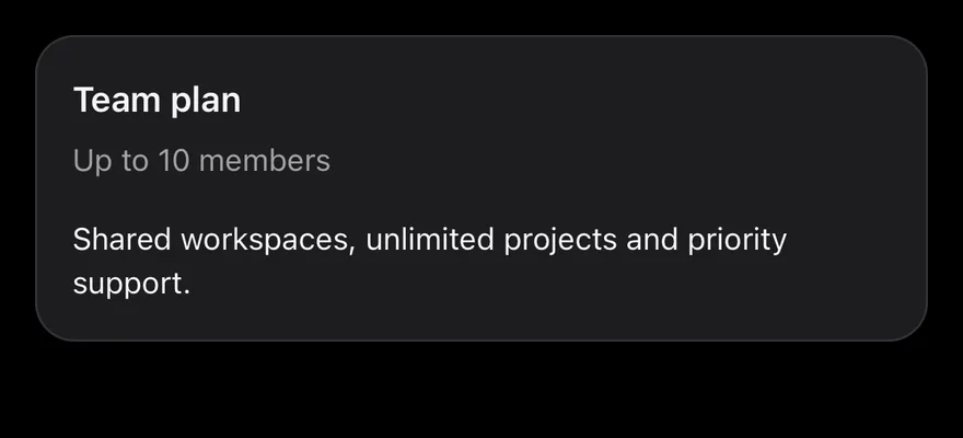
The compact sm size.
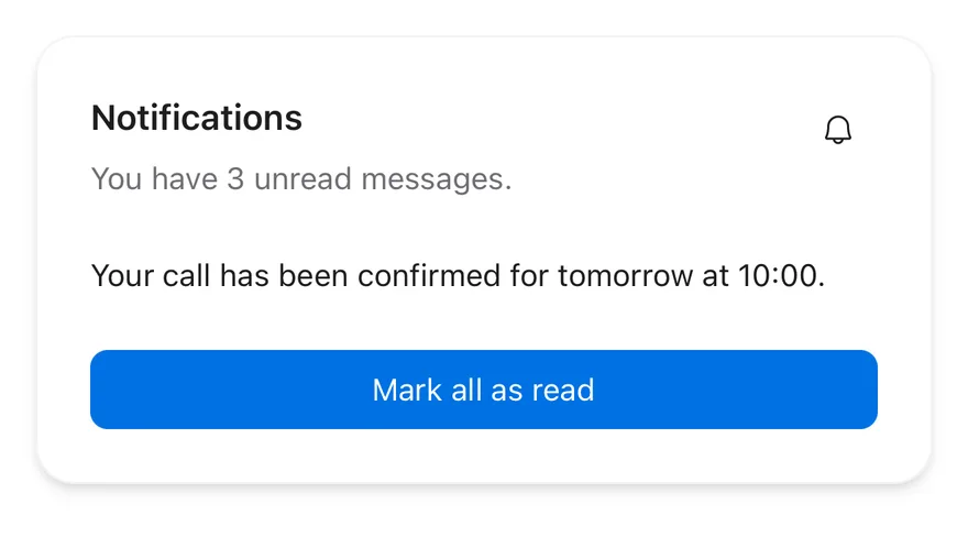
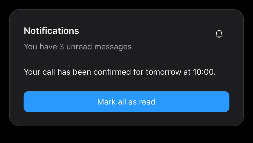
With action
A CardAction button beside the title.
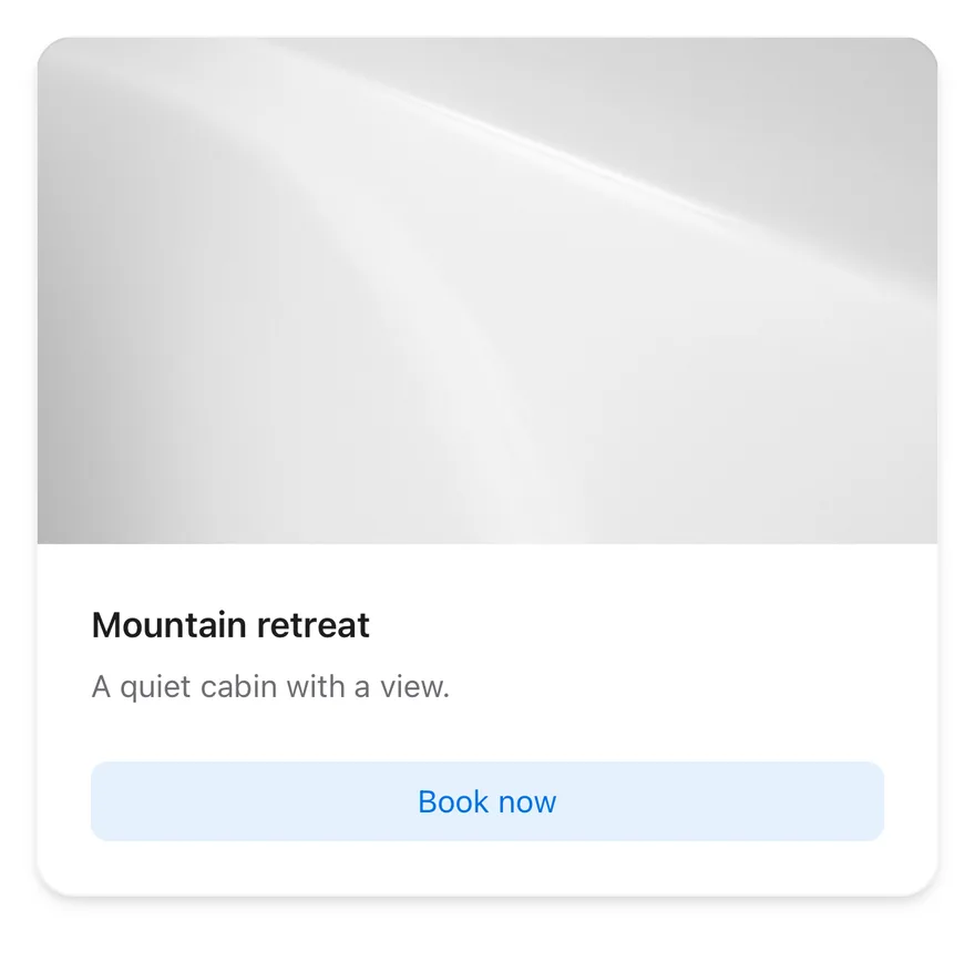
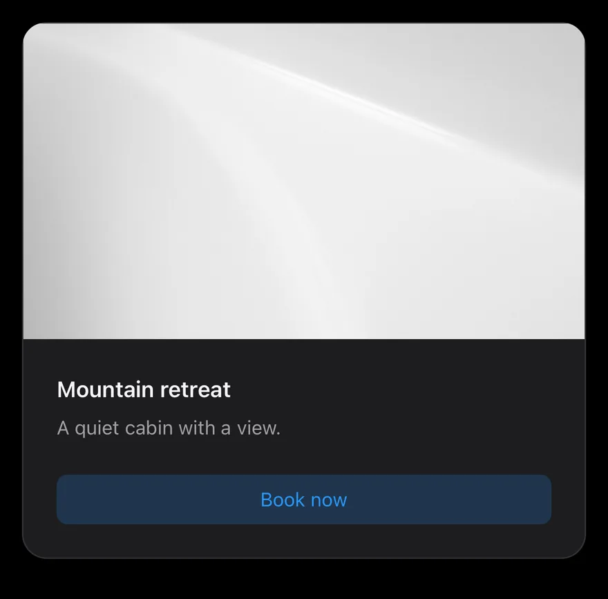
With image
An edge-to-edge image above the header.
Filled
The flat filled variant.
API Reference
Card
Outer container that sets the size and variant.
| Prop | Type | Default | Description |
|---|---|---|---|
size | CardSize | "default" | default or sm. |
variant | CardVariant | "default" | default (raised) or filled. |
Also accepts the props of React.ComponentProps<typeof View>, React.RefAttributes<View>.
CardHeader
Title area; places a CardAction beside the text.
Also accepts the props of React.ComponentProps<typeof View>, React.RefAttributes<View>.
CardTitle
Bold heading.
Also accepts the props of React.ComponentProps<typeof Text>, React.RefAttributes<typeof Text>.
CardDescription
Secondary text below the title.
Also accepts the props of React.ComponentProps<typeof Text>, React.RefAttributes<typeof Text>.
CardAction
Slot for a button in the header.
Also accepts the props of React.ComponentProps<typeof View>, React.RefAttributes<View>.
CardContent
Padded body.
Also accepts the props of React.ComponentProps<typeof View>, React.RefAttributes<View>.
CardFooter
Padded row for actions.
Also accepts the props of React.ComponentProps<typeof View>, React.RefAttributes<View>.
Accessibility
CardTitlehas theheadingrole.- The card itself adds no role; actions inside provide their own.
Notes
- Uses
bg-cardwith a shadow, orbg-mutedforfilled; the border is stronger in dark mode. - Light and dark follow the system appearance.