suiss/ui
  • Docs
  • Components
  • Patterns
  • Interactions
  • Charts
  • Blocks
GitHubGet started
DocsComponentsPatternsInteractionsChartsBlocks
Components82
  • Overview
  • Accordion
  • Alert
  • Alert Dialog
  • Alert Sheet
  • Amount Input
  • Aspect Ratio
  • Attachment
  • Avatar
  • Badge
  • Bottom Bar
  • Breadcrumb
  • Bubble
  • Button
  • Button Group
  • Calendar
  • Card
  • Carousel
  • Chart
  • Checkbox
  • Chip
  • Collapsible
  • Combobox
  • Command
  • Context Menu
  • Dialog
  • Direction
  • Drawer
  • Dropdown Menu
  • Empty
  • FAB
  • Field
  • Fullscreen Menu
  • Haptics
  • Header
  • Hover Card
  • Icon
  • Input
  • Input Accessory Bar
  • Input Group
  • Input OTP
  • Item
  • Kbd
  • Keyboard Scroll View
  • Keypad
  • Label
  • Marker
  • Menubar
  • Message
  • Message Scroller
  • Native Select
  • Navigation Menu
  • Page Indicator
  • Pagination
  • Pin Pad
  • Popover
  • Progress
  • QR Scanner
  • Questionnaire
  • Radio Group
  • Resizable
  • Screen
  • Scroll Area
  • Select
  • Separator
  • Sheet
  • Sidebar
  • Signature Pad
  • Skeleton
  • Slider
  • Spinner
  • Switch
  • Tab Bar
  • Table
  • Tabs
  • Text
  • Textarea
  • Toast
  • Toggle
  • Toggle Group
  • Tooltip
  • Wheel Picker
  • Widget

suiss/ui · Component

Checkbox

A control that lets people turn a single option on or off.

Checkbox is an open-source component from suiss/ui for React, React Native, SwiftUI and Jetpack Compose. The @esuiss/ui CLI copies its source into your project, so you own the code.

import { Checkbox } from "@/components/ui/checkbox"

export default function CheckboxDemo() {
  return <Checkbox aria-label="Accept terms" />
}

Checkbox wraps the checkbox primitive and renders a check icon inside its indicator when checked. It is a single self-contained part: there are no child components to compose.

Use a checkbox for independent options that people can select in any combination, such as accepting terms or opting in to email. For a mutually exclusive choice, use a radio group; for a setting that takes effect immediately, consider a switch.

Installation

CLI

$ pnpm dlx shadcn@latest add @esuiss/checkbox

Works in any project with a components.json. See Installation for the one-line registry setup. Or use the suiss/ui CLI:

$ pnpm dlx @esuiss/ui@latest add checkbox

Manual

  1. Install the dependencies and add the cn helper:
$ pnpm add @base-ui/react @phosphor-icons/react
  1. Copy the source into components/ui/checkbox.tsx:
  1. Update the import paths to match your project.

Usage

import { Checkbox } 
<Checkbox

Leave the checkbox uncontrolled with defaultChecked, or control it with checked and onCheckedChange. Pair it with a visible Label: wrapping the checkbox in Label makes the whole label text clickable. To add supporting text, give the checkbox an id and an aria-describedby that points to the description element.

Examples

Checked

A checkbox that starts checked using defaultChecked.

With label

A checkbox wrapped in a Label, so clicking the text toggles it.

With description

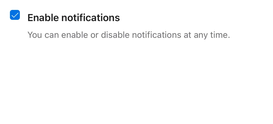
A checkbox labelled with htmlFor and described by supporting text through aria-describedby.

Disabled

Disabled checkboxes, both unchecked and checked, that ignore clicks and are skipped by Tab.

Invalid

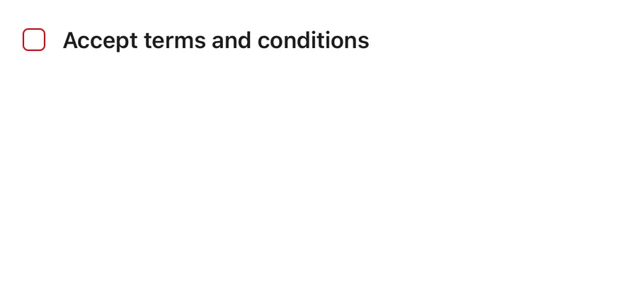
A checkbox marked with aria-invalid to show a validation error.

API Reference

01

Checkbox

The checkbox control, rendering the box and its check indicator.

Also accepts the props of the primitive part it wraps.

Accessibility

  • Renders with the checkbox role and exposes its checked state to assistive technology.
  • Toggles on click and with Space when focused.
  • Needs an accessible name: wrap it in a Label, associate a Label through htmlFor and id, or set aria-label.
  • When disabled, it sets aria-disabled, ignores clicks, and is removed from the Tab order.
  • Set aria-invalid to communicate a validation error; the border turns to the destructive color.

Notes

  • Styling hooks: data-slot="checkbox" on the root and data-slot="checkbox-indicator" on the indicator.
  • State attributes set by the primitive drive the checked and disabled styles.
  • Uses the primary, primary-foreground, background and border colors, and opacity-50 when disabled.
  • The hit area extends beyond the visible box through an after pseudo-element, making the small control easier to tap.

Checkbox is a Pressable with the checkbox role that shows a check icon when checked and a minus icon when indeterminate. It has an enlarged hit area around the box so it is easy to tap.

Use it for options that can be combined, such as terms acceptance or multi-select lists. For a single on/off setting that applies right away, use Switch.


Installation

$ pnpm dlx shadcn@latest add @esuiss-rn/checkbox

See Installation for the components.json setup. Or use the suiss/ui CLI:

$ pnpm dlx @esuiss/ui@latest add checkbox
$ pnpm dlx @esuiss/ui@latest add checkbox --platform swift
NextChipPreviousChart

On this page

  1. 01Installation
    • CLI
    • Manual
  2. 02Usage
  3. 03Examples
    • Checked
    • With label
    • With description
    • Disabled
    • Invalid
  4. 04API Reference
    • Checkbox
  5. 05Accessibility
  6. 06Notes
  7. 07Installation
    • Manual
  8. 08Usage
  9. 09Examples
    • Checked
    • With label
    • With description
    • Disabled
    • Indeterminate
    • Invalid
  10. 10API Reference
    • Checkbox
  11. 11Accessibility
  12. 12Notes
from
"@/components/ui/checkbox"
aria-label
=
"Accept terms"
/>
$ pnpm dlx @esuiss/ui@latest add checkbox --platform kotlin

The CLI also adds what it builds on: Icon, Text.

Manual

  1. Install the dependencies:
npx expo install cn phosphor-react-native react-native-svg
  1. Add the pieces it builds on: Icon, Text, and the primitives components/primitives/checkbox.tsx, components/primitives/use-render.tsx.

  2. Copy the source into components/ui/checkbox.tsx:

uniwind/components/ui/checkbox.tsx
import { cn } from "cn"
import { CheckIcon, MinusIcon } from "phosphor-react-native"
import * as CheckboxPrimitive from "@/components/primitives/checkbox"
import { resolveClassName } from "@/components/primitives/use-render"
import { Icon } from "@/components/ui/icon"

const HIT_SLOP = { top: 8, bottom: 8, left: 12, right: 12 }

function checkboxClassName(
  state: CheckboxPrimitive.RootState,
  invalid: boolean | undefined
) {
  const checked = state.checked || state.indeterminate
  return cn(
    "size-4 shrink-0 items-center justify-center rounded-[4px] border",
    checked
  1. Update the import paths to match your project.
  1. Install the dependencies:
npx expo install cn phosphor-react-native react-native-svg
  1. Add the pieces it builds on: Icon, Text, and the primitives components/primitives/checkbox.tsx, components/primitives/use-render.tsx.

  2. Copy the source into components/ui/checkbox.tsx:

  1. Update the import paths to match your project.
  1. Install the dependencies:
npx expo install phosphor-react-native react-native-svg
  1. Add the pieces it builds on: Icon, Text, and the primitives components/primitives/checkbox.tsx, components/primitives/use-render.tsx.

  2. Copy the source into components/ui/checkbox.tsx:

  1. Update the import paths to match your project.
  1. Target iOS 17 or later.

  2. Add the Swift package to your app:

Package.swift
.package(url: "https://github.com/phosphor-icons/swift", from: "2.1.0")
  1. Copy the theme files every view uses:
swift/Theme/Theme.swift
import SwiftUI
import UIKit

struct RGBA: Sendable {
  let red: CGFloat
  let green: CGFloat
  let blue: CGFloat
  let alpha: CGFloat

  init(_ hex: UInt32, _ alpha: CGFloat = 1) {
    red = CGFloat((hex >> 16) & 0xFF) / 255
    green = CGFloat((hex >> 8) & 0xFF) / 255
    blue = CGFloat(hex & 0xFF) / 255
    self.alpha = alpha
  }
swift/Theme/Tokens.swift
import SwiftUI

public enum EsuissColor {
  public static let background = Color.adaptive(light: .init(0xFFFFFF), dark: .init(0x000000))
  public static let foreground = Color.adaptive(light: .init(0x1D1D1F), dark: .init(0xF5F5F7))
  public static let card = Color.adaptive(light: .init(0xFFFFFF), dark: .init(0x1D1D1F))
  public static let cardForeground = Color.adaptive(light: .init(0x1D1D1F), dark: .init(0xF5F5F7))
  public static let popover = Color.adaptive(light: .init(0xFFFFFF), dark: .init(0x1D1D1F))
  public static let popoverForeground = Color.adaptive(light: .init(0x1D1D1F), dark: .init(0xF5F5F7))
  public static let primary = Color.adaptive(light: .init(0x0071E3), dark: .init(0x2997FF))
  public static let primaryForeground = Color.adaptive(light: .init(0xFFFFFF), dark: .init(0xFFFFFF))
  public static let secondary = Color.adaptive(light: .init(0x000000, 0.04), dark: .init(0xFFFFFF, 0.1))
  public static let secondaryForeground = Color.adaptive(light: .init(0x1D1D1F), dark: .init(0xF5F5F7))
  public static let muted = Color.adaptive(light: .init(0xF5F5F7), dark: .init(0x161617))
  public static let mutedForeground = Color.adaptive(light: .init(0x6E6E73), dark: .init(0xA1A1A6))
  public static let accent = Color.adaptive(light: .init(0x000000, 0.06), dark: .init(0xFFFFFF, 0.1))
  1. Copy the source and every file it uses:
swift/Components/Checkbox.swift
import PhosphorSwift
import SwiftUI

extension Shadow {
  static let control = Shadow(color: .black.opacity(0.08), radius: 0.5, y: 0.5)
  static let thumb = Shadow(color: .black.opacity(0.12), radius: 1.5, y: 1)
}

struct SelectionIndicator<Mark: View>: View {
  let checked: Bool
  let pressed: Bool
  let cornerRadius: CGFloat
  let mark: Mark

  @Environment(\.isEnabled) private var isEnabled
  @Environment(\.isInvalid) private var invalid
swift/Components/Field.swift
import SwiftUI

extension EnvironmentValues {
  @Entry public var isInvalid = false
  @Entry var fieldInset = false
  @Entry var fieldGroupInset = false
  @Entry var fieldSetInset = false
}

extension View {
  public func invalid(_ isInvalid: Bool = true) -> some View {
    environment(\.isInvalid, isInvalid)
  }
}

public enum FieldOrientation: CaseIterable, Sendable {
swift/Components/Haptics.swift
import SwiftUI

extension EnvironmentValues {
  @Entry public var hapticsEnabled = true
}

extension View {
  public func haptics(_ enabled: Bool) -> some View {
    environment(\.hapticsEnabled, enabled)
  }

  func hapticFeedback<Trigger: Equatable>(_ feedback: SensoryFeedback, trigger: Trigger) -> some View {
    modifier(HapticFeedbackModifier(feedback: feedback, trigger: trigger) { _, _ in true })
  }

  func hapticFeedback<Trigger: Equatable>(
swift/Components/Separator.swift
import SwiftUI

public struct Separator: View {
  let orientation: Axis

  public init(_ orientation: Axis = .horizontal) {
    self.orientation = orientation
  }

  public var body: some View {
    Rectangle()
      .fill(EsuissColor.border)
      .frame(width: orientation == .vertical ? 1 : nil, height: orientation == .horizontal ? 1 : nil)
      .frame(maxWidth: orientation == .horizontal ? .infinity : nil, maxHeight: orientation == .vertical ? .infinity : nil)
      .accessibilityHidden(true)
  }
swift/Components/TextVariant.swift
import SwiftUI

public enum TextVariant: CaseIterable, Sendable {
  case `default`, h1, h2, h3, h4, p, blockquote, code, lead, large, small, muted

  var style: TextStyle {
    switch self {
    case .h1: .xl3
    case .h2: .xl2
    case .h3: .xl
    case .h4, .lead, .large: .lg
    case .code, .small, .muted: .sm
    default: .base
    }
  }
  1. Add the files to your app target.
  1. Set minSdk to 24 or higher and add the dependencies:
build.gradle.kts
implementation(platform("androidx.compose:compose-bom:2026.09.00"))
implementation("androidx.compose.foundation:foundation")
implementation("androidx.compose.ui:ui")
implementation("com.adamglin:phosphor-icon-android:1.0.0")
  1. Copy the theme files every view uses:
kotlin/theme/Theme.kt
package com.esuiss.ui.theme

import androidx.compose.foundation.isSystemInDarkTheme
import androidx.compose.runtime.Composable
import androidx.compose.runtime.CompositionLocalProvider
import androidx.compose.runtime.Immutable
import androidx.compose.runtime.staticCompositionLocalOf
import androidx.compose.ui.Modifier
import androidx.compose.ui.draw.dropShadow
import androidx.compose.ui.graphics.Color
import androidx.compose.ui.graphics.Shape
import androidx.compose.ui.graphics.shadow.Shadow as DropShadow
import androidx.compose.ui.text.TextStyle
import androidx.compose.ui.text.style.LineHeightStyle
import androidx.compose.ui.unit.Dp
import androidx.compose.ui.unit.DpOffset
kotlin/theme/Tokens.kt
package com.esuiss.ui.theme

import androidx.compose.runtime.Immutable
import androidx.compose.ui.graphics.Color
import androidx.compose.ui.unit.dp

@Immutable
data class Colors(
    val background: Color,
    val foreground: Color,
    val card: Color,
    val cardForeground: Color,
    val popover: Color,
    val popoverForeground: Color,
    val primary: Color,
    val primaryForeground: Color,
  1. Copy the source and every file it uses:
kotlin/components/Checkbox.kt
package com.esuiss.ui.components

import androidx.compose.foundation.background
import androidx.compose.foundation.border
import androidx.compose.foundation.interaction.MutableInteractionSource
import androidx.compose.foundation.interaction.collectIsPressedAsState
import androidx.compose.foundation.layout.Box
import androidx.compose.foundation.layout.size
import androidx.compose.foundation.selection.triStateToggleable
import androidx.compose.foundation.shape.RoundedCornerShape
import androidx.compose.runtime.Composable
import androidx.compose.runtime.getValue
import androidx.compose.runtime.remember
import androidx.compose.ui.Alignment
import androidx.compose.ui.Modifier
import androidx.compose.ui.draw.alpha
kotlin/components/Content.kt
package com.esuiss.ui.components

import androidx.compose.runtime.compositionLocalOf
import androidx.compose.ui.graphics.Color
import androidx.compose.ui.text.TextStyle
import androidx.compose.ui.unit.Dp
import androidx.compose.ui.unit.dp

val LocalContentStyle = compositionLocalOf { TextStyle.Default }

val LocalContentColor = compositionLocalOf { Color.Unspecified }

val LocalIconSize = compositionLocalOf { 20.dp }
kotlin/components/Field.kt
package com.esuiss.ui.components

import androidx.compose.foundation.background
import androidx.compose.foundation.gestures.Orientation
import androidx.compose.foundation.layout.Arrangement
import androidx.compose.foundation.layout.Box
import androidx.compose.foundation.layout.Column
import androidx.compose.foundation.layout.ColumnScope
import androidx.compose.foundation.layout.LayoutScopeMarker
import androidx.compose.foundation.layout.Row
import androidx.compose.foundation.layout.RowScope
import androidx.compose.foundation.layout.fillMaxWidth
import androidx.compose.foundation.layout.heightIn
import androidx.compose.foundation.layout.padding
import androidx.compose.foundation.shape.RoundedCornerShape
import androidx.compose.foundation.text.BasicText
kotlin/components/FormSupport.kt
package com.esuiss.ui.components

import android.provider.Settings
import androidx.compose.animation.core.CubicBezierEasing
import androidx.compose.foundation.background
import androidx.compose.foundation.border
import androidx.compose.foundation.gestures.Orientation
import androidx.compose.foundation.text.selection.TextSelectionColors
import androidx.compose.runtime.Composable
import androidx.compose.runtime.mutableStateOf
import androidx.compose.runtime.remember
import androidx.compose.ui.Modifier
import androidx.compose.ui.draw.alpha
import androidx.compose.ui.draw.clip
import androidx.compose.ui.draw.drawWithContent
import androidx.compose.ui.geometry.Offset
kotlin/components/Haptics.kt
package com.esuiss.ui.components

import androidx.compose.runtime.Composable
import androidx.compose.runtime.CompositionLocalProvider
import androidx.compose.runtime.remember
import androidx.compose.runtime.staticCompositionLocalOf
import androidx.compose.ui.hapticfeedback.HapticFeedback
import androidx.compose.ui.hapticfeedback.HapticFeedbackType
import androidx.compose.ui.platform.LocalHapticFeedback

val LocalHapticsEnabled = staticCompositionLocalOf { true }

@Composable
fun ProvideHaptics(enabled: Boolean, content: @Composable () -> Unit) {
    CompositionLocalProvider(LocalHapticsEnabled provides enabled, content = content)
}
kotlin/components/Icon.kt
package com.esuiss.ui.components

import androidx.compose.foundation.Image
import androidx.compose.foundation.layout.size
import androidx.compose.runtime.Composable
import androidx.compose.ui.Modifier
import androidx.compose.ui.graphics.Color
import androidx.compose.ui.graphics.ColorFilter
import androidx.compose.ui.graphics.takeOrElse
import androidx.compose.ui.graphics.vector.ImageVector
import androidx.compose.ui.unit.Dp
import com.esuiss.ui.theme.EsuissTheme

@Composable
fun Icon(
    imageVector: ImageVector,
kotlin/components/Label.kt
package com.esuiss.ui.components

import androidx.compose.foundation.layout.Arrangement
import androidx.compose.foundation.layout.Row
import androidx.compose.foundation.layout.RowScope
import androidx.compose.foundation.text.BasicText
import androidx.compose.runtime.Composable
import androidx.compose.runtime.CompositionLocalProvider
import androidx.compose.ui.Alignment
import androidx.compose.ui.Modifier
import androidx.compose.ui.draw.alpha
import androidx.compose.ui.text.font.FontWeight
import androidx.compose.ui.unit.dp
import com.esuiss.ui.theme.EsuissTheme
import com.esuiss.ui.theme.Typography
kotlin/components/Separator.kt
package com.esuiss.ui.components

import androidx.compose.foundation.background
import androidx.compose.foundation.gestures.Orientation
import androidx.compose.foundation.layout.Box
import androidx.compose.foundation.layout.fillMaxHeight
import androidx.compose.foundation.layout.fillMaxWidth
import androidx.compose.foundation.layout.height
import androidx.compose.foundation.layout.width
import androidx.compose.runtime.Composable
import androidx.compose.ui.Modifier
import androidx.compose.ui.unit.dp
import com.esuiss.ui.theme.EsuissTheme

@Composable
fun Separator(
  1. Update the com.esuiss.ui package names to match your project.

Usage

import { Checkbox } from "@/components/ui/checkbox"
<CheckboxDemo />

Use checked with onCheckedChange for controlled state, or defaultChecked for uncontrolled. Set indeterminate for a parent checkbox whose children are partly selected.

Pair the checkbox with a Label: give the label a nativeID and the checkbox a matching accessibilityLabelledBy, and toggle the value from the label's onPress. Set invalid to show a destructive border.

Examples

Checked

Starts checked.

iOS
Checkbox (checked) on iOS in light modeCheckbox (checked) on iOS in dark mode
import * as React from "react"
import { Checkbox } from "@/components/ui/checkbox"

function CheckboxDemo({ initial = false }: { initial?: boolean }) {
  const [checked, setChecked] = React.useState(initial)
  return <Checkbox checked={checked} onCheckedChange={setChecked} />
}

export function CheckboxCheckedExample() {
  return (
    <CheckboxDemo initial />
  )
}
import EsuissUI
import SwiftUI

struct CheckboxCheckedExample: View {
  var body: some View {
    CheckboxDemo(initial: true)
  }
}

struct CheckboxDemo: View {
  @State private var checked: Bool

  init(initial: Bool) {
    _checked = State(initialValue: initial)
  }

  var body: some View {
    Toggle(isOn: $checked) { EmptyView() }
      .toggleStyle(.checkbox)
  }
}
import androidx.compose.foundation.layout.Row
import androidx.compose.runtime.Composable
import androidx.compose.runtime.getValue
import androidx.compose.runtime.mutableStateOf
import androidx.compose.runtime.saveable.rememberSaveable
import androidx.compose.runtime.setValue
import com.esuiss.ui.components.Checkbox

@Composable
fun CheckboxCheckedExample() {
    CheckboxDemo(initial = true)
}

@Composable
fun CheckboxDemo(initial: Boolean) {
    var checked by rememberSaveable { mutableStateOf(initial) }
    Row {
        Checkbox(checked, { checked = it })
    }
}

With label

Linked to a Label that also toggles it.

iOS
Checkbox (with label) on iOS in light modeCheckbox (with label) on iOS in dark mode
import * as React from "react"
import { View } from "react-native"
import { Checkbox } from "@/components/ui/checkbox"
import { Label } from "@/components/ui/label"

function WithLabelDemo() {
  const [checked, setChecked] = React.useState(false)
  return (
    <View className="flex-row items-center gap-3">
      <Checkbox
        accessibilityLabelledBy="terms"
        checked={checked}
        onCheckedChange={setChecked}
      />
      <Label nativeID="terms" onPress={() => setChecked((value) => !value)}>
        Accept terms and conditions
      </Label>
    </View>
  )
}

export function CheckboxWithLabelExample() {
  return (
    <WithLabelDemo />
  )
}
import EsuissUI
import SwiftUI

struct CheckboxWithLabelDemo: View {
  @State private var checked = false

  var body: some View {
    Toggle(isOn: $checked) {
      FieldLabel("Accept terms and conditions")
    }
    .toggleStyle(.checkbox)
  }
}
import androidx.compose.foundation.clickable
import androidx.compose.foundation.layout.Arrangement
import androidx.compose.foundation.layout.Row
import androidx.compose.runtime.Composable
import androidx.compose.runtime.getValue
import androidx.compose.runtime.mutableStateOf
import androidx.compose.runtime.saveable.rememberSaveable
import androidx.compose.runtime.setValue
import androidx.compose.ui.Alignment
import androidx.compose.ui.Modifier
import androidx.compose.ui.semantics.contentDescription
import androidx.compose.ui.semantics.semantics
import androidx.compose.ui.unit.dp
import com.esuiss.ui.components.Checkbox
import com.esuiss.ui.components.Label

fun Modifier.checkboxLabelToggle(onToggle: () -> Unit): Modifier =
    clickable(interactionSource = null, indication = null, onClick = onToggle)

@Composable
fun CheckboxWithLabel() {
    var checked by rememberSaveable { mutableStateOf(false) }
    Row(horizontalArrangement = Arrangement.spacedBy(12.dp), verticalAlignment = Alignment.CenterVertically) {
        Checkbox(checked, { checked = it }, Modifier.semantics { contentDescription = "Accept terms and conditions" })
        Label("Accept terms and conditions", Modifier.checkboxLabelToggle { checked = !checked })
    }
}

With description

A label with a supporting description.

iOS
Checkbox (with description) on iOS in light modeCheckbox (with description) on iOS in dark mode
import * as React from "react"
import { View } from "react-native"
import { Checkbox } from "@/components/ui/checkbox"
import { Label } from "@/components/ui/label"
import { Text } from "@/components/ui/text"

function WithDescriptionDemo() {
  const [checked, setChecked] = React.useState(true)
  return (
    <View className="flex-row items-start gap-3">
      <Checkbox
        accessibilityLabelledBy="notifications"
        checked={checked}
        onCheckedChange={setChecked}
      />
      <View className="flex-1 gap-1.5">
        <Label
          nativeID="notifications"
          onPress={() => setChecked((value) => !value)}
        >
          Enable notifications
        </Label>
        <Text className="text-sm text-muted-foreground">
          You can enable or disable notifications at any time.
        </Text>
      </View>
    </View>
  )
}

export function CheckboxWithDescriptionExample() {
  return (
    <WithDescriptionDemo />
  )
}
import EsuissUI
import SwiftUI

struct CheckboxWithDescriptionDemo: View {
  @State private var checked = true

  var body: some View {
    HStack(alignment: .top, spacing: 12) {
      Toggle(isOn: $checked) { EmptyView() }
        .toggleStyle(.checkbox)
        .accessibilityLabel(Text("Enable notifications"))
        .padding(.top, 2)
      VStack(alignment: .leading, spacing: 6) {
        FieldLabel("Enable notifications")
          .onTapGesture { checked.toggle() }
        Text("You can enable or disable notifications at any time.")
          .textStyle(.sm)
          .foregroundStyle(EsuissColor.mutedForeground)
      }
      .frame(maxWidth: .infinity, alignment: .leading)
    }
  }
}
import androidx.compose.foundation.clickable
import androidx.compose.foundation.layout.Arrangement
import androidx.compose.foundation.layout.Column
import androidx.compose.foundation.layout.Row
import androidx.compose.runtime.Composable
import androidx.compose.runtime.getValue
import androidx.compose.runtime.mutableStateOf
import androidx.compose.runtime.saveable.rememberSaveable
import androidx.compose.runtime.setValue
import androidx.compose.ui.Alignment
import androidx.compose.ui.Modifier
import androidx.compose.ui.semantics.contentDescription
import androidx.compose.ui.semantics.semantics
import androidx.compose.ui.unit.dp
import com.esuiss.ui.components.Checkbox
import com.esuiss.ui.components.Label
import com.esuiss.ui.components.Text
import com.esuiss.ui.theme.EsuissTheme
import com.esuiss.ui.theme.Typography

fun Modifier.checkboxLabelToggle(onToggle: () -> Unit): Modifier =
    clickable(interactionSource = null, indication = null, onClick = onToggle)

@Composable
fun CheckboxWithDescription() {
    var checked by rememberSaveable { mutableStateOf(true) }
    Row(horizontalArrangement = Arrangement.spacedBy(12.dp), verticalAlignment = Alignment.Top) {
        Checkbox(checked, { checked = it }, Modifier.semantics { contentDescription = "Enable notifications" })
        Column(Modifier.weight(1f), verticalArrangement = Arrangement.spacedBy(6.dp)) {
            Label("Enable notifications", Modifier.checkboxLabelToggle { checked = !checked })
            Text(
                "You can enable or disable notifications at any time.",
                style = Typography.sm.copy(color = EsuissTheme.colors.mutedForeground),
            )
        }
    }
}

Disabled

Disabled checkboxes in both states.

iOS
Checkbox (disabled) on iOS in light modeCheckbox (disabled) on iOS in dark mode
import { View } from "react-native"
import { Checkbox } from "@/components/ui/checkbox"
import { Label } from "@/components/ui/label"

export function CheckboxDisabledExample() {
  return (
    <View className="gap-4">
      <View className="flex-row items-center gap-3">
        <Checkbox disabled checked={false} onCheckedChange={() => undefined} />
        <Label disabled>Unchecked</Label>
      </View>
      <View className="flex-row items-center gap-3">
        <Checkbox disabled checked onCheckedChange={() => undefined} />
        <Label disabled>Checked</Label>
      </View>
    </View>
  )
}
import EsuissUI
import SwiftUI

struct CheckboxDisabledExample: View {
  var body: some View {
    VStack(alignment: .leading, spacing: 16) {
      Toggle(isOn: .constant(false)) { FieldLabel("Unchecked") }
      Toggle(isOn: .constant(true)) { FieldLabel("Checked") }
    }
    .toggleStyle(.checkbox)
    .disabled(true)
  }
}
import androidx.compose.foundation.layout.Arrangement
import androidx.compose.foundation.layout.Column
import androidx.compose.foundation.layout.Row
import androidx.compose.runtime.Composable
import androidx.compose.ui.Alignment
import androidx.compose.ui.unit.dp
import com.esuiss.ui.components.Checkbox
import com.esuiss.ui.components.Label

@Composable
fun CheckboxDisabled() {
    Column(verticalArrangement = Arrangement.spacedBy(16.dp)) {
        Row(horizontalArrangement = Arrangement.spacedBy(12.dp), verticalAlignment = Alignment.CenterVertically) {
            Checkbox(false, {}, enabled = false)
            Label("Unchecked", enabled = false)
        }
        Row(horizontalArrangement = Arrangement.spacedBy(12.dp), verticalAlignment = Alignment.CenterVertically) {
            Checkbox(true, {}, enabled = false)
            Label("Checked", enabled = false)
        }
    }
}

Indeterminate

A select-all checkbox in the indeterminate state.

iOS
Checkbox (indeterminate) on iOS in light modeCheckbox (indeterminate) on iOS in dark mode
import { View } from "react-native"
import { Checkbox } from "@/components/ui/checkbox"
import { Label } from "@/components/ui/label"

export function CheckboxIndeterminateExample() {
  return (
    <View className="flex-row items-center gap-3">
      <Checkbox
        indeterminate
        checked={false}
        onCheckedChange={() => undefined}
        accessibilityLabelledBy="select-all"
      />
      <Label nativeID="select-all">Select all</Label>
    </View>
  )
}
import EsuissUI
import SwiftUI

struct CheckboxIndeterminateExample: View {
  var body: some View {
    Toggle(sources: [Binding.constant(true), .constant(false)], isOn: \.self) {
      FieldLabel("Select all")
    }
    .toggleStyle(.checkbox)
  }
}
import androidx.compose.foundation.clickable
import androidx.compose.foundation.layout.Arrangement
import androidx.compose.foundation.layout.Row
import androidx.compose.runtime.Composable
import androidx.compose.ui.Alignment
import androidx.compose.ui.Modifier
import androidx.compose.ui.semantics.contentDescription
import androidx.compose.ui.semantics.semantics
import androidx.compose.ui.state.ToggleableState
import androidx.compose.ui.unit.dp
import com.esuiss.ui.components.Label
import com.esuiss.ui.components.TriStateCheckbox

fun Modifier.checkboxLabelToggle(onToggle: () -> Unit): Modifier =
    clickable(interactionSource = null, indication = null, onClick = onToggle)

@Composable
fun CheckboxIndeterminate() {
    Row(horizontalArrangement = Arrangement.spacedBy(12.dp), verticalAlignment = Alignment.CenterVertically) {
        TriStateCheckbox(ToggleableState.Indeterminate, {}, Modifier.semantics { contentDescription = "Select all" })
        Label("Select all")
    }
}

Invalid

A required checkbox with the invalid border.

iOS
Checkbox (invalid) on iOS in light modeCheckbox (invalid) on iOS in dark mode
import * as React from "react"
import { View } from "react-native"
import { Checkbox } from "@/components/ui/checkbox"
import { Label } from "@/components/ui/label"

function InvalidDemo() {
  const [checked, setChecked] = React.useState(false)
  return (
    <View className="flex-row items-center gap-3">
      <Checkbox
        invalid={!checked}
        accessibilityLabelledBy="terms-invalid"
        checked={checked}
        onCheckedChange={setChecked}
      />
      <Label
        nativeID="terms-invalid"
        onPress={() => setChecked((value) => !value)}
      >
        Accept terms and conditions
      </Label>
    </View>
  )
}

export function CheckboxInvalidExample() {
  return (
    <InvalidDemo />
  )
}
import EsuissUI
import SwiftUI

struct CheckboxInvalidDemo: View {
  @State private var checked = false

  var body: some View {
    Toggle(isOn: $checked) {
      FieldLabel("Accept terms and conditions")
    }
    .toggleStyle(.checkbox)
    .invalid(!checked)
  }
}
import androidx.compose.foundation.clickable
import androidx.compose.foundation.layout.Arrangement
import androidx.compose.foundation.layout.Row
import androidx.compose.runtime.Composable
import androidx.compose.runtime.getValue
import androidx.compose.runtime.mutableStateOf
import androidx.compose.runtime.saveable.rememberSaveable
import androidx.compose.runtime.setValue
import androidx.compose.ui.Alignment
import androidx.compose.ui.Modifier
import androidx.compose.ui.semantics.contentDescription
import androidx.compose.ui.semantics.semantics
import androidx.compose.ui.unit.dp
import com.esuiss.ui.components.Checkbox
import com.esuiss.ui.components.Label

fun Modifier.checkboxLabelToggle(onToggle: () -> Unit): Modifier =
    clickable(interactionSource = null, indication = null, onClick = onToggle)

@Composable
fun CheckboxInvalid() {
    var checked by rememberSaveable { mutableStateOf(false) }
    Row(horizontalArrangement = Arrangement.spacedBy(12.dp), verticalAlignment = Alignment.CenterVertically) {
        Checkbox(
            checked,
            { checked = it },
            Modifier.semantics { contentDescription = "Accept terms and conditions" },
            invalid = !checked,
        )
        Label("Accept terms and conditions", Modifier.checkboxLabelToggle { checked = !checked })
    }
}

API Reference

01

Checkbox

PropTypeDefaultDescription
iconClassNamestring-Extra classes for the check icon.
invalidboolean-Shows a destructive border.

Also accepts the props of React.ComponentProps<typeof CheckboxPrimitive.Root>.

Accessibility

  • Has the checkbox role with checked (or mixed when indeterminate) and disabled state.
  • Link it to a visible label with accessibilityLabelledBy, or give it an accessibilityLabel.

Notes

  • Uses bg-primary when checked and bg-background with a translucent border when unchecked; in dark mode the unchecked box is filled instead of outlined.
  • Light and dark follow the system appearance.
iOS
Checkbox on iOS in light modeCheckbox on iOS in dark mode
import * as React from "react"
import { Checkbox } from "@/components/ui/checkbox"

function CheckboxDemo({ initial = false }: { initial?: boolean }) {
  const [checked, setChecked] = React.useState(initial)
  return <Checkbox checked={checked} onCheckedChange={setChecked} />
}

export function CheckboxExample() {
  return (
    <CheckboxDemo />
  )
}
import EsuissUI
import SwiftUI

struct CheckboxExample: View {
  var body: some View {
    CheckboxDemo(initial: false)
  }
}

struct CheckboxDemo: View {
  @State private var checked: Bool

  init(initial: Bool) {
    _checked = State(initialValue: initial)
  }

  var body: some View {
    Toggle(isOn: $checked) { EmptyView() }
      .toggleStyle(.checkbox)
  }
}
import androidx.compose.foundation.layout.Row
import androidx.compose.runtime.Composable
import androidx.compose.runtime.getValue
import androidx.compose.runtime.mutableStateOf
import androidx.compose.runtime.saveable.rememberSaveable
import androidx.compose.runtime.setValue
import com.esuiss.ui.components.Checkbox

@Composable
fun CheckboxExample() {
    CheckboxDemo(initial = false)
}

@Composable
fun CheckboxDemo(initial: Boolean) {
    var checked by rememberSaveable { mutableStateOf(initial) }
    Row {
        Checkbox(checked, { checked = it })
    }
}
components/ui/checkbox.tsx
"use client"

import { Checkbox as CheckboxPrimitive } from "@base-ui/react/checkbox"
import { CheckIcon } from "@phosphor-icons/react"
import { cn } from "@/lib/utils"

function Checkbox({ className, ...props }: CheckboxPrimitive.Root.Props) {
  return (
    <CheckboxPrimitive.Root
      data-slot="checkbox"
      className={cn(
        "peer relative flex size-4 shrink-0 items-center justify-center rounded-[calc(var(--radius)*0.4)] border border-foreground/25 bg-background shadow-[0_0.5px_1px_color-mix(in_oklab,var(--foreground)_12%,transparent)] outline-none after:absolute after:-inset-x-3 after:-inset-y-2 focus-visible:border-ring focus-visible:ring-3 focus-visible:ring-ring/50 dark:not-data-checked:border-transparent dark:not-data-checked:bg-border dark:shadow-none data-checked:border-primary data-checked:bg-primary data-checked:text-primary-foreground data-checked:shadow-none data-disabled:cursor-not-allowed data-disabled:shadow-none data-disabled:data-checked:border-transparent aria-invalid:border-destructive aria-invalid:ring-3 aria-invalid:ring-destructive/20 dark:aria-invalid:ring-destructive/40 aria-invalid:aria-checked:border-primary group-has-focus-visible/field-label:ring-0 group-has-focus-visible/field-label:data-checked:border-primary data-disabled:opacity-50 group-has-disabled/field:opacity-50",
        className
      )}
      {...props}
    >
import { Checkbox } from "@/components/ui/checkbox"

export default function CheckboxChecked() {
  return <Checkbox defaultChecked aria-label="Accept terms" />
}
import { Checkbox } from "@/components/ui/checkbox"
import { Label } from "@/components/ui/label"

export default function CheckboxWithLabel() {
  return (
    <Label>
      <Checkbox />
      Accept terms and conditions
    </Label>
  )
}
import { Checkbox } from "@/components/ui/checkbox"
import { Label } from "@/components/ui/label"

export default function CheckboxWithDescription() {
  return (
    <div className="flex w-80 items-start gap-3">
      <Checkbox
        id="marketing"
        aria-describedby="marketing-description"
        defaultChecked
        className="mt-0.75"
      />
      <div className="grid gap-1.5">
        <Label htmlFor="marketing">Product updates</Label>
        <p id="marketing-description" className="text-muted-foreground text-sm">
          Get an email when we release new features.
        </p>
      </div>
    </div>
  )
}
import { Checkbox } from "@/components/ui/checkbox"
import { Label } from "@/components/ui/label"

export default function CheckboxDisabled() {
  return (
    <div className="flex flex-col gap-3">
      <Label>
        <Checkbox disabled />
        Unavailable option
      </Label>
      <Label>
        <Checkbox disabled defaultChecked />
        Always included
      </Label>
    </div>
  )
}
import { Checkbox } from "@/components/ui/checkbox"
import { Label } from "@/components/ui/label"

export default function CheckboxInvalid() {
  return (
    <Label>
      <Checkbox aria-invalid />
      You must accept the terms
    </Label>
  )
}
nativewind/components/ui/checkbox.tsx
import { cn } from "cn"
import { CheckIcon, MinusIcon } from "phosphor-react-native"
import * as CheckboxPrimitive from "@/components/primitives/checkbox"
import { resolveClassName } from "@/components/primitives/use-render"
import { Icon } from "@/components/ui/icon"

const HIT_SLOP = { top: 8, bottom: 8, left: 12, right: 12 }

function checkboxClassName(
  state: CheckboxPrimitive.RootState,
  invalid: boolean | undefined
) {
  const checked = state.checked || state.indeterminate
  return cn(
    "size-4 shrink-0 items-center justify-center rounded-[4px] border",
    checked
stylesheet/components/ui/checkbox.tsx
import { CheckIcon, MinusIcon } from "phosphor-react-native"
import {
  Pressable,
  type StyleProp,
  StyleSheet,
  type TextStyle,
  type ViewStyle,
} from "react-native"
import * as CheckboxPrimitive from "@/components/primitives/checkbox"
import { resolveStyle } from "@/components/primitives/use-render"
import { Icon } from "@/components/ui/icon"
import { TextStyleContext } from "@/components/ui/text"
import { shadow, type ThemeColors, useTheme } from "@/components/ui/theme"

const HIT_SLOP = { top: 8, bottom: 8, left: 12, right: 12 }