suiss/ui · Component
Input OTP
A segmented field for entering one-time passcodes, one character per slot.
Input OTP is an open-source component from suiss/ui for React, React Native, SwiftUI and Jetpack Compose. The @esuiss/ui CLI copies its source into your project, so you own the code.
Input OTP is built on the input-otp library. InputOTP renders a single hidden text input that holds the whole code, and displays it through InputOTPSlot elements, each showing the character at its index. Group slots with InputOTPGroup, and place an InputOTPSeparator between groups to split a code, for example into two sets of three.
Use it for verification and two-factor codes. For other short values, use Input.
Installation
CLI
Works in any project with a components.json. See Installation for the one-line registry setup. Or use the suiss/ui CLI:
Manual
- Install the dependencies and add the
cnhelper:
- Copy the source into
components/ui/input-otp.tsx:
- Update the import paths to match your project.
Usage
Set maxLength to the length of the code and render one InputOTPSlot for each position, with index values from 0. The value is uncontrolled with defaultValue, or controlled with value and onChange, which receives the code as a string. Restrict accepted characters with pattern, for example with REGEXP_ONLY_DIGITS_AND_CHARS from input-otp.
Typing fills the slots in order and stops at maxLength; Backspace removes the last character. Set aria-invalid on InputOTP to show the error style on every slot.
Examples
Filled
A code that starts filled from defaultValue.
Single group
Six slots in a single group with no separator.
Four digits
A four-digit code with maxLength set to 4.
Alphanumeric
A code that accepts letters and digits using the REGEXP_ONLY_DIGITS_AND_CHARS pattern.
Invalid
An invalid code with every slot outlined in the error color.
Disabled
A disabled code that keeps its value and dims its slots and separator.
API Reference
InputOTP
The root that holds the code in a single hidden input.
| Prop | Type | Default | Description |
|---|---|---|---|
containerClassName | string | - | Classes applied to the element that wraps the slots. |
Also accepts the props of React.ComponentProps<typeof OTPInput>.
InputOTPGroup
Groups adjacent slots.
Also accepts the props of React.ComponentProps<"div">.
InputOTPSlot
Displays one character of the code and a caret when active.
| Prop | Type | Default | Description |
|---|---|---|---|
index | number | Required | The position of the character this slot displays. |
Also accepts the props of React.ComponentProps<"div">.
InputOTPSeparator
A dash shown between groups of slots.
Also accepts the props of React.ComponentProps<"div">.
Accessibility
- The code is entered into one native text input, so it has the
textboxrole. Give it an accessible name witharia-labelor an associated label. - Slots are visual only; assistive technology reads the value of the input.
InputOTPSeparatorhas theseparatorrole.- When
disabled, the input cannot be edited and the slots are dimmed.
Notes
- Styling hooks:
data-slotvaluesinput-otp,input-otp-group,input-otp-slotandinput-otp-separator. The active slot getsdata-active="true"and aprimaryborder. - Slots react to the invalid and disabled states of the input through the
data-input-otp-containerattribute on its container. - The blinking caret uses the
animate-caret-blinkanimation. - Uses the
secondary,primaryanddestructivecolors, andopacity-50when disabled.
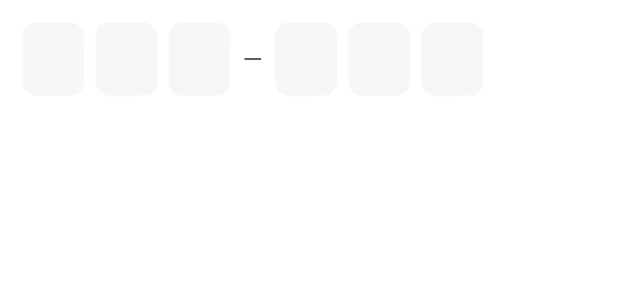
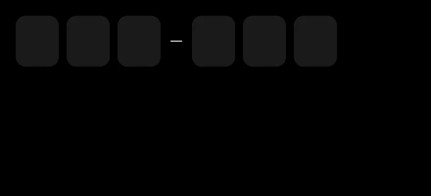
InputOTP is backed by one hidden TextInput and shows each character in an InputOTPSlot. The active slot gets a border-primary border and a blinking caret. The hidden input uses the one-time-code autofill hints, so codes from messages can be filled in automatically, and pasting fills every slot.
Group slots with InputOTPGroup and place an InputOTPSeparator between groups for codes such as 123-456.
Installation
The CLI also adds what it builds on: Icon, Text.
Manual
-
Target iOS 17 or later.
-
Add the Swift package to your app:
- Copy the theme files every view uses:
- Copy the source and every file it uses:
- Add the files to your app target.
- Set
minSdkto 24 or higher and add the dependencies:
- Copy the theme files every view uses:
- Copy the source and every file it uses:
- Update the
com.esuiss.uipackage names to match your project.
Usage
Set length and render one InputOTPSlot per index. Use value with onValueChange for controlled state, or defaultValue. onValueComplete fires when every slot is filled.
validationType limits input to numeric (the default number pad), alpha, alphanumeric or none, and onValueInvalid reports rejected characters. Set mask to hide the characters.
Use InputOTPSlotClassContext to style every slot at once, or className on a single slot.
Examples
Controlled
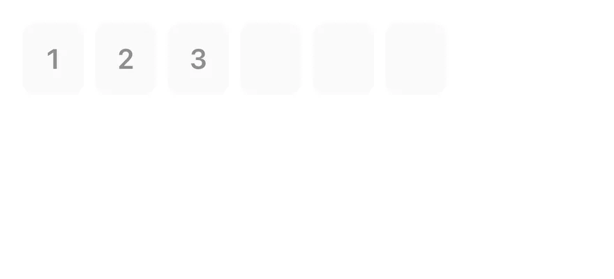
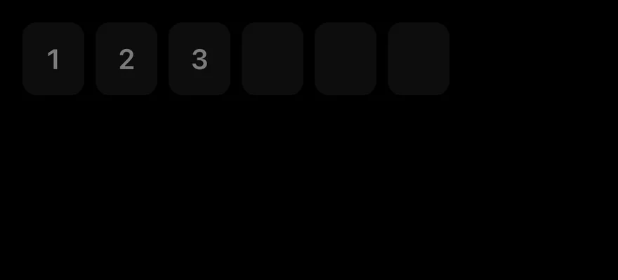
Controlled with value and onValueChange.
Alphanumeric
Letters and numbers with validationType="alphanumeric".
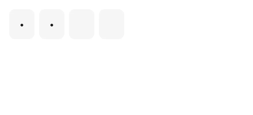
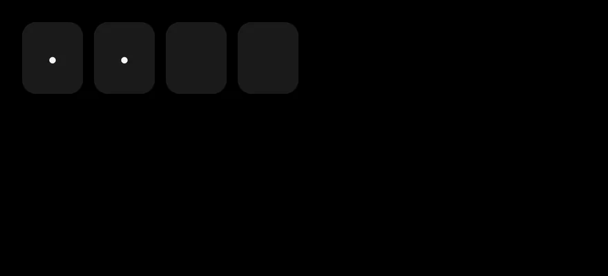
Masked
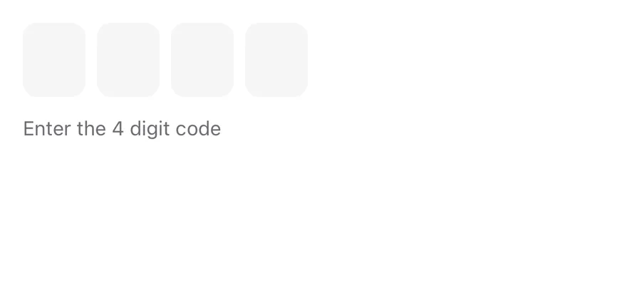
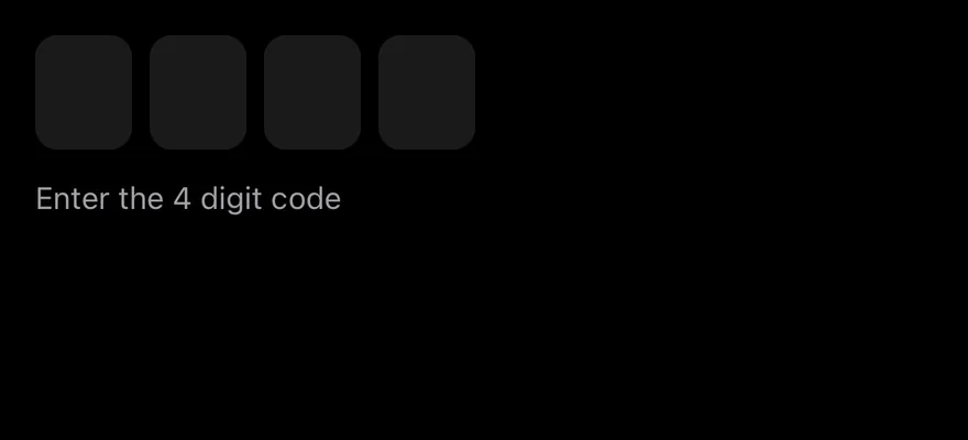
A four-digit code with hidden characters.
Disabled
A disabled field with a partial value.
API Reference
InputOTP
Root that owns the hidden input and the value.
Also accepts the props of React.ComponentProps<typeof OTPFieldPrimitive.Root>.
InputOTPGroup
Row of adjacent slots.
Also accepts the props of React.ComponentProps<typeof View>.
InputOTPSlot
Box that shows one character.
Also accepts the props of React.ComponentProps<typeof OTPFieldPrimitive.Input>.
InputOTPSeparator
Dash between groups.
Also accepts the props of React.ComponentProps<typeof OTPFieldPrimitive.Separator>.
Accessibility
- Screen readers interact with the hidden input, labelled "N character code" by default; pass
inputPropswith anaccessibilityLabelto localize it. - The visual slots are hidden from VoiceOver and TalkBack.
disabledis exposed on the input.
Notes
- The hidden input sets
textContentType="oneTimeCode"for iOS andautoComplete="one-time-code"for Android autofill. - The caret blink respects the system Reduce Motion setting.
- Uses
bg-secondary,border-primaryandbg-primarytokens; light and dark follow the system appearance.