suiss/ui · Component
Spinner
An eight-spoke activity indicator that shows an indeterminate wait.
Spinner is an open-source component from suiss/ui for React, React Native, SwiftUI and Jetpack Compose. The @esuiss/ui CLI copies its source into your project, so you own the code.
Spinner is an SVG of eight fading spokes that rotates in steps, like the system activity indicator. It draws in currentColor and is size-4 by default, so it inherits the surrounding text color.
Use it for short waits whose length is unknown, such as saving or loading more. For a placeholder that previews the shape of content, use Skeleton.
Installation
CLI
Works in any project with a components.json. See Installation for the one-line registry setup. Or use the suiss/ui CLI:
Manual
-
Add the
cnhelper. -
Copy the source into
components/ui/spinner.tsx:
- Update the import paths to match your project.
Usage
Change the size with a size-* class and the color with a text-* class. Inside a Button, pair it with disabled and give it data-icon="inline-start" to place it before the label.
Examples
Sizes
Shows spinners from size-3 to size-8.
Colors
Tints spinners with text-* color classes.
In button
Places a spinner in disabled buttons that are busy.
API Reference
Spinner
The animated activity indicator.
Also accepts the props of React.ComponentProps<"svg">.
Accessibility
- Renders with the
statusrole and the accessible nameLoading. Overridearia-labelto describe the specific task.
Notes
- Uses
data-slot="spinner". - The rotation lasts
0.8sand moves in eight steps, so one spoke advances at a time.


Spinner wraps the native ActivityIndicator in a square View. The indicator is scaled from its native small size to the size you pass, so it can match text and icon sizes. Its color is set through a class.
Installation
Manual
- Install the dependencies:
- Copy the source into
components/ui/spinner.tsx:
- Update the import paths to match your project.
- Install the dependencies:
- Copy the source into
components/ui/spinner.tsx:
- Update the import paths to match your project.
- Copy the source into
components/ui/spinner.tsx:
- Update the import paths to match your project.
-
Target iOS 17 or later.
-
Copy the theme files every view uses:
- Copy the source:
- Add the files to your app target.
- Set
minSdkto 24 or higher and add the dependencies:
- Copy the theme files every view uses:
- Copy the source and every file it uses:
- Update the
com.esuiss.uipackage names to match your project.
Usage
Set size in points (default 16) and colorClassName with an accent-* class, such as accent-primary or accent-destructive. Inside a button, use accent-primary-foreground on the default variant so the spinner matches the label.
Examples
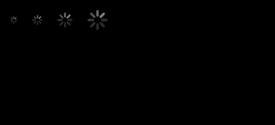
Sizes
Spinners at 12, 16, 24 and 32 points.

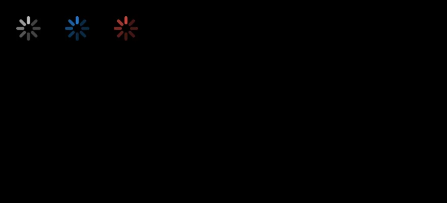
Colors
Spinners in the foreground, primary and destructive colors.

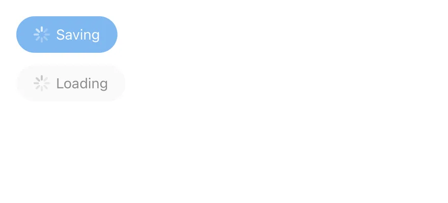
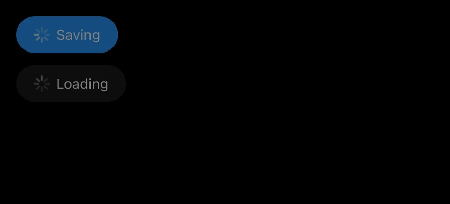
In button
Spinners inside disabled buttons next to a label.
API Reference
Spinner
| Prop | Type | Default | Description |
|---|---|---|---|
size | number | 16 | Width and height in points. Defaults to 16. |
colorClassName | string | "accent-muted-foreground" | Class that sets the indicator color. Defaults to accent-muted-foreground. |
Also accepts the props of React.ComponentProps<typeof ActivityIndicator>.
Accessibility
- The wrapper has
role="progressbar", isaccessible, and setsbusy: trueinaccessibilityState. - It is announced as
"Loading"unless you pass anotheraccessibilityLabel.
Notes
- The default color uses the
muted-foregroundtoken. - The look of the indicator comes from the platform's native activity indicator, so it differs between iOS and Android.