suiss/ui · Component
Calendar
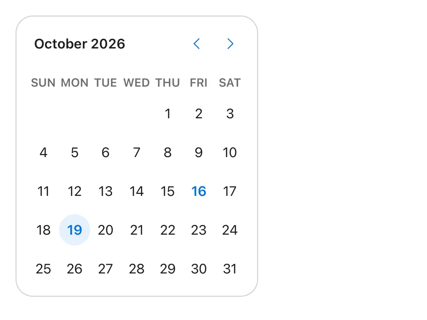
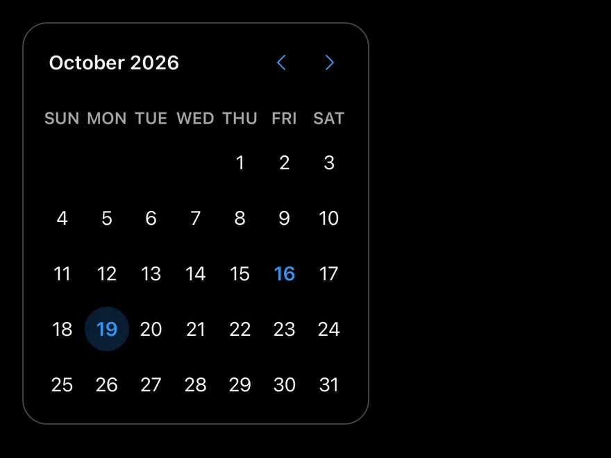
A month-grid date picker for selecting a single date, several dates or a date range.
Calendar is an open-source component from suiss/ui for React, React Native, SwiftUI and Jetpack Compose. The @esuiss/ui CLI copies its source into your project, so you own the code.
import * as React from "react"
import { Calendar } from "@/components/ui/calendar"

function SingleCalendar(props: React.ComponentProps<typeof Calendar>) {
  const today = new Date()
  const [date, setDate] = React.useState<Date | undefined>(
    new Date(today.getFullYear(), today.getMonth(), today.getDate() + 3)
  )
  return (
    <Calendar
      {...props}
      mode="single"
      selected={date}
      onSelect={setDate}
      className="rounded-2xl border"
    />
  )
}

export default function CalendarDemo() {
  return <SingleCalendar buttonVariant="plain" />
}Calendar is a styled wrapper around DayPicker from react-day-picker, so it accepts the full DayPicker API, including mode, selected, onSelect, numberOfMonths, captionLayout, disabled and showWeekNumber. It replaces the day cells with CalendarDayButton, which renders each day as a Button and styles today, single selections and range start, middle and end.
Use a calendar when people need to see dates in context, such as availability or a stay range. Place it inside a Popover to build a compact date picker; the calendar's background becomes transparent inside popover and card content.
Installation
CLI
$ pnpm dlx shadcn@latest add @esuiss/calendarWorks in any project with a components.json. See Installation for the one-line registry setup. Or use the suiss/ui CLI:
$ pnpm dlx @esuiss/ui@latest add calendarManual
- Install the dependencies and add the
cnhelper:
$ pnpm add @phosphor-icons/react react-day-picker-
Add the pieces it builds on: Button.
-
Copy the source into
components/ui/calendar.tsx:
"use client"

import {
  CaretDownIcon,
  CaretLeftIcon,
  CaretRightIcon,
} from "@phosphor-icons/react"
import * as React from "react"
import {
  type ChevronProps,
  type DayButtonProps,
  DayPicker,
  getDefaultClassNames,
  type RootProps,
  useDayPicker,
type WeekNumberProps,- Update the import paths to match your project.
Usage
import { Calendar, CalendarDayButton } from "@/components/ui/calendar"<SingleCalendar buttonVariant="plain" />Set mode to single, multiple or range, and control the selection with selected and onSelect. For ranges, numberOfMonths={2} shows two months side by side on wider screens.
Set captionLayout to dropdown, dropdown-months or dropdown-years to let people jump to a month or year directly; the default is label.
Unlike the DayPicker default, outside days are hidden unless you pass showOutsideDays. The default locale is enUS. Pass disabled with a matcher, such as { dayOfWeek: [0, 6] }, to block days.
Use CalendarDayButton when you supply your own components and still want the library's day styling.
Examples
Sizes
Compares the sm, default and lg sizes.
import * as React from "react"
import { Calendar } from "@/components/ui/calendar"

function SingleCalendar(props: React.ComponentProps<typeof Calendar>) {
  const today = new Date()
  const [date, setDate] = React.useState<Date | undefined>(
    new Date(today.getFullYear(), today.getMonth(), today.getDate() + 3)
  )
  return (
    <Calendar
      {...props}
      mode="single"
      selected={date}
      onSelect={setDate}
      className="rounded-2xl border"
    />
  )
}

export default function CalendarSizes() {
  return (
    <div className="flex flex-wrap items-start gap-6">
      <SingleCalendar buttonVariant="plain" size="sm" />
      <SingleCalendar buttonVariant="plain" size="default" />
      <SingleCalendar buttonVariant="plain" size="lg" />
    </div>
  )
}Range
Selects a seven-day range across two months with mode="range".
import * as React from "react"
import type { DateRange } from "react-day-picker"
import { Calendar } from "@/components/ui/calendar"

function RangeCalendar(props: React.ComponentProps<typeof Calendar>) {
  const today = new Date()
  const [range, setRange] = React.useState<DateRange | undefined>({
    from: today,
    to: new Date(today.getFullYear(), today.getMonth(), today.getDate() + 6),
  })
  return (
    <Calendar
      {...props}
      mode="range"
      selected={range}
      onSelect={setRange}
      numberOfMonths={2}
      className="rounded-2xl border"
    />
  )
}

export default function CalendarRange() {
  return <RangeCalendar buttonVariant="plain" />
}Dropdown caption
Replaces the month label with month and year dropdowns.
import * as React from "react"
import { Calendar } from "@/components/ui/calendar"

function SingleCalendar(props: React.ComponentProps<typeof Calendar>) {
  const today = new Date()
  const [date, setDate] = React.useState<Date | undefined>(
    new Date(today.getFullYear(), today.getMonth(), today.getDate() + 3)
  )
  return (
    <Calendar
      {...props}
      mode="single"
      selected={date}
      onSelect={setDate}
      className="rounded-2xl border"
    />
  )
}

export default function CalendarDropdownCaption() {
  return <SingleCalendar buttonVariant="plain" captionLayout="dropdown" />
}Week numbers
Shows the week number at the start of each row.
import * as React from "react"
import { Calendar } from "@/components/ui/calendar"

function SingleCalendar(props: React.ComponentProps<typeof Calendar>) {
  const today = new Date()
  const [date, setDate] = React.useState<Date | undefined>(
    new Date(today.getFullYear(), today.getMonth(), today.getDate() + 3)
  )
  return (
    <Calendar
      {...props}
      mode="single"
      selected={date}
      onSelect={setDate}
      className="rounded-2xl border"
    />
  )
}

export default function CalendarWeekNumbers() {
  return <SingleCalendar buttonVariant="plain" showWeekNumber />
}Disabled days
Disables weekends with a dayOfWeek matcher.
import * as React from "react"
import { Calendar } from "@/components/ui/calendar"

function SingleCalendar(props: React.ComponentProps<typeof Calendar>) {
  const today = new Date()
  const [date, setDate] = React.useState<Date | undefined>(
    new Date(today.getFullYear(), today.getMonth(), today.getDate() + 3)
  )
  return (
    <Calendar
      {...props}
      mode="single"
      selected={date}
      onSelect={setDate}
      className="rounded-2xl border"
    />
  )
}

export default function CalendarDisabledDays() {
  return (
    <SingleCalendar buttonVariant="plain" disabled={{ dayOfWeek: [0, 6] }} />
  )
}API Reference
Calendar
The date grid, with month navigation and caption.
| Prop | Type | Default | Description |
|---|---|---|---|
buttonVariant | React.ComponentProps<typeof Button>["variant"] | "plain" | Button variant used for the previous and next month buttons. Defaults to plain. |
size | "sm" | "default" | "lg" | "default" | Cell size and type scale: sm, default or lg. |
Also accepts the props of React.ComponentProps<typeof DayPicker>.
CalendarDayButton
The button rendered for each day, styled by its selection state.
Also accepts the props of DayButtonProps.
Accessibility
- Each month renders as a
gridlabelled with its month and year; selected days setaria-selectedon their cell. - Arrow keys move focus between days, and clicking or pressing a day selects it.
- The navigation buttons are labelled for the next and previous month.
- Disabled days render disabled buttons.
- Caption dropdowns are native
selectelements labelled for month and year.
Notes
- Styling hooks:
data-slot="calendar"anddata-sizeon the root; day buttons exposedata-day,data-today,data-selected-single,data-range-start,data-range-middleanddata-range-end. - Cell size and radius come from the
--cell-sizeand--cell-radiuscustom properties, whichsizeadjusts. - Pass
classNamesto override anyreact-day-pickerclass key; your values replace the defaults for that key. - Navigation chevrons flip in right-to-left layouts.
import * as React from "react"
import { Calendar } from "@/components/ui/calendar"

type CalendarProps = React.ComponentProps<typeof Calendar>

function SingleCalendar(
  props: Omit<CalendarProps, "mode" | "selected" | "onSelect">
) {
  const today = new Date()
  const [date, setDate] = React.useState<Date | undefined>(
    new Date(today.getFullYear(), today.getMonth(), today.getDate() + 3)
  )
  return (
    <Calendar
      {...props}
      mode="single"
      selected={date}
      onSelect={setDate}
      className="rounded-2xl border border-border"
    />
  )
}

export function CalendarExample() {
  return (
    <SingleCalendar />
  )
}import EsuissUI
import SwiftUI
enum CalendarDates {
static func day(_ offset: Int) -> Date {
let calendar = Foundation.Calendar.current
let start = calendar.startOfDay(for: Date())
return calendar.date(byAdding: .day, value: offset, to: start) ?? start
}
static func dayOfMonth(_ day: Int) -> Date {
let calendar = Foundation.Calendar.current
var components = calendar.dateComponents([.year, .month], from: Date())
components.day = day
return calendar.date(from: components) ?? Date()
}
}
struct CalendarBordered: ViewModifier {
func body(content: Content) -> some View {
content
.clipShape(RoundedRectangle(cornerRadius: Radius.xl2, style: .continuous))
.overlay {
RoundedRectangle(cornerRadius: Radius.xl2, style: .continuous).strokeBorder(EsuissColor.border)
}
}
}
struct CalendarSingleDemo: View {
var size: DateCalendar.Size = .default
var buttonVariant: VariantButtonStyle.Variant = .plain
var captionLayout: DateCalendar.CaptionLayout = .label
var showOutsideDays = false
var showWeekNumber = false
var weekendsDisabled = false
@State private var date: Date? = CalendarDates.day(3)
var body: some View {
DateCalendar(
selection: $date,
size: size,
buttonVariant: buttonVariant,
captionLayout: captionLayout,
showOutsideDays: showOutsideDays,
showWeekNumber: showWeekNumber,
isDisabled: { day in
guard weekendsDisabled else { return false }
let weekday = Foundation.Calendar.current.component(.weekday, from: day)
return weekday == 1 || weekday == 7
}
)
.modifier(CalendarBordered())
}
}
func day(_ offset: Int) -> Date {
let calendar = Foundation.Calendar.current
let start = calendar.startOfDay(for: Date())
return calendar.date(byAdding: .day, value: offset, to: start) ?? start
}
func dayOfMonth(_ day: Int) -> Date {
let calendar = Foundation.Calendar.current
var components = calendar.dateComponents([.year, .month], from: Date())
components.day = day
return calendar.date(from: components) ?? Date()
}import androidx.compose.foundation.border
import androidx.compose.foundation.layout.Box
import androidx.compose.foundation.layout.padding
import androidx.compose.foundation.shape.RoundedCornerShape
import androidx.compose.runtime.Composable
import androidx.compose.runtime.getValue
import androidx.compose.runtime.mutableStateOf
import androidx.compose.runtime.saveable.rememberSaveable
import androidx.compose.runtime.setValue
import androidx.compose.ui.Modifier
import androidx.compose.ui.unit.dp
import com.esuiss.ui.components.ButtonVariant
import com.esuiss.ui.components.Calendar
import com.esuiss.ui.components.CalendarCaptionLayout
import com.esuiss.ui.components.CalendarSize
import com.esuiss.ui.theme.EsuissTheme
import com.esuiss.ui.theme.Radius
import java.util.Date
import java.util.GregorianCalendar
import java.util.Locale
fun calendarDay(offsetDays: Int = 0, dayOfMonth: Int? = null): Date {
val now = GregorianCalendar()
val result = GregorianCalendar(now.get(GregorianCalendar.YEAR), now.get(GregorianCalendar.MONTH), now.get(GregorianCalendar.DAY_OF_MONTH))
if (dayOfMonth != null) result.set(GregorianCalendar.DAY_OF_MONTH, dayOfMonth)
result.add(GregorianCalendar.DAY_OF_MONTH, offsetDays)
return result.time
}
fun calendarIsWeekend(date: Date): Boolean {
val day = GregorianCalendar().apply { time = date }.get(GregorianCalendar.DAY_OF_WEEK)
return day == GregorianCalendar.SATURDAY || day == GregorianCalendar.SUNDAY
}
@Composable
fun CalendarFrame(content: @Composable () -> Unit) {
Box(
Modifier
.border(1.dp, EsuissTheme.colors.border, RoundedCornerShape(Radius.xl2))
.padding(1.dp),
) {
content()
}
}
@Composable
fun CalendarSingle(
size: CalendarSize = CalendarSize.Default,
captionLayout: CalendarCaptionLayout = CalendarCaptionLayout.Label,
showWeekNumber: Boolean = false,
showOutsideDays: Boolean = false,
weekendsDisabled: Boolean = false,
buttonVariant: ButtonVariant = ButtonVariant.Plain,
locale: Locale = Locale.getDefault(),
key: String = "",
) {
var date by rememberSaveable(key) { mutableStateOf<Date?>(calendarDay(offsetDays = 3)) }
CalendarFrame {
Calendar(
selected = date,
onSelect = { date = it },
size = size,
captionLayout = captionLayout,
showWeekNumber = showWeekNumber,
showOutsideDays = showOutsideDays,
disabled = { weekendsDisabled && calendarIsWeekend(it) },
buttonVariant = buttonVariant,
locale = locale,
)
}
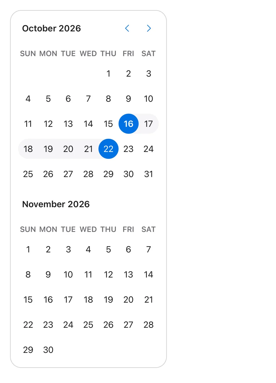
}Calendar renders one or more month grids with a caption, previous and next buttons, weekday headers and pressable day cells. Selection mode is set with mode: single, multiple or range. Ranges are drawn as a continuous shaded band with filled start and end days.
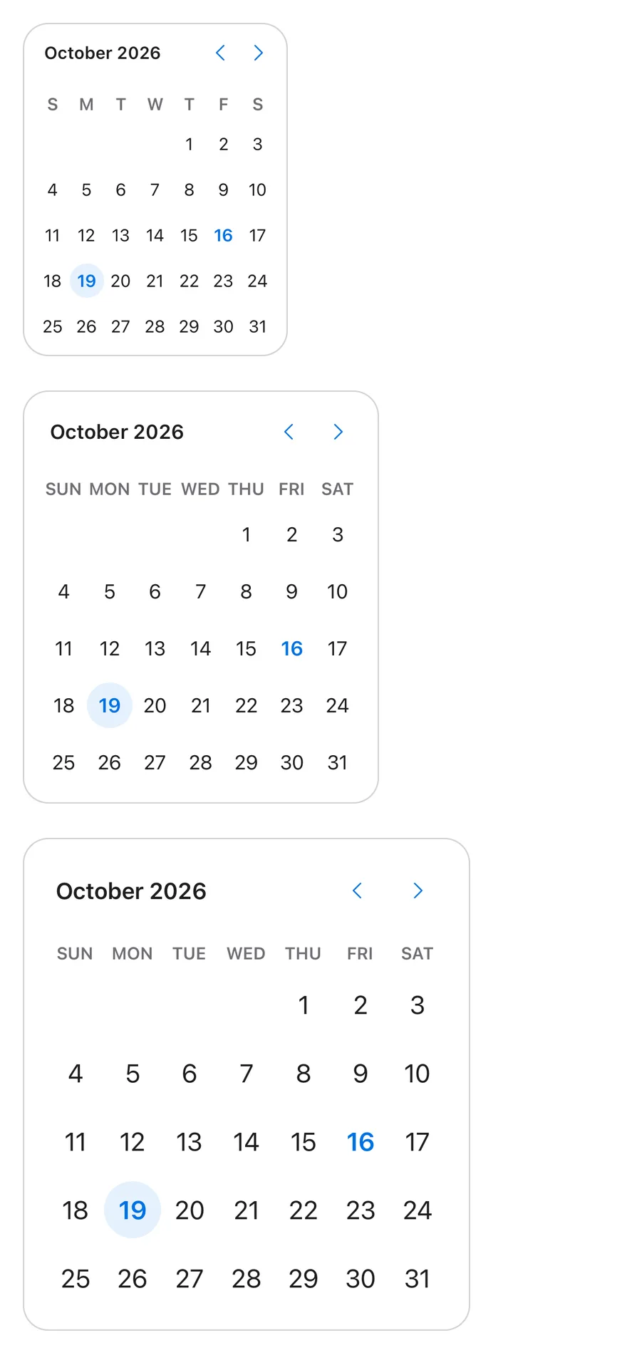
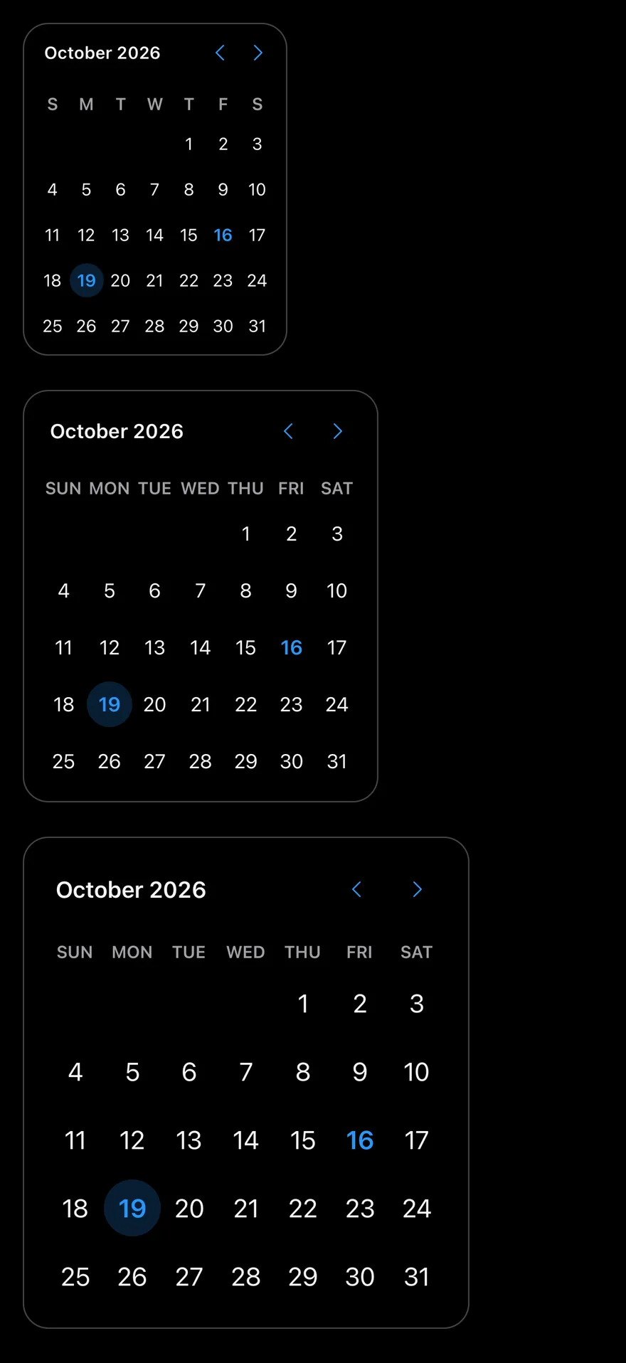
Three sizes are available: sm, default and lg. The caption can be a plain label or month and year dropdowns built on Select, which suits birth dates and other dates far from today.
Installation
$ pnpm dlx shadcn@latest add @esuiss-rn/calendarSee Installation for the components.json setup. Or use the suiss/ui CLI:
$ pnpm dlx @esuiss/ui@latest add calendar$ pnpm dlx @esuiss/ui@latest add calendar --platform swift$ pnpm dlx @esuiss/ui@latest add calendar --platform kotlinThe CLI also adds what it builds on: Button, Icon, Select, Text.
Manual
- Install the dependencies:
npx expo install cn phosphor-react-native react-native-svg-
Add the pieces it builds on: Button, Icon, Select, Text, and the primitives
components/primitives/calendar.tsx,components/primitives/use-render.tsx. -
Copy the source into
components/ui/calendar.tsx:
import { cn } from "cn"
import { CaretLeftIcon, CaretRightIcon } from "phosphor-react-native"
import * as React from "react"
import { I18nManager, ScrollView, View } from "react-native"
import * as CalendarPrimitive from "@/components/primitives/calendar"
import { resolveClassName } from "@/components/primitives/use-render"
import { Button, type ButtonProps } from "@/components/ui/button"
import { Icon } from "@/components/ui/icon"
import {
  Select,
  SelectContent,
  SelectItem,
  SelectTrigger,
  SelectValue,
} from "@/components/ui/select"
import { Text, TextClassContext } from "@/components/ui/text"- Update the import paths to match your project.
- Install the dependencies:
npx expo install cn phosphor-react-native react-native-svg-
Add the pieces it builds on: Button, Icon, Select, Text, and the primitives
components/primitives/calendar.tsx,components/primitives/use-render.tsx. -
Copy the source into
components/ui/calendar.tsx:
import { cn } from "cn"
import { CaretLeftIcon, CaretRightIcon } from "phosphor-react-native"
import * as React from "react"
import { I18nManager, ScrollView, View } from "react-native"
import * as CalendarPrimitive from "@/components/primitives/calendar"
import { resolveClassName } from "@/components/primitives/use-render"
import { Button, type ButtonProps } from "@/components/ui/button"
import { Icon } from "@/components/ui/icon"
import {
  Select,
  SelectContent,
  SelectItem,
  SelectTrigger,
  SelectValue,
} from "@/components/ui/select"
import { Text, TextClassContext } from "@/components/ui/text"- Update the import paths to match your project.
- Install the dependencies:
npx expo install phosphor-react-native react-native-svg-
Add the pieces it builds on: Button, Icon, Select, Text, and the primitives
components/primitives/calendar.tsx,components/primitives/use-render.tsx. -
Copy the source into
components/ui/calendar.tsx:
import { CaretLeftIcon, CaretRightIcon } from "phosphor-react-native"
import * as React from "react"
import {
  I18nManager,
  Pressable,
  ScrollView,
  type StyleProp,
  StyleSheet,
  type TextStyle,
  View,
  type ViewStyle,
} from "react-native"
import * as CalendarPrimitive from "@/components/primitives/calendar"
import { resolveStyle } from "@/components/primitives/use-render"
import { Button, type ButtonProps } from "@/components/ui/button"
import { Icon } from "@/components/ui/icon"- Update the import paths to match your project.
-
Target iOS 17 or later.
-
Add the Swift package to your app:
.package(url: "https://github.com/phosphor-icons/swift", from: "2.1.0")- Copy the theme files every view uses:
import SwiftUI
import UIKit

struct RGBA: Sendable {
  let red: CGFloat
  let green: CGFloat
  let blue: CGFloat
  let alpha: CGFloat

  init(_ hex: UInt32, _ alpha: CGFloat = 1) {
    red = CGFloat((hex >> 16) & 0xFF) / 255
    green = CGFloat((hex >> 8) & 0xFF) / 255
    blue = CGFloat(hex & 0xFF) / 255
    self.alpha = alpha
}import SwiftUI
public enum EsuissColor {
public static let background = Color.adaptive(light: .init(0xFFFFFF), dark: .init(0x000000))
public static let foreground = Color.adaptive(light: .init(0x1D1D1F), dark: .init(0xF5F5F7))
public static let card = Color.adaptive(light: .init(0xFFFFFF), dark: .init(0x1D1D1F))
public static let cardForeground = Color.adaptive(light: .init(0x1D1D1F), dark: .init(0xF5F5F7))
public static let popover = Color.adaptive(light: .init(0xFFFFFF), dark: .init(0x1D1D1F))
public static let popoverForeground = Color.adaptive(light: .init(0x1D1D1F), dark: .init(0xF5F5F7))
public static let primary = Color.adaptive(light: .init(0x0071E3), dark: .init(0x2997FF))
public static let primaryForeground = Color.adaptive(light: .init(0xFFFFFF), dark: .init(0xFFFFFF))
public static let secondary = Color.adaptive(light: .init(0x000000, 0.04), dark: .init(0xFFFFFF, 0.1))
public static let secondaryForeground = Color.adaptive(light: .init(0x1D1D1F), dark: .init(0xF5F5F7))
public static let muted = Color.adaptive(light: .init(0xF5F5F7), dark: .init(0x161617))
public static let mutedForeground = Color.adaptive(light: .init(0x6E6E73), dark: .init(0xA1A1A6))
public static let accent = Color.adaptive(light: .init(0x000000, 0.06), dark: .init(0xFFFFFF, 0.1))- Copy the source and every file it uses:
import PhosphorSwift
import SwiftUI

public struct DateRange: Hashable, Sendable {
  public var from: Date
  public var to: Date?

  public init(from: Date, to: Date? = nil) {
    self.from = from
    self.to = to
  }

  public static func adding(_ day: Date, to range: DateRange?, calendar: Foundation.Calendar) -> DateRange? {
    guard let range else { return DateRange(from: day) }
    let from = range.from
guard let to = range.to else {import SwiftUI
public struct VariantButtonStyle: ButtonStyle {
public enum Variant: CaseIterable, Sendable {
case `default`, outline, secondary, tinted, ghost, plain, destructive, link
}
public enum Size: CaseIterable, Sendable {
case `default`, xs, sm, lg, xl, icon, iconXs, iconSm, iconLg, iconXl
var height: CGFloat {
switch self {
case .xs, .iconXs: 24
case .sm, .iconSm: 32
case .default, .icon: 36
case .lg, .iconLg: 44import SwiftUI
extension EnvironmentValues {
@Entry var buttonGroup: Axis? = nil
@Entry var buttonGroupSize: CGSize = .zero
}
enum ButtonGroupSpace: Hashable {
case group
}
struct ButtonGroupFrame {
let bounds: Anchor<CGRect>
let outlined: Bool
}import PhosphorSwift
import SwiftUI
extension Shadow {
static let control = Shadow(color: .black.opacity(0.08), radius: 0.5, y: 0.5)
static let thumb = Shadow(color: .black.opacity(0.12), radius: 1.5, y: 1)
}
struct SelectionIndicator<Mark: View>: View {
let checked: Bool
let pressed: Bool
let cornerRadius: CGFloat
let mark: Mark
@Environment(\.isEnabled) private var isEnabled
@Environment(\.isInvalid) private var invalidimport SwiftUI
extension EnvironmentValues {
@Entry public var isInvalid = false
@Entry var fieldInset = false
@Entry var fieldGroupInset = false
@Entry var fieldSetInset = false
}
extension View {
public func invalid(_ isInvalid: Bool = true) -> some View {
environment(\.isInvalid, isInvalid)
}
}
public enum FieldOrientation: CaseIterable, Sendable {import SwiftUI
extension EnvironmentValues {
@Entry public var hapticsEnabled = true
}
extension View {
public func haptics(_ enabled: Bool) -> some View {
environment(\.hapticsEnabled, enabled)
}
func hapticFeedback<Trigger: Equatable>(_ feedback: SensoryFeedback, trigger: Trigger) -> some View {
modifier(HapticFeedbackModifier(feedback: feedback, trigger: trigger) { _, _ in true })
}
func hapticFeedback<Trigger: Equatable>(import SwiftUI
public struct Separator: View {
let orientation: Axis
public init(_ orientation: Axis = .horizontal) {
self.orientation = orientation
}
public var body: some View {
Rectangle()
.fill(EsuissColor.border)
.frame(width: orientation == .vertical ? 1 : nil, height: orientation == .horizontal ? 1 : nil)
.frame(maxWidth: orientation == .horizontal ? .infinity : nil, maxHeight: orientation == .vertical ? .infinity : nil)
.accessibilityHidden(true)
}import SwiftUI
public enum TextVariant: CaseIterable, Sendable {
case `default`, h1, h2, h3, h4, p, blockquote, code, lead, large, small, muted
var style: TextStyle {
switch self {
case .h1: .xl3
case .h2: .xl2
case .h3: .xl
case .h4, .lead, .large: .lg
case .code, .small, .muted: .sm
default: .base
}
}- Add the files to your app target.
- Set
minSdkto 24 or higher and add the dependencies:
implementation(platform("androidx.compose:compose-bom:2026.09.00"))
implementation("androidx.compose.foundation:foundation")
implementation("androidx.compose.ui:ui")
implementation("com.adamglin:phosphor-icon-android:1.0.0")- Copy the theme files every view uses:
package com.esuiss.ui.theme

import androidx.compose.foundation.isSystemInDarkTheme
import androidx.compose.runtime.Composable
import androidx.compose.runtime.CompositionLocalProvider
import androidx.compose.runtime.Immutable
import androidx.compose.runtime.staticCompositionLocalOf
import androidx.compose.ui.Modifier
import androidx.compose.ui.draw.dropShadow
import androidx.compose.ui.graphics.Color
import androidx.compose.ui.graphics.Shape
import androidx.compose.ui.graphics.shadow.Shadow as DropShadow
import androidx.compose.ui.text.TextStyle
import androidx.compose.ui.text.style.LineHeightStyle
import androidx.compose.ui.unit.Dp
import androidx.compose.ui.unit.DpOffsetpackage com.esuiss.ui.theme
import androidx.compose.runtime.Immutable
import androidx.compose.ui.graphics.Color
import androidx.compose.ui.unit.dp
@Immutable
data class Colors(
val background: Color,
val foreground: Color,
val card: Color,
val cardForeground: Color,
val popover: Color,
val popoverForeground: Color,
val primary: Color,
val primaryForeground: Color,- Copy the source and every file it uses:
package com.esuiss.ui.components

import androidx.compose.animation.AnimatedContent
import androidx.compose.animation.core.tween
import androidx.compose.animation.fadeIn
import androidx.compose.animation.fadeOut
import androidx.compose.animation.slideInHorizontally
import androidx.compose.animation.slideOutHorizontally
import androidx.compose.animation.togetherWith
import androidx.compose.foundation.background
import androidx.compose.foundation.clickable
import androidx.compose.foundation.gestures.detectHorizontalDragGestures
import androidx.compose.foundation.interaction.MutableInteractionSource
import androidx.compose.foundation.interaction.collectIsPressedAsState
import androidx.compose.foundation.layout.Arrangement
import androidx.compose.foundation.layout.Boxpackage com.esuiss.ui.components
import androidx.compose.foundation.background
import androidx.compose.foundation.border
import androidx.compose.foundation.clickable
import androidx.compose.foundation.interaction.MutableInteractionSource
import androidx.compose.foundation.interaction.collectIsPressedAsState
import androidx.compose.foundation.layout.Arrangement
import androidx.compose.foundation.layout.Row
import androidx.compose.foundation.layout.RowScope
import androidx.compose.foundation.layout.fillMaxWidth
import androidx.compose.foundation.layout.height
import androidx.compose.foundation.layout.padding
import androidx.compose.foundation.layout.size
import androidx.compose.foundation.shape.CircleShape
import androidx.compose.foundation.shape.RoundedCornerShapepackage com.esuiss.ui.components
import androidx.compose.foundation.background
import androidx.compose.foundation.gestures.Orientation
import androidx.compose.foundation.layout.Arrangement
import androidx.compose.foundation.layout.Box
import androidx.compose.foundation.layout.Row
import androidx.compose.foundation.layout.RowScope
import androidx.compose.foundation.layout.padding
import androidx.compose.foundation.shape.CircleShape
import androidx.compose.foundation.shape.CornerSize
import androidx.compose.foundation.shape.RoundedCornerShape
import androidx.compose.runtime.Composable
import androidx.compose.runtime.CompositionLocalProvider
import androidx.compose.runtime.DisposableEffect
import androidx.compose.runtime.Immutablepackage com.esuiss.ui.components
import androidx.compose.foundation.background
import androidx.compose.foundation.border
import androidx.compose.foundation.interaction.MutableInteractionSource
import androidx.compose.foundation.interaction.collectIsPressedAsState
import androidx.compose.foundation.layout.Box
import androidx.compose.foundation.layout.size
import androidx.compose.foundation.selection.triStateToggleable
import androidx.compose.foundation.shape.RoundedCornerShape
import androidx.compose.runtime.Composable
import androidx.compose.runtime.getValue
import androidx.compose.runtime.remember
import androidx.compose.ui.Alignment
import androidx.compose.ui.Modifier
import androidx.compose.ui.draw.alphapackage com.esuiss.ui.components
import androidx.compose.runtime.compositionLocalOf
import androidx.compose.ui.graphics.Color
import androidx.compose.ui.text.TextStyle
import androidx.compose.ui.unit.Dp
import androidx.compose.ui.unit.dp
val LocalContentStyle = compositionLocalOf { TextStyle.Default }
val LocalContentColor = compositionLocalOf { Color.Unspecified }
val LocalIconSize = compositionLocalOf { 20.dp }package com.esuiss.ui.components
import androidx.compose.animation.core.animateFloatAsState
import androidx.compose.foundation.background
import androidx.compose.foundation.clickable
import androidx.compose.foundation.interaction.MutableInteractionSource
import androidx.compose.foundation.interaction.collectIsPressedAsState
import androidx.compose.foundation.layout.Arrangement
import androidx.compose.foundation.layout.Box
import androidx.compose.foundation.layout.Column
import androidx.compose.foundation.layout.ColumnScope
import androidx.compose.foundation.layout.IntrinsicSize
import androidx.compose.foundation.layout.Row
import androidx.compose.foundation.layout.RowScope
import androidx.compose.foundation.layout.fillMaxWidth
import androidx.compose.foundation.layout.heightpackage com.esuiss.ui.components
import androidx.compose.foundation.background
import androidx.compose.foundation.gestures.Orientation
import androidx.compose.foundation.layout.Arrangement
import androidx.compose.foundation.layout.Box
import androidx.compose.foundation.layout.Column
import androidx.compose.foundation.layout.ColumnScope
import androidx.compose.foundation.layout.LayoutScopeMarker
import androidx.compose.foundation.layout.Row
import androidx.compose.foundation.layout.RowScope
import androidx.compose.foundation.layout.fillMaxWidth
import androidx.compose.foundation.layout.heightIn
import androidx.compose.foundation.layout.padding
import androidx.compose.foundation.shape.RoundedCornerShape
import androidx.compose.foundation.text.BasicTextpackage com.esuiss.ui.components
import android.provider.Settings
import androidx.compose.animation.core.CubicBezierEasing
import androidx.compose.foundation.background
import androidx.compose.foundation.border
import androidx.compose.foundation.gestures.Orientation
import androidx.compose.foundation.text.selection.TextSelectionColors
import androidx.compose.runtime.Composable
import androidx.compose.runtime.mutableStateOf
import androidx.compose.runtime.remember
import androidx.compose.ui.Modifier
import androidx.compose.ui.draw.alpha
import androidx.compose.ui.draw.clip
import androidx.compose.ui.draw.drawWithContent
import androidx.compose.ui.geometry.Offsetpackage com.esuiss.ui.components
import androidx.compose.runtime.Composable
import androidx.compose.runtime.CompositionLocalProvider
import androidx.compose.runtime.remember
import androidx.compose.runtime.staticCompositionLocalOf
import androidx.compose.ui.hapticfeedback.HapticFeedback
import androidx.compose.ui.hapticfeedback.HapticFeedbackType
import androidx.compose.ui.platform.LocalHapticFeedback
val LocalHapticsEnabled = staticCompositionLocalOf { true }
@Composable
fun ProvideHaptics(enabled: Boolean, content: @Composable () -> Unit) {
CompositionLocalProvider(LocalHapticsEnabled provides enabled, content = content)
}package com.esuiss.ui.components
import androidx.compose.foundation.Image
import androidx.compose.foundation.layout.size
import androidx.compose.runtime.Composable
import androidx.compose.ui.Modifier
import androidx.compose.ui.graphics.Color
import androidx.compose.ui.graphics.ColorFilter
import androidx.compose.ui.graphics.takeOrElse
import androidx.compose.ui.graphics.vector.ImageVector
import androidx.compose.ui.unit.Dp
import com.esuiss.ui.theme.EsuissTheme
@Composable
fun Icon(
imageVector: ImageVector,package com.esuiss.ui.components
import androidx.compose.foundation.layout.Arrangement
import androidx.compose.foundation.layout.Row
import androidx.compose.foundation.layout.RowScope
import androidx.compose.foundation.text.BasicText
import androidx.compose.runtime.Composable
import androidx.compose.runtime.CompositionLocalProvider
import androidx.compose.ui.Alignment
import androidx.compose.ui.Modifier
import androidx.compose.ui.draw.alpha
import androidx.compose.ui.text.font.FontWeight
import androidx.compose.ui.unit.dp
import com.esuiss.ui.theme.EsuissTheme
import com.esuiss.ui.theme.Typographypackage com.esuiss.ui.components
import android.os.Build
import android.view.Window
import android.view.WindowManager
import androidx.compose.animation.AnimatedVisibility
import androidx.compose.animation.AnimatedVisibilityScope
import androidx.compose.animation.EnterExitState
import androidx.compose.animation.core.MutableTransitionState
import androidx.compose.animation.core.animateFloat
import androidx.compose.animation.core.tween
import androidx.compose.animation.fadeIn
import androidx.compose.animation.fadeOut
import androidx.compose.animation.scaleIn
import androidx.compose.animation.scaleOut
import androidx.compose.animation.slideInpackage com.esuiss.ui.components
import androidx.compose.foundation.background
import androidx.compose.foundation.gestures.Orientation
import androidx.compose.foundation.layout.Box
import androidx.compose.foundation.layout.fillMaxHeight
import androidx.compose.foundation.layout.fillMaxWidth
import androidx.compose.foundation.layout.height
import androidx.compose.foundation.layout.width
import androidx.compose.runtime.Composable
import androidx.compose.ui.Modifier
import androidx.compose.ui.unit.dp
import com.esuiss.ui.theme.EsuissTheme
@Composable
fun Separator(- Update the
com.esuiss.uipackage names to match your project.
Usage
import { CalendarDayButton, Calendar } from "@/components/ui/calendar"<SingleCalendar />Pass mode, selected and onSelect to control the selection; selected is a Date, a Date[] or a { from, to } range depending on the mode. Use month, defaultMonth and onMonthChange to control the visible month, and numberOfMonths to show several months.
Use disabled with date matchers, such as { dayOfWeek: [0, 6] }, to block days. Limit navigation with startMonth and endMonth; with a year dropdown they default to the last 100 years.
Set locale for month and weekday names, and weekStartsOn to change the first day of the week. CalendarDayButton is exported for custom day rendering.
Examples
Sizes
The sm, default and lg sizes.
import * as React from "react"
import { ScrollView } from "react-native"
import { Calendar } from "@/components/ui/calendar"

type CalendarProps = React.ComponentProps<typeof Calendar>

function SingleCalendar(
  props: Omit<CalendarProps, "mode" | "selected" | "onSelect">
) {
  const today = new Date()
  const [date, setDate] = React.useState<Date | undefined>(
    new Date(today.getFullYear(), today.getMonth(), today.getDate() + 3)
  )
  return (
    <Calendar
      {...props}
      mode="single"
      selected={date}
      onSelect={setDate}
      className="rounded-2xl border border-border"
    />
  )
}

export function CalendarSizesExample() {
  return (
    <ScrollView contentContainerClassName="items-start gap-6">
      <SingleCalendar size="sm" />
      <SingleCalendar size="default" />
      <SingleCalendar size="lg" />
    </ScrollView>
  )
}import EsuissUI
import SwiftUI
struct CalendarSizesExample: View {
var body: some View {
VStack(alignment: .leading, spacing: 24) {
CalendarSingleDemo(size: .sm)
CalendarSingleDemo(size: .default)
CalendarSingleDemo(size: .lg)
}
}
}
enum CalendarDates {
static func day(_ offset: Int) -> Date {
let calendar = Foundation.Calendar.current
let start = calendar.startOfDay(for: Date())
return calendar.date(byAdding: .day, value: offset, to: start) ?? start
}
static func dayOfMonth(_ day: Int) -> Date {
let calendar = Foundation.Calendar.current
var components = calendar.dateComponents([.year, .month], from: Date())
components.day = day
return calendar.date(from: components) ?? Date()
}
}
struct CalendarBordered: ViewModifier {
func body(content: Content) -> some View {
content
.clipShape(RoundedRectangle(cornerRadius: Radius.xl2, style: .continuous))
.overlay {
RoundedRectangle(cornerRadius: Radius.xl2, style: .continuous).strokeBorder(EsuissColor.border)
}
}
}
struct CalendarSingleDemo: View {
var size: DateCalendar.Size = .default
var buttonVariant: VariantButtonStyle.Variant = .plain
var captionLayout: DateCalendar.CaptionLayout = .label
var showOutsideDays = false
var showWeekNumber = false
var weekendsDisabled = false
@State private var date: Date? = CalendarDates.day(3)
var body: some View {
DateCalendar(
selection: $date,
size: size,
buttonVariant: buttonVariant,
captionLayout: captionLayout,
showOutsideDays: showOutsideDays,
showWeekNumber: showWeekNumber,
isDisabled: { day in
guard weekendsDisabled else { return false }
let weekday = Foundation.Calendar.current.component(.weekday, from: day)
return weekday == 1 || weekday == 7
}
)
.modifier(CalendarBordered())
}
}
func day(_ offset: Int) -> Date {
let calendar = Foundation.Calendar.current
let start = calendar.startOfDay(for: Date())
return calendar.date(byAdding: .day, value: offset, to: start) ?? start
}
func dayOfMonth(_ day: Int) -> Date {
let calendar = Foundation.Calendar.current
var components = calendar.dateComponents([.year, .month], from: Date())
components.day = day
return calendar.date(from: components) ?? Date()
}import androidx.compose.foundation.border
import androidx.compose.foundation.layout.Arrangement
import androidx.compose.foundation.layout.Box
import androidx.compose.foundation.layout.Column
import androidx.compose.foundation.layout.padding
import androidx.compose.foundation.shape.RoundedCornerShape
import androidx.compose.runtime.Composable
import androidx.compose.runtime.getValue
import androidx.compose.runtime.mutableStateOf
import androidx.compose.runtime.saveable.rememberSaveable
import androidx.compose.runtime.setValue
import androidx.compose.ui.Modifier
import androidx.compose.ui.unit.dp
import com.esuiss.ui.components.ButtonVariant
import com.esuiss.ui.components.Calendar
import com.esuiss.ui.components.CalendarCaptionLayout
import com.esuiss.ui.components.CalendarSize
import com.esuiss.ui.theme.EsuissTheme
import com.esuiss.ui.theme.Radius
import java.util.Date
import java.util.GregorianCalendar
import java.util.Locale
fun calendarDay(offsetDays: Int = 0, dayOfMonth: Int? = null): Date {
val now = GregorianCalendar()
val result = GregorianCalendar(now.get(GregorianCalendar.YEAR), now.get(GregorianCalendar.MONTH), now.get(GregorianCalendar.DAY_OF_MONTH))
if (dayOfMonth != null) result.set(GregorianCalendar.DAY_OF_MONTH, dayOfMonth)
result.add(GregorianCalendar.DAY_OF_MONTH, offsetDays)
return result.time
}
fun calendarIsWeekend(date: Date): Boolean {
val day = GregorianCalendar().apply { time = date }.get(GregorianCalendar.DAY_OF_WEEK)
return day == GregorianCalendar.SATURDAY || day == GregorianCalendar.SUNDAY
}
@Composable
fun CalendarFrame(content: @Composable () -> Unit) {
Box(
Modifier
.border(1.dp, EsuissTheme.colors.border, RoundedCornerShape(Radius.xl2))
.padding(1.dp),
) {
content()
}
}
@Composable
fun CalendarSingle(
size: CalendarSize = CalendarSize.Default,
captionLayout: CalendarCaptionLayout = CalendarCaptionLayout.Label,
showWeekNumber: Boolean = false,
showOutsideDays: Boolean = false,
weekendsDisabled: Boolean = false,
buttonVariant: ButtonVariant = ButtonVariant.Plain,
locale: Locale = Locale.getDefault(),
key: String = "",
) {
var date by rememberSaveable(key) { mutableStateOf<Date?>(calendarDay(offsetDays = 3)) }
CalendarFrame {
Calendar(
selected = date,
onSelect = { date = it },
size = size,
captionLayout = captionLayout,
showWeekNumber = showWeekNumber,
showOutsideDays = showOutsideDays,
disabled = { weekendsDisabled && calendarIsWeekend(it) },
buttonVariant = buttonVariant,
locale = locale,
)
}
}
@Composable
fun CalendarSizes() {
Column(verticalArrangement = Arrangement.spacedBy(24.dp)) {
CalendarSingle(size = CalendarSize.Sm, key = "sm")
CalendarSingle(size = CalendarSize.Default, key = "default")
CalendarSingle(size = CalendarSize.Lg, key = "lg")
}
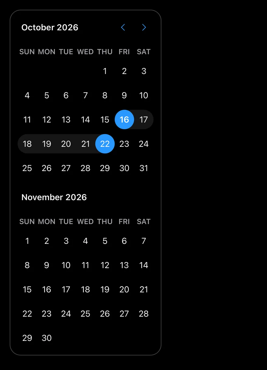
}Range
Range selection across two months.
import * as React from "react"
import { ScrollView } from "react-native"
import { DateRange } from "@/components/primitives/calendar"
import { Calendar } from "@/components/ui/calendar"

function RangeCalendar() {
  const today = new Date()
  const [range, setRange] = React.useState<DateRange | undefined>({
    from: today,
    to: new Date(today.getFullYear(), today.getMonth(), today.getDate() + 6),
  })
  return (
    <ScrollView>
      <Calendar
        mode="range"
        selected={range}
        onSelect={setRange}
        numberOfMonths={2}
        className="rounded-2xl border border-border"
      />
    </ScrollView>
  )
}

export function CalendarRangeExample() {
  return (
    <RangeCalendar />
  )
}import EsuissUI
import SwiftUI
enum CalendarDates {
static func day(_ offset: Int) -> Date {
let calendar = Foundation.Calendar.current
let start = calendar.startOfDay(for: Date())
return calendar.date(byAdding: .day, value: offset, to: start) ?? start
}
static func dayOfMonth(_ day: Int) -> Date {
let calendar = Foundation.Calendar.current
var components = calendar.dateComponents([.year, .month], from: Date())
components.day = day
return calendar.date(from: components) ?? Date()
}
}
struct CalendarBordered: ViewModifier {
func body(content: Content) -> some View {
content
.clipShape(RoundedRectangle(cornerRadius: Radius.xl2, style: .continuous))
.overlay {
RoundedRectangle(cornerRadius: Radius.xl2, style: .continuous).strokeBorder(EsuissColor.border)
}
}
}
struct CalendarRangeDemo: View {
@State private var range: DateRange? = DateRange(from: CalendarDates.day(0), to: CalendarDates.day(6))
var body: some View {
DateCalendar(selection: $range, numberOfMonths: 2)
.modifier(CalendarBordered())
}
}
func day(_ offset: Int) -> Date {
let calendar = Foundation.Calendar.current
let start = calendar.startOfDay(for: Date())
return calendar.date(byAdding: .day, value: offset, to: start) ?? start
}
func dayOfMonth(_ day: Int) -> Date {
let calendar = Foundation.Calendar.current
var components = calendar.dateComponents([.year, .month], from: Date())
components.day = day
return calendar.date(from: components) ?? Date()
}import androidx.compose.foundation.border
import androidx.compose.foundation.layout.Box
import androidx.compose.foundation.layout.padding
import androidx.compose.foundation.shape.RoundedCornerShape
import androidx.compose.runtime.Composable
import androidx.compose.runtime.getValue
import androidx.compose.runtime.mutableStateOf
import androidx.compose.runtime.saveable.rememberSaveable
import androidx.compose.runtime.setValue
import androidx.compose.ui.Modifier
import androidx.compose.ui.unit.dp
import com.esuiss.ui.components.Calendar
import com.esuiss.ui.components.DateRange
import com.esuiss.ui.theme.EsuissTheme
import com.esuiss.ui.theme.Radius
import java.util.Date
import java.util.GregorianCalendar
fun calendarDay(offsetDays: Int = 0, dayOfMonth: Int? = null): Date {
val now = GregorianCalendar()
val result = GregorianCalendar(now.get(GregorianCalendar.YEAR), now.get(GregorianCalendar.MONTH), now.get(GregorianCalendar.DAY_OF_MONTH))
if (dayOfMonth != null) result.set(GregorianCalendar.DAY_OF_MONTH, dayOfMonth)
result.add(GregorianCalendar.DAY_OF_MONTH, offsetDays)
return result.time
}
@Composable
fun CalendarFrame(content: @Composable () -> Unit) {
Box(
Modifier
.border(1.dp, EsuissTheme.colors.border, RoundedCornerShape(Radius.xl2))
.padding(1.dp),
) {
content()
}
}
@Composable
fun CalendarRange() {
var from by rememberSaveable { mutableStateOf<Date?>(calendarDay()) }
var to by rememberSaveable { mutableStateOf<Date?>(calendarDay(offsetDays = 6)) }
CalendarFrame {
Calendar(
selected = if (from == null) null else DateRange(from, to),
onSelect = { range: DateRange? ->
from = range?.from
to = range?.to
},
numberOfMonths = 2,
)
}
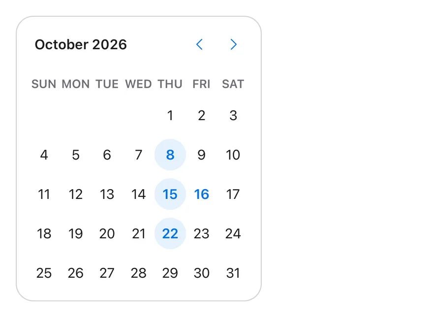
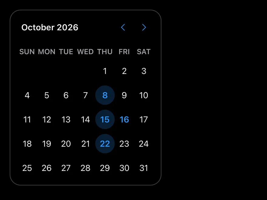
}Multiple
Several separate dates selected with mode="multiple".
import * as React from "react"
import { Calendar } from "@/components/ui/calendar"

function MultipleCalendar() {
  const today = new Date()
  const [dates, setDates] = React.useState<Date[] | undefined>([
    new Date(today.getFullYear(), today.getMonth(), 8),
    new Date(today.getFullYear(), today.getMonth(), 15),
    new Date(today.getFullYear(), today.getMonth(), 22),
  ])
  return (
    <Calendar
      mode="multiple"
      selected={dates}
      onSelect={setDates}
      className="rounded-2xl border border-border"
    />
  )
}

export function CalendarMultipleExample() {
  return (
    <MultipleCalendar />
  )
}import EsuissUI
import SwiftUI
enum CalendarDates {
static func day(_ offset: Int) -> Date {
let calendar = Foundation.Calendar.current
let start = calendar.startOfDay(for: Date())
return calendar.date(byAdding: .day, value: offset, to: start) ?? start
}
static func dayOfMonth(_ day: Int) -> Date {
let calendar = Foundation.Calendar.current
var components = calendar.dateComponents([.year, .month], from: Date())
components.day = day
return calendar.date(from: components) ?? Date()
}
}
struct CalendarBordered: ViewModifier {
func body(content: Content) -> some View {
content
.clipShape(RoundedRectangle(cornerRadius: Radius.xl2, style: .continuous))
.overlay {
RoundedRectangle(cornerRadius: Radius.xl2, style: .continuous).strokeBorder(EsuissColor.border)
}
}
}
struct CalendarMultipleDemo: View {
@State private var dates: Set<Date> = [
CalendarDates.dayOfMonth(8),
CalendarDates.dayOfMonth(15),
CalendarDates.dayOfMonth(22),
]
var body: some View {
DateCalendar(selection: $dates)
.modifier(CalendarBordered())
}
}
func day(_ offset: Int) -> Date {
let calendar = Foundation.Calendar.current
let start = calendar.startOfDay(for: Date())
return calendar.date(byAdding: .day, value: offset, to: start) ?? start
}
func dayOfMonth(_ day: Int) -> Date {
let calendar = Foundation.Calendar.current
var components = calendar.dateComponents([.year, .month], from: Date())
components.day = day
return calendar.date(from: components) ?? Date()
}import androidx.compose.foundation.border
import androidx.compose.foundation.layout.Box
import androidx.compose.foundation.layout.padding
import androidx.compose.foundation.shape.RoundedCornerShape
import androidx.compose.runtime.Composable
import androidx.compose.runtime.getValue
import androidx.compose.runtime.mutableStateOf
import androidx.compose.runtime.saveable.rememberSaveable
import androidx.compose.runtime.setValue
import androidx.compose.ui.Modifier
import androidx.compose.ui.unit.dp
import com.esuiss.ui.components.Calendar
import com.esuiss.ui.theme.EsuissTheme
import com.esuiss.ui.theme.Radius
import java.util.Date
import java.util.GregorianCalendar
fun calendarDay(offsetDays: Int = 0, dayOfMonth: Int? = null): Date {
val now = GregorianCalendar()
val result = GregorianCalendar(now.get(GregorianCalendar.YEAR), now.get(GregorianCalendar.MONTH), now.get(GregorianCalendar.DAY_OF_MONTH))
if (dayOfMonth != null) result.set(GregorianCalendar.DAY_OF_MONTH, dayOfMonth)
result.add(GregorianCalendar.DAY_OF_MONTH, offsetDays)
return result.time
}
@Composable
fun CalendarFrame(content: @Composable () -> Unit) {
Box(
Modifier
.border(1.dp, EsuissTheme.colors.border, RoundedCornerShape(Radius.xl2))
.padding(1.dp),
) {
content()
}
}
@Composable
fun CalendarMultiple() {
var dates by rememberSaveable {
mutableStateOf(listOf(calendarDay(dayOfMonth = 8), calendarDay(dayOfMonth = 15), calendarDay(dayOfMonth = 22)))
}
CalendarFrame {
Calendar(selected = dates, onSelect = { value: List<Date> -> dates = value })
}
}Dropdown caption
Month and year dropdowns in the caption.
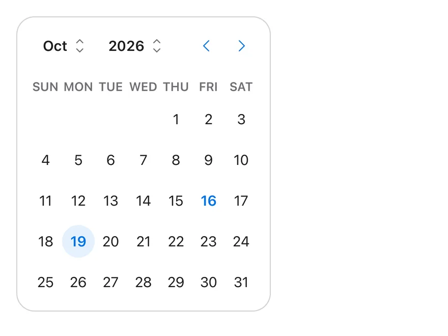
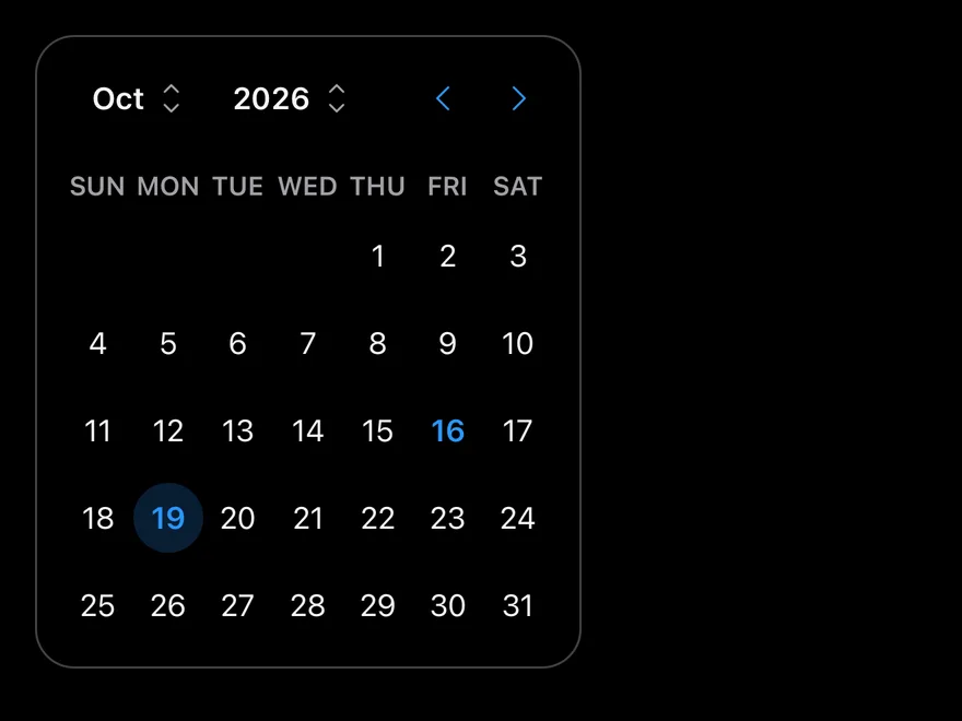
import * as React from "react"
import { Calendar } from "@/components/ui/calendar"

type CalendarProps = React.ComponentProps<typeof Calendar>

function SingleCalendar(
  props: Omit<CalendarProps, "mode" | "selected" | "onSelect">
) {
  const today = new Date()
  const [date, setDate] = React.useState<Date | undefined>(
    new Date(today.getFullYear(), today.getMonth(), today.getDate() + 3)
  )
  return (
    <Calendar
      {...props}
      mode="single"
      selected={date}
      onSelect={setDate}
      className="rounded-2xl border border-border"
    />
  )
}

export function CalendarDropdownCaptionExample() {
  return (
    <SingleCalendar captionLayout="dropdown" />
  )
}import EsuissUI
import SwiftUI
struct CalendarDropdownCaptionExample: View {
var body: some View {
CalendarSingleDemo(captionLayout: .dropdown)
}
}
enum CalendarDates {
static func day(_ offset: Int) -> Date {
let calendar = Foundation.Calendar.current
let start = calendar.startOfDay(for: Date())
return calendar.date(byAdding: .day, value: offset, to: start) ?? start
}
static func dayOfMonth(_ day: Int) -> Date {
let calendar = Foundation.Calendar.current
var components = calendar.dateComponents([.year, .month], from: Date())
components.day = day
return calendar.date(from: components) ?? Date()
}
}
struct CalendarBordered: ViewModifier {
func body(content: Content) -> some View {
content
.clipShape(RoundedRectangle(cornerRadius: Radius.xl2, style: .continuous))
.overlay {
RoundedRectangle(cornerRadius: Radius.xl2, style: .continuous).strokeBorder(EsuissColor.border)
}
}
}
struct CalendarSingleDemo: View {
var size: DateCalendar.Size = .default
var buttonVariant: VariantButtonStyle.Variant = .plain
var captionLayout: DateCalendar.CaptionLayout = .label
var showOutsideDays = false
var showWeekNumber = false
var weekendsDisabled = false
@State private var date: Date? = CalendarDates.day(3)
var body: some View {
DateCalendar(
selection: $date,
size: size,
buttonVariant: buttonVariant,
captionLayout: captionLayout,
showOutsideDays: showOutsideDays,
showWeekNumber: showWeekNumber,
isDisabled: { day in
guard weekendsDisabled else { return false }
let weekday = Foundation.Calendar.current.component(.weekday, from: day)
return weekday == 1 || weekday == 7
}
)
.modifier(CalendarBordered())
}
}
func day(_ offset: Int) -> Date {
let calendar = Foundation.Calendar.current
let start = calendar.startOfDay(for: Date())
return calendar.date(byAdding: .day, value: offset, to: start) ?? start
}
func dayOfMonth(_ day: Int) -> Date {
let calendar = Foundation.Calendar.current
var components = calendar.dateComponents([.year, .month], from: Date())
components.day = day
return calendar.date(from: components) ?? Date()
}import androidx.compose.foundation.border
import androidx.compose.foundation.layout.Box
import androidx.compose.foundation.layout.padding
import androidx.compose.foundation.shape.RoundedCornerShape
import androidx.compose.runtime.Composable
import androidx.compose.runtime.getValue
import androidx.compose.runtime.mutableStateOf
import androidx.compose.runtime.saveable.rememberSaveable
import androidx.compose.runtime.setValue
import androidx.compose.ui.Modifier
import androidx.compose.ui.unit.dp
import com.esuiss.ui.components.ButtonVariant
import com.esuiss.ui.components.Calendar
import com.esuiss.ui.components.CalendarCaptionLayout
import com.esuiss.ui.components.CalendarSize
import com.esuiss.ui.theme.EsuissTheme
import com.esuiss.ui.theme.Radius
import java.util.Date
import java.util.GregorianCalendar
import java.util.Locale
@Composable
fun CalendarDropdownCaptionExample() {
CalendarSingle(captionLayout = CalendarCaptionLayout.Dropdown)
}
fun calendarDay(offsetDays: Int = 0, dayOfMonth: Int? = null): Date {
val now = GregorianCalendar()
val result = GregorianCalendar(now.get(GregorianCalendar.YEAR), now.get(GregorianCalendar.MONTH), now.get(GregorianCalendar.DAY_OF_MONTH))
if (dayOfMonth != null) result.set(GregorianCalendar.DAY_OF_MONTH, dayOfMonth)
result.add(GregorianCalendar.DAY_OF_MONTH, offsetDays)
return result.time
}
fun calendarIsWeekend(date: Date): Boolean {
val day = GregorianCalendar().apply { time = date }.get(GregorianCalendar.DAY_OF_WEEK)
return day == GregorianCalendar.SATURDAY || day == GregorianCalendar.SUNDAY
}
@Composable
fun CalendarFrame(content: @Composable () -> Unit) {
Box(
Modifier
.border(1.dp, EsuissTheme.colors.border, RoundedCornerShape(Radius.xl2))
.padding(1.dp),
) {
content()
}
}
@Composable
fun CalendarSingle(
size: CalendarSize = CalendarSize.Default,
captionLayout: CalendarCaptionLayout = CalendarCaptionLayout.Label,
showWeekNumber: Boolean = false,
showOutsideDays: Boolean = false,
weekendsDisabled: Boolean = false,
buttonVariant: ButtonVariant = ButtonVariant.Plain,
locale: Locale = Locale.getDefault(),
key: String = "",
) {
var date by rememberSaveable(key) { mutableStateOf<Date?>(calendarDay(offsetDays = 3)) }
CalendarFrame {
Calendar(
selected = date,
onSelect = { date = it },
size = size,
captionLayout = captionLayout,
showWeekNumber = showWeekNumber,
showOutsideDays = showOutsideDays,
disabled = { weekendsDisabled && calendarIsWeekend(it) },
buttonVariant = buttonVariant,
locale = locale,
)
}
}Week numbers
Week numbers in a leading column.
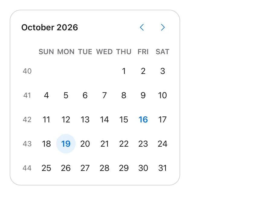
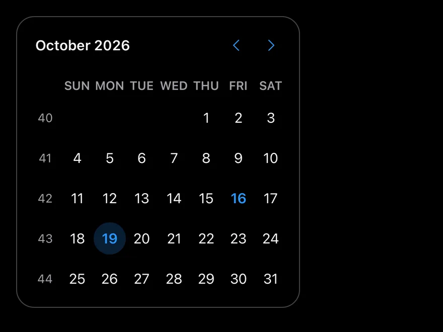
import * as React from "react"
import { Calendar } from "@/components/ui/calendar"

type CalendarProps = React.ComponentProps<typeof Calendar>

function SingleCalendar(
  props: Omit<CalendarProps, "mode" | "selected" | "onSelect">
) {
  const today = new Date()
  const [date, setDate] = React.useState<Date | undefined>(
    new Date(today.getFullYear(), today.getMonth(), today.getDate() + 3)
  )
  return (
    <Calendar
      {...props}
      mode="single"
      selected={date}
      onSelect={setDate}
      className="rounded-2xl border border-border"
    />
  )
}

export function CalendarWeekNumbersExample() {
  return (
    <SingleCalendar showWeekNumber />
  )
}import EsuissUI
import SwiftUI
struct CalendarWeekNumbersExample: View {
var body: some View {
CalendarSingleDemo(showWeekNumber: true)
}
}
enum CalendarDates {
static func day(_ offset: Int) -> Date {
let calendar = Foundation.Calendar.current
let start = calendar.startOfDay(for: Date())
return calendar.date(byAdding: .day, value: offset, to: start) ?? start
}
static func dayOfMonth(_ day: Int) -> Date {
let calendar = Foundation.Calendar.current
var components = calendar.dateComponents([.year, .month], from: Date())
components.day = day
return calendar.date(from: components) ?? Date()
}
}
struct CalendarBordered: ViewModifier {
func body(content: Content) -> some View {
content
.clipShape(RoundedRectangle(cornerRadius: Radius.xl2, style: .continuous))
.overlay {
RoundedRectangle(cornerRadius: Radius.xl2, style: .continuous).strokeBorder(EsuissColor.border)
}
}
}
struct CalendarSingleDemo: View {
var size: DateCalendar.Size = .default
var buttonVariant: VariantButtonStyle.Variant = .plain
var captionLayout: DateCalendar.CaptionLayout = .label
var showOutsideDays = false
var showWeekNumber = false
var weekendsDisabled = false
@State private var date: Date? = CalendarDates.day(3)
var body: some View {
DateCalendar(
selection: $date,
size: size,
buttonVariant: buttonVariant,
captionLayout: captionLayout,
showOutsideDays: showOutsideDays,
showWeekNumber: showWeekNumber,
isDisabled: { day in
guard weekendsDisabled else { return false }
let weekday = Foundation.Calendar.current.component(.weekday, from: day)
return weekday == 1 || weekday == 7
}
)
.modifier(CalendarBordered())
}
}
func day(_ offset: Int) -> Date {
let calendar = Foundation.Calendar.current
let start = calendar.startOfDay(for: Date())
return calendar.date(byAdding: .day, value: offset, to: start) ?? start
}
func dayOfMonth(_ day: Int) -> Date {
let calendar = Foundation.Calendar.current
var components = calendar.dateComponents([.year, .month], from: Date())
components.day = day
return calendar.date(from: components) ?? Date()
}import androidx.compose.foundation.border
import androidx.compose.foundation.layout.Box
import androidx.compose.foundation.layout.padding
import androidx.compose.foundation.shape.RoundedCornerShape
import androidx.compose.runtime.Composable
import androidx.compose.runtime.getValue
import androidx.compose.runtime.mutableStateOf
import androidx.compose.runtime.saveable.rememberSaveable
import androidx.compose.runtime.setValue
import androidx.compose.ui.Modifier
import androidx.compose.ui.unit.dp
import com.esuiss.ui.components.ButtonVariant
import com.esuiss.ui.components.Calendar
import com.esuiss.ui.components.CalendarCaptionLayout
import com.esuiss.ui.components.CalendarSize
import com.esuiss.ui.theme.EsuissTheme
import com.esuiss.ui.theme.Radius
import java.util.Date
import java.util.GregorianCalendar
import java.util.Locale
@Composable
fun CalendarWeekNumbersExample() {
CalendarSingle(showWeekNumber = true)
}
fun calendarDay(offsetDays: Int = 0, dayOfMonth: Int? = null): Date {
val now = GregorianCalendar()
val result = GregorianCalendar(now.get(GregorianCalendar.YEAR), now.get(GregorianCalendar.MONTH), now.get(GregorianCalendar.DAY_OF_MONTH))
if (dayOfMonth != null) result.set(GregorianCalendar.DAY_OF_MONTH, dayOfMonth)
result.add(GregorianCalendar.DAY_OF_MONTH, offsetDays)
return result.time
}
fun calendarIsWeekend(date: Date): Boolean {
val day = GregorianCalendar().apply { time = date }.get(GregorianCalendar.DAY_OF_WEEK)
return day == GregorianCalendar.SATURDAY || day == GregorianCalendar.SUNDAY
}
@Composable
fun CalendarFrame(content: @Composable () -> Unit) {
Box(
Modifier
.border(1.dp, EsuissTheme.colors.border, RoundedCornerShape(Radius.xl2))
.padding(1.dp),
) {
content()
}
}
@Composable
fun CalendarSingle(
size: CalendarSize = CalendarSize.Default,
captionLayout: CalendarCaptionLayout = CalendarCaptionLayout.Label,
showWeekNumber: Boolean = false,
showOutsideDays: Boolean = false,
weekendsDisabled: Boolean = false,
buttonVariant: ButtonVariant = ButtonVariant.Plain,
locale: Locale = Locale.getDefault(),
key: String = "",
) {
var date by rememberSaveable(key) { mutableStateOf<Date?>(calendarDay(offsetDays = 3)) }
CalendarFrame {
Calendar(
selected = date,
onSelect = { date = it },
size = size,
captionLayout = captionLayout,
showWeekNumber = showWeekNumber,
showOutsideDays = showOutsideDays,
disabled = { weekendsDisabled && calendarIsWeekend(it) },
buttonVariant = buttonVariant,
locale = locale,
)
}
}Disabled days
Weekends disabled with a dayOfWeek matcher.
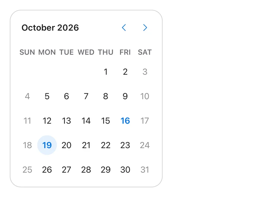
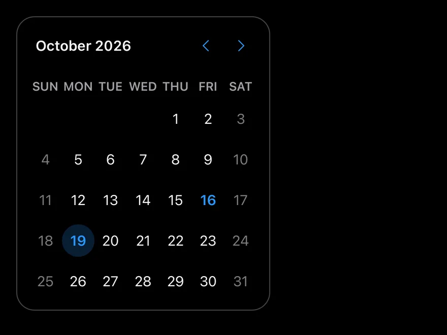
import * as React from "react"
import { Calendar } from "@/components/ui/calendar"

type CalendarProps = React.ComponentProps<typeof Calendar>

function SingleCalendar(
  props: Omit<CalendarProps, "mode" | "selected" | "onSelect">
) {
  const today = new Date()
  const [date, setDate] = React.useState<Date | undefined>(
    new Date(today.getFullYear(), today.getMonth(), today.getDate() + 3)
  )
  return (
    <Calendar
      {...props}
      mode="single"
      selected={date}
      onSelect={setDate}
      className="rounded-2xl border border-border"
    />
  )
}

export function CalendarDisabledDaysExample() {
  return (
    <SingleCalendar disabled={{ dayOfWeek: [0, 6] }} />
  )
}import EsuissUI
import SwiftUI
struct CalendarDisabledDaysExample: View {
var body: some View {
CalendarSingleDemo(weekendsDisabled: true)
}
}
enum CalendarDates {
static func day(_ offset: Int) -> Date {
let calendar = Foundation.Calendar.current
let start = calendar.startOfDay(for: Date())
return calendar.date(byAdding: .day, value: offset, to: start) ?? start
}
static func dayOfMonth(_ day: Int) -> Date {
let calendar = Foundation.Calendar.current
var components = calendar.dateComponents([.year, .month], from: Date())
components.day = day
return calendar.date(from: components) ?? Date()
}
}
struct CalendarBordered: ViewModifier {
func body(content: Content) -> some View {
content
.clipShape(RoundedRectangle(cornerRadius: Radius.xl2, style: .continuous))
.overlay {
RoundedRectangle(cornerRadius: Radius.xl2, style: .continuous).strokeBorder(EsuissColor.border)
}
}
}
struct CalendarSingleDemo: View {
var size: DateCalendar.Size = .default
var buttonVariant: VariantButtonStyle.Variant = .plain
var captionLayout: DateCalendar.CaptionLayout = .label
var showOutsideDays = false
var showWeekNumber = false
var weekendsDisabled = false
@State private var date: Date? = CalendarDates.day(3)
var body: some View {
DateCalendar(
selection: $date,
size: size,
buttonVariant: buttonVariant,
captionLayout: captionLayout,
showOutsideDays: showOutsideDays,
showWeekNumber: showWeekNumber,
isDisabled: { day in
guard weekendsDisabled else { return false }
let weekday = Foundation.Calendar.current.component(.weekday, from: day)
return weekday == 1 || weekday == 7
}
)
.modifier(CalendarBordered())
}
}
func day(_ offset: Int) -> Date {
let calendar = Foundation.Calendar.current
let start = calendar.startOfDay(for: Date())
return calendar.date(byAdding: .day, value: offset, to: start) ?? start
}
func dayOfMonth(_ day: Int) -> Date {
let calendar = Foundation.Calendar.current
var components = calendar.dateComponents([.year, .month], from: Date())
components.day = day
return calendar.date(from: components) ?? Date()
}import androidx.compose.foundation.border
import androidx.compose.foundation.layout.Box
import androidx.compose.foundation.layout.padding
import androidx.compose.foundation.shape.RoundedCornerShape
import androidx.compose.runtime.Composable
import androidx.compose.runtime.getValue
import androidx.compose.runtime.mutableStateOf
import androidx.compose.runtime.saveable.rememberSaveable
import androidx.compose.runtime.setValue
import androidx.compose.ui.Modifier
import androidx.compose.ui.unit.dp
import com.esuiss.ui.components.ButtonVariant
import com.esuiss.ui.components.Calendar
import com.esuiss.ui.components.CalendarCaptionLayout
import com.esuiss.ui.components.CalendarSize
import com.esuiss.ui.theme.EsuissTheme
import com.esuiss.ui.theme.Radius
import java.util.Date
import java.util.GregorianCalendar
import java.util.Locale
@Composable
fun CalendarDisabledDaysExample() {
CalendarSingle(weekendsDisabled = true)
}
fun calendarDay(offsetDays: Int = 0, dayOfMonth: Int? = null): Date {
val now = GregorianCalendar()
val result = GregorianCalendar(now.get(GregorianCalendar.YEAR), now.get(GregorianCalendar.MONTH), now.get(GregorianCalendar.DAY_OF_MONTH))
if (dayOfMonth != null) result.set(GregorianCalendar.DAY_OF_MONTH, dayOfMonth)
result.add(GregorianCalendar.DAY_OF_MONTH, offsetDays)
return result.time
}
fun calendarIsWeekend(date: Date): Boolean {
val day = GregorianCalendar().apply { time = date }.get(GregorianCalendar.DAY_OF_WEEK)
return day == GregorianCalendar.SATURDAY || day == GregorianCalendar.SUNDAY
}
@Composable
fun CalendarFrame(content: @Composable () -> Unit) {
Box(
Modifier
.border(1.dp, EsuissTheme.colors.border, RoundedCornerShape(Radius.xl2))
.padding(1.dp),
) {
content()
}
}
@Composable
fun CalendarSingle(
size: CalendarSize = CalendarSize.Default,
captionLayout: CalendarCaptionLayout = CalendarCaptionLayout.Label,
showWeekNumber: Boolean = false,
showOutsideDays: Boolean = false,
weekendsDisabled: Boolean = false,
buttonVariant: ButtonVariant = ButtonVariant.Plain,
locale: Locale = Locale.getDefault(),
key: String = "",
) {
var date by rememberSaveable(key) { mutableStateOf<Date?>(calendarDay(offsetDays = 3)) }
CalendarFrame {
Calendar(
selected = date,
onSelect = { date = it },
size = size,
captionLayout = captionLayout,
showWeekNumber = showWeekNumber,
showOutsideDays = showOutsideDays,
disabled = { weekendsDisabled && calendarIsWeekend(it) },
buttonVariant = buttonVariant,
locale = locale,
)
}
}Outside days
Days from adjacent months shown with showOutsideDays.
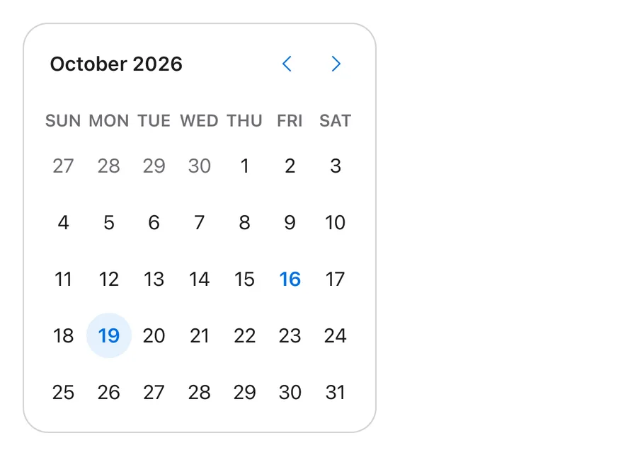
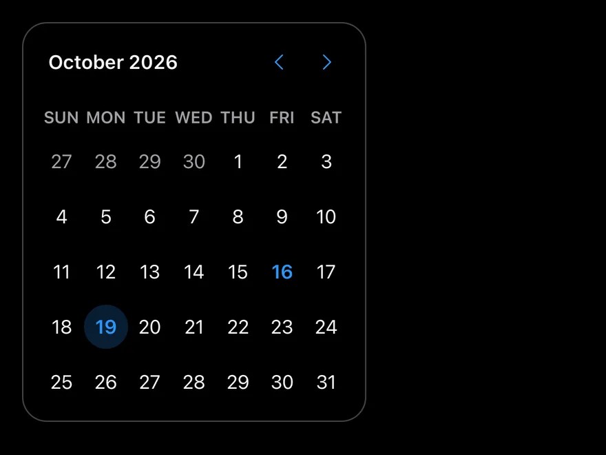
import * as React from "react"
import { Calendar } from "@/components/ui/calendar"

type CalendarProps = React.ComponentProps<typeof Calendar>

function SingleCalendar(
  props: Omit<CalendarProps, "mode" | "selected" | "onSelect">
) {
  const today = new Date()
  const [date, setDate] = React.useState<Date | undefined>(
    new Date(today.getFullYear(), today.getMonth(), today.getDate() + 3)
  )
  return (
    <Calendar
      {...props}
      mode="single"
      selected={date}
      onSelect={setDate}
      className="rounded-2xl border border-border"
    />
  )
}

export function CalendarOutsideDaysExample() {
  return (
    <SingleCalendar showOutsideDays />
  )
}import EsuissUI
import SwiftUI
struct CalendarOutsideDaysExample: View {
var body: some View {
CalendarSingleDemo(showOutsideDays: true)
}
}
enum CalendarDates {
static func day(_ offset: Int) -> Date {
let calendar = Foundation.Calendar.current
let start = calendar.startOfDay(for: Date())
return calendar.date(byAdding: .day, value: offset, to: start) ?? start
}
static func dayOfMonth(_ day: Int) -> Date {
let calendar = Foundation.Calendar.current
var components = calendar.dateComponents([.year, .month], from: Date())
components.day = day
return calendar.date(from: components) ?? Date()
}
}
struct CalendarBordered: ViewModifier {
func body(content: Content) -> some View {
content
.clipShape(RoundedRectangle(cornerRadius: Radius.xl2, style: .continuous))
.overlay {
RoundedRectangle(cornerRadius: Radius.xl2, style: .continuous).strokeBorder(EsuissColor.border)
}
}
}
struct CalendarSingleDemo: View {
var size: DateCalendar.Size = .default
var buttonVariant: VariantButtonStyle.Variant = .plain
var captionLayout: DateCalendar.CaptionLayout = .label
var showOutsideDays = false
var showWeekNumber = false
var weekendsDisabled = false
@State private var date: Date? = CalendarDates.day(3)
var body: some View {
DateCalendar(
selection: $date,
size: size,
buttonVariant: buttonVariant,
captionLayout: captionLayout,
showOutsideDays: showOutsideDays,
showWeekNumber: showWeekNumber,
isDisabled: { day in
guard weekendsDisabled else { return false }
let weekday = Foundation.Calendar.current.component(.weekday, from: day)
return weekday == 1 || weekday == 7
}
)
.modifier(CalendarBordered())
}
}
func day(_ offset: Int) -> Date {
let calendar = Foundation.Calendar.current
let start = calendar.startOfDay(for: Date())
return calendar.date(byAdding: .day, value: offset, to: start) ?? start
}
func dayOfMonth(_ day: Int) -> Date {
let calendar = Foundation.Calendar.current
var components = calendar.dateComponents([.year, .month], from: Date())
components.day = day
return calendar.date(from: components) ?? Date()
}import androidx.compose.foundation.border
import androidx.compose.foundation.layout.Box
import androidx.compose.foundation.layout.padding
import androidx.compose.foundation.shape.RoundedCornerShape
import androidx.compose.runtime.Composable
import androidx.compose.runtime.getValue
import androidx.compose.runtime.mutableStateOf
import androidx.compose.runtime.saveable.rememberSaveable
import androidx.compose.runtime.setValue
import androidx.compose.ui.Modifier
import androidx.compose.ui.unit.dp
import com.esuiss.ui.components.ButtonVariant
import com.esuiss.ui.components.Calendar
import com.esuiss.ui.components.CalendarCaptionLayout
import com.esuiss.ui.components.CalendarSize
import com.esuiss.ui.theme.EsuissTheme
import com.esuiss.ui.theme.Radius
import java.util.Date
import java.util.GregorianCalendar
import java.util.Locale
@Composable
fun CalendarOutsideDaysExample() {
CalendarSingle(showOutsideDays = true)
}
fun calendarDay(offsetDays: Int = 0, dayOfMonth: Int? = null): Date {
val now = GregorianCalendar()
val result = GregorianCalendar(now.get(GregorianCalendar.YEAR), now.get(GregorianCalendar.MONTH), now.get(GregorianCalendar.DAY_OF_MONTH))
if (dayOfMonth != null) result.set(GregorianCalendar.DAY_OF_MONTH, dayOfMonth)
result.add(GregorianCalendar.DAY_OF_MONTH, offsetDays)
return result.time
}
fun calendarIsWeekend(date: Date): Boolean {
val day = GregorianCalendar().apply { time = date }.get(GregorianCalendar.DAY_OF_WEEK)
return day == GregorianCalendar.SATURDAY || day == GregorianCalendar.SUNDAY
}
@Composable
fun CalendarFrame(content: @Composable () -> Unit) {
Box(
Modifier
.border(1.dp, EsuissTheme.colors.border, RoundedCornerShape(Radius.xl2))
.padding(1.dp),
) {
content()
}
}
@Composable
fun CalendarSingle(
size: CalendarSize = CalendarSize.Default,
captionLayout: CalendarCaptionLayout = CalendarCaptionLayout.Label,
showWeekNumber: Boolean = false,
showOutsideDays: Boolean = false,
weekendsDisabled: Boolean = false,
buttonVariant: ButtonVariant = ButtonVariant.Plain,
locale: Locale = Locale.getDefault(),
key: String = "",
) {
var date by rememberSaveable(key) { mutableStateOf<Date?>(calendarDay(offsetDays = 3)) }
CalendarFrame {
Calendar(
selected = date,
onSelect = { date = it },
size = size,
captionLayout = captionLayout,
showWeekNumber = showWeekNumber,
showOutsideDays = showOutsideDays,
disabled = { weekendsDisabled && calendarIsWeekend(it) },
buttonVariant = buttonVariant,
locale = locale,
)
}
}Button variants
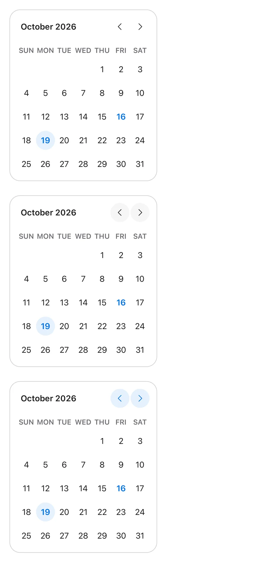
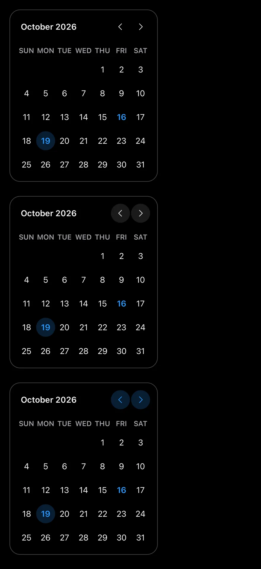
Navigation buttons in the ghost, secondary and tinted variants.
import * as React from "react"
import { ScrollView } from "react-native"
import { Calendar } from "@/components/ui/calendar"

type CalendarProps = React.ComponentProps<typeof Calendar>

function SingleCalendar(
  props: Omit<CalendarProps, "mode" | "selected" | "onSelect">
) {
  const today = new Date()
  const [date, setDate] = React.useState<Date | undefined>(
    new Date(today.getFullYear(), today.getMonth(), today.getDate() + 3)
  )
  return (
    <Calendar
      {...props}
      mode="single"
      selected={date}
      onSelect={setDate}
      className="rounded-2xl border border-border"
    />
  )
}

export function CalendarButtonVariantsExample() {
  return (
    <ScrollView contentContainerClassName="items-start gap-6">
      <SingleCalendar buttonVariant="ghost" />
      <SingleCalendar buttonVariant="secondary" />
      <SingleCalendar buttonVariant="tinted" />
    </ScrollView>
  )
}import EsuissUI
import SwiftUI
struct CalendarButtonVariantsExample: View {
var body: some View {
VStack(alignment: .leading, spacing: 24) {
CalendarSingleDemo(buttonVariant: .ghost)
CalendarSingleDemo(buttonVariant: .secondary)
CalendarSingleDemo(buttonVariant: .tinted)
}
}
}
enum CalendarDates {
static func day(_ offset: Int) -> Date {
let calendar = Foundation.Calendar.current
let start = calendar.startOfDay(for: Date())
return calendar.date(byAdding: .day, value: offset, to: start) ?? start
}
static func dayOfMonth(_ day: Int) -> Date {
let calendar = Foundation.Calendar.current
var components = calendar.dateComponents([.year, .month], from: Date())
components.day = day
return calendar.date(from: components) ?? Date()
}
}
struct CalendarBordered: ViewModifier {
func body(content: Content) -> some View {
content
.clipShape(RoundedRectangle(cornerRadius: Radius.xl2, style: .continuous))
.overlay {
RoundedRectangle(cornerRadius: Radius.xl2, style: .continuous).strokeBorder(EsuissColor.border)
}
}
}
struct CalendarSingleDemo: View {
var size: DateCalendar.Size = .default
var buttonVariant: VariantButtonStyle.Variant = .plain
var captionLayout: DateCalendar.CaptionLayout = .label
var showOutsideDays = false
var showWeekNumber = false
var weekendsDisabled = false
@State private var date: Date? = CalendarDates.day(3)
var body: some View {
DateCalendar(
selection: $date,
size: size,
buttonVariant: buttonVariant,
captionLayout: captionLayout,
showOutsideDays: showOutsideDays,
showWeekNumber: showWeekNumber,
isDisabled: { day in
guard weekendsDisabled else { return false }
let weekday = Foundation.Calendar.current.component(.weekday, from: day)
return weekday == 1 || weekday == 7
}
)
.modifier(CalendarBordered())
}
}
func day(_ offset: Int) -> Date {
let calendar = Foundation.Calendar.current
let start = calendar.startOfDay(for: Date())
return calendar.date(byAdding: .day, value: offset, to: start) ?? start
}
func dayOfMonth(_ day: Int) -> Date {
let calendar = Foundation.Calendar.current
var components = calendar.dateComponents([.year, .month], from: Date())
components.day = day
return calendar.date(from: components) ?? Date()
}import androidx.compose.foundation.border
import androidx.compose.foundation.layout.Arrangement
import androidx.compose.foundation.layout.Box
import androidx.compose.foundation.layout.Column
import androidx.compose.foundation.layout.padding
import androidx.compose.foundation.shape.RoundedCornerShape
import androidx.compose.runtime.Composable
import androidx.compose.runtime.getValue
import androidx.compose.runtime.mutableStateOf
import androidx.compose.runtime.saveable.rememberSaveable
import androidx.compose.runtime.setValue
import androidx.compose.ui.Modifier
import androidx.compose.ui.unit.dp
import com.esuiss.ui.components.ButtonVariant
import com.esuiss.ui.components.Calendar
import com.esuiss.ui.components.CalendarCaptionLayout
import com.esuiss.ui.components.CalendarSize
import com.esuiss.ui.theme.EsuissTheme
import com.esuiss.ui.theme.Radius
import java.util.Date
import java.util.GregorianCalendar
import java.util.Locale
fun calendarDay(offsetDays: Int = 0, dayOfMonth: Int? = null): Date {
val now = GregorianCalendar()
val result = GregorianCalendar(now.get(GregorianCalendar.YEAR), now.get(GregorianCalendar.MONTH), now.get(GregorianCalendar.DAY_OF_MONTH))
if (dayOfMonth != null) result.set(GregorianCalendar.DAY_OF_MONTH, dayOfMonth)
result.add(GregorianCalendar.DAY_OF_MONTH, offsetDays)
return result.time
}
fun calendarIsWeekend(date: Date): Boolean {
val day = GregorianCalendar().apply { time = date }.get(GregorianCalendar.DAY_OF_WEEK)
return day == GregorianCalendar.SATURDAY || day == GregorianCalendar.SUNDAY
}
@Composable
fun CalendarFrame(content: @Composable () -> Unit) {
Box(
Modifier
.border(1.dp, EsuissTheme.colors.border, RoundedCornerShape(Radius.xl2))
.padding(1.dp),
) {
content()
}
}
@Composable
fun CalendarSingle(
size: CalendarSize = CalendarSize.Default,
captionLayout: CalendarCaptionLayout = CalendarCaptionLayout.Label,
showWeekNumber: Boolean = false,
showOutsideDays: Boolean = false,
weekendsDisabled: Boolean = false,
buttonVariant: ButtonVariant = ButtonVariant.Plain,
locale: Locale = Locale.getDefault(),
key: String = "",
) {
var date by rememberSaveable(key) { mutableStateOf<Date?>(calendarDay(offsetDays = 3)) }
CalendarFrame {
Calendar(
selected = date,
onSelect = { date = it },
size = size,
captionLayout = captionLayout,
showWeekNumber = showWeekNumber,
showOutsideDays = showOutsideDays,
disabled = { weekendsDisabled && calendarIsWeekend(it) },
buttonVariant = buttonVariant,
locale = locale,
)
}
}
@Composable
fun CalendarButtonVariants() {
Column(verticalArrangement = Arrangement.spacedBy(24.dp)) {
CalendarSingle(buttonVariant = ButtonVariant.Ghost, key = "ghost")
CalendarSingle(buttonVariant = ButtonVariant.Secondary, key = "secondary")
CalendarSingle(buttonVariant = ButtonVariant.Tinted, key = "tinted")
}
}Locale
Turkish month and weekday names with locale="tr-TR".
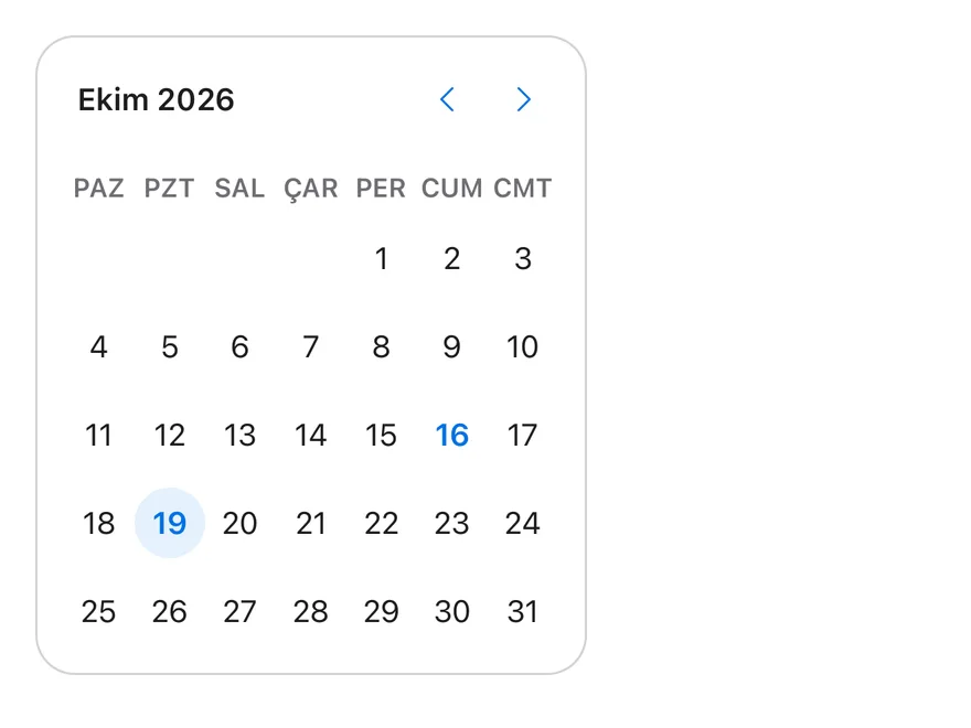
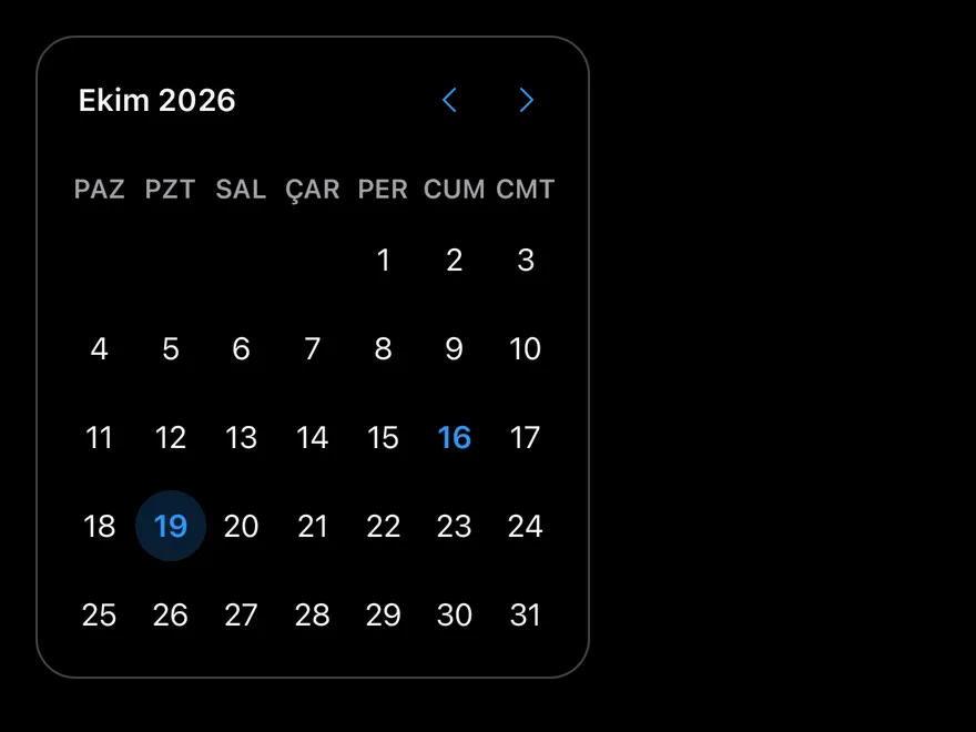
import * as React from "react"
import { Calendar } from "@/components/ui/calendar"

type CalendarProps = React.ComponentProps<typeof Calendar>

function SingleCalendar(
  props: Omit<CalendarProps, "mode" | "selected" | "onSelect">
) {
  const today = new Date()
  const [date, setDate] = React.useState<Date | undefined>(
    new Date(today.getFullYear(), today.getMonth(), today.getDate() + 3)
  )
  return (
    <Calendar
      {...props}
      mode="single"
      selected={date}
      onSelect={setDate}
      className="rounded-2xl border border-border"
    />
  )
}

export function CalendarLocaleExample() {
  return (
    <SingleCalendar locale="tr-TR" />
  )
}import EsuissUI
import SwiftUI
struct CalendarLocaleExample: View {
var body: some View {
CalendarSingleDemo()
.environment(\.locale, Locale(identifier: "tr_TR"))
}
}
enum CalendarDates {
static func day(_ offset: Int) -> Date {
let calendar = Foundation.Calendar.current
let start = calendar.startOfDay(for: Date())
return calendar.date(byAdding: .day, value: offset, to: start) ?? start
}
static func dayOfMonth(_ day: Int) -> Date {
let calendar = Foundation.Calendar.current
var components = calendar.dateComponents([.year, .month], from: Date())
components.day = day
return calendar.date(from: components) ?? Date()
}
}
struct CalendarBordered: ViewModifier {
func body(content: Content) -> some View {
content
.clipShape(RoundedRectangle(cornerRadius: Radius.xl2, style: .continuous))
.overlay {
RoundedRectangle(cornerRadius: Radius.xl2, style: .continuous).strokeBorder(EsuissColor.border)
}
}
}
struct CalendarSingleDemo: View {
var size: DateCalendar.Size = .default
var buttonVariant: VariantButtonStyle.Variant = .plain
var captionLayout: DateCalendar.CaptionLayout = .label
var showOutsideDays = false
var showWeekNumber = false
var weekendsDisabled = false
@State private var date: Date? = CalendarDates.day(3)
var body: some View {
DateCalendar(
selection: $date,
size: size,
buttonVariant: buttonVariant,
captionLayout: captionLayout,
showOutsideDays: showOutsideDays,
showWeekNumber: showWeekNumber,
isDisabled: { day in
guard weekendsDisabled else { return false }
let weekday = Foundation.Calendar.current.component(.weekday, from: day)
return weekday == 1 || weekday == 7
}
)
.modifier(CalendarBordered())
}
}
func day(_ offset: Int) -> Date {
let calendar = Foundation.Calendar.current
let start = calendar.startOfDay(for: Date())
return calendar.date(byAdding: .day, value: offset, to: start) ?? start
}
func dayOfMonth(_ day: Int) -> Date {
let calendar = Foundation.Calendar.current
var components = calendar.dateComponents([.year, .month], from: Date())
components.day = day
return calendar.date(from: components) ?? Date()
}import androidx.compose.foundation.border
import androidx.compose.foundation.layout.Box
import androidx.compose.foundation.layout.padding
import androidx.compose.foundation.shape.RoundedCornerShape
import androidx.compose.runtime.Composable
import androidx.compose.runtime.getValue
import androidx.compose.runtime.mutableStateOf
import androidx.compose.runtime.saveable.rememberSaveable
import androidx.compose.runtime.setValue
import androidx.compose.ui.Modifier
import androidx.compose.ui.unit.dp
import com.esuiss.ui.components.ButtonVariant
import com.esuiss.ui.components.Calendar
import com.esuiss.ui.components.CalendarCaptionLayout
import com.esuiss.ui.components.CalendarSize
import com.esuiss.ui.theme.EsuissTheme
import com.esuiss.ui.theme.Radius
import java.util.Date
import java.util.GregorianCalendar
import java.util.Locale
@Composable
fun CalendarLocaleExample() {
CalendarSingle(locale = Locale.forLanguageTag("tr-TR"))
}
fun calendarDay(offsetDays: Int = 0, dayOfMonth: Int? = null): Date {
val now = GregorianCalendar()
val result = GregorianCalendar(now.get(GregorianCalendar.YEAR), now.get(GregorianCalendar.MONTH), now.get(GregorianCalendar.DAY_OF_MONTH))
if (dayOfMonth != null) result.set(GregorianCalendar.DAY_OF_MONTH, dayOfMonth)
result.add(GregorianCalendar.DAY_OF_MONTH, offsetDays)
return result.time
}
fun calendarIsWeekend(date: Date): Boolean {
val day = GregorianCalendar().apply { time = date }.get(GregorianCalendar.DAY_OF_WEEK)
return day == GregorianCalendar.SATURDAY || day == GregorianCalendar.SUNDAY
}
@Composable
fun CalendarFrame(content: @Composable () -> Unit) {
Box(
Modifier
.border(1.dp, EsuissTheme.colors.border, RoundedCornerShape(Radius.xl2))
.padding(1.dp),
) {
content()
}
}
@Composable
fun CalendarSingle(
size: CalendarSize = CalendarSize.Default,
captionLayout: CalendarCaptionLayout = CalendarCaptionLayout.Label,
showWeekNumber: Boolean = false,
showOutsideDays: Boolean = false,
weekendsDisabled: Boolean = false,
buttonVariant: ButtonVariant = ButtonVariant.Plain,
locale: Locale = Locale.getDefault(),
key: String = "",
) {
var date by rememberSaveable(key) { mutableStateOf<Date?>(calendarDay(offsetDays = 3)) }
CalendarFrame {
Calendar(
selected = date,
onSelect = { date = it },
size = size,
captionLayout = captionLayout,
showWeekNumber = showWeekNumber,
showOutsideDays = showOutsideDays,
disabled = { weekendsDisabled && calendarIsWeekend(it) },
buttonVariant = buttonVariant,
locale = locale,
)
}
}API Reference
CalendarDayButton
Pressable day cell styled for each selection state.
Also accepts the props of React.ComponentProps<typeof CalendarPrimitive.DayButton>.
Calendar
Month grids with caption and navigation.
| Prop | Type | Default | Description |
|---|---|---|---|
buttonVariant | ButtonProps["variant"] | "plain" | Button variant for the navigation buttons. Defaults to plain. |
size | CalendarSize | "default" | sm, default or lg. |
captionLayout | CaptionLayout | "label" | label, dropdown, dropdown-months or dropdown-years. |
showWeekNumber | boolean | false | Shows week numbers. |
Also accepts the props of React.ComponentProps<typeof CalendarPrimitive.Root>.
Accessibility
- Each month is a
gridlabelled with its caption. - Day cells have the
buttonrole, a full date label, andselectedanddisabledstate. - On React Native and Android, the previous and next buttons are labelled with the relative month in the calendar's locale, such as "Last month" and "Next month" in English. On iOS they are labelled "Previous month" and "Next month".
- Caption dropdowns are labelled "Choose the Month" and "Choose the Year".
Notes
- Navigation arrows swap in right-to-left layouts.
- Uses
bg-primary,bg-primary/10 dark:bg-primary/20,bg-mutedandtext-primarytokens; light and dark follow the system appearance.