suiss/ui · Component
Alert Dialog
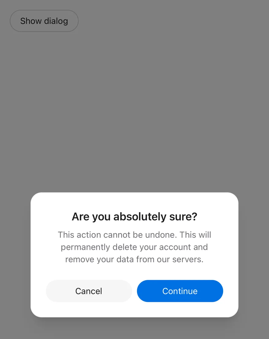
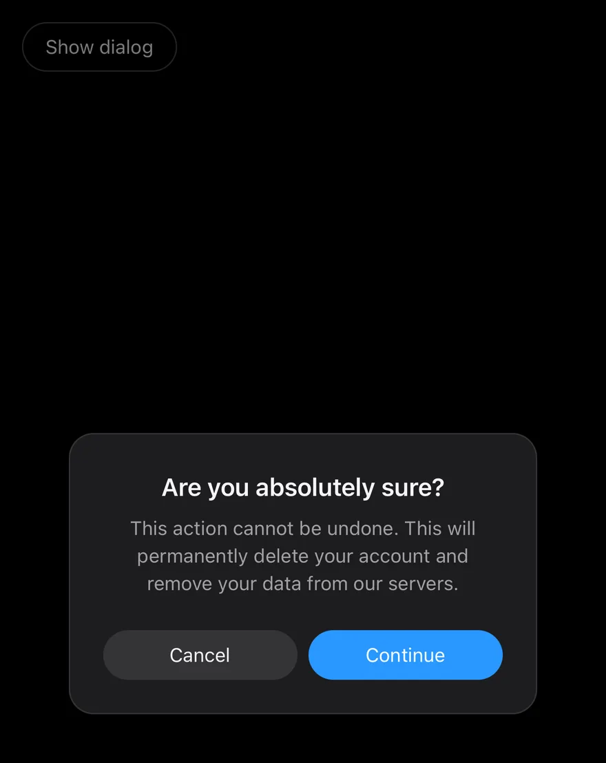
A modal dialog that interrupts the user to confirm an important action or acknowledge information.
Alert Dialog is an open-source component from suiss/ui for React, React Native, SwiftUI and Jetpack Compose. The @esuiss/ui CLI copies its source into your project, so you own the code.
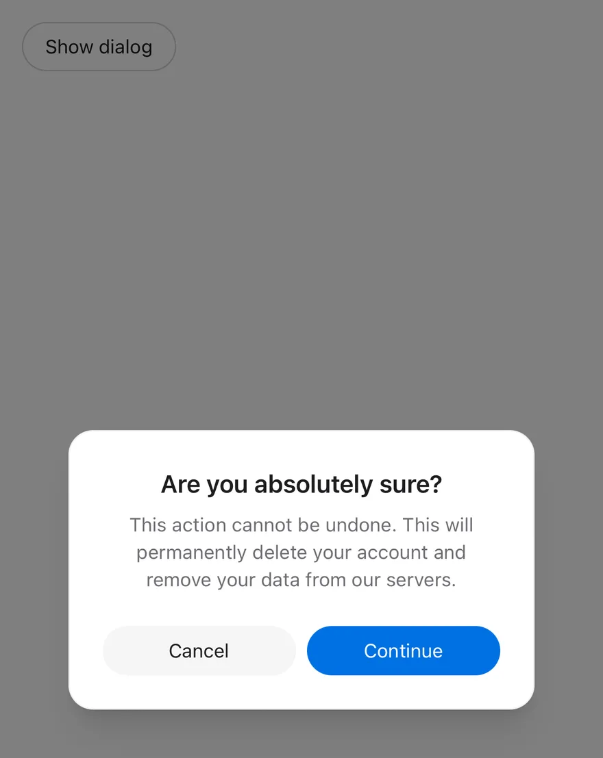
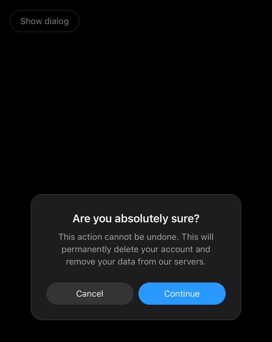
Alert Dialog wraps the alert dialog primitive of the chosen base. An AlertDialog root contains an AlertDialogTrigger and an AlertDialogContent. The content renders its own portal and scrim overlay, and typically holds an AlertDialogHeader (with optional AlertDialogMedia, plus AlertDialogTitle and AlertDialogDescription) followed by an AlertDialogFooter with AlertDialogCancel and AlertDialogAction buttons.
Use it when a decision must be made before continuing, such as signing out or deleting data. Unlike a regular dialog, it is not dismissed by clicking outside. For a choice of actions anchored to the bottom of the screen, use Alert Sheet.
Installation
CLI
Works in any project with a components.json. See Installation for the one-line registry setup. Or use the suiss/ui CLI:
Manual
- Install the dependencies and add the
cnhelper:
-
Add the pieces it builds on: Button,
use-scrollbar-gap. -
Copy the source into
components/ui/alert-dialog.tsx:
- Update the import paths to match your project.
Usage
AlertDialogContent already includes AlertDialogPortal and AlertDialogOverlay, so you rarely use those parts directly.
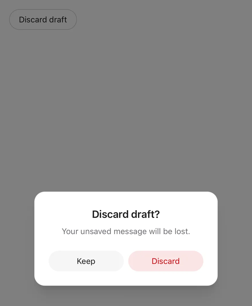
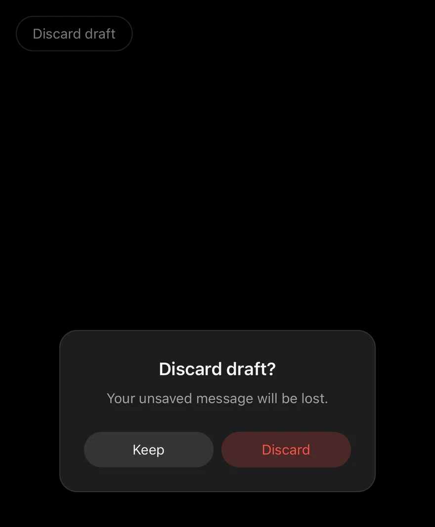
AlertDialogAction and AlertDialogCancel both close the dialog and render a Button; pass variant and size to style them. Cancel defaults to the secondary variant and Action to default. Use variant="destructive" on the action for irreversible operations.
The dialog is uncontrolled by default; use defaultOpen, or control it with open and onOpenChange.
Examples
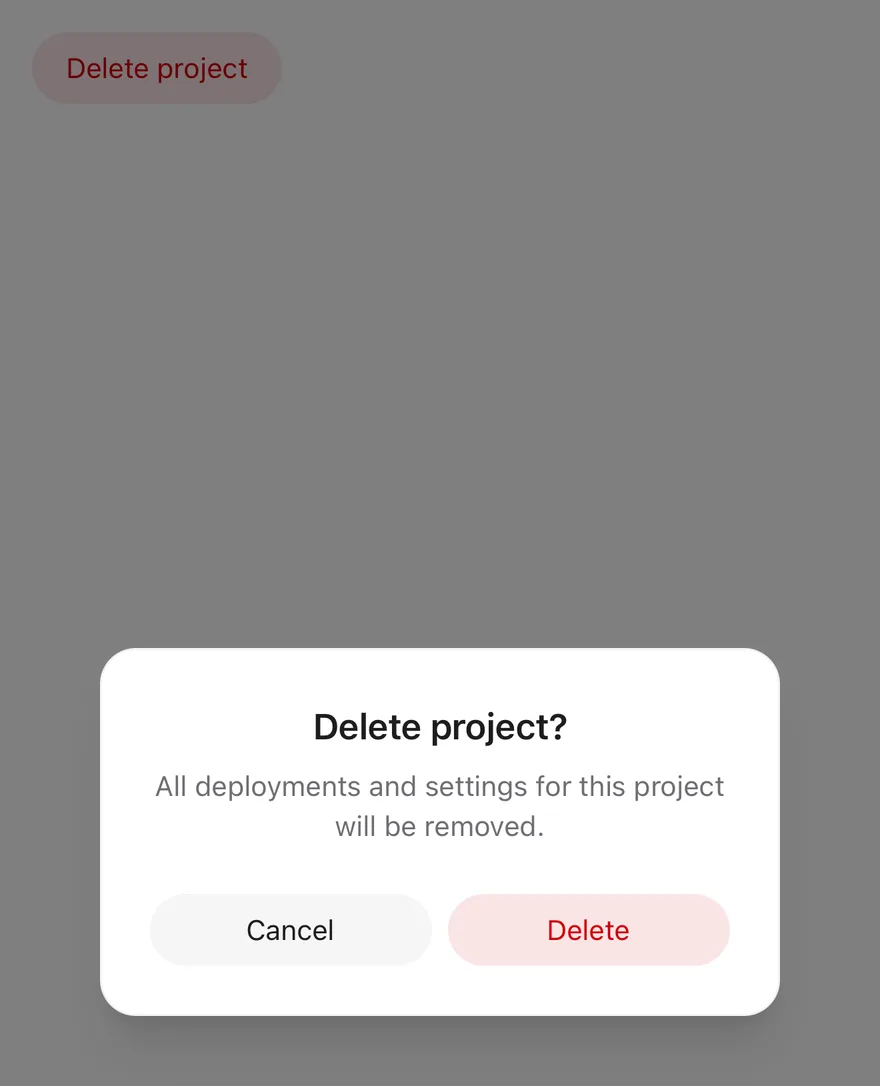
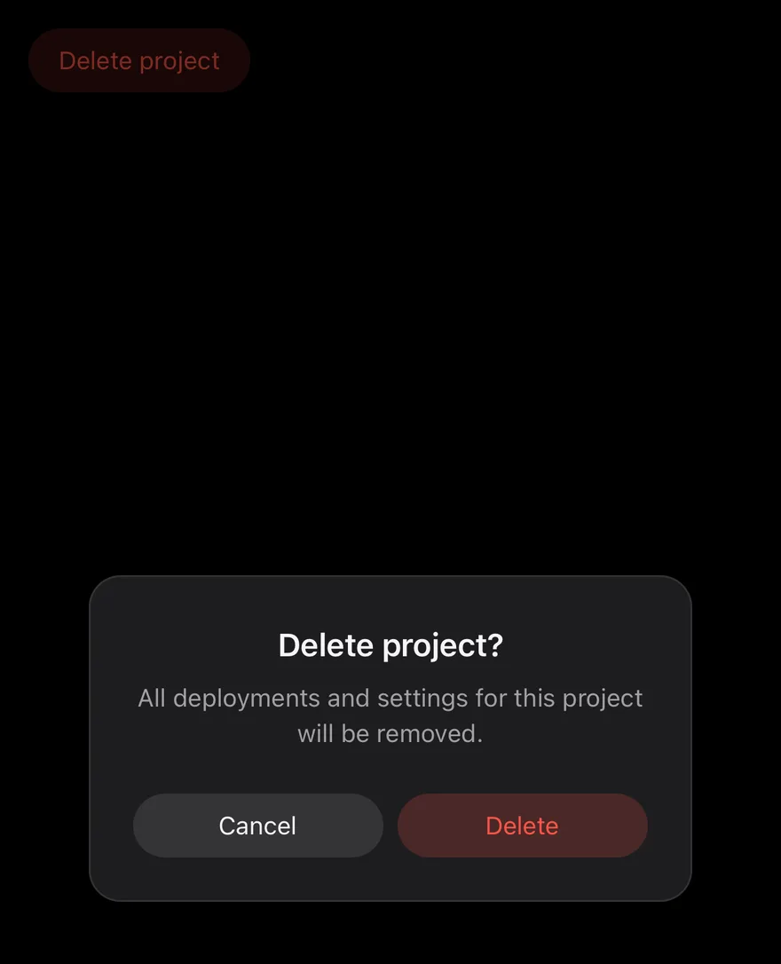
Small
A narrower dialog using size="sm" with a destructive action.
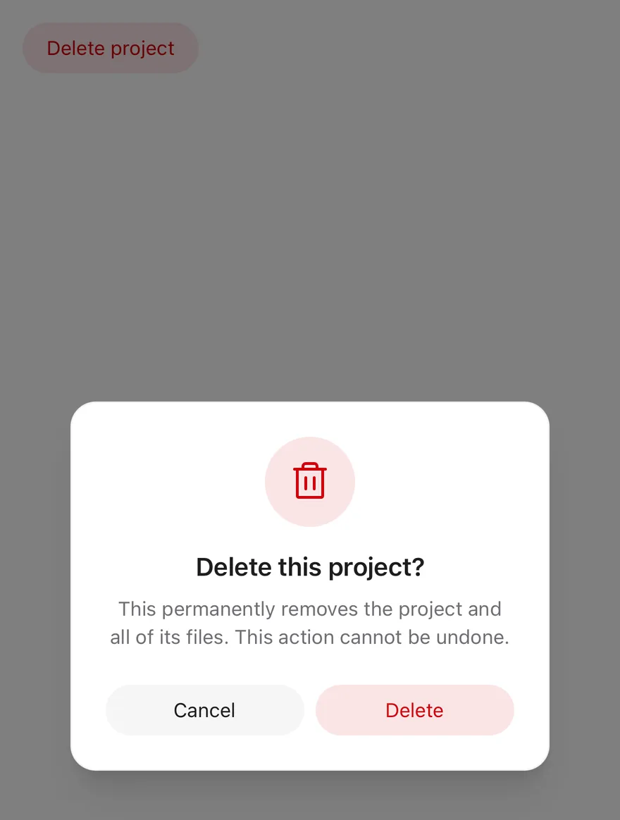
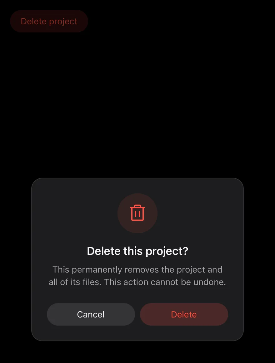
With media
Adds an icon above the title with AlertDialogMedia.
API Reference
AlertDialog
The root that manages the open state.
Also accepts the props of the primitive part it wraps.
AlertDialogTrigger
The control that opens the dialog.
Also accepts the props of the primitive part it wraps.
AlertDialogPortal
Renders the dialog into a portal outside the DOM hierarchy.
Also accepts the props of the primitive part it wraps.
AlertDialogOverlay
The full-screen scrim behind the dialog.
Also accepts the props of the primitive part it wraps.
AlertDialogContent
The dialog surface, rendered with its own portal and overlay.
| Prop | Type | Default | Description |
|---|---|---|---|
size | "default" | "sm" | "default" | Maximum width of the dialog. sm is narrower than default. |
Also accepts the props of the primitive part it wraps.
AlertDialogHeader
A centered layout wrapper for the media, title and description.
Also accepts the props of React.ComponentProps<"div">.
AlertDialogFooter
A two-column grid for the cancel and action buttons.
Also accepts the props of React.ComponentProps<"div">.
AlertDialogMedia
A circular container for an icon or image above the title.
Also accepts the props of React.ComponentProps<"div">.
AlertDialogTitle
The heading that names the dialog.
Also accepts the props of React.ComponentProps<typeof AlertDialogPrimitive.Title>.
AlertDialogDescription
Supporting text that describes the dialog.
Also accepts the props of React.ComponentProps<typeof AlertDialogPrimitive.Description>.
AlertDialogAction
A button that confirms and closes the dialog.
Also accepts the props of the primitive part it wraps, plus Button.
AlertDialogCancel
A button that dismisses the dialog without acting.
Also accepts the props of the primitive part it wraps, plus Button.
Accessibility
- The popup has the
alertdialogrole, named byAlertDialogTitleand described byAlertDialogDescription. - Opening moves focus into the dialog; closing returns focus to the trigger.
Escapecloses the dialog.- Clicking the overlay does not close it; a choice must be made with a footer button or
Escape.
Notes
- Styling hooks:
data-slotvalues fromalert-dialogthroughalert-dialog-cancel; the content also setsdata-size. - Surface tokens:
bg-popoverfor the dialog,bg-black/50for the overlay andbg-mutedfor media. - Enter and exit use fade and zoom animations keyed to
data-openanddata-closed.
AlertDialog is a modal that cannot be dismissed by tapping the scrim. AlertDialogContent renders through a portal (inside a full-window overlay on iOS) with a dimmed scrim and a centered card that scales and fades in.
Use it for confirmations that need an explicit choice, such as deleting data. For less critical content that can be dismissed freely, use Dialog; for a list of choices anchored to the bottom of the screen, use Alert Sheet.