suiss/ui
  • Docs
  • Components
  • Patterns
  • Interactions
  • Charts
  • Blocks
GitHubGet started
DocsComponentsPatternsInteractionsChartsBlocks
Components82
  • Overview
  • Accordion
  • Alert
  • Alert Dialog
  • Alert Sheet
  • Amount Input
  • Aspect Ratio
  • Attachment
  • Avatar
  • Badge
  • Bottom Bar
  • Breadcrumb
  • Bubble
  • Button
  • Button Group
  • Calendar
  • Card
  • Carousel
  • Chart
  • Checkbox
  • Chip
  • Collapsible
  • Combobox
  • Command
  • Context Menu
  • Dialog
  • Direction
  • Drawer
  • Dropdown Menu
  • Empty
  • FAB
  • Field
  • Fullscreen Menu
  • Haptics
  • Header
  • Hover Card
  • Icon
  • Input
  • Input Accessory Bar
  • Input Group
  • Input OTP
  • Item
  • Kbd
  • Keyboard Scroll View
  • Keypad
  • Label
  • Marker
  • Menubar
  • Message
  • Message Scroller
  • Native Select
  • Navigation Menu
  • Page Indicator
  • Pagination
  • Pin Pad
  • Popover
  • Progress
  • QR Scanner
  • Questionnaire
  • Radio Group
  • Resizable
  • Screen
  • Scroll Area
  • Select
  • Separator
  • Sheet
  • Sidebar
  • Signature Pad
  • Skeleton
  • Slider
  • Spinner
  • Switch
  • Tab Bar
  • Table
  • Tabs
  • Text
  • Textarea
  • Toast
  • Toggle
  • Toggle Group
  • Tooltip
  • Wheel Picker
  • Widget

suiss/ui · Component

Toast

Brief, stacked notifications that appear at the bottom of the screen and dismiss themselves.

Toast is an open-source component from suiss/ui for React, React Native, SwiftUI and Jetpack Compose. The @esuiss/ui CLI copies its source into your project, so you own the code.

import { Button } from "@/components/ui/button"
import {
  createToastManager,
  Toaster,
  useToastManager,
} from "@/components/ui/toast"

const toastManager = createToastManager()

function DefaultExample() {
  const toast = useToastManager()

  return (
    <Button
      variant="outline"
      onClick={() =>
        toast.add({
          title: "Event created",
          description: "Friday, October 3 at 9:00 AM",
        })
      }
    >
      Show toast
    </Button>
  )
}

export default function ToastDemo() {
  return (
    <Toaster toastManager={toastManager}>
      <DefaultExample />
    </Toaster>
  )
}

Toasts are built on the Base UI Toast primitive. Toaster is the ready-made setup: it combines ToastProvider, ToastPortal and ToastViewport, and renders each queued toast as a Toast with a ToastContent row holding a status icon, ToastTitle, ToastDescription, ToastAction and ToastClose.

New toasts stack at the bottom of the screen, with older ones scaled down behind, and expand into a list on hover or focus. A toast's type adds a colored icon: success, info, warning or error, or a progress ring for loading. Use toasts for short confirmations and background results; for messages that need a decision, use AlertDialog.

Installation

CLI

$ pnpm dlx shadcn@latest add @esuiss/toast

Works in any project with a components.json. See Installation for the one-line registry setup. Or use the suiss/ui CLI:

$ pnpm dlx @esuiss/ui@latest add toast

Manual

  1. Install the dependencies and add the cn helper:
$ pnpm add @base-ui/react @phosphor-icons/react
  1. Add the pieces it builds on: Button.

  2. Copy the source into components/ui/toast.tsx:

components/ui/toast.tsx
"use client"

import { Toast as ToastPrimitive } from "@base-ui/react/toast"
import {
  CheckCircleIcon,
  InfoIcon,
  WarningIcon,
  XCircleIcon,
  XIcon,
} from "@phosphor-icons/react"
import * as React from "react"
import { Button } from "@/components/ui/button"
import { cn } from "@/lib/utils"

const toast = ToastPrimitive.createToastManager()
  1. Update the import paths to match your project.

Usage

import { ToastProvider, ToastPortal, ToastViewport, Toast, ToastContent, ToastTitle, ToastDescription, ToastAction, ToastClose, Toaster } from "@/components/ui/toast"
<DefaultExample />

Render Toaster once near the root of your app, wrapping the content that shows toasts. Call toast.add({ title, description, type }) from anywhere, or read the manager inside the tree with useToastManager(). add returns an id that you can pass to close; close() with no id closes every toast.

Pass actionProps to show a ToastAction button, and timeout in milliseconds to change how long a toast stays; 0 keeps it until it's closed. toast.promise(promise, { loading, success, error }) shows a loading toast that turns into the success or error toast when the promise settles.

Toaster uses the shared toast manager by default. Pass toastManager to use one created with createToastManager() instead. Use the individual parts only to build a custom toast list.

Examples

Types

Shows each toast type with its icon and color.

import { Button } from "@/components/ui/button"
import {
  createToastManager,
  Toaster,
  useToastManager,
} from "@/components/ui/toast"

const toastManager = createToastManager()

function TypesExample() {
  const toast = useToastManager()

  return (
    <div className="flex flex-wrap items-center gap-3">
      <Button
        variant="outline"
        onClick={() =>
          toast.add({
            type: "success",
            title: "Changes saved",
            description: "Your profile has been updated.",
          })
        }
      >
        Success
      </Button>
      <Button
        variant="outline"
        onClick={() =>
          toast.add({
            type: "info",
            title: "New version available",
            description: "Refresh the page to get the latest features.",
          })
        }
      >
        Info
      </Button>
      <Button
        variant="outline"
        onClick={() =>
          toast.add({
            type: "warning",
            title: "Storage almost full",
            description: "You have used 90% of your storage.",
          })
        }
      >
        Warning
      </Button>
      <Button
        variant="outline"
        onClick={() =>
          toast.add({
            type: "error",
            title: "Upload failed",
            description: "The file is larger than 10 MB.",
          })
        }
      >
        Error
      </Button>
      <Button
        variant="outline"
        onClick={() =>
          toast.add({
            type: "loading",
            title: "Uploading file",
            description: "This may take a few seconds.",
          })
        }
      >
        Loading
      </Button>
    </div>
  )
}

export default function ToastTypes() {
  return (
    <Toaster toastManager={toastManager}>
      <TypesExample />
    </Toaster>
  )
}

Title only

Shows a toast with a title and no description.

import { Button } from "@/components/ui/button"
import {
  createToastManager,
  Toaster,
  useToastManager,
} from "@/components/ui/toast"

const toastManager = createToastManager()

function TitleOnlyExample() {
  const toast = useToastManager()

  return (
    <Button
      variant="outline"
      onClick={() => toast.add({ type: "success", title: "8 photos uploaded" })}
    >
      Upload photos
    </Button>
  )
}

export default function ToastTitleOnly() {
  return (
    <Toaster toastManager={toastManager}>
      <TitleOnlyExample />
    </Toaster>
  )
}

With action

Adds an Undo action button that closes the toast.

import { Button } from "@/components/ui/button"
import {
  createToastManager,
  Toaster,
  useToastManager,
} from "@/components/ui/toast"

const toastManager = createToastManager()

function WithActionExample() {
  const toast = useToastManager()

  return (
    <Button
      variant="outline"
      onClick={() => {
        const id = toast.add({
          title: "Message archived",
          description: "The conversation was moved to your archive.",
          actionProps: {
            children: "Undo",
            onClick: () => toast.close(id),
          },
        })
      }}
    >
      Archive message
    </Button>
  )
}

export default function ToastWithAction() {
  return (
    <Toaster toastManager={toastManager}>
      <WithActionExample />
    </Toaster>
  )
}

Timeout

Compares a short timeout with a persistent toast that stays until closed.

import { Button } from "@/components/ui/button"
import {
  createToastManager,
  Toaster,
  useToastManager,
} from "@/components/ui/toast"

const toastManager = createToastManager()

function TimeoutExample() {
  const toast = useToastManager()

  return (
    <div className="flex flex-wrap items-center gap-3">
      <Button
        variant="outline"
        onClick={() => toast.add({ title: "Link copied", timeout: 1500 })}
      >
        Short
      </Button>
      <Button
        variant="outline"
        onClick={() =>
          toast.add({
            type: "warning",
            title: "Connection lost",
            description: "Stays until you close it.",
            timeout: 0,
          })
        }
      >
        Persistent
      </Button>
      <Button variant="outline" onClick={() => toast.close()}>
        Close all
      </Button>
    </div>
  )
}

export default function ToastTimeout() {
  return (
    <Toaster toastManager={toastManager}>
      <TimeoutExample />
    </Toaster>
  )
}

Promise toast

Uses toast.promise to move from loading to success.

import { Button } from "@/components/ui/button"
import {
  createToastManager,
  Toaster,
  useToastManager,
} from "@/components/ui/toast"

function wait(ms: number) {
  return new Promise((resolve) => setTimeout(resolve, ms))
}

const toastManager = createToastManager()

function PromiseExample({ fail = false }: { fail?: boolean }) {
  const toast = useToastManager()

  return (
    <Button
      variant="outline"
      onClick={() =>
        toast
          .promise(
            fail
              ? wait(2000).then(() =>
                  Promise.reject(new Error("Network error"))
                )
              : wait(2000),
            {
              loading: {
                title: "Publishing post",
                description: "Hang tight, this only takes a moment.",
              },
              success: {
                title: "Post published",
                description: "Your post is now live.",
              },
              error: (error) => ({
                title: "Publishing failed",
                description:
                  error instanceof Error ? error.message : "Please try again.",
              }),
            }
          )
          .catch(() => undefined)
      }
    >
      Publish post
    </Button>
  )
}

export default function ToastPromiseToast() {
  return (
    <Toaster toastManager={toastManager}>
      <PromiseExample />
    </Toaster>
  )
}

Promise rejected

Uses toast.promise to move from loading to an error when the promise rejects.

import { Button } from "@/components/ui/button"
import {
  createToastManager,
  Toaster,
  useToastManager,
} from "@/components/ui/toast"

function wait(ms: number) {
  return new Promise((resolve) => setTimeout(resolve, ms))
}

const toastManager = createToastManager()

function PromiseExample({ fail = false }: { fail?: boolean }) {
  const toast = useToastManager()

  return (
    <Button
      variant="outline"
      onClick={() =>
        toast
          .promise(
            fail
              ? wait(2000).then(() =>
                  Promise.reject(new Error("Network error"))
                )
              : wait(2000),
            {
              loading: {
                title: "Publishing post",
                description: "Hang tight, this only takes a moment.",
              },
              success: {
                title: "Post published",
                description: "Your post is now live.",
              },
              error: (error) => ({
                title: "Publishing failed",
                description:
                  error instanceof Error ? error.message : "Please try again.",
              }),
            }
          )
          .catch(() => undefined)
      }
    >
      Publish post
    </Button>
  )
}

export default function ToastPromiseRejected() {
  return (
    <Toaster toastManager={toastManager}>
      <PromiseExample fail />
    </Toaster>
  )
}

API Reference

01

ToastProvider

Provides a toast manager to the parts inside it.

Also accepts the props of ToastPrimitive.Provider.Props.

02

ToastPortal

Renders the viewport into a portal.

Also accepts the props of ToastPrimitive.Portal.Props.

03

ToastViewport

The fixed region at the bottom of the screen that holds the stack.

Also accepts the props of ToastPrimitive.Viewport.Props.

04

Toast

A single toast in the stack, positioned and animated by its index.

Also accepts the props of ToastPrimitive.Root.Props.

05

ToastContent

The row that lays out a toast's icon, text and buttons.

Also accepts the props of ToastPrimitive.Content.Props.

06

ToastTitle

The toast's title, which names it.

Also accepts the props of ToastPrimitive.Title.Props.

07

ToastDescription

Supporting text, which describes the toast.

Also accepts the props of ToastPrimitive.Description.Props.

08

ToastAction

An optional action button, rendered as a small outline Button.

Also accepts the props of ToastPrimitive.Action.Props.

09

ToastClose

An icon button that dismisses the toast.

Also accepts the props of ToastPrimitive.Close.Props.

10

Toaster

The complete setup: provider, portal, viewport and the rendered toasts.

Also accepts the props of ToastPrimitive.Provider.Props.

Accessibility

  • The viewport is a region landmark named Notifications.
  • Each toast has the dialog role, named by its title and described by its description.
  • ToastClose has the accessible name Close toast.
  • Prefer an action that can also be reached elsewhere, since toasts dismiss themselves after their timeout.

Notes

  • On small screens the stack is centered at the bottom, inset from the edges and up to max-w-sm wide; from the sm breakpoint it sits in the bottom end corner, up to max-w-sm wide.
  • Toasts can be swiped away; the exit animation follows the swipe direction.
  • Parts carry data-slot attributes such as toast-viewport, toast, toast-content, toast-icon and toast-close.
  • Status icons are solid circles filled with fill-green-500, fill-primary, fill-orange-500 and fill-destructive, with a white glyph (text-primary-foreground on the info icon); the loading ring uses stroke-primary. The ring's progress animation is removed when reduced motion is preferred.
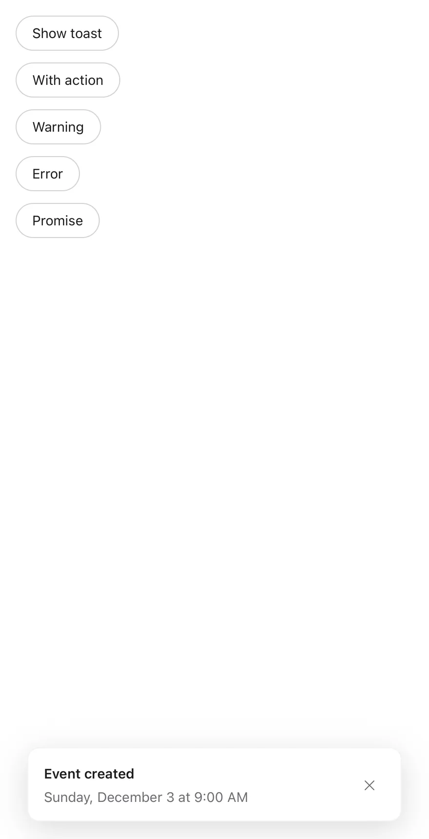
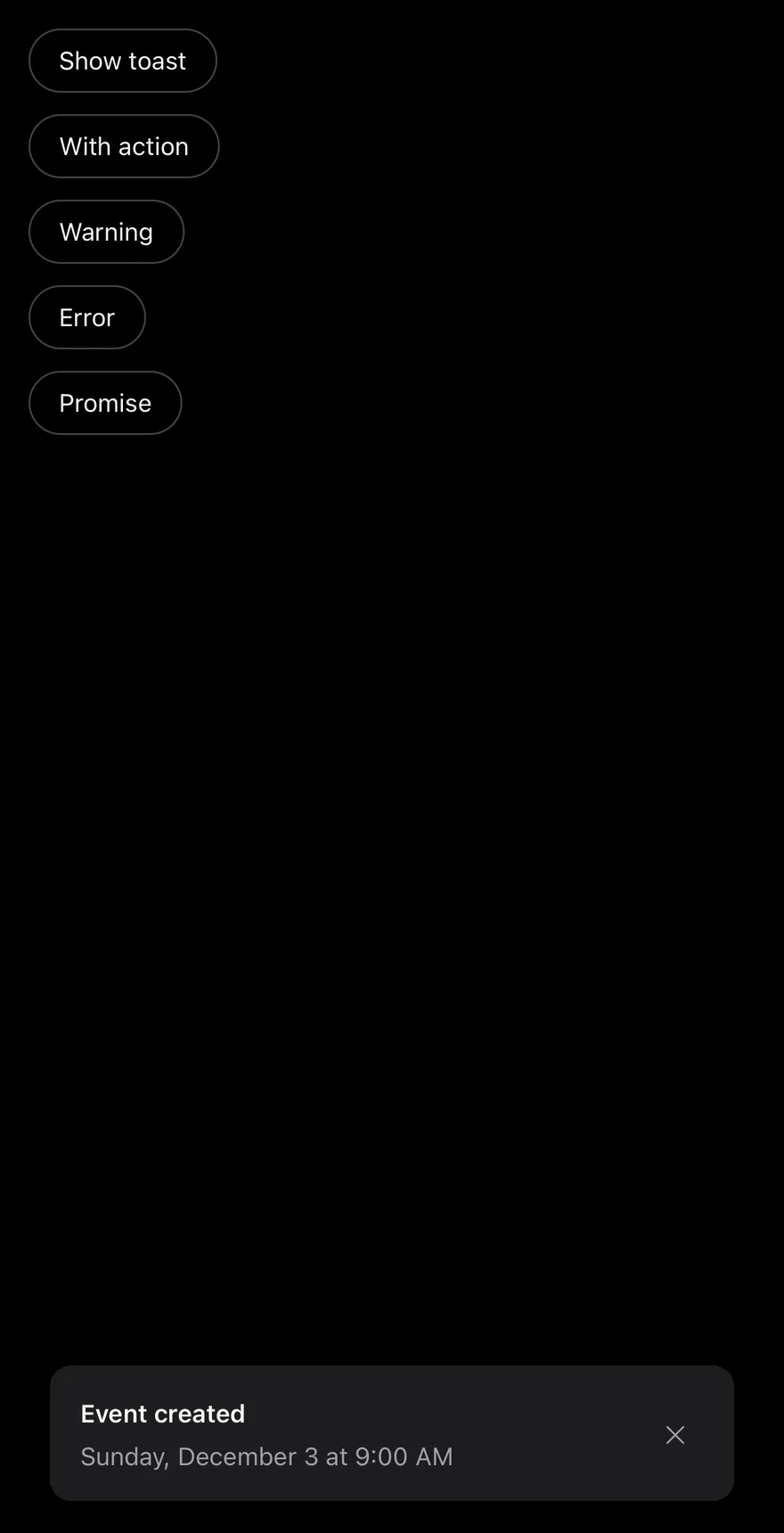
iOS
Toast on iOS in light modeToast on iOS in dark mode
import { View } from "react-native"
import { Button } from "@/components/ui/button"
import { Text } from "@/components/ui/text"
import { Toaster, toast } from "@/components/ui/toast"

function wait(ms: number) {
  return new Promise<void>((resolve) => setTimeout(resolve, ms))
}

function Examples() {
  return (
    <View className="items-start gap-3">
      <Button
        variant="outline"
        onPress={() =>
          toast.add({
            title: "Event created",
            description: "Sunday, December 3 at 9:00 AM",
          })
        }
      >
        <Text>Show toast</Text>
      </Button>
      <Button
        variant="outline"
        onPress={() =>
          toast.add({
            title: "Message archived",
            type: "info",
            actionProps: {
              children: "Undo",
              onPress: () => toast.add({ title: "Restored", type: "success" }),
            },
          })
        }
      >
        <Text>With action</Text>
      </Button>
      <Button
        variant="outline"
        onPress={() =>
          toast.add({
            title: "Storage almost full",
            description: "Free up space to keep syncing.",
            type: "warning",
          })
        }
      >
        <Text>Warning</Text>
      </Button>
      <Button
        variant="outline"
        onPress={() =>
          toast.add({
            title: "Upload failed",
            description: "Check your connection and try again.",
            type: "error",
            priority: "high",
          })
        }
      >
        <Text>Error</Text>
      </Button>
      <Button
        variant="outline"
        onPress={() => {
          toast
            .promise(wait(2000), {
              loading: "Saving changes",
              success: "Changes saved",
              error: "Could not save changes",
            })
            .catch(() => undefined)
        }}
      >
        <Text>Promise</Text>
      </Button>
    </View>
  )
}

export function ToastExample() {
  return (
    <Toaster>
      <Examples />
    </Toaster>
  )
}

Toaster wraps your app in a toast provider and renders the queue into a full-screen viewport. Each toast slides in from the bottom edge, fades out downward, and is capped at 384 points wide.

The viewport renders through a portal. On iOS it sits inside a FullWindowOverlay from react-native-screens, so toasts appear above native modals. Each toast is a Reanimated view.

Visible toasts stack with a small peek and shrink behind the frontmost one. Touching the stack expands it; it collapses again three seconds after the touch ends. Each toast shows an icon for its type (success, info, warning, error, or a spinner for loading), a title, a description, an optional action button and a close button.

Installation

$ pnpm dlx shadcn@latest add @esuiss-rn/toast

See Installation for the components.json setup. Or use the suiss/ui CLI:

$ pnpm dlx @esuiss/ui@latest add toast
$ pnpm dlx @esuiss/ui@latest add toast --platform swift
$ pnpm dlx @esuiss/ui@latest add toast --platform kotlin

The CLI also adds what it builds on: Button, Icon, Text. On React Native it also adds the animated view components/ui/animated-view.tsx.

Manual

  1. Install the dependencies:
npx expo install cn phosphor-react-native react-native-reanimated react-native-safe-area-context react-native-screens react-native-svg react-native-worklets
  1. Add the pieces it builds on: Button, Icon, Text, and the primitives components/primitives/toast.tsx, components/primitives/use-render.tsx, and the animated view components/ui/animated-view.tsx from the next step.

  2. Copy the animated view into components/ui/animated-view.tsx:

uniwind/components/ui/animated-view.tsx
import { Pressable } from "react-native"
import Animated from "react-native-reanimated"

const AnimatedPressable = Animated.createAnimatedComponent(Pressable)

type AnimatedViewProps =
  | (React.ComponentProps<typeof Animated.View> &
      React.RefAttributes<React.ComponentRef<typeof Animated.View>> & {
        as?: "View"
      })
  | (React.ComponentProps<typeof AnimatedPressable> &
      React.RefAttributes<React.ComponentRef<typeof AnimatedPressable>> & {
        as: "Pressable"
      })

function AnimatedView(props: AnimatedViewProps) {
  1. Copy the source into components/ui/toast.tsx:
uniwind/components/ui/toast.tsx
import { cn } from "cn"
import { CheckIcon, ExclamationMarkIcon, XIcon } from "phosphor-react-native"
import * as React from "react"
import {
  ActivityIndicator,
  Platform,
  useWindowDimensions,
  View,
} from "react-native"
import {
  FadeOutDown,
  ReduceMotion,
  SlideInDown,
  useAnimatedStyle,
  withTiming,
} from "react-native-reanimated"
  1. Update the import paths to match your project.
  1. Install the dependencies:
npx expo install cn nativewind phosphor-react-native react-native-reanimated react-native-safe-area-context react-native-screens react-native-svg react-native-worklets
  1. Add the pieces it builds on: Button, Icon, Text, and the primitives components/primitives/toast.tsx, components/primitives/use-render.tsx, and the animated view components/ui/animated-view.tsx from the next step.

  2. Copy the animated view into components/ui/animated-view.tsx:

nativewind/components/ui/animated-view.tsx
import { Pressable } from "react-native"
import Animated from "react-native-reanimated"

const AnimatedPressable = Animated.createAnimatedComponent(Pressable)

type AnimatedViewProps =
  | (React.ComponentProps<typeof Animated.View> &
      React.RefAttributes<React.ComponentRef<typeof Animated.View>> & {
        as?: "View"
      })
  | (React.ComponentProps<typeof AnimatedPressable> &
      React.RefAttributes<React.ComponentRef<typeof AnimatedPressable>> & {
        as: "Pressable"
      })

function AnimatedView(props: AnimatedViewProps) {
  1. Copy the source into components/ui/toast.tsx:
nativewind/components/ui/toast.tsx
import { cn } from "cn"
import { cssInterop } from "nativewind"
import { CheckIcon, ExclamationMarkIcon, XIcon } from "phosphor-react-native"
import * as React from "react"
import {
  ActivityIndicator,
  Platform,
  useWindowDimensions,
  View,
} from "react-native"
import {
  FadeOutDown,
  ReduceMotion,
  SlideInDown,
  useAnimatedStyle,
  withTiming,
  1. Update the import paths to match your project.
  1. Install the dependencies:
npx expo install phosphor-react-native react-native-reanimated react-native-safe-area-context react-native-screens react-native-svg react-native-worklets
  1. Add the pieces it builds on: Button, Icon, Text, and the primitives components/primitives/toast.tsx, components/primitives/use-render.tsx, and the animated view components/ui/animated-view.tsx from the next step.

  2. Copy the animated view into components/ui/animated-view.tsx:

stylesheet/components/ui/animated-view.tsx
import { Pressable } from "react-native"
import Animated from "react-native-reanimated"

const AnimatedPressable = Animated.createAnimatedComponent(Pressable)

type AnimatedViewProps =
  | (React.ComponentProps<typeof Animated.View> &
      React.RefAttributes<React.ComponentRef<typeof Animated.View>> & {
        as?: "View"
      })
  | (React.ComponentProps<typeof AnimatedPressable> &
      React.RefAttributes<React.ComponentRef<typeof AnimatedPressable>> & {
        as: "Pressable"
      })

function AnimatedView(props: AnimatedViewProps) {
  1. Copy the source into components/ui/toast.tsx:
stylesheet/components/ui/toast.tsx
import { CheckIcon, ExclamationMarkIcon, XIcon } from "phosphor-react-native"
import * as React from "react"
import {
  ActivityIndicator,
  Platform,
  StyleSheet,
  useWindowDimensions,
  View,
} from "react-native"
import {
  FadeOutDown,
  ReduceMotion,
  SlideInDown,
  useAnimatedStyle,
  withTiming,
} from "react-native-reanimated"
  1. Update the import paths to match your project.
  1. Target iOS 17 or later.

  2. Add the Swift package to your app:

Package.swift
.package(url: "https://github.com/phosphor-icons/swift", from: "2.1.0")
  1. Copy the theme files every view uses:
swift/Theme/Theme.swift
import SwiftUI
import UIKit

struct RGBA: Sendable {
  let red: CGFloat
  let green: CGFloat
  let blue: CGFloat
  let alpha: CGFloat

  init(_ hex: UInt32, _ alpha: CGFloat = 1) {
    red = CGFloat((hex >> 16) & 0xFF) / 255
    green = CGFloat((hex >> 8) & 0xFF) / 255
    blue = CGFloat(hex & 0xFF) / 255
    self.alpha = alpha
  }
swift/Theme/Tokens.swift
import SwiftUI

public enum EsuissColor {
  public static let background = Color.adaptive(light: .init(0xFFFFFF), dark: .init(0x000000))
  public static let foreground = Color.adaptive(light: .init(0x1D1D1F), dark: .init(0xF5F5F7))
  public static let card = Color.adaptive(light: .init(0xFFFFFF), dark: .init(0x1D1D1F))
  public static let cardForeground = Color.adaptive(light: .init(0x1D1D1F), dark: .init(0xF5F5F7))
  public static let popover = Color.adaptive(light: .init(0xFFFFFF), dark: .init(0x1D1D1F))
  public static let popoverForeground = Color.adaptive(light: .init(0x1D1D1F), dark: .init(0xF5F5F7))
  public static let primary = Color.adaptive(light: .init(0x0071E3), dark: .init(0x2997FF))
  public static let primaryForeground = Color.adaptive(light: .init(0xFFFFFF), dark: .init(0xFFFFFF))
  public static let secondary = Color.adaptive(light: .init(0x000000, 0.04), dark: .init(0xFFFFFF, 0.1))
  public static let secondaryForeground = Color.adaptive(light: .init(0x1D1D1F), dark: .init(0xF5F5F7))
  public static let muted = Color.adaptive(light: .init(0xF5F5F7), dark: .init(0x161617))
  public static let mutedForeground = Color.adaptive(light: .init(0x6E6E73), dark: .init(0xA1A1A6))
  public static let accent = Color.adaptive(light: .init(0x000000, 0.06), dark: .init(0xFFFFFF, 0.1))
  1. Copy the source and every file it uses:
swift/Components/Toast.swift
import Observation
import PhosphorSwift
import SwiftUI

public enum ToastType: CaseIterable, Sendable {
  case `default`, success, info, warning, error, loading
}

public struct ToastAction: Sendable {
  public let title: LocalizedStringResource
  public let action: @MainActor @Sendable () -> Void

  public init(_ title: LocalizedStringResource, action: @escaping @MainActor @Sendable () -> Void) {
    self.title = title
    self.action = action
  }
swift/Components/Button.swift
import SwiftUI

public struct VariantButtonStyle: ButtonStyle {
  public enum Variant: CaseIterable, Sendable {
    case `default`, outline, secondary, tinted, ghost, plain, destructive, link
  }

  public enum Size: CaseIterable, Sendable {
    case `default`, xs, sm, lg, xl, icon, iconXs, iconSm, iconLg, iconXl

    var height: CGFloat {
      switch self {
      case .xs, .iconXs: 24
      case .sm, .iconSm: 32
      case .default, .icon: 36
      case .lg, .iconLg: 44
swift/Components/ButtonGroup.swift
import SwiftUI

extension EnvironmentValues {
  @Entry var buttonGroup: Axis? = nil
  @Entry var buttonGroupSize: CGSize = .zero
}

enum ButtonGroupSpace: Hashable {
  case group
}

struct ButtonGroupFrame {
  let bounds: Anchor<CGRect>
  let outlined: Bool
}
swift/Components/TextVariant.swift
import SwiftUI

public enum TextVariant: CaseIterable, Sendable {
  case `default`, h1, h2, h3, h4, p, blockquote, code, lead, large, small, muted

  var style: TextStyle {
    switch self {
    case .h1: .xl3
    case .h2: .xl2
    case .h3: .xl
    case .h4, .lead, .large: .lg
    case .code, .small, .muted: .sm
    default: .base
    }
  }
  1. Add the files to your app target.
  1. Set minSdk to 24 or higher and add the dependencies:
build.gradle.kts
implementation(platform("androidx.compose:compose-bom:2026.09.00"))
implementation("androidx.compose.foundation:foundation")
implementation("androidx.compose.ui:ui")
implementation("com.adamglin:phosphor-icon-android:1.0.0")
  1. Copy the theme files every view uses:
kotlin/theme/Theme.kt
package com.esuiss.ui.theme

import androidx.compose.foundation.isSystemInDarkTheme
import androidx.compose.runtime.Composable
import androidx.compose.runtime.CompositionLocalProvider
import androidx.compose.runtime.Immutable
import androidx.compose.runtime.staticCompositionLocalOf
import androidx.compose.ui.Modifier
import androidx.compose.ui.draw.dropShadow
import androidx.compose.ui.graphics.Color
import androidx.compose.ui.graphics.Shape
import androidx.compose.ui.graphics.shadow.Shadow as DropShadow
import androidx.compose.ui.text.TextStyle
import androidx.compose.ui.text.style.LineHeightStyle
import androidx.compose.ui.unit.Dp
import androidx.compose.ui.unit.DpOffset
kotlin/theme/Tokens.kt
package com.esuiss.ui.theme

import androidx.compose.runtime.Immutable
import androidx.compose.ui.graphics.Color
import androidx.compose.ui.unit.dp

@Immutable
data class Colors(
    val background: Color,
    val foreground: Color,
    val card: Color,
    val cardForeground: Color,
    val popover: Color,
    val popoverForeground: Color,
    val primary: Color,
    val primaryForeground: Color,
  1. Copy the source and every file it uses:
kotlin/components/Toast.kt
package com.esuiss.ui.components

import androidx.compose.animation.core.Animatable
import androidx.compose.animation.core.LinearEasing
import androidx.compose.animation.core.RepeatMode
import androidx.compose.animation.core.VectorConverter
import androidx.compose.animation.core.animateDpAsState
import androidx.compose.animation.core.animateFloat
import androidx.compose.animation.core.animateFloatAsState
import androidx.compose.animation.core.infiniteRepeatable
import androidx.compose.animation.core.rememberInfiniteTransition
import androidx.compose.animation.core.tween
import androidx.compose.foundation.background
import androidx.compose.foundation.border
import androidx.compose.foundation.gestures.detectDragGestures
import androidx.compose.foundation.gestures.detectTapGestures
kotlin/components/Button.kt
package com.esuiss.ui.components

import androidx.compose.foundation.background
import androidx.compose.foundation.border
import androidx.compose.foundation.clickable
import androidx.compose.foundation.interaction.MutableInteractionSource
import androidx.compose.foundation.interaction.collectIsPressedAsState
import androidx.compose.foundation.layout.Arrangement
import androidx.compose.foundation.layout.Row
import androidx.compose.foundation.layout.RowScope
import androidx.compose.foundation.layout.fillMaxWidth
import androidx.compose.foundation.layout.height
import androidx.compose.foundation.layout.padding
import androidx.compose.foundation.layout.size
import androidx.compose.foundation.shape.CircleShape
import androidx.compose.foundation.shape.RoundedCornerShape
kotlin/components/ButtonGroup.kt
package com.esuiss.ui.components

import androidx.compose.foundation.background
import androidx.compose.foundation.gestures.Orientation
import androidx.compose.foundation.layout.Arrangement
import androidx.compose.foundation.layout.Box
import androidx.compose.foundation.layout.Row
import androidx.compose.foundation.layout.RowScope
import androidx.compose.foundation.layout.padding
import androidx.compose.foundation.shape.CircleShape
import androidx.compose.foundation.shape.CornerSize
import androidx.compose.foundation.shape.RoundedCornerShape
import androidx.compose.runtime.Composable
import androidx.compose.runtime.CompositionLocalProvider
import androidx.compose.runtime.DisposableEffect
import androidx.compose.runtime.Immutable
kotlin/components/Content.kt
package com.esuiss.ui.components

import androidx.compose.runtime.compositionLocalOf
import androidx.compose.ui.graphics.Color
import androidx.compose.ui.text.TextStyle
import androidx.compose.ui.unit.Dp
import androidx.compose.ui.unit.dp

val LocalContentStyle = compositionLocalOf { TextStyle.Default }

val LocalContentColor = compositionLocalOf { Color.Unspecified }

val LocalIconSize = compositionLocalOf { 20.dp }
kotlin/components/Icon.kt
package com.esuiss.ui.components

import androidx.compose.foundation.Image
import androidx.compose.foundation.layout.size
import androidx.compose.runtime.Composable
import androidx.compose.ui.Modifier
import androidx.compose.ui.graphics.Color
import androidx.compose.ui.graphics.ColorFilter
import androidx.compose.ui.graphics.takeOrElse
import androidx.compose.ui.graphics.vector.ImageVector
import androidx.compose.ui.unit.Dp
import com.esuiss.ui.theme.EsuissTheme

@Composable
fun Icon(
    imageVector: ImageVector,
  1. Update the com.esuiss.ui package names to match your project.

Usage

import { ToastProvider, ToastPortal, ToastViewport, Toast, ToastContent, ToastTitle, ToastDescription, ToastAction, ToastClose, Toaster } from "@/components/ui/toast"
<Toaster>
  <Examples />
</Toaster>

Render Toaster once near the root, then call the exported toast manager from anywhere: toast.add({ title, description, type }) returns an id, toast.update(id, updates) changes a toast, and toast.close(id) removes it (or all toasts when called without an id).

toast.promise(promise, { loading, success, error }) shows a loading toast and replaces it with the success or error state when the promise settles.

Pass actionProps (for example { children: "Undo", onPress }) to show an action button. Set priority: "high" for urgent messages and timeout to override the provider default; loading toasts stay until updated.

Use createToastManager to create a separate manager and pass it to Toaster as toastManager, and useToastManager to read the current toasts and actions inside the provider. The lower-level parts are exported for building a custom toast layout.

Examples

Show on load

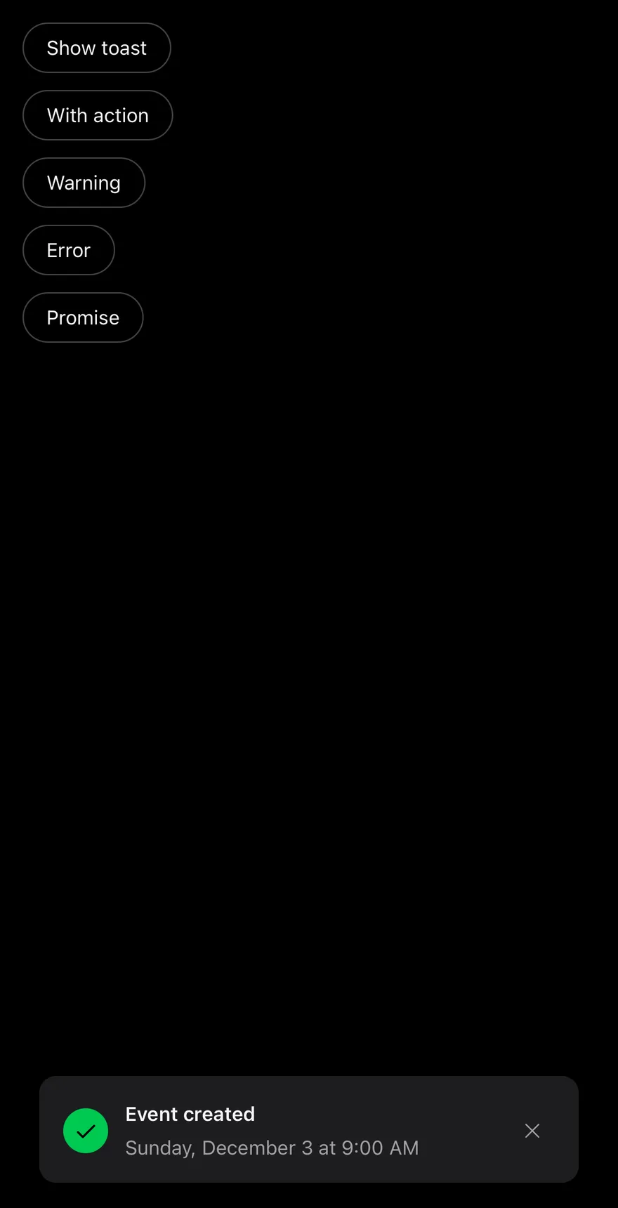
Shows a success toast as soon as the screen mounts.
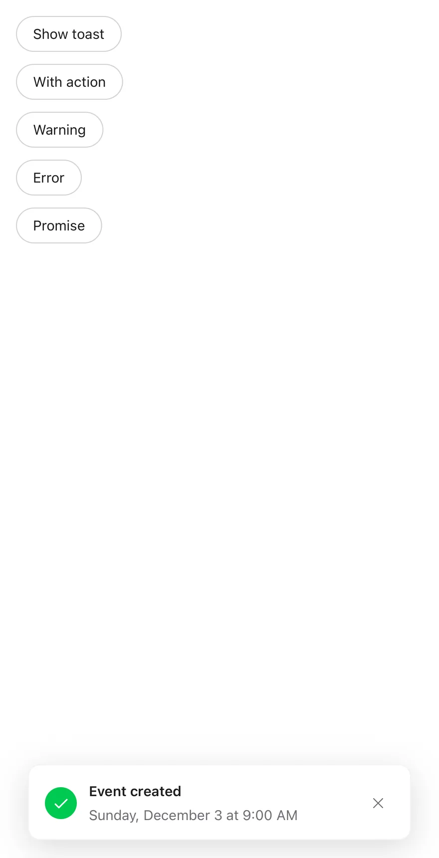
iOS
Toast (show on load) on iOS in light modeToast (show on load) on iOS in dark mode
import * as React from "react"
import { View } from "react-native"
import { Button } from "@/components/ui/button"
import { Text } from "@/components/ui/text"
import { Toaster, toast } from "@/components/ui/toast"

function wait(ms: number) {
  return new Promise<void>((resolve) => setTimeout(resolve, ms))
}

function ShowOnMount() {
  React.useEffect(() => {
    const id = toast.add({
      title: "Event created",
      description: "Sunday, December 3 at 9:00 AM",
      type: "success",
    })
    return () => toast.close(id)
  }, [])
  return null
}

function Examples() {
  return (
    <View className="items-start gap-3">
      <Button
        variant="outline"
        onPress={() =>
          toast.add({
            title: "Event created",
            description: "Sunday, December 3 at 9:00 AM",
          })
        }
      >
        <Text>Show toast</Text>
      </Button>
      <Button
        variant="outline"
        onPress={() =>
          toast.add({
            title: "Message archived",
            type: "info",
            actionProps: {
              children: "Undo",
              onPress: () => toast.add({ title: "Restored", type: "success" }),
            },
          })
        }
      >
        <Text>With action</Text>
      </Button>
      <Button
        variant="outline"
        onPress={() =>
          toast.add({
            title: "Storage almost full",
            description: "Free up space to keep syncing.",
            type: "warning",
          })
        }
      >
        <Text>Warning</Text>
      </Button>
      <Button
        variant="outline"
        onPress={() =>
          toast.add({
            title: "Upload failed",
            description: "Check your connection and try again.",
            type: "error",
            priority: "high",
          })
        }
      >
        <Text>Error</Text>
      </Button>
      <Button
        variant="outline"
        onPress={() => {
          toast
            .promise(wait(2000), {
              loading: "Saving changes",
              success: "Changes saved",
              error: "Could not save changes",
            })
            .catch(() => undefined)
        }}
      >
        <Text>Promise</Text>
      </Button>
    </View>
  )
}

export function ToastShowOnLoadExample() {
  return (
    <Toaster>
      <ShowOnMount />
      <Examples />
    </Toaster>
  )
}

API Reference

01

ToastProvider

Holds the toast queue, default timeout and visible limit.

Also accepts the props of ToastPrimitive.ProviderProps.

02

ToastPortal

Renders its children into a portal host.

Also accepts the props of ToastPrimitive.PortalProps.

03

ToastViewport

Full-screen layer that holds the stack and expands it on touch.

Also accepts the props of React.ComponentProps<typeof ToastPrimitive.Viewport>.

04

Toast

One animated, swipeable toast in the stack.

Also accepts the props of React.ComponentProps<typeof ToastPrimitive.Root>.

05

ToastContent

Row layout for the icon, text, action and close button.

Also accepts the props of React.ComponentProps<typeof ToastPrimitive.Content>.

06

ToastTitle

The toast title, read from the toast object.

Also accepts the props of React.ComponentProps<typeof ToastPrimitive.Title>.

07

ToastDescription

Secondary text under the title.

Also accepts the props of React.ComponentProps<typeof ToastPrimitive.Description>.

08

ToastAction

Outline button rendered from actionProps.

Also accepts the props of React.ComponentProps<typeof ToastPrimitive.Action>.

09

ToastClose

Icon button that dismisses the toast.

Also accepts the props of React.ComponentProps<typeof ToastPrimitive.Close>.

10

Toaster

Provider, portal and viewport that render the default toast list.

PropTypeDefaultDescription
portalHoststring-Name of the portal host to render into.

Also accepts the props of ToastPrimitive.ProviderProps.

Accessibility

  • Each toast has the alert role and a live region that is polite, or assertive for priority: "high".
  • New toasts are announced with their title and description; high-priority announcements are not queued.
  • A dismiss accessibility action and the escape gesture close the toast.
  • Toasts stacked behind the front one are hidden from VoiceOver and TalkBack.
  • The close button has the label "Close toast" and the type icon is hidden from assistive technology.
  • Animations respect the system reduce motion setting.

Notes

  • Uses bg-popover, text-foreground, text-muted-foreground and tint tokens bg-green-500, bg-primary, bg-orange-500 and bg-destructive for the icons.
  • Light and dark colors follow the system appearance; dark mode drops the border.
  • Toasts respect the bottom safe area inset.
  • FullWindowOverlay is used on iOS only; Android renders the viewport directly.
NextTogglePreviousTextarea

On this page

  1. 01Installation
    • CLI
    • Manual
  2. 02Usage
  3. 03Examples
    • Types
    • Title only
    • With action
    • Timeout
    • Promise toast
    • Promise rejected
  4. 04API Reference
    • ToastProvider
    • ToastPortal
    • ToastViewport
    • Toast
    • ToastContent
    • ToastTitle
    • ToastDescription
    • ToastAction
    • ToastClose
    • Toaster
  5. 05Accessibility
  6. 06Notes
  7. 07Installation
    • Manual
  8. 08Usage
  9. 09Examples
    • Show on load
  10. 10API Reference
    • ToastProvider
    • ToastPortal
    • ToastViewport
    • Toast
    • ToastContent
    • ToastTitle
    • ToastDescription
    • ToastAction
    • ToastClose
    • Toaster
  11. 11Accessibility
  12. 12Notes