suiss/ui
  • Docs
  • Components
  • Patterns
  • Interactions
  • Charts
  • Blocks
GitHubGet started
DocsComponentsPatternsInteractionsChartsBlocks
Charts70
  • Overview
Area
  • Axes
  • Default
  • Gradient
  • Interactive
  • Linear
  • Range
  • Sparkline
  • Stacked
  • Stacked Expand
  • Step
Bar
  • Active
  • Default
  • Horizontal
  • Hourly
  • Interactive
  • Labeled
  • Multiple
  • Negative
  • Range
  • Stacked
Line
  • Default
  • Dots
  • Forecast
  • Goal
  • Goal Dots
  • Interactive
  • Labeled
  • Linear
  • Multiple
  • Step
Pie
  • Active
  • Default
  • Donut
  • Donut Text
  • Half
  • Interactive
  • Label
  • Legend
  • Nested
  • Separated
Radar
  • Default
  • Dots
  • Grid Circle
  • Grid Filled
  • Grid None
  • Interactive
  • Legend
  • Lines Only
  • Multiple
  • Radius Axis
Radial
  • Batteries
  • Default
  • Gauge
  • Interactive
  • Label
  • Progress
  • Rings
  • Stacked
  • Text
  • Tinted
Tooltip
  • Custom
  • Dashed
  • Dot
  • Formatter
  • Icons
  • Interactive
  • Label Formatter
  • Line
  • No Indicator
  • No Label

suiss/ui · Chart

Radial Chart Interactive

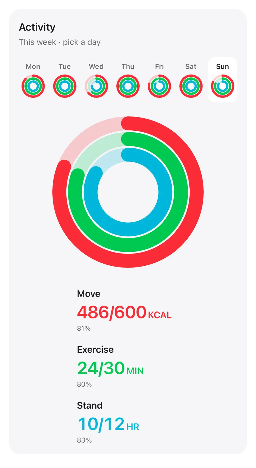
A weekly activity view where picking a day animates three large rings and updates each ring's totals.

Radial Chart Interactive is an open-source chart from suiss/ui for React, React Native, SwiftUI and Jetpack Compose. The @esuiss/ui CLI copies its source into your project, so you own the code.

components/charts/radial-chart-interactive.tsx
"use client"

import * as React from "react"

import { Card, CardContent, CardHeader } from "@/components/ui/card"
import { ToggleGroup, ToggleGroupItem } from "@/components/ui/toggle-group"

type Ring = "move" | "exercise" | "stand"

const RINGS: {
  key: Ring
  label: string
  unit: string
  goal: number
  color: string
}[] = [

An activity summary with a strip of seven day buttons, each showing mini rings, and large Move, Exercise and Stand rings that fill to the selected day's values. Totals and goal progress for each ring update next to it. Use it as a pattern for daily goals that readers browse day by day.

Installation

CLI

$ pnpm dlx shadcn@latest add @esuiss/radial-chart-interactive

Works in any project with a components.json. See Installation for the one-line registry setup. Or use the suiss/ui CLI:

$ pnpm dlx @esuiss/ui@latest add charts radial-chart-interactive

Manual

  1. Add the pieces it builds on: Card, Toggle Group.

  2. Copy the source into components/charts/radial-chart-interactive.tsx:

components/charts/radial-chart-interactive.tsx
"use client"

import * as React from "react"

import { Card, CardContent, CardHeader } from "@/components/ui/card"
import { ToggleGroup, ToggleGroupItem } from "@/components/ui/toggle-group"

type Ring = "move" | "exercise" | "stand"

const RINGS: {
  key: Ring
  label: string
  unit: string
  goal: number
  color: string
}[] = [
  1. Update the import paths to match your project.

Usage

import { RadialChartInteractive } from "@/components/charts/radial-chart-interactive"
<RadialChartInteractive />

Replace WEEK with your own days and values, one number per ring in the same order as RINGS. Edit RINGS to change labels, units, goals and colors. Set the initially selected day in the selected state.

Notes

The rings are plain SVG rather than a Recharts chart, so there is no tooltip. Values beyond the goal show a full ring, while the text still reports the real percentage. Day buttons are fully keyboard accessible, the totals are announced through a live region, and the fill animation respects reduced motion.
iOS
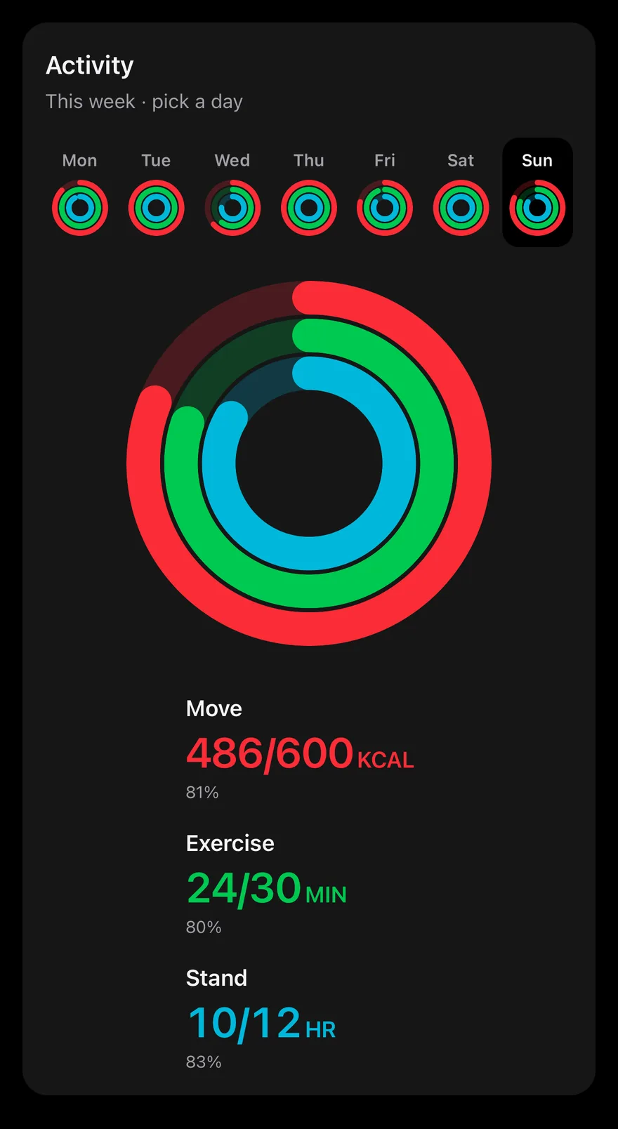
Radial (interactive) on iOS in light modeRadial (interactive) on iOS in dark mode
uniwind/components/charts/radial-chart-interactive.tsx
import { cn } from "cn"
import * as React from "react"
import { View } from "react-native"
import Svg, { Circle, G } from "react-native-svg"
import { Card, CardContent, CardHeader } from "@/components/ui/card"
import { type ChartColor, ChartPalette } from "@/components/ui/chart"
import { Text } from "@/components/ui/text"
import { ToggleGroup, ToggleGroupItem } from "@/components/ui/toggle-group"

type Ring = "move" | "exercise" | "stand"

const RINGS: {
  key: Ring
  label: string
  unit: string
  goal: number
swift/Charts/RadialChartInteractive.swift
import SwiftUI

private let rings: [(key: String, label: String, unit: String, goal: Double, color: Color)] = [
  ("move", "Move", "kcal", 600, Palette.red500),
  ("exercise", "Exercise", "min", 30, Palette.green500),
  ("stand", "Stand", "hr", 12, Palette.cyan500),
]

private let week: [(day: String, values: [Double])] = [
  ("Monday", [520, 34, 11]),
  ("Tuesday", [610, 42, 12]),
  ("Wednesday", [380, 18, 9]),
  ("Thursday", [640, 45, 12]),
  ("Friday", [470, 28, 10]),
  ("Saturday", [720, 62, 12]),
  ("Sunday", [486, 24, 10]),
kotlin/charts/RadialChartInteractive.kt
package com.esuiss.ui.charts

import androidx.compose.animation.core.Animatable
import androidx.compose.animation.core.CubicBezierEasing
import androidx.compose.animation.core.tween
import androidx.compose.foundation.background
import androidx.compose.foundation.layout.Arrangement
import androidx.compose.foundation.layout.BoxWithConstraints
import androidx.compose.foundation.layout.Column
import androidx.compose.foundation.layout.Row
import androidx.compose.foundation.layout.fillMaxWidth
import androidx.compose.foundation.layout.padding
import androidx.compose.foundation.layout.widthIn
import androidx.compose.foundation.selection.selectable
import androidx.compose.foundation.selection.selectableGroup
import androidx.compose.foundation.shape.RoundedCornerShape

A Card with a ToggleGroup of seven days, each showing small rings, above a large ring view and per-ring totals. The rings are drawn with Svg circles colored through ChartPalette; RINGS sets each label, unit, goal and color, and WEEK holds three values per day. Picking a day updates the large rings and the totals, which show the value, goal and percentage, with a note when a goal is met.

Installation

$ pnpm dlx shadcn@latest add @esuiss-rn/radial-chart-interactive

See Installation for the components.json setup. Or use the suiss/ui CLI:

$ pnpm dlx @esuiss/ui@latest add radial-chart-interactive
$ pnpm dlx @esuiss/ui@latest add radial-chart-interactive --platform swift
$ pnpm dlx @esuiss/ui@latest add radial-chart-interactive --platform kotlin

The CLI also adds what it builds on: Card, Chart, Text, Toggle Group.

Manual

  1. Install the dependencies:
npx expo install cn react-native-svg
  1. Add the pieces it builds on: Card, Chart, Text, Toggle Group.

  2. Copy the source into components/charts/radial-chart-interactive.tsx:

uniwind/components/charts/radial-chart-interactive.tsx
import { cn } from "cn"
import * as React from "react"
import { View } from "react-native"
import Svg, { Circle, G } from "react-native-svg"
import { Card, CardContent, CardHeader } from "@/components/ui/card"
import { type ChartColor, ChartPalette } from "@/components/ui/chart"
import { Text } from "@/components/ui/text"
import { ToggleGroup, ToggleGroupItem } from "@/components/ui/toggle-group"

type Ring = "move" | "exercise" | "stand"

const RINGS: {
  key: Ring
  label: string
  unit: string
  goal: number
  1. Update the import paths to match your project.
  1. Install the dependencies:
npx expo install cn react-native-svg
  1. Add the pieces it builds on: Card, Chart, Text, Toggle Group.

  2. Copy the source into components/charts/radial-chart-interactive.tsx:

nativewind/components/charts/radial-chart-interactive.tsx
import { cn } from "cn"
import * as React from "react"
import { View } from "react-native"
import Svg, { Circle, G } from "react-native-svg"
import { Card, CardContent, CardHeader } from "@/components/ui/card"
import { type ChartColor, ChartPalette } from "@/components/ui/chart"
import { Text } from "@/components/ui/text"
import { ToggleGroup, ToggleGroupItem } from "@/components/ui/toggle-group"

type Ring = "move" | "exercise" | "stand"

const RINGS: {
  key: Ring
  label: string
  unit: string
  goal: number
  1. Update the import paths to match your project.
  1. Install the dependencies:
npx expo install react-native-svg
  1. Add the pieces it builds on: Card, Chart, Text, Toggle Group.

  2. Copy the source into components/charts/radial-chart-interactive.tsx:

stylesheet/components/charts/radial-chart-interactive.tsx
import * as React from "react"
import { StyleSheet, View } from "react-native"
import Svg, { Circle, G } from "react-native-svg"
import { Card, CardContent, CardHeader } from "@/components/ui/card"
import { type ChartColor, ChartPalette } from "@/components/ui/chart"
import { Text } from "@/components/ui/text"
import {
  fontSize,
  palette,
  type ThemeColors,
  useTheme,
} from "@/components/ui/theme"

import { ToggleGroup, ToggleGroupItem } from "@/components/ui/toggle-group"

type Tone = keyof ThemeColors | keyof typeof palette
  1. Update the import paths to match your project.
  1. Target iOS 17 or later.

  2. Copy the theme files every view uses:

swift/Theme/Theme.swift
import SwiftUI
import UIKit

struct RGBA: Sendable {
  let red: CGFloat
  let green: CGFloat
  let blue: CGFloat
  let alpha: CGFloat

  init(_ hex: UInt32, _ alpha: CGFloat = 1) {
    red = CGFloat((hex >> 16) & 0xFF) / 255
    green = CGFloat((hex >> 8) & 0xFF) / 255
    blue = CGFloat(hex & 0xFF) / 255
    self.alpha = alpha
  }
swift/Theme/Tokens.swift
import SwiftUI

public enum EsuissColor {
  public static let background = Color.adaptive(light: .init(0xFFFFFF), dark: .init(0x000000))
  public static let foreground = Color.adaptive(light: .init(0x1D1D1F), dark: .init(0xF5F5F7))
  public static let card = Color.adaptive(light: .init(0xFFFFFF), dark: .init(0x1D1D1F))
  public static let cardForeground = Color.adaptive(light: .init(0x1D1D1F), dark: .init(0xF5F5F7))
  public static let popover = Color.adaptive(light: .init(0xFFFFFF), dark: .init(0x1D1D1F))
  public static let popoverForeground = Color.adaptive(light: .init(0x1D1D1F), dark: .init(0xF5F5F7))
  public static let primary = Color.adaptive(light: .init(0x0071E3), dark: .init(0x2997FF))
  public static let primaryForeground = Color.adaptive(light: .init(0xFFFFFF), dark: .init(0xFFFFFF))
  public static let secondary = Color.adaptive(light: .init(0x000000, 0.04), dark: .init(0xFFFFFF, 0.1))
  public static let secondaryForeground = Color.adaptive(light: .init(0x1D1D1F), dark: .init(0xF5F5F7))
  public static let muted = Color.adaptive(light: .init(0xF5F5F7), dark: .init(0x161617))
  public static let mutedForeground = Color.adaptive(light: .init(0x6E6E73), dark: .init(0xA1A1A6))
  public static let accent = Color.adaptive(light: .init(0x000000, 0.06), dark: .init(0xFFFFFF, 0.1))
  1. Copy the source and every file it uses:
swift/Charts/RadialChartInteractive.swift
import SwiftUI

private let rings: [(key: String, label: String, unit: String, goal: Double, color: Color)] = [
  ("move", "Move", "kcal", 600, Palette.red500),
  ("exercise", "Exercise", "min", 30, Palette.green500),
  ("stand", "Stand", "hr", 12, Palette.cyan500),
]

private let week: [(day: String, values: [Double])] = [
  ("Monday", [520, 34, 11]),
  ("Tuesday", [610, 42, 12]),
  ("Wednesday", [380, 18, 9]),
  ("Thursday", [640, 45, 12]),
  ("Friday", [470, 28, 10]),
  ("Saturday", [720, 62, 12]),
  ("Sunday", [486, 24, 10]),
swift/Components/Card.swift
import SwiftUI

public struct Card<Content: View>: View {
  public enum Variant: CaseIterable, Sendable {
    case `default`, filled
  }

  public enum Size: CaseIterable, Sendable {
    case `default`, sm

    var spacing: CGFloat {
      switch self {
      case .default: 24
      case .sm: 16
      }
    }
swift/Components/Haptics.swift
import SwiftUI

extension EnvironmentValues {
  @Entry public var hapticsEnabled = true
}

extension View {
  public func haptics(_ enabled: Bool) -> some View {
    environment(\.hapticsEnabled, enabled)
  }

  func hapticFeedback<Trigger: Equatable>(_ feedback: SensoryFeedback, trigger: Trigger) -> some View {
    modifier(HapticFeedbackModifier(feedback: feedback, trigger: trigger) { _, _ in true })
  }

  func hapticFeedback<Trigger: Equatable>(
  1. Add the files to your app target.
  1. Set minSdk to 24 or higher and add the dependencies:
build.gradle.kts
implementation(platform("androidx.compose:compose-bom:2026.09.00"))
implementation("androidx.compose.foundation:foundation")
implementation("androidx.compose.ui:ui")
  1. Copy the theme files every view uses:
kotlin/theme/Theme.kt
package com.esuiss.ui.theme

import androidx.compose.foundation.isSystemInDarkTheme
import androidx.compose.runtime.Composable
import androidx.compose.runtime.CompositionLocalProvider
import androidx.compose.runtime.Immutable
import androidx.compose.runtime.staticCompositionLocalOf
import androidx.compose.ui.Modifier
import androidx.compose.ui.draw.dropShadow
import androidx.compose.ui.graphics.Color
import androidx.compose.ui.graphics.Shape
import androidx.compose.ui.graphics.shadow.Shadow as DropShadow
import androidx.compose.ui.text.TextStyle
import androidx.compose.ui.text.style.LineHeightStyle
import androidx.compose.ui.unit.Dp
import androidx.compose.ui.unit.DpOffset
kotlin/theme/Tokens.kt
package com.esuiss.ui.theme

import androidx.compose.runtime.Immutable
import androidx.compose.ui.graphics.Color
import androidx.compose.ui.unit.dp

@Immutable
data class Colors(
    val background: Color,
    val foreground: Color,
    val card: Color,
    val cardForeground: Color,
    val popover: Color,
    val popoverForeground: Color,
    val primary: Color,
    val primaryForeground: Color,
  1. Copy the source and every file it uses:
kotlin/charts/RadialChartInteractive.kt
package com.esuiss.ui.charts

import androidx.compose.animation.core.Animatable
import androidx.compose.animation.core.CubicBezierEasing
import androidx.compose.animation.core.tween
import androidx.compose.foundation.background
import androidx.compose.foundation.layout.Arrangement
import androidx.compose.foundation.layout.BoxWithConstraints
import androidx.compose.foundation.layout.Column
import androidx.compose.foundation.layout.Row
import androidx.compose.foundation.layout.fillMaxWidth
import androidx.compose.foundation.layout.padding
import androidx.compose.foundation.layout.widthIn
import androidx.compose.foundation.selection.selectable
import androidx.compose.foundation.selection.selectableGroup
import androidx.compose.foundation.shape.RoundedCornerShape
kotlin/charts/RadialChartRings.kt
package com.esuiss.ui.charts

import androidx.compose.foundation.Canvas
import androidx.compose.foundation.layout.Box
import androidx.compose.foundation.layout.fillMaxWidth
import androidx.compose.foundation.layout.size
import androidx.compose.runtime.Composable
import androidx.compose.ui.Alignment
import androidx.compose.ui.Modifier
import androidx.compose.ui.geometry.Offset
import androidx.compose.ui.geometry.Size
import androidx.compose.ui.graphics.Color
import androidx.compose.ui.graphics.StrokeCap
import androidx.compose.ui.graphics.drawscope.DrawScope
import androidx.compose.ui.graphics.drawscope.Stroke
import androidx.compose.ui.semantics.clearAndSetSemantics
kotlin/components/Card.kt
package com.esuiss.ui.components

import androidx.compose.foundation.background
import androidx.compose.foundation.border
import androidx.compose.foundation.layout.Arrangement
import androidx.compose.foundation.layout.Column
import androidx.compose.foundation.layout.ColumnScope
import androidx.compose.foundation.layout.Row
import androidx.compose.foundation.layout.RowScope
import androidx.compose.foundation.layout.fillMaxWidth
import androidx.compose.foundation.layout.padding
import androidx.compose.foundation.shape.RoundedCornerShape
import androidx.compose.foundation.text.BasicText
import androidx.compose.runtime.Composable
import androidx.compose.runtime.CompositionLocalProvider
import androidx.compose.runtime.compositionLocalOf
kotlin/components/Content.kt
package com.esuiss.ui.components

import androidx.compose.runtime.compositionLocalOf
import androidx.compose.ui.graphics.Color
import androidx.compose.ui.text.TextStyle
import androidx.compose.ui.unit.Dp
import androidx.compose.ui.unit.dp

val LocalContentStyle = compositionLocalOf { TextStyle.Default }

val LocalContentColor = compositionLocalOf { Color.Unspecified }

val LocalIconSize = compositionLocalOf { 20.dp }
kotlin/components/FormSupport.kt
package com.esuiss.ui.components

import android.provider.Settings
import androidx.compose.animation.core.CubicBezierEasing
import androidx.compose.foundation.background
import androidx.compose.foundation.border
import androidx.compose.foundation.gestures.Orientation
import androidx.compose.foundation.text.selection.TextSelectionColors
import androidx.compose.runtime.Composable
import androidx.compose.runtime.mutableStateOf
import androidx.compose.runtime.remember
import androidx.compose.ui.Modifier
import androidx.compose.ui.draw.alpha
import androidx.compose.ui.draw.clip
import androidx.compose.ui.draw.drawWithContent
import androidx.compose.ui.geometry.Offset
kotlin/components/Haptics.kt
package com.esuiss.ui.components

import androidx.compose.runtime.Composable
import androidx.compose.runtime.CompositionLocalProvider
import androidx.compose.runtime.remember
import androidx.compose.runtime.staticCompositionLocalOf
import androidx.compose.ui.hapticfeedback.HapticFeedback
import androidx.compose.ui.hapticfeedback.HapticFeedbackType
import androidx.compose.ui.platform.LocalHapticFeedback

val LocalHapticsEnabled = staticCompositionLocalOf { true }

@Composable
fun ProvideHaptics(enabled: Boolean, content: @Composable () -> Unit) {
    CompositionLocalProvider(LocalHapticsEnabled provides enabled, content = content)
}
  1. Update the com.esuiss.ui package names to match your project.

Usage

import { RadialChartInteractive } from "@/components/charts/radial-chart-interactive"
<RadialChartInteractive />

Replace WEEK with your daily values and adjust the goals, units and colors in RINGS. The component takes no props.

NextRadial Chart LabelPreviousRadial Chart Gauge

On this page

  1. 01Installation
    • CLI
    • Manual
  2. 02Usage
  3. 03Notes
  4. 04Installation
    • Manual
  5. 05Usage