suiss/ui · Chart
Pie Chart Separated
A donut whose slices are pulled apart with wide gaps and rounded corners.
Pie Chart Separated is an open-source chart from suiss/ui for React, React Native, SwiftUI and Jetpack Compose. The @esuiss/ui CLI copies its source into your project, so you own the code.
A donut whose slices are pushed apart with wide gaps and rounded corners, giving each segment a tile-like look. Choose it for a softer, more decorative style than the standard donut.
Installation
CLI
Works in any project with a components.json. See Installation for the one-line registry setup. Or use the suiss/ui CLI:
Manual
- Install the dependencies:
-
Copy the source into
components/charts/pie-chart-separated.tsx:
- Update the import paths to match your project.
Usage
Replace chartData and add each category to chartConfig. Tune the spacing with paddingAngle and the rounding with cornerRadius; large values for either make small slices hard to see.
Notes
The wide gaps and rounded corners squeeze very thin slices, so this style suits data without tiny values.
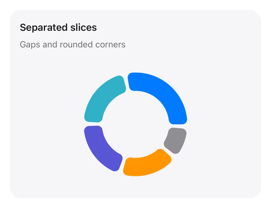
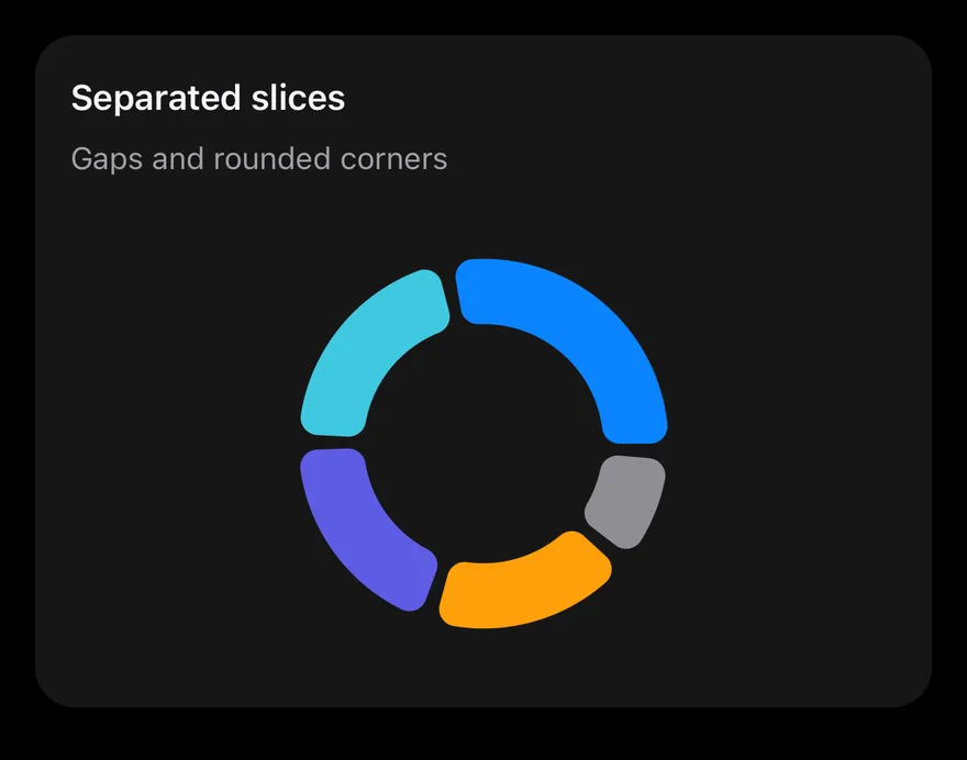
A PieChart donut with paddingAngle and cornerRadius set so each slice stands apart. chartData holds one record per device with a users count. Pressing a slice shows a tooltip.
Installation
The CLI also adds what it builds on: Card, Chart.
Manual
-
Target iOS 17 or later.
-
Copy the theme files every view uses:
- Copy the source and every file it uses:
- Add the files to your app target.
- Set
minSdkto 24 or higher and add the dependencies:
- Copy the theme files every view uses:
- Copy the source and every file it uses:
- Update the
com.esuiss.uipackage names to match your project.
Usage
Replace chartData with your records and keep dataKey and nameKey in step with your field names. Add one entry per slice to chartConfig with its label and color; the component takes no props.