suiss/ui · Chart
Bar Chart Default
A single series of rounded vertical bars, one per month.
Bar Chart Default is an open-source chart from suiss/ui for React, React Native, SwiftUI and Jetpack Compose. The @esuiss/ui CLI copies its source into your project, so you own the code.
The plain bar chart: one series of rounded vertical bars with a month axis and a tooltip. Start from it whenever you compare a handful of discrete values.
Installation
CLI
Works in any project with a components.json. See Installation for the one-line registry setup. Or use the suiss/ui CLI:
Manual
- Install the dependencies:
-
Copy the source into
components/charts/bar-chart-default.tsx:
- Update the import paths to match your project.
Usage
Replace chartData, set the dataKey on the axis and the bar to your fields, and rename the chartConfig entry to set the label and color. Adjust radius for corner rounding and maxBarSize to cap bar width on wide containers.
Notes
Focus the chart and use the arrow keys to move the tooltip from bar to bar.
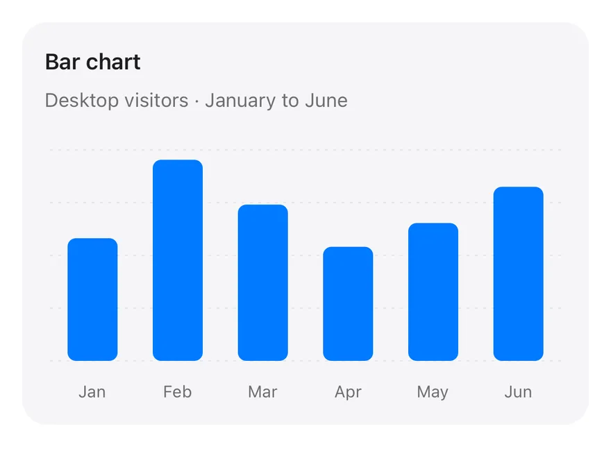
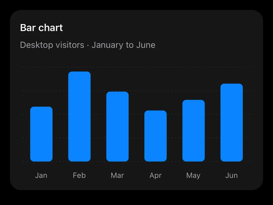
The baseline bar chart inside a Card: one rounded bar per month, a month axis, a dashed horizontal grid and a tooltip without a label. Start here and add series, stacking or labels as needed.
Installation
The CLI also adds what it builds on: Card, Chart.
Manual
-
Target iOS 17 or later.
-
Copy the theme files every view uses:
- Copy the source and every file it uses:
- Add the files to your app target.
- Set
minSdkto 24 or higher and add the dependencies:
- Copy the theme files every view uses:
- Copy the source and every file it uses:
- Update the
com.esuiss.uipackage names to match your project.
Usage
Replace chartData with your records and change each dataKey to match your fields. Set the bar color with fill and the series label in chartConfig. The component takes no props.