suiss/ui
  • Docs
  • Components
  • Patterns
  • Interactions
  • Charts
  • Blocks
GitHubGet started
DocsComponentsPatternsInteractionsChartsBlocks
Charts70
  • Overview
Area
  • Axes
  • Default
  • Gradient
  • Interactive
  • Linear
  • Range
  • Sparkline
  • Stacked
  • Stacked Expand
  • Step
Bar
  • Active
  • Default
  • Horizontal
  • Hourly
  • Interactive
  • Labeled
  • Multiple
  • Negative
  • Range
  • Stacked
Line
  • Default
  • Dots
  • Forecast
  • Goal
  • Goal Dots
  • Interactive
  • Labeled
  • Linear
  • Multiple
  • Step
Pie
  • Active
  • Default
  • Donut
  • Donut Text
  • Half
  • Interactive
  • Label
  • Legend
  • Nested
  • Separated
Radar
  • Default
  • Dots
  • Grid Circle
  • Grid Filled
  • Grid None
  • Interactive
  • Legend
  • Lines Only
  • Multiple
  • Radius Axis
Radial
  • Batteries
  • Default
  • Gauge
  • Interactive
  • Label
  • Progress
  • Rings
  • Stacked
  • Text
  • Tinted
Tooltip
  • Custom
  • Dashed
  • Dot
  • Formatter
  • Icons
  • Interactive
  • Label Formatter
  • Line
  • No Indicator
  • No Label

suiss/ui · Chart

Pie Chart Interactive

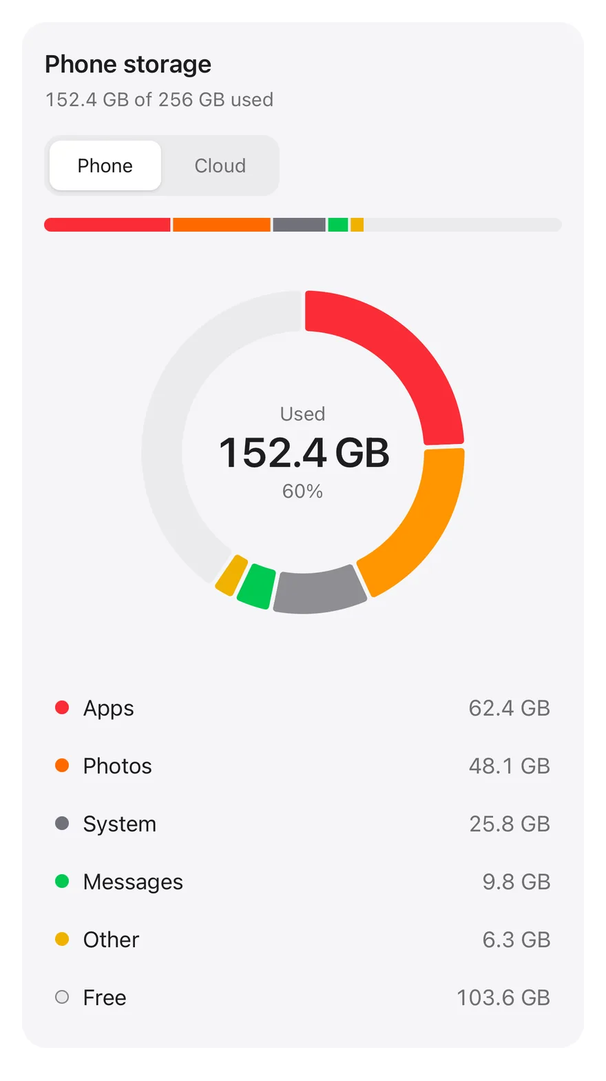
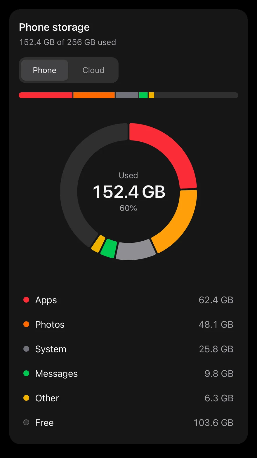
A storage breakdown donut with a device switch, hover-linked list and lifted slices, plus a linear usage bar.

Pie Chart Interactive is an open-source chart from suiss/ui for React, React Native, SwiftUI and Jetpack Compose. The @esuiss/ui CLI copies its source into your project, so you own the code.

components/charts/pie-chart-interactive.tsx
"use client"

import * as React from "react"
import { Pie, PieChart, Sector } from "recharts"

import { Card, CardContent, CardHeader } from "@/components/ui/card"
import { type ChartConfig, ChartContainer } from "@/components/ui/chart"
import { ToggleGroup, ToggleGroupItem } from "@/components/ui/toggle-group"

type Device = "phone" | "cloud"

type Kind =
  | "apps"
  | "photos"
  | "system"
  | "backups"

A storage breakdown with a Phone and Cloud switch, a stacked usage bar, a donut whose hovered slice lifts out and a list linked to it. The center shows the used total or the hovered category, and the slices morph when you switch devices. Use it as a reference for a rich part-to-whole view with linked controls.

Installation

CLI

$ pnpm dlx shadcn@latest add @esuiss/pie-chart-interactive

Works in any project with a components.json. See Installation for the one-line registry setup. Or use the suiss/ui CLI:

$ pnpm dlx @esuiss/ui@latest add charts pie-chart-interactive

Manual

  1. Install the dependencies:
$ pnpm add recharts
  1. Add the pieces it builds on: Card, Chart, Toggle Group.

  2. Copy the source into components/charts/pie-chart-interactive.tsx:

components/charts/pie-chart-interactive.tsx
"use client"

import * as React from "react"
import { Pie, PieChart, Sector } from "recharts"

import { Card, CardContent, CardHeader } from "@/components/ui/card"
import { type ChartConfig, ChartContainer } from "@/components/ui/chart"
import { ToggleGroup, ToggleGroupItem } from "@/components/ui/toggle-group"

type Device = "phone" | "cloud"

type Kind =
  | "apps"
  | "photos"
  | "system"
  | "backups"
  1. Update the import paths to match your project.

Usage

import { PieChartInteractive } from "@/components/charts/pie-chart-interactive"
<PieChartInteractive />

Replace STORAGE with your own sources, each with a total and the size of every category, and list all categories in KINDS. Add a label and color for each category to chartConfig; the free space is computed from the total. Add another source to STORAGE to get another toggle.

Notes

Highlighting works with a mouse over the slices, the bar or the list, but list rows aren't focusable, so keyboard users only get the totals. Changes in the center readout are announced through a live region, and the morph animation is skipped when reduced motion is preferred.
iOS
Pie (interactive) on iOS in light modePie (interactive) on iOS in dark mode
uniwind/components/charts/pie-chart-interactive.tsx
import { cn } from "cn"
import * as React from "react"
import { Pressable, View } from "react-native"
import { Card, CardContent, CardHeader } from "@/components/ui/card"
import {
  type ChartConfig,
  ChartContainer,
  Pie,
  PieChart,
} from "@/components/ui/chart"
import { Text } from "@/components/ui/text"
import { ToggleGroup, ToggleGroupItem } from "@/components/ui/toggle-group"

type Device = "phone" | "cloud"

type Kind =
swift/Charts/PieChartInteractive.swift
import Charts
import SwiftUI

private enum Device: String, CaseIterable {
  case phone, cloud

  var label: String {
    switch self {
    case .phone: "Phone"
    case .cloud: "Cloud"
    }
  }

  var total: Double {
    switch self {
    case .phone: 256
kotlin/charts/PieChartInteractive.kt
package com.esuiss.ui.charts

import androidx.compose.animation.AnimatedVisibility
import androidx.compose.animation.core.CubicBezierEasing
import androidx.compose.animation.core.animateFloatAsState
import androidx.compose.animation.core.snap
import androidx.compose.animation.core.tween
import androidx.compose.animation.expandVertically
import androidx.compose.animation.fadeIn
import androidx.compose.animation.fadeOut
import androidx.compose.animation.shrinkVertically
import androidx.compose.foundation.background
import androidx.compose.foundation.border
import androidx.compose.foundation.clickable
import androidx.compose.foundation.interaction.MutableInteractionSource
import androidx.compose.foundation.layout.Arrangement

A Card with a ToggleGroup that switches between phone and cloud storage, a stacked usage bar, a PieChart donut and a list of categories. Sizes come from the STORAGE record, and free space is the total minus what is used. Pressing a slice or a list row selects that category: its slice lifts outward, other segments in the bar dim, and the center text shows its size and share. Pressing it again returns to total used. The donut sets isAnimationActive={false} and draws without the enter animation.

Installation

$ pnpm dlx shadcn@latest add @esuiss-rn/pie-chart-interactive

See Installation for the components.json setup. Or use the suiss/ui CLI:

$ pnpm dlx @esuiss/ui@latest add pie-chart-interactive
$ pnpm dlx @esuiss/ui@latest add pie-chart-interactive --platform swift
$ pnpm dlx @esuiss/ui@latest add pie-chart-interactive --platform kotlin

The CLI also adds what it builds on: Card, Chart, Text, Toggle Group.

Manual

  1. Install the dependencies:
npx expo install cn
  1. Add the pieces it builds on: Card, Chart, Text, Toggle Group.

  2. Copy the source into components/charts/pie-chart-interactive.tsx:

uniwind/components/charts/pie-chart-interactive.tsx
import { cn } from "cn"
import * as React from "react"
import { Pressable, View } from "react-native"
import { Card, CardContent, CardHeader } from "@/components/ui/card"
import {
  type ChartConfig,
  ChartContainer,
  Pie,
  PieChart,
} from "@/components/ui/chart"
import { Text } from "@/components/ui/text"
import { ToggleGroup, ToggleGroupItem } from "@/components/ui/toggle-group"

type Device = "phone" | "cloud"

type Kind =
  1. Update the import paths to match your project.
  1. Install the dependencies:
npx expo install cn
  1. Add the pieces it builds on: Card, Chart, Text, Toggle Group.

  2. Copy the source into components/charts/pie-chart-interactive.tsx:

nativewind/components/charts/pie-chart-interactive.tsx
import { cn } from "cn"
import * as React from "react"
import { Pressable, View } from "react-native"
import { Card, CardContent, CardHeader } from "@/components/ui/card"
import {
  type ChartConfig,
  ChartContainer,
  Pie,
  PieChart,
} from "@/components/ui/chart"
import { Text } from "@/components/ui/text"
import { ToggleGroup, ToggleGroupItem } from "@/components/ui/toggle-group"

type Device = "phone" | "cloud"

type Kind =
  1. Update the import paths to match your project.
  1. Add the pieces it builds on: Card, Chart, Text, Toggle Group.

  2. Copy the source into components/charts/pie-chart-interactive.tsx:

stylesheet/components/charts/pie-chart-interactive.tsx
import * as React from "react"
import { Pressable, StyleSheet, View } from "react-native"
import { Card, CardContent, CardHeader } from "@/components/ui/card"
import {
  type ChartConfig,
  ChartContainer,
  Pie,
  PieChart,
} from "@/components/ui/chart"
import { Text } from "@/components/ui/text"
import {
  fontSize,
  palette,
  type ThemeColors,
  useTheme,
} from "@/components/ui/theme"
  1. Update the import paths to match your project.
  1. Target iOS 17 or later.

  2. Add the Swift package to your app:

Package.swift
.package(url: "https://github.com/phosphor-icons/swift", from: "2.1.0")
  1. Copy the theme files every view uses:
swift/Theme/Theme.swift
import SwiftUI
import UIKit

struct RGBA: Sendable {
  let red: CGFloat
  let green: CGFloat
  let blue: CGFloat
  let alpha: CGFloat

  init(_ hex: UInt32, _ alpha: CGFloat = 1) {
    red = CGFloat((hex >> 16) & 0xFF) / 255
    green = CGFloat((hex >> 8) & 0xFF) / 255
    blue = CGFloat(hex & 0xFF) / 255
    self.alpha = alpha
  }
swift/Theme/Tokens.swift
import SwiftUI

public enum EsuissColor {
  public static let background = Color.adaptive(light: .init(0xFFFFFF), dark: .init(0x000000))
  public static let foreground = Color.adaptive(light: .init(0x1D1D1F), dark: .init(0xF5F5F7))
  public static let card = Color.adaptive(light: .init(0xFFFFFF), dark: .init(0x1D1D1F))
  public static let cardForeground = Color.adaptive(light: .init(0x1D1D1F), dark: .init(0xF5F5F7))
  public static let popover = Color.adaptive(light: .init(0xFFFFFF), dark: .init(0x1D1D1F))
  public static let popoverForeground = Color.adaptive(light: .init(0x1D1D1F), dark: .init(0xF5F5F7))
  public static let primary = Color.adaptive(light: .init(0x0071E3), dark: .init(0x2997FF))
  public static let primaryForeground = Color.adaptive(light: .init(0xFFFFFF), dark: .init(0xFFFFFF))
  public static let secondary = Color.adaptive(light: .init(0x000000, 0.04), dark: .init(0xFFFFFF, 0.1))
  public static let secondaryForeground = Color.adaptive(light: .init(0x1D1D1F), dark: .init(0xF5F5F7))
  public static let muted = Color.adaptive(light: .init(0xF5F5F7), dark: .init(0x161617))
  public static let mutedForeground = Color.adaptive(light: .init(0x6E6E73), dark: .init(0xA1A1A6))
  public static let accent = Color.adaptive(light: .init(0x000000, 0.06), dark: .init(0xFFFFFF, 0.1))
  1. Copy the source and every file it uses:
swift/Charts/PieChartInteractive.swift
import Charts
import SwiftUI

private enum Device: String, CaseIterable {
  case phone, cloud

  var label: String {
    switch self {
    case .phone: "Phone"
    case .cloud: "Cloud"
    }
  }

  var total: Double {
    switch self {
    case .phone: 256
swift/Components/Button.swift
import SwiftUI

public struct VariantButtonStyle: ButtonStyle {
  public enum Variant: CaseIterable, Sendable {
    case `default`, outline, secondary, tinted, ghost, plain, destructive, link
  }

  public enum Size: CaseIterable, Sendable {
    case `default`, xs, sm, lg, xl, icon, iconXs, iconSm, iconLg, iconXl

    var height: CGFloat {
      switch self {
      case .xs, .iconXs: 24
      case .sm, .iconSm: 32
      case .default, .icon: 36
      case .lg, .iconLg: 44
swift/Components/ButtonGroup.swift
import SwiftUI

extension EnvironmentValues {
  @Entry var buttonGroup: Axis? = nil
  @Entry var buttonGroupSize: CGSize = .zero
}

enum ButtonGroupSpace: Hashable {
  case group
}

struct ButtonGroupFrame {
  let bounds: Anchor<CGRect>
  let outlined: Bool
}
swift/Components/Card.swift
import SwiftUI

public struct Card<Content: View>: View {
  public enum Variant: CaseIterable, Sendable {
    case `default`, filled
  }

  public enum Size: CaseIterable, Sendable {
    case `default`, sm

    var spacing: CGFloat {
      switch self {
      case .default: 24
      case .sm: 16
      }
    }
swift/Components/Chart.swift
import Charts
import SwiftUI

public struct ChartConfig: ExpressibleByDictionaryLiteral, Sendable {
  public struct Item: Sendable {
    public var label: String?
    public var color: Color?
    public var icon: Image?

    public init(_ label: String? = nil, color: Color? = nil, icon: Image? = nil) {
      self.label = label
      self.color = color
      self.icon = icon
    }
  }
swift/Components/Checkbox.swift
import PhosphorSwift
import SwiftUI

extension Shadow {
  static let control = Shadow(color: .black.opacity(0.08), radius: 0.5, y: 0.5)
  static let thumb = Shadow(color: .black.opacity(0.12), radius: 1.5, y: 1)
}

struct SelectionIndicator<Mark: View>: View {
  let checked: Bool
  let pressed: Bool
  let cornerRadius: CGFloat
  let mark: Mark

  @Environment(\.isEnabled) private var isEnabled
  @Environment(\.isInvalid) private var invalid
swift/Components/Field.swift
import SwiftUI

extension EnvironmentValues {
  @Entry public var isInvalid = false
  @Entry var fieldInset = false
  @Entry var fieldGroupInset = false
  @Entry var fieldSetInset = false
}

extension View {
  public func invalid(_ isInvalid: Bool = true) -> some View {
    environment(\.isInvalid, isInvalid)
  }
}

public enum FieldOrientation: CaseIterable, Sendable {
swift/Components/Haptics.swift
import SwiftUI

extension EnvironmentValues {
  @Entry public var hapticsEnabled = true
}

extension View {
  public func haptics(_ enabled: Bool) -> some View {
    environment(\.hapticsEnabled, enabled)
  }

  func hapticFeedback<Trigger: Equatable>(_ feedback: SensoryFeedback, trigger: Trigger) -> some View {
    modifier(HapticFeedbackModifier(feedback: feedback, trigger: trigger) { _, _ in true })
  }

  func hapticFeedback<Trigger: Equatable>(
swift/Components/Item.swift
import SwiftUI

public enum ItemVariant: CaseIterable, Sendable {
  case `default`, outline, muted
}

public enum ItemSize: CaseIterable, Sendable {
  case `default`, sm, xs

  var horizontalPadding: CGFloat {
    switch self {
    case .default: 16
    case .sm: 14
    case .xs: 12
    }
  }
swift/Components/Separator.swift
import SwiftUI

public struct Separator: View {
  let orientation: Axis

  public init(_ orientation: Axis = .horizontal) {
    self.orientation = orientation
  }

  public var body: some View {
    Rectangle()
      .fill(EsuissColor.border)
      .frame(width: orientation == .vertical ? 1 : nil, height: orientation == .horizontal ? 1 : nil)
      .frame(maxWidth: orientation == .horizontal ? .infinity : nil, maxHeight: orientation == .vertical ? .infinity : nil)
      .accessibilityHidden(true)
  }
swift/Components/TextVariant.swift
import SwiftUI

public enum TextVariant: CaseIterable, Sendable {
  case `default`, h1, h2, h3, h4, p, blockquote, code, lead, large, small, muted

  var style: TextStyle {
    switch self {
    case .h1: .xl3
    case .h2: .xl2
    case .h3: .xl
    case .h4, .lead, .large: .lg
    case .code, .small, .muted: .sm
    default: .base
    }
  }
swift/Components/Toggle.swift
import SwiftUI

public enum ToggleVariant: CaseIterable, Sendable {
  case `default`, outline
}

public enum ToggleSize: CaseIterable, Sendable {
  case `default`, sm, lg

  var height: CGFloat {
    switch self {
    case .default: 36
    case .sm: 32
    case .lg: 40
    }
  }
swift/Components/ToggleGroup.swift
import SwiftUI

struct ToggleGroupContext {
  var variant: ToggleVariant
  var size: ToggleSize
  var spacing: Int
  var orientation: Axis
  var namespace: Namespace.ID
  var multiple: Bool
  var isSelected: (AnyHashable) -> Bool
  var toggle: (AnyHashable) -> Void

  var segmented: Bool { spacing == 0 && variant == .default }
  var attached: Bool { spacing == 0 && variant == .outline }
}
  1. Add the files to your app target.
  1. Set minSdk to 24 or higher and add the dependencies:
build.gradle.kts
implementation(platform("androidx.compose:compose-bom:2026.09.00"))
implementation("androidx.compose.foundation:foundation")
implementation("androidx.compose.ui:ui")
implementation("com.adamglin:phosphor-icon-android:1.0.0")
  1. Copy the theme files every view uses:
kotlin/theme/Theme.kt
package com.esuiss.ui.theme

import androidx.compose.foundation.isSystemInDarkTheme
import androidx.compose.runtime.Composable
import androidx.compose.runtime.CompositionLocalProvider
import androidx.compose.runtime.Immutable
import androidx.compose.runtime.staticCompositionLocalOf
import androidx.compose.ui.Modifier
import androidx.compose.ui.draw.dropShadow
import androidx.compose.ui.graphics.Color
import androidx.compose.ui.graphics.Shape
import androidx.compose.ui.graphics.shadow.Shadow as DropShadow
import androidx.compose.ui.text.TextStyle
import androidx.compose.ui.text.style.LineHeightStyle
import androidx.compose.ui.unit.Dp
import androidx.compose.ui.unit.DpOffset
kotlin/theme/Tokens.kt
package com.esuiss.ui.theme

import androidx.compose.runtime.Immutable
import androidx.compose.ui.graphics.Color
import androidx.compose.ui.unit.dp

@Immutable
data class Colors(
    val background: Color,
    val foreground: Color,
    val card: Color,
    val cardForeground: Color,
    val popover: Color,
    val popoverForeground: Color,
    val primary: Color,
    val primaryForeground: Color,
  1. Copy the source and every file it uses:
kotlin/charts/PieChartInteractive.kt
package com.esuiss.ui.charts

import androidx.compose.animation.AnimatedVisibility
import androidx.compose.animation.core.CubicBezierEasing
import androidx.compose.animation.core.animateFloatAsState
import androidx.compose.animation.core.snap
import androidx.compose.animation.core.tween
import androidx.compose.animation.expandVertically
import androidx.compose.animation.fadeIn
import androidx.compose.animation.fadeOut
import androidx.compose.animation.shrinkVertically
import androidx.compose.foundation.background
import androidx.compose.foundation.border
import androidx.compose.foundation.clickable
import androidx.compose.foundation.interaction.MutableInteractionSource
import androidx.compose.foundation.layout.Arrangement
kotlin/components/Card.kt
package com.esuiss.ui.components

import androidx.compose.foundation.background
import androidx.compose.foundation.border
import androidx.compose.foundation.layout.Arrangement
import androidx.compose.foundation.layout.Column
import androidx.compose.foundation.layout.ColumnScope
import androidx.compose.foundation.layout.Row
import androidx.compose.foundation.layout.RowScope
import androidx.compose.foundation.layout.fillMaxWidth
import androidx.compose.foundation.layout.padding
import androidx.compose.foundation.shape.RoundedCornerShape
import androidx.compose.foundation.text.BasicText
import androidx.compose.runtime.Composable
import androidx.compose.runtime.CompositionLocalProvider
import androidx.compose.runtime.compositionLocalOf
kotlin/components/Chart.kt
package com.esuiss.ui.components

import androidx.compose.animation.core.Animatable
import androidx.compose.animation.core.CubicBezierEasing
import androidx.compose.animation.core.Easing
import androidx.compose.animation.core.LinearEasing
import androidx.compose.animation.core.tween
import androidx.compose.foundation.Canvas
import androidx.compose.foundation.background
import androidx.compose.foundation.border
import androidx.compose.foundation.gestures.detectHorizontalDragGestures
import androidx.compose.foundation.gestures.detectTapGestures
import androidx.compose.foundation.layout.Arrangement
import androidx.compose.foundation.layout.Box
import androidx.compose.foundation.layout.BoxScope
import androidx.compose.foundation.layout.BoxWithConstraints
kotlin/components/Checkbox.kt
package com.esuiss.ui.components

import androidx.compose.foundation.background
import androidx.compose.foundation.border
import androidx.compose.foundation.interaction.MutableInteractionSource
import androidx.compose.foundation.interaction.collectIsPressedAsState
import androidx.compose.foundation.layout.Box
import androidx.compose.foundation.layout.size
import androidx.compose.foundation.selection.triStateToggleable
import androidx.compose.foundation.shape.RoundedCornerShape
import androidx.compose.runtime.Composable
import androidx.compose.runtime.getValue
import androidx.compose.runtime.remember
import androidx.compose.ui.Alignment
import androidx.compose.ui.Modifier
import androidx.compose.ui.draw.alpha
kotlin/components/Content.kt
package com.esuiss.ui.components

import androidx.compose.runtime.compositionLocalOf
import androidx.compose.ui.graphics.Color
import androidx.compose.ui.text.TextStyle
import androidx.compose.ui.unit.Dp
import androidx.compose.ui.unit.dp

val LocalContentStyle = compositionLocalOf { TextStyle.Default }

val LocalContentColor = compositionLocalOf { Color.Unspecified }

val LocalIconSize = compositionLocalOf { 20.dp }
kotlin/components/Field.kt
package com.esuiss.ui.components

import androidx.compose.foundation.background
import androidx.compose.foundation.gestures.Orientation
import androidx.compose.foundation.layout.Arrangement
import androidx.compose.foundation.layout.Box
import androidx.compose.foundation.layout.Column
import androidx.compose.foundation.layout.ColumnScope
import androidx.compose.foundation.layout.LayoutScopeMarker
import androidx.compose.foundation.layout.Row
import androidx.compose.foundation.layout.RowScope
import androidx.compose.foundation.layout.fillMaxWidth
import androidx.compose.foundation.layout.heightIn
import androidx.compose.foundation.layout.padding
import androidx.compose.foundation.shape.RoundedCornerShape
import androidx.compose.foundation.text.BasicText
kotlin/components/FormSupport.kt
package com.esuiss.ui.components

import android.provider.Settings
import androidx.compose.animation.core.CubicBezierEasing
import androidx.compose.foundation.background
import androidx.compose.foundation.border
import androidx.compose.foundation.gestures.Orientation
import androidx.compose.foundation.text.selection.TextSelectionColors
import androidx.compose.runtime.Composable
import androidx.compose.runtime.mutableStateOf
import androidx.compose.runtime.remember
import androidx.compose.ui.Modifier
import androidx.compose.ui.draw.alpha
import androidx.compose.ui.draw.clip
import androidx.compose.ui.draw.drawWithContent
import androidx.compose.ui.geometry.Offset
kotlin/components/Haptics.kt
package com.esuiss.ui.components

import androidx.compose.runtime.Composable
import androidx.compose.runtime.CompositionLocalProvider
import androidx.compose.runtime.remember
import androidx.compose.runtime.staticCompositionLocalOf
import androidx.compose.ui.hapticfeedback.HapticFeedback
import androidx.compose.ui.hapticfeedback.HapticFeedbackType
import androidx.compose.ui.platform.LocalHapticFeedback

val LocalHapticsEnabled = staticCompositionLocalOf { true }

@Composable
fun ProvideHaptics(enabled: Boolean, content: @Composable () -> Unit) {
    CompositionLocalProvider(LocalHapticsEnabled provides enabled, content = content)
}
kotlin/components/Icon.kt
package com.esuiss.ui.components

import androidx.compose.foundation.Image
import androidx.compose.foundation.layout.size
import androidx.compose.runtime.Composable
import androidx.compose.ui.Modifier
import androidx.compose.ui.graphics.Color
import androidx.compose.ui.graphics.ColorFilter
import androidx.compose.ui.graphics.takeOrElse
import androidx.compose.ui.graphics.vector.ImageVector
import androidx.compose.ui.unit.Dp
import com.esuiss.ui.theme.EsuissTheme

@Composable
fun Icon(
    imageVector: ImageVector,
kotlin/components/Label.kt
package com.esuiss.ui.components

import androidx.compose.foundation.layout.Arrangement
import androidx.compose.foundation.layout.Row
import androidx.compose.foundation.layout.RowScope
import androidx.compose.foundation.text.BasicText
import androidx.compose.runtime.Composable
import androidx.compose.runtime.CompositionLocalProvider
import androidx.compose.ui.Alignment
import androidx.compose.ui.Modifier
import androidx.compose.ui.draw.alpha
import androidx.compose.ui.text.font.FontWeight
import androidx.compose.ui.unit.dp
import com.esuiss.ui.theme.EsuissTheme
import com.esuiss.ui.theme.Typography
kotlin/components/Separator.kt
package com.esuiss.ui.components

import androidx.compose.foundation.background
import androidx.compose.foundation.gestures.Orientation
import androidx.compose.foundation.layout.Box
import androidx.compose.foundation.layout.fillMaxHeight
import androidx.compose.foundation.layout.fillMaxWidth
import androidx.compose.foundation.layout.height
import androidx.compose.foundation.layout.width
import androidx.compose.runtime.Composable
import androidx.compose.ui.Modifier
import androidx.compose.ui.unit.dp
import com.esuiss.ui.theme.EsuissTheme

@Composable
fun Separator(
kotlin/components/Toggle.kt
package com.esuiss.ui.components

import androidx.compose.animation.core.animateFloatAsState
import androidx.compose.animation.core.tween
import androidx.compose.foundation.background
import androidx.compose.foundation.border
import androidx.compose.foundation.interaction.MutableInteractionSource
import androidx.compose.foundation.interaction.collectIsPressedAsState
import androidx.compose.foundation.layout.Arrangement
import androidx.compose.foundation.layout.Row
import androidx.compose.foundation.layout.RowScope
import androidx.compose.foundation.layout.defaultMinSize
import androidx.compose.foundation.layout.height
import androidx.compose.foundation.layout.padding
import androidx.compose.foundation.selection.selectable
import androidx.compose.foundation.selection.toggleable
kotlin/components/ToggleGroup.kt
package com.esuiss.ui.components

import androidx.compose.animation.core.Animatable
import androidx.compose.animation.core.CubicBezierEasing
import androidx.compose.animation.core.tween
import androidx.compose.foundation.background
import androidx.compose.foundation.border
import androidx.compose.foundation.gestures.Orientation
import androidx.compose.foundation.interaction.MutableInteractionSource
import androidx.compose.foundation.interaction.collectIsPressedAsState
import androidx.compose.foundation.layout.Arrangement
import androidx.compose.foundation.layout.Box
import androidx.compose.foundation.layout.Column
import androidx.compose.foundation.layout.IntrinsicSize
import androidx.compose.foundation.layout.Row
import androidx.compose.foundation.layout.RowScope
  1. Update the com.esuiss.ui package names to match your project.

Usage

import { PieChartInteractive } from "@/components/charts/pie-chart-interactive"
<PieChartInteractive />

Replace STORAGE with your devices, totals and per-category sizes, and keep KINDS, chartConfig and SWATCH in sync when adding categories. The component takes no props.

NextPie Chart LabelPreviousPie Chart Half

On this page

  1. 01Installation
    • CLI
    • Manual
  2. 02Usage
  3. 03Notes
  4. 04Installation
    • Manual
  5. 05Usage