suiss/ui · Chart
Bar Chart Interactive
A screen-time report with stacked category bars, a week and day toggle, selectable days and a most-used apps list.
Bar Chart Interactive is an open-source chart from suiss/ui for React, React Native, SwiftUI and Jetpack Compose. The @esuiss/ui CLI copies its source into your project, so you own the code.
A full screen-time report: stacked category bars per day, a Week and Day toggle, selectable days, per-category totals and a most-used apps list that all update together. Use it as a reference for building a drill-down dashboard on top of a bar chart.
Installation
CLI
Works in any project with a components.json. See Installation for the one-line registry setup. Or use the suiss/ui CLI:
Manual
- Install the dependencies:
-
Add the pieces it builds on: Card, Chart, Toggle Group.
-
Copy the source into
components/charts/bar-chart-interactive.tsx:
- Update the import paths to match your project.
Usage
Replace USAGE with your per-day category totals and APPS with your item breakdown, and rename the categories in CATEGORIES and chartConfig. The hourly Day view is generated from the daily totals for the demo, so feed it real hourly data in production. The comparison line under the headline is a fixed string until a day is selected.
Notes
Click, tap or press Return on a bar to select a day, and select it again to clear the selection; taps that move like a scroll are ignored. Day view shows Sunday if no day was selected. The header is a live region so selection changes are announced.
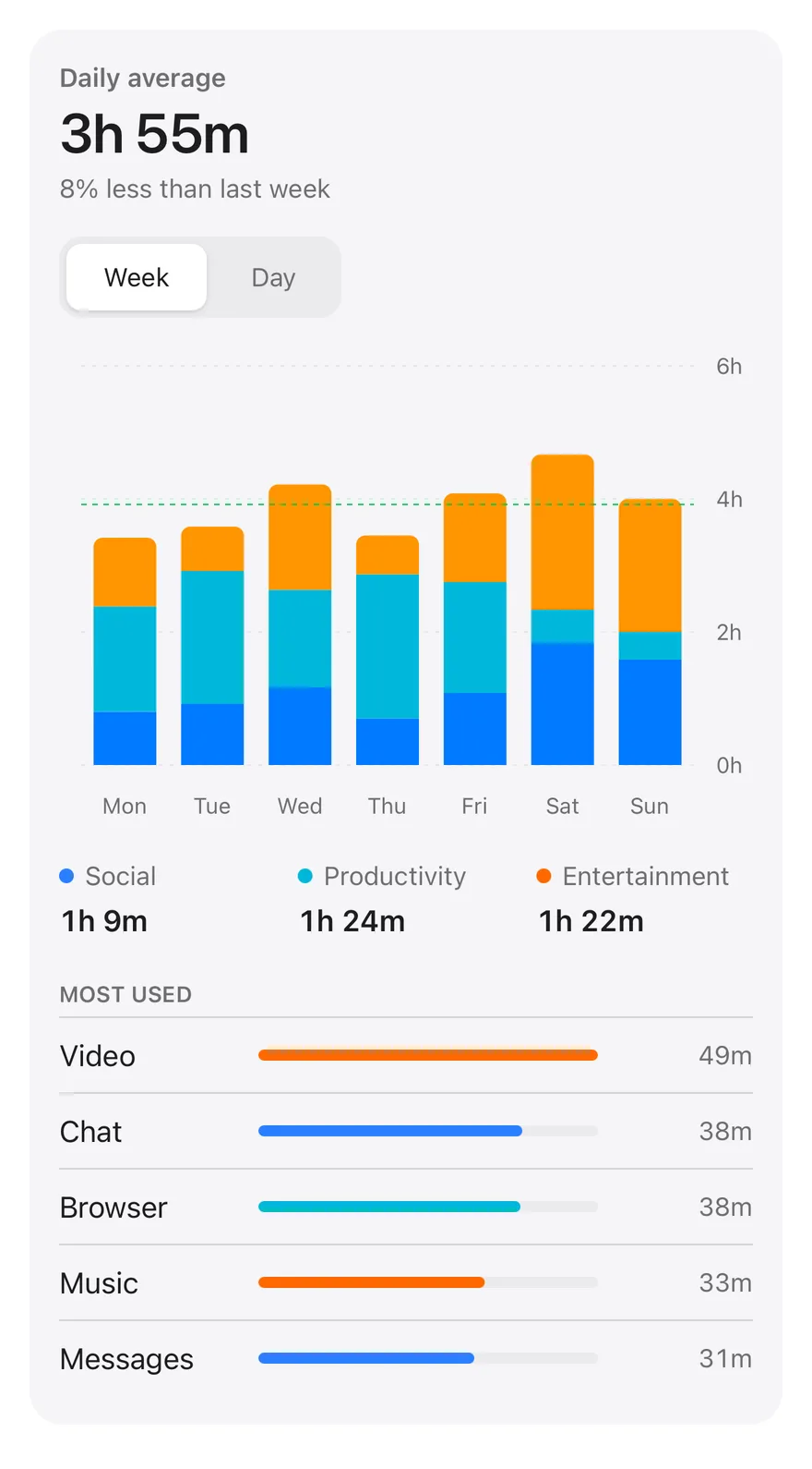
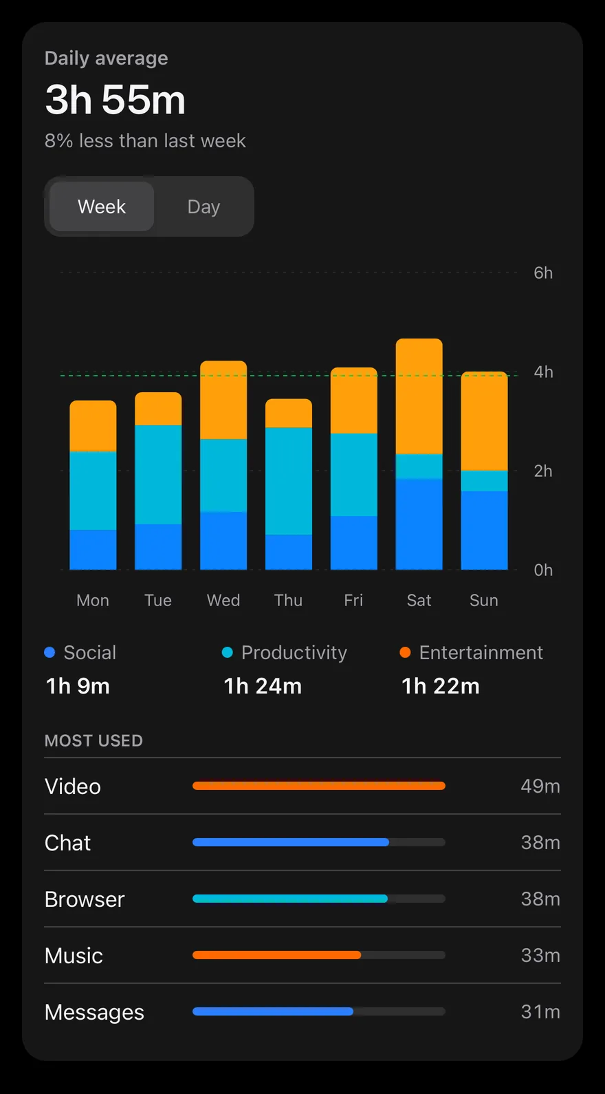
Bars stack social, productivity and entertainment time. A ToggleGroup switches between a weekly view and an hourly view of one day. In the week view, touching a bar selects that day through onActiveIndexChange, dims the other days and updates the headline, comparison text, category totals and the most used apps list below. A dashed line marks the weekly average. The bars set isAnimationActive={false}, so they draw without the enter animation and switch views instantly.
Installation
The CLI also adds what it builds on: Card, Chart, Text, Toggle Group.
Manual
- Install the dependencies:
-
Add the pieces it builds on: Card, Chart, Text, Toggle Group.
-
Copy the source into
components/charts/bar-chart-interactive.tsx:
- Update the import paths to match your project.
- Install the dependencies:
-
Add the pieces it builds on: Card, Chart, Text, Toggle Group.
-
Copy the source into
components/charts/bar-chart-interactive.tsx:
- Update the import paths to match your project.
-
Add the pieces it builds on: Card, Chart, Text, Toggle Group.
-
Copy the source into
components/charts/bar-chart-interactive.tsx:
- Update the import paths to match your project.
-
Target iOS 17 or later.
-
Add the Swift package to your app:
- Copy the theme files every view uses:
- Copy the source and every file it uses:
- Add the files to your app target.
- Set
minSdkto 24 or higher and add the dependencies:
- Copy the theme files every view uses:
- Copy the source and every file it uses:
- Update the
com.esuiss.uipackage names to match your project.
Usage
Replace USAGE with daily minutes per category and APPS with your apps and their share of each category. The hourly view is generated from PROFILE, so swap hourly() for real data. The component takes no props.