suiss/ui · Chart
Radar Chart Grid Filled
A borderless radar shape over shaded circular rings separated by card-colored lines.
Radar Chart Grid Filled is an open-source chart from suiss/ui for React, React Native, SwiftUI and Jetpack Compose. The @esuiss/ui CLI copies its source into your project, so you own the code.
A borderless radar shape over shaded circular bands, separated by lines in the card's background color (muted). Choose it for a quieter, more graphic look where the grid reads as tinted rings rather than lines.
Installation
CLI
Works in any project with a components.json. See Installation for the one-line registry setup. Or use the suiss/ui CLI:
Manual
- Install the dependencies:
-
Copy the source into
components/charts/radar-chart-grid-filled.tsx:
- Update the import paths to match your project.
Usage
Replace chartData, set the axis and value keys, and rename the series in chartConfig. Adjust the band shading through the fill and opacity on PolarGrid, and the shape's strength through the opacity on Radar.
Notes
The gaps between bands use the card's background color, so place this chart on that same surface or update the grid stroke to match.
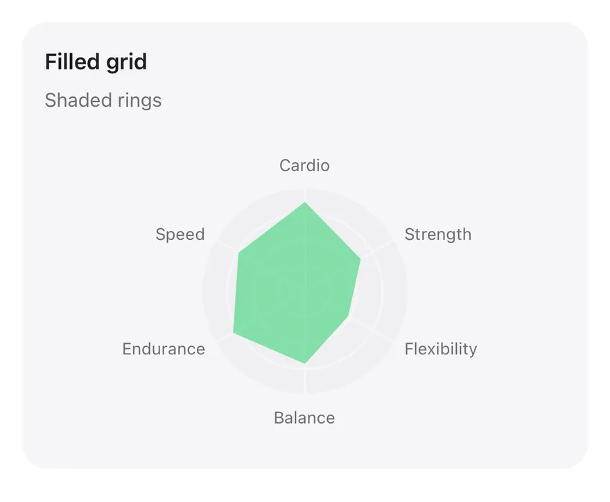
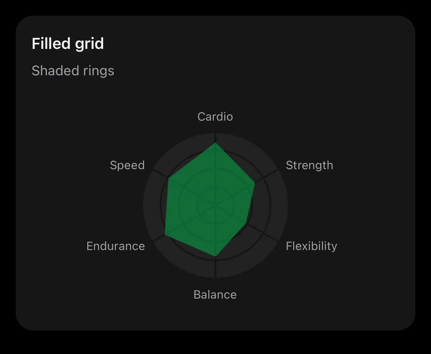
A RadarChart whose circular PolarGrid is filled with the secondary color and separated by strokes in the card color. The single Radar series has no stroke. chartData has one record per axis (skill) with thisMonth and lastMonth scores. Pressing the chart shows a tooltip.
Installation
The CLI also adds what it builds on: Card, Chart.
Manual
-
Target iOS 17 or later.
-
Copy the theme files every view uses:
- Copy the source and every file it uses:
- Add the files to your app target.
- Set
minSdkto 24 or higher and add the dependencies:
- Copy the theme files every view uses:
- Copy the source and every file it uses:
- Update the
com.esuiss.uipackage names to match your project.
Usage
Replace chartData with your records, set PolarAngleAxis dataKey to your axis field, and rename the series in chartConfig. The component takes no props.