suiss/ui
  • Docs
  • Components
  • Patterns
  • Interactions
  • Charts
  • Blocks
GitHubGet started
DocsComponentsPatternsInteractionsChartsBlocks
Charts70
  • Overview
Area
  • Axes
  • Default
  • Gradient
  • Interactive
  • Linear
  • Range
  • Sparkline
  • Stacked
  • Stacked Expand
  • Step
Bar
  • Active
  • Default
  • Horizontal
  • Hourly
  • Interactive
  • Labeled
  • Multiple
  • Negative
  • Range
  • Stacked
Line
  • Default
  • Dots
  • Forecast
  • Goal
  • Goal Dots
  • Interactive
  • Labeled
  • Linear
  • Multiple
  • Step
Pie
  • Active
  • Default
  • Donut
  • Donut Text
  • Half
  • Interactive
  • Label
  • Legend
  • Nested
  • Separated
Radar
  • Default
  • Dots
  • Grid Circle
  • Grid Filled
  • Grid None
  • Interactive
  • Legend
  • Lines Only
  • Multiple
  • Radius Axis
Radial
  • Batteries
  • Default
  • Gauge
  • Interactive
  • Label
  • Progress
  • Rings
  • Stacked
  • Text
  • Tinted
Tooltip
  • Custom
  • Dashed
  • Dot
  • Formatter
  • Icons
  • Interactive
  • Label Formatter
  • Line
  • No Indicator
  • No Label

suiss/ui · Chart

Line Chart Interactive

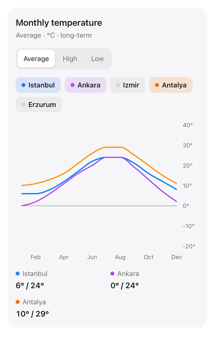
Monthly temperatures for several cities, with chips to show or hide each city and an average, high or low switch.

Line Chart Interactive is an open-source chart from suiss/ui for React, React Native, SwiftUI and Jetpack Compose. The @esuiss/ui CLI copies its source into your project, so you own the code.

components/charts/line-chart-interactive.tsx
"use client"

import * as React from "react"
import {
  CartesianGrid,
  Line,
  LineChart,
  ReferenceLine,
  useActiveTooltipDataPoints,
  XAxis,
  YAxis,
} from "recharts"

import { Card, CardContent, CardHeader } from "@/components/ui/card"
import {
  type ChartConfig,

Monthly temperatures for several cities with chips to show or hide each city and a switch between average, high and low. A row of stats under the chart shows each city's range and follows the cursor month. Use it as a pattern for comparing many series where readers pick which ones to see.

Installation

CLI

$ pnpm dlx shadcn@latest add @esuiss/line-chart-interactive

Works in any project with a components.json. See Installation for the one-line registry setup. Or use the suiss/ui CLI:

$ pnpm dlx @esuiss/ui@latest add charts line-chart-interactive

Manual

  1. Install the dependencies:
$ pnpm add recharts
  1. Add the pieces it builds on: Card, Chart, Toggle, Toggle Group.

  2. Copy the source into components/charts/line-chart-interactive.tsx:

components/charts/line-chart-interactive.tsx
"use client"

import * as React from "react"
import {
  CartesianGrid,
  Line,
  LineChart,
  ReferenceLine,
  useActiveTooltipDataPoints,
  XAxis,
  YAxis,
} from "recharts"

import { Card, CardContent, CardHeader } from "@/components/ui/card"
import {
  type ChartConfig,
  1. Update the import paths to match your project.

Usage

import { LineChartInteractive } from "@/components/charts/line-chart-interactive"
<LineChartInteractive />

Replace CITIES with your own series and add a matching entry with label and color to chartConfig for each one. Set which series start visible in the visible state. The high and low modes are derived from the averages with a demo formula, so replace temperature with real values, and adjust the fixed value axis domain to your range.

Notes

The last visible city can't be hidden, so the chart is never empty. Values outside the fixed value axis range are clipped. Newly shown lines draw in with an animation that is skipped when reduced motion is preferred.
iOS
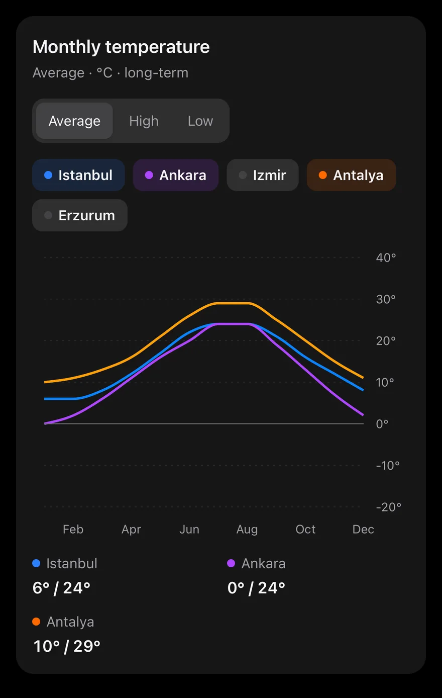
Line (interactive) on iOS in light modeLine (interactive) on iOS in dark mode
uniwind/components/charts/line-chart-interactive.tsx
import { cn } from "cn"
import * as React from "react"
import { View } from "react-native"
import { Card, CardContent, CardHeader } from "@/components/ui/card"
import {
  CartesianGrid,
  type ChartConfig,
  ChartContainer,
  ChartTooltip,
  ChartTooltipContent,
  Line,
  LineChart,
  ReferenceLine,
  XAxis,
  YAxis,
} from "@/components/ui/chart"
swift/Charts/LineChartInteractive.swift
import Charts
import SwiftUI

private enum City: String, CaseIterable {
  case istanbul, ankara, izmir, antalya, erzurum

  var average: [Double] {
    switch self {
    case .istanbul: [6, 6, 8, 12, 17, 22, 24, 24, 21, 16, 12, 8]
    case .ankara: [0, 2, 6, 11, 16, 20, 24, 24, 19, 13, 7, 2]
    case .izmir: [9, 10, 12, 16, 21, 26, 28, 28, 24, 19, 14, 10]
    case .antalya: [10, 11, 13, 16, 21, 26, 29, 29, 25, 20, 15, 11]
    case .erzurum: [-9, -8, -2, 6, 11, 15, 20, 20, 15, 8, 1, -6]
    }
  }
kotlin/charts/LineChartInteractive.kt
package com.esuiss.ui.charts

import androidx.compose.animation.animateColorAsState
import androidx.compose.foundation.background
import androidx.compose.foundation.layout.Arrangement
import androidx.compose.foundation.layout.Box
import androidx.compose.foundation.layout.Column
import androidx.compose.foundation.layout.FlowRow
import androidx.compose.foundation.layout.Row
import androidx.compose.foundation.layout.fillMaxWidth
import androidx.compose.foundation.layout.height
import androidx.compose.foundation.layout.padding
import androidx.compose.foundation.layout.size
import androidx.compose.foundation.layout.width
import androidx.compose.foundation.selection.toggleable
import androidx.compose.foundation.shape.CircleShape

One line per visible city across twelve months. A ToggleGroup switches between average, high and low temperatures, and a row of Toggle chips shows or hides each city, keeping at least one on. Touching the plot reports the month through onActiveIndexChange, and the summary under the chart switches from each city's range to its value for that month. The lines animate with animationDuration={650} and animationEasing="ease-in-out".

Installation

$ pnpm dlx shadcn@latest add @esuiss-rn/line-chart-interactive

See Installation for the components.json setup. Or use the suiss/ui CLI:

$ pnpm dlx @esuiss/ui@latest add line-chart-interactive
$ pnpm dlx @esuiss/ui@latest add line-chart-interactive --platform swift
$ pnpm dlx @esuiss/ui@latest add line-chart-interactive --platform kotlin

The CLI also adds what it builds on: Card, Chart, Text, Toggle, Toggle Group.

Manual

  1. Install the dependencies:
npx expo install cn
  1. Add the pieces it builds on: Card, Chart, Text, Toggle, Toggle Group.

  2. Copy the source into components/charts/line-chart-interactive.tsx:

uniwind/components/charts/line-chart-interactive.tsx
import { cn } from "cn"
import * as React from "react"
import { View } from "react-native"
import { Card, CardContent, CardHeader } from "@/components/ui/card"
import {
  CartesianGrid,
  type ChartConfig,
  ChartContainer,
  ChartTooltip,
  ChartTooltipContent,
  Line,
  LineChart,
  ReferenceLine,
  XAxis,
  YAxis,
} from "@/components/ui/chart"
  1. Update the import paths to match your project.
  1. Install the dependencies:
npx expo install cn
  1. Add the pieces it builds on: Card, Chart, Text, Toggle, Toggle Group.

  2. Copy the source into components/charts/line-chart-interactive.tsx:

nativewind/components/charts/line-chart-interactive.tsx
import { cn } from "cn"
import * as React from "react"
import { View } from "react-native"
import { Card, CardContent, CardHeader } from "@/components/ui/card"
import {
  CartesianGrid,
  type ChartConfig,
  ChartContainer,
  ChartTooltip,
  ChartTooltipContent,
  Line,
  LineChart,
  ReferenceLine,
  XAxis,
  YAxis,
} from "@/components/ui/chart"
  1. Update the import paths to match your project.
  1. Add the pieces it builds on: Card, Chart, Text, Toggle, Toggle Group.

  2. Copy the source into components/charts/line-chart-interactive.tsx:

stylesheet/components/charts/line-chart-interactive.tsx
import * as React from "react"
import { StyleSheet, View } from "react-native"
import { Card, CardContent, CardHeader } from "@/components/ui/card"
import {
  CartesianGrid,
  type ChartConfig,
  ChartContainer,
  ChartTooltip,
  ChartTooltipContent,
  Line,
  LineChart,
  ReferenceLine,
  XAxis,
  YAxis,
} from "@/components/ui/chart"
import { Text } from "@/components/ui/text"
  1. Update the import paths to match your project.
  1. Target iOS 17 or later.

  2. Add the Swift package to your app:

Package.swift
.package(url: "https://github.com/phosphor-icons/swift", from: "2.1.0")
  1. Copy the theme files every view uses:
swift/Theme/Theme.swift
import SwiftUI
import UIKit

struct RGBA: Sendable {
  let red: CGFloat
  let green: CGFloat
  let blue: CGFloat
  let alpha: CGFloat

  init(_ hex: UInt32, _ alpha: CGFloat = 1) {
    red = CGFloat((hex >> 16) & 0xFF) / 255
    green = CGFloat((hex >> 8) & 0xFF) / 255
    blue = CGFloat(hex & 0xFF) / 255
    self.alpha = alpha
  }
swift/Theme/Tokens.swift
import SwiftUI

public enum EsuissColor {
  public static let background = Color.adaptive(light: .init(0xFFFFFF), dark: .init(0x000000))
  public static let foreground = Color.adaptive(light: .init(0x1D1D1F), dark: .init(0xF5F5F7))
  public static let card = Color.adaptive(light: .init(0xFFFFFF), dark: .init(0x1D1D1F))
  public static let cardForeground = Color.adaptive(light: .init(0x1D1D1F), dark: .init(0xF5F5F7))
  public static let popover = Color.adaptive(light: .init(0xFFFFFF), dark: .init(0x1D1D1F))
  public static let popoverForeground = Color.adaptive(light: .init(0x1D1D1F), dark: .init(0xF5F5F7))
  public static let primary = Color.adaptive(light: .init(0x0071E3), dark: .init(0x2997FF))
  public static let primaryForeground = Color.adaptive(light: .init(0xFFFFFF), dark: .init(0xFFFFFF))
  public static let secondary = Color.adaptive(light: .init(0x000000, 0.04), dark: .init(0xFFFFFF, 0.1))
  public static let secondaryForeground = Color.adaptive(light: .init(0x1D1D1F), dark: .init(0xF5F5F7))
  public static let muted = Color.adaptive(light: .init(0xF5F5F7), dark: .init(0x161617))
  public static let mutedForeground = Color.adaptive(light: .init(0x6E6E73), dark: .init(0xA1A1A6))
  public static let accent = Color.adaptive(light: .init(0x000000, 0.06), dark: .init(0xFFFFFF, 0.1))
  1. Copy the source and every file it uses:
swift/Charts/LineChartInteractive.swift
import Charts
import SwiftUI

private enum City: String, CaseIterable {
  case istanbul, ankara, izmir, antalya, erzurum

  var average: [Double] {
    switch self {
    case .istanbul: [6, 6, 8, 12, 17, 22, 24, 24, 21, 16, 12, 8]
    case .ankara: [0, 2, 6, 11, 16, 20, 24, 24, 19, 13, 7, 2]
    case .izmir: [9, 10, 12, 16, 21, 26, 28, 28, 24, 19, 14, 10]
    case .antalya: [10, 11, 13, 16, 21, 26, 29, 29, 25, 20, 15, 11]
    case .erzurum: [-9, -8, -2, 6, 11, 15, 20, 20, 15, 8, 1, -6]
    }
  }
swift/Components/Button.swift
import SwiftUI

public struct VariantButtonStyle: ButtonStyle {
  public enum Variant: CaseIterable, Sendable {
    case `default`, outline, secondary, tinted, ghost, plain, destructive, link
  }

  public enum Size: CaseIterable, Sendable {
    case `default`, xs, sm, lg, xl, icon, iconXs, iconSm, iconLg, iconXl

    var height: CGFloat {
      switch self {
      case .xs, .iconXs: 24
      case .sm, .iconSm: 32
      case .default, .icon: 36
      case .lg, .iconLg: 44
swift/Components/ButtonGroup.swift
import SwiftUI

extension EnvironmentValues {
  @Entry var buttonGroup: Axis? = nil
  @Entry var buttonGroupSize: CGSize = .zero
}

enum ButtonGroupSpace: Hashable {
  case group
}

struct ButtonGroupFrame {
  let bounds: Anchor<CGRect>
  let outlined: Bool
}
swift/Components/Card.swift
import SwiftUI

public struct Card<Content: View>: View {
  public enum Variant: CaseIterable, Sendable {
    case `default`, filled
  }

  public enum Size: CaseIterable, Sendable {
    case `default`, sm

    var spacing: CGFloat {
      switch self {
      case .default: 24
      case .sm: 16
      }
    }
swift/Components/Chart.swift
import Charts
import SwiftUI

public struct ChartConfig: ExpressibleByDictionaryLiteral, Sendable {
  public struct Item: Sendable {
    public var label: String?
    public var color: Color?
    public var icon: Image?

    public init(_ label: String? = nil, color: Color? = nil, icon: Image? = nil) {
      self.label = label
      self.color = color
      self.icon = icon
    }
  }
swift/Components/Checkbox.swift
import PhosphorSwift
import SwiftUI

extension Shadow {
  static let control = Shadow(color: .black.opacity(0.08), radius: 0.5, y: 0.5)
  static let thumb = Shadow(color: .black.opacity(0.12), radius: 1.5, y: 1)
}

struct SelectionIndicator<Mark: View>: View {
  let checked: Bool
  let pressed: Bool
  let cornerRadius: CGFloat
  let mark: Mark

  @Environment(\.isEnabled) private var isEnabled
  @Environment(\.isInvalid) private var invalid
swift/Components/Field.swift
import SwiftUI

extension EnvironmentValues {
  @Entry public var isInvalid = false
  @Entry var fieldInset = false
  @Entry var fieldGroupInset = false
  @Entry var fieldSetInset = false
}

extension View {
  public func invalid(_ isInvalid: Bool = true) -> some View {
    environment(\.isInvalid, isInvalid)
  }
}

public enum FieldOrientation: CaseIterable, Sendable {
swift/Components/Haptics.swift
import SwiftUI

extension EnvironmentValues {
  @Entry public var hapticsEnabled = true
}

extension View {
  public func haptics(_ enabled: Bool) -> some View {
    environment(\.hapticsEnabled, enabled)
  }

  func hapticFeedback<Trigger: Equatable>(_ feedback: SensoryFeedback, trigger: Trigger) -> some View {
    modifier(HapticFeedbackModifier(feedback: feedback, trigger: trigger) { _, _ in true })
  }

  func hapticFeedback<Trigger: Equatable>(
swift/Components/Item.swift
import SwiftUI

public enum ItemVariant: CaseIterable, Sendable {
  case `default`, outline, muted
}

public enum ItemSize: CaseIterable, Sendable {
  case `default`, sm, xs

  var horizontalPadding: CGFloat {
    switch self {
    case .default: 16
    case .sm: 14
    case .xs: 12
    }
  }
swift/Components/Separator.swift
import SwiftUI

public struct Separator: View {
  let orientation: Axis

  public init(_ orientation: Axis = .horizontal) {
    self.orientation = orientation
  }

  public var body: some View {
    Rectangle()
      .fill(EsuissColor.border)
      .frame(width: orientation == .vertical ? 1 : nil, height: orientation == .horizontal ? 1 : nil)
      .frame(maxWidth: orientation == .horizontal ? .infinity : nil, maxHeight: orientation == .vertical ? .infinity : nil)
      .accessibilityHidden(true)
  }
swift/Components/TextVariant.swift
import SwiftUI

public enum TextVariant: CaseIterable, Sendable {
  case `default`, h1, h2, h3, h4, p, blockquote, code, lead, large, small, muted

  var style: TextStyle {
    switch self {
    case .h1: .xl3
    case .h2: .xl2
    case .h3: .xl
    case .h4, .lead, .large: .lg
    case .code, .small, .muted: .sm
    default: .base
    }
  }
swift/Components/Toggle.swift
import SwiftUI

public enum ToggleVariant: CaseIterable, Sendable {
  case `default`, outline
}

public enum ToggleSize: CaseIterable, Sendable {
  case `default`, sm, lg

  var height: CGFloat {
    switch self {
    case .default: 36
    case .sm: 32
    case .lg: 40
    }
  }
swift/Components/ToggleGroup.swift
import SwiftUI

struct ToggleGroupContext {
  var variant: ToggleVariant
  var size: ToggleSize
  var spacing: Int
  var orientation: Axis
  var namespace: Namespace.ID
  var multiple: Bool
  var isSelected: (AnyHashable) -> Bool
  var toggle: (AnyHashable) -> Void

  var segmented: Bool { spacing == 0 && variant == .default }
  var attached: Bool { spacing == 0 && variant == .outline }
}
  1. Add the files to your app target.
  1. Set minSdk to 24 or higher and add the dependencies:
build.gradle.kts
implementation(platform("androidx.compose:compose-bom:2026.09.00"))
implementation("androidx.compose.foundation:foundation")
implementation("androidx.compose.ui:ui")
implementation("com.adamglin:phosphor-icon-android:1.0.0")
  1. Copy the theme files every view uses:
kotlin/theme/Theme.kt
package com.esuiss.ui.theme

import androidx.compose.foundation.isSystemInDarkTheme
import androidx.compose.runtime.Composable
import androidx.compose.runtime.CompositionLocalProvider
import androidx.compose.runtime.Immutable
import androidx.compose.runtime.staticCompositionLocalOf
import androidx.compose.ui.Modifier
import androidx.compose.ui.draw.dropShadow
import androidx.compose.ui.graphics.Color
import androidx.compose.ui.graphics.Shape
import androidx.compose.ui.graphics.shadow.Shadow as DropShadow
import androidx.compose.ui.text.TextStyle
import androidx.compose.ui.text.style.LineHeightStyle
import androidx.compose.ui.unit.Dp
import androidx.compose.ui.unit.DpOffset
kotlin/theme/Tokens.kt
package com.esuiss.ui.theme

import androidx.compose.runtime.Immutable
import androidx.compose.ui.graphics.Color
import androidx.compose.ui.unit.dp

@Immutable
data class Colors(
    val background: Color,
    val foreground: Color,
    val card: Color,
    val cardForeground: Color,
    val popover: Color,
    val popoverForeground: Color,
    val primary: Color,
    val primaryForeground: Color,
  1. Copy the source and every file it uses:
kotlin/charts/LineChartInteractive.kt
package com.esuiss.ui.charts

import androidx.compose.animation.animateColorAsState
import androidx.compose.foundation.background
import androidx.compose.foundation.layout.Arrangement
import androidx.compose.foundation.layout.Box
import androidx.compose.foundation.layout.Column
import androidx.compose.foundation.layout.FlowRow
import androidx.compose.foundation.layout.Row
import androidx.compose.foundation.layout.fillMaxWidth
import androidx.compose.foundation.layout.height
import androidx.compose.foundation.layout.padding
import androidx.compose.foundation.layout.size
import androidx.compose.foundation.layout.width
import androidx.compose.foundation.selection.toggleable
import androidx.compose.foundation.shape.CircleShape
kotlin/components/Card.kt
package com.esuiss.ui.components

import androidx.compose.foundation.background
import androidx.compose.foundation.border
import androidx.compose.foundation.layout.Arrangement
import androidx.compose.foundation.layout.Column
import androidx.compose.foundation.layout.ColumnScope
import androidx.compose.foundation.layout.Row
import androidx.compose.foundation.layout.RowScope
import androidx.compose.foundation.layout.fillMaxWidth
import androidx.compose.foundation.layout.padding
import androidx.compose.foundation.shape.RoundedCornerShape
import androidx.compose.foundation.text.BasicText
import androidx.compose.runtime.Composable
import androidx.compose.runtime.CompositionLocalProvider
import androidx.compose.runtime.compositionLocalOf
kotlin/components/Chart.kt
package com.esuiss.ui.components

import androidx.compose.animation.core.Animatable
import androidx.compose.animation.core.CubicBezierEasing
import androidx.compose.animation.core.Easing
import androidx.compose.animation.core.LinearEasing
import androidx.compose.animation.core.tween
import androidx.compose.foundation.Canvas
import androidx.compose.foundation.background
import androidx.compose.foundation.border
import androidx.compose.foundation.gestures.detectHorizontalDragGestures
import androidx.compose.foundation.gestures.detectTapGestures
import androidx.compose.foundation.layout.Arrangement
import androidx.compose.foundation.layout.Box
import androidx.compose.foundation.layout.BoxScope
import androidx.compose.foundation.layout.BoxWithConstraints
kotlin/components/Checkbox.kt
package com.esuiss.ui.components

import androidx.compose.foundation.background
import androidx.compose.foundation.border
import androidx.compose.foundation.interaction.MutableInteractionSource
import androidx.compose.foundation.interaction.collectIsPressedAsState
import androidx.compose.foundation.layout.Box
import androidx.compose.foundation.layout.size
import androidx.compose.foundation.selection.triStateToggleable
import androidx.compose.foundation.shape.RoundedCornerShape
import androidx.compose.runtime.Composable
import androidx.compose.runtime.getValue
import androidx.compose.runtime.remember
import androidx.compose.ui.Alignment
import androidx.compose.ui.Modifier
import androidx.compose.ui.draw.alpha
kotlin/components/Content.kt
package com.esuiss.ui.components

import androidx.compose.runtime.compositionLocalOf
import androidx.compose.ui.graphics.Color
import androidx.compose.ui.text.TextStyle
import androidx.compose.ui.unit.Dp
import androidx.compose.ui.unit.dp

val LocalContentStyle = compositionLocalOf { TextStyle.Default }

val LocalContentColor = compositionLocalOf { Color.Unspecified }

val LocalIconSize = compositionLocalOf { 20.dp }
kotlin/components/Field.kt
package com.esuiss.ui.components

import androidx.compose.foundation.background
import androidx.compose.foundation.gestures.Orientation
import androidx.compose.foundation.layout.Arrangement
import androidx.compose.foundation.layout.Box
import androidx.compose.foundation.layout.Column
import androidx.compose.foundation.layout.ColumnScope
import androidx.compose.foundation.layout.LayoutScopeMarker
import androidx.compose.foundation.layout.Row
import androidx.compose.foundation.layout.RowScope
import androidx.compose.foundation.layout.fillMaxWidth
import androidx.compose.foundation.layout.heightIn
import androidx.compose.foundation.layout.padding
import androidx.compose.foundation.shape.RoundedCornerShape
import androidx.compose.foundation.text.BasicText
kotlin/components/FormSupport.kt
package com.esuiss.ui.components

import android.provider.Settings
import androidx.compose.animation.core.CubicBezierEasing
import androidx.compose.foundation.background
import androidx.compose.foundation.border
import androidx.compose.foundation.gestures.Orientation
import androidx.compose.foundation.text.selection.TextSelectionColors
import androidx.compose.runtime.Composable
import androidx.compose.runtime.mutableStateOf
import androidx.compose.runtime.remember
import androidx.compose.ui.Modifier
import androidx.compose.ui.draw.alpha
import androidx.compose.ui.draw.clip
import androidx.compose.ui.draw.drawWithContent
import androidx.compose.ui.geometry.Offset
kotlin/components/Haptics.kt
package com.esuiss.ui.components

import androidx.compose.runtime.Composable
import androidx.compose.runtime.CompositionLocalProvider
import androidx.compose.runtime.remember
import androidx.compose.runtime.staticCompositionLocalOf
import androidx.compose.ui.hapticfeedback.HapticFeedback
import androidx.compose.ui.hapticfeedback.HapticFeedbackType
import androidx.compose.ui.platform.LocalHapticFeedback

val LocalHapticsEnabled = staticCompositionLocalOf { true }

@Composable
fun ProvideHaptics(enabled: Boolean, content: @Composable () -> Unit) {
    CompositionLocalProvider(LocalHapticsEnabled provides enabled, content = content)
}
kotlin/components/Icon.kt
package com.esuiss.ui.components

import androidx.compose.foundation.Image
import androidx.compose.foundation.layout.size
import androidx.compose.runtime.Composable
import androidx.compose.ui.Modifier
import androidx.compose.ui.graphics.Color
import androidx.compose.ui.graphics.ColorFilter
import androidx.compose.ui.graphics.takeOrElse
import androidx.compose.ui.graphics.vector.ImageVector
import androidx.compose.ui.unit.Dp
import com.esuiss.ui.theme.EsuissTheme

@Composable
fun Icon(
    imageVector: ImageVector,
kotlin/components/Label.kt
package com.esuiss.ui.components

import androidx.compose.foundation.layout.Arrangement
import androidx.compose.foundation.layout.Row
import androidx.compose.foundation.layout.RowScope
import androidx.compose.foundation.text.BasicText
import androidx.compose.runtime.Composable
import androidx.compose.runtime.CompositionLocalProvider
import androidx.compose.ui.Alignment
import androidx.compose.ui.Modifier
import androidx.compose.ui.draw.alpha
import androidx.compose.ui.text.font.FontWeight
import androidx.compose.ui.unit.dp
import com.esuiss.ui.theme.EsuissTheme
import com.esuiss.ui.theme.Typography
kotlin/components/Separator.kt
package com.esuiss.ui.components

import androidx.compose.foundation.background
import androidx.compose.foundation.gestures.Orientation
import androidx.compose.foundation.layout.Box
import androidx.compose.foundation.layout.fillMaxHeight
import androidx.compose.foundation.layout.fillMaxWidth
import androidx.compose.foundation.layout.height
import androidx.compose.foundation.layout.width
import androidx.compose.runtime.Composable
import androidx.compose.ui.Modifier
import androidx.compose.ui.unit.dp
import com.esuiss.ui.theme.EsuissTheme

@Composable
fun Separator(
kotlin/components/Toggle.kt
package com.esuiss.ui.components

import androidx.compose.animation.core.animateFloatAsState
import androidx.compose.animation.core.tween
import androidx.compose.foundation.background
import androidx.compose.foundation.border
import androidx.compose.foundation.interaction.MutableInteractionSource
import androidx.compose.foundation.interaction.collectIsPressedAsState
import androidx.compose.foundation.layout.Arrangement
import androidx.compose.foundation.layout.Row
import androidx.compose.foundation.layout.RowScope
import androidx.compose.foundation.layout.defaultMinSize
import androidx.compose.foundation.layout.height
import androidx.compose.foundation.layout.padding
import androidx.compose.foundation.selection.selectable
import androidx.compose.foundation.selection.toggleable
kotlin/components/ToggleGroup.kt
package com.esuiss.ui.components

import androidx.compose.animation.core.Animatable
import androidx.compose.animation.core.CubicBezierEasing
import androidx.compose.animation.core.tween
import androidx.compose.foundation.background
import androidx.compose.foundation.border
import androidx.compose.foundation.gestures.Orientation
import androidx.compose.foundation.interaction.MutableInteractionSource
import androidx.compose.foundation.interaction.collectIsPressedAsState
import androidx.compose.foundation.layout.Arrangement
import androidx.compose.foundation.layout.Box
import androidx.compose.foundation.layout.Column
import androidx.compose.foundation.layout.IntrinsicSize
import androidx.compose.foundation.layout.Row
import androidx.compose.foundation.layout.RowScope
  1. Update the com.esuiss.ui package names to match your project.

Usage

import { LineChartInteractive } from "@/components/charts/line-chart-interactive"
<LineChartInteractive />

Replace CITIES with your series and monthly values, and add a matching entry to chartConfig and SWATCH for each. The high and low values are derived in temperature(), so replace that with real data. The component takes no props.

NextLine Chart LabeledPreviousLine Chart Goal Dots

On this page

  1. 01Installation
    • CLI
    • Manual
  2. 02Usage
  3. 03Notes
  4. 04Installation
    • Manual
  5. 05Usage