suiss/ui · Block
Verify Device
A trusted-device sign-in flow that pairs instructions with a simulated approval alert and code entry.
Verify Device is an open-source block from suiss/ui for React, React Native, SwiftUI and Jetpack Compose. The @esuiss/ui CLI copies its source into your project, so you own the code.
A trusted-device sign-in flow with instructions on one side and a simulated approval alert on the other, which shows a verification code after Allow and a blocked message after Don't Allow. The user then types the code to finish. The columns sit side by side on desktop and stack on mobile. Use it to illustrate or build sign-in approval from a second device.
Installation
CLI
Works in any project with a components.json. See Installation for the one-line registry setup. Or use the suiss/ui CLI:
Manual
- Install the dependencies:
-
Copy the source into
components/blocks/verify-device.tsx:
- Update the import paths to match your project.
Usage
In a real flow the approval alert appears on the user's other device, so remove the simulated alert and poll or subscribe for the approval instead. Replace the DEMO_CODE check with your verification API, and edit the per-phase text in copy. Swap the backdrop image and the location text.
Notes
The backdrop image is an Unsplash placeholder.
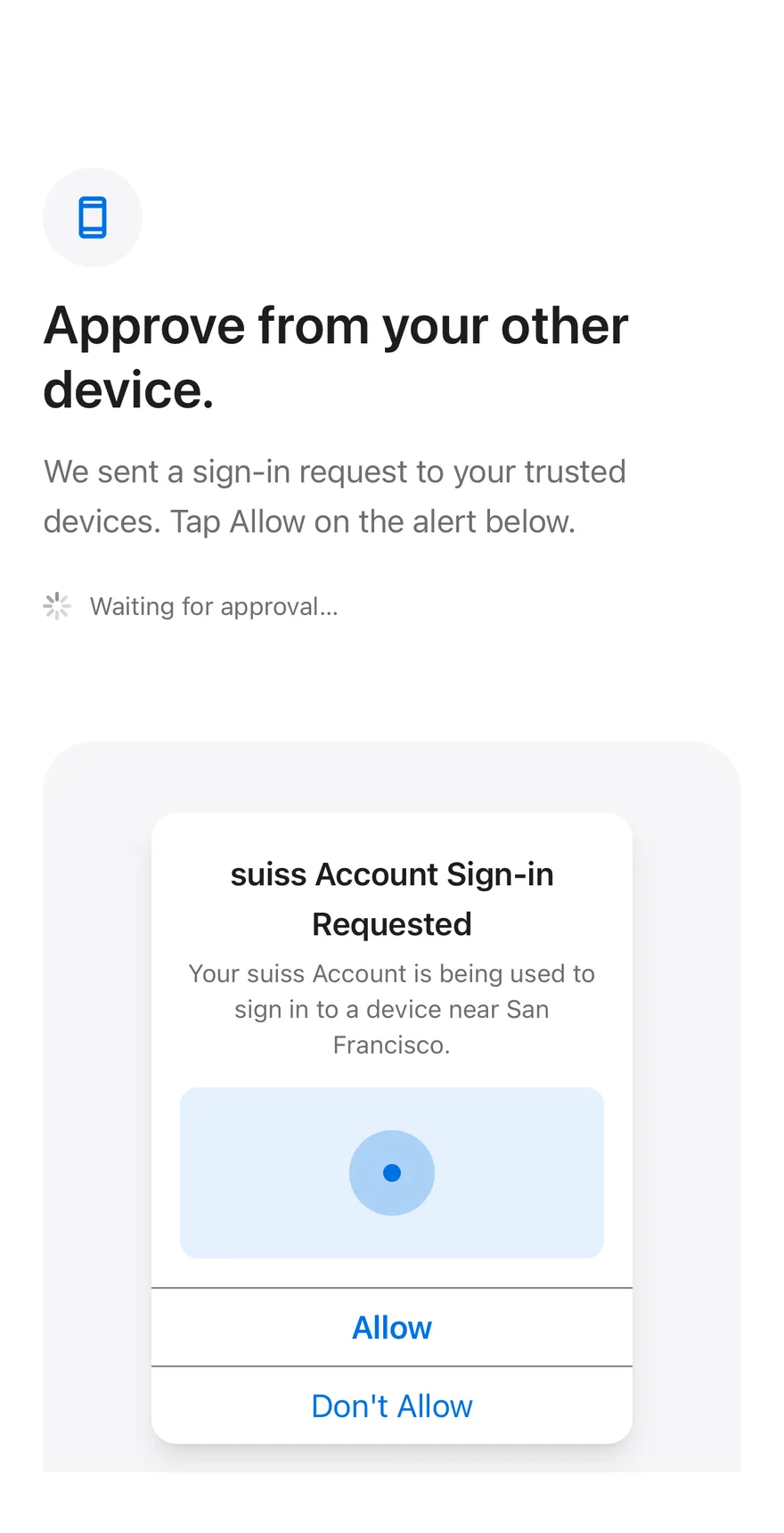
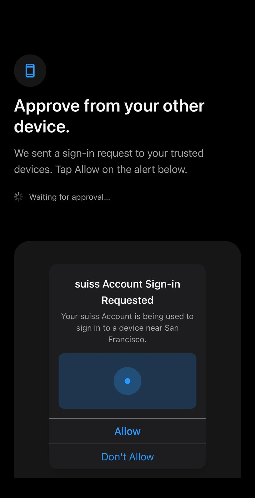
The screen shows a mock alert from the trusted device with Allow and Don't Allow. Allowing reveals a code and an InputOTP to enter it, with a Spinner while checking and an error for a wrong code; denying shows a blocked message with an option to show the request again. A correct code shows an approved screen.
Installation
The CLI also adds what it builds on: Icon, Input OTP, Keyboard Scroll View, Screen, Spinner, Text. On React Native it also adds the animated view components/ui/animated-view.tsx.
Manual
- Install the dependencies:
-
Add the pieces it builds on: Icon, Input OTP, Keyboard Scroll View, Screen, Spinner, Text, and the animated view
components/ui/animated-view.tsxfrom the next step. -
Copy the animated view into
components/ui/animated-view.tsx:
- Copy the source into
components/blocks/verify-device.tsx:
- Update the import paths to match your project.
- Install the dependencies:
-
Add the pieces it builds on: Icon, Input OTP, Keyboard Scroll View, Screen, Spinner, Text, and the animated view
components/ui/animated-view.tsxfrom the next step. -
Copy the animated view into
components/ui/animated-view.tsx:
- Copy the source into
components/blocks/verify-device.tsx:
- Update the import paths to match your project.
- Install the dependencies:
-
Add the pieces it builds on: Icon, Input OTP, Keyboard Scroll View, Screen, Spinner, Text, and the animated view
components/ui/animated-view.tsxfrom the next step. -
Copy the animated view into
components/ui/animated-view.tsx:
- Copy the source into
components/blocks/verify-device.tsx:
- Update the import paths to match your project.
-
Target iOS 17 or later.
-
Add the Swift package to your app:
- Copy the theme files every view uses:
- Copy the source and every file it uses:
- Add the files to your app target.
- Set
minSdkto 24 or higher and add the dependencies:
- Copy the theme files every view uses:
- Copy the source and every file it uses:
- Update the
com.esuiss.uipackage names to match your project.
Usage
onVerify receives the code and returns a boolean or a promise; by default it accepts the demo code 482913. Edit COPY to change the text for each phase.