suiss/ui · Block
Bag Review
A shopping bag review page with quantity steppers, removable line items, and a totals summary.
Bag Review is an open-source block from suiss/ui for React, React Native, SwiftUI and Jetpack Compose. The @esuiss/ui CLI copies its source into your project, so you own the code.
A shopping bag page that leads with the order total, then lists each item with a photo, a quantity stepper, its price and a Remove link, followed by subtotal, shipping and total. Line items use a compact two-column layout on mobile and a four-column row on desktop. Removing everything turns the headline into an empty-bag message. Reach for it for any cart or order review screen.
Installation
CLI
Works in any project with a components.json. See Installation for the one-line registry setup. Or use the suiss/ui CLI:
Manual
-
Copy the source into
components/blocks/bag-review.tsx:
- Update the import paths to match your project.
Usage
Replace initialItems with your cart lines, each with a name, variant, price, image and quantity. Persist quantity changes and removals to your cart service, and connect both Check Out buttons to your checkout. The product links point to #details, and the free delivery and shipping copy is placeholder text. In the empty state, Continue Shopping restores the sample items, so point it at your catalog instead.
Notes
Quantities are limited to 1–10, and each stepper and Remove button is labeled with the product name. Product photos are Unsplash placeholders.
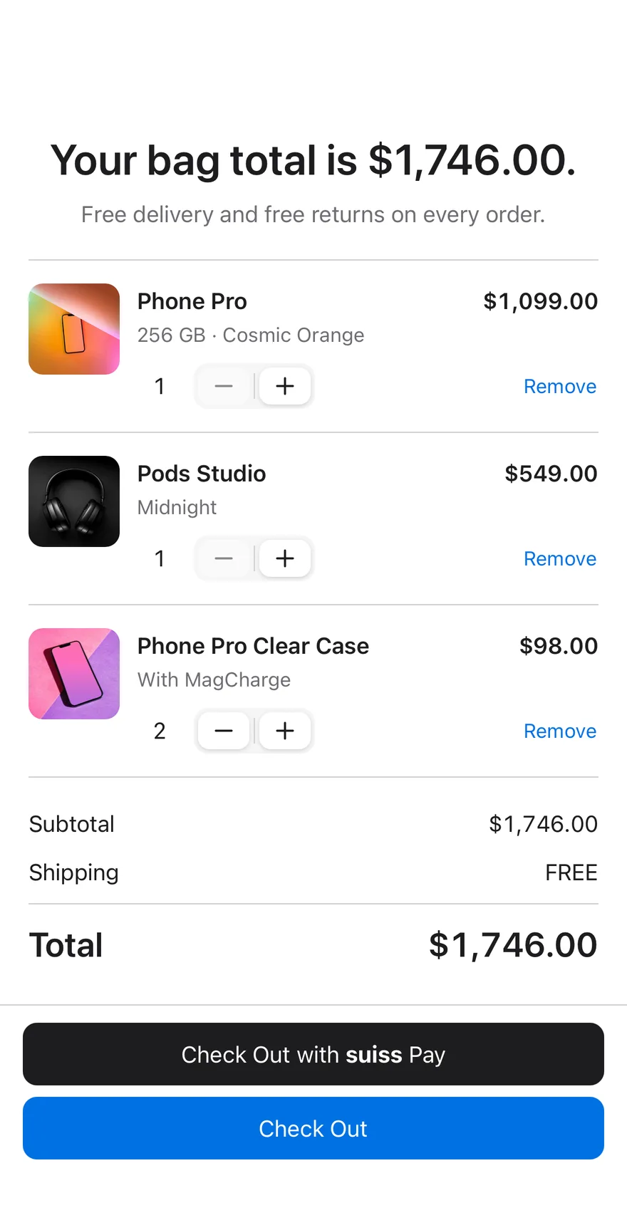
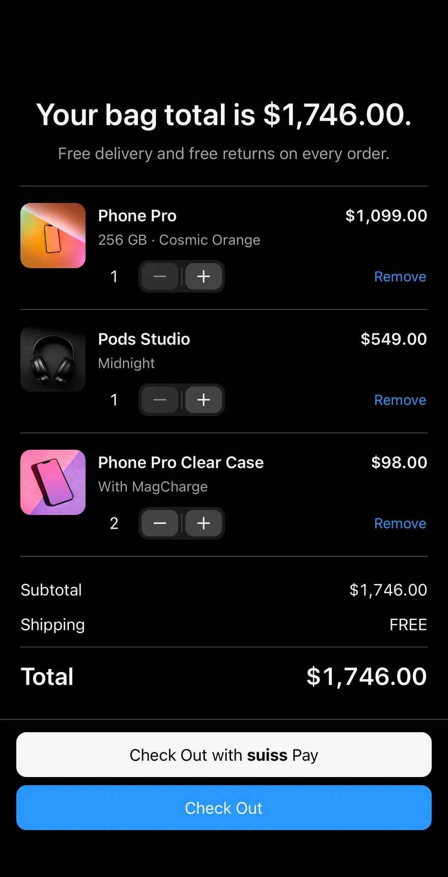
Composes Screen, Stepper from the interactions, Button, Text and BottomBar. Each compact row shows a thumbnail, the product name with its line price, the variant, a quantity stepper and a Remove link; tapping the thumbnail or the name opens the product details. The heading and totals update as the bag changes, and removing every item shows an empty state with a Continue Shopping button.
Installation
The CLI also adds what it builds on: Bottom Bar, Button, Screen, Stepper, Text. On React Native it also adds the animated view components/ui/animated-view.tsx.
Manual
- Install the dependencies:
-
Add the pieces it builds on: Bottom Bar, Button, Screen, Stepper, Text, and the animated view
components/ui/animated-view.tsxfrom the next step. -
Copy the animated view into
components/ui/animated-view.tsx:
- Copy the source into
components/blocks/bag-review.tsx:
- Update the import paths to match your project.
- Install the dependencies:
-
Add the pieces it builds on: Bottom Bar, Button, Screen, Stepper, Text, and the animated view
components/ui/animated-view.tsxfrom the next step. -
Copy the animated view into
components/ui/animated-view.tsx:
- Copy the source into
components/blocks/bag-review.tsx:
- Update the import paths to match your project.
- Install the dependencies:
-
Add the pieces it builds on: Bottom Bar, Button, Screen, Stepper, Text, and the animated view
components/ui/animated-view.tsxfrom the next step. -
Copy the animated view into
components/ui/animated-view.tsx:
- Copy the source into
components/blocks/bag-review.tsx:
- Update the import paths to match your project.
-
Target iOS 17 or later.
-
Add the Swift package to your app:
- Copy the theme files every view uses:
- Copy the source and every file it uses:
- Add the files to your app target.
- Set
minSdkto 24 or higher and add the dependencies:
- Copy the theme files every view uses:
- Copy the source and every file it uses:
- Update the
com.esuiss.uipackage names to match your project.
Usage
Replace INITIAL_ITEMS with your cart lines. Wire onCheckout, onShowDetails, onContinueShopping, onQuantityChange and onRemove to your cart logic.