suiss/ui · Block
Grid Carousel
A horizontally scrolling carousel of product cards with previous and next controls.
Grid Carousel is an open-source block from suiss/ui for React, React Native, SwiftUI and Jetpack Compose. The @esuiss/ui CLI copies its source into your project, so you own the code.
A horizontally scrolling row of product cards under a two-tone heading, each with an optional kicker, name, tagline, starting price and image. Previous and next buttons sit below the track, and cards shrink to fit narrow screens. With no state of its own, it is a simple base for latest products, featured items or related content rows.
Installation
CLI
Works in any project with a components.json. See Installation for the one-line registry setup. Or use the suiss/ui CLI:
Manual
-
Add the pieces it builds on: Carousel.
-
Copy the source into
components/blocks/grid-carousel.tsx:
- Update the import paths to match your project.
Usage
Replace products; each has an optional kicker, a name, tagline, formatted price, image and alt text. Card links are hash anchors built from the name, so point them at your product pages.
Notes
Images are Unsplash placeholders with descriptive alt text.
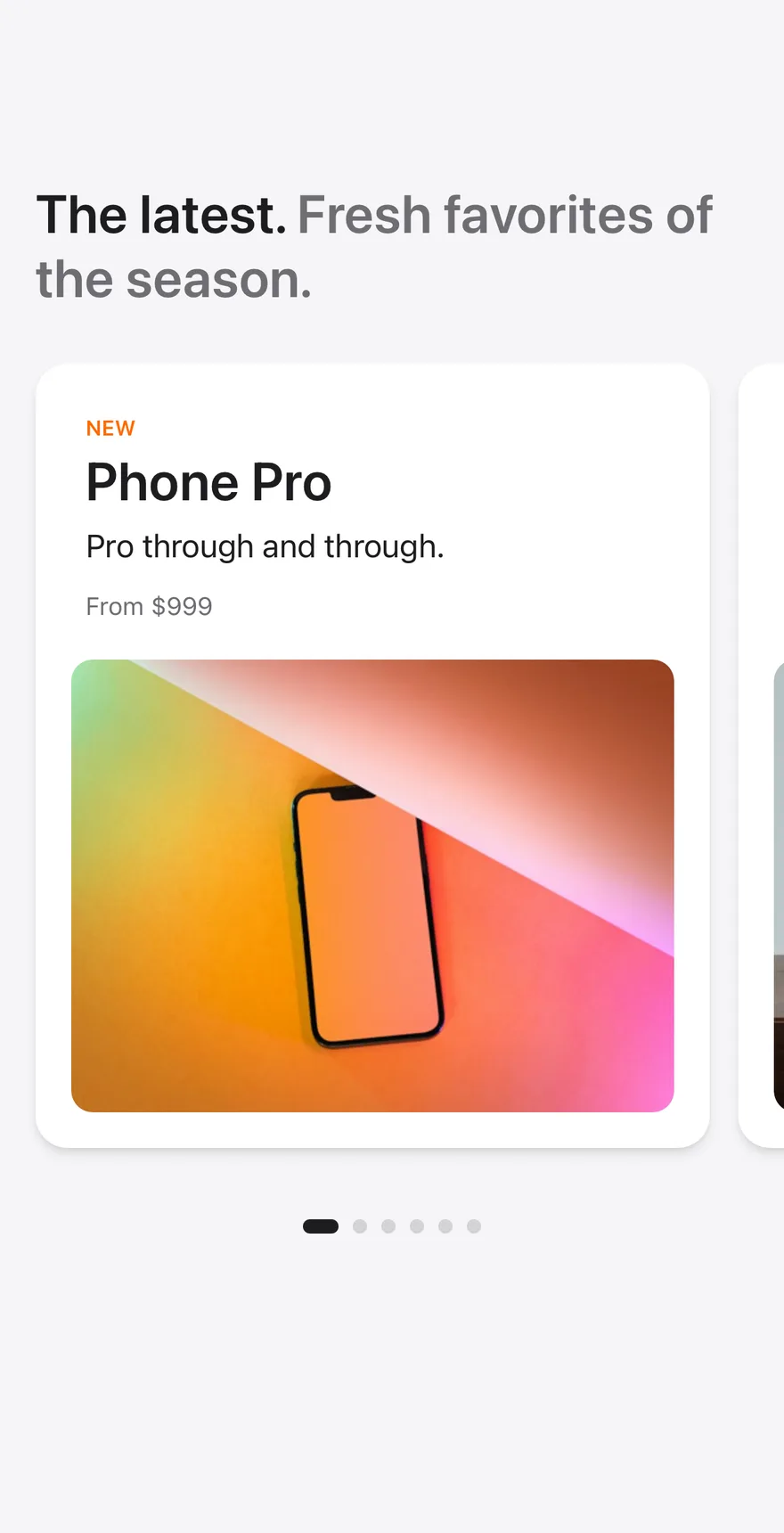
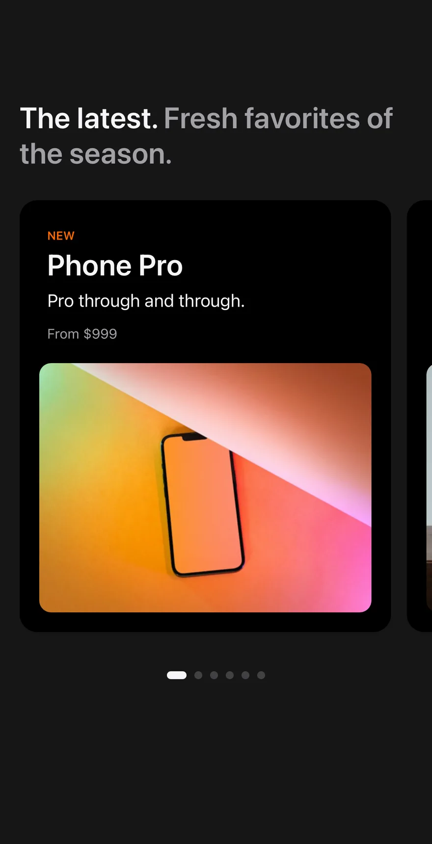
Composes Screen, Carousel with CarouselPageIndicator, Text and product photos. Each card shows an optional kicker, name, tagline and starting price, and the whole card is pressable.
Installation
The CLI also adds what it builds on: Carousel, Page Indicator, Screen, Text. On React Native it also adds the animated view components/ui/animated-view.tsx.
Manual
- Install the dependencies:
-
Add the pieces it builds on: Carousel, Page Indicator, Screen, Text, and the animated view
components/ui/animated-view.tsxfrom the next step. -
Copy the animated view into
components/ui/animated-view.tsx:
- Copy the source into
components/blocks/grid-carousel.tsx:
- Update the import paths to match your project.
- Install the dependencies:
-
Add the pieces it builds on: Carousel, Page Indicator, Screen, Text, and the animated view
components/ui/animated-view.tsxfrom the next step. -
Copy the animated view into
components/ui/animated-view.tsx:
- Copy the source into
components/blocks/grid-carousel.tsx:
- Update the import paths to match your project.
- Install the dependencies:
-
Add the pieces it builds on: Carousel, Page Indicator, Screen, Text, and the animated view
components/ui/animated-view.tsxfrom the next step. -
Copy the animated view into
components/ui/animated-view.tsx:
- Copy the source into
components/blocks/grid-carousel.tsx:
- Update the import paths to match your project.
-
Target iOS 17 or later.
-
Add the Swift package to your app:
- Copy the theme files every view uses:
- Copy the source and every file it uses:
- Add the files to your app target.
- Set
minSdkto 24 or higher and add the dependencies:
- Copy the theme files every view uses:
- Copy the source and every file it uses:
- Update the
com.esuiss.uipackage names to match your project.
Usage
Replace PRODUCTS with your items. Pass onSelectProduct to receive the name of the pressed product.