suiss/ui · Block
Settings Notifications
Per-app notification settings with a live lock screen preview that reflects each choice.
Settings Notifications is an open-source block from suiss/ui for React, React Native, SwiftUI and Jetpack Compose. The @esuiss/ui CLI copies its source into your project, so you own the code.
Per-app notification settings with a live lock screen preview: toggle notifications and choose alert styles, banner style, sounds, badges, preview text and grouping, and the preview updates to match. The preview sits beside the settings on desktop and below them on mobile. Use it for any settings screen where a live preview helps users understand their choices.
Installation
CLI
Works in any project with a components.json. See Installation for the one-line registry setup. Or use the suiss/ui CLI:
Manual
- Install the dependencies:
-
Add the pieces it builds on: Item, Select, Switch, Toggle, Toggle Group.
-
Copy the source into
components/blocks/settings-notifications.tsx:
- Update the import paths to match your project.
Usage
Every setting is local state, so persist each one to your settings store. alerts, previewOptions and groupingOptions define the choices. Replace the wallpaper image and the sample sender and message in the preview.
Notes
When notifications are off, the dependent settings are dimmed and skipped by keyboard, and the preview has a text summary for screen readers. The wallpaper is an Unsplash placeholder.
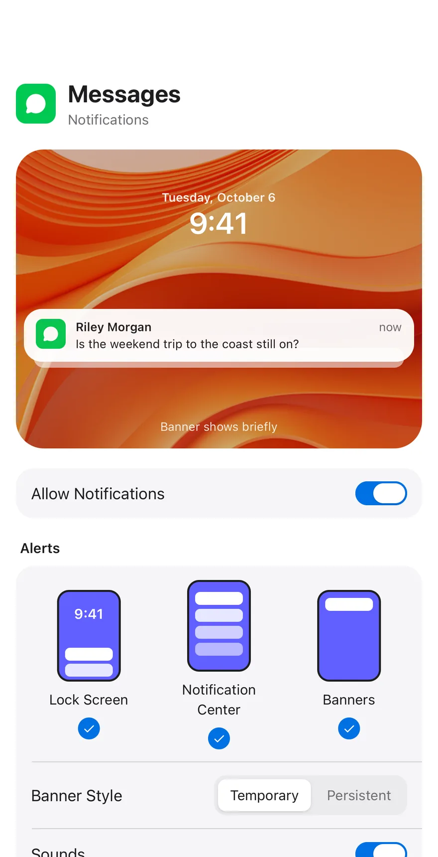
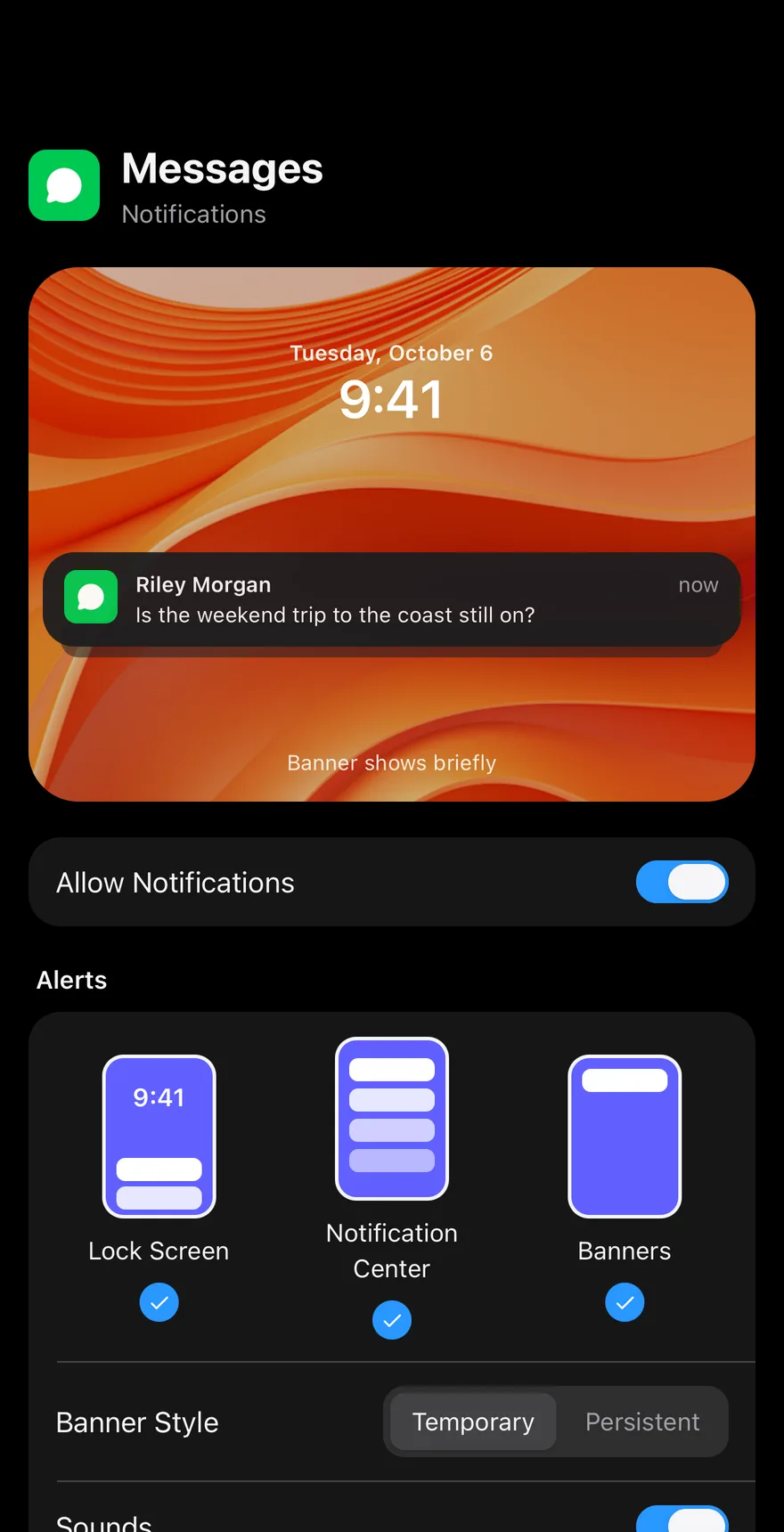
A wallpaper preview shows a sample notification that reflects the current settings: hidden previews, stacking when grouping is on, and banners that fade out when set to temporary. Below it, Switch rows control notifications, sounds and badges, Toggle tiles choose Lock Screen, Notification Center and Banners, a ToggleGroup picks the banner style, and Picker rows set previews and grouping.
Installation
The CLI also adds what it builds on: Icon, Item, Picker, Screen, Switch, Text, Toggle, Toggle Group. On React Native it also adds the animated view components/ui/animated-view.tsx.
Manual
- Install the dependencies:
-
Add the pieces it builds on: Icon, Item, Picker, Screen, Switch, Text, Toggle, Toggle Group, and the animated view
components/ui/animated-view.tsxfrom the next step. -
Copy the animated view into
components/ui/animated-view.tsx:
- Copy the source into
components/blocks/settings-notifications.tsx:
- Update the import paths to match your project.
- Install the dependencies:
-
Add the pieces it builds on: Icon, Item, Picker, Screen, Switch, Text, Toggle, Toggle Group, and the animated view
components/ui/animated-view.tsxfrom the next step. -
Copy the animated view into
components/ui/animated-view.tsx:
- Copy the source into
components/blocks/settings-notifications.tsx:
- Update the import paths to match your project.
- Install the dependencies:
-
Add the pieces it builds on: Icon, Item, Picker, Screen, Switch, Text, Toggle, Toggle Group, and the animated view
components/ui/animated-view.tsxfrom the next step. -
Copy the animated view into
components/ui/animated-view.tsx:
- Copy the source into
components/blocks/settings-notifications.tsx:
- Update the import paths to match your project.
-
Target iOS 17 or later.
-
Add the Swift package to your app:
- Copy the theme files every view uses:
- Copy the source and every file it uses:
- Add the files to your app target.
- Set
minSdkto 24 or higher and add the dependencies:
- Copy the theme files every view uses:
- Copy the source and every file it uses:
- Update the
com.esuiss.uipackage names to match your project.
Usage
The settings live in local state and the component takes no props. Replace WALLPAPER, PREVIEW_OPTIONS and GROUPING_OPTIONS and wire each control's change handler to your preferences store.