suiss/ui · Block
Grid Lineup
A product lineup comparing models side by side, each with finish swatches, a price, and buy actions.
Grid Lineup is an open-source block from suiss/ui for React, React Native, SwiftUI and Jetpack Compose. The @esuiss/ui CLI copies its source into your project, so you own the code.
A side-by-side model comparison where each model shows a photo, finish swatches, a name and tagline, a starting price, a Buy button and a Learn more link. Models sit two per row, or four on large screens, and the text blocks keep a fixed height so prices line up. Use it for a product family page or any plan or tier lineup.
Installation
CLI
Works in any project with a components.json. See Installation for the one-line registry setup. Or use the suiss/ui CLI:
Manual
-
Add the pieces it builds on: Button, Toggle Group.
-
Copy the source into
components/blocks/grid-lineup.tsx:
- Update the import paths to match your project.
Usage
Edit models; each has a name, tagline, formatted price, optional kicker, image, alt text and a list of finishes with a label and color. Picking a swatch changes only the selection, not the photo, so add per-finish images if you need them. Give Buy a handler and point the #learn links at real pages.
Notes
Swatches are labeled with their finish names and have enlarged hit areas. Photos are Unsplash placeholders.
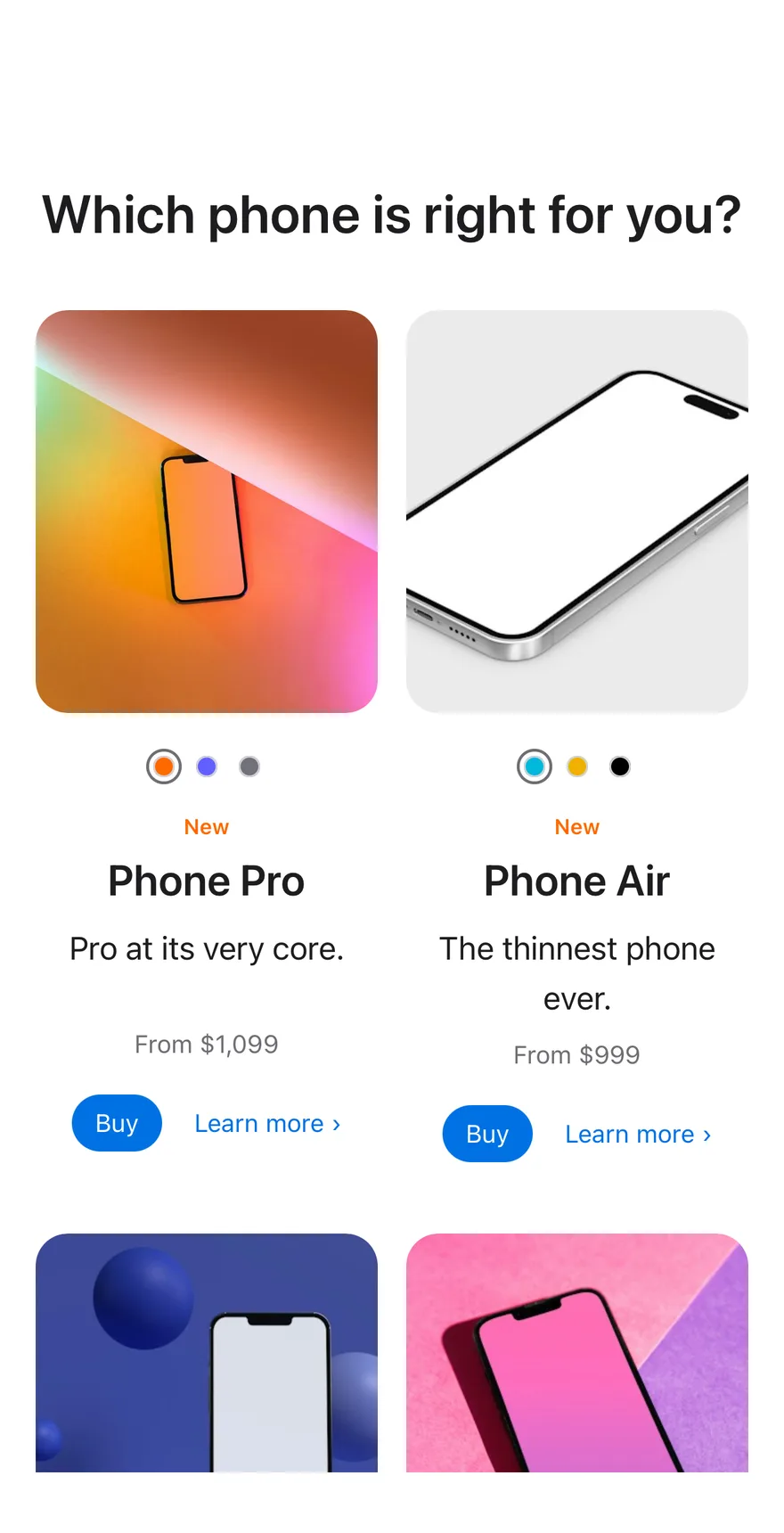
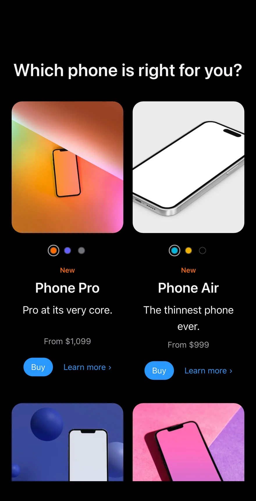
Composes Screen, ToggleGroup color swatches, Button and Text. Each model keeps its own selected finish, which is passed along when Buy is pressed.
Installation
The CLI also adds what it builds on: Button, Screen, Text, Toggle Group. On React Native it also adds the animated view components/ui/animated-view.tsx.
Manual
- Install the dependencies:
-
Add the pieces it builds on: Button, Screen, Text, Toggle Group, and the animated view
components/ui/animated-view.tsxfrom the next step. -
Copy the animated view into
components/ui/animated-view.tsx:
- Copy the source into
components/blocks/grid-lineup.tsx:
- Update the import paths to match your project.
- Install the dependencies:
-
Add the pieces it builds on: Button, Screen, Text, Toggle Group, and the animated view
components/ui/animated-view.tsxfrom the next step. -
Copy the animated view into
components/ui/animated-view.tsx:
- Copy the source into
components/blocks/grid-lineup.tsx:
- Update the import paths to match your project.
- Install the dependencies:
-
Add the pieces it builds on: Button, Screen, Text, Toggle Group, and the animated view
components/ui/animated-view.tsxfrom the next step. -
Copy the animated view into
components/ui/animated-view.tsx:
- Copy the source into
components/blocks/grid-lineup.tsx:
- Update the import paths to match your project.
-
Target iOS 17 or later.
-
Add the Swift package to your app:
- Copy the theme files every view uses:
- Copy the source and every file it uses:
- Add the files to your app target.
- Set
minSdkto 24 or higher and add the dependencies:
- Copy the theme files every view uses:
- Copy the source and every file it uses:
- Update the
com.esuiss.uipackage names to match your project.
Usage
Replace MODELS with your lineup. Pass onBuy to receive the model name and finish, and onLearnMore for the Learn more link.