suiss/ui · Block
Inbox Support
A support ticket inbox with status views, a ticket list with priorities, and a detail pane for replying and resolving.
Inbox Support is an open-source block from suiss/ui for React, React Native, SwiftUI and Jetpack Compose. The @esuiss/ui CLI copies its source into your project, so you own the code.
A help desk inbox with Open, Pending, Solved and All views and live counts, a ticket list with priority badges and a detail pane for replying or marking a ticket solved. Sending a reply moves the ticket to Pending. On mobile the panes show one at a time with a back button. A good base for support queues, moderation queues or any triage workflow.
Installation
CLI
Works in any project with a components.json. See Installation for the one-line registry setup. Or use the suiss/ui CLI:
Manual
- Install the dependencies:
-
Add the pieces it builds on: Avatar, Button, Split View, Textarea, Toggle Group.
-
Copy the source into
components/blocks/inbox-support.tsx:
- Update the import paths to match your project.
Usage
Replace initialTickets with your tickets, each with an id, title, device, status, priority, requester and avatar hue; priorityClass maps priorities to badge colors. Connect the reply and Mark as solved actions to your help desk API. Every ticket shows the same hard-coded customer message and timestamp, so load the real conversation.
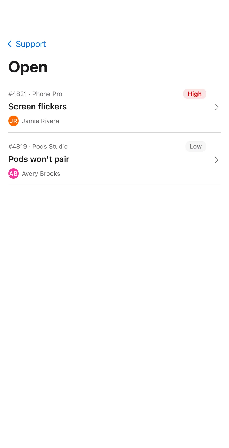
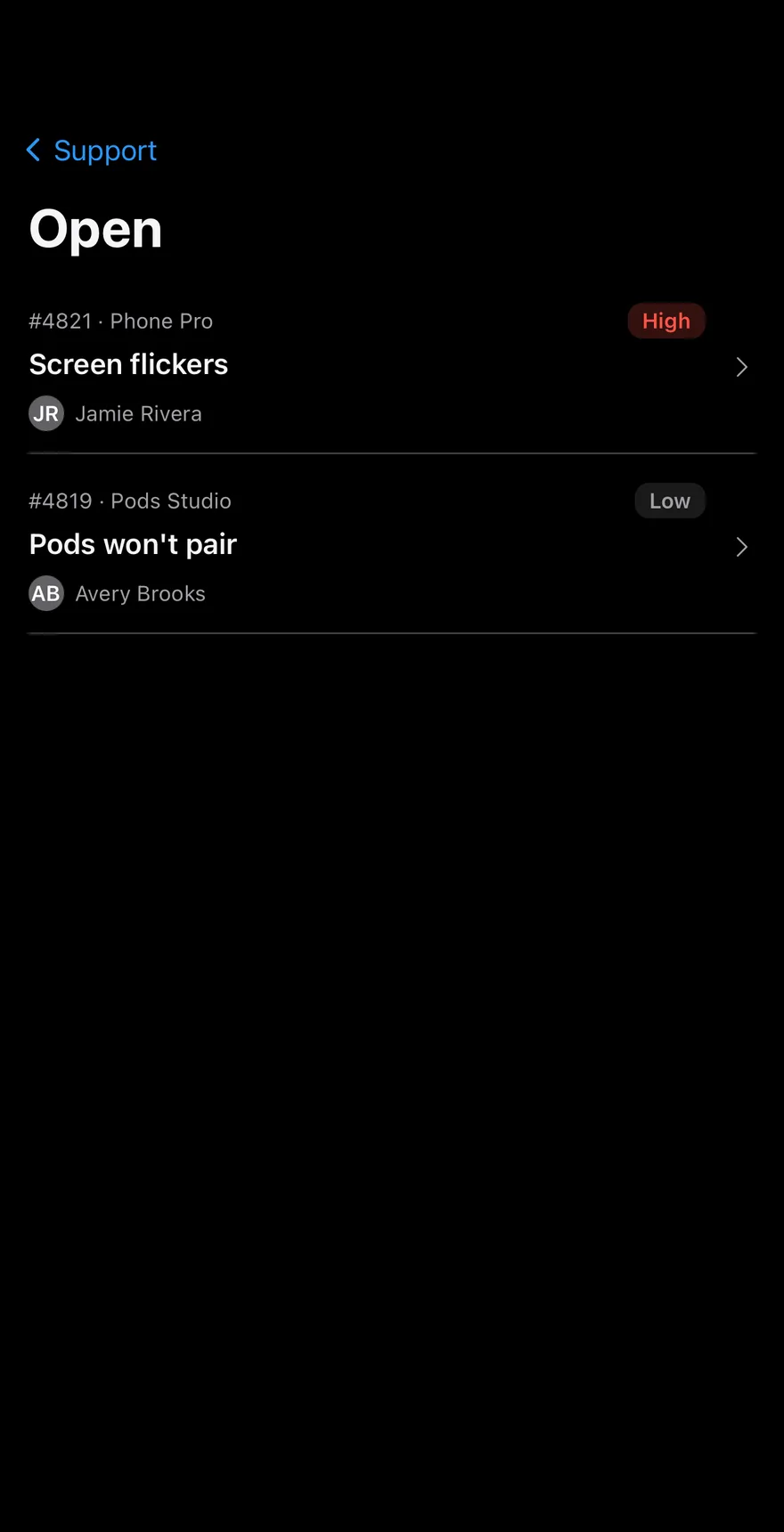
A help desk screen built on SplitView, with a sidebar of queues, a list of tickets showing the requester Avatar, priority and device, and a detail view. In the detail view a ToggleGroup changes the ticket status, a Textarea takes a reply, Send and set pending sends it and moves the ticket to Pending, and Mark as solved closes it.
Installation
The CLI also adds what it builds on: Avatar, Button, Icon, Screen, Split View, Text, Textarea, Toggle Group. On React Native it also adds the animated view components/ui/animated-view.tsx.
Manual
- Install the dependencies:
-
Add the pieces it builds on: Avatar, Button, Icon, Screen, Split View, Text, Textarea, Toggle Group, and the animated view
components/ui/animated-view.tsxfrom the next step. -
Copy the animated view into
components/ui/animated-view.tsx:
- Copy the source into
components/blocks/inbox-support.tsx:
- Update the import paths to match your project.
- Install the dependencies:
-
Add the pieces it builds on: Avatar, Button, Icon, Screen, Split View, Text, Textarea, Toggle Group, and the animated view
components/ui/animated-view.tsxfrom the next step. -
Copy the animated view into
components/ui/animated-view.tsx:
- Copy the source into
components/blocks/inbox-support.tsx:
- Update the import paths to match your project.
- Install the dependencies:
-
Add the pieces it builds on: Avatar, Button, Icon, Screen, Split View, Text, Textarea, Toggle Group, and the animated view
components/ui/animated-view.tsxfrom the next step. -
Copy the animated view into
components/ui/animated-view.tsx:
- Copy the source into
components/blocks/inbox-support.tsx:
- Update the import paths to match your project.
-
Target iOS 17 or later.
-
Add the Swift package to your app:
- Copy the theme files every view uses:
- Copy the source and every file it uses:
- Add the files to your app target.
- Set
minSdkto 24 or higher and add the dependencies:
- Copy the theme files every view uses:
- Copy the source and every file it uses:
- Update the
com.esuiss.uipackage names to match your project.
Usage
Replace INITIAL_TICKETS with your tickets. Wire onViewChange, onStatusChange and onReply to your help desk backend; the screen also updates its own ticket list.