suiss/ui · Block
Permission Primer
A screen that explains why the app needs a permission before asking, with Allow and Not now buttons.
Permission Primer is an open-source block from suiss/ui for React Native, SwiftUI and Jetpack Compose. The @esuiss/ui CLI copies its source into your project, so you own the code.
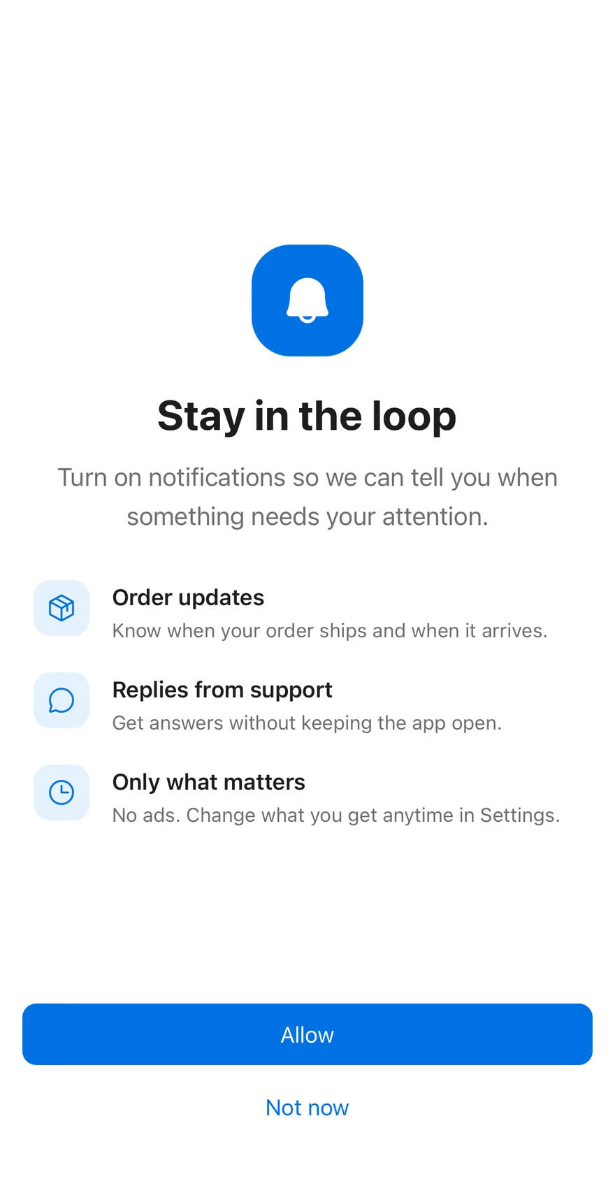
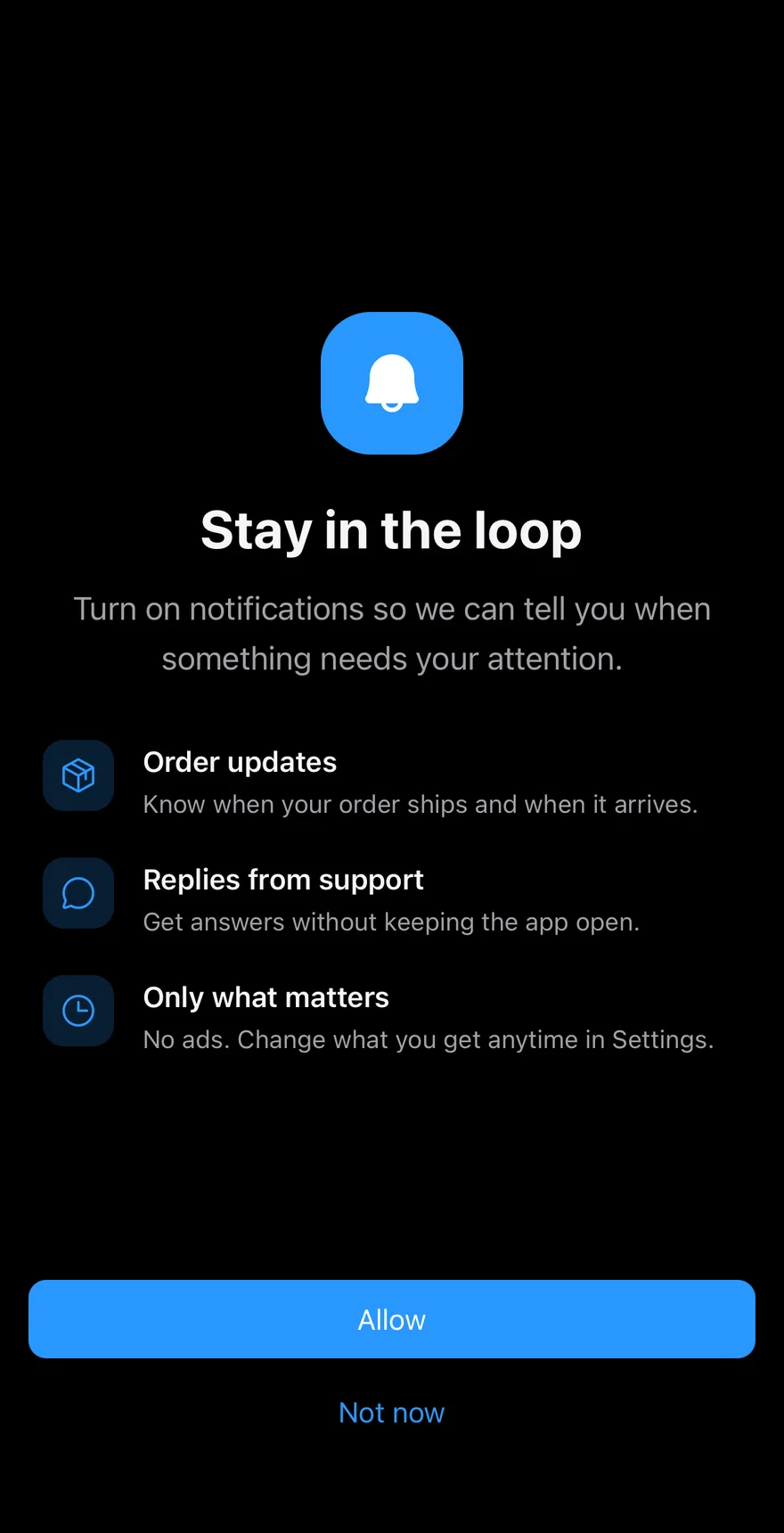
A primer shown before a system permission prompt: a large icon, a title, a description and a list of benefits, each with its own icon. Allow and Not now buttons sit in a BottomBar. By default it asks for notifications.
Installation
The CLI also adds what it builds on: Bottom Bar, Button, Icon, Screen, Text.
Manual
- Install the dependencies:
-
Add the pieces it builds on: Bottom Bar, Button, Icon, Screen, Text.
-
Copy the source into
components/blocks/permission-primer.tsx:
- Update the import paths to match your project.
- Install the dependencies:
-
Add the pieces it builds on: Bottom Bar, Button, Icon, Screen, Text.
-
Copy the source into
components/blocks/permission-primer.tsx:
- Update the import paths to match your project.
- Install the dependencies:
-
Add the pieces it builds on: Bottom Bar, Button, Icon, Screen, Text.
-
Copy the source into
components/blocks/permission-primer.tsx:
- Update the import paths to match your project.
-
Target iOS 17 or later.
-
Add the Swift package to your app:
- Copy the theme files every view uses:
- Copy the source and every file it uses:
- Add the files to your app target.
- Set
minSdkto 24 or higher and add the dependencies:
- Copy the theme files every view uses:
- Copy the source and every file it uses:
- Update the
com.esuiss.uipackage names to match your project.
Usage
Every piece is a prop: icon, title, description, benefits, allowLabel and dismissLabel. Request the real permission in onAllow and close the screen in onDismiss.