suiss/ui · Block
Log Security
A security overview with a computed score ring, alert counts by severity, and resolvable alerts.
Log Security is an open-source block from suiss/ui for React, React Native, SwiftUI and Jetpack Compose. The @esuiss/ui CLI copies its source into your project, so you own the code.
A security overview with a score ring that drops for each open alert and shifts from green to orange to red, next to open alert counts by severity. Below, alerts can be filtered by Open, Resolved or All and resolved or reopened one by one. It sits in a Sidebar with admin navigation that opens as a sheet from the trigger on mobile. Use it for security centers, compliance checklists or system health checks.
Installation
CLI
Works in any project with a components.json. See Installation for the one-line registry setup. Or use the suiss/ui CLI:
Manual
- Install the dependencies:
-
Add the pieces it builds on: Button, Sidebar, Toggle Group.
-
Copy the source into
components/blocks/log-security.tsx:
- Update the import paths to match your project.
Usage
Replace initialAlerts with alerts from your security backend; each has a severity, title, detail and icon. severity sets each level's colors and how much it lowers the score. Alerts are matched by title when resolving, so switch to an id for real data, and connect Resolve and Reopen to your API.
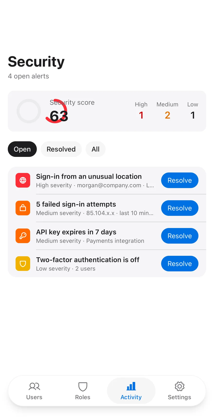
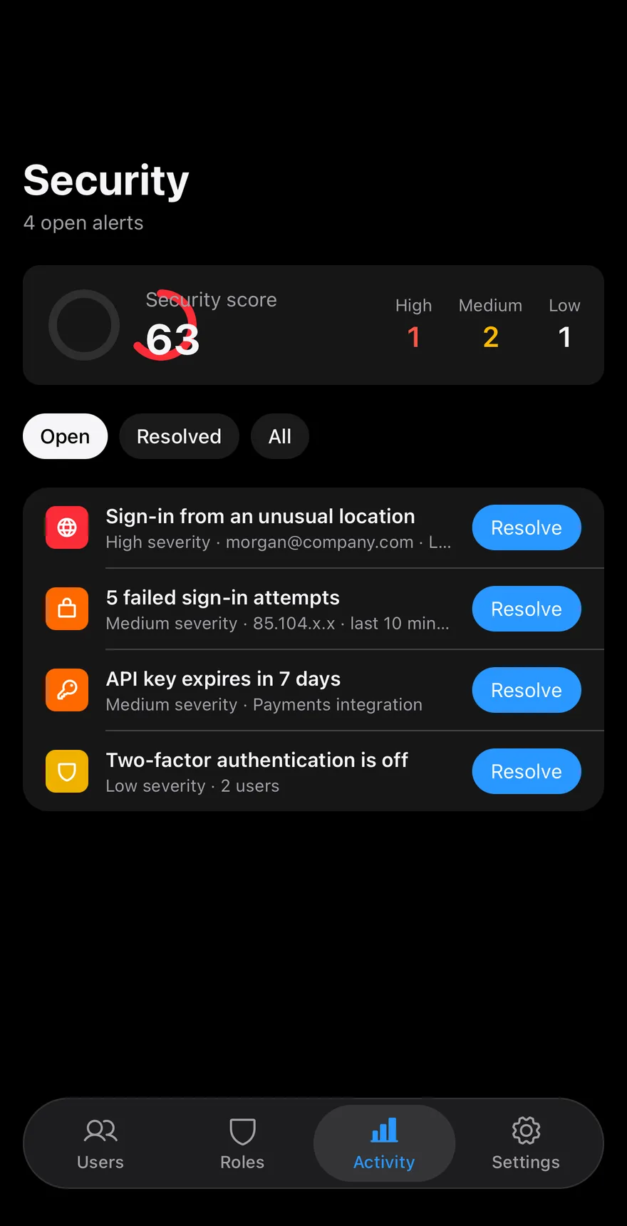
An admin screen with a collapsing Header, a ring that shows a security score, and counts of open High, Medium and Low alerts. A ChipGroup filters the list by Open, Resolved or All, and each alert has a Resolve or Reopen Button; the score and counts update as alerts change. A TabBar at the bottom switches between admin sections; only Activity has content in the sample.
Installation
The CLI also adds what it builds on: Button, Chip, Header, Icon, Screen, Tab Bar, Text. On React Native it also adds the animated view components/ui/animated-view.tsx.
Manual
- Install the dependencies:
-
Add the pieces it builds on: Button, Chip, Header, Icon, Screen, Tab Bar, Text, and the animated view
components/ui/animated-view.tsxfrom the next step. -
Copy the animated view into
components/ui/animated-view.tsx:
- Copy the source into
components/blocks/log-security.tsx:
- Update the import paths to match your project.
- Install the dependencies:
-
Add the pieces it builds on: Button, Chip, Header, Icon, Screen, Tab Bar, Text, and the animated view
components/ui/animated-view.tsxfrom the next step. -
Copy the animated view into
components/ui/animated-view.tsx:
- Copy the source into
components/blocks/log-security.tsx:
- Update the import paths to match your project.
- Install the dependencies:
-
Add the pieces it builds on: Button, Chip, Header, Icon, Screen, Tab Bar, Text, and the animated view
components/ui/animated-view.tsxfrom the next step. -
Copy the animated view into
components/ui/animated-view.tsx:
- Copy the source into
components/blocks/log-security.tsx:
- Update the import paths to match your project.
-
Target iOS 17 or later.
-
Add the Swift package to your app:
- Copy the theme files every view uses:
- Copy the source and every file it uses:
- Add the files to your app target.
- Set
minSdkto 24 or higher and add the dependencies:
- Copy the theme files every view uses:
- Copy the source and every file it uses:
- Update the
com.esuiss.uipackage names to match your project.
Usage
Replace INITIAL_ALERTS with your alerts and tune the weights in SEVERITY to change how the score is computed. Wire onFilterChange, onResolve and onNavigate to your app.