suiss/ui · Block
Empty Bag
An empty shopping bag state with sign-in and shopping actions above a row of recommended products.
Empty Bag is an open-source block from suiss/ui for React, React Native, SwiftUI and Jetpack Compose. The @esuiss/ui CLI copies its source into your project, so you own the code.
An empty shopping bag state with a short message, Sign In and Continue Shopping buttons and a row of recommended products. Adding a recommendation updates the bag icon's count and switches the message and primary action to a checkout state. Recommendations sit in one column on mobile and three on larger screens. Use it for empty carts, wish lists or saved-items screens.
Installation
CLI
Works in any project with a components.json. See Installation for the one-line registry setup. Or use the suiss/ui CLI:
Manual
- Install the dependencies:
- Update the import paths to match your project.
Usage
Replace recommended with products from your recommendation service, each with a name, formatted price and image. Swap the local add toggle for your cart logic, and connect Sign In, Check Out and Continue Shopping to your routes.
Notes
Add buttons expose their pressed state and name the product. Product photos are Unsplash placeholders.
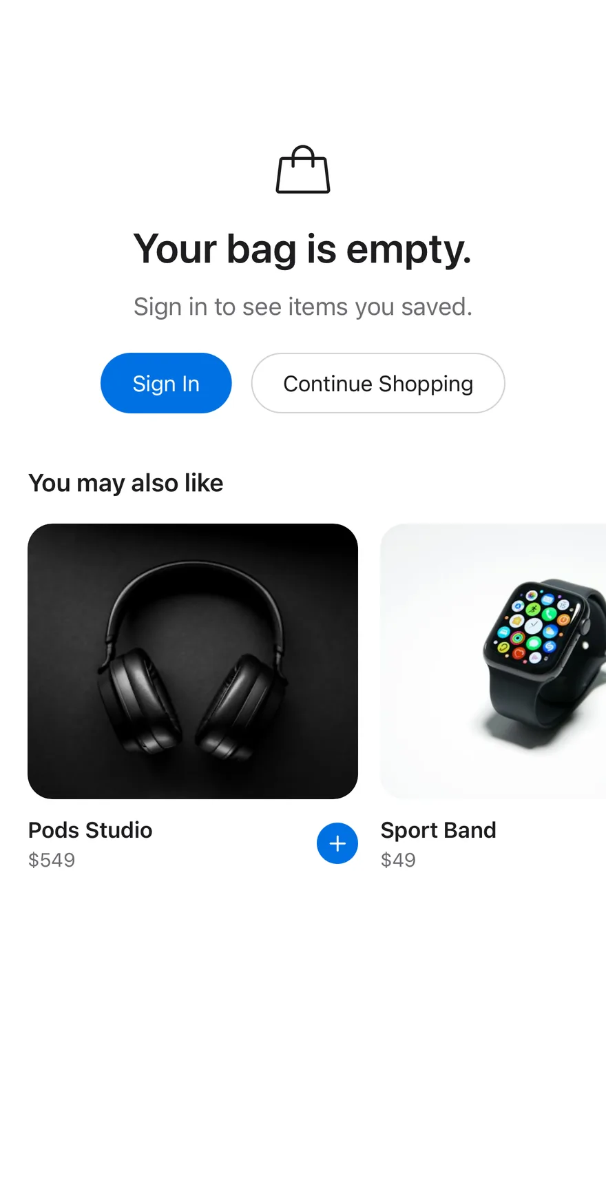
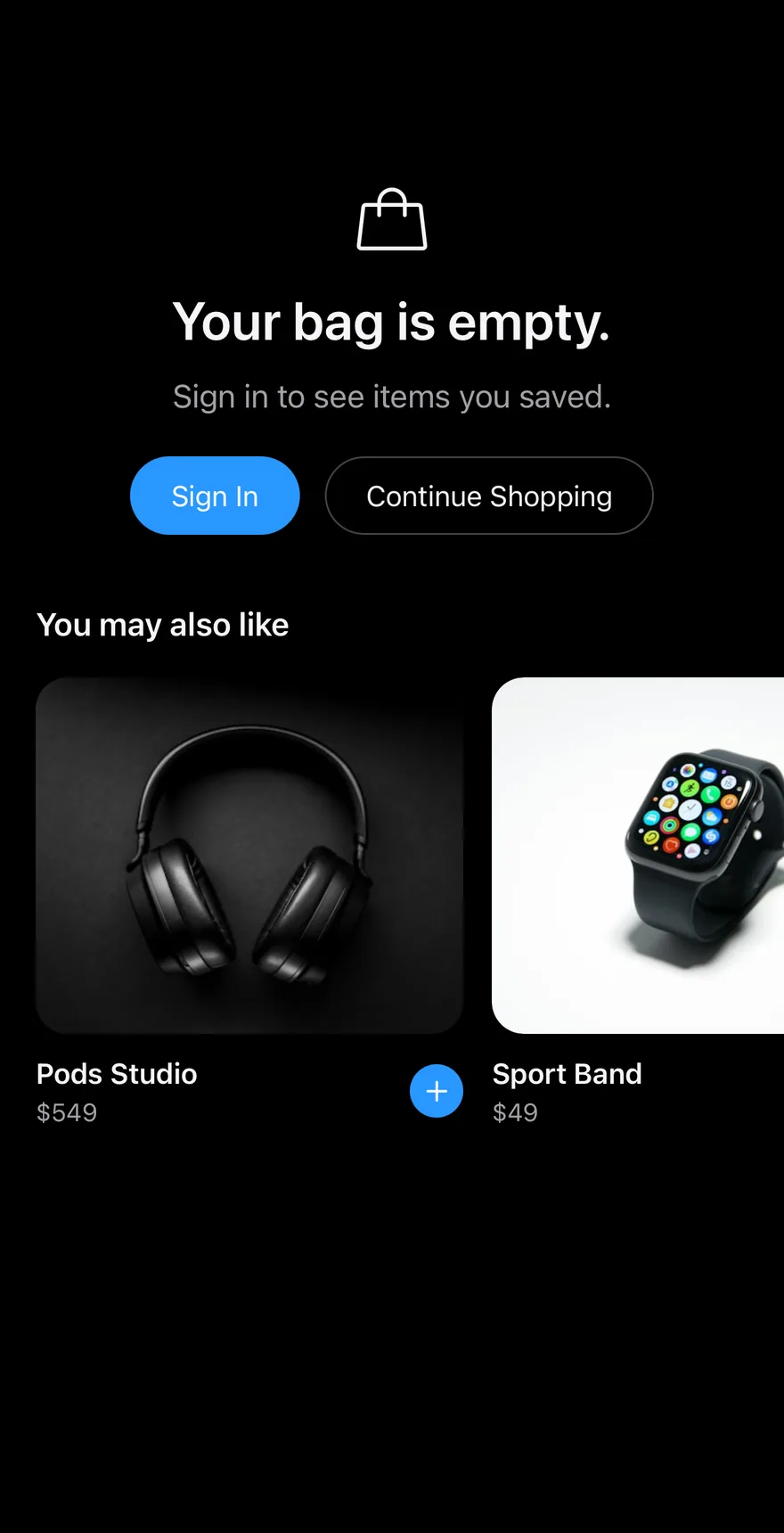
Composes Screen, Empty, Button, Icon and Text. Adding a recommended product with its plus button increments a badge on the bag icon and changes the title and primary button to a checkout prompt.
Installation
The CLI also adds what it builds on: Button, Empty, Icon, Screen, Text. On React Native it also adds the animated view components/ui/animated-view.tsx.
Manual
- Install the dependencies:
-
Add the pieces it builds on: Button, Empty, Icon, Screen, Text, and the animated view
components/ui/animated-view.tsxfrom the next step. -
Copy the animated view into
components/ui/animated-view.tsx:
- Copy the source into
components/blocks/empty-bag.tsx:
- Update the import paths to match your project.
- Install the dependencies:
-
Add the pieces it builds on: Button, Empty, Icon, Screen, Text, and the animated view
components/ui/animated-view.tsxfrom the next step. -
Copy the animated view into
components/ui/animated-view.tsx:
- Copy the source into
components/blocks/empty-bag.tsx:
- Update the import paths to match your project.
- Install the dependencies:
-
Add the pieces it builds on: Button, Empty, Icon, Screen, Text, and the animated view
components/ui/animated-view.tsxfrom the next step. -
Copy the animated view into
components/ui/animated-view.tsx:
- Copy the source into
components/blocks/empty-bag.tsx:
- Update the import paths to match your project.
-
Target iOS 17 or later.
-
Add the Swift package to your app:
- Copy the theme files every view uses:
- Copy the source and every file it uses:
- Add the files to your app target.
- Set
minSdkto 24 or higher and add the dependencies:
- Copy the theme files every view uses:
- Copy the source and every file it uses:
- Update the
com.esuiss.uipackage names to match your project.
Usage
Replace RECOMMENDED with your products. The component takes no props, so wire the Sign In, Check Out and Continue Shopping buttons to your own navigation.