suiss/ui
  • Docs
  • Components
  • Patterns
  • Interactions
  • Charts
  • Blocks
GitHubGet started
DocsComponentsPatternsInteractionsChartsBlocks
Blocks56
  • Overview
Bag
  • Checkout
  • Configure
  • Review
Bento
  • Closer Look
  • Features
  • Stats
Chat
  • Conversations
  • Support
  • Thread
Dash
  • Analytics
  • Health
  • Store
Empty
  • Bag
  • Offline
  • Search
Footer
  • Compact
  • Directory
  • Services
Grid
  • Accessories
  • Carousel
  • Lineup
Hero
  • Cinematic
  • Product
  • Tiles
Inbox
  • Categories
  • Mail
  • Support
Log
  • Activity
  • Live
  • Security
Login
  • Account
  • Passkey
  • Sheet
Nav
  • Categories
  • Global
  • Local
Onboarding
  • Onboarding
Permission
  • Primer
Price
  • Bundle
  • Care
  • Storage
Roles
  • Editor
  • Matrix
  • Requests
Settings
  • Account
  • Device
  • Notifications
Signup
  • Form
  • Steps
  • Trial
Users
  • Detail
  • Invite
  • Table
Verify
  • Code
  • Device
  • Email

suiss/ui · Block

Settings Account

An account settings page with a profile sidebar and a Sign-In and Security section of editable cards.

Settings Account is an open-source block from suiss/ui for React, React Native, SwiftUI and Jetpack Compose. The @esuiss/ui CLI copies its source into your project, so you own the code.

components/blocks/settings-account.tsx
"use client"

import {
  CheckIcon,
  CloudIcon,
  CreditCardIcon,
  DeviceMobileIcon,
  KeyIcon,
  ShieldIcon,
  UserIcon,
  UsersIcon,
} from "@phosphor-icons/react"
import * as React from "react"

import { Avatar, AvatarFallback } from "@/components/ui/avatar"
import { Button } from "@/components/ui/button"

An account settings page with a profile header and a sidebar of sections. Only Sign-In and Security is filled in: email and phone cards that expand into an inline edit form, a Passkeys switch, a two-factor row and a confirmation after each save, while the other sections show a placeholder. It uses a Sidebar that slides off canvas. Use it as the frame for any account or profile settings.

Installation

CLI

$ pnpm dlx shadcn@latest add @esuiss/settings-account

Works in any project with a components.json. See Installation for the one-line registry setup. Or use the suiss/ui CLI:

$ pnpm dlx @esuiss/ui@latest add blocks settings-account

Manual

  1. Install the dependencies:
$ pnpm add @phosphor-icons/react
  1. Add the pieces it builds on: Avatar, Button, Input, Sidebar, Switch.

  2. Copy the source into components/blocks/settings-account.tsx:

components/blocks/settings-account.tsx
"use client"

import {
  CheckIcon,
  CloudIcon,
  CreditCardIcon,
  DeviceMobileIcon,
  KeyIcon,
  ShieldIcon,
  UserIcon,
  UsersIcon,
} from "@phosphor-icons/react"
import * as React from "react"

import { Avatar, AvatarFallback } from "@/components/ui/avatar"
import { Button } from "@/components/ui/button"
  1. Update the import paths to match your project.

Usage

import { SettingsAccount } from "@/components/blocks/settings-account"
<SettingsAccount />

Load the email, phone and profile details from the signed-in user, and replace the onSave handler with your account API. Add content for the remaining sections listed in items. The profile name, email and initials in the header are hard-coded.

Notes

Collapsed edit forms are inert, focus moves to the input when a card opens, and save confirmations are announced.
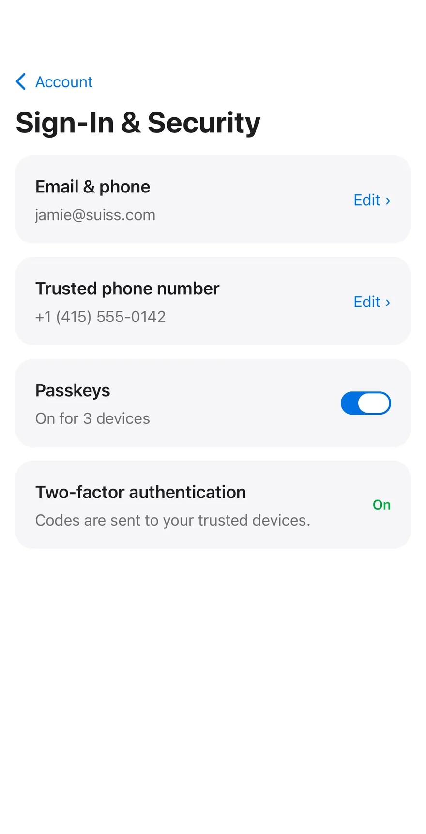
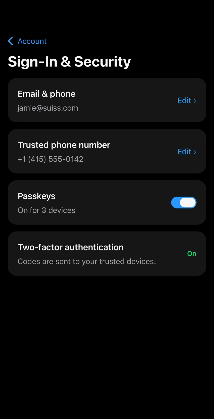
iOS
Settings Account on iOS in light modeSettings Account on iOS in dark mode
uniwind/components/blocks/settings-account.tsx
import { cn } from "cn"
import {
  CaretRightIcon,
  CheckIcon,
  CloudIcon,
  CreditCardIcon,
  DeviceMobileIcon,
  KeyIcon,
  type Icon as PhosphorIcon,
  ShieldIcon,
  UserIcon,
  UsersIcon,
} from "phosphor-react-native"
import * as React from "react"
import { I18nManager, Pressable, View } from "react-native"
import { FadeIn, FadeInDown, ReduceMotion } from "react-native-reanimated"
swift/Blocks/SettingsAccount.swift
import PhosphorSwift
import SwiftUI

public struct SettingsAccount: View {
  struct Section: Identifiable {
    let id: String
    let label: LocalizedStringKey
    let icon: Image
  }

  static var sections: [Section] {
    [
      Section(id: "personal", label: "Personal Information", icon: Ph.user.regular),
      Section(id: "security", label: "Sign-In & Security", icon: Ph.key.regular),
      Section(id: "payment", label: "Payment & Shipping", icon: Ph.creditCard.regular),
      Section(id: "subscriptions", label: "Subscriptions", icon: Ph.cloud.regular),
kotlin/blocks/SettingsAccount.kt
package com.esuiss.ui.blocks

import androidx.compose.animation.AnimatedContent
import androidx.compose.animation.AnimatedVisibility
import androidx.compose.animation.core.CubicBezierEasing
import androidx.compose.animation.core.tween
import androidx.compose.animation.expandVertically
import androidx.compose.animation.fadeIn
import androidx.compose.animation.fadeOut
import androidx.compose.animation.shrinkVertically
import androidx.compose.animation.slideInHorizontally
import androidx.compose.animation.slideInVertically
import androidx.compose.animation.togetherWith
import androidx.compose.foundation.background
import androidx.compose.foundation.clickable
import androidx.compose.foundation.interaction.MutableInteractionSource

The main page shows an Avatar and name above an inset ItemGroup of account sections; tapping one pushes it into the same Header with a back button. The Sign-In & Security page has cards for email and phone that open an inline Input with Save and Cancel, a passkeys Switch, and a confirmation that appears after saving. Other sections show a placeholder.

Installation

$ pnpm dlx shadcn@latest add @esuiss-rn/settings-account

See Installation for the components.json setup. Or use the suiss/ui CLI:

$ pnpm dlx @esuiss/ui@latest add settings-account
$ pnpm dlx @esuiss/ui@latest add settings-account --platform swift
$ pnpm dlx @esuiss/ui@latest add settings-account --platform kotlin

The CLI also adds what it builds on: Avatar, Button, Header, Icon, Input, Item, Screen, Switch, Text. On React Native it also adds the animated view components/ui/animated-view.tsx.

Manual

  1. Install the dependencies:
npx expo install cn phosphor-react-native react-native-reanimated react-native-svg react-native-worklets
  1. Add the pieces it builds on: Avatar, Button, Header, Icon, Input, Item, Screen, Switch, Text, and the animated view components/ui/animated-view.tsx from the next step.

  2. Copy the animated view into components/ui/animated-view.tsx:

uniwind/components/ui/animated-view.tsx
import { Pressable } from "react-native"
import Animated from "react-native-reanimated"

const AnimatedPressable = Animated.createAnimatedComponent(Pressable)

type AnimatedViewProps =
  | (React.ComponentProps<typeof Animated.View> &
      React.RefAttributes<React.ComponentRef<typeof Animated.View>> & {
        as?: "View"
      })
  | (React.ComponentProps<typeof AnimatedPressable> &
      React.RefAttributes<React.ComponentRef<typeof AnimatedPressable>> & {
        as: "Pressable"
      })

function AnimatedView(props: AnimatedViewProps) {
  1. Copy the source into components/blocks/settings-account.tsx:
uniwind/components/blocks/settings-account.tsx
import { cn } from "cn"
import {
  CaretRightIcon,
  CheckIcon,
  CloudIcon,
  CreditCardIcon,
  DeviceMobileIcon,
  KeyIcon,
  type Icon as PhosphorIcon,
  ShieldIcon,
  UserIcon,
  UsersIcon,
} from "phosphor-react-native"
import * as React from "react"
import { I18nManager, Pressable, View } from "react-native"
import { FadeIn, FadeInDown, ReduceMotion } from "react-native-reanimated"
  1. Update the import paths to match your project.
  1. Install the dependencies:
npx expo install cn phosphor-react-native react-native-reanimated react-native-svg react-native-worklets
  1. Add the pieces it builds on: Avatar, Button, Header, Icon, Input, Item, Screen, Switch, Text, and the animated view components/ui/animated-view.tsx from the next step.

  2. Copy the animated view into components/ui/animated-view.tsx:

nativewind/components/ui/animated-view.tsx
import { Pressable } from "react-native"
import Animated from "react-native-reanimated"

const AnimatedPressable = Animated.createAnimatedComponent(Pressable)

type AnimatedViewProps =
  | (React.ComponentProps<typeof Animated.View> &
      React.RefAttributes<React.ComponentRef<typeof Animated.View>> & {
        as?: "View"
      })
  | (React.ComponentProps<typeof AnimatedPressable> &
      React.RefAttributes<React.ComponentRef<typeof AnimatedPressable>> & {
        as: "Pressable"
      })

function AnimatedView(props: AnimatedViewProps) {
  1. Copy the source into components/blocks/settings-account.tsx:
nativewind/components/blocks/settings-account.tsx
import { cn } from "cn"
import {
  CaretRightIcon,
  CheckIcon,
  CloudIcon,
  CreditCardIcon,
  DeviceMobileIcon,
  KeyIcon,
  type Icon as PhosphorIcon,
  ShieldIcon,
  UserIcon,
  UsersIcon,
} from "phosphor-react-native"
import * as React from "react"
import { I18nManager, Pressable, View } from "react-native"
import { FadeIn, FadeInDown, ReduceMotion } from "react-native-reanimated"
  1. Update the import paths to match your project.
  1. Install the dependencies:
npx expo install phosphor-react-native react-native-reanimated react-native-svg react-native-worklets
  1. Add the pieces it builds on: Avatar, Button, Header, Icon, Input, Item, Screen, Switch, Text, and the animated view components/ui/animated-view.tsx from the next step.

  2. Copy the animated view into components/ui/animated-view.tsx:

stylesheet/components/ui/animated-view.tsx
import { Pressable } from "react-native"
import Animated from "react-native-reanimated"

const AnimatedPressable = Animated.createAnimatedComponent(Pressable)

type AnimatedViewProps =
  | (React.ComponentProps<typeof Animated.View> &
      React.RefAttributes<React.ComponentRef<typeof Animated.View>> & {
        as?: "View"
      })
  | (React.ComponentProps<typeof AnimatedPressable> &
      React.RefAttributes<React.ComponentRef<typeof AnimatedPressable>> & {
        as: "Pressable"
      })

function AnimatedView(props: AnimatedViewProps) {
  1. Copy the source into components/blocks/settings-account.tsx:
stylesheet/components/blocks/settings-account.tsx
import {
  CaretRightIcon,
  CheckIcon,
  CloudIcon,
  CreditCardIcon,
  DeviceMobileIcon,
  KeyIcon,
  type Icon as PhosphorIcon,
  ShieldIcon,
  UserIcon,
  UsersIcon,
} from "phosphor-react-native"
import * as React from "react"
import { I18nManager, Pressable, StyleSheet, View } from "react-native"
import { FadeIn, FadeInDown, ReduceMotion } from "react-native-reanimated"
import { AnimatedView } from "@/components/ui/animated-view"
  1. Update the import paths to match your project.
  1. Target iOS 17 or later.

  2. Add the Swift package to your app:

Package.swift
.package(url: "https://github.com/phosphor-icons/swift", from: "2.1.0")
  1. Copy the theme files every view uses:
swift/Theme/Theme.swift
import SwiftUI
import UIKit

struct RGBA: Sendable {
  let red: CGFloat
  let green: CGFloat
  let blue: CGFloat
  let alpha: CGFloat

  init(_ hex: UInt32, _ alpha: CGFloat = 1) {
    red = CGFloat((hex >> 16) & 0xFF) / 255
    green = CGFloat((hex >> 8) & 0xFF) / 255
    blue = CGFloat(hex & 0xFF) / 255
    self.alpha = alpha
  }
swift/Theme/Tokens.swift
import SwiftUI

public enum EsuissColor {
  public static let background = Color.adaptive(light: .init(0xFFFFFF), dark: .init(0x000000))
  public static let foreground = Color.adaptive(light: .init(0x1D1D1F), dark: .init(0xF5F5F7))
  public static let card = Color.adaptive(light: .init(0xFFFFFF), dark: .init(0x1D1D1F))
  public static let cardForeground = Color.adaptive(light: .init(0x1D1D1F), dark: .init(0xF5F5F7))
  public static let popover = Color.adaptive(light: .init(0xFFFFFF), dark: .init(0x1D1D1F))
  public static let popoverForeground = Color.adaptive(light: .init(0x1D1D1F), dark: .init(0xF5F5F7))
  public static let primary = Color.adaptive(light: .init(0x0071E3), dark: .init(0x2997FF))
  public static let primaryForeground = Color.adaptive(light: .init(0xFFFFFF), dark: .init(0xFFFFFF))
  public static let secondary = Color.adaptive(light: .init(0x000000, 0.04), dark: .init(0xFFFFFF, 0.1))
  public static let secondaryForeground = Color.adaptive(light: .init(0x1D1D1F), dark: .init(0xF5F5F7))
  public static let muted = Color.adaptive(light: .init(0xF5F5F7), dark: .init(0x161617))
  public static let mutedForeground = Color.adaptive(light: .init(0x6E6E73), dark: .init(0xA1A1A6))
  public static let accent = Color.adaptive(light: .init(0x000000, 0.06), dark: .init(0xFFFFFF, 0.1))
  1. Copy the source and every file it uses:
swift/Blocks/SettingsAccount.swift
import PhosphorSwift
import SwiftUI

public struct SettingsAccount: View {
  struct Section: Identifiable {
    let id: String
    let label: LocalizedStringKey
    let icon: Image
  }

  static var sections: [Section] {
    [
      Section(id: "personal", label: "Personal Information", icon: Ph.user.regular),
      Section(id: "security", label: "Sign-In & Security", icon: Ph.key.regular),
      Section(id: "payment", label: "Payment & Shipping", icon: Ph.creditCard.regular),
      Section(id: "subscriptions", label: "Subscriptions", icon: Ph.cloud.regular),
swift/Components/Avatar.swift
import SwiftUI

public enum AvatarSize: CaseIterable, Sendable {
  case sm, `default`, lg, xl

  var dimension: CGFloat {
    switch self {
    case .sm: 24
    case .default: 32
    case .lg: 40
    case .xl: 64
    }
  }

  var overlap: CGFloat {
    self == .xl ? 16 : 8
swift/Components/Button.swift
import SwiftUI

public struct VariantButtonStyle: ButtonStyle {
  public enum Variant: CaseIterable, Sendable {
    case `default`, outline, secondary, tinted, ghost, plain, destructive, link
  }

  public enum Size: CaseIterable, Sendable {
    case `default`, xs, sm, lg, xl, icon, iconXs, iconSm, iconLg, iconXl

    var height: CGFloat {
      switch self {
      case .xs, .iconXs: 24
      case .sm, .iconSm: 32
      case .default, .icon: 36
      case .lg, .iconLg: 44
swift/Components/ButtonGroup.swift
import SwiftUI

extension EnvironmentValues {
  @Entry var buttonGroup: Axis? = nil
  @Entry var buttonGroupSize: CGSize = .zero
}

enum ButtonGroupSpace: Hashable {
  case group
}

struct ButtonGroupFrame {
  let bounds: Anchor<CGRect>
  let outlined: Bool
}
swift/Components/Checkbox.swift
import PhosphorSwift
import SwiftUI

extension Shadow {
  static let control = Shadow(color: .black.opacity(0.08), radius: 0.5, y: 0.5)
  static let thumb = Shadow(color: .black.opacity(0.12), radius: 1.5, y: 1)
}

struct SelectionIndicator<Mark: View>: View {
  let checked: Bool
  let pressed: Bool
  let cornerRadius: CGFloat
  let mark: Mark

  @Environment(\.isEnabled) private var isEnabled
  @Environment(\.isInvalid) private var invalid
swift/Components/Field.swift
import SwiftUI

extension EnvironmentValues {
  @Entry public var isInvalid = false
  @Entry var fieldInset = false
  @Entry var fieldGroupInset = false
  @Entry var fieldSetInset = false
}

extension View {
  public func invalid(_ isInvalid: Bool = true) -> some View {
    environment(\.isInvalid, isInvalid)
  }
}

public enum FieldOrientation: CaseIterable, Sendable {
swift/Components/Haptics.swift
import SwiftUI

extension EnvironmentValues {
  @Entry public var hapticsEnabled = true
}

extension View {
  public func haptics(_ enabled: Bool) -> some View {
    environment(\.hapticsEnabled, enabled)
  }

  func hapticFeedback<Trigger: Equatable>(_ feedback: SensoryFeedback, trigger: Trigger) -> some View {
    modifier(HapticFeedbackModifier(feedback: feedback, trigger: trigger) { _, _ in true })
  }

  func hapticFeedback<Trigger: Equatable>(
swift/Components/Header.swift
import PhosphorSwift
import SwiftUI

extension EnvironmentValues {
  @Entry var headerProgress: CGFloat?
  @Entry var headerReport: ((CGFloat) -> Void)?
}

enum HeaderMath {
  static func progress(minY: CGFloat, height: CGFloat) -> CGFloat {
    guard height > 0 else { return 0 }
    return min(max(-minY / height, 0), 1)
  }
}

public struct Header<Title: View, Leading: View, Trailing: View>: View {
swift/Components/Input.swift
import SwiftUI

public struct InputStyle: TextFieldStyle {
  public enum Size: CaseIterable, Sendable {
    case `default`, md, sm

    var height: CGFloat {
      switch self {
      case .default: 44
      case .md: 36
      case .sm: 32
      }
    }

    var horizontalPadding: CGFloat {
      self == .sm ? 10 : 12
swift/Components/Item.swift
import SwiftUI

public enum ItemVariant: CaseIterable, Sendable {
  case `default`, outline, muted
}

public enum ItemSize: CaseIterable, Sendable {
  case `default`, sm, xs

  var horizontalPadding: CGFloat {
    switch self {
    case .default: 16
    case .sm: 14
    case .xs: 12
    }
  }
swift/Components/KeyboardScrollView.swift
import SwiftUI
import UIKit

public struct KeyboardScrollView<Content: View>: View {
  let showsIndicators: Bool
  let content: Content

  public init(showsIndicators: Bool = true, @ViewBuilder content: () -> Content) {
    self.showsIndicators = showsIndicators
    self.content = content()
  }

  public var body: some View {
    ScrollView(.vertical, showsIndicators: showsIndicators) {
      content
        .frame(maxWidth: .infinity, alignment: .topLeading)
swift/Components/Screen.swift
import SwiftUI

extension EnvironmentValues {
  @Entry var screenBackground: Color = EsuissColor.background
}

public struct Screen<Content: View>: View {
  public enum Background: CaseIterable, Sendable {
    case background, muted

    var color: Color {
      switch self {
      case .background: EsuissColor.background
      case .muted: EsuissColor.muted
      }
    }
swift/Components/Separator.swift
import SwiftUI

public struct Separator: View {
  let orientation: Axis

  public init(_ orientation: Axis = .horizontal) {
    self.orientation = orientation
  }

  public var body: some View {
    Rectangle()
      .fill(EsuissColor.border)
      .frame(width: orientation == .vertical ? 1 : nil, height: orientation == .horizontal ? 1 : nil)
      .frame(maxWidth: orientation == .horizontal ? .infinity : nil, maxHeight: orientation == .vertical ? .infinity : nil)
      .accessibilityHidden(true)
  }
swift/Components/Switch.swift
import SwiftUI

public struct SwitchStyle: ToggleStyle {
  public enum Size: CaseIterable, Sendable {
    case `default`, sm

    var track: CGSize {
      switch self {
      case .default: CGSize(width: 52, height: 24)
      case .sm: CGSize(width: 44, height: 20)
      }
    }

    var thumbHeight: CGFloat {
      switch self {
      case .default: 20
swift/Components/TextVariant.swift
import SwiftUI

public enum TextVariant: CaseIterable, Sendable {
  case `default`, h1, h2, h3, h4, p, blockquote, code, lead, large, small, muted

  var style: TextStyle {
    switch self {
    case .h1: .xl3
    case .h2: .xl2
    case .h3: .xl
    case .h4, .lead, .large: .lg
    case .code, .small, .muted: .sm
    default: .base
    }
  }
  1. Add the files to your app target.
  1. Set minSdk to 24 or higher and add the dependencies:
build.gradle.kts
implementation(platform("androidx.compose:compose-bom:2026.09.00"))
implementation("androidx.compose.foundation:foundation")
implementation("androidx.compose.ui:ui")
implementation("com.adamglin:phosphor-icon-android:1.0.0")
  1. Copy the theme files every view uses:
kotlin/theme/Theme.kt
package com.esuiss.ui.theme

import androidx.compose.foundation.isSystemInDarkTheme
import androidx.compose.runtime.Composable
import androidx.compose.runtime.CompositionLocalProvider
import androidx.compose.runtime.Immutable
import androidx.compose.runtime.staticCompositionLocalOf
import androidx.compose.ui.Modifier
import androidx.compose.ui.draw.dropShadow
import androidx.compose.ui.graphics.Color
import androidx.compose.ui.graphics.Shape
import androidx.compose.ui.graphics.shadow.Shadow as DropShadow
import androidx.compose.ui.text.TextStyle
import androidx.compose.ui.text.style.LineHeightStyle
import androidx.compose.ui.unit.Dp
import androidx.compose.ui.unit.DpOffset
kotlin/theme/Tokens.kt
package com.esuiss.ui.theme

import androidx.compose.runtime.Immutable
import androidx.compose.ui.graphics.Color
import androidx.compose.ui.unit.dp

@Immutable
data class Colors(
    val background: Color,
    val foreground: Color,
    val card: Color,
    val cardForeground: Color,
    val popover: Color,
    val popoverForeground: Color,
    val primary: Color,
    val primaryForeground: Color,
  1. Copy the source and every file it uses:
kotlin/blocks/SettingsAccount.kt
package com.esuiss.ui.blocks

import androidx.compose.animation.AnimatedContent
import androidx.compose.animation.AnimatedVisibility
import androidx.compose.animation.core.CubicBezierEasing
import androidx.compose.animation.core.tween
import androidx.compose.animation.expandVertically
import androidx.compose.animation.fadeIn
import androidx.compose.animation.fadeOut
import androidx.compose.animation.shrinkVertically
import androidx.compose.animation.slideInHorizontally
import androidx.compose.animation.slideInVertically
import androidx.compose.animation.togetherWith
import androidx.compose.foundation.background
import androidx.compose.foundation.clickable
import androidx.compose.foundation.interaction.MutableInteractionSource
kotlin/components/Avatar.kt
package com.esuiss.ui.components

import androidx.compose.foundation.Image
import androidx.compose.foundation.background
import androidx.compose.foundation.layout.Box
import androidx.compose.foundation.layout.fillMaxSize
import androidx.compose.foundation.layout.offset
import androidx.compose.foundation.layout.padding
import androidx.compose.foundation.layout.size
import androidx.compose.foundation.shape.CircleShape
import androidx.compose.foundation.text.BasicText
import androidx.compose.runtime.Composable
import androidx.compose.runtime.CompositionLocalProvider
import androidx.compose.runtime.staticCompositionLocalOf
import androidx.compose.ui.Alignment
import androidx.compose.ui.Modifier
kotlin/components/Button.kt
package com.esuiss.ui.components

import androidx.compose.foundation.background
import androidx.compose.foundation.border
import androidx.compose.foundation.clickable
import androidx.compose.foundation.interaction.MutableInteractionSource
import androidx.compose.foundation.interaction.collectIsPressedAsState
import androidx.compose.foundation.layout.Arrangement
import androidx.compose.foundation.layout.Row
import androidx.compose.foundation.layout.RowScope
import androidx.compose.foundation.layout.fillMaxWidth
import androidx.compose.foundation.layout.height
import androidx.compose.foundation.layout.padding
import androidx.compose.foundation.layout.size
import androidx.compose.foundation.shape.CircleShape
import androidx.compose.foundation.shape.RoundedCornerShape
kotlin/components/ButtonGroup.kt
package com.esuiss.ui.components

import androidx.compose.foundation.background
import androidx.compose.foundation.gestures.Orientation
import androidx.compose.foundation.layout.Arrangement
import androidx.compose.foundation.layout.Box
import androidx.compose.foundation.layout.Row
import androidx.compose.foundation.layout.RowScope
import androidx.compose.foundation.layout.padding
import androidx.compose.foundation.shape.CircleShape
import androidx.compose.foundation.shape.CornerSize
import androidx.compose.foundation.shape.RoundedCornerShape
import androidx.compose.runtime.Composable
import androidx.compose.runtime.CompositionLocalProvider
import androidx.compose.runtime.DisposableEffect
import androidx.compose.runtime.Immutable
kotlin/components/Content.kt
package com.esuiss.ui.components

import androidx.compose.runtime.compositionLocalOf
import androidx.compose.ui.graphics.Color
import androidx.compose.ui.text.TextStyle
import androidx.compose.ui.unit.Dp
import androidx.compose.ui.unit.dp

val LocalContentStyle = compositionLocalOf { TextStyle.Default }

val LocalContentColor = compositionLocalOf { Color.Unspecified }

val LocalIconSize = compositionLocalOf { 20.dp }
kotlin/components/Field.kt
package com.esuiss.ui.components

import androidx.compose.foundation.background
import androidx.compose.foundation.gestures.Orientation
import androidx.compose.foundation.layout.Arrangement
import androidx.compose.foundation.layout.Box
import androidx.compose.foundation.layout.Column
import androidx.compose.foundation.layout.ColumnScope
import androidx.compose.foundation.layout.LayoutScopeMarker
import androidx.compose.foundation.layout.Row
import androidx.compose.foundation.layout.RowScope
import androidx.compose.foundation.layout.fillMaxWidth
import androidx.compose.foundation.layout.heightIn
import androidx.compose.foundation.layout.padding
import androidx.compose.foundation.shape.RoundedCornerShape
import androidx.compose.foundation.text.BasicText
kotlin/components/FormSupport.kt
package com.esuiss.ui.components

import android.provider.Settings
import androidx.compose.animation.core.CubicBezierEasing
import androidx.compose.foundation.background
import androidx.compose.foundation.border
import androidx.compose.foundation.gestures.Orientation
import androidx.compose.foundation.text.selection.TextSelectionColors
import androidx.compose.runtime.Composable
import androidx.compose.runtime.mutableStateOf
import androidx.compose.runtime.remember
import androidx.compose.ui.Modifier
import androidx.compose.ui.draw.alpha
import androidx.compose.ui.draw.clip
import androidx.compose.ui.draw.drawWithContent
import androidx.compose.ui.geometry.Offset
kotlin/components/Haptics.kt
package com.esuiss.ui.components

import androidx.compose.runtime.Composable
import androidx.compose.runtime.CompositionLocalProvider
import androidx.compose.runtime.remember
import androidx.compose.runtime.staticCompositionLocalOf
import androidx.compose.ui.hapticfeedback.HapticFeedback
import androidx.compose.ui.hapticfeedback.HapticFeedbackType
import androidx.compose.ui.platform.LocalHapticFeedback

val LocalHapticsEnabled = staticCompositionLocalOf { true }

@Composable
fun ProvideHaptics(enabled: Boolean, content: @Composable () -> Unit) {
    CompositionLocalProvider(LocalHapticsEnabled provides enabled, content = content)
}
kotlin/components/Header.kt
package com.esuiss.ui.components

import androidx.compose.animation.core.animate
import androidx.compose.animation.core.animateFloatAsState
import androidx.compose.animation.core.tween
import androidx.compose.foundation.clickable
import androidx.compose.foundation.interaction.MutableInteractionSource
import androidx.compose.foundation.interaction.collectIsPressedAsState
import androidx.compose.foundation.layout.Arrangement
import androidx.compose.foundation.layout.Column
import androidx.compose.foundation.layout.Row
import androidx.compose.foundation.layout.RowScope
import androidx.compose.foundation.layout.height
import androidx.compose.foundation.layout.padding
import androidx.compose.foundation.text.BasicText
import androidx.compose.runtime.Composable
kotlin/components/Icon.kt
package com.esuiss.ui.components

import androidx.compose.foundation.Image
import androidx.compose.foundation.layout.size
import androidx.compose.runtime.Composable
import androidx.compose.ui.Modifier
import androidx.compose.ui.graphics.Color
import androidx.compose.ui.graphics.ColorFilter
import androidx.compose.ui.graphics.takeOrElse
import androidx.compose.ui.graphics.vector.ImageVector
import androidx.compose.ui.unit.Dp
import com.esuiss.ui.theme.EsuissTheme

@Composable
fun Icon(
    imageVector: ImageVector,
kotlin/components/Input.kt
package com.esuiss.ui.components

import androidx.compose.foundation.interaction.MutableInteractionSource
import androidx.compose.foundation.interaction.collectIsFocusedAsState
import androidx.compose.foundation.layout.Box
import androidx.compose.foundation.layout.fillMaxWidth
import androidx.compose.foundation.layout.height
import androidx.compose.foundation.layout.padding
import androidx.compose.foundation.shape.RoundedCornerShape
import androidx.compose.foundation.text.BasicText
import androidx.compose.foundation.text.BasicTextField
import androidx.compose.foundation.text.KeyboardActions
import androidx.compose.foundation.text.KeyboardOptions
import androidx.compose.foundation.text.selection.LocalTextSelectionColors
import androidx.compose.runtime.Composable
import androidx.compose.runtime.CompositionLocalProvider
kotlin/components/Item.kt
package com.esuiss.ui.components

import androidx.compose.foundation.background
import androidx.compose.foundation.border
import androidx.compose.foundation.combinedClickable
import androidx.compose.foundation.interaction.MutableInteractionSource
import androidx.compose.foundation.interaction.collectIsPressedAsState
import androidx.compose.foundation.layout.Arrangement
import androidx.compose.foundation.layout.Box
import androidx.compose.foundation.layout.BoxScope
import androidx.compose.foundation.layout.Column
import androidx.compose.foundation.layout.ColumnScope
import androidx.compose.foundation.layout.PaddingValues
import androidx.compose.foundation.layout.Row
import androidx.compose.foundation.layout.RowScope
import androidx.compose.foundation.layout.fillMaxWidth
kotlin/components/KeyboardScrollView.kt
package com.esuiss.ui.components

import androidx.compose.foundation.ScrollState
import androidx.compose.foundation.gestures.detectTapGestures
import androidx.compose.foundation.layout.Arrangement
import androidx.compose.foundation.layout.Box
import androidx.compose.foundation.layout.Column
import androidx.compose.foundation.layout.ColumnScope
import androidx.compose.foundation.layout.PaddingValues
import androidx.compose.foundation.layout.WindowInsets
import androidx.compose.foundation.layout.fillMaxSize
import androidx.compose.foundation.layout.ime
import androidx.compose.foundation.layout.padding
import androidx.compose.foundation.rememberScrollState
import androidx.compose.foundation.verticalScroll
import androidx.compose.runtime.Composable
kotlin/components/Label.kt
package com.esuiss.ui.components

import androidx.compose.foundation.layout.Arrangement
import androidx.compose.foundation.layout.Row
import androidx.compose.foundation.layout.RowScope
import androidx.compose.foundation.text.BasicText
import androidx.compose.runtime.Composable
import androidx.compose.runtime.CompositionLocalProvider
import androidx.compose.ui.Alignment
import androidx.compose.ui.Modifier
import androidx.compose.ui.draw.alpha
import androidx.compose.ui.text.font.FontWeight
import androidx.compose.ui.unit.dp
import com.esuiss.ui.theme.EsuissTheme
import com.esuiss.ui.theme.Typography
kotlin/components/Screen.kt
package com.esuiss.ui.components

import android.app.Activity
import android.content.Context
import android.content.ContextWrapper
import android.os.Build
import android.view.View
import android.view.Window
import android.view.WindowInsetsController
import androidx.compose.foundation.background
import androidx.compose.foundation.layout.Arrangement
import androidx.compose.foundation.layout.Box
import androidx.compose.foundation.layout.BoxScope
import androidx.compose.foundation.layout.Column
import androidx.compose.foundation.layout.ExperimentalLayoutApi
import androidx.compose.foundation.layout.ColumnScope
kotlin/components/Separator.kt
package com.esuiss.ui.components

import androidx.compose.foundation.background
import androidx.compose.foundation.gestures.Orientation
import androidx.compose.foundation.layout.Box
import androidx.compose.foundation.layout.fillMaxHeight
import androidx.compose.foundation.layout.fillMaxWidth
import androidx.compose.foundation.layout.height
import androidx.compose.foundation.layout.width
import androidx.compose.runtime.Composable
import androidx.compose.ui.Modifier
import androidx.compose.ui.unit.dp
import com.esuiss.ui.theme.EsuissTheme

@Composable
fun Separator(
kotlin/components/Switch.kt
package com.esuiss.ui.components

import androidx.compose.animation.core.animateDpAsState
import androidx.compose.animation.core.tween
import androidx.compose.foundation.background
import androidx.compose.foundation.border
import androidx.compose.foundation.interaction.MutableInteractionSource
import androidx.compose.foundation.interaction.collectIsPressedAsState
import androidx.compose.foundation.layout.Box
import androidx.compose.foundation.layout.offset
import androidx.compose.foundation.layout.padding
import androidx.compose.foundation.layout.size
import androidx.compose.foundation.selection.toggleable
import androidx.compose.foundation.shape.CircleShape
import androidx.compose.runtime.Composable
import androidx.compose.runtime.getValue
  1. Update the com.esuiss.ui package names to match your project.

Usage

import { SettingsAccount } from "@/components/blocks/settings-account"
<SettingsAccount />

Replace ITEMS and the initial email and phone values with your account data. Use onSave, which receives the field and new value, to persist edits.

NextSettings DevicePreviousRoles Requests

On this page

  1. 01Installation
    • CLI
    • Manual
  2. 02Usage
  3. 03Notes
  4. 04Installation
    • Manual
  5. 05Usage