suiss/ui · Block
Price Bundle
A dark subscription bundle picker comparing three plans and the services each one includes.
Price Bundle is an open-source block from suiss/ui for React, React Native, SwiftUI and Jetpack Compose. The @esuiss/ui CLI copies its source into your project, so you own the code.
A dark plan picker comparing three subscription bundles, each with its audience, monthly price and the services it includes, with excluded services struck through. Cards stack on mobile and sit in three columns on desktop, and the selected one gains a primary outline. A Try it free button and a savings link that follows the selection close the section. Use it for bundle, tier or membership pricing.
Installation
CLI
Works in any project with a components.json. See Installation for the one-line registry setup. Or use the suiss/ui CLI:
Manual
- Install the dependencies and add the
cnhelper:
-
Add the pieces it builds on: Button, Label, Radio Group.
-
Copy the source into
components/blocks/price-bundle.tsx:
- Update the import paths to match your project.
Usage
Edit services and plans. Each plan includes the first services in order, up to its included count, and the fourth service shows the plan's storage, so order services from most basic to most premium. Give Try it free a handler and point #compare at your comparison page.
Notes
Excluded services include hidden not-included text, so the strike-through is not the only cue.
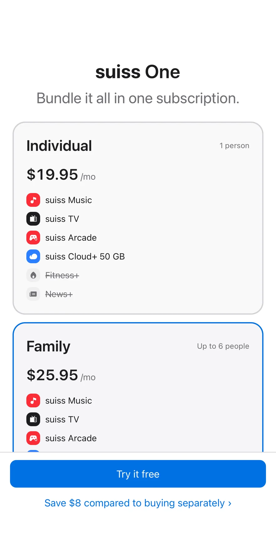
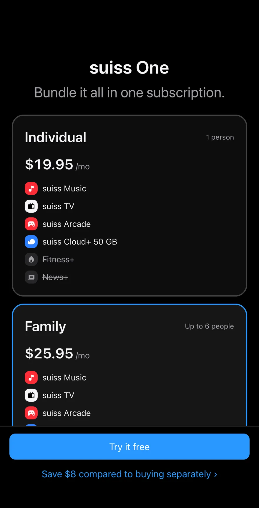
A pricing screen with selectable plan cards that act as radio buttons. Each card shows the price, who it covers, and the bundled services with icons, striking through any that the plan leaves out. A BottomBar holds a Try it free Button and a link that shows how much the selected plan saves.
Installation
The CLI also adds what it builds on: Bottom Bar, Button, Icon, Screen, Text. On React Native it also adds the animated view components/ui/animated-view.tsx.
Manual
- Install the dependencies:
-
Add the pieces it builds on: Bottom Bar, Button, Icon, Screen, Text, and the animated view
components/ui/animated-view.tsxfrom the next step. -
Copy the animated view into
components/ui/animated-view.tsx:
- Copy the source into
components/blocks/price-bundle.tsx:
- Update the import paths to match your project.
- Install the dependencies:
-
Add the pieces it builds on: Bottom Bar, Button, Icon, Screen, Text, and the animated view
components/ui/animated-view.tsxfrom the next step. -
Copy the animated view into
components/ui/animated-view.tsx:
- Copy the source into
components/blocks/price-bundle.tsx:
- Update the import paths to match your project.
- Install the dependencies:
-
Add the pieces it builds on: Bottom Bar, Button, Icon, Screen, Text, and the animated view
components/ui/animated-view.tsxfrom the next step. -
Copy the animated view into
components/ui/animated-view.tsx:
- Copy the source into
components/blocks/price-bundle.tsx:
- Update the import paths to match your project.
-
Target iOS 17 or later.
-
Add the Swift package to your app:
- Copy the theme files every view uses:
- Copy the source and every file it uses:
- Add the files to your app target.
- Set
minSdkto 24 or higher and add the dependencies:
- Copy the theme files every view uses:
- Copy the source and every file it uses:
- Update the
com.esuiss.uipackage names to match your project.
Usage
Replace PLANS and SERVICES with your offer. Wire onSelectPlan and onCompare (both receive the plan name) to your purchase flow.