suiss/ui · Block
Dash Health
A health summary dashboard with pinned metric cards, sparklines, and category views in a sidebar.
Dash Health is an open-source block from suiss/ui for React, React Native, SwiftUI and Jetpack Compose. The @esuiss/ui CLI copies its source into your project, so you own the code.
A health summary in the style of a phone health app, with cards for pinned metrics such as Move, Steps and Sleep, each showing its value and a small sparkline or bar chart. Edit mode lets users pin and unpin cards, and each category page lists all its metrics for the last seven days. Navigation is a Sidebar that collapses to icons on desktop and opens as a sheet from the trigger on mobile. Use it for fitness, wellness or any personal metrics dashboard.
Installation
CLI
Works in any project with a components.json. See Installation for the one-line registry setup. Or use the suiss/ui CLI:
Manual
- Install the dependencies:
-
Copy the source into
components/blocks/dash-health.tsx:
- Update the import paths to match your project.
Usage
Edit categories for names, icons and colors, and metrics for the cards; each metric has a category, label, value, optional unit, color and seven data points. Store the pinned list per user instead of in local state. Card links point to anchors built from each label, and the 9:41 time and JR avatar are hard-coded.
Notes
Sparklines are hidden from assistive technology because each value is also shown as text, and pin buttons are labeled with the metric name.
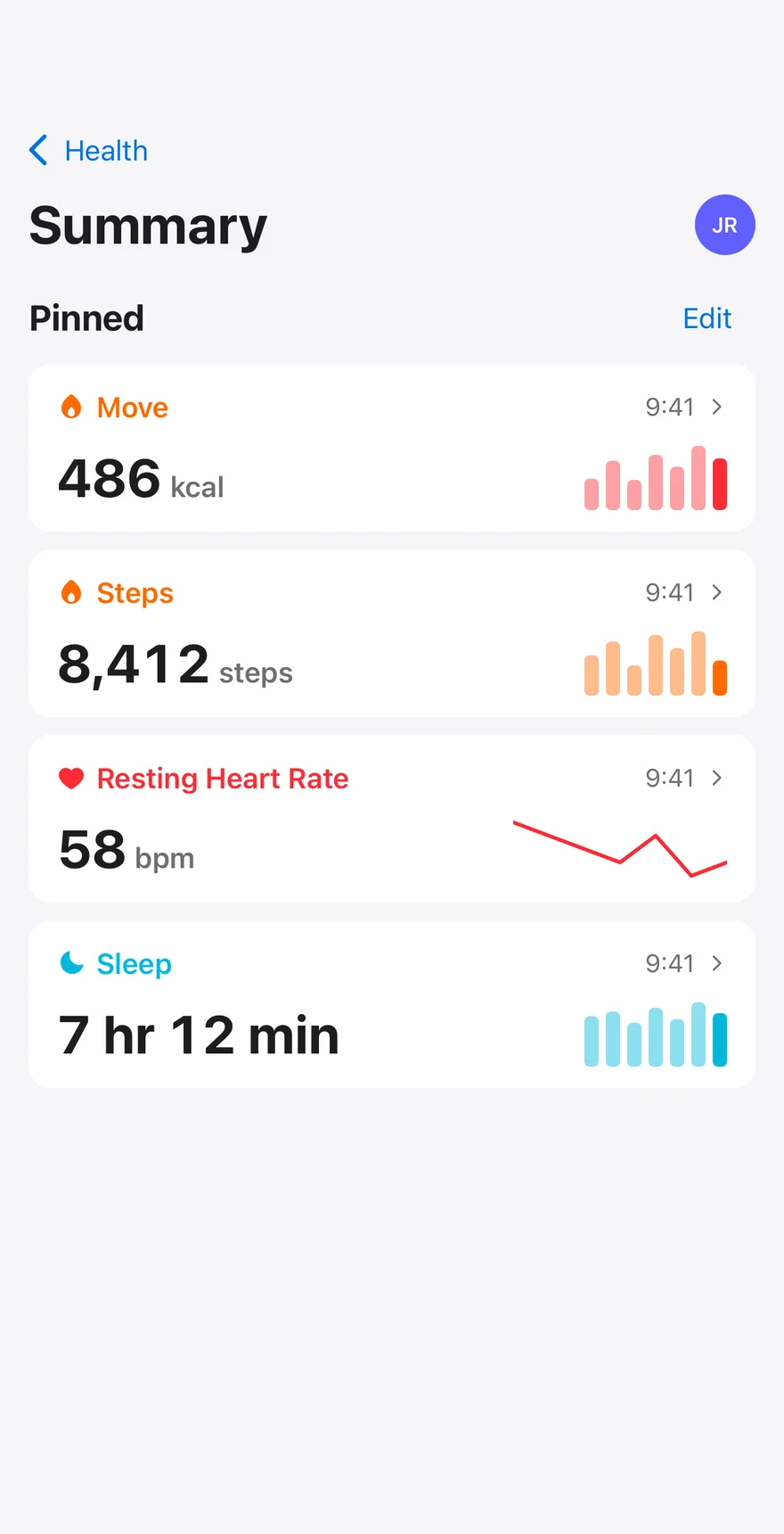
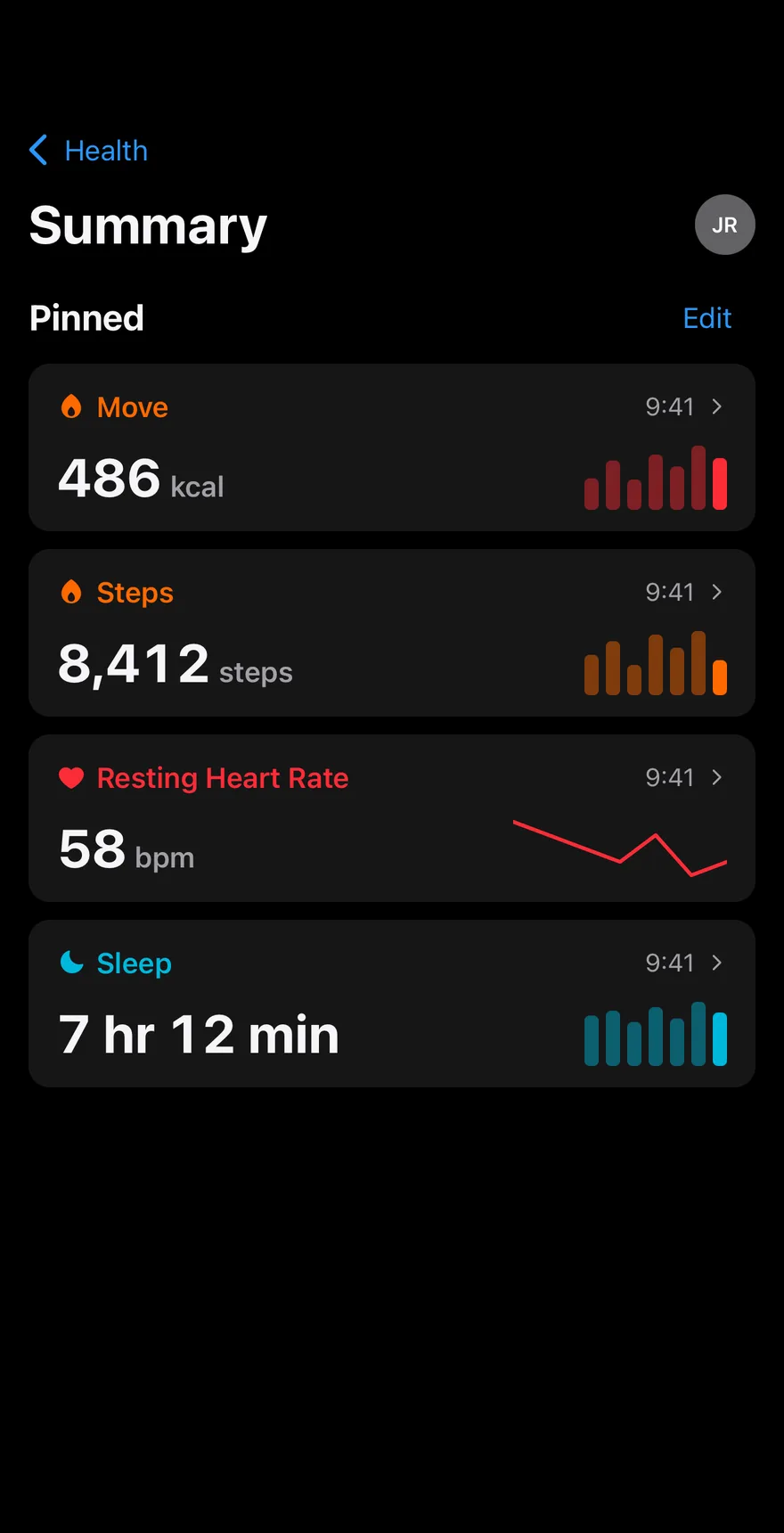
Composes Screen, Header with a back button, Avatar, Button, Icon and Item groups, with sparklines drawn using react-native-svg. The list opens a section of metric cards, and the Summary section has an Edit mode for pinning and unpinning cards.
Installation
The CLI also adds what it builds on: Avatar, Button, Header, Icon, Item, Screen, Text. On React Native it also adds the animated view components/ui/animated-view.tsx.
Manual
- Install the dependencies:
-
Add the pieces it builds on: Avatar, Button, Header, Icon, Item, Screen, Text, and the animated view
components/ui/animated-view.tsxfrom the next step. -
Copy the animated view into
components/ui/animated-view.tsx:
- Copy the source into
components/blocks/dash-health.tsx:
- Update the import paths to match your project.
- Install the dependencies:
-
Add the pieces it builds on: Avatar, Button, Header, Icon, Item, Screen, Text, and the animated view
components/ui/animated-view.tsxfrom the next step. -
Copy the animated view into
components/ui/animated-view.tsx:
- Copy the source into
components/blocks/dash-health.tsx:
- Update the import paths to match your project.
- Install the dependencies:
-
Add the pieces it builds on: Avatar, Button, Header, Icon, Item, Screen, Text, and the animated view
components/ui/animated-view.tsxfrom the next step. -
Copy the animated view into
components/ui/animated-view.tsx:
- Copy the source into
components/blocks/dash-health.tsx:
- Update the import paths to match your project.
-
Target iOS 17 or later.
-
Add the Swift package to your app:
- Copy the theme files every view uses:
- Copy the source and every file it uses:
- Add the files to your app target.
- Set
minSdkto 24 or higher and add the dependencies:
- Copy the theme files every view uses:
- Copy the source and every file it uses:
- Update the
com.esuiss.uipackage names to match your project.
Usage
Replace METRICS and CATEGORIES with your own readings. Pass onMetricPress to open a metric and onPinnedChange to store the pinned list.